5
THE INSTABILITY OF COLORS
The Instability of Colors / Color Composition / Ground and Carried Colors / Placement and Color Change / Equilibrium / Simultaneous Contrast / Afterimage and Contrast Reversal / Complementary Contrast / Ground Subtraction / Color and Area: Small, Medium, Large
The same color in two different contexts is not the same color. . . . This means that the identity of a color does not reside in the color itself but is established by relation.
—Rudolf Arnheim
Color is an experience of pure light, as insubstantial, unstable, fleeting, and changeable as a breath of air. Unanticipated color changes can be costly as well as disconcerting. There are real implications for vendors when a color that has sold well in the past loses its appeal when it is included as part of a new palette, or when companion products like wallpaper and fabric do not sell because their colors fail to coordinate when they are shown in a retail setting. Even grays, blacks, and whites will alter under the right set of conditions. The ability to anticipate the sometimes startling changes that take place in colors when they are arranged in different ways or placed in different settings, and to adjust for them as much as possible, is a critical skill for design professionals.
The Instability of Colors
Apparent changes in colors take place for two very different reasons. The first lies in the relationship between objects and the lighting under which they are seen. Changes in general lighting affect subtractive colors only. The additive colors of screen images, traffic lights, or any other light source are stable under all lighting conditions. Whether seen in daylight or under sodium lamps, fluorescent lamps, LEDs, or any other light source, the colors of light are stable as long as their source remains stable. They may be sensed as brighter overall in a dark setting than in a well-lit one, but the hues do not change.
Arrangement is the second cause of color instability. Any time that two or more colors are used together the possibility exists that one or more will undergo an apparent shift in hue, value, saturation, or some combination of these because of its placement relative to the others. Placement affects both subtractive and additive colors, and its power to change the way colors appear is relevant to every medium.
Color shifts in subtractive colors that are caused by changes in lighting are difficult to manage because products and print media are moved from place to place. But the ways in which colors influence each other by placement are predictable and can be manipulated by the designer. The concept that every color is subject to change by its placement is perfectly expressed by Josef Albers's phrase “interaction of colors.” No color is seen alone. At the very least it is seen against a background, even if that background is a simple as white paper or a blue sky.
Understanding how colors affect and change each other is more than just a way of anticipating and preventing problems. There is a positive side to instability. Two or three colors can be made to seem like four or even more by manipulating their placement. In some kinds of printing, for example, the number of colors is a factor in pricing: the more colors, the higher the production cost. A skilled colorist can make two or three colors seem like many more by placing them strategically against each other. The interaction of colors provides opportunities to fine-tune color combinations in ways that add vitality and interest to color compositions.
Color Composition
A composition is something made up of individual parts that have been arranged in such a way that they are understood as a single, complete idea. An essay is made of separate words; a song is made of single notes. A composition is understood as separate from its setting and from other things around it. A design composition is a planned arrangement of forms and colors meant to be sensed as a single visual idea. Colors used together create a color composition: a group of colors meant to be sensed as a whole.
A group of colors selected for use together is called (depending on the industry or design discipline) a palette, a colorway, a color story, or some other collective term. Selecting print, screen, or product colors—creating a color composition—can be a first step in the design process or a final one. Forms, colors, and their arrangement have equal importance in design. There are no rules about what must come first.


Figure 5–1. Color Composition. The same design can be offered as different color compositions. Carpet design by David Setlow for Stark Carpet Corp.
Ground and Carried Colors
The background of a color composition is its ground. Different industries use different terms for the materials that are used as grounds. Colors printed on fabric or wall covering are said to be printed on a ground. The background of a carpet or a banner is called the field. The paper used in printing is called stock. A printer asks if printing will be done on white or colored stock, or on coated or uncoated stock. The monitor screen is also a ground, an empty picture plane awaiting images and colors.
No matter what word is used, “ground” means the background when color relationships are discussed. Colors laid on a ground are carried colors. The ground may be an accidental or unconsidered element—a blank white paper or an empty screen—but it is always a factor in the final composition. Ground establishes the visual reference point for carried colors. It is a critical element in color compositions that is often overlooked.
The ground is not necessarily the largest area in a composition. The area of a design that is ground is identified by arrangement. Figure-ground perception, not relative area, determines which part of a composition is recognized as image or pattern and which part is understood as background.
Negative space is the area within a composition that is not part of the image or pattern. It is the unfilled area around, and sometimes within, the design elements. Negative space is often, but not always, the same area as the ground.
In some kinds of patterning it can be difficult (or even impossible) to decide which part of a design is ground and which is carried color. A checkerboard has no identifiable ground; neither does the coat of a tiger. It is not necessary for ground to be clearly defined. Colors will interact whether the ground is obvious or uncertain.

Figure 5–2. Ground and Area. The ground is not necessarily the largest area in a composition. The color of the ground is as important to a color composition as the filled area.

Figure 5–3. Shaky Ground. Is a tiger black with yellow stripes, or yellow with black stripes?
Placement and Color Change
Three different color interactions cause colors to change in ground-and-carried-color situations: simultaneous contrast, complementary contrast, and ground subtraction. All three serve to intensify the differences between colors. All three are involuntary responses of the eyes, and all three occur in both subtractive and additive color compositions.
Equilibrium
Equilibrium is a physiological state of rest that the eyes seek at all times. The eyes are at rest when the primary colors of light—red, green, and blue—are within the field of vision. The artist's primaries red, yellow, and blue reflect these wavelengths, as do the process printing primaries cyan, magenta, and yellow. The presence of any of these sets of primary colors in the visual field at the same time will bring the eyes to a state of equilibrium.
It is not necessary for the primaries to be present as individual colors for the eye to reach a state of rest. Any combination or mixture of primaries allows the eyes to reach equilibrium: three primaries, a pair of complements, two secondary colors, a muted hue diluted by its complement, or a tertiary color. The colors do not have to be equal in area. A green tree with one red apple is as effective in providing equilibrium as a red and green checkerboard.
Equilibrium is reached most easily in the presence of muted hues. The slightest dulling of a pure color makes it less stimulating to the eye. The popularity of “earth” colors, which are hues muted by the addition of their complement, may derive in part from the fact that they are genuinely, physically, restful.
Compositions of brilliant colors are less effective in providing equilibrium. Extremely vivid hues used together deliver such strong, separate, and contradictory stimuli that the eyes respond to each as if it were a single sensation. The struggle to maintain equilibrium means that the eyes must work, and work hard. Vivid multicolored images work well for attention-getting purposes but are less than ideal for extended uses like reading materials or interior room colors.

Figure 5–4. Equilibrium. The presence of three primary colors in any extent allows the eyes to be at rest. Elizabeth Eakins's carpet design “Sea Ranch,” © 1993.
Simultaneous Contrast
Simultaneous contrast is an involuntary response that takes place when the eyes are not at rest, when only a single hue is present in the field of vision. In this situation the eyes generate the missing complement, which appears as wash of hue on an adjacent achromatic area. If a single primary color is present, the missing secondary appears. If a secondary is present, the missing primary appears. For any given color the eye simultaneously and spontaneously generates the missing complement.
The effect of simultaneous contrast is strongest when the stimulating hue is a saturated color or brilliant tint, but muted, tinted, or darkened hues will also cause it to take place. Simultaneous contrast will occur to some extent whenever a single hue is placed on, or next to, an achromatic area.

Figure 5–5. Simultaneous Contrast. The strongest effects of simultaneous contrast occur when a neutral area is surrounded by a stimulating hue. All of the gray squares are the same. What hues can be seen in them?

Figure 5–6. Simultaneous Contrast. Even muted colors will influence the apparent color of neutrals. The same ground shifts from cool to warm when the carried colors are changed.
Failing to recognize situations in which simultaneous contrast will occur can be costly, as this true story illustrates. An interior designer selected a gray carpet for installation throughout a residence. The client had been specific, insisting, “I hate blue; I only want gray.” The walls throughout were painted “peach” and “terra-cotta,” more accurately, variations of orange. When the carpet was installed, it appeared to be a pale, but definite, blue. The frantic designer brought a sample of the carpet back to the vendor, insisting that the wrong goods had been installed. The sample was identical to the original selection. Simultaneous contrast was the villain. The orange-based wall colors caused the eyes to generate the complement, and the expanse of gray carpet was a perfect neutral field on which the complementary blue could be seen.
Simultaneous contrast is a factor in the selection of every neutral (including, and especially, variations of white) that is intended for use with a single hue or close family of hues. Fortunately, it is not difficult to anticipate and neutralize unwanted effects. If a green textile is used with a white one, adding a faint green undertone to the white counteracts the red that the eye generates. Without that hint of green, the white takes on a pink cast. A red textile calls for the opposite—a red undertone in the white to counteract the green that the eye supplies. If the designer in the example above had selected a gray carpet with a faint orange undertone the problem would not have occurred.
Afterimage and Contrast Reversal
Afterimage, or successive contrast, is exactly what it sounds like: an image that appears after a stimulating hue is taken away. Afterimage is caused by the same response of the eye as simultaneous contrast but takes place under different conditions. Simultaneous contrast can be induced by a brilliant color or a muted one, and the achromatic area that it affects must be adjacent. Afterimage requires a brilliant color stimulus and a nearby, but separate, white or light surface. The viewer stares hard at the color image, then blinks firmly and looks immediately at the white surface. The image appears ghost-like on the blank area—in complementary color.
Contrast reversal is a second kind of afterimage. In contrast reversal the “ghost” appears as a sort of double negative, with both complementary colors appearing, but in reversed positions. A stimulating pattern might be bright yellow diamonds on a white page. When the image is removed and a white field substituted, pale violet diamonds appear in place of the yellow ones, and the white spaces between them are faintly yellow.
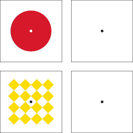
Figure 5–7. Afterimage and Contrast Reversal. Cover the lower half of the illustration with white paper. Stare at the red circle as long as possible without blinking. Blink firmly, then look immediately at the black dot in the center of the white square. Next, cover the upper half of the illustration and repeat the exercise with the diamond design. What happens?
Afterimage also takes place without hue. A black-and-white illustration viewed in this way will appear with the values reversed, like a photographic negative.
Complementary Contrast
Complementary contrast describes what happens when two colors with a complementary relationship—even the slightest complementary relationship—are used together. Simultaneous contrast takes place when only one hue is present. Complementary contrast intensifies the difference between two hues that are already present and already different. Complementary contrast occurs with every form of hue: saturated, tint, shade, or muted.
A pure color appears at maximum hue intensity when it is paired with its complement (or a near-complement). The difference between the two is emphasized by their pairing, but neither color undergoes any change. Red used with green remains red and green remains green; blue and orange together remain blue and orange, and so forth. This is true for colors that are opposite at all points on the spectrum. The intensity of any hue is enhanced by the presence of its complement. Red-violet is brilliant on its own; add a patch of yellow-green and it positively sings.
The second aspect of complementary contrast is its power to bring out undetected hue. It is with muted hues and their tints and shades that the hue-intensifying power of complementary contrast has its greatest impact. Complementary contrast does not require a brilliant stimulating color. A sample may seem so pale, or so dark, or so dull that it seems achromatic, but when placed with its complement, or a color that contains even a small amount of its complement, a previously unseen hue appears. When both halves of a complementary pair are muted, each seems to become more hue-intense and more different from the other. No matter how slight, how muted, how “barely there” the complementary relationship between samples, any hue difference between them becomes apparent when they are placed together.
Colors do not have to be perfect opposites for complementary contrast to occur. They can be near-complements or part-complements, like red-orange and green, or yellow-green and violet. When colors placed together have even a fraction of complementary relationship, each will undergo a shift in hue toward the closest primary-secondary pair. Two slightly different blue samples placed together may suddenly appear greenish-navy and purplish-navy. The difference that becomes visible is a slight, but definite, presence of the complements green and red. Goethe described the complements perfectly as “completing” colors. The eye seeks not only equilibrium, but also the simplest and most “completing” hue relationship.

Figure 5–8. Complementary Contrast. The contrast between complementary colors is emphasized when they are used together, but neither changes the other.

Figure 5–9. Complementary Contrast. When colors that have even a hint of complementary relationship are used together that contrast is intensified. Two blues seen separately appear to be very much the same. Seen together, a contrast in hue becomes visible.
Ground Subtraction
Simultaneous contrast and complementary contrast are responses of the eyes to the complementary relationship. Each intensifies differences between samples that are already unlike. Ground subtraction is completely different. It takes place when a ground and its carried colors have qualities in common—and also qualities that are different. Whatever qualities are shared by a ground and its carried colors are reduced, and differences between them are emphasized.
In the simplest example, a middle gray placed on a dark gray appears lighter; the darkness that is common to both is reduced and the remaining lightness intensified. The same middle gray placed on a light gray appears darker; the lightness common to both is reduced and darkness intensified.

Figure 5–10. Ground Subtraction of Value. A middle gray appears darker on a light ground and lighter on a dark ground.
Ground subtraction of value takes place whether or not hue is present. A light blue placed on yellow appears darker than the same blue placed on violet.

Figure 5–11. Ground Subtraction of Value When Hue Is Present. The same blue appears darker on a yellow ground and lighter on violet.
Changes in hue follow the same pattern. Primary colors alone will not change in hue no matter what their ground (although they can seem to shift in value). But all other colors can be changed in apparent hue, at times quite dramatically, when they are placed on grounds that share one or more aspects of their own qualities.
Orange appears more yellow-orange when it is placed on red, where the red common to both is subtracted. It seems closer to red-orange when it is placed on yellow, where the common yellow is subtracted. The difference between the two is emphasized because both hue and value are affected. The orange appears lighter on the red; darker on the yellow.

Figure 5–12. Ground Subtraction: One Color As Two. The same color appears to be two different colors when it is placed on grounds that share different aspects of its own qualities. The center color is the same for each pair of squares.
Changes in apparent saturation follow the same rule. When a muted hue is placed on each of its “parents,” the mix seems dull on the vivid ground; brighter and more chromatic on the muted one.

Figure 5–13. Ground Subtraction of Saturation. A red-gray placed on gray appears more red. Placed on red, it appears much grayer.
The more complex a color is—the more elements it contains—the more subject it is to alteration by its ground. The changes that take place in complex colors are not necessarily more dramatic than those that take place with simpler colors. Change is simply more likely, because the more ingredients in a color, the greater the number of possibilities that it will have elements in common with— and also different from—its ground. A neutral beige mixed from blue, orange, and white can be made to appear duller or brighter, darker or lighter, more cool (or blue), or more warm (or orange) by placing it on different grounds.
Color shifts can be extreme when both ground subtraction and complementary contrast are in play. If a brown square made of a mixture of blue and orange is placed on an orange ground, the orange component that is common to both is reduced by ground subtraction. The blue is strengthened twice: first, as the color remaining after the orange is reduced, and again by complementary contrast against the orange ground. The same brown square, placed on a blue ground, looks very much more orange. The orange component is made stronger twice: first, as the color remaining after the blue is reduced, then by complementary contrast against the blue ground.
Ground subtraction can be used in reverse to make different (but related) colors appear to be identical. A green and a yellow-green can be made to look the same by placing them on grounds of opposing qualities. Yellow-green placed on yellow appears more green; the common yellow is reduced. Green placed on blue-green appears more yellow; the blue that is present in both is reduced.

Figure 5–14. Ground Subtraction: Two Colors as One. Different colors can be made to seem the same by placing them on grounds of opposing qualities.
Color and Area: Small, Medium, Large
A different kind of shift takes place in subtractive colors when a color that has been selected from a small sample, like a paint chip or fabric cutting, is seen on a larger surface. The direction (placement in space) of a large color plane affects whether it will read as lighter or darker, or more muted or more chromatic, than it does as a small chip. Changes of this kind are not color interactions. They are differences seen in a single color, under the same lighting, but in different placements in space and different extents.
Typically, light reaches a surface from above and at an angle. When light reaches a wall surface or a floor from this conventional direction, floors and walls appear lighter than a small sample of color in the hand. Charcoal gray, near-black on a paint chart, becomes a medium gray when applied to the exterior of a house. Carpet, medium gray in a small cutting, becomes light gray on the expanse of a floor. Conversely, a color selected for a ceiling must be made two or three steps lighter than a small sample to achieve the same effect because less light that is directed conventionally—downward, from above—reaches a ceiling.
Muted colors appear more chromatic on a large plane. A dark brown applied to a wall appears lighter and more red-brown or more orange-brown than in a small chip. Vivid colors, cheerful in small doses, can be overwhelming in large scale. Adjusting a color selection to compensate for the difference between what is seen as a small sample and the same color on a large surface is an issue faced more in architecture and interior design than in other design fields.