9
TOOLS OF THE TRADE: COLOR IN PRODUCT AND PRINT
It's the Real Thing: Color in Product and Print / Design Media / Artists' Media / Subtractive Mixing: Pure Hues / Subtractive Mixing: Muted Hues / Tinting Strength / Color Printing: Process Colors / Color Printing: Spot Colors / Screen and Block Printing
The artist studies his materials and methods in order to gain the greatest possible control over his manipulations, so that he may bring out the best characteristics of his chosen technique, and express or convey his intentions.
—Ralph Mayer
Every manufactured object represents the culmination of a design/build process. Individuals or teams create design prototypes, but the final product—the real thing—is fabricated by others. The creative phase of product development ends at the moment when goods go into production.
A rendering is a drawing or painting that translates a real-world object, actual or imagined and often three-dimensional, into a two-dimensional image. Renderings are a way in which proposed new products can be visualized. Ideas for new forms and colors are sketched, modified, revised, and ultimately tweaked into a final form ready for production. These illustrations have another, equally important, use. Renderings are a means of selling design and color ideas. They are the principal way in which new product and color ideas are communicated to potential purchasers.

Figure 9–1. Selling Design. Architect Daniel Brammer's meticulous pencil drawing brings a structure to life on paper. Image courtesy of Daniel Brammer for Cook+Fox Architects.
It's the Real Thing: Color in Product and Print
The colors of objects can be described in color terms, but they are experienced in more complicated ways. The full impact of any real-life object includes subtleties of texture, light-reflectance, and other, harder-to-define qualities. The blue of a ceramic tile and the blue of a velvet might be described using the same words, but one would never be mistaken for the other.
It can be surprisingly difficult to separate the color of something from its other attributes. Much of the time the form, surface, and color of an object are understood as a single experience. Each surface scatters general light in ways that are characteristic of that particular thing and others like it. The pebbled yellow surface of a lemon is understood as the lemon. A lemon-shaped, lemon-colored form that is smooth and shiny is not identified in the same way. Two images printed on white paper using the same ink will read differently if the underlying surfaces are unlike. A matte paper scatters light in many directions so that colors printed on it are diffused and softened. The same inks on glossy paper are crisper and more dramatic. Deep reds and golds printed onto velvet suggest luxury; the same colors on a glossy vinyl seem sharp and aggressive.
Both natural and man-made materials are used in the manufacture of consumer goods. Natural materials like stone, wood, silk, linen, cotton, and wool have random gradations and shadings that many consumers find appealing just as they are, without added color. Man-made products mimic these convincingly, many times at lower cost. Synthetic yarns can look and feel like undyed wool, linen, or silk. Engineered stone is a man-made material that imitates the colors and patterns of natural stone so well that it can be impossible to discriminate the man-made material from a natural one. An apparently “wood” floor may actually be made of solid vinyl planks.
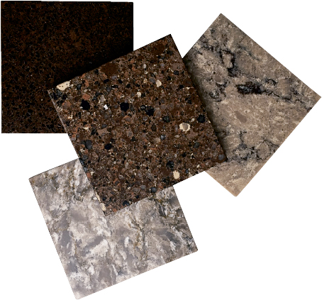
Figure 9–2. Art Imitates Nature. High-performance engineered stones from Cosentino draw their inspiration from nature—but their extreme durability from space-age technology.
Natural materials can also have color added without losing the attributes that gave them appeal in the first place. Wood can be stained to brilliant color without losing visible grain; even stone can be stained to subtle—or startling—color. Fibers like cotton, wool, linen, and silk can be dyed to any imaginable color without compromising characteristic texture.
Products are colored in three principal ways. Color can be introduced directly into a raw material before the start of the manufacturing process; materials can be dyed, which means bonding to a base material at the molecular level; or color can applied as a surface coating at a late stage of manufacture. Products are also colored using a combination of these. A textile can be dyed, for example, then overprinted after dyeing.
Solution dyeing of textiles is an example of a process where color is introduced into a base material at the earliest stage of manufacture. In solution dyeing, a colorant is introduced into a chemical soup before it is extruded into fibers; the fibers are then woven. Solid plastics, color-through porcelain tiles, luxury vinyl floorings, and an array of other products are colored in similar ways. There are limitations to introducing colorants directly into base materials. The colorant and base must be chemically compatible, and not all colorants are compatible with all substances. The inclusion of color into the substance of a material offers some advantages. In hard surface materials, for example, chipping becomes less of a concern. But producing a separate base material for each color in a product line is costly, so the number of colors available in color-through products is often limited.
Dyes form a chemical bond with the substances they color. Dyes are used to introduce color into a wide variety of materials: textiles, wood, paper, leather, fur, even stone. Textiles are the most familiar dyed products. Textiles can be dyed as fluff before the yarn is spun; dyed as yarn after spinning; or piece-dyed after fabric has been woven.
Finally, color can be applied as a coating to the surface of a product, typically at a late stage of production. Coverage can be complete, like paint, or used only in selected areas, as in a printed textile. Applied color enables a manufacturer to offer a wide range of color choices in a single product because one base material serves for all colorways. The principal requirement of applied color is that it adhere firmly to its substrate so that it performs well in normal use, without chipping, flaking, or rubbing off.
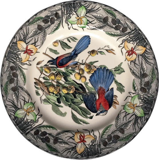
Figure 9–3. Applied Color. This hand-colored copy of an Audubon scene was painted onto a dinner plate at a late stage of manufacture.
Design Media
A medium is a means, a way of conveying something from one form to another. A design medium is a means of translating images, ideas, and colors from one kind of visual experience—real or imagined—to another. A three-dimensional reality like a person or an object becomes a two-dimensional image through the medium of paint on paper or light on a screen; or something that exists only in imagination comes suddenly to life as a drawing. Good design media communicate the force of a whole visual idea. The best enable designers to create images that closely approximate the forms, textures, and colors of the end product.
A product moving through design development passes through many stages of visualization. Imagine a new kind of umbrella. The concept begins as a sketch on a lunch napkin, then becomes a marker sketch or digital drawing. A prototype is produced by hand or by three-dimensional computer modeling. That model is photographed and becomes digital data. The resulting image is broadcast on the Internet or on television and is received by a wide variety of computer or television monitors, each with its own color-display capabilities. The photograph may go into print as an advertisement. And the product itself, the source of all these images, remains tantalizingly apart—six, seven, or more steps of color rendition between image and reality.
All fields of design share the same challenge: visual thinking and presentation must take place in (at least) one medium when the color of the actual product is achieved in an altogether different way. A rendering must approximate as closely as possible not just color, but a sense of the whole. Two very different kinds of media are used to achieve this goal. One is the traditional paints, inks, and markers of the artist-designer. The other is the near-universal medium of today's design studio: the on-screen imagery of digital design.
Artists' Media
Traditional artists' media are substances made up of a liquid, paste, viscous, solid, or other inert base that contains a colorant. The colorant, a dye or pigment, selectively absorbs and reflects wavelengths of light; traditional media produce subtractive colors. The base is a vehicle (or means) for transferring the colorant from one thing to another—from brush or pen to paper, for example. Together, base and colorant make up the medium. In a good-quality artists' medium the colorant permeates the base evenly and transfers smoothly. There are hundreds of different subtractive media, among them poster paints, opaque and translucent watercolors, oil paints, acrylic paints, markers, crayons, colored pencils, dyes, inks, and chalks.
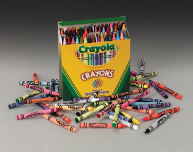
Figure 9–4. Artists' Media. The multitude of colors available in Crayola crayons has been an early inspiration to generations of artists and designers. © 2004 Binney and Smith. All rights reserved. Crayola, the chevron design, and the serpentine design are registered trademarks; the smile design is a trademark of Binney and Smith.
Dyes are colorants in solution. The colorant is fully dissolved in water, alcohol, or some other solvent. Dyes penetrate the material they color and bond with it. Some dyes are opaque, others are translucent. Opaque dyes mask the surface material completely, and the color that results is dense and rich. Translucent dyes act as a filter, allowing light to pass through and reflect back from a white or light underlying material. The added light reflectance from the surface below means that translucent dyes lend themselves to great brilliance in color.
Pigments are finely ground particles of colorant that are suspended in a liquid or other base. Pigments “sit” on a surface rather than bonding with it. Pigment hues are typically more opaque and less brilliant than dyes. Not all artists' colors fall neatly into a dye or pigment classification. “Lake” colors, for example, are dyes that have been bonded to a finely ground material, usually a white clay, and then suspended in a base. Lakes have the brilliance of dyes but perform with the opacity of pigments.
Before the mid-nineteenth century, most dyes were organic, derived from plant or animal material. Many were fugitive, oxidizing (fading or changing) over time on exposure to light or air. Pigments were made from ground earths; some, like lapis, were ground from semiprecious stones. The inorganic nature of pigments made them more durable than dyes. The accidental discovery in 1856 of coal-tar dyes precipitated a quest for ever more stable and brilliant synthetic colorants. Today's high-performance colorants have properties and durability unimaginable in the past. They are available in products made for commercial uses and as well as art supplies, and because of their complexity, many bridge the old distinctions between dyes and pigments.
Although the colorant alone determines the hue, the base of a medium plays a role in overall effect. A base is inert only in the sense that it does not modify light selectively. Colorants are selective, absorbing some wavelengths and reflecting others. A base modifies color by absorbing, scattering, or reflecting general light. Color qualities like translucency, opacity, and chalkiness depend in great part on the light-modifying qualities of the base.
Watercolor and crayon are examples of media whose differences come largely from the modifying quality of the base. Water is a colorless substance that transmits light. It evaporates completely after it is applied, leaving the colorant essentially unmodified. A brilliant dye that is dissolved in water and applied to a white substrate renders colors that are clear and brilliant. Crayons carry the colorant in a wax base. The wax is dense, cloudy, somewhat shiny, and slightly translucent. Unlike water, the wax base of a crayon remains after it has been transferred to paper. Wax absorbs a bit of the light reaching it, scatters some light, and allows some light to reach the underlying surface. No matter how brilliant the colorant in a wax crayon, the wax mutes the final color impression.
Some media have special properties and special uses. Colors from DayGlo, for example, include substances that absorb wavelengths of light from above the range of the visible spectrum and reemit them at a lower range, as visible light.1 The added light-reflectance makes these colors valuable for attention-getting purposes, like safety cones on the highway, because they are highly visible against any background. Metallic media mimic the sheen and color of various metals. They are made up of finely ground particles of copper, zinc, or aluminum in different proportions. The metal particles are suspended in a base, usually a resin, that can be tinted with conventional colorants for further effect. Yellow can be added for gold, or orange for copper, or deep green for bronze.
Subtractive Mixing: Pure Hues
No medium exists as a complete range of hues with all possible hue, tint, shade, and saturation variations. Instead, each product has a limited number of colors that can be used alone or mixed together to extend its range. It may be available in a large number of colors, like oil paints or children's crayons, or only a few colors, like natural chalks. Different kinds of liquid or paste colors can be mixed together successfully only when the bases are compatible. A water-based paint, for example, will not mix with an oil-based paint.
Creating a new hue in subtractive media is done in a visually logical way. Colors that contain two of the artists' primaries are mixed together in varying proportions to produce the colors that lie between them. Theoretically, red and yellow mixed together create a range of oranges, and yellow and green a range of yellow-greens. But two subtractive colors that are mixed to make a third do not dependably produce the expected result. Colorants do not reflect light from a single wavelength. Instead, they reflect a limited range of wavelengths. The perceived color is the wavelength that is reflected most strongly, while others present may not be visible to the naked eye. A red chosen at random and mixed with yellow will not necessarily make orange. In order for two colors to produce a new one, their colorants must reflect a wavelength in common.
Imagine a red paint whose colorant reflects a strong red wavelength and a weaker orange wavelength. All other colors are absorbed. A yellow in the same medium reflects a strong yellow wavelength and a weaker orange wavelength; all other wavelengths are absorbed. When the red and yellow paints are mixed, the mixture of the two absorbs all of the colors that each absorbed when used alone. What is left is orange, the one wavelength that the two reflect in common.
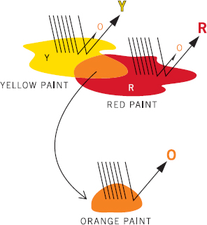
Figure 9–5. Subtractive Mixing of Hue. Two paints mixed together produce a third color when they reflect a wavelength in common.
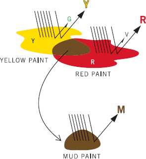
Figure 9–6. Subtractive Mixing of Hue: Failure. Two paints that do not reflect a wavelength in common mix to a muddy neutral.
Now imagine that same yellow mixed into a different red, one that reflects some violet instead of orange: The yellow reflects yellow and orange (and absorbs red, green, blue, indigo, and violet). The red reflects red and violet (and absorbs orange, yellow, green, blue, and indigo). If colorants were perfect, the result of that mixture would be no color at all, because all wavelengths would be absorbed by this particular mix. But they are not perfect, so a frequent result is a muddy, somewhat chromatic, sludge. Kindergarten poster paints are a familiar example of poor mixing affinity. Mixing primary colors in kindergarten poster paint does not produce clear secondary colors. Blue and yellow together produce a sickly khaki, red and yellow a brownish orange, and blue and red a sort of purplish mud color.
A skilled colorist creates new hues based on experience with the mixing affinities of colors in a particular medium or product. There are helpful articles and books of instruction for specific media, even for specific products, but there is no single magic answer. Color mixing in a subtractive medium requires a set of learned mixing skills.
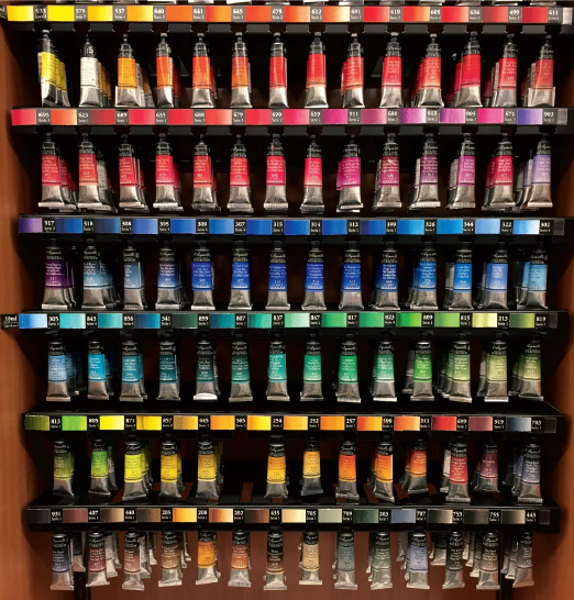
Figure 9–7. Mixing Affinity. A single product line has many tubes of apparently identical colors, but each tube color mixes differently with others.
Subtractive Mixing: Muted Hues
When three primaries are present in a mix, the resulting color will always be muted. How muted depends on the proportions of the various colors in the mix. The path to success can have a steep learning curve, but with the understanding that the contents of each tube or jar will mix differently with every other tube or jar in the same medium, the possibilities for creating subtle and complex colors becomes virtually limitless.
Tinting Strength
When subtractive colors are mixed, the quantity of each product in the mix does not necessarily produce a predictable result. Tinting strength refers to the amount of a color needed to make a perceptible difference when mixed into another color. Different tube or jar colors within the same medium will vary in tinting strength. Most yellows, for example, have little tinting strength. Add one-half cup of yellow paint to one-half cup of green paint and there is very little change in the green, but a teaspoon of green added to a cup of yellow changes yellow to yellow-green at once. Colorants with great tinting strength are like garlic. A teaspoon of apple in garlic soup does not make much of an impression, but a teaspoon of garlic in an apple pie will certainly be noticed.
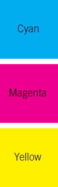
Figure 9–8. Process Colors.
Color Printing: Process Colors
Process colors are the most familiar and universally available color printing medium. They are used in commercial photo-offset and computer printing, color xerography and personal computer printing, as well as specialty printing methods. The process color primaries are Cyan (a blue-green), Magenta (a blue-red), Yellow, and blacK, referred to as CMYK. Magenta is also called process red; cyan, process blue; and yellow, process yellow.
The colorants used in CMYK printing inks are also available in media such as drawing inks, films, and markers, which is helpful in preparing art for CMYK printing. A design rendered by hand in process color markers or drawing inks will closely approximate the colors of the printed page.
Process colors are categorized as a subtractive medium, but they produce colors in a completely different way from artists' colors. Instead of selectively absorbing and reflecting wavelengths of light, process colors act as filters. Each process primary absorbs one wavelength of light and transmits the others.
- Process magenta absorbs green and transmits red and blue.
- Process yellow absorbs blue and transmits red and green.
- Process cyan absorbs red and transmits blue and green.
When a process primary is laid on white paper, some wavelengths reaching it are absorbed and others are transmitted to the paper surface below. The white surface reflects the wavelength that reaches it back through the ink “filter,” and that is the color that reaches the eye.
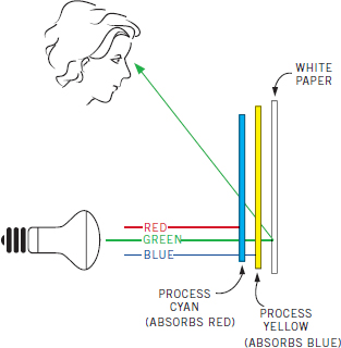
Figure 9–9. Process Colors Act As Filters. Here, cyan and yellow mixed absorb red and blue. Only the green wavelength reaching the paper surface is reflected back to the eye.
When process inks are mixed, they continue to absorb and transmit the same wavelengths. The secondary colors that result from mixing process primaries do not correspond to the colors that result from mixing artists' colors or the mixing of light.
- Magenta and yellow mixed absorb green and blue light (and transmit red); red results.
- Yellow and cyan mixed absorb red and blue light (and transmit green); green results.
- Magenta and cyan mixed absorb green and red (and transmit blue); blue results.
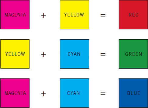
Figure 9–10. Process Color Mixing.
The three process primaries combined produce a medium gray tone, so black is needed to give sharpness and depth to a color image. The black also works to produce shades and muted colors. The brilliance of a pure color is reduced by adding black in 6% increments.
In CMYK printing, the inks are not actually mixed. Instead, each color is printed in tiny dots that are below the threshold of vision. Each color is printed as a separate step, called a separation or color separation. The dots are positioned at different angles to avoid a moire, or watermark, effect. Printing the color dots in different densities enables the printer to achieve hundreds of colors using only four foundation inks.
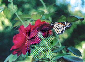
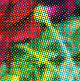
Figure 9–11. Process Color Printing. Images in CMYK printing are made up of tiny dots. The dots are overlaid in different proportions to produce different colors.
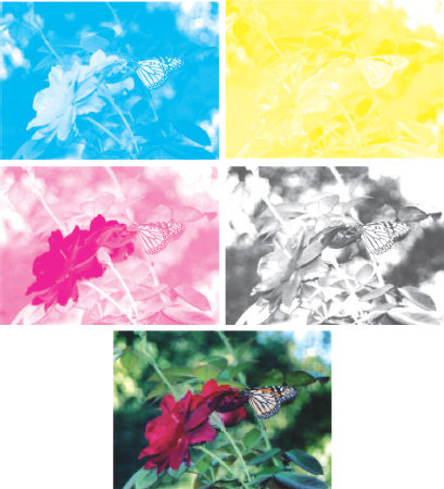
Figure 9–12. Color Separations. Each process color is printed as a separate step.
Most commercial printing is done on four-color photo-offset presses using CMYK colors. Four-color process printing has some shortcomings. It does not produce clear colors in the orange range, many tints do not reproduce well, and gradations of color can be difficult to print. (This book is printed in CMYK colors.)
Better results can be obtained by the use of six-color and eight-color process printing. Six-color printing adds two lightened inks, diluted yellow (LY) and diluted black (LK), which provide added depth to the CMYK image. Eight-color process adds all four CMYK inks in lightened form, LC, LM, LY, and LK, and produces an even richer image. Both six- and eight-color printing require special presses. Few of these presses are available, and production costs are high. Computer printers are also available in six colors, but most day-to-day color printing is done in four-color process inks. Dealing with the very real constraints of four-color printing remains an ongoing challenge for graphic designers.
Color Printing: Spot Colors
Color printing is also done with specially formulated solid-color inks called spot colors. A spot color is mixed individually in the same way as artists' colors before being applied to a roller. Specialty inks, like colors from DayGlo and metallics, are also printed in this way. These colors offer greater depth and clarity of hue than process colors, and because they are specially mixed, the number of possible colors is nearly limitless. However, since each color must be mixed and printed separately, printing with more than one or two spot colors can be costly. They are used principally for one- or two-color printing, but also to add emphasis to CMYK printed pages—as a special color logo, for example, on a CMYK-produced color brochure.
The principal spot color ink system used in the United States is the Pantone Matching System, which offers 1,677 standardized colors made from 15 Pantone base inks. Using Pantone formulas and Pantone inks, the same color can be reproduced by different printers, or at different times, with great accuracy.
Spot colors are not easily translated into CMYK printing. Some colors can be produced in either medium, but spot colors have a wider color range than CMYK colors and most spot colors when converted to CMYK printing lose their depth and vibrancy. The Pantone Color Bridge System is a selector that makes it possible for designers to see in advance how a spot color will appear when it is printed using CMYK inks.
Screen and Block Printing
Screen printing, also called silk screen printing or serigraphy, is a stencil technique with limited commercial use. A screen, or mesh, is set into a frame of fixed dimensions and a pattern is drawn onto it. Areas that are not to be printed are blocked with a waxy substance. A single color of specialty ink spread on each screen transfers through the unblocked areas to the surface below. Each color to be printed requires a separate screen, and colors are printed in a predetermined order. Screen printing can be done on many kinds of surfaces, and inks are available for a wide variety of effects and applications, including transparent colors that when overlaid achieve the effect of more colors than are actually printed. The technique of working with screen printing inks is more like working with artists' colors than four-color printing, although CMYK inks for screen print use are available.
Block printing is another less frequently used means of commercial printing. A flat block of wood or other material is carved so that areas to be colored remain at the flat surface and areas meant to be uncolored are cut away. Like screen printing, block printing requires specialty inks, a separate block is needed for each color, and colors can be overlaid.
Figure 9–13. Silk Screen Printing. Each color in this 1930s silk screen image is printed as a separate step.
Screen and block printing are techniques used most often for small output projects, like T-shirts or posters, because small lots can be produced in this way with reasonable efficiency. Although each technique is traditionally done by hand, both screen and block printing have been adapted for machine production, and machine screen printing in particular is used for high-end decorative fabrics and wall coverings.