Chapter 11
Active-Passive
Throughout the multiyear bull market it was well documented that mutual funds, on average, did not beat indexes. Promoters of index (passive) investing have spread word of this situation with full force. Significant assets have moved from actively managed funds to passive funds. To understand why assets were moving away from actively managed funds let's analyze the market setting and behavioral finance research regarding active managers. Initially, if we classify stocks by market capitalization and by value-growth characteristics, it can be seen that the first five to ten years of the eleven-year bull market were difficult for active managers due to a setting out of their control.
Market Capitalization
Within the S&P 1500 Index, the S&P 500 Index is composed of the largest 500 companies and the S&P Small-Cap 600 is composed of the smallest 600. Figure 11.1 shows the ratio of the P/E of the S&P Small-Cap 600 divided by the P/E of the S&P 500 monthly from January 1995 through February 2020.

Figure 11.1 Ratio of P/E of Small-Cap 600 to Large-Cap 500
Back to 1995, on average, the P/E on the Small-Cap 600 is greater than the P/E on the (Large-Cap) 500, which makes sense because small companies are growing faster, and investors usually pay a premium for growth potential. The average ratio of the two indexes is 1.25 (top line), meaning, on average, small caps have a P/E that is about 25% above the P/E on large caps. The bottom line is a ratio of 1.00 where they are equal. Any ratio above 1.25 suggests small caps are expensive and large caps are cheap by historic standards. Any reading below 1.25 suggests small caps are cheap and large caps are expensive by historic standards.
Notice how the relationship varies through time. In 1995 and 1996, investors must have loved small caps and took their P/E ratios much higher than normal relative to the 500 Index. Just the opposite in 1999 and 2000, when investors loved large caps so much, they even priced them with P/E ratios greater than that for small caps (below the 1.00 line).
At the beginning of the eleven-year bull market in 2009, small caps were expensive, and large caps were cheap by historic standards, making large caps favored to lead the stock market recovery. Indexes are market capitalization weighted, meaning larger stocks have a bigger weight or influence than small stocks. One way for a manager to try to beat an index is to hold small-cap stocks. For managers, bringing small caps into an active portfolio in an attempt to be different from, and beat, an index wouldn't work when large caps are in favor. Such a setting suggests a difficult environment for active managers and that the best investment tactic was to hug a market capitalization–weighted index and go for the ride.
From the bottom in March 2009 through February 2020, the Small-Cap 600 Index actually did keep up with the (Large-Cap) S&P 500 Index, just not consistently enough nor in the right sectors for managers to boost performance by holding small cap stocks. The Small-Cap 600 beat the S&P 500 only four of the eleven annual periods from 2009 through 2019. From a sector perspective, only four of the eleven sectors in the Small-Cap 600 beat their counterparts in the S&P 500. Most importantly, for all four of the leading sectors for the entire bull market, information technology, consumer discretionary, financials, and industrials, the S&P 500 sector beat its small-cap counterpart. The four small-cap sectors that beat the large caps, like utilities, were lagging sectors that were not going to boost performance by including those small caps. Over the eleven-year bull market, it was not a setting where holding small caps could help beat the market cap–weighted index.
Value–Growth
Within the S&P 500 Index, Standard and Poor's classifies stocks as value or growth. We assume they use metrics such as P/E, price-to-book, and price-to-sales for classifying. Figure 11.2 shows the ratio of the P/E on the growth stocks divided by the P/E ratio of the value stocks from June 1995 through February 2020. Back to 1995, growth stocks have a higher P/E than the value stocks, on average 1.32 times greater (gray line).
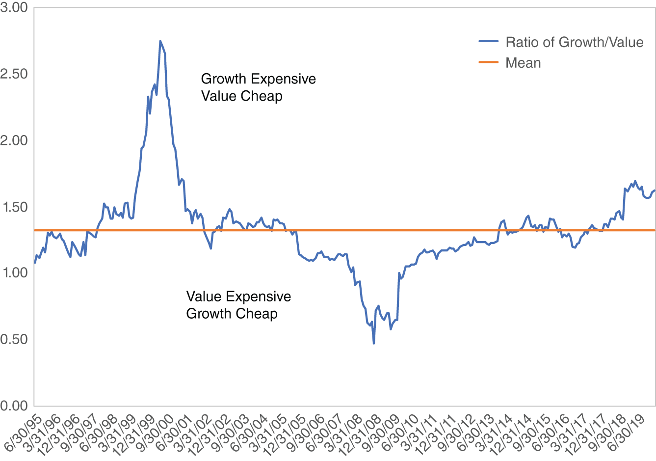
Figure 11.2 Ratio of P/E, S&P 500 Growth/Value
Just like with market capitalization, investors’ preference for value and growth stocks varies through time. In 1999 and early 2000, investors loved growth so much they priced it much more expensively than normal. At the market bottom of 2009, the love affair totally reversed from the previous extreme, because growth was cheap and value was expensive by historic standards. Combining market capitalization and value-growth metrics, the sweet spot of the market for the early years of the recent bull market was large-cap growth, which is exactly what indexes look like. As the bull market went on, value-growth moved back to neutral by historic standards but for market capitalization, large stayed cheap until late 2015. Because the preferred characteristics were large cap and growth, indexes had a head start over active managers during this bull market. To fully understand why active managers, on average, performed below indexes, we need to look at other factors as well.
Pace
What if the pace of a market advance affects a manager's ability to beat indexes? Maybe some rallies are just too fast for managers to keep up. We looked at the five most recent multiyear bull markets to see if pace and manager performance are related. We divided the total return for the S&P 500 Index from the day of the bottom to the day of the peak by the number of days in the bull market to get percent return per day (pace). In Table 11.1 bull markets are identified by the month and year they began. The first row is the average percent per day return, or daily pace. It can be seen that the three bull markets beginning in August 1982, December 1994, and March 2009 are the three fastest moving, on average, about twice the pace of the other two.
The S&P 500 line is total return for the advance. The S&P 500 and average active manager returns are from a database that tracks managers by their stated strategy (Chapter 12). The strategy database is monthly, so it does not match exactly with the daily data, but it is close. Lag is simply the percent of the index return that the active managers obtained. For example, in the 1982 bull market the average active manager earned 66.7% of what the index delivered. It is clear that in the three fastest-paced bull markets, active managers lagged the most. In the two slowest-paced markets, active managers beat the index in the 2002 bull market and barely lagged in the 1987 market.
Table 11.1 Pace of Bull Markets and Active Management (by Percent)
| 8/1982 | 12/1987 | 12/1994 | 10/2002 | 3/2009 | |
|---|---|---|---|---|---|
| %/Day | 0.24 | 0.11 | 0.21 | 0.10 | 0.19 |
| S&P | 280 | 155 | 264 | 108 | 392 |
| Average | 187 | 147 | 196 | 121 | 267 |
| Lag | 67 | 95 | 74 | 112 | 68 |
Maybe some bull markets are just too fast for managers. As for reasons, perhaps cash comes in and managers can't or don't get it invested quickly enough. As we saw in Chapter 2, bull markets have big surge days and it is important to participate in them. Maybe cash made funds sluggish during surge days. To confess, we are stuck on finding other reasons pace would affect performance, but it apparently does. This eleven-year bull market was fast enough to give active managers problems.
Changing Market Conditions
Active managers, or stock pickers, have their individual strategies for analyzing and selecting stocks. Most don't change through time. They just keep picking stocks their way. What changes is the market environment, which is a function of a variety of things such as investor sentiment, economic setting, political climate, etc. Recent research is showing that stock picking skill gets rewarded better in some environments than in others. Studies by Larry Gorman, Steven Sapra, and Robert Weigand in “The Role of Cross-Sectional Dispersion in Active Portfolio Management” (2010); Atti Petajisto in “Active Share and Mutual Fund Performance” (2006); and Anna Helen von Reibnitz in “When Opportunity Knocks: Cross-Sectional Return Dispersion and Active Fund Management” (2013) have focused in on three conditions that are ranked by their order of importance:
- Individual stock cross-sectional standard deviation
- Individual stock cross-sectional skewness
- Chicago Board Options Exchange (CBOE) volatility index (VIX)
Let's explain these one at a time before putting them all together. Cross-section standard deviation measures how spread out returns are among stocks. For any month we could compute the average, or mean, return for all the stocks on the New York Stock Exchange (NYSE). We could also compute the standard deviation of all those returns. It would measure how spread out, or dispersed, those returns are around their mean. It turns out that a high standard deviation, or big dispersion, is a good setting for stock pickers. In other words, when there is a big difference between the good stocks and bad stocks, it is easier for a stock picker to get rewarded.
Cross-section skewness refers to how individual stock returns are distributed. Some months the returns for all stocks on the NYSE may be in a perfect normal distribution, often called a bell curve, with an equal number of stocks above and below the mean. Other months return may be skewed, meaning there are an excessive number of stocks with extremely good or bad returns. It turns out that skewness, or an excessive number of stocks with extreme returns, is a good setting for stock pickers, something they can take advantage of.
As for the VIX, the price of a stock option is a function of five variables: the stock price, the exercise price, the risk-free rate of interest, the time to maturity, and the expected volatility of the stock price over the remaining life of the option. We know the first four and can therefore solve the Black-Scholes option pricing equation backwards to determine what investors think volatility is going to be. The CBOE does that and puts out its implied volatility index, known as VIX. Higher levels of VIX is a good setting for stock pickers. Perhaps higher levels of expected volatility result in temporary mispricing that stock pickers can recognize and exploit.
Tom Howard of AthenaInvest has added a fourth influence on the environment for stock picking: small-cap stock premium. As mentioned previously in the chapter, when small cap stocks are performing well, a manager can hold them to look different from, and beat, market capitalization–weighted indexes. Howard has combined the four variables into an equation to compute the Active Equity Opportunity Index, or AEO, which is shown in Figure 11.3 from 1998 through July 2021. Over that period the average is 40. Any reading greater than 40 is a favorable environment for stock pickers. Over this twenty-three year period, 1998 through 2006 and 2008 through 2010 were favorable environments for stock pickers. During the recent eleven-year bull market we were generally in a setting of some combination of low individual stock cross-sectional standard deviation, low individual stock cross-sectional skewness, low VIX, and no or low small-cap stock premium—a tough setting for stock pickers.

Figure 11.3 Active Equity Opportunity Index, 1/1998–7/2021
Behavioral Finance
Promoters of passive investing would like to declare that active management is dead but they can't because recent research from behavioral finance gives us a road map to find superior managers. These research results began to appear about 2004 and accelerated concurrent during the eleven-year bull market. They lead us to conclude superior managers do exist. We know how they behave. Therefore, we know how to find them. Generally this research has shown that stock-picking skill does exist and has found behaviors associated with superior performance.
But first a quiz. Do you think superior performance would be associated with which of the following:
- A manager staying in a style box or
- A manager selecting favorite stocks from anywhere in the style grid?
- A fund looking like an index or
- A manager comfortable with the fund looking different from an index?
- A fund with a high correlation to an index or
- A fund with a low correlation to an index?
- A fund with many stocks or
- A fund with fewer stocks?
If you answered all b you are right. You already know how superior managers behave and do not need to read the rest of this chapter. As for the reasons b was correct, let's take them in order.
Russ Wermers, University of Maryland, is a highly skilled researcher. He visited our office a few years back and told how a pension consultant had hired him to do research that would show that style drift was bad. Style drift means selecting stocks that fall in a variety of style boxes rather than selecting stocks from just one box. Wermers had to go to the consultant and deliver bad news. He found that managers who drifted the most performed the best. He concluded constraining a manager to a style box costs about 300 basis points per year.
In 2009, Martijn Cremers and Antti Petajisto, then at Yale, in “How Active Is Your Fund Manager? A New Measure That Predicts Performance,” defined what they called “Active Share.” It is the willingness of a manager to have a portfolio looking different from an index and can be measured by the percentage of the portfolio that is different from an index. They reported a perfect linear relationship: the greater the Active Share, the greater the performance. They note that “managers with the highest Active Share exhibit some skill and pick portfolios that outperform their benchmarks by 1.51–2.40% per year.” They found that funds with a high level of active share and good one-year performance continued to excel.
Two researchers at New York University, Yakov Amihud and Ruslan Goyenko, in “Mutual Fund's R2 as Predictor of Performance,” took a similar approach to Cremers and Petajisto and screened mutual funds for two characteristics. They showed that funds with the lowest quintile trailing one-year market R-squared (correlation) to an index and the highest quintile trailing one-year return significantly outperform over the subsequent year. Although Active Share and R-squared are not identical, it is likely that funds with high Active Share will demonstrate a low R-squared. In either case, high Active Share or low R-Squared reveals a manager that does not hug an index. She just picks her favorite stocks.
In the late 1990s when our firm began to market to the public funds institutional market, a plan's pension consultants would say, “I want you to beat the index, but I want you to look like it.” That request was based on the notion that tracking error was bad, a cockeyed belief that gained popularity in the 1990s. Now it is clear. Superior managers don't care whether or not they look like an index and their portfolios generally have low correlation to indexes.
A study called “Best Ideas” by Randy Cohen, Christopher Polk, and Bernard Silli, published in 2005 and updated in 2008, yielded startling results with respect to finding superior managers. They ranked holdings in mutual funds by the amount that a stock was overweight or underweight relative to its weighting in the benchmark index. The authors reasoned that the most overweight stocks must be the manager's best ideas and could be ranked by the degree of overweighting. They found that roughly the top thirty stocks generated a risk-adjusted alpha: the best-idea stock beat the second best, the second-best idea beat the third best, and so on. The study concluded, “The U.S. stock market does not appear to be efficiently priced, since even the typical active mutual fund manager is able to identify stocks that outperform by economically and statistically large amounts”. Notice the word typical. In fact, their statistics suggest that virtually all equity managers are superior stock pickers who are able to rank their best ideas. But if this is true, whydo studies show that the average mutual fund underperforms? The authors attribute such underperformance to over-diversification and argue that “investors would benefit if managers held more concentrated portfolios”. In other words, managers have a limited number of “good ideas.” This is powerful confirmation to the simpler study that C. Thomas Howard and Craig T. Callahan published in 2006 in an article titled “The Problematic ‘Style’ Grid” in the Journal of Investment Management Consulting showing that superior returns dropped off at about the fortieth-ranked stock among the four strategies tested. We often tell audiences, “You don't want our seventy-fifth best idea. It's probably not a good one.”
We contend that if a manager is rigidly following an investment strategy, its best forty ideas (favorite stocks) don't fall in any one style box, for example, small-cap value. So those best ideas can't be held or the manager would be accused of style drift. To fill out a portfolio and stay in a style box, the manager goes down the list and includes lesser-ranking stocks that do fall in the assigned box. They may be the fiftieth, sixtieth, seventy-fifth, and so on ranked ideas, which as the Cohen article showed are probably not good stocks.
Back to the data driving the move to passive. Why have funds, on average, not beaten indexes during this bull market? Some was due to the large-growth sweet spot. Some was due to the pace of the advance, perhaps simply being too fast for managers to keep up. Also, there are some funds in those averages that are restricted to a style box. There are some funds in those averages that hold 150 to 250 stocks. There are some funds in those averages that either by being so big or by choice hug indexes. In other words, there are funds in those averages exhibiting behaviors that behavioral finance has uncovered to be drags on performance, so they pull down the averages.
Although over the long run, we see behaviors that are drags and behaviors associated with superior performance, they are not always punished or rewarded, respectively. There are some settings, captured in Howard's AEO index, in which the good behaviors just don't get rewarded. They can even be punished in the short run. During the eleven-year bull market, we have had a few of those years.
Passive Investing's Dark Side
In 2016, we wrote a paper taking a different look at the trend toward passive (index) investing. It was called “How Passive Investing Interferes with Our Free Market System” and had a bit of an edge to it.
Summary
The large-cap growth leadership of this bull market combined with its relatively fast pace was a difficult setting for active managers. The Active Equity Opportunity Index was below its historic average of 40 indicating an environment unfavorable for stock-picking skills to be effective. In this setting, the behaviors associated with superior performance over the long run, like the freedom of not being locked in a style box, active share, low correlation and fewer holdings, were at times not rewarded and even punished. The volatility events of 2010, 2011, and 2018, as described in Chapter 8, were particularly disruptive to managers with those historically rewarded behaviors.
This bull market presented an interesting cross current. As it advanced, more and more investors switched to passive investing at the same time more and more research appeared confirming the existence of superior managers and identifying their behaviors. Perhaps the next bear market and subsequent bull market will bring these two divergent trends back into line.
- Large-cap growth leadership made it difficult for active managers.
- Perhaps the pace of the advance was too swift.
- Active Equity Opportunity Index confirms it was a difficult setting.
- Passive investing interferes with our allocation of resources.