
Chapter 6. Mobile Testing
Generally speaking, traditional web developers have always had to ensure that their code worked across popular browsers. This has become the universal truth of web development; users can and will access the web however they are able. In recent years, the freedom of accessibility has become less about “taking back the Web” by choice of browser and more about convenience of access with mobile devices. And it hasn’t stopped at mobile phones, either. People will access the web on their tablets and watches, and they will even get it projected onto their eyeball if they so desire. While we’re still waiting for the wearable WebPageTest agent, there is already support for tablets and phones.
In this chapter, we will explore the options that WebPageTest provides for mobile web performance testing. Mobile support falls under two categories: emulation and native. Rather than testing on an actual phone or tablet, emulation runs on desktop browsers configured to act like a mobile device. For the real thing, WebPageTest agents can actually control physical mobile devices. As we’ll discuss, each tool has its drawbacks and advantages.
Desktop Emulation
It is common for web developers to call their site “mobile-friendly” if it is responsive. One way to do this is to give mobile devices the entire desktop page and rely on client-side code to force it to be mobile-friendly. For example, a page could be viewed on a large desktop monitor or a small phone screen, and some savvy CSS rules could keep everything fitting like a glove. The CSS can work on large or small screen sizes by using media queries to adjust the styles that are applied to the page based on the dimensions of the screen. For a desktop browser to fool a media query, all it has to do is change its viewport size to be as small as a mobile device.
One obvious problem with this approach is that the mobile client must download all of the code required for the desktop view, which may not entirely be used in the mobile view. As we’ll discuss more in “Traffic Shaping”, unnecessary content can have a profound impact on performance as a result of limited download capacity. Many web developers have recognized this problem and have come up with another way to serve mobile web content. The User-Agent property included in the browser’s request headers provides the server with demographic information about the user’s device. Servers can tell whether the user is on a desktop or mobile device based on the information in this header. So instead of relying on client-side code like CSS to adjust the page layout from desktop to mobile-friendly, the server will use the User-Agent header to provide trimmed-down mobile code whenever necessary. Tricking a server into giving a desktop browser its mobile web page can easily be done by modifying the browser’s User-Agent value.
WebPageTest can create a desktop browser with a small viewport as well as overwrite its User-Agent identity. This is the basis for mobile web-browser emulation with desktop browsers. Let’s look at how to enable these options.
Any test location that supports Chrome can emulate a mobile device. To configure this, go to the Chrome tab of the Advanced Settings section. Check the Emulate Mobile Device option, as shown in Figure 6-1, and start the test. That’s it.
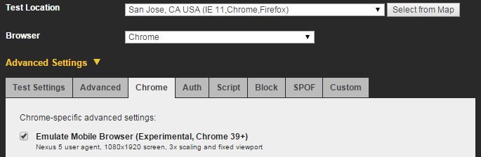
Figure 6-1. The option to enable mobile emulation is found on the Chrome tab of the Advanced Settings section. This will cause desktop Chrome to masquerade as a Nexus 5 and compel the server to produce the mobile web version of the test page.
As a result, the browser will identify itself as something like "Mozilla/5.0 (Linux; Android 4.4.4; Nexus 5 Build/KTU84P) AppleWebKit/537.36 (KHTML like Gecko) Chrome/37.0.2062.55 Mobile Safari/537.36,” which is a Nexus 5 device running Chrome 37. It will also adjust the viewport to match the Nexus 5 with a 1080 x 1920 px screen and 3x pixel density.
Tip
You can specify your own User-Agent value on the same tab that allows you to enable mobile device emulation. It’s also possible to configure the browser window to be as small as a mobile device by programmatically adjusting the viewport size with a scripting command. For example, in the Script tab, you would enter setViewportSize 1080 1920 to achieve the same viewport as a Nexus 5; 1080 pixels wide and 1920 pixels tall. These two options give you the flexibility to emulate any device configuration. See Chapter 7 for a more thorough introduction to using the Script tab.
The test results for an emulated mobile web page appear just like those for a desktop page. You still get the waterfall diagram, screenshots, video of the loading progress, and detailed analysis. However, emulation does come with shortcomings. Desktop computers generally have more powerful CPUs that can build a web page faster than a mobile device. Desktops also have the capacity for much larger browser caches, which means that repeat views may be uncharacteristically optimistic under emulation. Perhaps the most significant factor is the connection speed, which can be drastically slower on a mobile network.
Despite these limitations, there is still something to be learned from emulation. Especially when mobile tests are compared against straightforward desktop tests, egregious “mobile-unfriendly” anti-patterns can be spotted. Look at the size of static resources, for example. Just by counting the bytes, you can tell if a mobile site is unoptimized if the sizes are all equal (Figure 6-2 and Figure 6-3). Alternatively, you could see whether the size of one type of resource is disproportionately high.
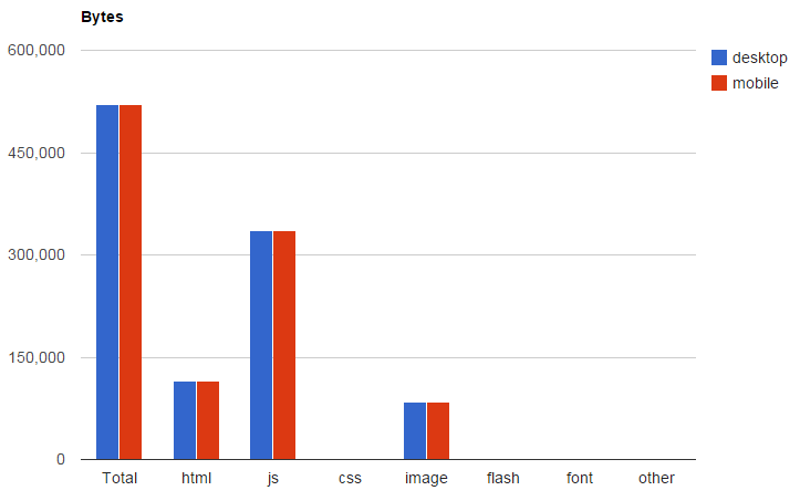
Figure 6-2. Using the A/B testing techniques from Chapter 3, we can use the automatically generated charts to compare the resources of multiple tests. Here, we compare resources of a desktop page against its unoptimized mobile counterpart. The total number of bytes loaded for markup, scripts, styles, and images are all identical. This is a red flag that the mobile page has hardly been optimized—if at all.
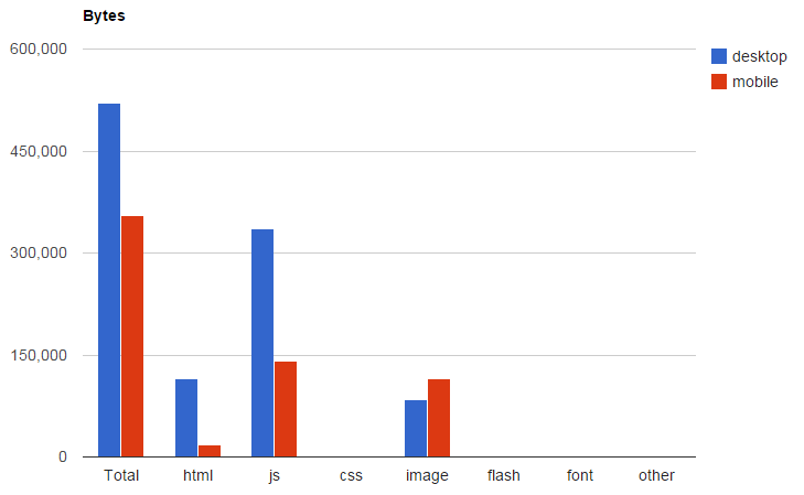
Figure 6-3. Even after some optimizations have been made to the mobile web page, this chart can show us when mobile is loading more of something than desktop. In this case the mobile page has more image bytes. Considering that the screen size is much smaller and the design is much simpler, this should be an automatic red flag to warn against wastefully loading images that are larger than necessary.
WebPageTest can account for the blind spots of emulation with additional tooling. The following sections each address a particular blind spot: simulating the connection speeds commonly experienced on mobile devices, and getting accurate results by testing on physical devices.
Traffic Shaping
In order to simulate a mobile web page in a desktop browser, we need to use Chrome’s emulation mode. This encourages the web server to give the browser the mobile version of the page, but the browser still has many properties that are unlike a mobile experience. As most mobile users would be quick to point out, the connection speed on a mobile device is typically much worse than on a desktop connection. WebPageTest accommodates this discrepancy by changing the way the desktop test agent is able to communicate over the network. This technique, called traffic shaping, allows test agents to simulate slow connection speeds.
We looked at traffic shaping in “Connection Speed” to find a speed that is representative of the real-user population. Instead of varying the connection speed to find realistic results with trial and error, we already know the network type that we’re looking for. For the purpose of emulating a mobile device, we can simulate the network conditions by choosing one of the preconfigured mobile profiles, as shown in Figure 6-4.

Figure 6-4. You can select one of WebPageTest’s preconfigured connection profiles on the Test Settings tab of Advanced Settings. You could also configure a custom connection profile by supplying your own download speed, upload speed, and round-trip time (RTT).
WebPageTest offers two mobile profiles for throttling the test agent’s network speed: 3G and Fast 3G. Both profiles share the same upload and download speeds of 1.6 and 0.768 Mbps respectively. The difference is that the 3G profile’s RTT is half as fast as Fast 3G’s. Keep in mind that the TCP handshake alone is one full round trip, so just opening up a single connection on the slower 3G profile takes a minimum of 300 ms as opposed to 150 ms on Fast 3G.
Modern cellular networks utilize faster technologies like 4G. Even though this option is not explicitly preconfigured in WebPageTest, you can still represent this demographic by choosing the Custom connection and specifying comparable download, upload, and RTT values. For 4G, one approximation would be to configure 5 and 2 Mbps for download and upload speeds respectively, and 75 ms for RTT. These values came from researching typical speeds and may vary depending on location and carrier.
Native Devices
So far, our mobile tests have been configured to run in a desktop browser. The browser disguises itself as a mobile user agent and shrinks its viewport to handheld proportions. The WebPageTest test agent throttles the connection to be more realistic to cellular network performance. The shortcoming of desktop emulation is that the hardware powering the browser is still that of a desktop. What we need is a way to run synthetic performance tests on real mobile devices.
The difference that native hardware offers to synthetic testing is in the computation power. Even when you load identical web pages over identical connection speeds, a mobile device will generally take longer to load than a desktop browser. This is because of the underlying hardware that does the heavy lifting of building the page to display on screen. Mobile devices are smaller by nature and hence they have less room for hardware. This forces a trade-off between size and performance: a smaller CPU can fit in a phone but is not as powerful, whereas a desktop CPU can take up as much space as it needs. Memory is also a significant factor. The browser cache on a mobile phone can be as little as 5% of that of its desktop counterpart. This introduces another common computational trade-off between the speed of a program and the amount of space it can take up. The relationship between speed and space means that (all other things being equal) a smaller cache would mean a slower running time. For mobile synthetic testing, these factors directly affect metrics like the load time of a page because the phone or tablet is slower by design.
Recall from “Device and Browser” that WebPageTest has native iOS and Android devices available for public use. Running tests for these devices is just as easy as any other configuration. To start, choose a geographic location with one of these devices on site, and then pick your device, as shown in Figure 6-5.

Figure 6-5. Testing on a native device is as straightforward as selecting a mobile-supported location and picking your device
Note, however, that the availability of mobile devices is extremely limited. Only about a dozen devices are available and they are all located in Dulles, Virginia, maintained personally by WebPageTest’s creator (Figure 6-6). Keep this in mind when running your mobile tests. Most important, consider the queue of people who may want to use these scarcely available resources and keep tests to a minimum. You should also consider the effects of the devices’ location. There will be latency inherent to the physical location of the test agents, especially if they are testing a web page served oceans away.
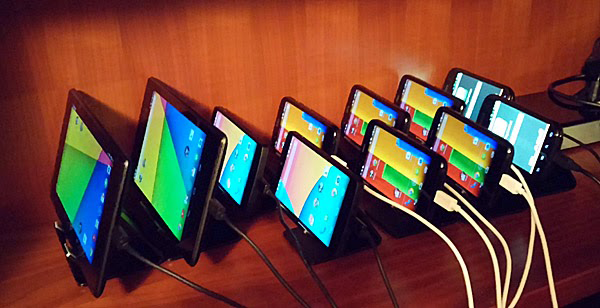
Figure 6-6. In this 2014 photo, the actual Android devices hooked up to the WebPageTest agent in Dulles, Virginia are shown. From left to right: Nexus 7 (landscape), Nexus 7 (portrait), two Nexus 5, five Motorola G, and two Motorola E. Source: Android web performance testing takes a big leap forward
These publicly available mobile devices do not communicate over a cellular network. They are connected to a traffic-shaped WiFi network, which is deliberately done for reliability. In order to keep the mobile test agents online and unaffected by capricious network conditions, they are relegated to a 3G-shaped traffic configuration. This connection speed is preset for you, as it is the only option compatible with the native mobile devices.
Tip
If traffic shaping does not suit your needs and your tests require native mobile devices on their native cellular networks, WebPageTest can still work for you. With a private instance of WebPageTest, you can create your own mobile test agent by installing testing software on a native device. See “Mobile Test Agents” for more information about setting this up.