Exploring Silverlight for Visual Studio 2010
Adding content to your Web application
Enhancing your application with interactive content
Microsoft Silverlight is the latest platform for developing visually rich content for Web applications. Silverlight integrates multimedia, graphics, animation, and interactivity all into one cross-platform and cross-platform runtime environment. Search engines can index and search Silverlight content because Silverlight applications aren't compiled, but are declared in the Extensible Application Markup Language (XAML) format files. These XAML files are interpreted by the Silverlight runtime when executed by the browser. Starting with Silverlight 2, you can develop Silverlight applications using any .NET language. This feature makes it easy for developers to apply their .NET framework development skills to develop enhanced Web applications with Silverlight. You can also develop Silverlight applications with dynamic scripting languages, such as Ruby and Python.
Silverlight has also become the tool of choice for delivering multimedia content on the Web. Silverlight supports all the major audio and video formats and appears in a majority of Web sites that deliver radio, television shows, and even movies. With Silverlight 3, you can even deliver high-definition video over the Web. Silverlight lets you watch your favorite television episodes that you missed or try out new shows when it's most convenient for you.
At the time of this writing, Silverlight 3 is the latest version of the Silverlight platform. Silverlight is by far the richest platform for developing the next generation of Web applications. The power of Silverlight is that it leverages the .NET platform and uses the programming languages of .NET making Web development easily accessible for programmers who have only developed desktop applications. Silverlight is making the Web the medium of choice for delivering informational, educational, and entertainment content to people all around the world. The next generation of Web applications is currently being developed with Silverlight.
To develop Silverlight applications in Visual Studio 2010, you need to install the Silverlight Software Development Kit (SDK), the developer runtime, and the Visual Studio project templates. You can install all these using the Microsoft Web Platform. You can find all you need at http://silverlight.net/getstarted. The Web Platform installer automatically detects the installation of required prerequisites and installs those components that you need.
After you have the necessary components for Silverlight, you can create Silverlight applications. To create a Silverlight application in Visual Studio 2010:
In Visual Studio 2010, choose File

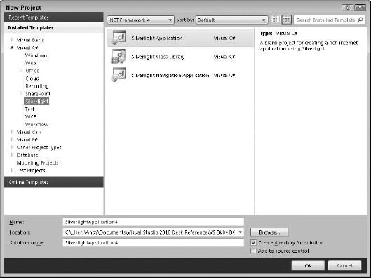
Select Silverlight from the Installed Templates pane under Visual Basic or Visual C# application types.
The list of Silverlight project templates appears in the middle pane of the New Project dialog box, as shown in Figure 11-1.
Select Silverlight Application and click OK.
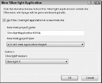
The New Silverlight Application dialog box appears, as shown in Figure 11-2.
Choose the type of Web application project and Silverlight version and click OK.
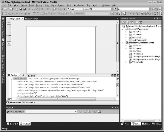
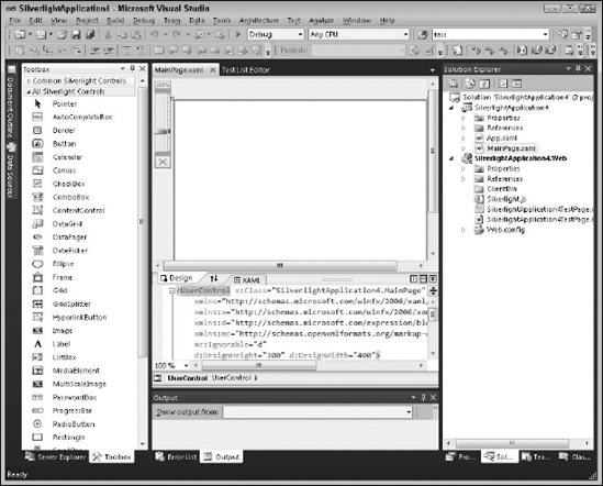
Visual Studio creates a Silverlight application with the main form visible in both Design view and Source view where the XAML code for the main form is visible, as shown in Figure 11-3.
Note
Extensible Application Markup Language (XAML) is a file format that is used to declaratively create user interfaces without the use of a compiled computer language like C#. The compiler interprets the XAML file and creates the necessary code to display the user interface elements when the application executes. Using XAML allows even non-developers to create and modify user interfaces easily without writing and compiling code.
Visual Studio loads the controls you can use in your application in the Toolbox, as shown in Figure 11-4.
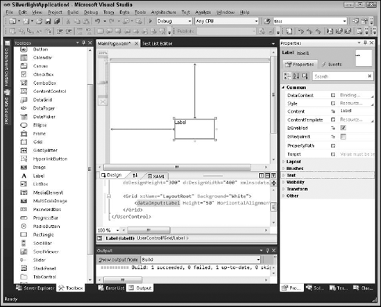
You can drag controls from the Toolbox onto the main form in the design view. To start, drag a Label control from the Toolbox onto the main form. You see the label in the design editor and XAML view, as shown in Figure 11-5.
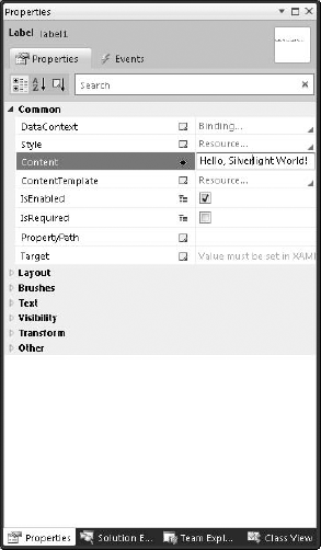
You can change the text of the label to read "Hello, Silverlight World!". To change the text, select the Content property in the Property Explorer, as shown in Figure 11-6.
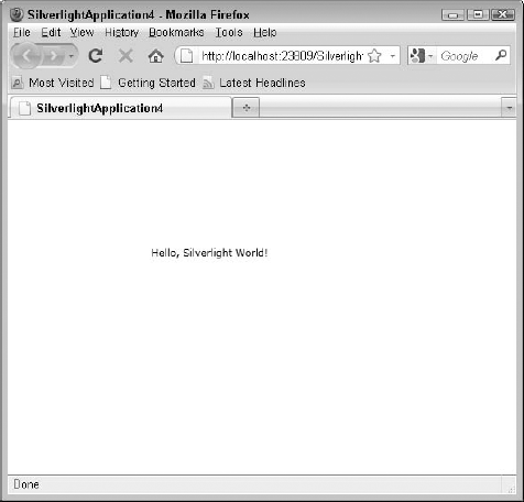
Click Ctrl+F5 or Debug
Note
You can download the complete program (both C# and VB versions) for this example from this book's companion Web site at www.dummies.com/go/vs2010.
You can use the tools provided in Silverlight to create content for your Web application. In this example, you create a simple page that uses the Silverlight controls to display a simple digital clock. Start by creating a Silverlight application. (See the section "Creating a Silverlight application," earlier in this chapter.)
To create a digital clock:
Drag a Canvas from the Toolbox onto your main form in the Design view.
A blank canvas appears in the form in the Design view.
Drag a rectangle from the Toolbox inside the Canvas.
A Rectangle object with sizing handles appears inside the Canvas.
Using the sizing handles, make the Rectangle completely cover the Canvas.
The Rectangle now covers the entire Canvas.
Drag a
TextBlockfrom the Toolbox to the interior of the Rectangle.A
TextBlockwith sizing handles appears in the interior of the Rectangle.Use the sizing handles to make the
TextBlocknearly the same size as the Rectangle.The
TextBlockappears in the Rectangle, as shown in Figure 11-8.
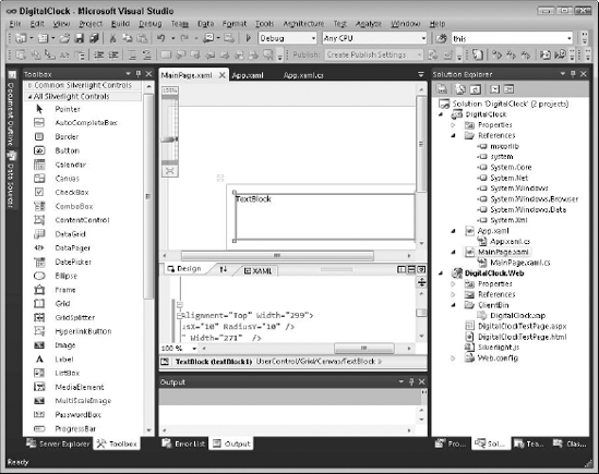
What appears so far is just the outline of the digital clock. You can make this outline look more like a clock, perhaps with some visual depth, a border, and maybe rounded corners, thanks to the Style property. You can create styles with XAML and then apply those styles to controls. You can place styles in any .xaml file. In this case, it would be nice for these styles to have scope in the entire application, so putting them in the App.xaml is a good choice.
Tip
You don't need to create styles separately in XAML. You can create the same effects by setting the appropriate properties on the elements themselves. Nevertheless, using separate styles is preferred. If you have more than one element that you want to have the same appearance, then you can easily change the style and all elements that use that style automatically change. Using separate styles makes for more flexible and maintainable code.
First, you want to style the Rectangle element that forms the background of the clock. This style gives the Rectangle element rounded corners and uses linear gradients to draw a border and fill the Rectangle element. The Stroke property controls the outline of the Rectangle. The Fill property sets the brush that fills the Rectangle element, and the StrokeThickness property determines the thickness of the border. For the digital clock, you use a LinearGradiantBrush for the border and fill of the Rectangle. The following style sets all these properties:
<Application xmlns="http://schemas.microsoft.com/winfx/2006/xaml/presentation"
xmlns:x="http://schemas.microsoft.com/winfx/2006/xaml"
x:Class="DigitalClock.App"
>
<Application.Resources>
<Style x:Key="ClockFace" TargetType="Rectangle">
<Setter Property="StrokeThickness" Value="4"></Setter>
<Setter Property="Fill">
<Setter.Value>
<LinearGradientBrush>
<GradientStop Offset="0.0" Color="DodgerBlue" />
<GradientStop Offset="1.0" Color="White" />
</LinearGradientBrush>
</Setter.Value>
</Setter>
<Setter Property="Stroke">
<Setter.Value>
<LinearGradientBrush>
<GradientStop Offset="0.0" Color="White" />
<GradientStop Offset="1.0" Color="DodgerBlue" />
</LinearGradientBrush>
</Setter.Value>
</Setter>
</Style>
</Application.Resources>
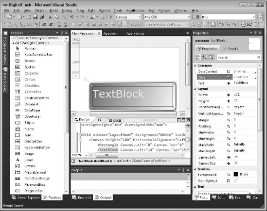
</Application>After you create this style, you can apply it to the Rectangle element by selecting the Rectangle in the Design view using the Properties window, as shown in Figure 11-9.
Now, you want to create a custom style for the clock's text. You can simply add a style to App.xaml by creating yellow text with a font size of 36.
<Style x:Key="ClockText" TargetType="TextBlock">
            <Setter Property="FontSize" Value="36" />
            <Setter Property="Foreground">
                <Setter.Value>
                    <SolidColorBrush Color="Yellow">
                    </SolidColorBrush>
                </Setter.Value>
            </Setter>
        </Style>
Now you can go to the Design view of MainPage.xaml and apply the ClockText to the TextBlock by selecting it and assigning the ClockText style to the Style property in the Properties window. Figure 11-10 shows the result.
The layout for the digital clock isn't quite complete. The text should display the current time in a digital clock format. And in order to function like a clock, the text must change as the time advances. Now is the time to go to code to finish up the clock.
First, you need a timer that ticks every second so that you can update the clock text. The System.Windows.Threading.DispatcherTimer provides a timer for use in Silverlight applications. To update the clock text, you set the Text property of the TextBlock element when the Tick event of the timer occurs:
C#:
using System.Collections.Generic;
using System.Linq;
using System.Net;
using System.Windows;
using System.Windows.Controls;
using System.Windows.Data;
using System.Windows.Documents;
using System.Windows.Input;
using System.Windows.Media;
using System.Windows.Media.Animation;
using System.Windows.Shapes;
using System.Windows.Threading;
using System.Text;

namespace DigitalClock
{
    public partial class MainPage : UserControl
    {
        private DispatcherTimer _Timer;

        public MainPage()
        {
            InitializeComponent();

            _Timer = new DispatcherTimer();

            _Timer.Tick += new EventHandler(_Timer_Tick);
            _Timer.Interval = new TimeSpan(0, 0, 1);
        }


        void _Timer_Tick(object sender, EventArgs e)
        {
            System.DateTime currentTime = System.DateTime.Now;

            this.textBlock1.Text = currentTime.ToString("HH:mm:ss");
        }

        private void LayoutRoot_Loaded(object sender, RoutedEventArgs e)
        {
            System.DateTime currentTime = System.DateTime.Now;

            this.textBlock1.Text = currentTime.ToString("HH:mm:ss");
this._Timer.Start();
}
}
}Imports System
Imports System.Windows
Imports System.Windows.Threading
Imports System.Windows.Controls
Imports System.Windows.Documents
Imports System.Windows.Input
Imports System.Windows.Media
Imports System.Windows.Media.Animation
Partial Public Class MainPage
Inherits UserControl
Private _Timer As System.Windows.Threading.DispatcherTimer
Public Sub New()
InitializeComponent()
_Timer = New System.Windows.Threading.DispatcherTimer()
_Timer.Interval = New TimeSpan(0, 0, 1)
End Sub
Private Sub LayoutRoot_Loaded(ByVal sender As System.Object, ByVal e As
System.Windows.RoutedEventArgs) Handles LayoutRoot.Loaded
Dim currentTime As System.DateTime = System.DateTime.Now
Me.textBlock1.Text = currentTime.ToString("HH:mm:ss")
AddHandler _Timer.Tick, AddressOf _Timer_Tick
_Timer.Start()
End Sub
Private Sub _Timer_Tick(ByVal sender As Object, ByVal e As System.EventArgs)
Dim currentTime As DateTime = System.DateTime.Now
Me.textBlock1.Text = currentTime.ToString("HH:mm:ss")
End Sub
End ClassMost clocks display the time centered in the clock display. Unfortunately, no property on the TextBlock centers the text, so you have to do a little math. After you set the Text property of the TextBlock, the ActualWidth and ActualHeight properties of the TextBlock element adjust to the actual height and width of the rendered text. Armed with this information, centering the text just takes a little math. You know the size of the Rectangle that contains the TextBlock; adding the following code centers the clock text.
C#:
double left = (this.rectangle1.Width - this.textBlock1.ActualWidth) / 2;
  double top = (this.rectangle1.Height - this.textBlock1.ActualHeight) / 2;

  this.textBlock1.SetValue(Canvas.TopProperty, top);
  this.textBlock1.SetValue(Canvas.LeftProperty, left);
VB:
Dim left As Double = (Me.rectangle1.Width - Me.textBlock1.ActualWidth) / 2
Dim top As Double = (Me.rectangle1.Height - Me.textBlock1.ActualHeight)
/ 2
Me.textBlock1.SetValue(Canvas.TopProperty, top)
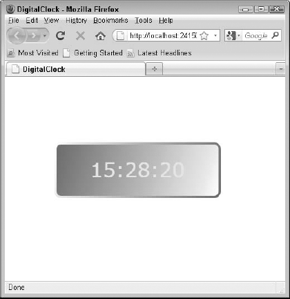
Me.textBlock1.SetValue(Canvas.LeftProperty, left)To see the digital clock in action, press Ctrl+F5 to run the application. The application loads in your browser and displays the clock, as shown in Figure 11-11.
The Web experience has evolved from just providing content to users to one in which users can directly interact with Web sites. My children love to play educational games designed for preschoolers such as starfall.com and pbskids.org. These sites provide visually pleasing graphics and games where children can select objects and fill in shapes with colors.
Silverlight controls can also respond to mouse events just like windows in desktop applications. Using the mouse, you can move things around, draw and fill shapes, and select objects on a Web page — truly making the Web an interactive experience.
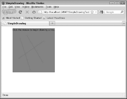
A simple example of interacting with a Silverlight application is a line drawing application. You simply click the mouse to set the start point and, while holding the left mouse button, drag the mouse to another point and release. As soon as you release the button, a line appears from the point where you clicked to the point where you released the button.
Handling mouse events in Silverlight is as simple as handling mouse events in desktop applications. The following code illustrates a simple line drawing application in Silverlight:
C#:
using System;
using System.Collections.Generic;
using System.Linq;
using System.Net;
using System.Windows;
using System.Windows.Controls;
using System.Windows.Documents;
using System.Windows.Input;
using System.Windows.Media;
using System.Windows.Media.Animation;
using System.Windows.Shapes;

namespace SimpleDrawing
{
    public partial class MainPage : UserControl
    {
        Point _StartPoint;
        bool _LeftButtonDown = false;

        public MainPage()
        {
            InitializeComponent();
        }

        private void LayoutRoot_MouseLeftButtonDown(object sender,
     MouseButtonEventArgs e)
         {
"_StartPoint = e.GetPosition(this);
_LeftButtonDown = true;
}
private void LayoutRoot_MouseLeftButtonUp(object sender,
MouseButtonEventArgs e)
{
_LeftButtonDown = false;
Point endPoint = e.GetPosition(this);
Line line = new Line();
line.X1 = _StartPoint.X;
line.X2 = endPoint.X;
line.Y1 = _StartPoint.Y;
line.Y2 = endPoint.Y;
line.Stroke = new System.Windows.Media.SolidColorBrush(Color.
FromArgb(255, 128,128,128));
this.LayoutRoot.Children.Add(line);
}
}
}VB:
Partial Public Class MainPage
    Inherits UserControl

    Private _StartPoint As Point
    Private _LeftButtonDown As Boolean = False

    Public Sub New()
        InitializeComponent()
    End Sub

    Private Sub LayoutRoot_MouseLeftButtonDown(ByVal sender As System.Object,
    ByVal e As System.Windows.Input.MouseButtonEventArgs)
        _StartPoint = e.GetPosition(Me)
        _LeftButtonDown = True
    End Sub

    Private Sub LayoutRoot_MouseLeftButtonUp(ByVal sender As System.Object, ByVal
    e As System.Windows.Input.MouseButtonEventArgs)
        _LeftButtonDown = False

        Dim endPoint As Point = e.GetPosition(Me)

        Dim line As Line = New Line()

        line.X1 = _StartPoint.X
        line.X2 = endPoint.X
        line.Y1 = _StartPoint.Y
        line.Y2 = endPoint.Y

        line.Stroke = New System.Windows.Media.SolidColorBrush(Color.
     FromArgb(255, 128, 128, 128))

        Me.LayoutRoot.Children.Add(line)
End Sub
Private Sub LayoutRoot_MouseMove(ByVal sender As System.Object, ByVal e As
System.Windows.Input.MouseEventArgs)
End Sub
End ClassFigure 11-12 shows the result in the browser.