Chapter 11: How to Develop and Test Vue Components with Storybook
by Ivaylo Gerchev
In today’s web application development, components play a central role. The complexity in modern apps requires us to split the codebase into small and manageable pieces—components—which then we can use as Lego bricks to build the entire app. To facilitate the building process and make it more automated and interactive, some smart developers have created specialized tools for component development. One such a tool is Storybook.
What Is Storybook?
Storybook is an interactive environment for developing and testing UI components. It allows developers to build components and play with them in isolation from the actual app. A Storybook project can be exported as a separate, static app, which is ideal for making live and interactive component showcases. Storybook is easy to configure and use, and can be extended via a simple API. It has a bunch of useful add-ons, both official and community made, which enhance the core with lots of different functionality.
Getting Started
In this tutorial, we’ll learn how to use Storybook to develop Vue components.
The Finished Result
If you’d like to view the finished result, you can find the Storybook deployed to GitHub Pages.
To follow along with this tutorial, you’ll need Git and Node installed on your machine. You can find instructions on how to install Git here. To install Node, you can download the binaries from the official website, or use a version manager. This is probably the easiest way, as it allows you to manage multiple versions of Node on the same machine.
As a starting point, we’ll use a vue-pomodoro timer app that I’ve already written. The Pomodoro Technique is a time-management method developed by Francesco Cirillo in the late 1980s, whereby one uses a timer to break down work into intervals, separated by short breaks. I created this app using Vue CLI. (See “A Beginner’s Guide to Vue CLI” in this Vue series if you’re not familiar with it.) I also chose to install the Babel, ESLint and Jest plugins. We’ll need the Jest plugin for testing our components later on.
Clone the app to your local machine, install the dependencies and make sure that it works:
git clone [email protected]:sitepoint-editors/vue-pomodoro.git
cd vue-pomodoro
npm i
npm run serve
Installing Storybook
Next we need to install Storybook and some additional dependencies.
Checking Your Progress
The repo has a second branch (named storybook) which you can check out, should you wish to jump straight to the finished code, or simply check your progress. You can see the storybook branch on GitHub, or you can check it out via the terminal:
git clone [email protected]:sitepoint-editors/vue-pomodoro.git
  git checkout storybook
Install the Storybook itself by running the following:
npm i --save-dev @storybook/vue
Next, we need to add some dependencies:
npm i --save-dev vue-loader
npm i --save-dev babel-preset-vue
The next step is to add the storybook script in our project’s package.json file:
{
  "scripts": {
   ...
    "storybook": "start-storybook -p 9001 -c .storybook"
  }
}
The script starts the Storybook development server at port 9001 and defines .storybook as a config directory. We’ll also need to create a config.js file in the .storybook directory, in which we import and register our components and load our stories. We’ll learn what stories are and how to create them in the next section.
mkdir .storybook
touch .storybook/config.js
Add the following to config.js:
import { configure } from '@storybook/vue';

import Vue from 'vue';

// Import your custom components.
import State from '../src/components/State.vue';
import Countdown from '../src/components/Countdown.vue';
import Controls from '../src/components/Controls.vue';

// Register your custom components.
Vue.component('state', State);
Vue.component('countdown', Countdown);
Vue.component('controls', Controls);

function loadStories() {
  // You can require as many stories as you need.
  require('../src/stories');
}

configure(loadStories, module);
Writing Stories
Stories are the heart of Storybook. A story represents a particular state of one single component or multiple components grouped together. We can have as many stories for as many components which we need. The great thing is that when we edit the stories the changes are applied and displayed immediately. This gives us a smooth, interactive experience.
The stories are stored in their own directory, which keeps them closer to the app’s components. In our case, we navigate to the src directory, and create a new stories folder inside. Then add an index.js file:
mkdir src/stories
touch src/stories/index.js
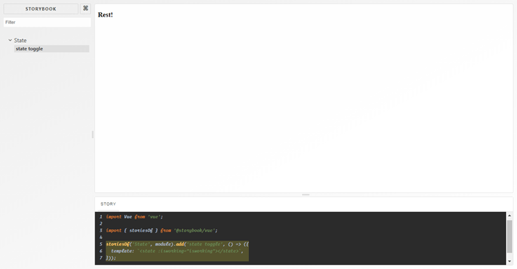
Writing stories is quite simple. Let’s create our first story now in index.js:
import Vue from "vue";
import { storiesOf } from "@storybook/vue";

storiesOf("State", module).add("state toggle", () => ({
  template: `<state :isworking="false"></state>`
}));
The storiesOf method wraps a story or set of stories about a particular component or group of components. The first argument defines a name for the wrapper. The individual stories are just different states, which we create by using the add method. The first argument defines the state’s name, and the second is a function in which we create the actual state. There are many ways available to render a state. To see them all, check out the Vue real examples.
Let’s now see our story in action by running the project:
npm run storybook
You should see the following in your browser:

Installing and Using Add-ons
As we saw, Storybook’s core has limited functionality. To add more useful features, we’ll need to install some add-ons. There are two types of add-ons:
- Decorators wrap a story or stories and transform them in some way. For example, we can create a center text decorator, which will center the text in our story. We’ll see a practical example of this later on.
- Native Add-ons allow for low-level interaction with the Storybook platform. We’ll also see examples of those.
Installing the Storysource Add-on
The first add-on we’ll install is Storysource. It adds a “STORY” panel to the storybook, which shows and highlights the source of the selected story. It’s useful because we can see how the story is written without the need to open the story file and search for the story manually. To install the add-on, we run:
npm install -D @storybook/addon-storysource
Before we can use the add-on, we need to register it in a special addons.js file, which we must create in the .storybook directory:
touch .storybook/addons.js
Then add:
import '@storybook/addon-storysource/register';
And one more thing. The add-on needs some custom webpack configuration. So we create a webpack.config.js file in the same .storybook directory:
touch .storybook/webpack.config.js
And add the following content to it:
const path = require('path');

module.exports = (storybookBaseConfig, configType, defaultConfig) => {
  defaultConfig.module.rules.push({
    test: [/.stories.js$/, /index.js$/],
    loaders: [require.resolve('@storybook/addon-storysource/loader')],
    include: [path.resolve(__dirname, '../src')],
    enforce: 'pre',
  });

  return defaultConfig;
};
Restarting the Storybook
After we’ve installed new add-ons, we need to restart the storybook so for the changes to take effects.
Finally, we can see the add-on in action:
Installing the Options Add-on
The next add-on we’ll install is Options. It gives us the ability to use some options for configuring Storybook’s UI.
Install it with this:
npm install -D @storybook/addon-options
Register it in the addons.js:
import '@storybook/addon-options/register';
Then we can use it in our config.js file like this:
import { configure, addDecorator } from '@storybook/vue';
import { withOptions } from '@storybook/addon-options';

addDecorator(
  withOptions({
    name: 'Vue Pomodoro',
  })
);
We import the addDecorator method and set the necessary options via withOptions decorator.
Now, the name in the top left corner of our storybook will be “VUE POMODORO”, instead of “STORYBOOK”. You can play with other options as you wish.
Installing Actions, Links, and Knobs Add-ons
In this section we’ll install three more add-ons: Actions, Links, and Knobs.
You can install them like so:
npm install -D @storybook/addon-knobs @storybook/addon-links @storybook/addon-actions
And register them in addons.js:
import '@storybook/addon-knobs/register';
import '@storybook/addon-links/register';
import '@storybook/addon-actions/register';
Registration Order
The order of registration matters here, because the add-ons will be displayed in the same sequence in the Storybook’s panels section.
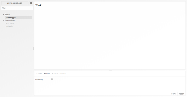
Using the Knobs Add-on
Knobs allow us to edit Vue props dynamically. Let’s see this in action. In the index.js file add the following:
import { withKnobs, boolean } from '@storybook/addon-knobs';

...

storiesOf("State", module)
  .addDecorator(withKnobs)
  .add("state toggle", () => ({
    props: {
      isworking: {
        type: Boolean,
        default: boolean("isworking", true)
      }
    },
    template: `<state :isworking="isworking"></state>`
  }));
Here, we import the withKnobs decorator and boolean knob. Then, we add the decorator to our story. We define the isworking prop and use the boolean knob to define the default value. Now, when we go to this story, we’ll see a checkbox in the “KNOBS” panel bound to the isworking prop.
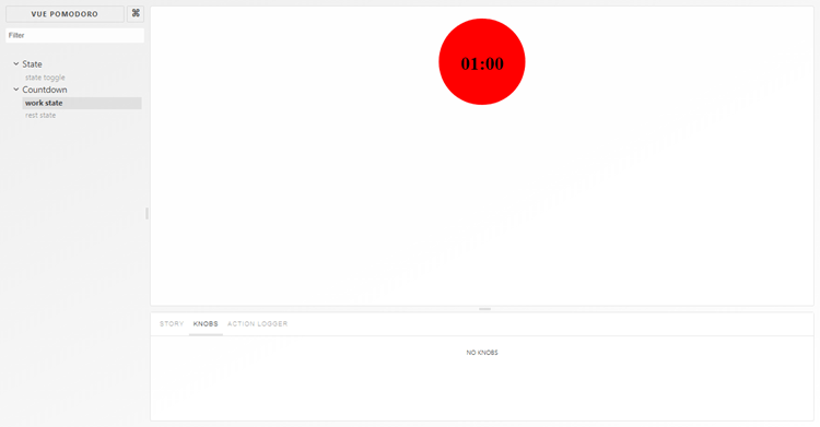
Creating and Using a Custom Decorator
Let’s now see how to create a custom decorator. In the same index.js file, add the following:
const CenterDecorator = () => ({
  template: '<div style="textAlign: center;"><story/></div>',
});

...

storiesOf("Countdown", module)
  .addDecorator(CenterDecorator)
  .add("work state", () => ({
    template: `<countdown :minute="1" :second="0" :isworking="true"></countdown>`
  }))
  .add("rest state", () => ({
    template: `<countdown :minute="5" :second="0" :isworking="false"></countdown>`
  }));
What we do here is define a CenterDecorator decorator. We wrap the <story/> component with our custom functionality. Then we add it to the two new states we created for the Countdown component.

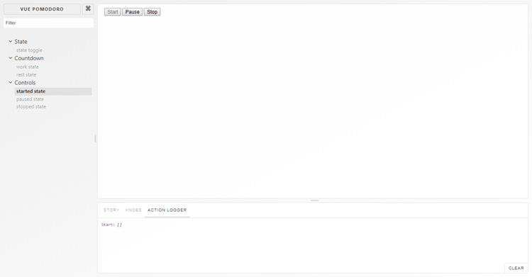
Using the Links and Actions Add-ons
In this section, we’ll create stories about the Pomodoro controls buttons, and we’ll use links to simulate the real world behavior when we click them.
In the index.js file, add the following:
import { linkTo } from '@storybook/addon-links';
import { action } from '@storybook/addon-actions';

...

storiesOf("Controls", module)
  .add("started state", () => ({
    template: `<controls state="started" @paused="linkToPaused()" @stopped="linkToStopped()"></controls>`,
    methods: {
      linkToPaused: linkTo("Controls", "paused state"),
      linkToStopped: linkTo("Controls", "stopped state")
    }
  }))
  .add("paused state", () => ({
    template: `<controls state="paused" @started="linkToStarted()" @stopped="linkToStopped()"></controls>`,
    methods: {
      linkToStarted: linkTo("Controls", "started state"),
      linkToStopped: linkTo("Controls", "stopped state")
    }
  }))
  .add("stopped state", () => ({
    template: `<controls state="stopped" @started="linkToStarted(), action()"></controls>`,
    methods: {
      linkToStarted: linkTo("Controls", "started state"),
      action: action("Starting")
    }
  }));
Here, we import the linkTo and action methods. Then we create stories about the three possible states of the buttons. Next, we create links to navigate between the states according to the pressed button. In the stopped state we use also an action. So when we press the Start button, it will log the start action in the “ACTION LOGGER” panel.
Combining Multiple Components
In Storybook, we can not only create a story for one single component, but we can combine multiple components into one Story screen. So when we’re done with the single components, we can then combine them to represent different screens of our app. Let’s try this. In index.js, add the following:
storiesOf("App Screen", module)
  .addDecorator(CenterDecorator)
  .add("all components", () => ({
    template: `
      <div>
        <state :isworking="true"></state>
        <countdown minute="1" second="0" :isworking="true"></countdown>
        <controls state="stopped"></controls>
      </div>`
  }));
Here, we use the CenterDecorator to center all components. And voilà.

Testing Components
So we have all our components ready. Now it’s time to test them. Testing is too wide a topic to be discussed here entirely. There are many different way to test components. Here, we’ll narrow our exploration to three of them:
- Manual testing relies on developers manually exploring components and making sure they work and behave correctly.
- Structural/Snapshot testing captures the rendered markup of components. At the next run, the new snapshots are compared to the old ones to make sure they match. If they don’t match, we have two choices. We can accept the differences if they’re the result of intentional changes, and update the snapshots. Or we can fix them if they’re the result of incorrect code.
- Unit testing verifies that, with a given input, we’ll get the expected output.
If you’re new to JavaScript testing, you might like to have a quick read of “How to Test React Components Using Jest” to get a handle on the general concepts.
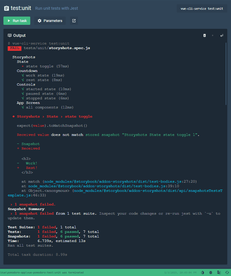
Implementing Structural Testing with the Storyshots Add-on
The Storyshots add-on adds automated snapshot testing to our storybook. Let’s see what that looks like.
First, install the add-on:
npm install --save-dev @storybook/addon-storyshots
Now, we create a storyshots.spec.js file in the tests/unit directory:
touch tests/unit/storyshots.spec.js
We then put the following in it:
import initStoryshots from '@storybook/addon-storyshots';

initStoryshots();
And that’s it. Now we run the test:
npm run test:unit
And here’s what we should see in the terminal:

All snapshots will be placed in a __snapshots__ directory, which is automatically created in the tests/unit directory.
Now, to demonstrate the snapshots diffing, let’s change the isworking prop, in our very first story, to false, and re-run the tests. As we can see in the screenshot below, the change is caught by the add-on, and it tells us that we can update the snapshots by using the -u flag.
To make this easier, we create a test:update script in the package.json:
{
  "scripts": {
    ...
    "test:update": "vue-cli-service test:unit -u"
  }
}
Now, if we want to accept the changes, we can run this script and the snapshots will be updated to their new version.
Unit Testing
As I mentioned at the beginning of this guide, the project has the Jest plugin installed. So we also have the Vue Test Utils at our disposal. Given that, let’s explore a practical example of unit testing.
In the tests/unit directory we create a components.spec.js file:
touch tests/unit/components.spec.js
And add the following content:
import { mount } from "@vue/test-utils";
import State from "../../src/components/State.vue";

describe("State", () => {
  it("has title Work!", () => {
    const wrapper = mount(State, {
      propsData: {
        isworking: true
      }
    });
    const title = wrapper.find("h3");
    expect(title.text()).toBe("Work!");
  });
  it("has title Rest!", () => {
    const wrapper = mount(State, {
      propsData: {
        isworking: false
      }
    });
    const title = wrapper.find("h3");
    expect(title.text()).toBe("Rest!");
  });
});
We use the mount method to create wrappers for the State.vue component with the two possible states of the prop isworking. Then we get the title where the prop is used and test whether it has the proper string, depending on the isworking state.
Now, let’s run the tests again:
npm run test:unit
And everything should be correct.
Exporting Storybook as a Static App
After the hard work is done, we may want to show our components to others. Doing this is easy. We just need to export our storybook as a static app and deploy it. Let’s do it.
First, we need to add a build script to package.json:
{
  "scripts": {
    ...
    "storybook-static": "build-storybook -c .storybook -o .storybook-static"
  }
}
Now, when we run the script, it will output a static Storybook in the .storybook-static directory.
Publishing the Storybook to GitHub
As the storybook is a static app, it’s easy to publish it anywhere on the Web. In this final section, I’ll demonstrate how to add the project to GitHub.
First, we create a new repo vue-pomodoro-storybook.
Now, we copy the origin URL of the repo and add it to our local Git project with this command:
git remote add origin https://github.com/<USERNAME>/vue-pomodoro-storybook.git
Finally, we push the repo to GitHub:
git push -u origin master
Now, let’s deploy our static app to GitHub Pages.
We navigate to .storybook-static folder and run:
git init
git add -A
git commit -m 'deploy'
Then, we deploy to GitHub Pages with this command:
git push -f https://github.com/<USERNAME>/vue-pomodoro-storybook.git master:gh-pages
This will create a new branch gh-pages and will upload the static app to it.
And that’s it.
Github
Don’t forget, you can find the deployed storybook here.
Conclusion
I hope you enjoyed learning Storybook. As you saw, it’s a powerful playground, which we can use to interactively develop and test self-contained UI components. It’s also great for making a live components showcase or documentation. I encourage you to check it out.