
Chapter 4
Understand Your Visitors and Their Needs—the Keys to Website Optimization
Without happy, engaged and converting website visitors, your website will struggle to exist for a very long time. Therefore, in this chapter you will learn the importance of focusing on your visitors, including understanding their needs and how to help them better recognize the value of your website. You will also learn how to gather great insights from them to generate high impact ideas for testing and optimizing your website.
Chapter Contents
- Week 7: Create Personas and Use Cases for Your Main Visitor Needs
- Week 8: Create a Unique Value Proposition and Clearly Promote It
- Week 9: Understand Your Visitors’ Intent by Visually Analyzing Them
- Week 10: Generate Insights from Visitor Satisfaction and Feedback Tools
Week 7: Create Personas and Use Cases for Your Main Visitor Needs
Remember that your website visitors generate the income for your online business income, not your actual website by itself, and without pleasing them you would not remain in business very long. And even if you have good conversion rates on your website, this doesn’t necessarily mean that it satisfies your visitors to a high degree. They could purchase or sign up for something, but that doesn’t mean they found it easy to do, or that they will want to come back again. This then obviously has a major impact on your future conversion rates.
To make sure your website isn’t guilty of not satisfying your visitors, you need to focus much more attention on recognizing them and their needs. To help you start doing this, this week you will learn about the benefits of creating personas and use cases for them. Analyzing and optimizing for these will help ensure that your website satisfies your visitors’ needs, and better engages and converts them.
Monday: Put Yourself in Your Visitor’s Shoes to Help Create Personas and Use Cases
Unfortunately, far too much focus is placed on marketing and creating websites without any great and consistent focus on the visitors’ needs, so they largely get ignored or thought about using preconceived notions. Remember that your web analytics data, while consisting of very large numbers of page views and visits, are actually all caused by individuals like you and me, so it’s important to think of your numbers as actual people.
To get an idea of how much attention you manage to devote to your visitors’ perspective, ask yourself a few questions relating to some common tasks on your website such as these:
- When was the last time you tried purchasing or signing up for something on your own website?
- When was the last time you used the internal search tool on your website to find something?
- Have you tried recently to fully register on your website?
- Have you tried recently to find help on your website regarding your product return or refund policy?
- When was the last time you tried to comment on one of your articles or share it on social networks?
Surprisingly, a great number of people who work for online businesses never even consider trying out their own websites from a visitor’s perspective, using the common “that’s not my job” excuse.
To avoid this pitfall, you need to put yourself in your website visitor’s shoes and use your website just as a new visitor would likely do—imagine that you have never been there before and spend some time reviewing it. In particular you need to re-create common tasks that visitors probably might want to do, such as using your navigation to find something or register on your website.
This understanding of what visitors do on your website is critical to be able to effectively build use cases and visitor personas for it, which is something that you will do during the rest of this week.
While you are doing this review of your website, you should take note of anything strange or tasks that are particularly difficult to achieve, or if anything is not working as expected or even broken. These issues that you find will be great candidates for testing and optimizing to improve visitor satisfaction and conversion rates.
Tuesday: Create Some Simple Personas for Your Visitors
Today you will learn how to get to know your visitors and their needs better by creating some simple personas for them. You may cringe when you see the word “personas” and think that the creation of these is only done by big marketing agencies that have money and time to burn. But in online business, one of the best ways for you to understand your website visitors’ needs is to create personas for the major types of them.
As it is used in website optimization, the term persona simply means a fictional character that is created to represent a group of visitors who regularly come to your website.
Far too often, online marketers treat their website visitors as just numbers and metrics, not as real people. Creating personas for your visitors helps puts a personal human face on these large numbers and helps you understand your visitors better, including their main characteristics and the likely impact they will have on your conversion rates.
Let’s get started and create a small set of personas for the major types of visitors that typically come to your website. You don’t necessarily need to go into great detail when you are creating these (as more traditional marketing personas often do), but you should at least try and include some references to their online experience, as this can often play a large role in the likelihood of their conversion. You will now learn about some elements to use when creating your personas.
Elements of Personas You Should Consider Using
When you are creating your personas, you should use common elements and attributes to help define them, and note down the most commonly found characteristics of each. You will need enough answers to help form three to five personas.
Here are some elements you should consider using:
- The visitor’s age bracket
- The visitor’s gender
- How web savvy they are
- Their likely expectations
- Their goals
- Their motivations
- Their buying stage
- Their confidence
- How they interact with your website
- If they have used competitor websites
Examples of Visitor Personas
To help you understand and create personas better, here are some examples of visitor personas for a few different types of websites:
Simple Examples of Visitor Personas for a Dating Website
- A young lady who is new to online dating, and is fairly web savvy
- A middle-aged man who has old-fashioned dating standards and is not very web savvy
- A young lady who considers herself an expert online dater and has big expectations
- A middle-aged woman who wants to start online dating, but is skeptical and needs convincing
- A young man who is very visual and prefers seeing many photos instead of text when browsing
Simple Examples of Visitor Personas for an E-commerce Website
- A young man who is very tech savvy and is looking for the latest tech product offerings
- A middle-aged woman who usually shops in stores and is not very tech savvy
- An older man who uses the website purely to get reviews and prices before buying in a store
- A middle-aged woman who is traditionally a bargain shopper and only buys things on sale
- A young woman who usually uses a competitor’s website but is considering trying yours
- A middle-aged man looking for customer support options to try and return something
- A young man who only uses internal site searches to find what he’s looking for
Using these tips and examples, you should now go ahead and create some simple personas for your website visitors. Ideally, you should try to come up with at least three to five different personas. To make these even more realistic, relatable, and understandable across all departments of your company, you should try and give these key personas actual names and ideally even try to add a photo of what each type might look like.
Once you have created your visitor personas, this helps you not only understand your visitors better but will also make it easier to build some very important use cases for your website, which leads us into tomorrow’s topic.
Wednesday: Create Use Cases for Your Website
Now that you have created some simple personas of your website visitors, you need to adapt them into use cases. These use cases will represent the most likely things that your visitors will want to do on your website and their most likely needs.
The reason why it’s so important to create these is because it’s essential that your visitors can complete your major use cases with ease; otherwise, they may often get frustrated and may leave your website prematurely. This therefore can have a major impact on your conversion rates and success metrics.
Determine the Most Common Tasks on Your Website
Next you need to determine the most common tasks that a visitor might want to do on your website. Understanding these will make it much easier to create your use cases. Here are some examples of tasks that your website visitors might want to achieve on your website:
- Watch a demo video of your service
- Get pricing information
- Find contact phone numbers
- Update their member profile
- Invite friends to join
- Find their closest physical store
- Register for a new webinar
- Compare product features
- Manage their online account
- Share a page on Facebook or Twitter
- Get product return information
- Comment on an article
- Purchase products
- Use an internal search tool to find a product
- Get help via web chat
- Schedule a call to learn more details
- Unsubscribe from a newsletter
- Get the latest investor and stock information
- Read company management bios
With the help of these examples and the personas you created yesterday, go ahead and create a list of all the tasks that a visitor might want to do specifically on your website, no matter how large or small it might be. Spend at least an hour or two trying to think of at least 20 of these tasks, and you should ideally set up a brainstorming session with others to help you create a more complete list.
Then after you have a good list, you need to rate and rank these tasks in order of how often each one is likely to occur on your website. This is because you will need to build your use cases out of the most common tasks on your website and pay less attention to the less common ones. For example, visitors to an e-commerce website are more likely to try and find product return information than to look for a job.
As a rating scheme for your tasks use a 1–10 scale, where 10 represents a task that occurs very often and 1 represents a task that does not occur very often. Using this scale, go ahead and rate your use tasks and re-rank them in order of highest score.
Doing this will help you understand what your pages need to focus on to help solve these most important tasks, and not risk confusing visitors by trying to solve hundreds of tasks at once that only a small percent might want to do.
Develop Your Most Important Tasks into Use Cases
Once you have come up with a ranked list of tasks, you need to take the top five or six most important tasks and create a use case for each one that explains it in more detail. For example, instead of just saying “purchase products,” a use case would be “A first time visitor arrives looking for product X using the navigation menu.”
To give some color to these use cases, try adding how the visitor arrived and navigated the website, if they have been here before, and what they are likely looking for or want to do. To help you understand the level of detail needed for your use cases, here are a few examples of major use cases for two different types of websites:
Example Use Cases for a Dating Website
- An existing member who comes back to search for other members in their area who don’t have kids and who are younger than 35
- A repeat visitor who is trying to find the cancellation policy before signing up
- A first-time visitor who wants to compare pricing plans
- An existing member who wants to change their main profile photo and upload some more photos
Example Use Cases for a Website Selling Services
- A first-time visitor who wants to watch a demo of your service
- A customer who wants to upgrade their feature set
- A second-time visitor who is looking for a white paper to help convince his boss to use their services
- A customer who wants to find and use an FAQ (frequently asked questions) page to answer a technical question
Using these examples and tips, you now need to go ahead and create use cases for your top five visitor tasks on your website that you created yesterday. Tomorrow, you will put these major use cases to the test on your website and see how easy it is to complete them all, which is the key to ensuring that you have a highly optimized and converting website.
Thursday: Re-create the Use Cases on Your Website and Grade the Ease of Doing So
Now that you have created some good major use cases for your website, you need to put them to work and judge for yourself how easy it is to complete each of them on your website. This can provide some great insight into which pages and key conversion flows on your website need the most improvement.
The first step in testing your use cases is to list them in Table 4-1. Then go to your website and try to re-create each use case. As you are going through each use case, grade it according to how easy it is to complete. Use an A–F grading system to record these grades in Table 4-1. An A grade should be given if the use case is very easy to accomplish, a C grade if it was relatively hard to accomplish, and an F grade if you could not actually complete the use case.
And remember to be as honest as possible with your ratings, as the ultimate goal is to find weaknesses in your website that can be optimized and tested to improve your visitor engagement and conversion rates.
Table 4-1: Use case completion grade table
| Use Cases for Your Website | Your Website Completion Grade | |
| 1 | ||
| 2 | ||
| 3 | ||
| 4 | ||
| 5 |
You may actually be surprised how hard or confusing it may be to achieve a fairly common use case on your website, particularly if your website has not been very customer-centric in the past.
After you have done the completion ratings for your top use cases, you need to note any of them you have particular trouble with and gave a D, E or F grade. The pages and flows that relate to your troublesome use cases are great candidates to perform testing and optimization on.
Over the rest of this book you will learn some great ways to make it easier for your visitors to complete your use cases, in particular from your homepage. In the last week of the book you will then revisit these and re-rate these use cases, because using the best practices in this book will likely make them easier to complete.
Friday: Learn How to Get Even Greater Value from Your Use Cases
You should not just create and test your use cases once and then forget about them. There are several other things you can be doing with them that you will learn about today.
Test Your Use Cases on Your Website Visitors
As discussed yesterday, it’s important to make it as easy as possible for your visitors to complete your use cases. However, rather than just judging and rating using your own opinion, to get an even better and more realistic perspective, you need to involve your visitors and see how easy it is for them to complete them too. You will do this by revisiting them in Week 10 of this chapter and putting them to the ultimate test against your very own website visitors.
The use case completion rating results from your visitors will help form invaluable ideas to help optimize your website and to ensure you are keeping your visitors as happy and engaged as possible.
Create Your Use Cases as Visitor Segments in Your Analytics and Testing Tools
A great way to get even more from your use cases is to create visitor segments in your web analytics and testing tools that match the characteristics of your use cases. This allows you to analyze them to gain additional insights for your testing efforts, and then target them with even more relevant content. This will really help improve your conversion rates and success metrics. Therefore, next you should try to create these use cases as visitor segments in your analytics tool and testing tool. To do this you should refer back to Chapter 2 where this was discussed in more detail.
In advanced testing tools like Adobe Test&Target, these use cases can also be created as custom targets and profiles that you can segment and target. To do this, you would create a profile for each use case by defining the characteristics of your visitors using rules and definitions. For example, a profile could include which pages your visitors need to see (and how they get there) and which tasks they need to accomplish in order to complete the use case. To set these up, please refer to the help section regarding this in your testing tool.
Re-review Your Use Cases Every Few Months to Make Sure They Still Work Well
During your upcoming optimization efforts, you will likely be making many changes to improve and optimize your website. Ideally, every time you change something significant, you need to remember to make sure your visitors’ use cases are still being met easily. This is because even if one of your success metrics increases based on a change that you make, your change might also unknowingly impact the ability of your visitors to complete one of your major use cases, and potentially negatively impact other success metrics.
Week 8: Create a Unique Value Proposition and Clearly Promote It
One of the common problems with many websites is that the creators/marketers of them often presume their visitors know why they should use the website, what they can do on it and what’s in it for them, without actually directly informing them. This is particularly problematic because there are usually many websites that a visitor can choose from, and competitors are only a mouse click away. That means you have to work hard to make sure that your visitors quickly understand the benefit of using your website to ensure they stay and hopefully engage and convert.
A great way to ensure your visitors recognize the benefits of using your website is to have a good unique value proposition for it and clearly promote that. Therefore, this week you will learn how to create and promote a better one of these.
Even if you think you already have a good unique value proposition you should still try and improve it, and the best practices you will learn this week should help you do so. And while it is certainly possible to run a website with a value proposition that isn’t unique, your website will be in a much stronger position if it is at least somewhat unique.
Monday: Understand Your Current Unique Value Proposition from Your Visitor’s Perspective
The first step in terms of creating a great website value proposition is to understand the perspective of this from your visitors. This is important because while you or your company might think you know what your website’s unique value proposition is, unfortunately your visitor’s opinion of it may be very different, and you need to work to align these together better.
To help you do this, put yourself in your website visitor’s shoes again and visit your homepage as if you were a first time visitor. Then ask yourself the following three questions and see if you come can up with answers very quickly (because your visitors will be judging your website very quickly too):
After your first attempt at answering these questions, you need to try pretending you landed on a few different common entry pages from a search engine, for example a product or service page, and see if you can still answer these three questions as easily.
Don’t be surprised, though, if you can’t answer these questions very well from the perspective of your visitor (particularly on your interior pages because it is harder to convey unique value proposition on non-home pages). This is because many online businesses don’t realize the importance of showing their unique value proposition or find it difficult to create one.
Now try this exercise on some people who are likely to be unfamiliar with your website (like your mom) and see if they can answer the three questions listed previously. Try asking a few different types of people, including someone who is not very web savvy and someone who is. If they also can’t answer these questions very easily, then you know you have a lot of potential room for improvement by creating and promoting a unique value proposition on your website.
Tuesday: Survey Your Visitors to Help Create Your Value Proposition
A great way to get further ideas to help with the creation or improvement of your unique value proposition is to survey your visitors to gain feedback on what they currently think it is. This can be done very simply by using a free survey tool like Survey Monkey (www.SurveyMonkey.com) to ask them a simple question regarding what they like most about your online business and website. Gaining this feedback is best achieved by using an open-ended text box survey question like “Please describe what you like the most about this site,” or “What are some of the reasons why you like this website? In particular, do you prefer anything over any competitors’ websites?” Don’t worry about asking further questions in your survey at this point—you’ll be learning more about that in Week 10.
Once you have gathered sufficient responses (at least 50), you need to analyze the results to look for patterns and common themes. This can easily be done by exporting the text of your responses into a text file and then importing into a word cloud tool like Wordle (www.Wordle.net). This helps you visualize which words are most commonly found in your responses—for example, “free shipping,” “great customer service,” “easy-to-use site.” Pick the four or five most common phrases you see and make a note of them. You should also look for common phrases that don’t match what you perceive your website’s unique value proposition to be, and try to understand and address reasons why they might incorrectly think that way.
This survey response analysis will then be used to help create or improve your unique value proposition over the next few days.
Wednesday: Learn from Competitor Websites to Improve Your Value Proposition
Fairly often the dominant company in a website vertical isn’t the one that started first but is the one that learned from other companies. Just look at the example of Google: Yahoo was the giant in search engines first, but then Google came along, learned from them and did everything better and now completely dominates.
Therefore today you will learn from your competitors’ websites to improve your value proposition (and also give you great ideas to test on your website).
Perform Competitive Intelligence to Gain Ideas
First you need to come up with a list of your major online competitors and then review each of them and look for things that you can try and improve or try using on your website. Here are some things that you should look for:
- New tools
- Marketing promotions
- Original content
- New products
- Personalized page elements
It might be worthwhile to see which of your competitors are doing the best in terms of traffic and pay special attention to gathering intelligence from their websites. To help you run competitive traffic analysis you can use free tools such as Compete (www.Compete.com).
When you are reviewing your competitor websites for ideas, you should aim to differentiate from them to make your value proposition more unique—don’t just copy them. In addition to this, you should look for ideas to differentiate your website using ideas from other websites across your industry, as you will learn about next.
Look for Best Practices across Websites in Your Industry
Just because a website doesn’t sell the same thing or offer the same services as you doesn’t mean you won’t be able to learn from them. Rather than just focusing on your direct competitor websites you should also think laterally.
First you should think of and learn from websites that are more niche than yours (that may only offer one particular product/content relating to your website). Then you should think of and learn from websites that match the same type of website as yours but sell different products or services—for example, if your website is for a lead-generation company, look around for other websites that focus on generating leads, regardless of what they are generating leads for.
Thursday: Create or Improve the Unique Value Proposition for Your Website
Now that you have got some ideas from your visitors and your online competitors, today you need to actually create or improve the unique value proposition for your website.
Using the best practices and criteria below, you need to create a couple of different unique value propositions for your website. You will then review and refine these into just one later on in this day.
Best Practices to Help You Create or Improve your Unique Value Proposition
Here are some other best practices to help you create or improve the unique value proposition of your website:
- Most important, you should always think if your visitors will be able to easily relate to your value proposition, understand it, and find it useful.
- Try and restrict your value proposition to less than 20 words. Any more and this will become too wordy for your visitors to quickly read and understand.
- Don’t use words from your mission statement in your value proposition, because this is usually very sales-like and isn’t very visitor-centric (for example “to be the biggest global provider of shoes online”).
- Don’t use words in your value proposition that are too sales- or marketing-like (such as “We are the best X”), because these also aren’t very visitor-centric.
- Take out any fluff words that aren’t really needed, as this will help keep your value proposition shorter and sweeter.
- Take out any jargon words from your unique value proposition that may confuse your visitor.
Meet the Following Criteria for an Effective Unique Value Proposition
Last and most important, to have an effective unique value proposition, it needs to meet the following three criteria for your visitors:
If any of the two or three versions of your unique value proposition that you have come up with don’t satisfy all of these criteria, try and refine them until they do.
Now you need to decide on which version of your unique value proposition you want to use. To help you decide on the final one, you should review your two or three versions with your other colleagues to get their input, particularly ones from your marketing department, because they might be able to help you put a better spin on it and make it sound even better. You should then refine and combine them until you reach agreement on the best unique value proposition to use.
Tomorrow you will learn how to best promote your newly improved or created unique value proposition on your website.
Friday: Effectively Promote Your Unique Value Proposition on Your Site
Now that you have come up with your website’s value proposition (or improved your existing one), the next thing you need to do is to clearly communicate this to your visitors in an effective way.
Promote on Your High-Traffic Webpages
The first and most important areas of your website to promote your unique value proposition are on your high traffic pages, for example your homepage and top entry pages. This is because you want as many people to see your unique value proposition as possible, and often your homepage not only gets considerable traffic, but is a page where you need to convince your visitors of the value of your website the most.
The best and most important way of doing this is to place a prominent module on the homepage that states your unique value proposition, ideally combined with a relevant, high impact image or video in it (more on the subject of image and video optimization in Chapter 6). This should be highly visible and should be viewable without the visitor having to scroll down to see it (above the page fold, as you will also learn more about in Chapter 5).
Mint.com is a great example of a website that has an effectively promoted good unique value proposition on their home page, as shown in Figure 4-1.
Figure 4-1: Example of a unique value proposition promoted well on a home page

Repeat Your Value Proposition in Your Checkout
Another essential area on your website that you need to re-emphasize your unique value proposition is on your checkout page or signup pages, because this is where visitors often need extra reassurance before they are willing to purchase or sign up. This will be covered in more detail in Chapter 7.
Create a First-Time Visitor Page
The next thing you should do is to try creating a “first-time visitor” page that focuses on giving more detail regarding your unique value proposition and the major benefits of using your website. This should be aimed at appealing to first time visitors and should contain tips explaining how to make effective use of your website (try creating and using a top five benefits list), and any top content or most popular products or services you offer. You should also show the reasons why your website is better than your competitors, and to do this you could try showing a grid that compares the features of your website to your competitors’ websites.
Another thing you could offer on this page are coupons to first time purchasers, and this will hopefully have a great impact on your website conversion rates.
After you have created this page, you should then prominently link to it from your value proposition module on your homepage and in the footer of your website.
Use a Tagline on Your Logo
Another best practice to effectively communicate your unique value proposition is to create a shorter version in the form of a tagline and place this right by your logo (or even go so far as to make this part of your logo). The website logo is often one of the things that a visitor first looks at upon arriving on a website, and if elements of your unique value proposition are in the form of a tagline that is right next to it, then this is going to help your visitors understand the value of your website much more quickly. This is particularly helpful to use if you have a generic website name that is nondescriptive but not as important for websites with a strong brand already. To help you create some examples of this, Figure 4-2 shows a few examples of great tag lines that help reinforce a website’s value proposition.
Figure 4-2: Example of taglines with a value proposition

Week 9: Understand Your Visitors’ Intent by Visually Analyzing Them
This week you will learn about the benefits of visually analyzing your visitors’ behavior on your website, and the great insights for testing and optimization that they form. You will then learn from several different types of visual analysis tools that you can use and the benefits of doing so.
Monday: Learn the Importance of Visually Analyzing Your Website Visitors
Traditional web analytics tools track visitor click stream data and are great at helping you determine insight into what your visitors are doing on your website. However, they don’t tell you why your visitors are doing these things on your website, and you are left with guessing reasons for their behavior.
A great way of helping to bridge this analytical gap is to add additional tracking tools to your website that actually visually record what your visitors are doing. This helps you gain more clarity and context about your visitors’ behavior on your web pages and possible reasons for why your visitors do what they do. For example, you can use these tools to determine what links they are clicking on the most and which page elements are least looked at. Knowing this helps provide you with some excellent insights that you can use to form better test ideas to optimize your website.
Ultimately, before anything is changed or tested on your web pages you should be gathering visual insights to help you improve your decision making and what needs testing. Don’t just guess at they are doing, go on a hunch, or always do what your HiPPOs think because this will result in sub-bar optimization efforts and may even have a negative impact.
These visual analysis tools come in many forms. Click heat maps are the most basic type, which show you exactly where visitors click on all of the pages on your website. Next there are eye flow heat maps, which show (and predict) where your visitors are looking—which is often different than what they click on. Last, and impressively, they also come in the form of video sessions of your visitors using and clicking around your website.
While you can get some understanding of what your visitors are clicking on in web analytics tools by using link tracking, this doesn’t really substitute for good visual- based analysis, particularly if not all your links are tracked or have distinctive names, making it hard to tell which link visitors are actually clicking on.
Tuesday: Check Click Heat Maps for Your Key Pages
There are several benefits to using click heat map analysis tools to visually understand what your visitors are clicking on. First, they can tell you if your visitors are clicking on what you want them to ideally click on, for example your important calls-to-action. This may sometimes be very different from what you expect them to be clicking on.
Another good benefit of using click heat maps is to analyze how visitors use your main navigation links—for example, your header and left-hand navigation menus or your related links sections. This way you can understand which links are the most popular and which ones don’t seem to resonate with your visitors. Based on the results of this, you can optimize your navigation options to better engage and convert your visitors.
Click heat map analysis will ultimately help you understand what needs testing and improving on your pages. For example, if visitors don’t seem to be clicking on your important links, test placing them in more visible locations, and try testing the wording of the links in case your visitors don’t understand what they are for or what they mean.
It’s important that when considering doing a test on any page on your website, you should first look at a click heat map to see which links and elements on it are most and least popular with your visitors. This will give you additional insight into which page elements you should focus on and test, and will improve the efficiency and results of your testing efforts.
This click heat map analysis is particularly important to run on and understand for the pages that relate to your conversion goals and use cases.
Next, you will learn about the different click heat map reports and tools that are available for you to evaluate and make use of.
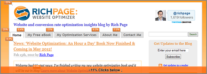
The first and most primitive of these is Google Analytics In-Page Analytics report (www.google.com/analytics), which enables you to see an overlay of link click percentages on any of your pages. You can see an example of this tool in action in Figure 4-3.
Figure 4-3: Screenshot of the Google Analytics In-Page Analytics report
You can also analyze clicks for each of the different visitor segment groups you set up in Chapter 2 to see how clicking patterns vary. This is important, because visitor click patterns are going to vary depending on where the visitor comes from, or the characteristics of them.
This is a rather primitive visual analysis report though, relying on simply showing percentage usage metrics for each link instead of better color coded heat maps, but it will give you some good basic details. On the plus side, it is simple to make use of because it requires no downloads or plugins to be able to view these clicks on your website.
In more advanced analytics tools they usually offer more visual click analysis functionality, with greater emphasis on showing heat maps of clicks. This makes it much easier to visually decipher what people are clicking on the most, with the brighter the color of the heat, the more people clicking in that area.
In Adobe SiteCatalyst this is known as the Click Map tool, which requires you to download a browser plugin to do this visual analysis. This useful tool also allows you to turn on revenue related click analysis (if you use that in Adobe SiteCatalyst) and helps you understand revenue per click, and total revenue generated from each link.
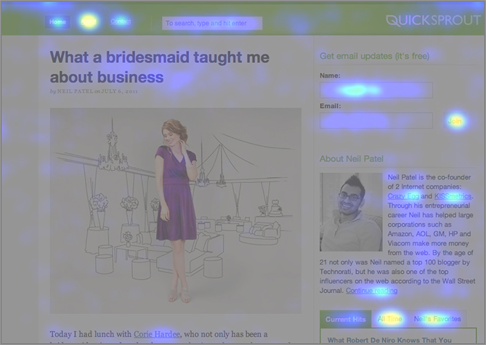
For a more powerful tool that is dedicated to click tracking visual analysis, you should try using Crazy Egg (www.CrazyEgg.com). In addition to offering powerful click heat map visual analysis (see Figure 4-4 for an example), they also offer some other great features. The tool lets you run visitor segmentation on your clicks to see what particular groups of visitors click on (but much fewer segments than Google Analytics offers). They also offer scroll map visual reports that show you on average how far visitors scroll down any of your pages and have some great options for generating automated email reports to help keep you in the loop better regarding this visual analysis.
Figure 4-4: Screenshot of the Crazy Egg Heat Map tool
Wednesday: Use Eye Tracking Tools to Understand Visitors’ Eye Flow
Knowing what visitors are clicking on is a good start for understanding visitor behavior, but you really need to know what your visitors are looking at too. This can often be different than where they are clicking, and depending on what they look at first it can have a major impact on your ability to engage and convert them.
Ideally you want to design your pages so that your visitors look at your most important content first, such as key images and calls-to-action. Unfortunately, many websites have too much content that distracts the visitor’s eye away from these more important elements (with marketing banners and ads being a major offender).
Therefore it’s essential that you analyze how your visitors currently look at on your website, particularly on your key conversion pages, and based on findings run tests on your page elements to improve what they are looking at first.
Up until recently it was fairly hard to get this visitor eye flow insight without having to do expensive laboratory-based eye-tracking tests. However, over the last few years some great improvements in web technology have made this much cheaper and easier to understand, with two great tools in particular that you can use.
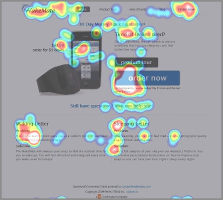
The first tool that you can make use of to understand your visitor’s eye flow is from Gazehawk (www.Gazehawk.com). In order to use this you simply submit your website that you want reviewed for eye flow (or upload images of web pages you want reviewed), and then their testers begin using your website while their eye movements are tracked and recorded using webcams. You can either use their testers or find your own visitors to do this—all they need is to have a webcam to able to participate. The tool then aggregates your testers’ eye flows and generates eye flow heat maps so you can see what visitors are looking at, which you can see an example of in Figure 4-5.
Figure 4-5: Screenshot of the Gazehawk Eye Heat Map tool
They also then give you live replays of what your test visitors looked at, so you can replay at your leisure to get even more insight. Basic tests start from $500 for 10 test participants, which sounds expensive, but that is much cheaper than traditional eye flow laboratory tests, which usually cost in the thousands.
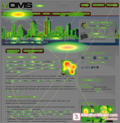
Another simpler eye flow tool you can use is available from AttentionWizard (www.AttentionWizard.com). Instead of actually putting your web pages in front of testers’ web cams, they are put through this tool’s proprietary algorithm to predict what page elements your visitors are likely to look at the most. It then generates a great heat map of the results, complete with the flow and order of things they look at (for example what they look at first and last). This is done almost instantly and is great for getting a quick prediction of what your visitors might be looking at. In Figure 4-6, you can see an example of this eye flow analysis.
This tool is much cheaper than Gazehawk’s because it doesn’t use real people and prices at the time of writing start from $27 per month for 10 heat maps per month.
Figure 4-6: Screenshot of AttentionWizard Eye Heat Map tool
It is also important to try and predict visitor click and eye flow patterns before you launch something and not just after you launch something. Remember it’s much cheaper and easier to get feedback to act on it early in the website development phase, rather than trying to test and change a live website. Both of these eye tracking tools are essential for helping with website prototyping and wireframe development of new websites, web pages, or new site features.
As another option to gain visitor eye flow analysis, if you have a higher level of budget, you can consider renting or purchasing an eye tracker machine. These allow you to do unlimited eye flow tracking experiments with as many people as you want. You just need to recruit people to participate and find a lab where you can use the machine on them. There are several companies to evaluate that offer these machines, such as Tobii (www.tobii.com).
Thursday: Use Visitor Recording Tools to Gain a Complete View of Your Visitor’s Experience
Don’t you wish you could stand over the shoulders of your visitors and actually see what they are doing on your website, without them knowing you are there? You would be able to see how they actually navigate your website (not just how you think they do) and what pages and elements they get stuck on or engage with the most.
Luckily there are now a few website tools that allow you to do this by recording your visitors’ mouse movements and clicks, all without you needing to be there in person or needing to use expensive web cams. The visitor isn’t even aware they are being recorded, and they don’t have to download anything to be recorded, either.
The pioneering tool to offer this visitor recording ability is called ClickTale (www.ClickTale.com), but there is now a cheaper, simpler tool called Userfly (www.Userfly.com), in addition to a more expensive but more robust offering from Tea Leaf (www.Tealeaf.com).
The visitor recordings these tools gather can be searched and categorized in many ways (by page seen or by entry point, for example), and you can also change the speed of the replay to make it faster to watch. The tools also offer aggregate reporting so you can understand how visitors interacted with your web page forms, the most clicked and engaged elements of your pages, and the average progress they make through your conversion flows. These aggregate reports are great because it means you don’t have to sit through every single recording to get an overall impression of these important aspects of your website.
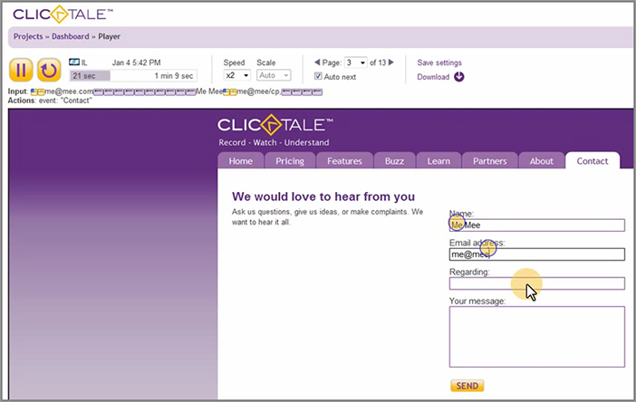
You can see a sample screenshot of this visitor recording from ClickTale.com in Figure 4-7. As you can see in the figure, ClickTale shows the playback controls, where the visitor has clicked (marked by circles), and where the mouse currently is (with a circle around the mouse pointer).
Figure 4-7: Screenshot of ClickTale visitor recording playback
There are several insights you can learn from these visitor recordings that you wouldn’t be able to learn from your web analytics tool or click heat map tool. For example:
Another great thing you can do on the more powerful visitor recording tools is to set up email alerts to inform you of any visitor issues with any pages relating to your key conversion goals.
Friday: Implement Tools and Gather and Review Visual Analysis for Insights
Today you need to begin to implement at least one or two types of these visual analysis tools on your website. Before you decide on which ones to try using, you should first review with your IT department each of the tools to find out which ones are easier to implement from a technical standpoint. Depending on how strict your IT department is, you may get some pushback relating to some of these tools, because they require continual data capture from your pages. If this occurs, you should set up a meeting with them to make them understand the importance and real benefit of using these tools.
After you have chosen one, set it up, and gathered at least a few weeks’ worth of data, you need to start spending time reviewing all this visual analysis reporting. This is important because there will be an abundance of it, and you need to generate some common visitor patterns and insights from it. To help you do a better job with this, you should categorize your results by page, and spend more time on ones that relate to your conversion goals. Then while you are reviewing the results you should start documenting a list of patterns and insights to try testing and optimizing on your website. The first time you do this visual analysis review of the results you should spend considerable time on it (ideally dedicate a few days). You should then perform some brief visual analysis on your key pages every month or two after this and see if you notice anything new that may be worth testing and optimizing.
Last, every time you launch new page functionality or content on your website it’s important that you run this visual analysis on the related pages to see what you can learn from and then test and optimize.
Week 10: Generate Insights from Visitor Satisfaction and Feedback Tools
As previously discussed, it’s important to try and understand why your visitors do what they are doing in order to gain ideas for testing and optimizing. Today you are going to learn another way to do this by making use of additional tools to listen to the needs, feedback, and experiences of your website visitors.
Monday: Learn the Importance of the Voice of Your Visitors and Asking for Feedback
As stated before in this book, your website really would be nothing without your website visitors. And it’s important to remember that they are pickier and more web savvy than ever before, usually having a wealth of choice on the internet and growing expertise and expectations of browsing websites.
These website visitors usually know exactly what they want from a website, what they don’t like, and what they prefer. These visitor viewpoints are unfortunately quite often different from the viewpoint that your website decision makers have, particularly your HiPPOs. And if your visitors don’t like what they see, or can’t accomplish what they came to your website to do, they can simply leave your website and go to one of many other potential competitor websites. This then has a negative impact because of the missed potential conversion from this unsatisfied lost visitor.
Therefore, rather than just presuming you know what is good for your website visitors or listening to your HiPPPOs demands all the time, it’s critical that you ask your website visitors for their opinions and feedback, listen to what they say, and then act upon it by testing and optimizing pages relating to the feedback. Many of the best companies in the world have learned the importance of acting on great visitor feedback and have been very successful as a result of this. Apple and Zappos are two great examples of companies really listening to their customers, adapting their companies based on the feedback with impressive results.
Asking for feedback also makes your visitors feel more wanted and more involved with your company and ultimately helps build a better relationship between you and them. This can have the great effect of increasing the amount of engaged repeat visitors that you have, often resulting in higher levels of conversion from them, too.
Tuesday: Survey Your Website Visitors to Gain Feedback and Insights
One of the best and easiest ways of gaining feedback from your visitors is to set up surveys on your website and ask them a series of questions about their experience of visiting your website. These surveys come in two main forms: short and simple health-check surveys about your website and more in-depth surveys about particular aspects of your website. Today you will first learn about these types of surveys and then review the tools available to you and begin surveying your visitors. After you have gathered enough results from your surveys, the analysis from them provides invaluable ideas to help test and improve your website and also helps indicate what needs fixing most urgently.
Set Up a Simple Survey and Ask Three Very Important Feedback Questions
One of the most effective surveys you should run on your website is one that is short and to point, yet yields the most insight from your visitors. This type of survey should ideally have less than five questions to help ensure higher survey completion rates and less chance of the visitor getting frustrated by having to complete a very long one.
When setting this short survey up, it’s important to always include three specific questions that are particularly effective at gaining insight and feedback from your visitors:
- What is the main reason you visited this website today?
- Were you able to complete the task you came to this website for? If not, why not?
- Would you recommend this website to a friend? Please provide reasons why.
These three simple questions help form a quick health check of your website, in particular the second question, which you should turn into a “task completion rate” success metric. As discussed earlier, this is because if people can’t complete the task they came to your website for, then they probably won’t be happy, and there is a good chance they won’t come back.
In addition to these three questions, you should also include a question that you can use to gather specific feedback about an area or feature of your website. This can be changed or rotated for each survey you run depending on new features being launched or the current area of your website that you are looking to generate test ideas for.
As a fifth and last question you should also include an open-ended question. This allows your visitors to vent or rave in detail about anything you may not have directly asked them a question about in the survey.
You need to run this type of short feedback survey as soon as you can to start forming some great visitor insights, and to get a significant sample you should get at least 100 hundred results before you analyze the data. Depending on how quickly you get feedback coming in, you could wait until you have at least 200 responses to really make this analysis worth your while.
Once you have gathered enough responses, you need to analyze the results to look for patterns and common themes. To help you do this you can export the text of your survey responses into a text file and then import them into a word cloud tool like Wordle (www.Wordle.net) for easier analysis. This will help you understand what survey feedback is most common that you should act on first without having to focus on every single piece of feedback you get.
After you have done the analysis, you should then rerun this survey several times per year to gain new insights, and ideally you should permanently feature a link to one of these types of surveys on your website to constantly gather and monitor feedback.
Set Up In-Depth Surveys to Gain Additional Feedback
In addition to the shorter survey just discussed, you should also periodically set up and run longer surveys to gain feedback and insight for specific areas or features of your website. For example, if you have just launched or redesigned major content or functionality on your website, you could ask feedback related questions about that. Ideally you should use this survey on the pages that are related to what you are trying to gain additional in-depth feedback about.
This survey can be quite long, but to ensure you get reasonable completion rates (about 20%) you should try and keep the questions to fewer than 20. To help increase survey completion rates, you should try and split up your survey questions into multiple pages and include a progress bar.
Evaluate and Set Up Tools to Survey Your Visitors
There are several tools you can use to run your website visitor feedback surveys. If you have a fairly small website or a limited survey budget, a good tool with a free version you could try is 4Q (www.4Qsurvey.com). This tool is great for asking a limited set of questions as in the shorter type of survey just discussed, and you can also integrate your results into Google Analytics to perform great analysis on the visitor characteristics of your survey respondents.
Another lower-budget survey tool you can use is called Survey Monkey (www.SurveyMonkey.com), which offers more advanced functionality, including question logic and branching that allows you to show related questions depending on the visitor’s previous question answers, and multiple different types of question formats (for example matrix style, multiple choice etc.). It also offers the ability to customize the look and feel of the survey to match your website.
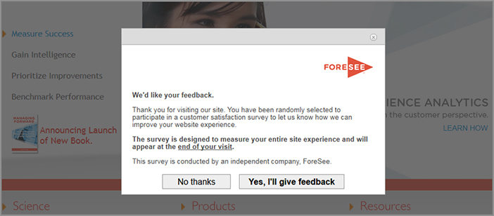
Ideally you should try and use a more advanced survey tool though. There are several you can choose from including Adobe Survey (http://www.omniture.com/en/products/analytics/survey), Opinion Lab (www.OpinionLab.com) or Foresee Results (www.Foreseeresults.com). These advanced survey tools offer greater flexibility in survey setup by allowing usage of rules and logic and also offer alerts based on results. They also offer advanced results analysis, including the ability to filter based on the page that visitors completed the survey from—important because reactions and feedback can heavily vary depending on the page the user takes the survey from. This means you can gather feedback for each of your pages and sections of your website rather than just feedback for your website as a whole.
These more advanced surveying tools also have great options for launching the surveys to ask for feedback. Instead of immediately showing the questions to a visitor upon arriving at a website and risk not getting good responses, they instead ask visitors if they would like to participate in a survey after they have spent more time on the website. This works by reminding the visitor to complete the survey as they are about to exit or by leaving a pop-up survey window open on their desktop or browser while the visitor is browsing the website. See Figure 4-8 for an example of this pop-up survey in action.
Figure 4-8: An example of a ForeSee Results survey pop-up
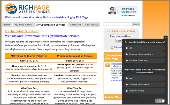
Another great newer, reasonably priced survey tool you can use to help gain even greater visitor insights is called KISSinsights (www.KISSinsights.com). This unique tool helps you gather shorter but more specific visitor insight in the most contextual and most important moments rather than showing longer general website surveys on all of your pages. The tool enables you to do this by automatically popping up a single question survey on specific important pages that you are targeting. For example, you could ask a shopping cart feedback question just on your shopping cart pages, or ask a pricing feedback question just on your product pricing page. This allows you to ask for quick and specific feedback without overwhelming your visitors with long website surveys and ensures the visitor has actually seen the page you are asking feedback about. Figure 4-9 shows an example of what this survey tool looks like in action.
This unique feedback tool is definitely worth trying on your website to gain feedback and test insights, especially because they have a free trial and their paid plans start at just $29 (at the time of writing this).
Figure 4-9: Example of a KISSinsights survey pop-up
Other Website Survey Best Practices
To ensure greater success, there are also several other best practices you should adopt when running feedback surveys on your website that you will now learn about.
First, you should always have a “give feedback” link available on all pages of your website, because doing this allows for your visitors to give feedback any time they want, whether this is to give praise or to complain about something. A link in your footer is a great place to have this permanent survey link in addition to more prominent modules on your pages that visually ask your visitors for feedback. Some websites even go so far as to have open text comment boxes in the footer of their websites to encourage more feedback.
In order to get more survey responses to gain possible insight from them, you should try offering an incentive to your visitors for completing the survey, for example, by offering a coupon or special promotion if they complete the survey.
You also need to make sure you have enough survey results for each survey you run in order to make sure you can gain a representative, unbiased sample of feedback. Anything less than 50 visitors will mean you will risk not getting enough of a realistic, representative and valid response.
Another best practice is to include ratings questions for your website in several categories—for example, ratings out of 10 for overall website rating, and ratings for website features and website design. The results of these ratings should ideally be included in your weekly analytics website reports so you can monitor and understand the current rating level of your website. Several survey tools offer this built-in page rating functionality and is something that many feedback rating tools also feature (which will be discussed in more detail tomorrow).
Wednesday: Use Website Feedback Rating Tools to Gain Further Insight
Many tools have recently appeared that help increase your ability to generate, organize, and analyze this all-important feedback from your visitors. These great, relatively inexpensive tools help visitors submit website and product improvement ideas and complaints and give ratings for particular elements of your website.
One of the first tools you should know about is called Get Satisfaction (www.GetSatisfaction.com) and in particular is great for any website that offers a product or service. Not only does it offer good functionality for collecting feedback about what you are selling and identifying problems on your website, it also allows for visitors to rank and rate other visitors’ feedback. This makes giving feedback a democracy and helps website owners prioritize which feedback is most important to act on first. Figure 4-10 shows a screenshot of the Get Satisfaction pop-up in action. As you will see, it’s very intuitive for the visitor to offer feedback and to see what other ideas and feedback are most popular from other visitors.
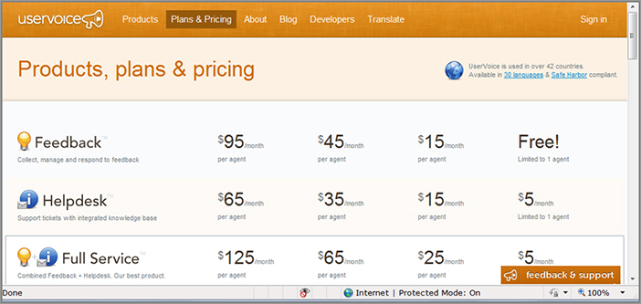
You could also try using UserVoice (www.UserVoice.com) for a slightly cheaper but less advanced tool that offers similar powerful feedback and support options.
For a slightly different perspective on feedback generation, you could also try using the feedback tool from Kampyle (www.Kampyle.com). It allows visitors to submit ratings for different features and aspects of your website (that are fully configurable in the tool), and even goes as far to let visitors leave their contact details after giving feedback so you can reply to them if need be.
All these tools also have great options to make it easier for visitors to see how to give feedback, with all of them having icons and widgets that stay visible on screen as they scroll, either showing a button in the bottom right or showing as a tab on either side the of the browser. In Figure 4-11, you can see an example of this tab that Uservoice.com uses in the bottom right of the visitors’ browser.
Figure 4-10: Example of a Get Satisfaction survey pop-up
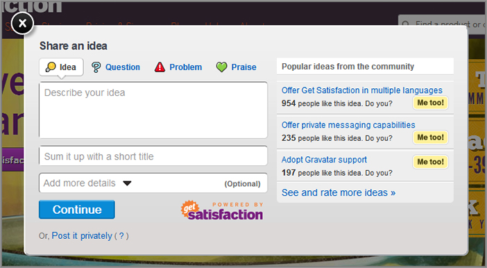
Figure 4-11: Example of a UserVoice feedback tab in bottom right of browser
Once you have chosen and set up one of these feedback tools on your website, spend considerable time reviewing and analyzing the ratings and comments you initially receive. As with the other feedback and survey tools that have been covered, make sure you receive at least 50 responses to ensure a representative and valid sample to review. You then need to look for any patterns regarding the ratings or feedback received and use these to generate ideas for testing and optimizing your website.
After you have done this the first time, as discussed earlier you should then try and add your website feedback ratings to your web analytics reports each week and monitor them for trends. You should also review your latest responses in depth on at least a monthly basis to look for new insights.
Thursday: Gain Feedback on the Usability and Task Completion Rate of Your Website
Unfortunately for you and your online business, website visitors are getting smarter and more demanding every day, and the website usability bar of websites is being continually lifted by new standards and best practices. Because of this, regardless of how good your website looks, if visitors find your website too hard to use in comparison to other websites, they can easily go to Google and find a competitor website that offers better usability instead. This obviously has negative impact on your ability to engage your visitors, let alone convert them.
Historically, in order to gain usability feedback from your visitors you usually had to run expensive usability labs and focus groups. While these often gave some good feedback, they were limited in that they only represented a small sample of your audience. This meant that results were sometimes biased and unrepresentative, unfortunately resulting in website changes that had little positive impact on visitors.
Due to the recent shift and focus toward improved website usability, luckily there are now several usability feedback tools that you can use to gain usability feedback from a much larger and representative population of your website visitors, all without needing to run expensive focus groups or usability labs.
The first and simplest usability tool you should try using is UserTesting.com (www.UserTesting.com). This tool offers a great way of understanding how visitors interact with your website in great detail and how easily they complete tasks you give them. You simply pick the number of testers you want to review your website and their demographics (for example age, gender, income and web expertise). You can even recruit testers from your own website to make sure they are from the exact target market you are looking for. You are charged a small fee per person who is tested (just $29 if you get at least three to test your website), so this ends up being much more cost effective than running usability labs.
After you have picked your testers, you then submit a list of tasks that you want feedback on for your testers to try and complete. You also make use of the option to ask your testers a set of questions at the end for you to gain additional feedback.
After the tester has reviewed your website and answered the tasks and questions you pose, you get a visual recording of them interacting with your website and answering your questions, complete with audio of them talking through your website. This allows you to look for and optimize any common issues your visitors may have, and will also often give you great ideas for testing and optimizing your website. See Figure 4-12 for a screenshot of this tool in action and the tester giving feedback.
To make best use of this tool, get at least 20 testers (any less and you risk getting unrepresentative or biased responses) to try and complete the major use cases you created for your website earlier in this chapter. After they have finished your test, review their responses and look for patterns and insights from them, in particular taking note of common issues they have with any of your use cases. This will help form some great ideas for testing and optimizing the pages relating to these use cases, and will usually help increase your conversion rates and success metrics.
Figure 4-12: Example of a tester giving feedback using UserTesting.com
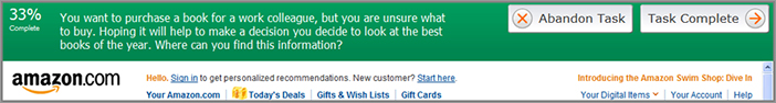
To help you gain considerably more task completion feedback from a wider audience of your current website visitors, you should consider using a tool called Loop11 (www.Loop11.com). This usability tool enables you to get many more task completion feedback responses for a much cheaper rate than UserTesting.com (at the time of writing this is $350 per 1,000 visitors being tested).
A benefit of using this tool is that you can gain feedback from your actual visitors on your website rather than having to recruit them from other places (like you would need to do with UserTesting.com). The visitor also doesn’t need to install anything in order to respond to your task completion questions; they just get a pop-up asking if they would like to participate, and a bar appears at the top of the website asking tasks for them to respond to. You can see an example of this bar being used on Amazon.com in Figure 4-13. All you have to do is submit a list of tasks that you want to see if your visitors can complete, and you should start getting responses immediately.
Figure 4-13: Example of a tester giving feedback using Loop11.com
While you don’t get an audio and video recording of each respondent as with UserTesting.com, this tool importantly takes UserTesting.com’s task feedback and analysis feature to a higher level. It actually measures and reports on how many visitors complete each of your tasks and at what completion rates, so you can run analysis on which use cases are most problematic.
Run Your Use Cases as Tasks in a Usability Tool for Visitors to Complete
One of the best uses of a task completion usability tool like Loop11 is that you can put your use cases to the ultimate test and ask your website visitors to complete them.
To do this, take the major use cases you created earlier in this chapter and turn each one of them into a task in a tool like Loop11, and run the tool to see how easy it is for your visitors to complete them. Test your use cases on at least 50 people from your website, and then from the tool report findings, note down the percentage completion rates for each of your use cases in Table 4-2.
Table 4-2: Visitor use case completion grade table
| Use Cases for Your Website | Visitor Use Case % Completion Rates | |
| 1 | ||
| 2 | ||
| 3 | ||
| 4 | ||
| 5 |
If any of your use cases get below 70 percent completion rate from your visitors, you need to pay particular attention to testing and fixing pages associated with them. This really is a great exercise to perform, because fixing any major use cases that are hard for your visitors to complete will mean your visitors will be happier, more engaged, and convert more often (increasing your conversion rates).
There are several other tools that you can also use to analyze this use case completion rate from your website visitors, for example Usabilla.com (www.usabilla.com) and UserZoom.com (www.userzoom.com). Both of these tools also offer other tool functionality, like mockup and wire framing options, or surveying and online card sorting options.
Pitfalls of Visitor Usability Testind to Avoid
To ensure that you get reliable actionable feedback from your visitors when using these usability tools, it’s key that you involve enough people in each round of usability tests. One common mistake is to only involve a small number of visitors, which often results in biased or extreme feedback that might not actually reflect your regular website visitors. This is particularly problematic if your visitors don’t fit your target market, and haven’t been to your website before (or at the very least a competitor website).
Therefore, it’s important when doing usability testing that you get feedback from at least 20 people per usability test, and make sure you are picking visitors who fit the types of visitors usually on your website. Some tools allow you to pick and recruit your own participants, and I suggest you make good use of this to ensure you get highly relevant and targeted results from your own website visitors.
Gain Feedback from Usability Experts
The next tool that you should consider using allows you to obtain usability feedback from experts rather than your website visitors. This tool is called Concept Feedback (www.ConceptFeedback.com) and helps balance out some of the visitors’ feedback (who may not necessarily suggest how to fix or improve things the best way) with opinions and feedback from experts.
You can get feedback from experts in multiple categories, from design and usability experts, to website strategy and conversion rate experts. It is also offers free options to ask for feedback from the general expert community on their website. Once you gain this expert feedback (usually within 48 hours), it offers great built-in options for easily sharing and reviewing this feedback with your design, marketing, and IT teams.
The expert feedback results from this tool are great to complement the feedback generated from your other usability and feedback tools and should help provide some great ideas for testing and optimizing your website.
Use Usability Tools Pre-launch in Addition to Post-launch
One last best practice is to not just use these usability feedback tools on your live websites; it’s particularly important to also make use of these tools before you launch new websites, launch a redesign, or offer a new feature or functionality. You can get great feedback regarding wireframes, mockups, and images from these tools (not just live websites), allowing you to gather and act on feedback much more quickly and cheaply than on a live website.
Ultimately you shouldn’t just presume that your visitors are going to like what you launch or change, no matter how pretty or cool it may look. If they don’t like it, they may start using a competitor’s website instead, so you should always get feedback from visitors before you launch or change something.
Friday: Make Use of Web Chat Tools to Gain Additional Insight
Today you will learn about making use of web chat tools to help with your website optimization efforts. Not only do web chat options provide a great real time support mechanism for your visitors, but they allow you to ask feedback related questions of your visitors in real time. The responses from your visitors enable you to analyze them for any patterns or issues that they mention most often and help you discover great insights for testing and optimizing your website. Another benefit of web chat tools is that you can modify your questions immediately depending on the context or what the visitor is currently doing (as opposed to traditional survey tools, which aren’t able to be this dynamic).
Web Chat Tool Best Practices
Not only should you offer web chat button options on your website for visitors who need to get help and support fast, but you should proactively seek feedback using chat pop-up requests. You should have specific questions to ask your visitors that are geared toward helping improve your website, not just general questions like “Can I help you?” or questions about your products or services. For a few examples of questions, you should try asking visitors if they are finding what they need, and if not, what your website could offer to make it easier, or you could ask them if they find anything problematic or lacking about using your website.
You could also try asking your visitors questions regarding particular tools or sections of your website that you are looking for feedback about, in addition to feedback on conversion related pages like your shopping cart or registration pages.
However, as noted earlier with survey pop-ups, you shouldn’t be too intrusive with these web chat pop-up requests. In particular you should avoid making use of these within a few seconds of a visitor arriving on the home page or any other major page. This is because you may pop up the chat tool to a new visitor who won’t be able to give you good feedback yet, or may get frustrated with the popup and leave. To increase the chances of them responding favorably, ideally you should wait at least 20 seconds before popping on this page, and do so with good reason only.
Once you have asked feedback questions of a significant amount of your website visitors (which should ideally be at least 50), you should then take a look at the text chat logs and try and look for patterns or common issues that are mentioned. Again, you could export all the data into a word cloud tool like Wordle to help you find most commonly used words and phrases. You should make note of any particularly common issues and themes because the pages related to these make great candidates for testing and optimizing.
You should also use best practices for placing web chat buttons on your website. At the very least you should make sure they are in a consistent place on your website so that your visitor always knows where to find them if needed, but more important, you should also place them in areas where they are likely needed the most. For example, while your visitors are in your shopping cart or signup process, their anxiety levels are likely to be much higher, and placing prominent web chat buttons in a highly visible spot on these pages is a great way for the visitor to get help to address any concerns they may have.
Web Chat Tool Providers
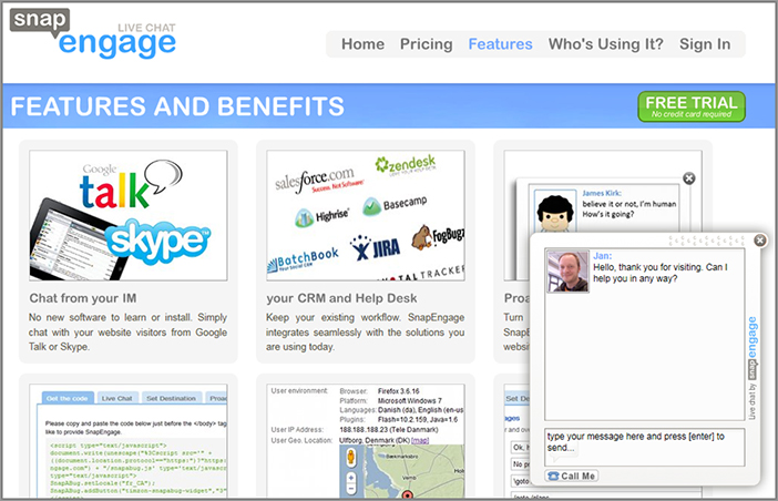
When looking at web chat tools there are several options for you to start evaluating today, in particular two good and popular options from BoldChat.com (www.BoldChat.com) and SnapEngage.com (www.SnapEngage.com). Both of these offer a wide variety of web chat service levels that cater to both small business and large enterprises, starting at a very reasonable $19 per month for a basic level at the time of writing.
Both of these chat tools also sync with your CRM tools (customer relationship management), so you can manage and record your visitor chats and associate them with sales records and other customer details. Another great feature of these tools is that many of them allow you to co-browse your website with your web chat users, so your visitors can show you anything they may be having issues with or have a suggestion on. SnapEngage even allows you to use your own instant messenger accounts to chat with your website visitors instead of having to download software to talk to them (see Figure 4-14).
Figure 4-14: Example of a SnapEngage web chat pop-up request
There is also a built-in limited functionality web chat tool in the Woopra (www.Woopra.com) web analytics tool (which may also give you another reason to evaluate this newer analytics tool). If you are looking for an even more robust full enterprise-level web chat tool, you could consider using LivePerson (www.LivePerson.com).