
Chapter 5
Build the Foundation of a Better Converting Website
Before you can begin effectively optimizing your website, you first need to learn important web design and usability foundations. Applying these will mean your visitors will find it easier to navigate and make better use of your website, and increase the chances of them engaging and converting. These foundations apply to any kind of website and will help build a solid foundation to maximize the impact from your website optimization efforts throughout the rest of this book.
Chapter Contents
- Week 11: Understand and Improve Your Website’s Layout
- Week 12: Improve Page Load Speed
- Week 13: Optimize Your Navigation Menus and Links
- Week 14: Optimize and Learn from Your Internal Site Search
Week 11: Understand and Improve Your Website’s Layout
As you began to learn about last week, it is very important that you design and create a highly usable website that your visitors can easily use and engage with. This will increase the chances of them converting and coming back in the future. Don’t just make it look good—if you ignore usability conventions that your visitors have now grown accustomed to seeing you will risk losing them to a competitor website that does a better job with this.
This week we are going to continue discussions around the importance of website usability for optimizing your website, and focus on improving a particular aspect of it—your website layout. Applying best practices for this will ensure that your website is optimally laid out and more usable, enabling your visitors to find what they are looking for more easily without issues.
Monday: Understand the Impact of Your Web Page Fold
One of the most important layout considerations you need to understand is how your web pages look “above the page fold” and what your visitors can see there. This is the area that is visible in a visitor’s web browser without them having to scroll vertically to see more and sometimes represents all they see before judging your website, particularly if they are a first-time visitor.
What the visitor sees above the page fold can have a major impact on your conversion rates, because they might not see your most important conversion-related content and calls-to-action if they are lower down. This is supported by a 2010 study by Jakob Nielsen that found that web users spend 80% of their time looking at content above the page fold. For more details on this study you can visit this page: www.useit.com/alertbox/scrolling-attention.html
While this isn’t as much of an issue for well-known brand websites because visitors will often scroll more (like Amazon.com or CNN.com), this is problematic if your website is much newer or less well known because many of your visitors won’t know what to expect lower down on your pages. Therefore, today you will learn about some best practices to ensure your website doesn’t make this mistake by not showing the most important content above the fold.
Learn the Most Common Page Fold Area Size
To understand the potential effect of the page fold, the first thing you need to do is learn what the most common page fold height is.
The most common screen resolution height is 1024 × 768 pixels (according to recent general web statistics at the time of writing), but you need to cater to a lower common size because a significant portion of people still browse on 800 × 600 screen resolution, particularly the older, less tech-savvy generation.
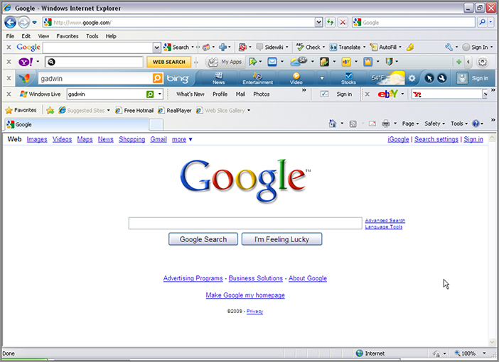
This visible page fold height gets even smaller when you take into account the room that is taken up in many Internet browsers by extra toolbars (as you can see in Figure 5-1). Therefore, to ensure that a large percentage of your visitors see your important content above the page fold, you should use a slightly lower height as your page fold area—500 pixel height would be considered safe to use.
Figure 5-1: A browser with too many toolbars turned on
Display Your Most Important Content above the Page Fold
To ensure that your visitors see your most important content, you should always display your most important information above the page fold, particularly your calls-to-action and supporting text and images. This is essential for your top entry pages like home pages, paid search landing pages, and product pages. This is particularly bad if it’s the visitor’s first visit to your website because they will often judge your website in less than three seconds and leave if they don’t find what they are looking for.
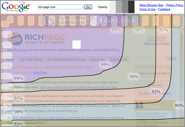
One great quick way to check if your key pages are following this best practice is to use Google’s free Browser Size tool (http://browsersize.googlelabs.com). For any page that you want to submit and review, this overlay tool shows color-coded percentages of the page that your visitors are likely to be seeing above the fold. You should try to fit your most critical information and calls-to-action in the colored area that denotes more than 90 percent. Figure 5-2 shows this tool in action, so you can see the percentage areas.
Figure 5-2: Google’s Browser Size tool in action
Scrolling Can Impact Your Visitor Engagement
Although many visitors do scroll down on websites quite often now, you should try and make your web pages as short as possible, so it’s easier for visitors to view the whole of your pages. Even if you have a media website, you should try and split long pages into separate, shorter pages to make it easier to read them (also having the benefit of increasing page views per visit, which can help increase ad revenue).
E-commerce website pages can be longer (apart from the homepage which should remain more concise), because they have to convey more per page, particularly on product pages and category pages, and visitors won’t mind scrolling as much on these pages because they will expect them to be longer.
If you are only selling one product or service, you could test using a longer “sales letter” type of page that contains all the key information needed to convert the visitor with a major call-to-action at the bottom—these often convert quite well for some products.
Last, you should never make your visitors have to scroll horizontally on your regular website. This is because you run the risk of them not realizing there is more content to the right of your pages, as occurs on some trendy media websites like glo.com. The only time you might want to experiment with offering this is if you have a version of your website just for tablet devices, which are more suited to horizontal scrolling by hand swiping.
Tuesday: Understand the Impact of Your Website Design on Eye Flow
Regardless of how good you think your website looks, if you don’t understand the impact of website design on your visitor’s eye flow this can have a big negative impact on your conversion and visitor engagement rates.
If you don’t understand how visitors usually read and scan websites, in addition to what can impact their eye flow, you may inadvertently cause friction to their eye flow or distract them from key content like calls-to-action. This reduces the likelihood of your visitors engaging and converting.
Therefore today you will learn about how your visitors read and scan websites, and then understand what can impact and distract their eye flow. This will help you test and create pages that flow better and result in a higher number of conversions.
Understand the F-Shape Reading Pattern on Websites
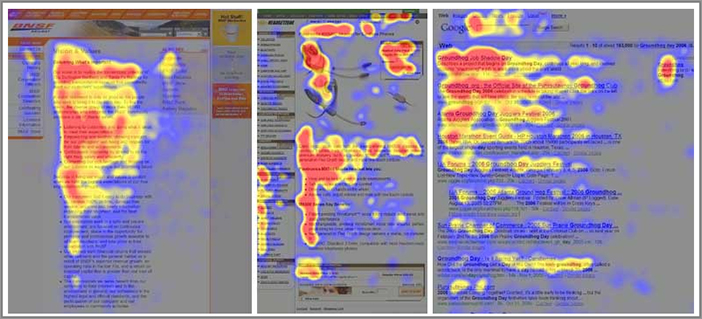
To understand the effect of visitors’ eye flows and how to lay out your pages better, you need to understand how visitors typically look at websites. Studies have shown that they typically look at the top left of the page first and scan horizontally, and then they look down slightly and scan again horizontally to the right. They then typically scan down the rest of the page, mainly keeping to the left of the page. This is known as the F-shape reading pattern, a term that was coined by Jakob Nielsen. An example of an F-shape reading pattern heat map is shown in Figure 5-3. You can read more about this at www.useit.com/alertbox/reading_pattern.html.
Figure 5-3: F-shape reading pattern examples
This reading and scanning pattern ultimately means you need to convey your most important wording and imagery at the top-left of your website. Headlines and sub-headlines are particularly important to make good use of in this location, and you will learn about how to make effective use of these in Chapter 6.
It also means you shouldn’t rely on using the right-hand side of your pages to show key information because your visitors won’t look there very often.
Understand the Influence of Using Images, Videos, and Other Graphical Content on Eye Flow
One of the things that can have a huge influence on your visitor’s eye flow and where they look on your webpages is the usage of images, videos, and other graphical content.
Careful and planned placement of images and graphical elements can actually help guide the visitor’s eye flow through the most important parts of your pages, eventually increasing the chances of them clicking on the main call-to-action on your pages. If you don’t do this, your less important images and graphical elements will distract and detract your visitor’s eye flow away from these.
The best way to understand the impact of your visitor’s eye flow is to use eye tracking tools that were discussed in Chapter 4, such as Gazehawk and AttentionWizard and analyze what your visitors are looking at, particularly on key conversion-related pages. Based on what you observe, you should test rearranging graphical elements on your pages to refocus the flow so that your visitors end up looking at your key call-to-actions more often.
In Chapter 6, you will learn much more about how to optimize your usage of images, videos, and interactive content to help increase your website conversion rates further.
Use White Space Effectively in Your Design
Having empty space on your website is often criticized by web designers who like to ensure their website real estate is maximized and covered as much as possible. However, this isn’t always true, because when used effectively, white space can help draw the visitor’s eye toward important page elements like calls-to-action. It can also break up some of the intensity of pages and make them look less crowded to reduce confusion.
Therefore, next you need to review your website and make sure it doesn’t look too crammed, remembering to put yourself in the shoes of your visitor and getting feedback from them if possible. Then you should try testing increasing spacing slightly around key page elements, particularly around key calls-to-action, to see what positive impact that hopefully has on your conversion rates and success metrics.
Wednesday: Check Your Website in Different Browsers and Resolutions
Slight variances between website browsers and screen resolutions can have a dramatic impact on how your website looks and functions, which can potentially reduce your conversion rate. Therefore, it’s important to ensure your website works well and looks good in all major browsers.
Not only are there now many different browsers you need to check your website in, but there are now a wide variety of screen resolutions you need to check too. It’s now fairly common for some visitors to browse websites with very large screen resolutions (with many tech savvy visitors using widths higher than 2000 pixels), and this can play havoc with your carefully planned web page layout and flow, particularly if your website auto expands to fill the screen width.
Today, you will learn some best practices to help negate the impact of different resolutions and browsers on your website and conversion rates.
There are literally thousands of different combinations of browsers and screen resolution sizes that you should check your website in. Doing this sounds like a very daunting and time-consuming task to have to perform regularly, but luckily there are now several great tools that can help you or your design team do this checking in an automated fashion.
For example, the CrossBrowserTesting.com tool ((www.crossbrowsertesting.com)) checks how your website looks in any combination of browser and resolution that you want to check. It also gives you image thumbnails of each of the versions checked, so you can review and understand potential issues. This tool is also very cost-effective, with monthly plans starting at just $29 per month and a free one-week trial at the time of writing.
There are also a couple of other effective but limited functionality browser-checking tools that you can use to check what your website looks like in any browser (but not screen resolution size unfortunately). For example, Adobe BrowserLab (http://browserlab.adobe.com) and BrowserShots (www.BrowserShots.org) are currently free and well worth using.
At the very least, you should check what your key pages look like in the most common browsers and screen resolutions, in particular your home page, checkout or signup pages, and product or service pages. Then fix any of the major issues with them and recheck what they look like again to ensure that they are fixed in all combinations.
Thursday: Learn Other Website Layout Best Practices
Today you will learn about some other best practices for the layout of your website. This includes optimizing the layout to work better on smaller screen width resolutions, avoiding use of auto-expanding websites, and always centering your website.
Optimize Your Website to Work on Smaller Screen Widths
If your website isn’t optimized to work well on smaller browser resolution sizes, visitors using them may miss important content to the left or right on your website like calls-to-action or other functionality, and thus negatively impact your conversion rates.
Therefore, you should design your websites so that the most important content and elements of your website are visible on a resolution width of 800 pixels (800 × 600 pixel resolution), which is the narrowest browser width that a small percentage of your visitors is likely still using.
To check this, simply change your monitor’s screen resolution so that it has a width of 800 pixels and then check all of your pages to see if any key page elements to the left or right can’t be seen because of this narrower width. You can use Google’s Browser Size tool to get a good idea of this too (as discussed earlier).
It’s particularly important to check for any page width issues on your key conversion-related pages, such as your shopping cart or registration pages. If you do find issues, you should ideally move the important elements that are not being seen to more prominent central spots.
Avoid Using Auto-Expanding Width for Displaying Your Website
Sometimes it’s seen as fairly “cool” to have your website expand to fit the width of your visitor’s browser, no matter how wide it is, and many web designers still like to spend considerable time designing websites that do this. This is also sometimes referred to as using liquid layout.
Unfortunately, this expanding website design can often have negative consequences on key aspects of your website, such as module and text layout, which often unintentionally damages your website conversion rates without your realizing it. Key issues with auto-expanding width websites on very wide resolutions are the huge amount of white space this causes, and separation of key calls-to-action and supporting modules.
If your website does auto-expand to fill browser width, it’s important that you check for this potential impact. This can simply be done by changing your screen resolution to a very wide one like 1600 pixel-width (one of the more common larger screen widths), and then checking your pages to see if any of your page layouts look broken or don’t flow as well. Again, its most important to check your key pages because issues on these will have a bigger impact on your conversion rates.
For an advanced way of checking the impact of this, you could set up a visitor segment in your analytics tool for visitors using this width and see if they experience lower conversion rates than average.
Once you have reviewed what your web pages look like in this wider view, you should try to fix any layout of flow issues you uncover, or consider redesigning your website in the future so that it uses a fixed-width instead.
Ultimately though you should try to use fixed-width design for your website to limit potential negative impact, and to have more control over the layout of your pages and how they look and flow for visitors on many different screen sizes.
Horizontally Center Your Website
Not only should you always try to use a fixed-width for your website, you should also make sure your website is designed so that it is centered across the visitor’s web browser. If you don’t do this and instead left justify your website (pushing it against the left hand side of browsers), this can have the effect of making your website look very small and unbalanced, particularly when a visitor is looking at your website on a very wide screen resolution. While fixing this won’t have a big impact on conversions alone, it is one of the smaller things that can contribute to a more usable and better converting website.
It is also important to check how your website looks on mobile devices. This is due to the huge recent rise in mobile website browsing, a subject that will be covered in greater detail in Chapter 7.
Friday: Check How Your Email Marketing Efforts Look
Your email marketing efforts can have a significant impact on your website’s conversion rates because they often form a considerable, highly targeted, and highly convertible traffic source to your website.
Therefore, you also need to consider the layout of how your marketing emails look and render in different email providers, and fix any issues you see.
In particular, you need to check what your emails look like in email preview panes, because the page fold is usually significantly smaller in email readers, and you need to make sure your most important content can be seen there.
Another important thing you need to check for in particular is to make sure your emails look good when visitors have images turned off by default (the default setting on many email clients like Outlook). Instead of risking having your images and important image call-to-actions in them not show, it is best to make use of plain text on background images to achieve a similar effect for users with images turned off.
You should also check how your email marketing efforts look in different email providers, such as Gmail, Yahoo Mail, Hotmail, and Outlook. This is because your emails can look different or broken across some of these email providers, which can have a negative impact on getting some of your most important visitors to your website and ultimately lower your website’s potential conversion rates.
You will learn much more about these email marketing optimization best practices in Chapter 8.
Week 12: Improve Page Load Speed
Do you remember having to use slow dial-up Internet access? Remember how painful it was, in particular the frustration of finding a website that took forever to load? Unfortunately, this issue is rearing its ugly head again, despite the widespread usage of high-speed Internet connections. This is in part due to web designers who increasingly use slower loading but “cool” new interactive media elements but have little understanding of the impact that this has on visitors and conversion rates.
When you combine this with the fact that many websites are built with bloated or inefficient programming code, this can make matters even worse for page load times. Therefore, this week you are going to learn about improving the speed of your page load time to make your visitors happier and improve your conversion rates.
Monday: Understand the Negative Impact of Slow Page Load
Slow-loading web pages can have a surprisingly negative effect on your conversion rates because many of your visitors will not wait for them to load and abandon them prematurely. This was echoed in a recent study by Forrester Research that found 40 percent of consumers would abandon a page if it took more than three seconds to load.
Visitors are often quick to judge these offending slow-loading websites, often without giving the website a second chance in the future. This quick judgment is even more likely to occur when they arrive on your home page, especially if it’s their first visit.
Often this slow-loading page impact happens without online marketers even realizing it. This is because many offices where websites are built have the fastest Internet connections you can get (which are much faster than home high-speed Internet connections), so page load speed issues are often overlooked. It’s also important to understand that website visitors are even pickier about waiting for pages to load when browsing websites on mobile devices, because they have much slower Internet connections. This will be discussed in more detail in Chapter 7, where you will learn about mobile website optimization.
Finally, another emerging impact of slow-loading websites is the negative impact on your rankings within Google search results. Recent studies have shown that Google lowers rankings for websites that are particularly slow at loading, particularly for their paid search listings. This obviously is going to have a major impact on your conversion rates if you are highly reliant on Google for driving quality traffic to your website.
Therefore, during the rest of the week, you will learn how to check your page load performance, key issues to look for, and how to fix any offenders that you find.
Tuesday: Check How Fast Your Web Pages Load and Diagnose Issues
Remember that offices where websites get built usually have the fastest Internet connections possible and are much faster than regular home Internet connection speeds. Just because your website pages load fast on your office network doesn’t mean they will for your website visitors in their homes.
Therefore, today you will check how fast your web pages load at more common Internet connection speeds, and then use tools to diagnose any issues.
To do this, you can use the advanced settings of a tool called Web Page Test (www.webpagetest.org/) to check your page load times on different connection speeds. This is particularly important to do for your home page, because visitors are even more sensitive to slow load times here.
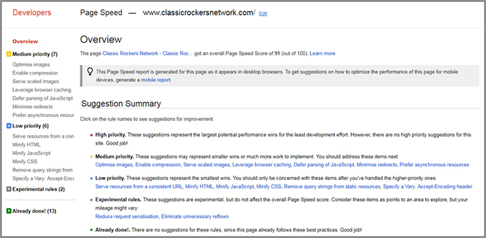
Next you need to diagnose if you have page load issues. To help you do this, there are several free tools to help diagnose a litany of potential common page load issues on your website. These issues can be in the form of slow-loading third-party applications, slow-loading external JavaScript calls, and bloated website programming code or CSS files. Here are some of the tools you can try using:
Figure 5-4: Example of Google Page Speed results
Once you have used some of these tools to detect your web page load-time performance, note any major issues you find and try to address them as soon as possible. You will probably need to get some help from your IT department to do this, as many of the issues may be very technical in nature.
Over the next few days you will learn about some particularly problematic things that cause slow loading pages, and some ways to overcome them.
Wednesday: Limit and Optimize Your Usage of Slow-Loading Website Elements
One of the major culprits of slow-loading web pages is the overuse of visual or interactive elements created with excessively long and bloated JavaScript, HTML5, Adobe Flash, or other website code. Examples of these potentially problematic page elements are interactive or dynamic content (that allows visitors to control and fine tune their experience), image sliders, video players, and intro splash pages. If these slow-loading elements are found frequently on your website, they can often frustrate visitors and can give them reason to leave your website prematurely.
Entertainment-related websites are common offenders of slow page load, because they usually contain multimedia like video and audio, in addition to slow loading “cool” elements.
To reduce the risk of visitors leaving your website due to slow-loading elements, you should consider rebuilding slow-loading elements so they load more quickly— for example, using different technology or more efficient code. And if your website has an intro page, you should run a simple A/B test that compares the engagement and conversion rates of your website with and without this intro page.
Another common solution is to offer two different versions of the website to your visitors, a high-bandwidth version and a low-bandwidth basic version. You can either let the visitor chose the version they want, or better yet, detect their level of connection speed if possible and automatically choose the best version based on their connection speed level.
You should also be sure to focus on the visitors who are browsing your website on mobile devices, because they are going to usually have a much slower connection. As you will learn in Chapter 7, the best solution to this is to create a separate lighter mobile website that doesn’t feature these slow-loading elements and therefore loads more quickly.
Thursday: Reduce the File Size of Your Images and Videos, and the Length of Your Page Code
Other major causes of slow-loading pages are pages that include images and videos that are unnecessarily large in size or pages built with bloated, overly long code or pages that make inefficient calls to other website services. Luckily it is fairly quick to fix these and improve your website load times, and today you will learn how.
Reduce Image and Video Sizes
First, you should check the file sizes of the images and videos on your website. You may be surprised at how large some of them are! By reducing the file size of these you can often shave vital seconds off your web page load times and make your visitors much more happy and engaged.
It’s fairly easy to reduce the file size of images by using simple web design tools to compress file size, often by as much as 50 percent, but be careful that you are not reducing their quality too much so they look noticeably poor. You should also save them as files that are optimized for website use—don’t use TIF files or other formats that are more appropriate for print use. And don’t be tempted to take the easy way out and just scale down your website images by using smaller dimensions, because even though they will look smaller, it can still take up as much bandwidth to download them.
Another way to reduce file size is to use photo-editing software to crop images so they become smaller in dimensions and therefore file size too.
You should pay particular attention to the backgrounds of your website if you are using images (including advertisements), because these can often be very large in file size. Ideally, you should not use a very large image as your background but instead make use of a smaller repeatable image and tile it horizontally and vertically on your website.
Reducing video file size is a little bit harder, but there are some decent video compression services available, such as WinSoftMagic (www.winsoftmagic.com). You should also consider shortening your videos, or splitting them up into multiple videos, so they will load more quickly.
Improve Website Code Efficiency and Reduce Size
To speed up your page load times you should also reduce the size and improve the efficiency of the code that your website uses. First you need to diagnose potential code issues using the tools discussed yesterday if you haven’t already done so. Due to the technical nature of these code-based load time issues, I suggest that you get help from your IT department to run tests, interpret the results, and fix any issues that are diagnosed.
One thing to consider in particular is to optimize the usage of third party JavaScript code tags on your webpages, like the ones you use to track and test content for your visitors. While individually they are usually fine, if you have many of them on your pages it can slow down load time. There are now several services that you should consider using to manage these tags and speed up load times, such as Adobe’s Tag Manager (www.omniture.com/en/products/platform/tag-manager) and Tag Man (www.TagMan.com).
Friday: Optimize the Delivery of Your Website Content
An alternative to tweaking code on your website to decrease page load times is to use a service that will optimize the delivery of your website content from your website servers.
This is known as content delivery optimization, and it helps in several ways. Most important, it compresses your website code so that it loads more quickly and efficiently. It also caches your website on your website servers, which means that your pages don’t have to be completely loaded again when a visitor returns to your website, greatly increasing the perception of a faster-loading website.
There are several services from companies like Akamai (www.akamai.com) that provide this type of delivery optimization, and most large websites will usually use a service like this to improve their website load times. Unfortunately, these services can be costly, but they are often worth investing in to speed up your website load times.
It’s particularly important to do this content delivery optimization if your website has extremes in your peak traffic flows or has content that is highly seasonally influenced. This is because it reduces the risk of your website not being able to handle this high volume of traffic and crashing (having the worst possible impact on your conversion rates and visitor perception).
Much of this content delivery optimization is highly technical, so I suggest that you get some technical help from your IT department to pursue options like this. You can even try and do this in-house to produce similar effects and benefits if you have the necessary technical resources available.
Week 13: Optimize Your Navigation Menus and Links
In online marketing, there is a lot of emphasis placed on attracting and driving visitors to websites, which is definitely important to do. But unfortunately often too little emphasis is placed on helping your visitors move around your website once they get there, and helping them complete the task that they came for in the first place.
Even with the advance in understanding of website usability best practices, website navigation menus and related links are still often poorly designed with little consideration for the visitor’s needs and wants, often with poor choices of links presented in them. This makes it unnecessarily hard for visitors to find what they are looking for in an effective, quick manner.
This week, to help you lay a better navigation website foundation and improve how well your visitors move around your website, engage, and convert on it, you will learn how to optimize your navigation menus and links.
Note that there is also another major method that visitors navigate through websites, which is through the usage of internal search tools. However, because of the importance of site search and the ability to generate insights from this, it will be covered in more detail next week.
Monday: Learn the Importance of Navigation Menus and Links
If your website has poor or confusing navigation menus and links, it will be much harder for your visitors to find what they are looking for or to complete the task they came to your website to achieve. If this is the case it can often mean that they will seek out another website that is easier to navigate than yours and won’t return to yours as much, having a negative impact on your ability to engage and convert them.
It’s not just optimizing your header navigation menu either—you also need to make sure your visitors can make good use of secondary left-hand navigation menus and related link sections to get around your website better and more efficiently.
Therefore it is essential that you spend time reviewing and optimizing your navigation menus and links on your website to ensure you are better meeting the needs of visitors.
Luckily, there are many different ways for you to optimize your website navigation menus and links that you will learn through the rest of this week.
Lastly, don’t forget about the increased number of your visitors who will be visiting your website on mobile devices, because you will need to optimize and make your navigation links work better on these much smaller resolution screens. You’ll learn about this in more detail in Chapter 7, which covers mobile website optimization best practices.
Tuesday: Optimize the Contents, Usability, and Location of Your Navigation Menus
One of the key ways that your visitors navigate through websites is via the use of navigation menus that persist across all pages of a website. Today you’ll learn some best practices and test ideas to help improve the ones on your website.
Position Your Main Navigation Menu at the Top of Your Website
It is now so common to see main navigation menus at the top of websites that it has become a website standard to show this menu in this location, as opposed to the left-hand side of your website.
The top navigation menu should ideally be in the form of a bar that spans the width of your website and should be tall enough to be easily noticeable and interacted with. You can offer a supporting secondary left-hand navigation menu if you have an e-commerce or media website that has many broad and deep categories to navigate.
There has actually been a recent trend of several major e-commerce websites moving their top menu to the left, using fly-out mega menus instead. Amazon.com was one of the first to change to this style, and others like Staples.com and Walmart.com have followed suit (perhaps because they think if Amazon is doing it, it must be the right thing to do, which is not always the case). While these certainly are fairly usable, the jury is still out on whether these are more effective than advanced drop-down menus at the top supported by a secondary left-hand menu, which will be discussed next.
Use Additional Left-Hand Navigation Menus for Deeper Websites
On websites that have particularly deep hierarchies, you should also use a left-hand navigation menu to support your top navigation menu. This will allow visitors to more easily explore and understand what deeper subcategories are available to browse. To improve the visitor’s ability to do this more quickly, you should make your left-hand navigation menu instantly expandable (accordion-style) when clicked on, without needing a page refresh. You can see an example of this type of expandable left-hand menu in Figure 5-5.
Figure 5-5: Example of an expandable left-hand navigation menu
These menus also take up less room than fixed menus that are fully expanded already. This means you can make more use of the left-hand sidebar to show additional promotions.
Make Sure Navigation Content Is Easy to Read and Understand
When labeling the links in your navigation menu, you should make sure your visitors can easily read and understand them. This helps reduce possible confusion and friction when they are using them, because it is very frustrating for a visitor to have to click each main link in the navigation menu to find out what each leads to.
First, you need to make sure your navigation bar is sufficiently big enough so that the links are easily readable. To ensure this, ideally the links should be at least 14 or 16 point font size and should contrast well with the background color of the menu to make them easier to read.
For the language level of your links, you should use high-school grade language (and in general on your website), and also refrain from using jargon or techy words. Therefore, go ahead and set up a test to remove or correct any offending navigation links—you will likely see an increase in click-through rates on your navigation menus.
Your navigation menu should also act as a signpost system that lets your visitors know where they are at all times on your website. This is particularly important for when visitors arrive deep within your website from search engines.
To help do this you should be visually highlighting the current page that a visitor is on in the navigation menu. This is often best achieved by inverting the color and font of the tab, or by using a pointer or colored indicator at the bottom of the tab. Surprisingly, many large websites fail to do this, including websites like Target.com and OfficeDepot.com.
Wednesday: Optimize Your Usage of Navigation Drop-Down or Fly-Out Menus
Websites that have many categories and sub-categories need to offer more than just a standard main navigation menu. If you only have static menus that don’t expand, your visitors will have to click on each category to find the subcategories within them. This can be frustrating and time consuming for them.
Having a website that offers advanced drop-down or fly-out menus that contain links to all subcategories and other important links is a much better experience for visitors. By using these it means they can instantly see what subcategories are under each main category, and it gives them a great quick overview of what your website offers just by moving their mouse on these dynamic menus.
Today you will learn best practices that can help you optimize your drop-downs and fly-out menus so they are more usable for your visitors.
Check How Easy Your Navigation Menus Are to Interact with and for Any Potential Issues
If you have drop-down or left-hand fly-out menus that are designed with poor usability you may frustrate your visitors when they use them, possibly causing them to leave your website. Sometimes they are hard to interact with, scroll over, and even break entirely in some browsers. Therefore you need to check how easy it is to use them and fix any issues you find.
In particular, you should check if your mouse can easily fall off your drop-down or fly-out menu when using it, and also check to see if they get obstructed by other page elements. These are both particularly frustrating to visitors when they occur.
Test Advanced Navigation Menu Functionality
You should also test improving the functionality and usability of your menus by showing larger drop-down or fly-out menu areas that include advanced navigation options. The benefit of these is that you can include more tools and promotions in them than normal menus, which will greatly assist visitor navigation and engagement.
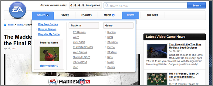
In these advanced menus, you should test showing search boxes that relate to the navigation tab currently rolled over, promotional items or modules, and relevant imagery or icons. The ElectronicArts.com website has a particularly good example of this advanced menu, which can be seen in Figure 5-6. Another example is ESPN.com, which has a great dynamic menu that even includes the ability to include personalized content in it (like favorite team-related content).
These advanced functionality drop-down menus can also help make your website stand out from the crowd of competing websites, and encourage repeat usage.
Figure 5-6: Example of a good advanced drop-down menu
While this may take a while to prototype and create, I suggest you develop one of these advanced types of menu and test it against your current navigation menu. Don’t forget to get feedback from your visitors on your current and proposed new navigation, too.
Test the Order of Long Drop-Down Menu Links
If you have drop-down menus that have many navigation options in them (more than five), you should test what order you display the links in them to better influence your visitors to convert to your goals. Don’t just display them in a random order; you should think which ones are most important to show visitors first. In particular, you should test moving your links higher for pages that have greater relevance to your conversion goals.
If none of your links have higher priority from a conversion standpoint, you should test putting your items in alphabetical order because this will make it is easier for your visitors to read and understand all of the options available. This is also particularly important to do if you have long drop-down menus with more than seven drop-down items.
Thursday: Improve Your Usage of Website Navigation Links
Next, you need to optimize the other major ways that visitors will navigate around your website in addition to your navigation menus, from basic links to related links. Here are some best practices for you to optimize these other ways of navigating on your website.
Optimize and Use Related Links on Your Pages
A key principle to follow is to never let your visitors dead end on your pages without offering suggestions for where they should go next. If you don’t do this, your visitors will often just read what you are showing them and simply leave because they are either satisfied or don’t know what to click on next.
This is particularly important for media and blog websites that have many articles for visitors to read. This is because rather than letting them leave after reading an article, you should show them links to related articles to engage them further. When they use these related links, it will increase page views per visit, which will then in turn increase ad revenue from the additional ads seen per page (which, as discussed in Chapter 2, are key success metrics for these two types of websites).
One of the best ways of ensuring this doesn’t happen is to make better use of related links at the end of your pages, which is where the visitor’s eye flow will naturally end up. Don’t just place these in the right-hand rail of your web pages, because visitor’s eye flow often doesn’t end up looking there due to the high frequency of banner ads usually found there.
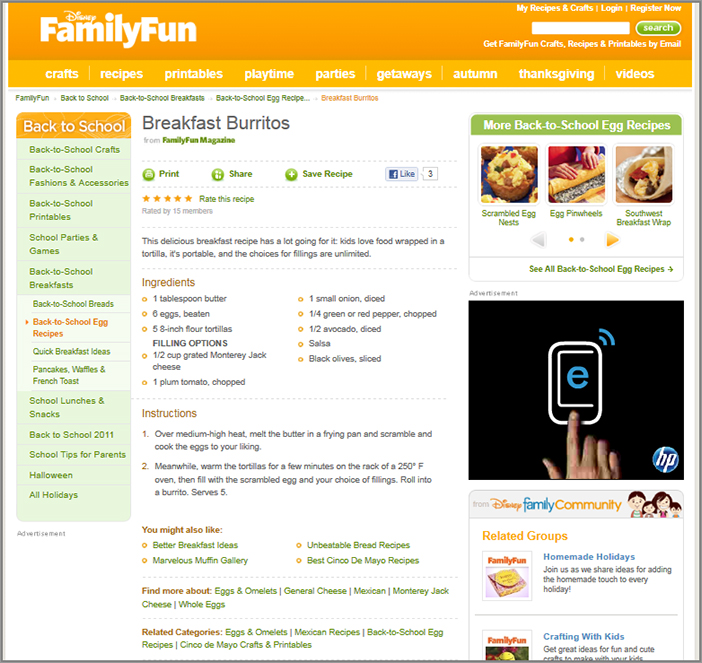
Examples of related links to test can come in the form of most popular content, or related items, categories, or sections. To see a good example of how this can be done on a media website, take a look at Figure 5-7, which shows how FamilyFun.com includes related links on its article pages.
Figure 5-7: Example of good related link options at the bottom of a page
Therefore, to take advantage of this go ahead and work with your design team to come up with a few styles for displaying related links. To understand what usage and versions of these engages the most, you need to test each of these related link styles, along with the links that you are showing in them and the location of them on your pages. This will improve your engagement rates and likely have a positive effect on your conversion rates.
Don’t Make Your Visitors Guess Which Links Are Clickable
It’s important to make sure that your website visitors know what links are clickable on your website. If you don’t do this, you will decrease the ability to influence what your visitors click on and make it harder for them to find related content links, which is particularly problematic if they relate to your conversion goals.
Unfortunately, too many websites still make their visitors guess what links are clickable on their web pages, often using links that don’t stand out and barely look any different than normal website text or using bold text that looks the same as links.
This is particularly problematic for your visitors who aren’t very web savvy and will have less of an understanding of what might be considered a link.
To make it more obvious and to confuse your visitors less, go ahead and make your text links underlined and a different color from your regular text (with blue being a great color to use because it is a website usability standard). While it may sometimes be hard to convey this point to your graphic designers (who often like to be very creative and cool regarding the style and color of their links), a great way to prove this is by testing your current style of links against more obvious and underlined links in order to see which gets higher click-through rates.
Friday: Learn Other Best Practices to Help Visitors Navigate Your Website
In addition to the navigation best practices already discussed this week, there are also several other, smaller best practices that you should test using on your website, including using breadcrumb trails and better footer navigation links. Today you will learn about these best practices, which will help visitors navigate your website better and increase the chances of them engaging and converting.
Have a Helpful Mini-Navigation Link Area in the Top Right
To aid visitor navigation you should always place a mini-navigation link area in the top right-hand area of your website that contains useful links.
This should include account and help related links such as shopping cart, contact, help, FAQ, and login and register links. Visitors often now expect to see links of this nature in this location and may be frustrated if they can’t find these important links.
This mini-navigation area should use simple text links, and be much smaller than the font in your main header navigation menu to help deprioritize these links slightly. Icons like shopping carts are useful visual representations too.
This link area should also look consistent and be available on every page of your website so that your visitors notice it more easily and can access it any time. Figure 5-8 shows a good example of how a mini-navigation area in the top right of a website page can be used effectively.
Figure 5-8: Example of a helpful mini-navigation area in the top right

If you haven’t already got this useful link area on your website, test adding it to your website and see if it helps increase visitor task completion rates and overall conversion rates. And if you already have one, test to make sure you are using the types of links that are listed above, and test the presentation of this link area.
Make Your Website Logo Clickable, Sending Visitors to Your Home Page
A simple thing you need to do next is make sure your website logo is clickable, redirecting the visitor to the home page after clicking on it. Many website visitors will now expect this to happen when clicking on website logos and will be frustrated if they can’t do this, particularly if they also can’t find a “home” link in your navigation. This provides an easy way for your visitors to get to your home page and also means you don’t waste space by adding the “home” link into your navigation menu.
Use of Breadcrumb Trails to Aid Visitor Navigation
Another simple yet effective way to aid your website visitor’s navigation is to place a breadcrumb trail set of links that shows the visitor context of where they are in relation to the rest of the website. This isn’t necessarily a highly clicked set of links, because it is more of a visual guide to visitors—think of it as a signpost system to help your visitor understand where they are on your website.
This is particularly useful for your visitors who have arrived deep within your website from a search engine and may not know where they are in the context of the rest of your website.
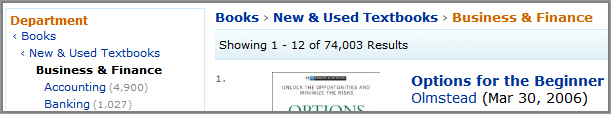
In terms of format and location, these breadcrumb links should show the locations that are higher up in the hierarchy of where the visitor is, plus the page they are currently on. Using a forward chevron or arrow between the links is a good way to indicate the depth of pages above where they currently are. Ideally this should be placed at the top of the main content area of pages, just below the header navigation menu and just to the right of the left-hand menu if you have one of those. Figure 5-9 shows a good example of how breadcrumb links are used on Amazon.com.
Figure 5-9: Example of good breadcrumb trail usage
Optimize Your Footer Navigation Links
Another way to optimize the way that your visitors navigate your website is not only to have a footer link area on your website but to optimize the format and contents of it.
Don’t just have a single row of links to things like your contact page, privacy policy, and site map. Instead, make your footer area much more of a navigational aid to your visitors by making it taller to include lists of the major sections and subsections of your website and your major calls-to-action (like register, sign up, learn more, etc.). Figure 5-10 shows a great example of an optimized footer from Shoes.com that even includes a newsletter signup area.
Figure 5-10: Example of an optimized footer link area
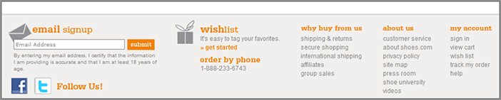
Therefore, you should test creating a few different versions of your footer area with these extra links and see which versions help increase click-through rates on it.
Test Different Navigation Options for Logged-In or Repeat Visitors
A more advanced best practice to improve your navigation is to offer different navigation links to different types of your visitors, and not just have a “one size fits all” navigation menu. This meets your visitors different needs better and often results in increased engagement and conversions.
For example, if your return visitors often log in, they are more likely to prefer seeing prominent log-in and account-related options, and not links that are trying to get them to sign up (which they already have done). This would be particularly good to do on the home page because that is where repeat visitors often come back to.
To do this you will need to set up visitor segments in your testing tool for visitors who are new, returning, or who frequently log in and then target different navigation options to them to better engage them.
Depending on your exact business model or value proposition, you could test offering different navigation links for any type of visitor group that you want to show different options to, not just whether they want to log in or not. I suggest thinking about what navigation needs your different types of visitors will have, and then trying to create, test, and target different variations to them. This will likely result in higher visitor engagement rates and higher overall conversion rates.
Week 14: Optimize and Learn from Your Internal Site Search
An internal site search tool is extremely valuable to offer to visitors on your website, not just in terms of offering them a very important way to try and find what they are looking for, but also because the keywords being searched for can provide some excellent feedback and insight that you can learn from to help you optimize your website.
If you don’t offer a very good internal site search tool, your visitors will find it harder to find what they are looking for and abandon your website more often, and you won’t be able to gather intelligence regarding what they were trying to find. Therefore today you will learn best practices to optimize and learn from your internal site search.
Monday: Offer a Good Internal Search Tool
The most important thing you should do is to make sure you are already offering a good internal search tool to visitors on your website and understand some of the options available to you to add or improve this internal search functionality.
Use Built-In Search Tool Functionality or Build It Yourself
The simplest approach to offering an internal site search tool is to use built-in functionality that your website platform already has. This is because many websites are built on a platform that has the option to turn on and use internal search functionality. Often these are fairly limited in functionality though, and you will need to evaluate how good your tool is, in particular the usability of the tool, how well you can customize how it works and what reporting is available.
Another option that you might consider is to build your own search tool. Depending on the complexity of your website and how much development resources you have to available to do this, this can sometimes be cheaper than using a third-party search tool (which options for will be discussed next). Unfortunately it’s hard to build an internal site search tool that matches the number of options and flexibility that an internal search tool provider offers.
Choose a Search Tool Provider
The best option is for you to choose a new search tool provider and plug that into your website. While this is often a more expensive way of offering an internal search tool, doing this usually gives the most flexibility in how your tool works and what it offers. Here are some options available to you:
Tuesday: Optimize Your Internal Site Search Location
If your visitors can’t find what they are looking for and then can’t easily locate your internal site search input box, you will increase the chance of them leaving your website. Therefore, today you will learn best practices so that your visitors will find your internal search box more easily.
Place Your Internal Search Tool at the Top of Your Webpages
First, you need to make sure that your internal search box is not only on every page on your website but in an optimal and standardized location. Depending on the type of website you have, visitors will expect to see it in a different location in your navigation header menu area. For websites that are very search driven like e-commerce websites, it needs to be more prominently placed in the center of your webpages. On most other types of websites, you should still show it at the top, but deprioritize by showing it in the top right instead.
Don’t just bury it away in the right-hand or left-hand column of your website either, particularly because visitors often do not look there due to the “banner blindness” issue. You should also make sure it’s big enough for your visitors to see and easily interact with, and it is clearly labeled as an internal search tool, with a submit button next to it.
Don’t Place Something Else in the Top Right That Looks Like a Search Input Box
Make sure you don’t confuse your visitors by placing other input boxes (such as newsletter signup boxes) in the same spot where they would usually find your internal search input box.
This is problematic because visitors will often naturally start typing a keyword search in an input tool box in the upper right of your website purely if it looks like a search input box and will be frustrated when they get no search results, possibly causing them to leave your website prematurely. Also, ideally you also shouldn’t put two input boxes into your website header area, as this may confuse the visitor even further as to which one is the internal search input box.
For an example of this confusion, Figure 5-11 shows a website that has a search box in the top left and a newsletter box in the top right.
Figure 5-11: Example of internal search input box location issues
Wednesday: Optimize Your Internal Site Search Functionality and Usability
Today, you will learn some best practices for making your internal site search more powerful and more usable. This will result in much greater visitor usage of this tool and more engagement and conversions from them as a result of using it.
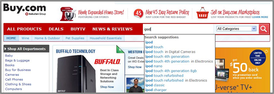
Offer Auto-Predict Results in the Internal Search Box
An increasingly common, smart way to improve the usability and power of your internal site search tool is to offer auto-prediction results in the search input box, much as Google now offers for their search input box on their website.
This functionality allows users of your search tool to get search suggestions while they type, helping them to understand what they might want to search for, and also to make it more efficient and quicker to enter their search query.
Figure 5-12 shows an example of auto-predict in action on Buy.com.
Therefore, try to introduce this auto-predict functionality into your internal search tool box, either by upgrading your tool or by building this functionality into it.
Figure 5-12: Example of auto-predict in a search entry box
Ensure Search Box Default Word Content Disappears When Users Begin Typing There
You need to make sure that when a user begins typing into your internal site search tool box the default word content disappears. For example, many internal search input boxes contain default words like “keyword” or “type search here” or “search.” If this doesn’t happen, it results in them struggling to easily enter a search term in the box, and often results in bad search results due to it also containing the default search box words. This can potentially cause them to prematurely leave your website out of frustration.
Add Additional Search Filter Functionality for E-commerce Search Boxes
If you have an e-commerce website, you should add search filter options next to the input box to allow visitors to search within particular product categories.
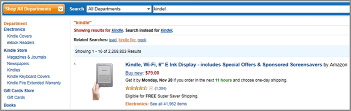
This helps the visitor refine their search to only a particular category that they are interested in and will help them find what they are looking for more quickly. You should offer this by showing a filtered drop-down menu adjacent to the search box, adding options to search within the music or electronics sections of your website for example. Amazon.com does a great job of offering this, as you can see in Figure 5-13.
Figure 5-13: Example of adding search filter boxes

Thursday: Optimize Your Internal Site Search Results
Many website marketers and owners think it is good enough to simply offer an internal site search tool and often don’t pay much attention to the actual results it generates for visitors. Far too many websites’ internal search results lack relevance and quality or just inundate the search user with hundreds of results to weed through. Therefore, today you will learn some best practices to ensure a positive visitor experience with your search results, and help increase engagement levels and conversion rates from these searchers.
Offer an Advanced Internal Site Search Option
Rather than just offering a basic search tool box on your website that only lets visitors search by keyword or only a few search criteria, you should give your visitors the option to run an advanced search to find exactly what they are looking for much more easily.
This advanced internal search tool should offer a greater number of search criteria, for example by content category or price range, and the ability to do Boolean searches that allow visitors to use “and,” “or,” and “not” logic. For an example of a website with a good advanced search tool, take a look at Figure 5-14, which shows the Advanced Search page at Cars.com.
Figure 5-14: Example of a good advanced search page
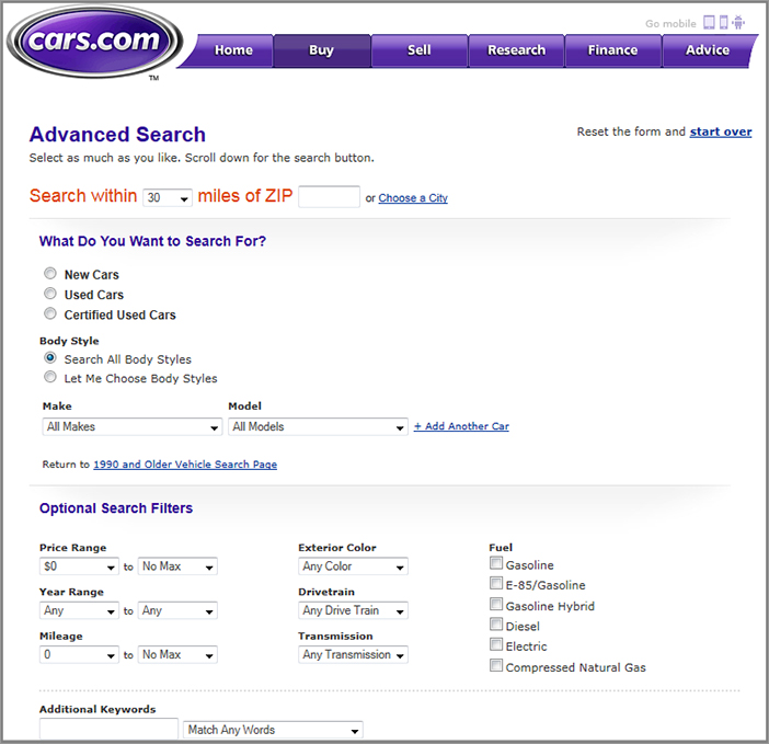
So that your visitors can easily find and use this advanced search page, ideally you should have a link to this advanced search right next to your search input box.
It is particularly important to offer this advanced search tool on websites that are very search driven, such as websites where visitors are searching for something specific like a car to buy, a place to live, or someone to date. If you don’t offer advanced search options on websites like these, visitors may get frustrated and go to a website that has better search options instead.
Use Featured Keyword Results to Promote Conversion-Related Items
When a visitor runs a search on your website, this shows an increased amount of engagement with your website. Therefore, it’s a good opportunity to try and influence what they click on next in order to help increase conversion rates on your website.
You can take advantage of this by showing featured keyword listings that promote items that will increase the chances of them converting (but still relate to what they were searching for). For example you could show them promotional products or ones that are on sale relating to their search query.
These featured promotional searches should be shown in a separate box at the top of the search results. However, don’t go over the top with usage of this, and always make sure what you are promoting is relevant to what the user has searched for; otherwise, you may risk them getting alienated or frustrated by what you are trying to promote to them.
If your current internal search tool doesn’t offer this functionality, you should consider upgrading your tool to one of the advanced tools discussed earlier that has options for this, such as Adobe Search&Promote.
Make Sure Your Internal Search Tool Adjusts for Spelling Mistakes and Acronyms
You should understand that your visitors might not always know how to spell what they are looking for or know the most common name for what they are looking for. Rather than not showing any related search results when this occurs and risk potentially losing your visitor because they didn’t find what they are looking for, you should optimize this. This involves building logic into your internal search tool that recognizes common misspellings and acronyms and then shows results for the corrected search results instead. Most good internal search tools will offer this great functionality.
Figure 5-15 shows an example of how auto-correction is used on Amazon.com.
Figure 5-15: An example of auto-correcting a misspelled search entry
Make Sure Your Tool Includes Customer Support–Related Keywords
Many website visitors use internal search to try and obtain information about support topics but often fail to get related results that they are looking for and potentially leave your website. This is because often internal search tools are only set up to crawl and index products and services and not additional help articles or forum topics.
Therefore, you need to make sure you have relevant results for common customer support keywords like “shipping,” “phone number,” and “returns.” Most internal search tools should allow you to choose what you would like to crawl and include in your search results, and if you cannot do this, I suggest you upgrade your search tool.
Allow Visitors to Refine Internal Search Results to Find What They Need
The next thing you need to do with your internal search tool is to make sure that users can easily refine their search results to narrow down and find exactly what they are looking for. This is because your visitors will often search for something broad first and then want to narrow it down by filtering the results by price or subcategory for example.
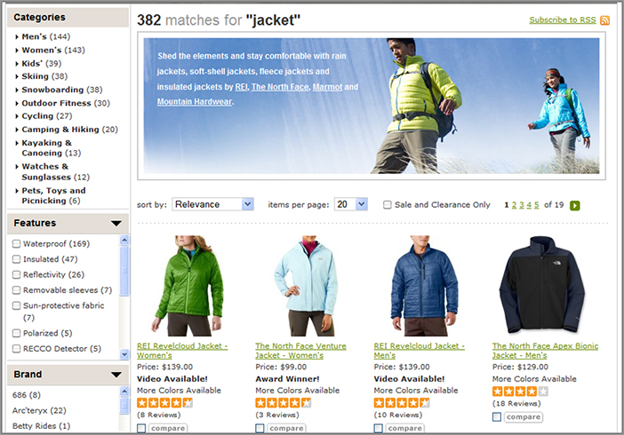
This is best done by offering search-refining filters in the left-hand rail of your search results page—for example, by category of the search results or by the newest first. You should also include a search box at the top of the search results page that allows visitors to search for something else or modify their search keywords. In Figure 5-16, you can see that REI.com does a great job with this in their internal searches and also offers a featured result area right at the top of the search results.
Figure 5-16: Good example of search results filters
You should also allow your visitors to customize how their search results are displayed, including the option to change the number of results shown per page. Depending on if your internal search is very product oriented, you should also give your visitors the option to show the search results in a grid format instead of a more traditional list view. You can also learn much more about how to optimize e-commerce search results and browse pages in Chapter 7.
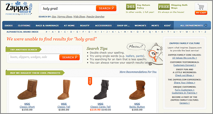
Don’t Let Visitors Dead End If There Are No Site Search Results
When a visitor runs an internal search that has no search results, you should always show them a few recommended options or next steps instead. This increases the chances of them clicking on something on your search results page and not abandoning your website because they couldn’t find what they were looking for.
For example, you should show them something they might be interested in, like your most popular content or categories on your website. As an example, Zappos.com is very good at handling an internal search that has no results, as you can see in Figure 5-17.
Figure 5-17: Handling an internal search with zero results
Therefore you should test making some improvements to your internal search results page by adding additional useful links if no results appear.
Friday: Analyze Your Top Internal Keywords for Additional Insights
Not only is the internal search tool an essential navigation method for your visitors, their keyword search queries also form a goldmine of information to help you better understand visitor behavior and intent. These insights can then help you form better test plans to optimize your website.
If you aren’t currently tracking what your visitors are searching for on your website, then you are going to be missing some great additional insights. Therefore, today you will learn how to analyze your keyword search reports to gain better insights.
Ensure You Are Tracking and Reporting on Your Internal Keyword Searches
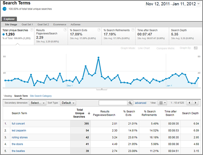
First of all, in order to analyze and gain insight from your visitors’ internal keyword searches, you need to make sure all of the internal keywords being searched for are being tracked by your web analytics tool. This is configurable in most good web analytics tools and is usually tracked by signifying a URL parameter that contains the keyword that was searched for. For example, if you use Google Analytics, follow the instructions at www.google.com/support/googleanalytics/bin/answer.py?answer=75817&topic=12627 to set this up.
Once you have set up this tracking, you then need to run and monitor reports for the top internal search keywords on your website. This is usually fairly simple to do in most analytics tool by running a fairly standard report. For example, in Google Analytics you need to run the Site Search Overview report, which is found under the Content report section. See Figure 5-18 for an example of this report.
Figure 5-18: Example of a top internal searches report
Check for Popular Internal Search Keywords That Yield Poor Results
When you are looking at your internal search keyword reports, just having some very popular internal searches doesn’t mean users are happy with the results that are generated when they search for these. Sometimes they will be searching for something that yields either none or very few results or results that have low relevance or quality. When this occurs they will be frustrated and may often leave your website because they can’t find what they are looking for.
To understand and gain insight into this, use the internal search tool on your website to search for your top keywords shown in your report and check if any of them yield zero, few, or poor search results. If you find keywords like this, it usually means one of two things. First, it can mean you need to create additional content relating to these search keywords so that it better satisfies your visitors’ search queries (and these keywords can often provide great ideas to expand what your website should offer).
Second, if these poorly performing keywords are not relevant to what you offer on your website (or plan to offer), it can be an indicator that your visitors are confused about what your website offers and expects to find. If this occurs you should try to address this by explaining better to your visitors what they can find on your website.
Another good simple indicator you can use to see which of your keyword searches may have poor results is to look for the number of visitors that immediately exit after searching for a keyword. In Google Analytics this is known as the “% Search Exits” metric, and is shown as standard on their internal search reports. The higher this percentage for a keyword, the more likely it offers zero, low, or poor quality results.
Check for Page Locations That Result in Most Internal Search Usage
You can also gain some great insight from looking at which pages your internal search is most often used on and the corresponding keyword searches that are run on them.
For example, if your product page has many searches run from it, this could indicate that your product page isn’t giving all the information that visitors need and that you should test placing the missing information on it that they are searching for. This should result in higher visitor satisfaction with the product page and higher conversion rates.
In most web analytics tools you can find which pages your internal search is mostly common run from to find these insights. In the example of Google Analytics, you can find this by running a report called Search Pages to see a list of top pages that your internal search is used on.
Make Content Relating to Your Top Keywords More Prominent
Internal search reports can also provide some valuable insight into what content you need to make more prominent for visitors on your website. If you see keywords heavily dominating your top-searched keyword reports, this is a good indicator of your most popular content that relates to these.
Therefore, you should consider testing making links to the related pages of these keywords more prominent on your website, for example, by adding them to your main navigation and top entry pages. By doing this, visitors who don’t use your internal search can find this very popular content without having to run a search, and you may increase engagement and give your conversion rates a slight boost.
Understand Influence of Internal Search Usage on Conversion
One last good but advanced thing to do with your internal site search data is to help you understand how influential your internal search is on your conversions.
This can be done by setting up a visitor segment in your web analytics tool for any visitors who run an internal search on your website (usually defined by someone seeing your internal search results page). You can then see the conversion rate for this segment of internal search users and compare it to the overall conversion rate for all of your visitors. Refer back to Chapter 2 to learn more about how to set up visitor segments like these.
If you see a much higher percentage of visitors converting when using your search tool, you should make your search tool even more prominent on your website. This would result in more usage of the tool, and because these users convert higher, there would be an increase in conversion rates for your website. To make it more prominent you could make your search box slightly bigger and more obvious, or add additional search boxes to more visible areas on common entry points like your home page.