
Chapter 6
Learn the Power of Influence and Persuasion on Visitors and Conversions
Visitors to your website are not robots—they are real people with real emotions, feelings, and thoughts, and they do things on your website for a reason. In this chapter, you will gain a more thorough understanding of these reasons and what makes your visitors click, so that you can better influence and persuade them to convert for your website goals.
Chapter Contents
- Week 15: Influence Your Visitors by Optimizing Your Calls-to-Action, Headlines, and Text
- Week 16: Influence by Optimizing Your Images, Promotions, Videos, Rich Media, and Advertising
- Week 17: Harness the Power of Social Proof, Reciprocity, and Scarcity
- Week 18: Influence by Making Your Visitors Feel Safer and Building Trust
Week 15: Influence Your Visitors by Optimizing Your Calls-to-Action, Headlines, and Text
You are probably spending considerable effort and money attracting visitors to your website, but how do you better influence them once they arrive and get them to do what you want them to do? This week you will learn more about this and focus on improving your usage of calls-to-action (CTAs), headlines and text to influence and convert more of your visitors for your goals. This week is one of the most important to understand and utilize in this book, because these elements are often some of the biggest influences on the conversion rate and success metrics on your website.
The marketing principles of AIDA, which describe the key phases that a potential buyer goes through (attention, interest, desire, and action), are particularly appropriate to use and influence this week, because you can use your headlines, subheaders and text to attract attention, raise interest and desire, and then use your CTAs to influence your visitors to take action (where the all-important conversion point occurs).
Monday: Review and Optimize Your Headlines and Subheaders
Your headlines and subheaders are often one of the few things that a visitors’ eye will be drawn to and read on your web pages first. This is because they stand out more than other text, and are usually found in the first part of the F-shape reading pattern that you learned about in Chapter 5.
If they are not compelling and don’t engage your visitors to want to continue reading, then there is a smaller chance they will stick around and convert for your goals (this is particularly true for first-time visitors). This is therefore going to have a seriously negative impact on your conversion rates.
Today you’ll learn some great best practices to optimize your website headlines and subheaders in order to better engage and convert your visitors.
Keep Your Headlines and Subheaders Simple and Concise
First you need to make sure your headlines and subheaders aren’t too long. Ideally your headlines should not span more than one line and definitely be shorter than 40 characters, but your subheaders can be slightly longer (ideally less than 80 characters though).The shorter you can make any of these the better because it will make it easier and quicker for your visitor to read and understand them.
You should also try testing simple direct statements for your headlines and subheaders, because they can often work better than clever or elaborate ones that your marketing team may have created.
To test the impact of improving these, come up with a few simpler and shorter variations on your current headlines and subheaders and run a test to see which ones perform better for lifting engagement and conversion rates. For an example of direct and short headline or subheader, see the HubSpot.com landing page in Figure 6-1.
Figure 6-1: Example of a short and direct headline
This is particularly important to do for any pages that are associated with your conversion goals such as product pages, and also your home page.
Pose Provocative Questions
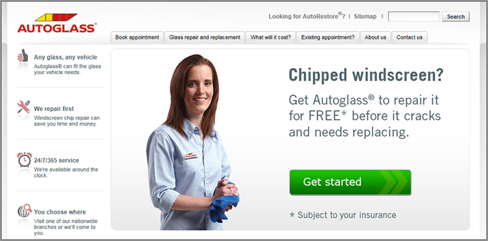
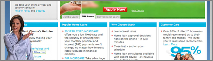
To spike the interest and curiosity of your visitors, you should test posing provocative questions for headlines that relate to them (for example, “Unsatisfied with your website conversion rates?”). These are more likely to catch the visitors’ eye and get them reading the rest of your page content.
For a good example of this in action, see the Autoglass.com home page in Figure 6-2, which asks “Chipped Windscreen?” as a strong way to influence their visitors to click on their auto glass repair CTA. Go ahead and put yourself in your visitors’ shoes and think of common questions that they might have, and then try testing a few of these in the form of headlines on your pages to see which ones engage and convert better.
Solve for a Need
You will get many more people reading your pages if your headlines solve one of your target audience visitors’ likely common needs. Again, try putting yourself in your visitors’ shoes and think of what needs they will likely have, and then test a few different variations for your headlines. For example, you could test using something like “Reduce the Bounce Rate of Your Home Page in 5 Easy Ways.”
Figure 6-2: Example of a provocative question headline
Try “How-To” Wording
Visitors are often more engaged with headlines that offer to help them do something, particularly in the form of “how-to” guides. You should test changing a few of your headlines to this type instead, and you should also test incorporating step numbers into the headline. This makes it sound easier to understand and digest for the visitor. For example, you should test styles of headline like “How to Easily Lower Your Cable Bill” or “5 Steps to Improve Your Email Productivity.”
Create a Sense of Urgency
Another tactic to test using on your headlines and subheaders is to create a sense of urgency in the wording of them. This will often make your visitors act and convert more quickly because they will fear they are going to miss out if they delay. This works particularly well if you are selling a product or service.
If possible, in the wording try and use specific numbers of stock items that remain, or specific time frames that remain, as this adds more realism to how scarce they are. For example, you could use something like “Act Now Before This Limited Offer Ends on December 31” or “Hurry, Only 3 Left in Stock.”
Personalize Your Website by Using the Visitor’s Name and “You” Wherever Possible
Studies have shown that people love seeing their name and respond better to something that includes it than something without it. To take advantage of this you should test personalizing your website and your emails by adding the reader’s name into the header or subject line. This will increase the chances of them engaging with it and reading more. In addition to this, test adding references to “you” in your website or email to make it more personable instead of using “us” and “we.”
Here are some examples of headlines and subheaders that make them seem more personal: “Dave, are you ready to improve your website?” and “Emily, have you seen our latest hot fashions yet?” You will learn more about this text optimization tactic and others on Friday of this week.
On Headlines for Paid Search Landing Pages Repeat Wording from the Ad Just Clicked On
To increase the chances of your visitors engaging and converting after clicking on a paid search ad, on your paid search landing pages you should test repeating and using some of the wording from the ad in the headline on your pages. This helps ensure continuation of messaging—if you don’t do this and your ad doesn’t relate well to your landing page you will lower your chances of converting visitors.
This can sometimes be achieved dynamically using your testing tool to pull this wording from the ad and show on your landing pages—please consult an optimization and testing expert in order to try and run this advanced technique.
Tuesday: Review and Optimize Your Call-to-Action Buttons and Links
After you have engaged your visitors to stay on your page by utilizing better headlines and subheaders, next you need to persuade them to take action by using influential calls-to-action. These usually come in the form of buttons or links, and their action should be aligned to convert for your website goals and use cases.
Your CTAs often have one of the biggest and most critical impacts on your conversion rates, so it’s essential that you spend considerable time testing and improving them. Therefore, the rest of this day is going to focus on best practices for them.
Make Sure Your CTAs Are Optimally Located
It is very important to always suggest what your visitors should do next on your pages—don’t just leave it up to them to decide and risk them leaving your website. To influence this, you need to place your CTAs in several key areas of all your pages.
The first key area to place them is high up in your main content area, above the page fold (as discussed in Chapter 5). This increases the chances of them being seen—don’t just bury them away at the bottom of your page or in the sidebar of your website. This is particularly important for your pages that relate to your conversion goals, like product or service pages.
Next, if you have an e-commerce website, your CTA buy buttons should not only be placed on your product pages above the fold, but your buy and learn more CTA buttons should also be placed next to anywhere you list a product on your homepage, category, browse, and search results pages.
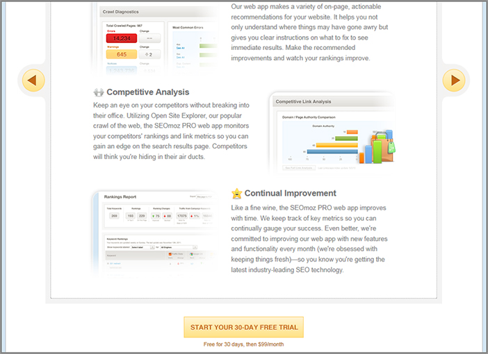
Then if you have longer article, lead generation, or service pages, you need to make additional use of them at the end of these pages. This is because your visitors’ eyes will often end up there after they read the page so it is a logical place to show them options for what to do and click on next. For a good example of this, see Figure 6-3 for how SEOmoz.com does this on their longer service description page.
Therefore you should go ahead and review your website for your current usage of CTAs, and then run tests to move the location of them to try and increase conversion rates. This is particularly important to do on your home page and pages that relate to your conversion goals like product and service pages.
Figure 6-3: Example of a good CTA at the bottom of a service page
Test the Format of Your CTAs
How you format and present your CTA buttons also has an extremely big impact on your conversion rates. You should therefore spend considerable time testing different variations of the size, style, color, and wording of them to get the highest conversion rates possible. Here are some important elements to test:
CTA Size
Many websites make the mistake of having very small CTA buttons or links that don’t attract visitors’ attention. Make sure they are big enough for your visitors to notice, but don’t make them too big and obnoxious. As a guide, you should aim to balance the size of your CTAs with the rest of your supporting copy and website elements on each page.
I definitely suggest you test increasing the size of your CTAs to make them slightly bigger, as this is often a quick and simple way to increase conversion rates.
CTA Style
There are several tactics for you to test regarding the style of your CTA buttons and links. Here are some things you can try testing, with some examples in Figure 6-4.
- Test using a button versus a link for your CTA, and vice versa. Don’t just presume one will work better than the other.
- Test using a button with an arrow in the design of it to help draw the visitors’ eye.
- Test adding other icons in the design of buttons to help stylize and make it stand out.
- Test using a button with a beveled effect or a shadow so that it stands out more, which helps make the button look 3D versus flat.
- Test using a rounded rectangle for a button (or even more circular shapes), as this style gives more of an impression of a button and makes them more intriguing to push.
Figure 6-4: Example of different CTA button styles

CTA Color Scheme
Here are some best practices to use when testing the colors of your CTA buttons:
- You should test making your button colors stand out from the rest of your color scheme, but don’t make them clash or become too garish.
- Greens, oranges, and more neutral colors should be tested, but test many other versions of colors too because sometimes even basic colors like gray can lift your conversion rates.
- Although some experts say to stay away from using red buttons because that color is associated with danger and warning, sometimes using it can have positive results on conversions and is worth testing.
- Don’t go for subtle variations of colors; always try and come up with a few bolder variations to test against, as these radical changes often stand out more and can have a higher potential impact on your conversion rates.
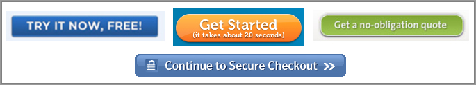
CTA Wording
The wording of your CTAs is one of the key things to help trigger action and the all-important conversion, and, depending on how well you use them, can have a major impact on your website conversion rates. Here are some best practices, along with examples in Figure 6-5 to use in your CTA tests to help lift your conversions:
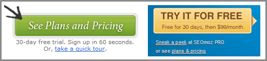
- Rather than using very generic and uninspiring words like “submit” or “click here” on your buttons, you should test making the wording action-based instead. You could test using words like “get started,” “start your free trial,” “try it for free,” or “see our low-cost plans.” Using words like these can often make a huge difference on your conversion rates.
- Test adding additional supporting text right onto your button to help convey benefit or reduce risk. This text should be smaller than the main CTA wording, and adding this can often help increase conversion rates.
- Don’t just make small changes to your CTA wording, and ideally you should try testing three to five significantly different versions of button wording.
- If you are using paid search landing pages, you should also match your CTA wording on those pages with the wording in the ad that was seen prior to your visitor arriving on them. This way you help to continue the messaging from the ad they clicked on and help increase conversion rates.
Figure 6-5: Example of different CTA button wording
If you run into issues from your web design or branding teams not allowing you to test variations of your CTAs using these best practices, refer back to Chapter 3 where you learned ways to help overcome these.
Wednesday: Learn Other Best Practices for Improving Your CTAs
Today, you’ll learn about some other CTA best practices that you can test using on your webpages to help increase your conversion rates:
Emphasize the More Important CTA Buttons If You Have Multiple Types per Page
If you have CTA buttons for multiple things on one page, you need to prioritize and put more emphasis on the ones that are going to entice visitors to complete your most important website goals. Don’t just give them all the same size and treatment, even though it might look nice in terms of website design, because it will confuse the visitor as to which one they should click on.
Make Sure Your CTA Buttons Are Legible and Easy on Your Visitors’ Eyes
On your CTA buttons and links, you definitely shouldn’t use fonts that are smaller than 10-point size, because visitors will find them harder to read and they won’t stand out very well. Ideally, your CTA text should be bigger than your regular page text.
You also shouldn’t use nontraditional fonts or colors that are hard to read—stick with common fonts like Verdana and Arial and colors that are not garish or loud. In other words, don’t let your web designers use trendy looking fonts and color combinations, because even though they might look cool to them, they can often have negative effects on your CTA click through rates, and thus your conversion rates.
Therefore, to see which ones convert better, try creating a few different CTA buttons that feature bigger text and are more easily readable.
Test Placing Risk Reducing or Benefit Statements Next to CTAs
Another thing you should test is placing small wording right to the side of or below your CTAs that reduces the risk of purchase and better explains the main benefits of doing so. This is good because it can often help propel the hesitant customer forward and improve conversion rates further.
Here are some examples of this risk-reducing and benefit-highlighting wording that you should test placing next to your CTAs, with some examples of buttons in Figure 6-6 that use this great tactic:
- It’s free!
- Money back guarantee included.
- No commitment needed.
- No credit-card details required.
- Takes less than 60 seconds.
- Your transaction is 100% safe and secure.
Figure 6-6: Examples of CTA buttons with risk reducers and benefits
Look for Inspiration on Your Competitors’ Websites and Google Search
To find inspiration for your CTA tests, you should look around some of your competitor websites and see what they are doing with their CTA buttons and links. Don’t blatantly rip off the same wording and styles from them though, as this is likely to cause problems.
For other CTA messaging ideas, try running a Google search for terms relating to your website to see how other competitors are phrasing things in their search results.
Based on all these best practices for improving your CTAs, go ahead and create some more variations on your current CTA buttons and links and start testing to see which have the best impact on your conversion rates. You should be able to increase conversion rates by a couple of percentage points at the very least, and you will check the impact of these in the final chapter. Don’t forget to involve your marketing team on coming up with these variations, as they will often have great ideas to increase conversion rate lift even further.
Thursday: Shorten Long Sections of Text and Convey Key Points
Over the next couple of days, you will learn some best practices to optimize one of the simplest conversion influencers of your website, and that is your website’s text.
First it’s important to understand that website visitors don’t read text on websites the same way they do on other media like newspapers and magazines. Instead of reading all of the text on pages, they will typically scan them to see if they can find what they’re looking for, and then, if they’re interested, they might read more. Therefore, today you will learn how make it easier for visitors to scan and be engaged by the text on your web pages.
Shorten Long and Dense Sections of Text
To help your visitors read and scan your content more easily you should review your website for any particularly long and dense blocks of text and make them shorter and easier to read—short, chunked paragraphs work the best.
To do this, test taking out any unnecessary wording to help reduce the word count (to help you do this, think whether each paragraph is really needed by putting yourself in your visitors’ shoes). To reduce the amount of text per page you could also test splitting your text up into multiple pages and have pagination links at the bottom of each page in the article. Doing this will also help increase page views per visit for media websites and helps increase ad revenue.
This is particularly important to test and improve on your home page and top entry pages, as long blocks of text on initial entry pages will not engage your visitors very well and will increase the chances of them bouncing from them prematurely.
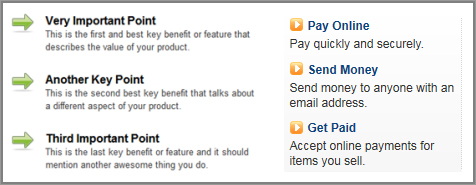
Convey Key Points Using Bullet Points
Another great way to optimize the usage of text on your website is to make use of bullet points instead of blocks of text, particularly when conveying benefits or highlighting something important. This helps make your content easier for your visitor to digest, and helps better convey your more important wording. So go ahead and look through your website and see what text you could possibly try testing turning into bullet points instead.
Ideally, you should make the wording for each bullet point fairly short, and not longer than one or two sentences. You should also restrict your sets of bullet points to less than five per section, because if you are using any more than this you lose your ability to emphasize the more important bullet point contents. You should then test the order of them to see which points resonate most with your visitors and improve conversions.
You can also test stylizing the bullet point icons to make them stand out more (try using arrows or stars at the beginning of each bullet point). Another thing you can test is the usage of elements of bold and different font colors within each bullet point text.
Figure 6-7 shows a great example of a bullet point list style to test using on your website text that incorporates all these best practices, and a great one being used on PayPal.com.
Figure 6-7: Examples of bullet point style lists
Use Other Ways to Emphasize Important Words and Points
In addition to condensing your text and making use of bullet points on your webpages, you can also use some best practices to draw visitors’ eyes to particularly important words on your website. These words should be the key ones that are associated with trying to convert your visitors, like benefits or risk reducers, for example. Here are some best practices to try testing on your web pages:
- Test using bolded font, italicized font, and different font colors to draw the eye.
- Test using yellow text background highlights to help draw the eye better, just as if you were using a yellow highlighter pen when taking notes on paper.
- Try using hand-drawn arrows, underlines, circles and asterisks, and even hand drawn signatures (these can work particularly well on long lead generation or product sales pages, but don’t overuse them).
Friday: Make Sure Your Website Text Is Easy to Read, Understand, and Relate To
The next thing you need to do to optimize your website text is improve the style and voice of your writing and make it easier for visitors to read, understand, and relate to. This will help increase the chances of them being influenced and engaged by it. Today you will learn some great ways to do this with your website, which will also work well on your email campaigns too.
Focus Your Text on Your Visitor, Not Your Website
First you should make your text more centric around your visitors and their needs and not around you and the owners of the website. This has the effect of making your text less sales-like, and more personal and relatable to your visitors, ultimately helping to persuade and convert them better. Many websites make this mistake with the voice of their text, but luckily it is a fairly simple one to fix.
The best way to fix this is to review your website text, and test changing your text to focus on words that relate to your visitor like “you” and “your” rather than words that relate to the owners of the website like “we” and “our.” Here are a couple of examples of saying a similar thing both ways; which one would engage you more? I’m sure you would choose the second one, as your visitors probably would too.
- Website owner voice: “Our website features the best new products that we proudly created.”
- Website visitor voice: “You will love the new products here designed to benefit you.”
An additional tactic you can try is using their name if possible. If the visitor is logged in to your website and you know their name, you should test dynamically combining their name with key parts of your text. Here is a simple yet effective welcome message that includes the visitor’s name and visitor centric text: “Welcome back Dave, You will love the new products here designed to benefit you.” This tactic works very well for personalizing email subject lines too.
Focus on Benefits, Not Just Features
To help focus your text even more on your website visitors, you should add text that explains the benefits of using your website, products or services, not just the features of them. This often has a great impact on improving conversion rates.
This is important to do because features can sometimes not provide much meaning if there is no context or the visitor doesn’t understand the need for the features. Examples of benefits are if your website offerings meet a need or save the user time.
So that you can understand the difference and power of using benefits, Table 6-2 gives you a few examples of benefits and how they differ from features.
After you have understood this, you should create a few examples of benefits for using your website and products and then test placing them prominently on your website.
Table 6-2: Examples of features versus benefits
| Features | Benefits |
| Available in small, medium, and large | Saves you time |
| Available in 3 different colors | Customizable to meet your needs |
| Comes with 5 premium tools | Lasts longer than other brands |
| 10 megapixel zoom | Reusable |
Simplify Your Website Text and Make It Easier to Understand
To make your text even easier for all types of your visitors to understand, you need to simplify the language level you use for your text. To do this you should aim to use a level that will appeal to the most common level of language of visitors to your website. Doing this ensures that the bulk of them will understand everything that you are talking about on your website and increases the chances of them being influenced by it and not alienated by it.
A good best practice is to use high-school level language on your website and to avoid business school language. This also includes the removal or translation of any industry jargon or “techy” sounding words that you might have on your website.
Go ahead and reread the text on your website, put yourself in your visitors’ shoes, and ask yourself, “Will most of my visitors understand what we are talking about?” After you have identified any language they might not understand, test either simplifying the text or removing it. While doing this in isolation won’t impact your conversion rates very much, when combined with other text best practices you have learned here, it will likely increase your conversion rates.
Optimize Your Font Colors and Sizes
It’s important to realize that your choice of font size and color can have an impact on your conversion rates and can easily be optimized. Too many websites make it hard to read text by having font size that is too small or poor choice of text color on background colors, potentially causing visitors to prematurely exit.
Best practices here include providing high contrast between your text and the background color (for example black text on white background is easier on the eye and better than gray text on black background), and not using a font size smaller than 8 point because this will cause friction for visitors and increase chances of them not reading and leaving your website.
You should also test increasing the line spacing of your paragraphs to 1.5 lines. This should add to the readability of your text and help increase the chances of visitors reading it.
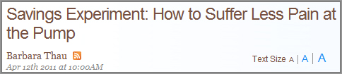
If your website is a media or publishing site with many articles, you should add a text resizing option at the top of your articles. This is particularly useful for older readers, and for visitors who are looking at your website on a mobile device (due to smaller screen resolutions). Figure 6-8 shows an example of how to show this text resizing option at the top of an article page.
Figure 6-8: Example of a text resizing tool on article pages
Week 16: Influence by Optimizing Your Images, Promotions, Videos, Rich Media, and Advertising
This week is going to focus on optimizing your usage of images, videos, rich media, and advertising to help influence visitors on your website, because combined, these factors can often have a significant impact on conversion rates without you realizing it. You will learn several best practices this week to help improve your usage of these and help to engage and convert your website visitors better.
Monday: Optimize Your Usage of Images
Far too often, websites use too many images, use ones that are not needed, and don’t make use of images correctly when they are most needed. A great photo used in the right place can be worth more than a thousand words, yet a poorly used photo in the wrong place can actually have a negative effect. Today you will learn some best practices to apply to your images to help better influence and convert your website visitors.
Limit Your Usage of Images
First, you need to avoid using too many images per page. If you are using more than four images per page, it is likely to clutter the page and confuse the eye flow of your visitors, making it hard for them to understand what to look at first. This may result in them prematurely abandoning your website. This is particularly important to avoid on your home page, as visitors will unfairly judge the rest of your website based on this.
Test Key Image and Photo Elements
Next, you need to see whether your usage of images and photos on your website actually adds value for your visitors and aids in converting them to any of your website goals. What you show in them and the size of them, can have a significant impact on this. Depending on what you are trying to achieve with each one, and what message you are trying to convey, you will need to test many elements of them. So instead of just picking photos and images by gut feel and intuition, here are some things that you should test when selecting and using them:
- Gender
- Age
- Ethnicity
- Apparel (for example, business attire, academic, or casual)
- Facial expression (for example, smiling versus looking confused)
- What they are doing (for example, sitting, pointing, or shaking hands)
You should also consider doing a professional photo shoot to get some quality photos of exactly what you are looking for. While this is not usually cheap, it is certainly worth the investment to help improve photos and influence and impress your visitors better.
Pay Attention to Your “Hero Shots”
Hero shots are large website images or photos that usually focus on marketing a product or service and are usually designed to convey an offer or engage visitors further. They are usually used on key pages like the home page, often in the form of a slideshow rotator that a visitor can click through or watch it scroll through automatically. These rotators are great for featuring more than one thing at a time in this hero shot area.
Unfortunately, the usage of hero shots is often abused, and all too often a poor choice of hero shot detracts from other more important CTAs on the page.
However, a carefully selected hero shot in the perfect spot can help support your call-to-action and get your visitors to convert for your goals much more quickly. Here are some things to test regarding your hero shots to help you improve them:
Figure 6-9 shows an example of well-designed hero shots within a short image rotator, with overlaying text and a good CTA.
Include More Photos or Screenshots of Your Products or Services
If you are selling products or services, you need to allow your visitors to see many photos or screenshots of them. This will help your visitors visualize what your product or service looks like better and increase the chances of them buying it. Just having one photo certainly won’t be adequate, and some of your better competitors will most likely have more.
On product pages, you should show one main photo, with thumbnail photo links below it to allow your visitors see more photos of it (ideally, at least three more; around ten is good). You also need to have photos that focus on specific features of the product, and ideally have images of it in use by the consumer (for example, wearing it or using it).
Figure 6-9: Hero shots in an image rotator
If you don’t have enough photos of your products, as discussed earlier, consider doing a photo shoot to get some that meet these best practices just mentioned.
On service pages, you should show at least three screenshots that each convey a major feature of your service (more depending on how many features you need to convey).
Your Product Photos Should Allow Visitors to Zoom and Interact
Remember that websites have an immediate disadvantage over traditional stores in that website visitors cannot pick up an object to examine it better. Therefore, rather than just showing one sized image for your products and hoping that satisfies your visitors, you should at the very least allow the visitor to zoom in to see a bigger version of the photo by clicking on it.
Ideally you should take this a step further and let your visitors zoom in on different elements and parts of the product. This can be done by using a pop-up that magnifies the area of the photo the visitor is hovering their mouse over. Make sure you use a higher quality image when zooming in—this zoom-in view shouldn’t be blurry. Figure 6-10 shows an example of this type of product zoom in action.
Bear in mind there are also some tools out there than can help automate this photo manipulation and resizing process, such as Adobe Scene7 (www.scene7.com).
To take this image viewing even further, you could try and offer a way of panning around the image so the visitor can see more angles of the product. While this is usually costly to implement, this is particularly important if you are selling products that are high fashion or have many product features that need to be shown and emphasized. Selling cars online is the perfect example of when this is needed most.
Figure 6-10: Example of zooming in on different areas of an image
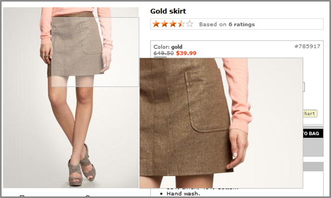
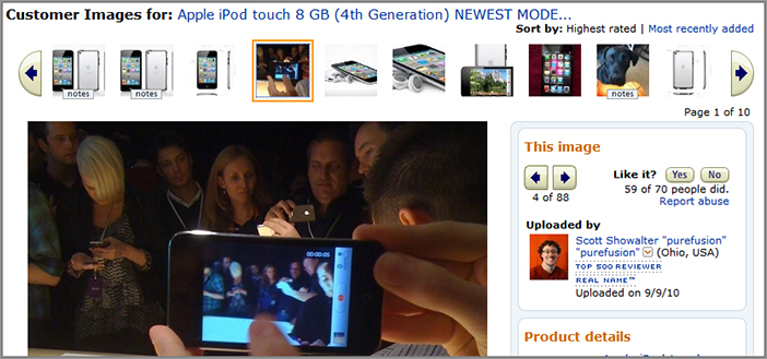
Allow Visitors to See User-Submitted Photos of Your Products
You should also consider showing visitors photos of your products taken from other visitors and offer options for them to submit their own photos. Not only does this help with increasing the number of photos you can show, but it also helps improve the social proof of your product and increase the changes of it being purchased. This is because if visitors see many other visitors using the product, it will increase the chances of them buying it (as discussed earlier).
It’s also good to allow visitors to submit photos because sometimes they will take and upload better (or more unique) photos than those you currently have on your website!
Amazon.com does a particularly great job of offering this, as you can see in Figure 6-11.
Figure 6-11: Example of offering user-submitted photos
Tuesday: Optimize Your Promotional Banners
One of the simplest and easiest ways to influence what your visitors click on your web pages is to create and promote banners relating to your conversion goals. These could be in the form of promoting your hot new product, a free download, or showing your latest deal, and you should be making use of several of these on your website to help drive conversions.
These promotional banners are excellent candidates to test and optimize to improve click-through and conversions. Today you will learn how to do this by combining many of the best practices found in this book already and some new ones. And when creating versions to test, you need to remember to go for some more radical changes instead of subtle changes, because this will improve the chances of bigger conversion rate lifts.
Test the Contents of Your Banners
What you actually show in your promotional banners will have the biggest impact on visitor engagement and conversion levels. Therefore, you need to test many different versions of the following elements to find the one that works the best:
Test the Overall Style of Your Banners
After you have figured out what you want to test in your promotional banners, you need to think about the overall style of your banners, and come up with a few versions to see which engages and converts the most—for example, the color scheme, whether it looks 3D or flat, and the border of the banner. This is where you will need to have great web designers to come up with a few engaging styles for you to test.
Test Animated versus Static Banners
Using animations in your promotional banners is important to test. Done well and selectively, this can help draw the eye and engage. Done poorly, it can irritate and cause your visitors to leave your website if you have too many per page. Ideally you should limit your animation to two or three animation steps and carefully plan the series of them so they end up with a great CTA on the last slide. The animation should auto-repeat, just in case the visitor missed it initially (important if it’s not immediately seen above the fold).
Go ahead and come up with a few animated versions of your banners and test to see if they engage and convert better than static ones.
Test Location and Size
Next, you need to test the optimal location to place your promotional banners. First, they should be fairly contextual and relate to the page they are found on. You should also test the size of them, because if they are too small, they may go unnoticed, or if they are too big, they may overpower more important content and CTAs on your pages. Go ahead and use a real estate test to check for the best conversion influencing areas to show your promotional banners, then do follow up tests on the actual size of them.
Use Content Affinity Targeting for Your Banners
In Chapter 4, you learned about the power of using affinity targeting to increase relevance of your content to your visitors and to get great conversion lifts. This is an excellent thing to test doing with your promotional banners on your home page and category pages and will increase the chances of your visitors engaging and clicking on them. Refer back to Chapter 4 for how to do this.
Use a Tool to Automate Creation of Your Banners
Designing many different versions of promotional banners to test often takes a considerable amount of time and cost and results in many different versions to manage. To relieve these issues, you should consider using a good asset management and manipulation tool like Adobe Scene 7 (www.scene7.com).
This tool dramatically improves these issues by dynamically changing elements of banners including text and images without needing to actually create separate files. The tool then tests them to find the best combination that most engages or converts your visitors.
You can also integrate it with Adobe Test&Target to show groups of visitors targeted messages in your dynamic banners (like content affinity targeting just mentioned) and also to improve the options for testing different versions.
Make Sure to Clearly Continue Messaging on the Next Page
Regardless of what you test for your promotional banners, if you aren’t continuing the message of the banner onto the next page, you will frustrate the clicker and increase the chances of them leaving your website prematurely. Consequently, you should make sure that the next page you are sending your visitors to clearly shows details of what they just clicked on. And don’t just bury this away on the page either—it should be visible above the fold.
One last point to cover today—all these best practices for promotional banners will also work well for testing ad banners placed on other websites to drive traffic to your website, and increase the chances of visitors converting after arriving.
Wednesday: Optimize Your Onsite Advertising
If you have a media or publishing website (like NewYorkTimes.com or AOL.com), you are going to be heavily reliant on using advertising on your website for generating revenue. Even nonmedia websites like e-commerce websites are starting to diversify and increase their revenue stream by using more advertising on their websites.
Unfortunately though, usage of ads can have serious implications for your visitor engagement and conversion rates, which many websites are often unaware of. However, there are certain types of advertising that can be used that are better for a visitor experience and ones to definitely avoid, which will be reviewed today.
Note that this onsite advertising is different than the promotional banner ads that you learned about yesterday, as these onsite ads being shown aren’t created by you, and are ads for other businesses shown in standardized locations like the header or side bar.
Avoid Using Intrusive and Annoying Ad Units
First, let’s discuss some particularly intrusive ad units that you should avoid using. Even though you may generate slightly higher revenue from them, they will often frustrate your visitors, and as a result of this increase your bounce rates and eventually reduce your repeat visit rate. Here are the ones you should avoid using:
Figure 6-12: Example of an expandable leaderboard banner ad
Figure 6-13: Example of a pop-up ad
Test Using Less-Intrusive Ad Types
To reduce the chances of annoying your visitors and increase the chances of generating advertising revenue, you should test using these less-intrusive ad types instead:
Figure 6-14: Example of a background takeover ad
Thursday: Optimize Your Video Usage
Due to the recent trend of increasing internet connection speeds and the rise in online viewing of videos, movies and TV, there is a tremendous opportunity for websites to use video to help convert visitors and generate revenue. Currently there is much emphasis on performing search engine optimization for videos so they rank higher in search engines, but very little focus on optimizing usage of these so they engage and convert better. Therefore, this is great for you to capitalize on, build competitive advantage, and ultimately increase your engagement and conversion levels. Today you will learn how to do this.
Create Demo and Review Videos of Your Products and Services
If you are selling something on your website, a great way to help influence your visitors to buy from you is to create and show demos and reviews of your products or services. These videos should ideally be relatively short (less than three minutes) and be of relatively high quality yet not take too long to buffer and load.
These should be placed on your product and service related pages, with a thumbnail of the video right next to where you show photos of the product or service, or have a direct link to the video that makes the video appear in place of the image. For a good example of this in action, Figure 6-15 shows how ASOS.com offers demonstration video options on their product pages right below the main photo.
Figure 6-15: Example of product demo video options on a product page
Create How-To or Guide Videos
“How-to” and guide videos are ideal to show if your product or service needs a certain amount of explaining that text or images alone can’t deliver very well. They also help provide a much deeper level of understanding to your visitors.
These videos should highlight the benefits and features of using your product or service and can be slightly longer than traditional demo or review videos. To help increase your conversion rates from them, you should always include a few built-in CTAs on the last frame of the video where they can learn more, or buy your product or service.
These videos should be prominently shown on your home page above the fold, on your top entry pages (particularly your paid search landing pages), and on your product and service pages. In Figure 6-16 you will see a good example of how HubSpot.com uses a “how-to” video on their landing page to convey benefits of using their service.
Best Practices for All Kinds of Videos
No matter what you are trying to achieve with videos on your website, there are several best practices that you can use to help engage and convert your visitors better.
Figure 6-16: Example of a how-to video in action
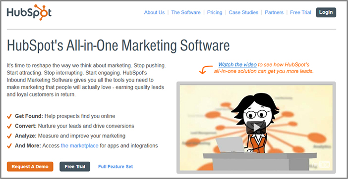
Figure 6-17: Example of related videos at the end of a video

Analyze Your Video Metrics to Optimize Performance
Don’t just hope and presume that the video content on your website is working well; instead you need to actually monitor its usage and optimize its performance. Many advanced web analytics tools have built-in video tracking metrics and reports, but unfortunately many of the free or cheap analytics tools don’t offer this so you will need to either upgrade to an advanced tool or use a specialty video analytics service like Oculu (www.oculu.com).
Here are some of the most important video-related metrics that you need to understand and then measure and optimize for all of your videos:
- Video starts (ideally, you should measure auto-started versus user-started)
- Video completion rate (a great indicator of visitor satisfaction of your videos)
- Videos viewed per visitor (a good indicator of how engaging your videos are)
- Video views by page location (useful if you have the same video playing on multiple pages)
- Ad video starts and completes (important to know if you are showing ads in your videos)
- Participation (attribution) of a video view on conversions (it’s good to understand how important your videos are for causing conversions on your website).
Friday: Use Rich Media Website Greeters to Increase Engagement and Influence
There are specific rich-media techniques involving human interaction and dynamics that you can use to help increase visitor engagement and better influence what they do on your website. Today you are going to focus on using this powerful technique on your website, much the way store visitors feel more engaged when a store assistant greets them and tells them what is on sale and asks if they need any help.
This works well because studies have shown that people are more likely to engage if human dynamics or interaction is present. And on websites, showing human elements like talking faces is also usually much more engaging for visitors than text or images that don’t move. To help you engage your visitors this way, there are two common ways of showing human-related rich media: animated and real-video website greeters, which you will now learn more about.
Test Using Interactive Animated Website Greeters
The first way that you can test showing this human-related rich media is to create an interactive animated website greeter that greets and engages your website visitors. There are several tools now available that let you create these and allow you to customize what the spokesperson looks and acts like, and what the script should be of what they say to your visitors.
Two major examples of websites that provide these services are SitePal (www.sitepal.com) and CodeBaby (www.codebaby.com). Both have hundreds of pre-created animated greeters for you to choose from and customize to fit the needs of your website better.
Although more expensive than SitePal, CodeBaby offers some essential advanced functionality to help increase your conversion rates further. In particular, it gives you the option to show related pop-up boxes right next to the greeter, containing links to help direct your visitors to pages relating to your conversion goals. These are essential for helping visitors understand what they should click on first and are a great way to increase conversions from the home page in particular.
See Figure 6-18 for an example of this animated spokesperson from CodeBaby, including the related links to the left of it.
Figure 6-18: Example of an animated greeter
Test Using Video of Real Human Greeters
The next way of showing these human greeters is similar to the interactive animated greeters that were just discussed, but they actually show video of real people instead.
To help you create these, there are several options. The easier and cheaper option is to use a pre-created video greeter from a service like Tweople (www.tweople.com), which even has options to customize the greeter by recording and showing someone from your company instead. The second option is to create a more customized video greeter using an agency like Innovate Media (www.innovatemedia.com). See Figure 6-19 for an example of one of Innovate Media client’s video greeters used on a banking website.
Figure 6-19: Example of a video human greeter
Another good reason to use video greeters is because you can measure the performance of the video and optimize it. In particular you should measure the completion rates of your video greeter to see how often visitors see the whole thing rather than just ignore it.
I suggest you evaluate animated and video greeters to see what fits your needs and budget better. Once you have picked a service, test tweaking what the greeter says in order to try and increase engagement and conversion rates further. For example, you could test asking the visitor a question rather than just a simple one-directional statement.
It’s also important to test where these greeters show up on your website and under what circumstances. These usually work very well to show to first-time visitors, particularly on your home page. Don’t just simply use these on every page of your website and for every visitor though, as this will annoy your visitors by seeing them too often and may result in them abandoning your website prematurely.
Week 17: Harness the Power of Social Proof, Reciprocity, and Scarcity
This week you will learn about influencing your visitors by using the power of social proof, reciprocity, comparison, and scarcity. These influence and persuasion theories are discussed in the book Influence: The Psychology of Persuasion by Robert B. Cialdini, Ph.D. (HarperCollins Publishers, 1998), which is a must-read for any budding website optimizer. Many marketers in the offline world have made great use of these theories, and you can adopt these same principles in order to influence and persuade your website visitors to complete more of your goals, and therefore, increase your conversion rates.
In particular, social proof works very well, and this will be covered during the first few days. Social proof (sometimes referred to as social validation) is a marketing approach and theory that has been used for many years with great success. This principle basically states that if your product or service seems to be well-liked and many people seem to be using it, this strongly influences the likelihood of other people using it and their positive perception of it too. For example, if someone is given the choice to dine in a restaurant that has few people in it versus one that is nearly full, then they are far more likely to pick the one that has more people in it. But more surprisingly, psychologists have found that this is also more likely to result in a better review of the restaurant, even if the food or service isn’t in reality that great.
The same applies to websites; visitors are far more likely to engage with a website if they see signs that many other people are using the website (seeing positive comments, reviews, testimonials, etc.) and are also more likely to have a positive association with it.
Monday: Build Social Proof by Optimizing Your Testimonials
Testimonials are a very powerful form of social proof. But it’s not enough to simply have them. How and where you display testimonials can have a major impact on conversion rates. The following are best practices you can apply or test.
Show Testimonials with Photos of Real Customers
One of the simplest things you can do to help optimize your testimonials is to obtain pictures from some of your customers that have given them, and clearly promote these alongside their testimonial. This is because testimonials with real photographs bring authenticity to them and are perceived as more trustworthy than those without. They also draw the eye. Consider asking customers to provide photos to use on your website, and then test adding them to your testimonials and see their likely positive impact on your conversion rates.
Show Video Testimonials
Video is highly engaging for many website visitors now, so you could consider using videos of your testimonials in addition to just photo and text testimonials. This makes them even more relatable and believable.
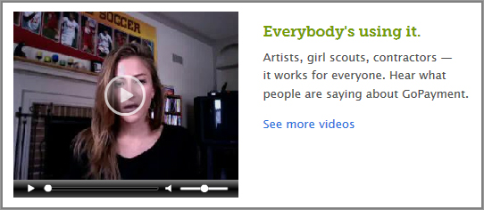
Go and ahead and get in touch with some of your best customers and ask them if you can record them giving an interview about their experience with your website. You could also offer them an incentive for doing this, like a credit or discount. From this interview, you should be able to edit it into a short good video testimonial to use on your homepage or other key pages. In Figure 6-20 you can see a good example of usage of video testimonials on the home page of IntuitGoPayment.com.
Figure 6-20: Example of a video testimonial
A word of caution: although videos can help improve conversion rates, if they are intrusive or annoying, they can have the opposite effect. Always allow visitors to easily turn off sound from your testimonial videos, and you shouldn’t use “auto-play,” which can frustrate visitors who are unsure of how to turn the sound off.
Obtain and Include Many Relevant, Impressive Testimonials
The more testimonials you can obtain from your customers, the greater the chance of finding a really impressive one that will have a much greater impact on social proof than just a regular generic testimonial. Showing an outstanding testimonial in comparison to a generic uninspiring one can sometimes make the difference between your visitor purchasing or not.
A great idea to find more testimonials is to search through tweets on Twitter (www.twitter.com) that mention your website. If you find positive tweets about your website there, you should send the tweeter a message asking if you can make use of their tweet as a testimonial on your website, and ask them if they would mind expanding on it for a testimonial, too.
Show Testimonials on Your Home Page
Your home page is one of the most powerful places to promote your testimonials, because this is a very common entry point for first-time visitors, and they will need social proof to give them a reason to stay on your website. Showing testimonials here also maximizes the chance they will be seen, as there’s no guarantee a visitor will click deeper into your website to a page that has one.
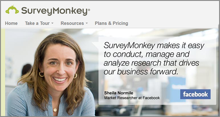
Remember to place these testimonials above the page fold, just in case your visitors don’t scroll down any lower and leave prematurely. If you have a home page image rotator area, you could try featuring one of your best testimonials as one of the slide contents, as you can see in Figure 6-21 for the SurveyMonkey.com home page.
Figure 6-21: Example of a testimonial on a home page
Show Expert Testimonials
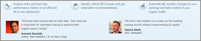
Another way to add even more credibility and social proof to your testimonials is to obtain and display ones that are from experts in your industry. These should come from someone who is very knowledgeable about what you are selling or promoting, and the more famous they are, the more this will amplify the positive effect. Go ahead and obtain a few of these and then test displaying them above the fold on your home page and other key pages to see the likely positive impact on conversion rates.
For a good example of this, in Figure 6-22 you will see SEOmoz.com making use of expert testimonials on their home page.
Figure 6-22: Example of expert testimonials
Tuesday: Build Social Proof by Optimizing Your Usage of Ratings and Reviews
Having reviews and ratings of the content on your website (whether it is products, services, articles, videos, or other) is another very important way to build social proof and influence visitors. To put it simply, the more reviews and ratings that your website and its content has, the more it will likely increase the social proof of your website. To help build social proof even further, today you will learn how to best show these ratings and reviews, and how to attract more of them.
Show Visitor Ratings for Content on Your Website
One of the quickest and simplest methods of improving social proof for your website is to begin gathering and showing ratings for the products, services, articles, videos, and other content on your website. These ratings are usually submitted by visitors directly or when they are submitting a review for your content. They usually come in the form of showing a rating out of 5 or 10 for each item, most often visually illustrated by stars (or check marks or other icons). Or in its simplest form this can be illustrated by showing a thumbs-up or thumbs-down.
There are also a number of tools that you can use to bolt on this rating (and review) functionality to your website, including Power Reviews (www.PowerReviews.com) and Bazaar Voice (www.bazaarvoice.com). Work with your IT department to explore these options in more detail and to help pick one that will be easier to implement on your website.
Not only do these ratings give visitors a great quick indicator of the quality of the content, this is also a quicker method for visitors to provide feedback than having to provide a more detailed review of the content.
Ideally this rating should be shown prominently in several key areas. First, it should be shown on product pages near your price or main image. Figure 6-23 shows a good example of how REI.com shows this rating on a product page.
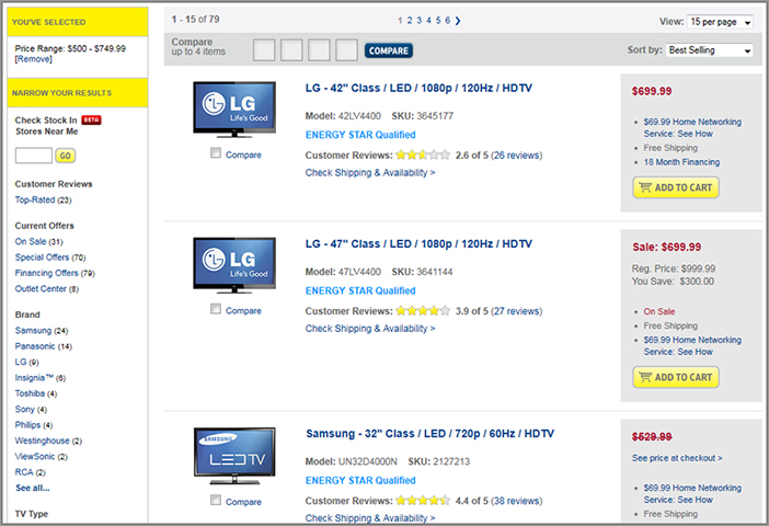
You should also show these ratings on your category, browse and search results pages, as this will help your visitors decide on which products they want to click on to learn more about. For an example of this, see how BestBuy.com does this in Figure 6-24.
Don’t forget to allow your visitors to sort these browse pages by top ratings to make it easier for them to find your best content. (You’ll learn more about this in Chapter 7, when you’ll review best practices for these types of browse and search results pages.)
To build social proof even further, next to the actual rating of your product or other content, you should also show the number of ratings that it receives. If these numbers of ratings get high (over 100 for example), it conveys to the visitor that many people are engaging with your content, thus increasing the chance that they will also engage with it (as long as the ratings of your content are fairly positive). This concept of showing numbers of interactions to build social proof will be discussed more tomorrow.
Figure 6-23: Example of ratings on a product page
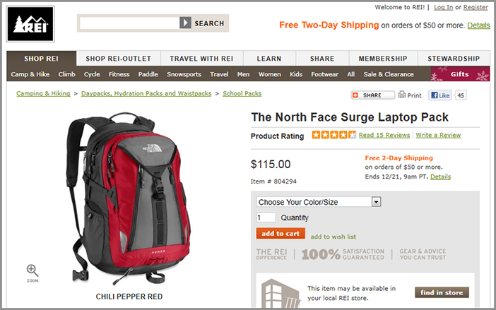
Figure 6-24: Example of ratings on a browse page
Improve the Usability of Your Review and Rating Process
In order to increase the number of reviews and ratings and help build more social proof, you should make it as easy as possible for your visitors to submit them.
First of all, to encourage more reviews and ratings you should clearly promote that visitors can (and should) submit their own reviews and ratings. This is best done by having review and rating submission links on your content pages, and ideally these should be placed next to the area where you show the average rating for the product, and also right by the area on your page where you show your current reviews.
However, you should also check to see how easy it is for your visitors to use your review submittal form, and you may want to remove fields that aren’t very important or non-mandatory. If the review submission form is on its own page, you should also check the exit rate for this page to see if it’s causing problems for your visitors. Many analytics tools offer form completion tracking so that you can also see exactly which fields your visitors get stuck on, and then optimize or remove them to increase your review form completion rates.
To make it even easier for visitors to submit a review, don’t make it mandatory for them to have to create an account before they can do so. To reduce the likelihood of fake reviews, you could add fields to the submission form that prove the submitter is human, such as using a CAPTCHA or asking a simple math question (that you will learn more about in Chapter 8).
Get More Visitors to Write Reviews by Offering Incentives
Some visitors may be reluctant or shy to leave reviews of your products, particularly because this often takes time. One of the best ways to help reduce this reluctance and increase the number of reviews you get is to offer an incentive for visitors to review your products or services, such as offering a discount, gift certificate, or potential contest prize.
Ask Visitors to Rate Products Purchased from Your Website
Asking for a review from a visitor who has just bought from you is a simple way to generate more reviews to increase your social proof. This is the best time to ask them for a review because they will be much more likely to offer an opinion shortly after buying, rather than just hoping that they remember to review the product in the future. Don’t send this trigger email too quickly though because you will need time for the product to be delivered and interacted with first. You will learn more about how to optimize emails like this in Chapter 8.
Let Visitors Rate Other Visitors’ Reviews
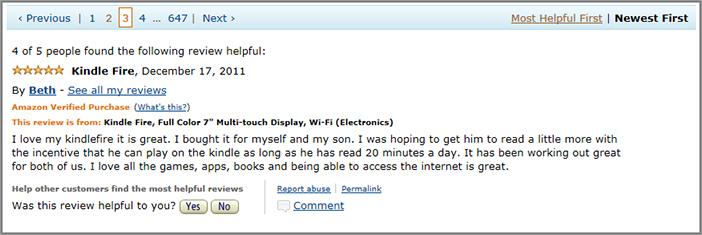
To give your reviews even more social proof, you should allow your visitors to rate reviews depending on how helpful they found them and then show how many people thought the review was helpful. This can simply be done by posing a question right at the end of the review to the reader if they found it helpful, with two buttons for yes or no. Then next to the review, you should state how many people found this review helpful. Amazon.com does a great job of doing this, as you can see in Figure 6-25.
Figure 6-25: Example of rating each review
Doing this also lets visitors sort and filter through reviews better, and will also help to reduce the negative social proof impact from unfairly negative reviews on any of your content, and vice versa it can also increase the impact of great positive reviews.
Wednesday: Other Best Practices to Help Improve Your Social Proof
Today, you’ll learn some best practices that you should implement to increase the level of social proof on your website and thus increase conversions.
Optimize Your Website for Social Sharing
Don’t forget about the power of a recommendation from a friend or colleague. Not only does this help build social proof for your products, services or other content, it also helps because people are much more likely to come to your website if they know one of their friends is also using it. This traffic is also often much more targeted and qualified and will have a greater chance of converting. Because of this you should make it as easy as possible for your visitors to share your website and its content with their friends, family, and colleagues.
Use Social Networking Buttons and Links to Increase Social Sharing
A great way to do this is by having buttons that allow your visitors to share any of your content on Facebook (the Like button) and Twitter (the Tweet button). Ideally you should place these share buttons on all of your content, particularly at the end of your articles and adjacent to your photos and videos or your products and services, as this will increase the chances of visitors using them.
When placing these two share buttons on your website, don’t forget to choose the option to show the number of times the content has been shared on the button, as this helps build social proof too (as you will learn about in the next section).
CNET.com has a good example of doing this, plus showing other social network sharing buttons, as you can see in Figure 6-26. They also use another best practice to make the sharing buttons stay in place as the visitor scrolls down, so they are always visible.
Figure 6-26: Example of prominent social sharing links

Use Traditional Refer-a-Friend Options
Don’t forget to offer refer-a-friend links on your web pages too, where the visitor can quickly and easily send a message to their friends recommending the current page they are on at your website (or your website as a whole). You could try testing adding links and promotions to refer-a-friend options on your login related pages, product or service pages, and also in the footer of your pages.
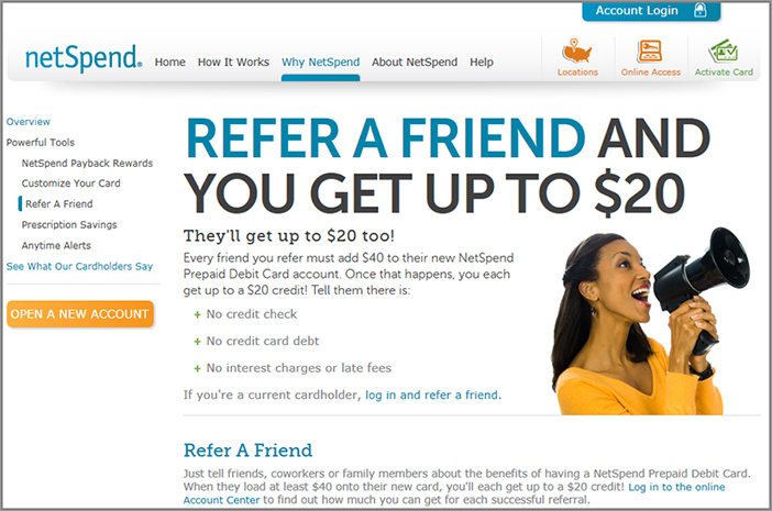
To encourage this refer-a-friend activity even more, you could try running a referral contest, with prizes going to the people who refer your website to the most friends. Or you could offer a discount to the person doing the referring as a reward for doing so. NetSpend.com has a great example of this incentivized refer-a-friend tool on their website, as you can see in Figure 6-27.
Figure 6-27: Example of a refer-a-friend promo and incentive
Show Usage Numbers to Illustrate Social Proof
Clearly showing the number of customers or users your online business has is a powerful way to build social proof for your website, particularly if you have a high volume of satisfied ones. To take advantage of this, get some good usage statistics about your online business and then run a test to show these on your home page and other key pages above the page fold in a few different variations.
For some ideas, you could test prominently adding text like “Now loved by over X satisfied customers” or “Downloaded over 100,000 times.” Even something as simple as stating how many years your company has been in business will help.
A particularly great example of this can be seen on the Basecamp.com home page in Figure 6-28 where they use several numbers to illustrate just how much their service is used. This also prominently features the logos of their big clients, which also helps build social proof, as you will learn about next.
Figure 6-28: Examples of customer usage numbers
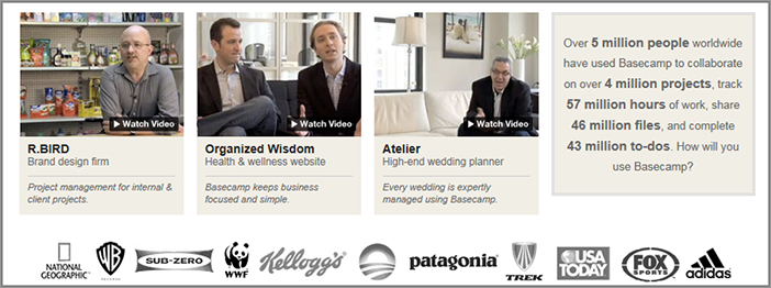
Show Client Logos to Build Social Proof
If you are selling products or services, one of the best ways to improve social proof is to show logos of clients you have, particularly if you have large clients with recognizable logos.
Test the power of this by adding your most major clients’ logos to your home page and product or service pages above the fold, in either a column or row, labeled as “Our Clients” or similar wording.
In Figure 6-29, you can see a good example of this in action on the AWeber.com home page, which also uses a good header for the section to explain the significance of the logos and provides a link to see who else uses their services.
Figure 6-29: Example of a client logos module
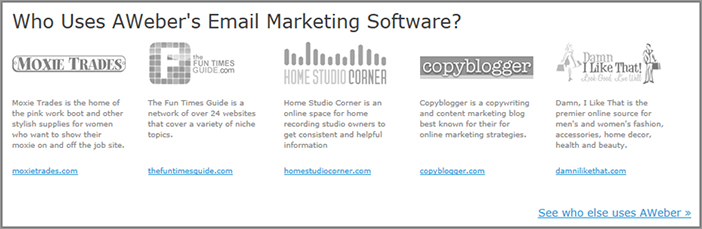
You should also make the client logos clickable, and send the clicker to a page that shows more details regarding your top clients, ideally with testimonials from some of them. You might also want to test graying the logos out if they appear too distracting, because this may increase focus on other key calls-to-action and increase conversions.
Show Media Mentions and Press Releases to Build Social Proof
Another way to build social proof is to show examples of the media talking about your online business. If you can get some good news agencies to run press releases about you and you show that on your website, visitors will more likely think your website is well-liked due to it being mentioned in the news.
If you don’t have anything great written about your online business from the press (and check Google news for this), I suggest you run some press release campaigns regarding something newsworthy, or engage with some press release professionals to help you. There are several services that can help with this, like PRweb.com (www.PRweb.com) and PRnewswire.com (www.PRnewswire.com).
Once you have obtained some great media mentions, you can do two things. First, you can take the best quote from one of the press releases, and test featuring it on your home page and make it clickable to the full article on your website. Second, you can also test showing the logos of the media websites that have written about you, as in the example in Figure 6-30, and link each of their logos to the article that mentions your website.
Figure 6-30: Example of logos from media mentions

Thursday: Use Scarcity to Influence Your Visitors
A powerful, unique approach to influence visitors to buy from your website is to introduce scarcity tactics. This theory works on the premise that if something seems unavailable (or is about to be), people often want it even more.
These scarcity tactics have worked very well historically in the offline world—for example, Apple not creating enough supply for iPhones, which caused huge long lines at stores and major publicity, and how Disney deliberately releases their movies in short time frames only. These tactics can also work very well in the online world when designed to make your visitors think that if they don’t buy or sign up now your product or service offered will sell out very soon.
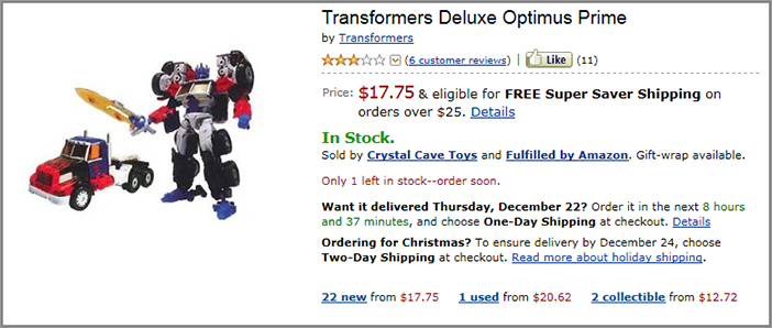
There are several examples of websites that do a good job of this that you should model. First of all is Amazon.com, which uses these scarcity tactics to show if any of their products are low in stock. They always clearly state on their product pages if there are only a few left in stock; as you can see in Figure 6-31 where they state in red “Only 1 left in stock—order soon.”
Figure 6-31: Product showing limited stock scarcity tactics
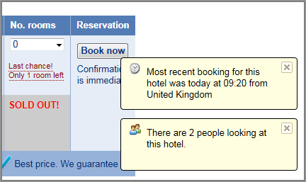
Booking.com also does a very good job of showing scarcity on their hotel pages. They show next to each type of room in their hotels whether there are fewer than five remaining, with last-chance wording if there is only one room left. Combining this scarcity tactic with their approach of popping up a message stating how many other visitors are currently looking at the page (as you can see in the example of Figure 6-32) apparently does a very good job of increasing the conversion rates of Booking.com.
Figure 6-32: Other limited availability scarcity tactics
Orbitz.com and several other travel websites are also taking advantage of these scarcity tactics by clearly stating if there are only a few tickets left for each flight.
As a few examples to test on your website, if you are selling products test showing the number of items of your products that are currently in stock, and if this is low, show additional messaging urging them to buy before it sells out. Or if you have a sale or promotion running, you should clearly state how many days are left until it’s finished. If done well, you are likely to see a good conversion lift from using tactics like these.
Friday: Influence Your Visitors by Using Reciprocity
Next you will learn about the theory of reciprocity to help influence your visitors better. Essentially, it states that if you give someone something for free (or very cheap), they will often feel obligated to return the favor and reciprocate by buying from you in the future.
Clever marketers have been using this to great advantage for many years. An example of an offline organization using this theory with great results are the Hare Krishna who give out free small flowers to strangers in train stations, who then feel obligated to return the favor by talking to them and donating to their organization.
This theory can often work well online too. To test this theory on your website, try offering your visitors something of value for free, such as a guide, a whitepaper, a free upgrade on shipping, or a free upgrade on their initial service level. This should have a good effect of increasing conversions in the future. If you don’t already have something of value to give away for free on your website, try creating something like an e-book containing tips or advice.
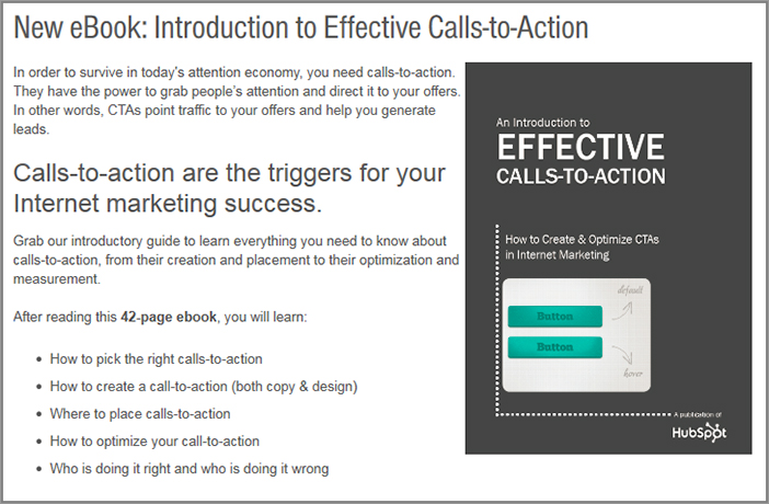
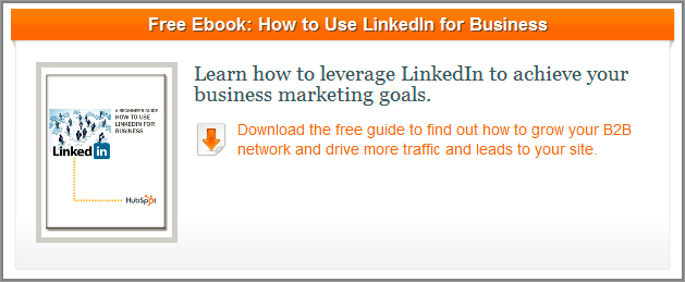
In Figure 6-33 you will see a good example of a website, HubSpot.com, using reciprocity by giving out free e-books to visitors.
Figure 6-33: Reciprocity using a free e-book
You could also test asking for the visitors’ email address to send them the free item. This is good because depending on if they agree to receive future emails, it’s a great way to market to them and get them to come back to your website, hopefully reciprocating and converting for one of your goals.
Week 18: Influence by Making Your Visitors Feel Safer and Building Trust
One of the strongest emotions that website visitors often have (and yes, even for your website) is a feeling of fear and anxiety just before they purchase or sign up for something. This is because they often feel they might be spammed or worse still, their credit card or personal details stolen or used for fraudulent purposes. As a result of this visitors are often wary of giving details like this, having a significant negative impact on website conversion rates.
Recent studies echo this too. In an August 2011 report by Harris Interactive and McAfee, 84 percent of online consumers had some level of concern when giving their personal information online, and the number of consumers who believe that most websites are safe has actually fallen over the last two years, now down to about one-third.
Even though online and data storage security measures have improved greatly, this resurgence of security and safety concerns has been caused by an increase in online fraud, the growing fear of personal identity theft, and the rise of phishing fake websites that trick visitors into giving their account or credit card details.
And these security issues aren’t limited to just e-commerce websites. Any type of website that requires registration or any of the visitors’ personal information is prone to these security concerns from their visitors.
One of the best ways to help ease your visitors’ security fears (and therefore increase conversions) is to influence their perception of how secure and trustworthy your website is. This week you will learn some great best practices to help you achieve this.
Monday: Optimize the Display of Security and Trust Seals and Symbols
One of the best ways to increase levels of trust and to make visitors feel safer is to prominently display logos and seals that visitors associate with higher levels of trust and security. For example, in the same Harris Interactive/McAfee recent report, 75 percent of online consumers indicated that they would choose to shop on a website with a trust or security symbol than one without.
When website visitors see these security and trust symbols, they are much more likely to complete the checkout or signup process, thus greatly increasing conversion rates. Today you will learn how to optimize and make better use of these seals and symbols so you influence and convert more of your visitors.
Test Using Different Types of Security and Trust Seals on Your Website
There are various types of security and trust seals that you can use to relieve your visitors’ anxiety and increase conversion rates, as described here:
Table 6-1 shows some examples of these types of security and trust seals and symbols.
Table 6-1: Examples of security and trust seals and symbols
| Seal or Symbol Type | Example |
| Security Seals | |
| Privacy Seals | |
| Business Approval/Accredited Seals |
Obtaining these trust and security seals can be relatively expensive, and if you are looking for a cheaper alternative to obtain them, there is a great new option available. This is offered from a company called SafeSite Certified (www.SafeSiteCertified.org), which realizes the impact these security and trust seals have on conversion rates and wants to make these even more accessible for companies to use on their websites. Not only do they offer seals like the ones discussed previously, but they also offer functionality to test different styles of the actual seals to see which colors or styles have the most impact on your conversion rates.
As another cheaper way of doing this, you could create your own home-made seals or badges that show lock icons or secure messaging and then test adding those to key pages on your website to see their conversion rate impact.
Optimize the Placement of Your Security Seals and Trust Symbols
Careful placement of these trust seals and symbols on your website can have a great positive influence on your visitors’ fears, and therefore increase your conversion rates. Rather than just burying these away out of visitors’ eyesight in the footer of your website, you will now learn about many more influential places that you should test showing them.
Here are some best practices to help test and optimize the locations of these on your pages:
Figure 6-34: Example of a well-placed security seal in checkout
Tuesday: Make Use of Supporting Text and Pages to Build Trust and Security
Before visitors decide to purchase on your website, they will often want to learn more detailed information about your security policies—for example, what you are doing to protect them and their information and what happens if a security breach occurs. And while having a great impact, your security seals alone might not be good enough to convince all of them to purchase on your website, and some won’t even understand what they mean.
To help address this and further reduce their purchase or signup fears, you will need to show additional security and trust related text on your pages, and make them easy to understand. Today you will learn how to do this.
Show Security-Related Text in Addition to Seals
The first thing you need to do is add prominent text that verbally reinforces your website’s high level of security and helps build trust. This is particularly good for visitors who might not immediately understand or realize the significance of the security and trust seals on your website (for example, what a “VeriSign Trusted” website actually means). Go ahead and test adding a few variations of this security-related text adjacent to your security and trust seals to see which ones increase your order completion rates the most.
If you have an e-commerce website, the most critical place to display security and safety wording is on the shopping cart and checkout pages. Using text like “Your transaction is 100% safe & secure” and linking this to a page or popup that explains your security policies will likely result in an increase in conversion rates. See Figure 6-35 for an example of this text next to a security seal.
Figure 6-35: Example of security text next to a security seal
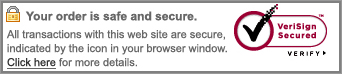
You should also test placing words like “Secure” or “Check out securely” right under your checkout or signup button, because this very quick test could have a great impact on your conversion rates. Then you should test making this wording link to a security details page so the visitor can learn more about how safe your website is (which will be discussed next).
To make your visitors feel more secure about clicking the checkout button, you can test labeling the button with security building wording like “Checkout Securely” or “Secure Checkout” (as opposed to just “Checkout”). For example, the checkout button on the Norton.com website is called “Continue to Secure Checkout,” as shown in Figure 6-36.
Figure 6-36: Example of security wording in a checkout button
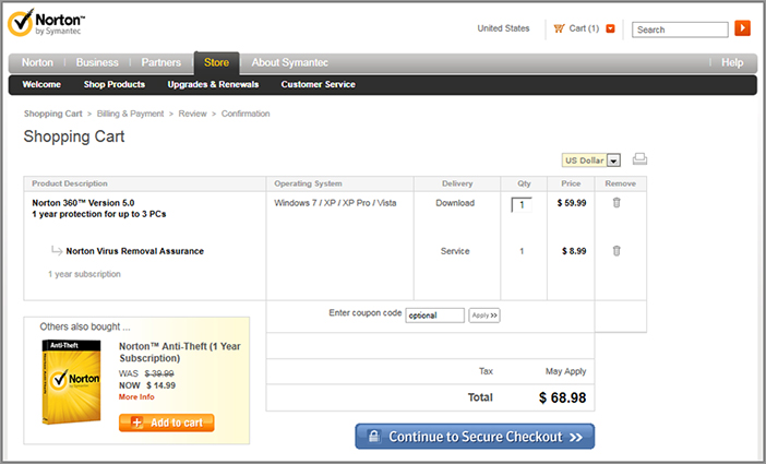
Create a Security and Privacy Page and Prominently Link to It
To help your visitors understand more about your security and trust policies, go ahead and create a page that shows the full details of this for your online business and website (if you haven’t already got a page like this). Use language for these policies that is easy for visitors to understand and relate to, and not overly technical either.
It’s important that you prominently link to this page from the footer of your website and in your help and support section because this is where visitors will expect to see it. You should also link to it in the same places where you show your security and trust seals and symbols, where visitors may most often want to know more about these details and your policies.
Create Pages That Detail Your Guarantee, Money-Back, Shipping, and Return Policies
Visitors are much more likely to trust and buy something from a website that clearly states its guarantee and return policies, just in case they aren’t happy with their purchase.
If you don’t already have pages on your website that explain your guarantee, money-back, shipping, and return policies, then you need to go ahead and create these. They will help reduce purchase anxiety and apprehension in your visitors, particularly if your policies regarding these seem generous and fair to them.
To maximize the influence of these, optimize the layout and messaging of them using best practices and test ideas you learned through the earlier weeks in this chapter, such as using bullet points for key points. Don’t just have these pages formed of long blocks of hard to read text.
To promote these policies you should test placing text links to these pages across your website, particularly on your product or service pages and checkout related pages. You should also place links to these in your footer, site map, and support pages because visitors will most often expect to see them there. If some of these policies are part of your unique value proposition (like Zappos.com does with its free shipping and returns), then you should use promotional banners for these too.
You should also reduce the risk of purchase for your visitors, which is a subject you will learn about tomorrow.
Wednesday: Reduce the Risk of Purchasing for the Visitor
The more reasons you can give your website visitors to assure them there is low risk and that they won’t regret purchasing or signing up for something from your website, the higher your conversion rates will be. These reasons to reduce potential purchase anxieties are called risk reducers, and you will learn how to make great use out of them today.
Test Offering a Money-Back or Exchange Guarantee
A great risk reducer to build trust and increase product- or service-order rates is by including a money-back and/or exchange guarantee. The time period for returning or exchanging a product can be anywhere from 7–90 days, although 30 days is most common. Test different types of guarantees to see which influences conversion the most, and if you already offer a guarantee, then test offering a better one.
You should test clearly, stating this guarantee on your home page, your product or service pages and your checkout pages, as it will often have the most impact on these pages.
You also ideally need to promote this guarantee in the form of a visual seal too, which will draw your visitors’ eye to the guarantee and increase the chance that they will be influenced by it. Test creating a few different styles to see which one impacts your conversion rates the most. Figure 6-37 shows some examples of this type of seal.
Figure 6-37: Examples of guarantee seals

Test Free Shipping Offers
If you are selling products on your website, another way of reducing risk is to offer free shipping for your visitors. Many online businesses now offer this on an occasional basis or on a permanent basis like Amazon.com does (free shipping on certain products with a minimum order of $25). This can be offered in a variety of ways, either free shipping on everything, or with a minimum purchase and/or on particular products only.
If you don’t currently offer free shipping, test offering this for a limited period on your website to see if it improves conversion rates. It will usually improve your average products per order too, so also check for that metric when analyzing results.
If you already offer free shipping, you can test two things. If you have a minimum purchase required for free shipping, test lowering this, for example, from $50 down to $25 (if your business allows for this). You can also test increasing the number of products free shipping is available for if it currently is not offered on many. When evaluating test results for these, in addition to checking for conversion rate lifts, you also need to check if there are any negative impacts on your profit levels and average order value.
Offer Free Returns
Another risk reducer that you can use if you are selling products on your website is to offer free returns, or at least do a trial run offering free returns. As long as your business model allows for this and can support it, it can really help reduce purchase anxiety. Often the money you have to spend on the shipping associated with these free returns can be outweighed by the additional levels of revenue.
This works particularly well for clothing websites that have to work against not being able to let their customers try on the clothes before they buy. Zappos.com is an example of an online business that has done very well by offering this, and it has become a very popular and well-known feature and unique value proposition for their website.
Test Improving Your Free Trial Details
Offering a free trial is a great risk reducer. If you have a website that offers one of these for its products or services (or is thinking about it), you should test the messaging for your free trial to increase conversions. This will help increase the number of visitors responding to this offer.
In particular you should test clearly stating that there is no obligation or commitment to purchase or sign up (if indeed that is the case) because visitors can often be wary if your offer seems too good to be true. You should also state that if the visitor isn’t happy during their trial they can cancel at any time (with no hidden fees).
If your business allows it, test increasing the length of your free trial if it is currently fairly short. Increasing it from 7 days to 30 days may result in a significant lift in purchases.
Restate Your Risk Reducers in Your Shopping Cart
Before they decide to go through with their purchase, the shopping cart page is where visitors will need the most reassurance that their risk of purchasing is low. Therefore, you should prominently restate some of the risk reducers that were covered above on this page. Test adding them to the footer or the sidebar of your shopping cart to achieve this. As you can see in Figure 6-38, ASOS.com does a very good job of this by clearly showing two of their risk reducers (free returns and free next day delivery) in the footer of their checkout page.
Figure 6-38: Example of risk reducers on a checkout page
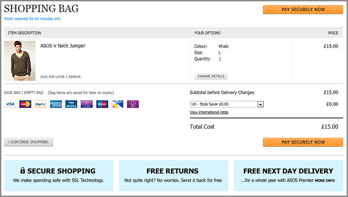
Thursday: Optimize Your Customer Support and Contact Options
Another way to build your website visitors’ trust and sense of security is to provide customers with support and contact information when and where they are most likely to need it. Today you will learn some best practices to take your support options a step further, past just offering email and phone support.
Clearly Promote Your Support and Contact Pages
First you need to make sure that your visitors can easily find your support and contact options. Don’t bury links for these pages on your website; they should be visible on every page on your website so that visitors can make use of them at any point. The best place to show the link to your support page is in the top-right and footer of every page in addition to a link for your “contact us” page in the footer of your pages. These are standard places that visitors will expect to find these.
Offer a Web Chat Option
Not only is offering a web chat option for your visitors a powerful way to gather feedback from them (as discussed in Chapter 4), it’s also a great way for visitors to get immediate support and help relieve any possible issues they may have. It’s particularly valuable for visitors who don’t like chatting on the phone as well as for visitors who don’t want to have to wait for support via email.
To gain best use of this web chat option you need to test offering this above the fold on your shopping cart or registration pages, because these pages are often a source of problems and anxiety for visitors. A recent study by BoldChat supported this and found that 76 percent of website visitors would initiate a web chat in response to issues they were encountering during the checkout process. Test being proactive with web chat on these pages, too, and pop up a chat dialog box if visitors seem to be idling for more than 10 seconds on them (don’t do it any quicker as this may annoy your visitors though). You should also show this web chat option on your contact and support pages.
To find out how to best display a web chat option, you should test different versions and styles of chat buttons in the header of these pages or in the right-hand rail, and see which version increases usage of them the most. For more information about web chat tool options and best practices, please refer back to Chapter 4.
Offer Support Forums and FAQ Pages
Another support best practice is to offer self-service methods for visitors to get answers to their questions and concerns. Offering FAQ (frequently asked question) pages and support forums empowers them to find their own answers, and is a great option for those who don’t have time to call or request help via email or phone.
Offering this support method also cuts down on your more traditional support-related expenses like call center costs, which can be very expensive.
On these pages, be sure to mention things like your return policy and money back policies, because as discussed earlier, visitors will often want to know this information before purchasing. You should also list the top 10 FAQs and provide your visitors with a way to search for specific forum or FAQ topics. Be sure to link to these pages from your support and contact pages.
Ideally, you should also track how often these self-support mechanisms are used. If they aren’t being used very much (low page views), this is an indicator that you need to optimize the usability and functionality of them.
Friday: Learn Other Best Practices for Increasing Levels of Trust and Security
Today you will learn some other effective best practices for improving your website’s level of trust and security, thus reducing visitors’ anxiety and improving your website conversion rates.
Clearly State Your Privacy Policy Regarding Email Addresses
Most websites will usually ask for a visitor’s email address for one reason or another—for example, to register for a profile, sign up for a newsletter or purchase something. Unfortunately, visitors are wary of providing this information due to concerns about getting spammed. And if you can’t get a visitor to give their email address to your online business, your future conversion rates are going to be significantly impacted because you won’t be able to market to them via email.
In order to help relieve this anxiety and build the trust needed for the visitor to give you their email address, you need to clearly state that your website won’t spam, rent, or sell email addresses. This should be stated in close proximity to your sign-up forms, with a link to a page that explains your privacy policy regarding this.
In Chapter 8, you will learn more about best practices relating to email marketing and how to encourage your website visitors to provide their email addresses.
Allow Visitors to Provide Their Credit Card Details over the Phone
As mentioned earlier this week, website visitors are often apprehensive about providing their credit card details online. To try and convert these visitors, in your checkout pages you should provide them with an option to complete their purchases over the phone instead.
Some large online businesses are apprehensive about showing their phone number on their website or making it very visible, because the costs of running a call center can be very expensive as opposed to handling support online. However, it is definitely worth testing the conversion rate impact of offering a phone number in your top right hand corner of all pages and your shopping cart page. To help you do this there are now great new tools to consider using that allow you to track usage and attribute conversions from a support phone number on a website, for example Mongoose Metrics (www.mongoosemetrics.com).
Only Ask for Personal Information That Is Necessary
Due to the increase in personal identity theft, many website visitors are reluctant to disclose particular personal information like their phone numbers and addresses. This information should only be necessary on a checkout page if the visitor is having something shipped to them. If you have phone number and/or address fields on your signup or registration pages, you should test removing them to see if this increases your conversion rates. Also, if you do require information like this, you should always include tool tip text next to each field that explains why it’s needed to allay concerns from visitors.