
Chapter 4
User Interfaces
WHAT’S IN THIS CHAPTER?
- Understanding WP7 UI principles
- Building a UI
- Customizing a UI
The touch user interface (UI), one in which the user interacts with the device and applications by using the touch gesture on the display screen, now is the UI for modern smartphones. Windows Phone 7 (WP7) introduces its touch UI based on a design system codenamed Metro, which is completely different from its predecessors. While the Metro UI concept is new to every mobile application developer, it’s based on Silverlight, a powerful development platform for creating interactive user experiences for web, desktop, and mobile applications. Thus it is quite straightforward to port existing Silverlight applications to the WP7 platform. The new UI is one of the most exciting changes in WP7.
This chapter is all about creating UI on WP7. Three topics are discussed:
- UI design guidelines
- Basic steps of generating the UI
- Device UI customization
We start with UI design guidelines, followed by detailed information about UI elements and controls, UI system behaviors, and the interaction model for the touch interface. This chapter also covers common tasks to customize the UI for WP7 applications. Because the UI itself could be a very broad topic and WP7 is based on Silverlight, this chapter doesn’t discuss every detail about each control or about Silverlight programming; instead, the chapter focuses on the key WP7 UI concepts and comparisons with Android and iOS.
Metro is the design system for the new WP7 UI, and the concept is inspired by the visual language of airport and metro system signage.
“Keep things simple, direct, and relevant” is the fundamental principle of the Metro design and it means:
- Clean, light, open, and fast: Focus on the primary tasks, make delightful use of white space, and do not fill every pixel.
- Content, not chrome: Reduce visuals that aren’t content.
- Integrated hardware and software: Create a seamless user experience.
- World-class motion: Provide responsive and animated transitions.
- Soulful and alive: Serve personalized, automatically updated views of the information that matters most.
Although these design principles are already enforced in the WP7 platform design and implementation, third-party WP7 developers are also encouraged to follow these principles in order to develop harmonious, functional, and attractive WP7 applications.
UI Design Resources
Several documents are available for WP7 developers to understand and master the WP7 UI principles, and they can be downloaded from http://msdn.microsoft.com/library/ff637515.aspx.
- UI Design and Interaction Guide: This guide provides detailed information about UI principles, usage, guidelines of UI elements and controls, and UI system behaviors. Designers and developers should read this guide to learn the dos and don’ts of UI design and implementation for WP7 applications. The rest of this chapter also presents the key points from this guide.
- Windows Phone Design System–Codename Metro: This is a visual explanation of the inspiration behind the Metro concept. It helps designers and developers to better understand the Metro design language and align their applications with the whole system design.
- Design Templates for WP7: This is a collection of 28 layered Photoshop template files that can be used to create pixel-perfect application mockups.
Platform Characteristics
Before exploring the details of WP7 application UI design and implementation, this section briefly highlights some basic facts that directly impact UI matters.
Currently, all WP7 phones have Wide Video Graphic Array (WVGA) screens that provide 480 × 800 pixel resolution, no matter the physical screen size. Even so, all the controls and UI elements within Windows Phone Developer Tools are sized to support all possible screen sizes.
COMPARING THE WP7 DISPLAY TO ANDROID AND IOS
Currently WP7 supports only one resolution, but support for other resolutions might be added in future updates. It’s unclear how supporting multi-resolutions will impact the WP7 application implementation; thus developers do not need to consider this issue for the current release.
Android applications run on devices with different screen sizes and resolutions. Android’s support for multiple screen characteristics is achieved through a set of built-in compatibility features that manage the rendering of application resources for the current device screen. Developers can create screen-specific resources for precise UI control if needed; otherwise the platform can handle most of the work of adapting applications to the current device screen.
iOS currently supports three different resolutions: 320 × 480 for the original iPhone screen, 640 × 960 for the iPhone 4 screen, and 768 × 1024 for the iPad screen. Similar to Android, most of the work of handling the different screens is done by the system framework. Developers can bundle different image resources to take advantage of extra pixels.
After users power on their phones, the Start screen is the first (and also the most viewed) interface. The Start screen displays application Tiles that users have pinned for quick launch; thus you should carefully consider the potential that users may pin and display your application Tile in the Start screen. No matter what application is running, pressing the Start button on the phone always brings the user to the Start screen.
COMPARING THE WP7 START SCREEN TO ANDROID AND IOS
In a similar way to WP7, users can pin an application’s icon to the Android or iOS Home screen for quick launch.
Unlike WP7, Android also supports App Widgets in the Home screen. App Widgets are small application views that can be placed in the Home screen and receive periodic updates. App Widgets provide users access to some of the corresponding application features directly from the Home screen, without launching the application.
There are two display areas beyond each WP7 application content space: Status Bar (on the top) and Application Bar (at the bottom). The Status Bar is an indicator that displays system-level status information such as signal strength, battery level, and time. The Status Bar is system-reserved and cannot be modified. The Application Bar provides a place to display icon buttons with text hints and an optional context menu for the common application tasks. The Application Bar is customizable.
WP7 uses Segoe WP as the system font, which is a Unicode font. You can embed your own fonts for use within your application, but these embedded fonts will be available only to your application and cannot be shared with others. The recommended font size is bigger than 15 points, because fonts smaller than 15 points are hard to read and too small to touch. Currently WP7 supports only five languages: English, French, Italian, German, and Spanish. A standard set of East Asian reading fonts that supports Chinese standard, Japanese, and Korean is also included.
On WP7, a touch target is an area that’s defined to accept touch input and isn’t visible to the user, and a touch element is the visual indicator of the touch target that’s visible to the user. Usually the touch element size is 60 percent to 100 percent of the touch target size. The recommended touch target size is 9mm or 34 pixels square, while the minimum touch target size is 7mm or 26 pixels square. The minimum spacing between each touch control (a touch target that is combined with a touch element that the user touches) is 2mm or 8 pixels.
The examples in previous chapters demonstrate how to develop a simple WP7 application, including how to build the UI. Visual Studio 2010 Express for Windows Phone helps the developer construct the base page layout and then add more controls to the page through the Toolbox or create new pages using templates. Now it’s time to take a close look at the UI implementation code under the hood.
Defining WP7 UI with XAML
WP7 applications are based on the Silverlight 3.0 platform, and Silverlight applications generally use Extensible Application Markup Language (XAML) for defining the application’s visual compositions and layouts. For example, in the HelloWP7 example, the IDE generates MainPage.xaml as the base UI layout. This approach is similar to what Android does. Android uses an XML layout file to define the application layout. On WP7, XAML is the primary format for declaring a WP7 UI and elements in that UI. A WP7 difference from Android is that the XAML file is also associated with a code-behind C# file to define the interaction logic. The HelloWP7 project shown in Chapter 2 uses a simple XAML file, MainPage.xaml, which can be used to explain the XAML basics for the WP7 UI. The first part of this XAML file is the PhoneApplicationPage element and its attributes.
<phone:PhoneApplicationPage
    x:Class="HelloWP7.MainPage"
    xmlns="http://schemas.microsoft.com/winfx/2006/xaml/presentation"
    xmlns:x="http://schemas.microsoft.com/winfx/2006/xaml"
    xmlns:phone="clr-namespace:Microsoft.Phone.Controls;
       assembly=Microsoft.Phone"
    xmlns:shell="clr-namespace:Microsoft.Phone.Shell;assembly=Microsoft.Phone"
    xmlns:d="http://schemas.microsoft.com/expression/blend/2008"
    xmlns:mc="http://schemas.openxmlformats.org/markup-compatibility/2006"
    mc:Ignorable="d" d:DesignWidth="480" d:DesignHeight="768"
    FontFamily="{StaticResource PhoneFontFamilyNormal}"
    FontSize="{StaticResource PhoneFontSizeNormal}"
    Foreground="{StaticResource PhoneForegroundBrush}"
    SupportedOrientations="Portrait" Orientation="Portrait"
    shell:SystemTray.IsVisible="True">
The PhoneApplicationPage element defines the general settings for the whole page, such as font, foreground color, and screen orientation. To get the full list of attributes you can manipulate, place the cursor anywhere in the PhoneApplicationPage keyword and press F1 to display the PhoneApplicationPage class help document. Another approach is to place the cursor anywhere in the PhoneApplicationPage element block so that the IDE displays all the configurable attributes in the Properties window. The following code defines the basic container layout inside the phone page as a Grid:
<Grid x:Name="LayoutRoot" Background="Transparent">
    <Grid.RowDefinitions>
        <RowDefinition Height="Auto"/>
        <RowDefinition Height="*"/>
    </Grid.RowDefinitions>
</Grid>
A Grid is a table-like control where you can create rows and columns with absolute or relative sizes; it’s similar to TableLayout on Android. In order to access this grid later in the code, you should assign a name to it. In this example, it’s named LayoutRoot. Giving the grid a name also declares a Grid object in the XAML file at design time. This object is instantiated and used at run time. In the RowDefinitions element (similarly for ColumnDefinitions), you can set attributes for each row. The most common attribute is the size of each row or column. You can use three types of values: double value (floating-point value for pixel count, typically specified as an integer); start sizing (a weighted factor for the size of rows or columns to take the remaining available space, for example, *, 2*, 3*, etc.); and auto (the size to contain controls inside, which must be described by the literal Auto). Inside the Grid, you can define the content of each row:
<StackPanel x:Name="TitlePanel" Grid.Row="0" Margin="12,17,0,28">
    <TextBlock x:Name="ApplicationTitle" Text="MY FIRST WP7 APPLICATION"
       Style="{StaticResource PhoneTextNormalStyle}"/>
    <TextBlock x:Name="PageTitle" Text="page name" Margin="9,-7,0,0"
       Style="{StaticResource PhoneTextTitle1Style}"/>
</StackPanel>
<Grid x:Name="ContentPanel" Grid.Row="1" Margin="12,0,12,0">
    <Button Content="Say" Height="85" HorizontalAlignment="Center"
       Margin="151,59,171,0" Name="SayButton" VerticalAlignment="Top"
       Width="134" Click="SayButton_Click" />
</Grid>
The first row is a StackPanel control which can align objects vertically or horizontally. The placement of this StackPanel is set through Grid.Row=“0”. Like the Grid control, StackPanel also serves as a container, which means you can place controls inside it. In this example, two TextBlock controls are used to show the application tile and page title. Another control you can use as a container is the Canvas control, in which you can explicitly position the child elements by coordinates. The second row in the LayoutRoot is another Grid called ContentPanel in which you can place your main content.
Defining WP7 UI Programmatically
Normally you define the WP7 UI using XAML at design time, which is good for UI verification and prototyping. However, like Android, you can also define the UI programmatically if needed. For example, if you want to add a button to the ContentPanel, you can create the button object dynamically and then add it to the ContentPanel. You can implement this in the constructor of the MainPage class:
public MainPage()
{
    InitializeComponent();

    var SayButton = new Button
    {
        Name = "SayButton",
        Content = "Say",
        HorizontalAlignment =
            HorizontalAlignment.Center,
        VerticalAlignment =
             VerticalAlignment.Top,
        Height = 85,
        Width = 134,
        Margin = new Thickness (151,59,171,0)
    };
    SayButton.Click += new RoutedEventHandler(SayButton_Click);

    ContentPanel.Children.Add(SayButton);
    Grid.SetRow(SayButton, 0);
}
If you want to remove the button definition from the MainPage.xaml and use this code in the MainPage.xaml.cs instead, the UI and the function remain the same. First, you create a button object, and then set its properties and event handler individually. Finally, you add it as a child of the ContentPanel and set its row number.
Pages and Navigation Among Pages
Like PC or web applications, a mobile application usually contains a collection of data and needs to present this data in different views. Sometimes, different functions in an application also have different UI presentations. Navigations and transitions among these different views are one of the primary tasks that mobile developers need to deal with.
Activity is normally used to provide a screen with which users can interact to achieve certain functions on Android. Thus navigation from one screen to another in Android is achieved when one activity starts another activity. Regarding the UI implementation, the screen navigations in Android are usually triggered by a touch on the UI widgets/views and are handled through intents (messages exchanged between Android components) in the touch event handlers.
A UI element called the navigation bar can be used to enable screen navigation on iOS. A navigation bar is at the upper edge of an application and just below the status bar. You can add content-specific controls to the navigation bar so that users can tap these controls to navigate to the different content views. The iPhone doesn’t have a hardware Back button, which differs from the Android and WP7. Thus a Back button on the left edge of the navigation bar is used to return to the previous screen.
WP7 Silverlight applications are based on the Silverlight page model where users can navigate forward through different pages of content via links and backward using the Back button. The user experience of this page model is similar to web page browsing. In addition, WP7 also provides a new user experience for navigating through data and information, which is carried out through the Pivot and Panorama controls. We will introduce these two controls later and focus on the basic page-based navigation described in this section.
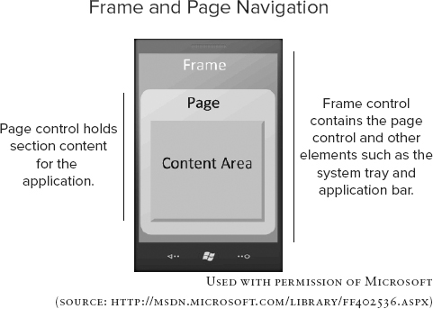
In a WP7 application, a frame is the top-level container control. It contains the page control and other system elements such as a system tray and application bar. Every application can have only one frame, and the frame exposes properties from a hosted page such as screen orientation. The PhoneApplicationFrame type is the reference object for the application frame. When you create a WP7 application project, access to the application’s root frame is also created in the App.xaml.cs file.
// The root frame of the Phone Application
public PhoneApplicationFrame RootFrame {get; private set;}
A page fills the entire content region of the frame. If the status bar and the optional application bar are visible, the drawable area of the page is smaller. The status bar is 32 pixels high and the application bar is 72 pixels high, so the minimal height of a page is 696 pixels and the maximal height is 800 pixels. The relationship between frame, page, and other UI elements is depicted in Figure 4-1. On WP7, every page you define is derived from the PhoneApplicationPage class.
FIGURE 4-1: Frame and page for WP7 applications
Basic Page Navigation
Navigation on WP7 means a transition between pages. As you may have seen in the previous chapter samples, the page navigation can be achieved through the NavigationSevice property of each PhoneApplicationPage. The most frequently used properties/methods to control the navigation include:
- CanGoBack: Gets a value that indicates whether there is at least one entry in back navigation history.
- CanGoForward: Gets a value that indicates whether there is at least one entry in forward navigation history.
- Navigate(): Navigates to the supplied URI, and each page can be identified by a URI.
- GoBack(): Navigates to the most recent entry in back navigation history, if there is one. You should check CanGoBack before calling this method.
- GoForward(): Navigates to the most recent entry in forward navigation history, if there is one.
The GoForward() method will always throw an exception because there isn’t any forward navigation stack for the current WP7 version.
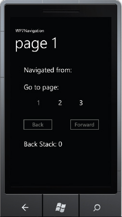
It’s time to create a sample application to demonstrate the usage of these key properties and methods. The sample application includes the following features:
- There are three pages with “page 1,” “page 2,” and “page 3” as the page title. All three pages have the same layout and functions, and page title is the only difference among them.
- In each page, users can navigate to other pages by clicking the listed page number. The current page number is grayed out and disabled.
- In each page, there are two navigation buttons for going back and going forward if possible.
- In each page, the source page is the previously displayed page.
- In each page, the entry count in the back stack is displayed.
Figure 4-2 is a screenshot of this sample application, WP7Navigation. You can create three Windows Phone portrait pages and name them Page1.xaml, Page2.xaml, and Page3.xaml. In each page, use a TextBlock for the page number and name them as textPage1, textPage2, and textPage3. Use a TextBlock for the forward and back buttons, naming them as buttonFwd and buttonBack, and then install the event handlers buttonFwd_Click() and buttonBack_Click() respectively. Use a TextBlock for the source page and back stack, and name them textFrom and textBack. You also need to define a local property currentPage to create a record of the current page number. You can obtain this information from the page title.
FIGURE 4-2: A sample application to demonstrate page navigation
You can make Page1.xaml as the default page when the application starts by modifying the WMAppManifest.xml file. After doing this, you can safely delete the MainPage.xaml.
<Tasks>
    <DefaultTask Name = "_default" NavigationPage="Page1.xaml"/>
</Tasks>
As just mentioned, you can use NavigationService to manage the page navigation in the corresponding event handlers shown in Listing 4-1.
LISTING 4-1: Managing page navigation, WP7NavigationWP7NavigationPage1.xaml.cs
private void buttonFwd_Click(object sender, RoutedEventArgs e)
{
    if (NavigationService.CanGoForward)
        NavigationService.GoForward();
}
private void buttonBack_Click(object sender, RoutedEventArgs e)
{
    if (NavigationService.CanGoBack)
        NavigationService.GoBack();
}
protected override void OnManipulationStarted(
    ManipulationStartedEventArgs args)
{
    if (args.OriginalSource == textPage1 ||
        args.OriginalSource == textPage2 ||
        args.OriginalSource == textPage3)
    {
        string text = (args.OriginalSource as TextBlock).Text;
        string uriString = "/Page" + text + ".xaml";
        int targetPage = Convert.ToInt32(text);
        if (currentPage != targetPage)
        {
            NavigationService.Navigate(
               new Uri(uriString, UriKind.RelativeOrAbsolute));
        }
    }
}
When users touch the screen, the system calls the OnManipulationStarted() event handler of the Page class. If the user touches a page number and current page isn’t the target page, then the Navigate() method of NavigationService is used to navigate from the current page to the target page. You should note that when you navigate to a page with the Navigate() method, WP7 always creates a new page instance. A good practice is to first check CanGoForward and CanGoBack when users click the forward or back button, before using GoForward() and GoBack() to navigate along the navigation history.
Sharing Data among Pages
Beside the UI connections among pages, pages also need to share data in many cases. When working with Android you can bundle the data in an intent object and pass it to the target activity because the screen navigation is handled through intents among activities. In iOS, the Model-View-Controller (MVC) pattern is adopted to share data among different views.
There are several ways for pages to share data on WP7. The first way is to add query arguments in the URI when you use NavigationService.Navigate() to pass simple types of data to the target page. This operation is similar to the method used to pass parameters between web pages. In the sample application, you need to display the source page, which is the previous page. You can achieve this goal by passing the current number from the source page to the target page. It’s possible to change the URI used in Listing 4-1 to:
string uriString = "/Page" + text + ".xaml" + "?from=" + currentPage;
To retrieve the passing arguments, you can use the QueryString() method provided by NavigationContext, a property of PhoneApplicationPage, which contains information about the navigation request. The code would look like this:
string from = "";
if (NavigationContext.QueryString.TryGetValue("from", out from))
   textFrom.Text = "Navigated from: " + from;
As we mentioned in the last chapter, the Application.Current property provides global access to the Application object associated with the program. Thus you can also store data you want to share among different pages in the App class, which derives from the Application class. In the sample application, you need to track the entry count in the back stack. You can define a property called BackStack in the App class to keep the entry count updated. Then you can make minor modifications to the code in the Listing 4-1 to achieve this.
protected override void OnManipulationStarted(
    ManipulationStartedEventArgs args)
{
    if (args.OriginalSource == textPage1 ||
        args.OriginalSource == textPage2 ||
        args.OriginalSource == textPage3)
    {
        string text = (args.OriginalSource as TextBlock).Text;
        string uriString = "/Page" + text + ".xaml" + "?from=" + currentPage;
        int targetPage = Convert.ToInt32(text);
        if (currentPage != targetPage)
        {
            (Application.Current as App).BackStack++;
            NavigationService.Navigate(
               new Uri(uriString, UriKind.RelativeOrAbsolute));
        }
    }
}
private void buttonBack_Click(object sender, RoutedEventArgs e)
{
    (Application.Current as App).BackStack--;
    if (NavigationService.CanGoBack)
        NavigationService.GoBack();
}
Before the application navigates to a new page the code increases the count number, and decreases the count number every time the application returns to the previous page.
Navigation Events
While navigating from/to a page, the PhoneApplicationPage exposes several methods you can override to take actions (such as initializing the page, managing the page states, canceling navigation, etc.) against navigation-related events. These methods include:
- OnNavigatingFrom(): Called just before the user is about to navigate from the current page. This is the place you can cancel the navigation if needed.
- OnNavigatedFrom(): Called when the current page is no longer the active page. This is the place you can preserve the page state.
- OnNavigatedTo(): Called after the user navigates to the current page. This is the place you can initialize the page or restore the page state.
- OnBackKeyPress(): Called when the hardware Back button is pressed. This is the place you can override the Back button’s default behavior when going to the previous page isn’t the logical behavior.
In the sample application, you need to gray out the current page and disable the Back or Forward button if there is no entry in the back or forward history stack. These initializations can be done in OnNavigatedTo() method as shown in Listing 4-2.
LISTING 4-2: Handling navigation events, WP7NavigationWP7NavigationPage1.xaml.cs
protected override void OnNavigatedTo(NavigationEventArgs args)
{
    base.OnNavigatedTo(args);

    if (!NavigationService.CanGoBack)
        buttonBack.IsEnabled = false;
    if (!NavigationService.CanGoForward)
        buttonFwd.IsEnabled = false;

    textPage1.Opacity = 1;
    textPage2.Opacity = 1;
    textPage3.Opacity = 1;
    string pageNumber = PageTitle.Text.Substring(PageTitle.Text.Length - 1);
    currentPage = Convert.ToInt32(pageNumber);
    switch (currentPage)
    {
        case 1:
            textPage1.Opacity = 0.5;
            break;
        case 2:
            textPage2.Opacity = 0.5;
            break;
        case 3:
            textPage3.Opacity = 0.5;
            break;
    }

    string from = "";
    if (NavigationContext.QueryString.TryGetValue("from", out from))
        textFrom.Text = "Navigated from: " + from;

    textBack.Text = "Back Stack: " + (Application.Current as App).BackStack;
}
In Listing 4-2, the code first uses NavigationService to check the CanGoBack and CanGoForward properties to disable the buttons if needed. Because there is no forward navigation stack, the Forward button is always disabled. Then the code uses the page title to decide the current page number and to gray out the corresponding control. Finally, the code displays the source page and the entry count of the back stack.
The default built-in behavior of the hardware Back button is to navigate to the previous page. There is no code required for the default operation. The system maintains a back stack for navigation caching, and a call of the Navigate() method will always add the source page to the back stack.
In the sample application you also track the entry count of the back stack, and the code decreases the count number every time the application returns to the previous page through the soft Back button control buttonBack. Therefore you need to override the OnBackKeyPress() method to tell the system that the code will handle the hardware Back button behavior instead, using the default operation.
LISTING 4-3: Overriding the Back button, WP7NavigationWP7NavigationPage1.xaml.cs
protected override void OnBackKeyPress(System.ComponentModel.CancelEventArgs e)
{
    if ((Application.Current as App).BackStack != 0)
    {
        e.Cancel = true;
        buttonBack_Click(null, null);
    }
}
In Listing 4-3, the code stops the navigation by using the Cancel property in the CancelEventArgs passed from the system. Setting the Cancel property to true will tell the system to cancel the Back button’s default operation and let the application handle it.
Using Controls
Like Android and iOS, WP7 provides a comprehensive control set that developers can use to build WP7 applications and maintain a consistent user experience. Table 4-1 lists the most commonly used WP7 controls and their counterparts on Android and iOS. The full list of the built-in base controls is available at http://msdn.microsoft.com/library/ff402549.aspx.
TABLE 4-1 WP7, Android, and iOS UI Controls
| WP7 | ANDROID | IOS |
| Border | n/a | n/a |
| Button | Button | UIButton/UIBarButtonItem |
| Canvas | FrameLayout/AbsoluteLayout | n/a |
| CheckBox | CheckBox | UITableView with checkmark accessory |
| Grid | TableLayout | UITableView |
| HyperlinkButton | Linkify TextView | n/a |
| Image | ImageView | UIImageView |
| ListBox | ListView | UITableView |
| MediaElement | MediaController | Media Player |
| MultiScaleImage | n/a | n/a |
| PasswordBox | EditText password | UITextField with secureTextEntry property |
| ProgressBar | ProgressBar | UIProgressView |
| RadioButton | RadioButton | UIPickerView |
| ScrollViewer | ScrollView | UIScrollView |
| Slider | SeekBar | UISlider |
| StackPanel | LinearLayout | UITabeleView |
| TextBlock | TextView | UILabel |
| TextBox | EditText | UITextView/UITextField |
| WebBrowser | WebView | UIWebView |
You can find these controls in the Toolbox of Visual Studio, so you can drag and drop them into your application design window. You can also instantiate them at run time if needed. In addition to these built-in controls, a Silverlight for the Windows Phone Toolkit can be downloaded from http://silverlight.codeplex.com/. This open source toolkit is designed and developed by Microsoft, and it offers additional controls that match the WP7 user experience.
The sample application WP7Controls introduced later in this chapter will need a control from the Silverlight for Windows Phone Toolkit. Thus you must install this toolkit in order to try the sample code.
The most recent release of the Silverlight Toolkit includes these components: AutoCompleteBox, ContextMenu, DatePicker, GestureService/GestureListener, ListPicker, LongListSelector, PerformanceProgressBar, TiltEffect, TimePicker, ToggleSwitch, and WrapPanel. This toolkit also includes a set of components to provide page transition effects. After you download and install the toolkit, you have to manually add them to the Toolbox: right-click in the Toolbox, select Choose Items in the pop-up menu, and check the controls you want to add in the pop-up dialog. Then you’ll see the selected controls appear in the Toolbox.
While using some controls from the Silverlight Toolkit you may notice that some icons are missing. To fix this issue, you have to add these icons into your project. You can find these icons in the toolkit installation folder, for example: %Program Files%Microsoft SDKsWindows Phonev7.0ToolkitFeb11BinIcons. Then copy the icons into your application project by putting them in a folder named Toolkit.Content.
Most controls, including the built-in controls and those from the Silverlight Toolkit, behave as you expect them to from your previous experience on other platforms, so this section doesn’t discuss the controls in detail. It does focus on two unique WP7 controls: Pivot and Panorama.
Overview of Pivot and Panorama Control
Compared to PCs, the screen size of a smartphone is small. To organize and display information (even different types of information) in a mobile application, you usually have to put information content on multiple pages/screens on Android and iOS and connect them through page navigation. As shown in the previous section, WP7 also provides a similar mechanism to display information. In addition, WP7 offers two special controls, Pivot and Panorama, to organize and display content.
Pivot is similar to the Tab Layout on Android or Segmented Control on iOS: it manages different views or pages without leaving the current context. Typical Pivot applications include the e-mail client and calendar application on a WP7 device. The Pivot control has two major usages: filtering and viewing multiple data sets, and switching application views.
Figure 4-3 illustrates the composition of a Pivot control. The base Pivot control is a container, and a PivotItem control is the actual container that hosts content and other controls. Each PivotItem has a Header property, and all headers appear in the same location and are the same size as the page titles of the normal WP7 page.
FIGURE 4-3: Pivot control for WP7 applications
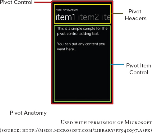
The Pivot control has built-in support for touch interaction and navigation. Users can navigate to each PivotItem by tapping its header or horizontally panning/flicking the Pivot control. The Pivot control handles all this navigation, so no code is needed. PivotItem control supports only portrait orientation, which means that, inside a PivotItem, content and controls can only scroll vertically regardless of whether the whole Pivot control is in portrait mode or landscape mode.
The Panorama experience is one of the major native Metro experiences that differentiate WP7 from other platforms. Many major applications such as People Hub, Media Hub, Picture Hub, Game Hub, Office Hub, and Marketplace Hub on WP7 are all implemented based on the Panorama control. By offering a long horizontal canvas, the contents and controls in a Panorama control can virtually spread beyond the screen boundary.
Figure 4-4 illustrates the composition of a Panorama control. The base Panorama control is similar to the Pivot control. It’s a container, and the developer can add multiple PanoramaItem controls to the Panorama surface. Generally, each PanoramaItem control offers a distinct functional purpose in its own section. The PanoramaItem is similar to the PivotItem control. It’s the container that hosts the content and other controls. The text size of the whole Panorama control title is designed to be large with a cut-off effect to motivate users to explore the contents outside the screen boundary.
FIGURE 4-4: Panorama control for WP7 applications
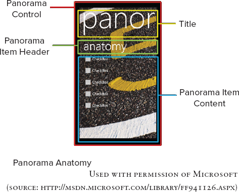
Unlike the Pivot control, users can navigate to each PanoramaItem only by horizontally panning/flicking the Panorama control. Only the current PanoramaItem title is visible, so there isn’t any way to tap the title to navigate to a new section. The PanoramaItem control supports both portrait and landscape orientation. When a PanoramaItem control is set to landscape orientation, the content inside the PanoramaItem is placed off the screen instead of being clipped. Thus users can pan around the contents in a wide PanoramaItem before snapping to another PanoramaItem.
Although Pivot and Panorama are conceptually similar, they have different usage scenarios in practice as listed in Table 4-2.
TABLE 4-2 Usage Comparisons between Pivot and Panorama
| CHARACTERISTIC | PIVOT | PANORAMA |
| Data | Filters-related content | Presents unrelated data |
| Views | Maintains consistent behavior among different views | Offers different presentations or different experiences among different views |
| Application Bar | Supports | Does not support |
| Content Organization | Optimizes contents to the screen size in the horizontal direction | Organizes contents in a long canvas beyond the screen boundary to offer a continuously explorative navigation experience |
Performance is one issue that many developers may not think about when using the Pivot and Panorama controls. Even though the contents in the PivotItem or PanoramaItem control may not be visible to users (especially with Panorama), by default they have been loaded to the memory when the page is displayed. This extra data will not only cause the application to start slower, but will also damage application responsiveness. Thus it is worth keeping the Pivot and Panorama control content items simple and few in number to maintain a better user experience. Generally there are no more than seven items in a Pivot control and four items in a Panorama control. An alternative solution is to implement the SelectionChanged() event handler for the Pivot and Panorama controls to defer the content loading.
Example of Using Pivot and Panorama Control
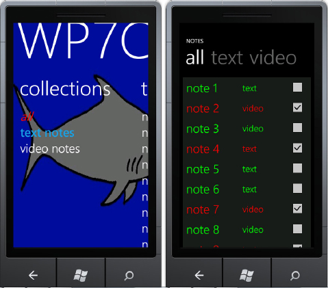
In order to demonstrate how to use the Pivot and Panorama controls, you create a sample application called WP7Controls. This sample application also appears in the next section to explain data binding and Model-View-ViewModel (MVVM) pattern. The sample application has the following features:
- This is an application to manage notes on the phone. There are two types of notes: text and video, and each note can be flagged as urgent or normal.
- Use a Panorama control for the default page. It contains three content sections which you implement using PanoramaItem controls: (1) links to view and change notes state; (2) list of text notes; (3) list of video notes.
- Use a Pivot control to show the collection of notes with detailed information. The notes are filtered by type. In addition, urgent notes appear in red, while regular notes are in green. The user can change the note’s urgency flag.
The completed application should look like the screens shown in Figure 4-5. In this section, we will just focus on how to build up the basic UI.
FIGURE 4-5: Screenshot of the sample application WP7Controls
Although Visual Studio provides a project template to create a Pivot/Panorama application, it’s more flexible to add Pivot/Panorama controls to a regular WP7 application manually. Use the following steps to perform this task:
1. Right click the project in the Solution Explorer and choose Add ⇒ New Item from the context menu. You’ll see the Add New Item dialog box.
2. Select Windows Phone Panorama Page template.
3. Type PanoramaPage.xaml in the Name field.
4. Click Add to add a new Panorama page to the project.
5. Repeat steps 1 through 4 to add a new Pivot page and name it PivotPage.xaml.
Visual Studio adds a Panorama control with two PanoramaItem controls to the page to PanoramaPage.xaml:
<Grid x:Name="LayoutRoot">
    <controls:Panorama Title="my application">
        <!--Panorama item one-->
        <controls:PanoramaItem Header="item1">
            <Grid/>
        </controls:PanoramaItem>
        <!--Panorama item two-->
        <controls:PanoramaItem Header="item2">
            <Grid/>
        </controls:PanoramaItem>
    </controls:Panorama>
</Grid>
Usually the Panorama control has a background image. The recommended background image size is 800 pixels in height and less than 2000 pixels in width. The picture is stretched to 800 pixels if its height is less than 800 pixels and it’s clipped to 2000 pixels if its width is more than 2000 pixels. To apply the background image, you can set the Background property of the Panorama control:
<controls:Panorama Title="WP7Controls">
    <controls:Panorama.Background>
        <ImageBrush ImageSource="PanoramaBackground.jpg"/>
    </controls:Panorama.Background>
</controls:Panorama>
In the first Panorama section, you need to add several links that can be used to navigate to the note details page. Because the PanoramaItem control is a layout container, you can put most controls inside it.
<controls:PanoramaItem Header="collections">
    <Grid>
        <StackPanel>
            <TextBlock Text="all" Name ="tbAll"
               Style="{StaticResource PhoneTextExtraLargeStyle}"/>
            <TextBlock Text="text notes" Name="tbText"
               Style="{StaticResource PhoneTextExtraLargeStyle}"/>
            <TextBlock Text="video notes" Name="tbVideo"
               Style="{StaticResource PhoneTextExtraLargeStyle}"/>
        </StackPanel>
    </Grid>
</controls:PanoramaItem>
Now you add three TextBlock controls to the first PanoramaItem control. They’re named tbAll, tbText, and tbVideo, respectively. The user expects to navigate to the note details page PivotPage.xaml after tapping any of these three controls. This page shows the corresponding type of note list. Thus in the code-behind file Panorama.xaml.cs, we can add code to handle the tapping event.
protected override void OnManipulationStarted(
   ManipulationStartedEventArgs args)
{
    string type = "";
    if (args.OriginalSource == tbAll)
        type = "all";
    else if (args.OriginalSource == tbText)
        type = "text";
    else if (args.OriginalSource == tbVideo)
        type = "video";

    if (type != "")
    {
        string uriString = "/PivotPage.xaml?type=" + type;
        NavigationService.Navigate(
           new Uri(uriString, UriKind.RelativeOrAbsolute));
    }
}
After identifying the source of the tapping event, the code can decide the note type and then use the NavigationService to navigate to the PivotPage and pass the note type to it. In the second and third Panorama section, you want to list text and video notes, respectively.
<!--Panorama item two-->
<controls:PanoramaItem Header="text notes">
    <Grid>
        <ListBox Name="TextList" ItemsSource="{Binding}">
        </ListBox>
    </Grid>
</controls:PanoramaItem>
<!--Panorama item three-->
<controls:PanoramaItem Header="video notes"  Orientation="Horizontal">
    <ListBox Name="VideoList" ItemsSource="{Binding}">
        <ListBox.ItemsPanel>
            <ItemsPanelTemplate>
                <toolkit:WrapPanel x:Name="wrapPanel" Width="600" />
            </ItemsPanelTemplate>
        </ListBox.ItemsPanel>
    </ListBox>
</controls:PanoramaItem>
The example uses a ListBox control to host the note list. Setting the ItemSource property to {Binding} means the ListBox content is determined at run time. The next section discusses the details of this topic. For video notes, you set the PanoramaItem’s orientation to Horizontal and use a WrapPanel control to define the content layout in this PanoramaItem. The WrapPanel control comes with the Silverlight Toolkit for Windows Phone introduced earlier, and it arranges the controls inside it in from left to right and top to bottom. Set the WrapPanel width to 600 pixels, which is wider than the screen width. This makes the video notes section stretch across multiple screens.
Because the basic function of the PivotPage page is to list detailed note information, which is decided at run time, the default layout definition of PivotPage.xaml is sufficient after you add one more PivotItem control and set its titles.
<controls:Pivot Title="NOTES" Name="NotesPivot">
    <!--Pivot item one-->
    <controls:PivotItem Header="all">
        <Grid/>
    </controls:PivotItem>
    <!--Pivot item two-->
    <controls:PivotItem Header="text">
        <Grid/>
    </controls:PivotItem>
    <!--Pivot item three-->
    <controls:PivotItem Header="video">
        <Grid/>
    </controls:PivotItem>
</controls:Pivot>
You can also connect the PivotPage to the PanoramaPage by implementing the OnNavigatedTo() event method in the code-behind file PivotPage.xaml.cs.
protected override void OnNavigatedTo(
   System.Windows.Navigation.NavigationEventArgs e)
{
    base.OnNavigatedTo(e);
    string type = "";
    if (NavigationContext.QueryString.TryGetValue("type", out type))
    {
        if (type == "all")
            NotesPivot.SelectedIndex = 0;
        else if (type == "text")
            NotesPivot.SelectedIndex = 1;
        else if (type == "video")
            NotesPivot.SelectedIndex = 2;
    }
}
When the user navigates to the PivotPage from the PanoramaPage, the application gets the note type using QueryString(). The note type is used to determine the focused PivotItem by setting its SelectedIndex property.
At this point, you have the basic UI set up for the sample application. The next section introduces how to integrate the data and control logic with the UI by using data binding and the MVVM pattern.
Data Binding and MVVM
Data binding is a widely used technology in Silverlight applications to enable different types of data sources to be connected with the UI elements. It makes data-UI connection and synchronization easy and automatic. The concept of data binding is also familiar to Android and iOS developers.
On Android, an AdaptView is a type of view whose children and contents are determined by an Adapter that binds to the concrete data. ListView, GridView, Spinner, and Gallery are well-known subclasses of AdapterView. An Adapter retrieves data from a data source, either a static resource or an external source that relies on code output or query results. AdapterView uses the setAdapter() method to set the adapter. Because Adapter provides the data and the views to present the data, when the data changes, the content displayed in AdaptView also changes.
On iOS, Cocoa bindings are a key technology to fully implement a MVC pattern. Cocoa bindings simplify programming using the MVC pattern. They provides means to keep UI presentations (views) and data (models) synchronized through a mediated connection; thus a change in one leads to the corresponding change in the other. Cocoa bindings rely on Key-Value Coding (KVC) and Key-Value Observing (KVO).
Data binding on WP7 is similar to the iOS and Android, and it provides a way to display and interact with data. Silverlight applications use XAML files to declare UI elements, layouts, and their properties. In the previous sample applications, most UI element properties are hard-coded as static values. This approach isn’t sufficient for the WP7Controls sample in this section — you need to display the note list whose content isn’t fixed, but may change at run time. Even though you can still use code to manually update the list UI when there is a UI data change, this method is error-prone because the greater amount of code increases the potential for bugs and development overhead.
You can create data binding in XAML using a binding expression: <object property=” {Binding propertyPath, oneOrMoreBindingProperties}” .../>. For example, <TextBox Text=”{Binding Path=Name, Mode=OneWay}”/> means the content displayed in the TextBox is bound to the Name property of an object, and if the value of Name changes, the content of TextBox also changes. In this way, the UI presentation is bound to the data object. The commonly used properties include:
- Source: Specifies a reference to an object or a collection of objects.
- Path: Specifies the path to the binding source property.
- Mode: Specifies the direction of binding.
- OneTime binding updates the target when the binding is created.
- OneWay binding updates the target whenever the source property changes.
- TwoWay binding updates source property whenever the target property is updated and vice versa.
- Converter: Specifies the converter object that modifies the data as it is passed between the source and target.
The full list of binding properties is available at http://msdn.microsoft.com/library/cc189022.aspx.
MVVM Pattern
As an iOS developer, you must be comfortable using the MVC (Model-View-Controller) pattern to design and implement your application. The MVC pattern defines the roles of objects in an application and how they communicate with each other. In the MVC model:
- View is the UI.
- Model encapsulates the data that the view displays.
- Controller contains the business logic that modifies the model depending on the user interaction with the view and updates the UI when model changes.
The MVC pattern can help decouple models and views to reduce application complexity and increase application flexibility.
WP7 relies on the MVVM (Model-View-ViewModel) pattern, which is close and related to the MVC pattern. In the MVVM pattern:
- View defines what the user sees on the screen such as controls, layouts, styling, and data template.
- Model encapsulates business logic and data.
- ViewModel encapsulates the presentation logic and data for the view.
There is no direct communication between View and Model, and ViewModel acts as the middleman between View and Model to handle the data update and UI presentation. The implementation of the MVVM pattern in WP7 heavily leverages the data-binding technology we just introduced. Figure 4-6 illustrates the relationship between the MVVM pattern and data binding.
FIGURE 4-6: Data binding and MVVM pattern
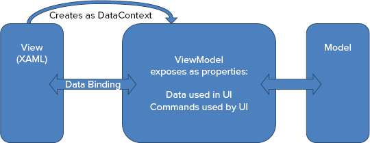
The View can access the ViewModel by setting its DataContext property. The properties of the controls in a View are bound to the properties exposed by the ViewModel through data binding. In addition, the View may use Converter to format the data before it is displayed. The UI presentation, logic, and behavior can be defined and implemented in the XAML file or the code-behind file.
In contrast to the View, the Model classes are non-visual classes, and they are all about the application data and the business logic among this data. The Model classes usually don’t have direct access to the View or ViewModel and don’t know how they’re implemented. Instead, they typically implement the change notification event interfaces INotifyPropertyChanged and INotifyCollectionChanged. In this way, changes in Model can be easily propagated to the View through data bindings between View and ViewModel.
Similar to the Model, the ViewModel classes are also non-visual classes. The ViewModel coordinates interaction between the View and the Model. As the name suggests, the ViewModel is the model of the view, and the actual data (not the data model and business logic defined in the model) is managed by the ViewModel. The ViewModel may implement additional properties that may not be defined in the Model for better presentation and consumption by the View.
To explain how to implement the MVVM pattern in a WP7 application, let’s complete the sample application, WP7Controls, by binding the application data with the UI you have already created.
Creating the Model
Because the model defines the basic data structure and business logic, we can define a class named Note to hold the properties we need for the sample application:
- Title: The title of a note, which is displayed in the note list
- Type: The type of a note, either text or video
- Urgent: A flag used to define a note as urgent or not
To better organize your project files, you need to create a new folder Model for the project: right-click the project in Solution Explorer and choose Add ⇒ New Folder from the context menu. Type Model and press Enter. Use the same technique to create the View and ViewModel folders.
After creating the folders, you can create a new class in the Model folder: right-click the Model folder in Solution Explorer and choose Add ⇒ Class from the context menu. You’ll see an Add New Item dialog. Type Note.cs in the Name field and click Add to add the class. The model typically implements the INotifyPropertyChanged interface so that the model can propagate its properties’ changes by raising the PropertyChanged events, as shown in Listing 4-4.
LISTING 4-4, Model class for WP7Controls application, WP7ControlsWP7ControlsModelNote.cs
public class Note : INotifyPropertyChanged
{
    public string Title{get;set;}
    public string Type{get;set;}

    private bool _urgent;
    public bool Urgent
    {
        get{return _urgent;}
        set
        {
            _urgent = value;
            RaisePropertyChanged("Urgent");
        }
    }

    public event PropertyChangedEventHandler PropertyChanged;
    private void RaisePropertyChanged(string propertyName)
    {
        if (this.PropertyChanged != null)
        {
            this.PropertyChanged(this,
               new PropertyChangedEventArgs(propertyName));
        }
    }
}
As shown in Listing 4-4, the code only raises the PropertyChanged event in the Urgent property, and this means that the user can only change the Urgent property. Later when you bind the UI elements to the Note model, the bound UI elements actually subscribe to the PropertyChanged event. If a UI element is bound to a property that raises the event, the subscriber UI element gets the notification.
Creating the ViewModel
ViewModel is the connection between the Model and the View, so that it hosts the actual data used in the View. In the sample application, the data is a collection of Note objects. The ObservableCollection class implements the INotifyCollectionChanged interface in the same way as INotifyPropertyChanged that provides notifications when items of the collection are changed. Because we need to bind the object collection to a list type control such as ListBox, the ObservableCollection class can be used to define the collection of notes.
The ViewModel used in this example contains the code to get the collection of notes. For demo purposes, the example populates the collection with sample data as shown in Listing 4-5. For real applications, the data could be from isolated storage or remote services.
LISTING 4-5 ViewModel class for WP7Controls application, WP7ControlsWP7ControlsViewModelNoteViewModel.cs
public class NoteViewModel
{
    public ObservableCollection<Note> Notes{get;set;}

    public void GetNotes()
    {
        ObservableCollection<Note> notes = new ObservableCollection<Note>();

        notes.Add(new Note()
        {
            Title = "note 1",
            Type = "text",
            Urgent = false
        });

        notes.Add(new Note()
        {
            Title = "note 2",
            Type = "video",
            Urgent = true
        });
        // more sample data can be added

        Notes = notes;
    }
}
In the ViewModel, the property Notes is used to hold the collection of notes, and the ViewModel provides a method called GetNotes() to the View to access this property.
Creating the View
In MVVM pattern implementation, View can be a window, a page, or a UI control. In the sample application, several application elements provide a View, and the application needs to bind to the ViewModel through data binding. In the PivotPage which is used to display the note details, there are three PivotItem controls defined earlier that are used to display the note list. The only difference between the contents shown in these three PivotItem controls is the data, and the PivotItem controls used in this sample share the same UI controls and layout. Thus, we can create a UI control called NoteListView and bind the ViewModel with this control, and then we can add it to the PivotItem controls. The NoteListView contains a ListBox and each item in the ListBox has the following columns:
- Title: A TextBlock is used to display the Title property. The binding mode is OneWay.
- Type: A TextBlock is used to display the Type property. The binding mode is OneWay.
- Urgent: A CheckBox is used to indicate whether a note is urgent or not. The user can check this item and the code updates the Model through data binding.
To create the NoteListView control, you can right-click the View folder in Solution Explorer and choose Add ⇒ New Item from the context menu. You’ll see the Add New Item dialog box. Select Windows Phone User Control entry and type NoteListView.xaml in the Name field. Click Add to add the control. Listing 4-6 shows the UI definition of the NoteListView.
LISTING 4-6: View for note list used in PivotPage, WP7ControlsWP7ControlsViewNoteListView.xaml
<UserControl.Resources>
    <src:TitleColor x:Key="TitleColor">
    </src:TitleColor>
</UserControl.Resources>
<Grid x:Name="LayoutRoot" Background="{StaticResource PhoneChromeBrush}">
    <ListBox Name="NoteList" ItemsSource="{Binding}">
        <ListBox.ItemTemplate>
            <DataTemplate>
                <Grid>
                    <Grid.ColumnDefinitions>
                        <ColumnDefinition Width="200"/>
                        <ColumnDefinition Width="180"/>
                        <ColumnDefinition Width="100"/>
                    </Grid.ColumnDefinitions>
                    <TextBlock x:Name="Title"
                       Text="{Binding Path=Title, Mode=OneWay}" Grid.Column="0"
                       HorizontalAlignment="Left" VerticalAlignment="Center"
                       Style="{StaticResource PhoneTextExtraLargeStyle}"
                       Foreground="{Binding Path=Urgent,
                                   Converter={StaticResource TitleColor}}"/>
                    <TextBlock x:Name="Type"
                       Text="{Binding Path=Type, Mode=OneWay}" Grid.Column="1"
                       HorizontalAlignment="Left" VerticalAlignment="Center"
                       Style="{StaticResource PhoneTextLargeStyle}"
                       Foreground="{Binding Path=Urgent,
                                   Converter={StaticResource TitleColor}}"/>
                    <CheckBox x:Name="Urgent"
                       IsChecked="{Binding Path=Urgent, Mode=TwoWay}"
                       Grid.Column="2" HorizontalAlignment="Left"
                       VerticalAlignment="Center"/>
                </Grid>
            </DataTemplate>
        </ListBox.ItemTemplate>
    </ListBox>
</Grid>
The ListBox control uses DataTemplate to define the UI display for each note item in the bound collection of notes. Each UI control that’s used to display the note details is bound to the ViewModel using binding syntax. For example, Text=”{Binding Path=Title, Mode=OneWay}” binds the Text property of a TextBlock control to the Title property of a Note object. Because the TextBlock control is only for display, we can’t change its Text property through user interaction. Thus the binding mode is OneWay. IsChecked=”{Binding Path=Urgent, Mode=TwoWay}” binds the check state of a CheckBox to the Urgent property of a Note object. Because the user can change the check state of the CheckBox control, and the application requires the Model data to update its value when the user changes the CheckBox check state, the binding mode is TwoWay.
Using Converters
Data binding is used to bind the UI control property to the Model data of the same data type: the Text property of the TextBlock is bound to the string type Title, and the IsChecked property is bound to the Boolean type Urgent. However, sometimes an application needs to bind the UI control property to Model data with a different data type. For example, you might want to display the Title and Type in green if a note isn’t urgent and in red if it is urgent. In this case, the Foreground property, which is a Brush type, needs to bind to the Urgent property of a Note object, which is a Boolean type. Converters provide the flexibility required to establish bindings between two different data types. Converter is a class that implements the IValueConverter interface. You can create a custom converter named TileColor that converts a Boolean-type Urgent property to a Brush object and then bind it with the Foreground property of a TextBlock control. Put the class definition of TileColor in the NoteListView.xaml.cs as shown in Listing 4-7.
LISTING 4-7: Converter for binding different data types, WP7ControlsWP7ControlsViewNoteListView.xaml.cs
public class TitleColor : System.Windows.Data.IValueConverter
{
   public object Convert(object value, Type targetValue,
      object parameter, CultureInfo culture)
    {
        SolidColorBrush brush = new SolidColorBrush();
        bool b = (bool)value;
        if (b)
            brush.Color = Color.FromArgb(255, 255, 0, 0);
        else
            brush.Color = Color.FromArgb(255, 0, 255, 0);
        return brush;
    }

   public object ConvertBack(object value, Type targetType,
      object parameter, CultureInfo culture)
    {
        throw new NotImplementedException();
    }

}
A converter class should implement the Convert() method (mapping the source value to another data type that the target can use) and the ConvertBack() method (mapping the target value to a data type that the source can use). In the sample application, because the Foreground binding is OneWay, you don’t need to implement ConvertBack(). Before you can use this converter, you need to declare it as a resource in NoteListView.xaml.
<UserControl.Resources>
    <src:TitleColor x:Key="TitleColor">
    </src:TitleColor>
</UserControl.Resources>
To use this converter, you need to set the Converter binding property to the resource you just declared: Foreground=”{Binding Path=Urgent, Converter={StaticResource TitleColor}}”/>. In this way, the TextBlock color is bound to the Urgent property of a note object.
After you’ve defined the NoteListView custom control, you can add it the PivotPage as shown in the Listing 4-8.
LISTING 4-8: adding NoteListView to PivotPage, WP7ControlsWP7ControlsPivotPage.xaml
<Grid x:Name="LayoutRoot" Background="Transparent">
    <!--Pivot Control-->
    <controls:Pivot Title="NOTES" Name="NotesPivot">
        <!--Pivot item one-->
        <controls:PivotItem Header="all">
            <Grid>
                <views:NoteListView x:Name="AllList">
                </views:NoteListView>
            </Grid>
        </controls:PivotItem>

        <!--Pivot item two-->
        <controls:PivotItem Header="text">
            <Grid>
                <views:NoteListView x:Name="TextList">
                </views:NoteListView>
            </Grid>
        </controls:PivotItem>

        <!--Pivot item three-->
        <controls:PivotItem Header="video">
            <Grid>
                <views:NoteListView x:Name="VideoList">
                </views:NoteListView>
            </Grid>
        </controls:PivotItem>
    </controls:Pivot>
</Grid>
Binding View and ViewModel
Now you have the View, Model, and ViewModel ready, and the ViewModel is able to provide Model data to the View. The last piece to make them work together is to connect the View and ViewModel. As described earlier, the View accesses the ViewModel through its DataContext property as shown in Listing 4-9.
LISTING 4-9: binding view and view model, WP7ControlsWP7ControlsPivotPage.xaml.cs
public partial class PivotPage : PhoneApplicationPage
{
    private NoteViewModel vm;
    public PivotPage()
    {
        InitializeComponent();
        vm = new NoteViewModel();
    }

   protected override void OnNavigatedTo(
      System.Windows.Navigation.NavigationEventArgs e)
    {
        base.OnNavigatedTo(e);

        vm.GetNotes();
        AllList.DataContext = vm.Notes;
        TextList.DataContext = from Note in vm.Notes
                               where Note.Type == "text"
                               select Note;
        VideoList.DataContext = from Note in vm.Notes
                                where Note.Type == "video"
                                select Note;
        string type = "";
        if (NavigationContext.QueryString.TryGetValue("type", out type))
        {
            if (type == "all")
                NotesPivot.SelectedIndex = 0;
            else if (type == "text")
                NotesPivot.SelectedIndex = 1;
            else if (type == "video")
                NotesPivot.SelectedIndex = 2;
        }
    }
}
In Listing 4-9, the code instantiates a ViewModel object vm and populates the sample Model data by calling vm.GetNotes(). For the all-notes list in PivotPage, the code displays the whole collection; thus you can set its DataContext to the collection of the note objects: AllList.DataContext = vm.Notes. On the other hand, for the text notes list and video notes list, the code displays a subset of the whole collection based on type, so the code uses Language Integrated Query (LINQ) statements to populate the data.
TextList.DataContext = from Note in vm.Notes
                       where Note.Type == "text"
                       select Note;
VideoList.DataContext = from Note in vm.Notes
                        where Note.Type == "video"
                        select Note;
Similarly, the code can connect the View and ViewModel in the PanoramaPage using the same technique as shown for the PivotPage.
Handling UI Events
Users interact with WP7 applications through touch gestures, and WP7 applications respond to the user interactions by handling UI events.
Gesture Support
WP7 UI controls are gesture-aware, and support gestures such as tap, double tap, tap and hold, pan, flick, and pinch and stretch. Some controls already have the support built-in for these gestures, along with the corresponding UI transitions. For example, the Pivot and Panorama controls already support the pan and flick gestures, so you don’t need to write any code to support the switch from one section to another.
However, sometimes you want to handle the touch gesture manually by using manipulation events. Manipulation events are supported on controls derived from UIElement:
- ManipulationStarted: Occurs when the user places the finger(s) on the screen.
- ManipulationDelta: Occurs repeatedly when the finger(s) move on the screen.
- ManipulationCompleted: Occurs when the finger(s) are removed from the screen.
The Silverlight framework provides additional support on simple gestures, such as tap, double tap, and tap and hold, through mouse events.
- Tap: Uses the MouseLeftButtonUp event.
- Double tap: Starts a TimeSpan timer when the MouseLeftButtonDown event occurs. If there are two MouseLeftButtonUp events and one MouseLeftButtonDown event occurs before the timer expires and the MouseMove event doesn’t occur between the first MouseLeftButtonUp event and the second MouseLeftButtonDown event, a double tap occurs.
- Tap and hold: Starts a TimeSpan timer when the MouseLeftButtonDown event occurs, and stores the users’ touch location. If the MouseLeftButtonUp event doesn’t occur before the timer expires and the user doesn’t move the touch location more than a few pixels in the MouseMove event, a tap and hold occurs.
Orientation
Orientation change is another important UI event that an application may be interested in. To support orientation changes on Android you can provide different resources and layouts for different screen orientations. By default, the Android application will rotate when the screen rotates and pick the right layouts and resources to render on the screen. On iOS you need to programmatically declare the supported orientations and program the view controllers to make changes to the views in response to the system notifications.
WP7 supports three screen orientations: portrait, landscape left (the top of the page rotates to the left), and landscape right (the top of the page rotates to the right). By default the application pages support only one orientation, either portrait or landscape depending on the template you selected when you created the page. To support multiple orientations, you have to declare it in the SupportedOrientations property of the Page class. This property can take Portrait, Landscape, or PortraitOrLandscape as the possible value. However, you can’t specify only left landscape or only right landscape if you support orientation changes — you have to support both. If it’s set to PortraitOrLandscape, the page re-orients itself automatically when the user rotates the phone. You can’t force a page to re-orient in code.
To handle the orientation change, you can install an event handler for the OnOrientationChanged() event, which is called after the Orientation property of the Page class changes. An OrientationChangedEventArgs object is passed to the event handler, and you can get the current orientation through its Orientation property. You might want to add transition animation effects to the orientation change as you can do on Android. Unfortunately, custom screen transition animation effects are prohibited as part of the application, so they’re implemented and handled by the system framework.
Other UI Considerations
In addition to the core concepts and UI controls, some other UI considerations are worth exploring to make your WP7 applications more efficient and appealing.
Application Bar
The Application Bar is a built-in control that allows you to add a toolbar to your WP7 applications. It provides functions, such as Menu, that are similar to the Action Bar on Android and Toolbar on iOS. You should use the Application Bar instead of creating your own menu system if a menu system is needed. This design approach helps create a consistent user experience with other applications on the device.
The Application Bar is displayed as a row of up to four icon buttons to access the most commonly used application-specific tasks and views. In addition to the icon buttons, you can add additional actions to the Application Bar by adding more text-based menu items. You don’t have to use all four icon buttons if the actions aren’t primary, and you can put those less-used actions on the menu. When you use the menu item, you should pay attention to the text length because the title will run off the screen if it’s too long. The recommended text length is 14 to 20 characters. Windows Phone Developer Tools provides a set of icons that are used by the WP7 system applications. You may want to use these icons if you implement similar functionality. You can find these icons at %Program Files%Microsoft SDKsWindows Phonev7.0Icons.
When you create a new Page in Visual Studio, the IDE generates some sample code showing Application Bar usage. You can uncomment this code if you want to add support for the Application Bar and customize it as needed.
<phone:PhoneApplicationPage.ApplicationBar>
    <shell:ApplicationBar IsVisible="True" IsMenuEnabled="True">
      <shell:ApplicationBarIconButton
         IconUri="/Images/appbar_button1.png" Text="Button 1"/>
       <shell:ApplicationBarIconButton
        IconUri="/Images/appbar_button2.png" Text="Button 2"/>
      <shell:ApplicationBar.MenuItems>
        <shell:ApplicationBarMenuItem Text="MenuItem 1"/>
        <shell:ApplicationBarMenuItem Text="MenuItem 2"/>
    </shell:ApplicationBar.MenuItems>
  </shell:ApplicationBar>
</phone:PhoneApplicationPage.ApplicationBar>
The ApplicationBarIconButton and ApplicationBarMenuItem classes are controls for the icon buttons and menu items used in the Application Bar. Both classes expose a Click event that can be handled like other button controls.
Splash Screen
When you create a new WP7 project, a default splash screen image, SplashScreenImage.jpg, is added to your project. The user will see this image immediately when the application is launched until the first page of the application is displayed.
You can replace the default splash screen image with another image you like. However, you must follow some rules to make the new image work.
- The image must be 480 × 800 pixels in size.
- The image much be named SplashScreenImage.jpg.
- The Build Action property for this image file must be set to Content.
When you develop an application, sometimes it needs a customized look-and-feel to match the brand image of your product. This section introduces the WP7 techniques for UI customization.
Styles and themes are used to personalize an application’s visual elements. This concept is widely adopted in web design. Styles such as Cascading Style Sheets (CSS) define control attributes, including height, width, font size, and color. On Android, styles are defined as XML resources and are separate from the XML that defines the layout.
Like Android, on WP7 Style is an object which is comprised of a collection of property setters and targets a particular control type. Styles are usually defined in XAML files. By using styles, it’s easy to maintain the same look-and-feel for controls in an application and improve the application maintainability.
On WP7, you have four options to set a UI control’s look-and-feel, (listed in order of precedence from low to high):
1. Use the default control property value. This option has the lowest precedence, and the control properties are set to the default value if you don’t use any style or explicitly set the value.
2. Use the default style. You can find the list of the default styles at %Program Files%Microsoft SDKsWindows Phonev7.0DesignThemeResources.xaml.
3. Define your own styles and set the Style property of the control to apply the customized styles to the controls you want to customize. This may affect all controls that use the same style.
4. Explicitly set the control’s UI properties, such as font, color, and padding. This applies only to the control object you’re working on, and it won’t affect other control objects with the same type. This option has the highest precedence, and you can override any style or default value by explicitly setting the property value.
This section shows how to apply the customized styles to the WP7 applications. The first thing you need to do is define your own style. Let’s use the WP7Controls sample application for the demonstration. If you look at App.xaml, you’ll see a placeholder element for customized styles: <Application.Resources/>. You can define your own style here. For example, if you want to customize the TextBlock control with a red foreground color and an italic font style, you can define a style as:
<Style x:Key="MyTextBlockStyle"
         BasedOn="{StaticResource PhoneTextBlockBase}"
         TargetType="TextBlock">
    <Setter Property="Foreground" Value="Red"/>
    <Setter Property="FontStyle" Value="Italic"/>
</Style>
In the style definition, you use the Key property to identify the style and later reference it in control definitions in the XAML file. The BasedOn property specifies the style that’s the basis of this style. Each style supports only one BasedOn value. The TargetType property sets the type for which this style is intended. The example defines a style named MyTextBlockStyle. You then use setters to apply property values that you want to use the style. In this example, the style is based on PhoneTextBlockBase, the default TextBlock style, and it should be applied to the TextBlock controls.
After defining a custom style, you can apply it to the TextBlock controls used in the WP7Controls application. For example, in PanoramaPage.xaml, you can use MyTextBlockStyle to style one TextBlock in the first PanoramaItem.
<TextBlock Text="all" Name ="tbAll"
   FontSize ="{StaticResource PhoneFontSizeExtraLarge}"
   Style="{StaticResource MyTextBlockStyle}"/>
Now the foreground color of this TextBlock control is red and its font style is italic.
On WP7, theme is a color-related concept. WP7 allows the user to customize the system theme on their phones. A WP7 system theme is a combination of a background and an accent color. In detail, the user can select light or dark background; and the user can select an accent color from a choice of 10 accent colors. You have the option of using the system theme color to color the application controls. For example, you can use PhoneAccentBrush, PhoneAccentColor, and PhoneTextAccentStyle in the properties that are related to colors. Then these control properties will use the same color as the color that the user selects for the system theme. In the PanoramaPage.xaml, you can use PhoneTextAccentStyle to style another TextBlock in the first PanoramaItem.
<TextBlock Text="text notes" Name="tbText"
   FontSize ="{StaticResource PhoneFontSizeExtraLarge}"
   Style="{StaticResource PhoneTextAccentStyle}"/>
Now if the user changes the system accent color, this TextBlock control’s color will change accordingly.
This chapter highlights key concepts about creating a user interface for WP7 applications. Page is the basic building block for WP7 applications. Each page is composed of controls, either built-in controls or custom controls. Developers can personalize application look-and-feel through styles and theme.
MVVM is the design pattern widely adopted in WP7 applications, and it decouples the application UI and data. Implementing MVVM relies heavily on data-binding technology which makes data changes reflect in the UI automatically.
Starting with the next chapter, the book focuses more on how to use specific WP7 platform features such as application data storage.