
Chapter 7. Media and Web Elements
In This Chapter
• Using the Image element
• Capturing and displaying user input with the InkPresenter
• Playing audio and video with the MediaElement
• Using the XNA SoundEffect class
• Using the Deep Zoom Composer
• Using touch gestures to manipulate a MultiScaleImage
• Communicating to and from a web page using the WebBrowser control
• Executing arbitrary JavaScript on a web page with InvokeScript
• Storing and viewing offline web content with the WebBrowser control
Silverlight for Windows Phone leverages a mature set of web and media related elements. This chapter explores some of the most feature-rich controls present in the Silverlight toolbox.
This chapter is jam-packed full of examples and begins by looking in depth at the Image element. The InkPresenter is discussed, and you see how to create a simple sketch app.
The MediaElement is also discussed and you see how it is used to play audio and video files stored locally on the phone, or streamed over the Internet. This chapter also examines a sample app that provides you with a test bed for experimenting with the MediaElement’s main properties.
The chapter looks at leveraging XNA within your Silverlight app to play sound effects more efficiently and then explores Deep Zoom to see how the MultiScaleImage element is used to provide stunning visual experiences, while making efficient use of your users’ bandwidth. We delve into a sample client and server application that allows the user to select and manipulate a Deep Zoom image.
Finally, the chapter explores the WebBrowser control, and you see how to communicate to a web page from your Silverlight for Windows Phone app and vice versa. You also discover how to execute arbitrary JavaScript on a web page to modify page content or to attach new behaviors, and how to store and browse offline content to decrease network usage.
Displaying Images with the Image Element
The Image element is a FrameworkElement that makes it easy to display both local or remote images on the phone.
The Image element supports two image formats: PNG and JPEG, and displays indexed images with 1, 4, or 8 bit color-depth, or true color images with 24 or 32 bit color-depth.
The Image.Source property is used to set the URI of the image file location. This value can be either an absolute or relative URI. A URI can be used to specify a source file from a variety of locations, including the following:
• The current assembly
• A referenced assembly
• The XAP file
• An external network, such as an image on the Web
Relative URIs are the most common way to identify local images in Silverlight for Windows Phone apps. The following example demonstrates how to display an image called Book.jpg, which is located in the root directory of a project, and which has its Build Action set to Content:
<Image Source="/Book.jpg" />
When the Build Action of an image file is set to Content, its path is relative to the root of the project. Conversely, when the Build Action is set to Resource, its path is relative to the directory in which it is located.
If the image were located in a subdirectory of the project, for example, a directory called Images, then the Image element would be as follows:
<Image Source="/Images/Book.jpg" />
The trailing slash is required when referring to images with a Build Action set to Content. If using a Build Action of Resource, a trailing slash cannot be used:
<Image Source="Images/BookAsResource.png" />
Avoid setting the Build Action of images to Resource. Instead use the Content Build Action because this will reduce the size of your project’s assembly, thus reducing the time the CLR takes to load it.
One caveat, however, is that it takes longer for the CLR to fetch a file that is content than it does to fetch a file that is a resource. This is because the image file data becomes present in memory as soon as the assembly is loaded. So, the Content Build Action, while reducing the startup time of your app, may lead to some images being displayed after the rest of the UI has been displayed. This is especially important for background images, whose momentary absence will be glaringly evident. The rule of thumb: If you need an image to be loaded immediately because it is the background for a page, for example, use the Resource Build Action; otherwise, use the Content Build Action.
An absolute URI, which targets an image in the same or another assembly, can be specified using the Relative Component URI scheme, as the following example demonstrates:
<Image Source="/AssemblyNameWithoutTheDllExtension;component/Images/Book.png" />
The URL of an image located on the Web can also be specified as shown:
<Image Source="http://www.example.com/Images/Book.jpg" />
Try to limit the number of images in your app. Even if your image happens to be a 30KB compressed JPEG image, at runtime that image becomes an uncompressed surface that may take several MBs of memory. In most cases an application must never consume more than 90MB of RAM, unless it has more than 256MB of total memory; otherwise it will fail Windows Phone Marketplace certification.
For more information on measuring the memory available to your app see the section “Device Status,” in Chapter 2, “Fundamental Concepts in Silverlight Development for Windows Phone.”
Working examples for each of these cases are located in the MediaExamplesView.xaml page in the downloadable sample code.
There are numerous examples of using the Image control throughout this book; you see how to implement image localizability, image caching, and in Chapter 12, “Launchers and Choosers,” you see how to data bind the Image.Source property to a viewmodel property.
Image Sizing
The size of an image control either can be set explicitly using its Width and Height properties, or the image can depend on its container to determine its size. If the container is a simple container such as a Canvas, the Image will be displayed using the native dimensions defined in the image file. The Image.Stretch property is used to control the sizing behavior of the Image when its size differs from its native image size. The Stretch property is of type System.Windows.Media.Stretch, whose values are described in Table 7.1.
Table 7.1. Stretch Enum Values and Their Effect on Image Sizing

The effects of each of these enum values on image sizing are depicted in Figure 7.1.

Figure 7.1. The Image.Stretch property determines how an image is sized.
The source for this section is located on the MediaExamplesView.xaml page in the ControlExamples directory of the WindowsPhone7Unleashed.Examples project in the downloadable sample code.
Providing a Drawing Surface with the InkPresenter Element
InkPresenter provides a primitive drawing surface to collect strokes or Bézier curves within a Canvas control. The InkPresenter is derived from the Canvas class and includes the addition of a single property called Strokes, which is a collection of Stroke objects. A Stroke represents a line segment and is comprised of a collection of StylusPoints.
The behavior of the InkPresenter can be likened to that of a pen and paper. When the pen makes contact with the paper, you begin a Stroke. As the pen moves on the paper, the Stroke is constructed using StylusPoints. When the pen leaves the paper, the Stroke is complete.
The appearance of a Stroke can be defined by using its DrawingAttributes property. This includes its color, height, outline, and width (see Figure 7.2).

Figure 7.2. A Stroke consists of many StylusPoint objects.
The InkPresenter does not provide any specialized support for capturing touch input. Instead, Strokes are created either in code by subscribing to the various touch related events, which you see later in the section, or by defining a StrokeCollection directly in XAML, as shown:
<InkPresenter VerticalAlignment="Stretch">
<InkPresenter.Strokes>
<StrokeCollection>
<Stroke>
<Stroke.DrawingAttributes>
<DrawingAttributes Color="White"
OutlineColor="Yellow"
Width="20" Height="10" />
</Stroke.DrawingAttributes>
<Stroke.StylusPoints>
<StylusPoint X="118" Y="141" />
...
<StylusPoint X="202" Y="383" />
</Stroke.StylusPoints>
</Stroke>
</StrokeCollection>
</InkPresenter.Strokes>
</InkPresenter>
In this excerpt, the single Stroke present in the StrokeCollection is styled using the DrawingAttribute element. The OutlineColor property is used to create a border around the Stroke (see Figure 7.3).

Figure 7.3. InkPresenter with a StrokeCollection defined in XAML
Capturing User Input
The touch related events, MouseLeftButtonDown, MouseMove, and MouseLeftButtonUp, are used to collect and display strokes in the InkPresenter while the user interacts with the control. The following excerpt shows an InkPresenter with subscriptions to the three mouse events:
<Grid x:Name="ContentPanel" Grid.Row="1">
<InkPresenter Strokes="{Binding Strokes}"
VerticalAlignment="Stretch"
Background="Black"
MouseMove="InkPresenter_MouseMove"
MouseLeftButtonDown="InkPresenter_MouseLeftButtonDown"
MouseLeftButtonUp="InkPresenter_MouseLeftButtonUp" />
</Grid>
Listing 7.1 shows how the mouse event handlers are used to add Stroke objects to the InkPresenter element’s Strokes collection. When the user touches the display, the MouseLeftButtonDown event is raised; at which time a new Stroke is created and added to the Strokes collection. When the user moves her finger, the MouseMove event is raised and the handler adds new StylusPoints to the Stroke. The stylus points are accessed through the MouseEventArgs of both the MouseLeftButtonDown and MouseMove events. When the user lifts her finger of the display, the MouseLeftButtonUp handler completes the current Stroke by setting it to null.
Listing 7.1. InkPresenterView Class—Non-MVVM (excerpt)
public partial class InkPresenterView : PhoneApplicationPage
{
public InkPresenterView()
{
InitializeComponent();
}
readonly StrokeCollection strokes = new StrokeCollection();
Stroke stroke;
void InkPresenter_MouseLeftButtonDown(object sender, MouseButtonEventArgs e)
{
InkPresenter inkPresenter = (InkPresenter)sender;
stroke = new Stroke();
StylusPointCollection points
= e.StylusDevice.GetStylusPoints(inkPresenter);
stroke.StylusPoints.Add(points);
stroke.DrawingAttributes.Color = Colors.White;
strokes.Add(stroke);
inkPresenter.Strokes = strokes;
}
void InkPresenter_MouseMove(object sender, MouseEventArgs e)
{
InkPresenter inkPresenter = (InkPresenter)sender;
if (stroke != null)
{
stroke.StylusPoints.Add(e.StylusDevice.GetStylusPoints(inkPresenter));
}
}
void InkPresenter_MouseLeftButtonUp(object sender, MouseButtonEventArgs e)
{
stroke = null;
}
}
InkPresenter Sample Code
The sample for this section is a simple sketch page that allows the user to draw a picture, undo and redo sketch lines, and clear the page using an application bar menu item (see Figure 7.4). The code presented in this section elaborates on the previous example and takes a more MVVM-centric approach.

Figure 7.4. InkPresenter sample app
The code for this sample is located in the InkPresenterView page and the InkPresenterViewModel class in the downloadable sample code.
An InkPresenter in the view is bound to the viewmodel’s StrokeCollection. As the user interacts with the view, viewmodel commands populate the StrokeCollection with Stroke objects.
Each command is instantiated in the viewmodel’s constructor. When executed, the beginStrokeCommand creates a new Stroke representing the beginning of a line drawn by the user. As the user moves a finger across the InkPresenter, the setStrokePointCommand is executed, which adds a new StylusPoint to the list of points for the current Stroke. Finally, when the user takes his finger off the display, the endStrokeCommand is executed setting the current Stroke to null (see Listing 7.2).
The viewmodel maintains a Stack of Strokes, called undoneStrokes, which contains strokes that have been undone by the user. The undoCommand pushes the last Stroke in the StrokeCollection onto undoneStrokes and then removes it from the StrokesCollection. Conversely, the redoCommand pops the top Stroke from undoneStrokes and places it back in the StrokesCollection.
Listing 7.2. InkPresenterViewModel Class (excerpt)
public InkPresenterViewModel() : base("InkPresenter")
{
beginStrokeCommand = new DelegateCommand<Point>(
point =>
{
stroke = new Stroke();
stroke.StylusPoints.Add(ConvertToStylusPoint(point));
stroke.DrawingAttributes.Color = stylusColor;
strokes.Add(stroke);
});
setStrokePointCommand = new DelegateCommand<Point>(
point =>
{
if (stroke != null)
{
stroke.StylusPoints.Add(ConvertToStylusPoint(point));
}
});
endStrokeCommand = new DelegateCommand(obj => stroke = null);
clearCommand = new DelegateCommand(obj => strokes.Clear());
undoCommand = new DelegateCommand(
delegate
{
if (strokes.Count > 0)
{
undoneStrokes.Push(strokes.Last());
strokes.RemoveAt(strokes.Count - 1);
}
});
redoCommand = new DelegateCommand(
delegate
{
if (undoneStrokes.Count > 0)
{
strokes.Add(undoneStrokes.Pop());
}
});
}
The BeginStrokeCommand, SetStrokePointCommand, and EndStrokeCommand are executed when the InkPresenters element’s MouseLeftButtonDown, MouseMove, and MouseLeftButtonUp events are raised, respectively (see Listing 7.3).
Listing 7.3. InkPresenterView Class
public partial class InkPresenterView : PhoneApplicationPage
{
public InkPresenterView()
{
InitializeComponent();
DataContext = new InkPresenterViewModel();
}
InkPresenterViewModel ViewModel
{
get
{
return (InkPresenterViewModel)DataContext;
}
}
void InkPresenter_MouseMove(object sender, MouseEventArgs e)
{
InkPresenter inkPresenter = (InkPresenter)sender;
ViewModel.SetStrokePointCommand.Execute(e.GetPosition(inkPresenter));
}
void InkPresenter_MouseLeftButtonDown(
object sender, MouseButtonEventArgs e)
{
InkPresenter inkPresenter = (InkPresenter)sender;
ViewModel.BeginStrokeCommand.Execute(e.GetPosition(inkPresenter));
}
void InkPresenter_MouseLeftButtonUp(object sender, MouseButtonEventArgs e)
{
ViewModel.EndStrokeCommand.Execute(null);
}
}
The three commands UndoCommand, RedoCommand, and ClearCommand are executed via the custom ApplicationBar wrapper AppBar in the view. The AppBar is discussed further in Chapter 8, “Taming the Application Bar.”
<u:AppBar IsEnabled="True" IsVisible="True" IsMenuEnabled="True">
<u:AppBarIconButton
Command="{Binding UndoCommand}"
Text="Undo"
IconUri="/ControlExamples/Images/AppBarArrowUndo.png" />
<u:AppBarIconButton
Command="{Binding RedoCommand}"
Text="Redo"
IconUri="/ControlExamples/Images/AppBarArrowRedo.png" />
<u:AppBar.MenuItems>
<u:AppBarMenuItem
Command="{Binding ClearCommand}"
Text="Clear" />
</u:AppBar.MenuItems>
</u:AppBar>
When the Undo or Redo buttons is pressed, the associated viewmodel command is executed. In addition, when the user taps the Clear button in the application bar menu the ClearCommand is executed, removing all items from the StrokeCollection in the viewmodel.
Playing Audio and Video with the MediaElement
MediaElement allows you to play audio and video from a file located in the app’s XAP file, from isolated storage, or by streaming it from a remote location. MediaElement is a FrameworkElement that provides a rectangular region used for displaying video on its surface.
To show video content in your app, place the MediaElement markup where you want the video to be displayed, as shown in the following example:
<MediaElement Source="http://www.example.net/Video.wmv" />
Once the MediaElement is loaded, it begins to download and play the content.
The XNA SoundEffect class is better suited to playing short sound effects. There can be a slight delay when first playing a sound using the MediaElement class, which the SoundEffect class does not suffer from. The SoundEffect class also does not need to reside in your page’s visual tree. See later in this chapter for an overview of the SoundEffect class.
The Source property indicates the location of the media file or stream and functions in the same manner as the Image element’s Source property (see the previous “Displaying Images with the Image Element” section).
By default, the MediaElement begins playback as soon as it loads. To prevent this, set its AutoPlay property to false. Playback will then not occur until the MediaElement’s Play method is called. Two other methods provide playback control: Pause and Stop.
Controlling Audio Output
The MediaElement allows control of audio output, via its IsMuted, Volume, and Balance properties.
The Volume property, a double value with a range between 0 and 1, allows control of the audio volume level.
Balance, a double value with a range between -1 and 1, allows control over the output to the left or right speaker. Its default value, 0, represents the center balance.
Streaming Content
For content located on a remote server, the DownloadProgress property indicates the proportion of the download completed. The range of this property is between 0 and 1, inclusively. Multiply this value by 100 to calculate the percentage. When the DownloadProgress property is changed, the DownloadProgressChanged event is raised.
The Position property is used to move to a location within a file or stream during playback. When a user skips to a location ahead of what has already been downloaded (for example, 5 minutes into a video), the DownloadProgressOffset property is set to this value.
The BufferingProgress property indicates the proportion of the stream that has been downloaded in relation to the minimum buffering time. This property also has a range between 0 and 1. When the value changes by more than 0.05, or a value of 1 is reached, the BufferingProgressChanged event is raised.
The buffering time is specified using the BufferingTime property, which has a default value of 5 seconds.
The MediaElement control has several read-only properties, such as the BufferingProgress property, which makes data binding to them difficult. Fortunately there are events that provide the opportunity to update viewmodel or code-beside properties.
MediaElement Sample Code
The sample for this section is a media viewer page, which allows you to specify a URL of a media file, and view and/or listen to the file. This sample demonstrates the main features of the MediaElement, and gives you a test bed for exploring the MediaElement’s main properties and methods.
The sample code is located in the MediaView page and MediaViewModel class in the downloadable sample code.
The MediaViewModel class uses four commands to toggle the playback state of the MediaElement and to mute and unmute audio. When the PlayCommand is executed, it updates the PlayerState property, signaling to the view to begin playback. Likewise, the PauseCommand signals to the view that playback should be paused, as shown in the following excerpt:
public MediaViewModel() : base("Media View")
{
playCommand = new DelegateCommand(
obj =>
{
PlayerState = PlayerState.Playing;
CanPlay = false;
CanPause = true;
});
pauseCommand = new DelegateCommand(
obj =>
{
PlayerState = PlayerState.Paused;
CanPause = false;
CanPlay = true;
});
muteCommand = new DelegateCommand(obj => Muted = true);
unMuteCommand = new DelegateCommand(obj => Muted = false);
}
This example uses the PropertyChanged event of the viewmodel to signal that the MediaElement should pause or resume playback.
The MediaViewModel contains numerous properties that are consumed by the MediaElement in the view and that for the sake of brevity are not shown.
Much of the code in the view serves to update viewmodel properties when MediaElement events are raised. For example, when the DownloadProgressChanged event is raised, the viewmodel’s DownloadProgress and DownloadProgressOffset properties are updated (see Listing 7.4).
Listing 7.4. MediaView Class (excerpt)
public partial class MediaView : PhoneApplicationPage
{
public MediaView()
{
InitializeComponent();
MediaViewModel viewModel = new MediaViewModel();
DataContext = viewModel;
viewModel.PropertyChanged += viewModel_PropertyChanged;
}
void viewModel_PropertyChanged(object sender, PropertyChangedEventArgs e)
{
if (e.PropertyName == "PlayerState")
{
switch (ViewModel.PlayerState)
{
case PlayerState.Stopped:
mediaElement.Stop();
break;
case PlayerState.Playing:
mediaElement.Play();
break;
case PlayerState.Paused:
mediaElement.Pause();
break;
}
}
}
void mediaElement_DownloadProgressChanged(object sender, RoutedEventArgs e)
{
MediaElement element = (MediaElement)sender;
ViewModel.DownloadProgress = element.DownloadProgress;
ViewModel.DownloadProgressOffset = element.DownloadProgressOffset;
}
void mediaElement_BufferingProgressChanged(
object sender, RoutedEventArgs e)
{
MediaElement element = (MediaElement)sender;
ViewModel.BufferingProgress = element.BufferingProgress;
ViewModel.DownloadProgressOffset = element.DownloadProgressOffset;
}
void mediaElement_MediaOpened(object sender, RoutedEventArgs e)
{
MediaElement element = (MediaElement)sender;
ViewModel.PlayLength = element.NaturalDuration.TimeSpan;
}
void mediaElement_CurrentStateChanged(object sender, RoutedEventArgs e)
{
MediaElement element = (MediaElement)sender;
ViewModel.MediaElementState = element.CurrentState;
ViewModel.CanSeek = element.CanSeek;
ViewModel.CanPause = element.CanPause;
}
void mediaElement_MediaFailed(object sender, ExceptionRoutedEventArgs e)
{
ViewModel.HandleMediaFailed(e.ErrorException);
}
}
When a command, such as the PlayCommand, is executed via a button in the view, the viewmodel causes the MediaElement to play by updating its PlayerState property, which then raises the PropertyChanged event, handled in the view.
Various MediaElement properties are bound to the viewmodel, as shown:
<MediaElement x:Name="mediaElement" Grid.Row="1"
DownloadProgressChanged="mediaElement_DownloadProgressChanged"
BufferingProgressChanged="mediaElement_BufferingProgressChanged"
Source="{Binding MediaUri, Mode=TwoWay}"
Position="{Binding Position, Mode=TwoWay}"
MediaOpened="mediaElement_MediaOpened"
CurrentStateChanged="mediaElement_CurrentStateChanged"
AutoPlay="{Binding AutoPlay}"
BufferingTime="{Binding BufferingTime, Mode=TwoWay}"
IsMuted="{Binding Muted}"
Volume="{Binding Volume}"
Balance="{Binding Balance}"
MediaFailed="mediaElement_MediaFailed" />
Two viewmodel properties are employed to track and control the position of the current media file: Position and SliderPosition.
Avoid placing a two-way data binding on the MediaElement.Position property to a source object that raises a PropertyChanged event. Doing so causes the MediaElement to stutter as it continually tries to return to the Position at the time when the event was raised.
The view contains two sections. The upper section holds the MediaElement, while the lower holds various controls for modifying the MediaElement properties, for monitoring download progress, and so forth. There is a position Slider that tracks the position of the media and allows the user to move to a different position. Moving the position Slider causes the download and buffer related progress bars to provide feedback to the user (see Figure 7.5).

Figure 7.5. Playing a video in the MediaView
The lower section of the view contains a ScrollViewer, allowing access, for example, to the auto play CheckBox (see Listing 7.5).
Listing 7.5. MediaView.xaml ScrollViewer (styling removed)
<ScrollViewer Height="400" Grid.Row="1"
VerticalScrollBarVisibility="Visible">
<StackPanel Margin="12,0,12,0">
<TextBlock Text="Position" />
<TextBlock Text="{Binding SliderPosition}" />
<Slider Value="{Binding SliderPosition, Mode=TwoWay,
Converter={StaticResource TimespanToDoubleConverter}}"
Maximum="{Binding PlayLength,
Converter={StaticResource TimespanToDoubleConverter}}"
IsEnabled="{Binding CanSeek}" />
<TextBlock Text="{Binding MediaElementState}" />
<TextBlock Text="{Binding Message}" />
<TextBlock Text="Download Progress" />
<ProgressBar Value="{Binding DownloadProgress}"
Minimum="0" Maximum="1" />
<TextBlock Text="Download Progress Offset" />
<ProgressBar Value="{Binding DownloadProgressOffset}"
Minimum="0" Maximum="1" />
<TextBlock Text="Buffer Progress" />
<ProgressBar Value="{Binding BufferingProgress}"
Minimum="0" Maximum="1" />
<TextBlock Text="Volume" />
<Slider Value="{Binding Volume, Mode=TwoWay}"
Maximum="1" LargeChange=".1" />
<TextBlock Text="Balance" />
<Slider Value="{Binding Balance, Mode=TwoWay}"
Minimum="-1" Maximum="1" LargeChange=".1" />
<TextBlock Text="Buffering Time" />
<TextBlock Text="{Binding BufferingTime}" />
<Slider Value="{Binding BufferingTime, Mode=TwoWay,
Converter={StaticResource TimespanToDoubleConverter}}"
Maximum="60000" LargeChange="10000" />
<CheckBox IsChecked="{Binding AutoPlay, Mode=TwoWay}"
Content="Auto Play" />
</StackPanel>
</ScrollViewer>
An AppBar control is used in the sample page, which provides data binding and commanding support. A custom AppBarToggleButton allows the use of two commands in conjunction with a Toggled property, which allows one of the commands to be enabled depending on the value of the property. If the Toggled property is false, then Command1, Text1, and Icon1Uri are used; if set to true the second set is used. For more information regarding the ApplicationBar, and the custom AppBar control used here, see Chapter 8.
PlayCommand becomes active if the CanPlay property of the viewmodel is true; when the CanPlay property evaluates to false, the button text is replaced along with its icon, and the PauseCommand becomes active (see Listing 7.6).
Listing 7.6. MediaView.xaml AppBar
<u:AppBar IsEnabled="True"
IsVisible="True"
IsMenuEnabled="True">
<u:AppBarToggleButton
Command1="{Binding PauseCommand}"
Text1="Pause"
Icon1Uri="/ControlExamples/MediaView/Images/Pause.png"
Command2="{Binding PlayCommand}"
Text2="Play"
Icon2Uri="/ControlExamples/MediaView/Images/Play.png"
Toggled="{Binding CanPlay}" />
<u:AppBarToggleButton
x:Name="button_Mute"
Command1="{Binding MuteCommand}"
Text1="Mute"
Icon1Uri="/ControlExamples/MediaView/Images/Speaker.png"
Command2="{Binding UnMuteCommand}"
Text2="Un-Mute"
Icon2Uri="/ControlExamples/MediaView/Images/Mute.png"
Toggled="{Binding Muted}" />
</u:AppBar>
Tapping the mute button executes the MuteCommand, which updates the Muted property in the viewmodel, updating the MediaElement control via a data binding. When muted, the property changed event for the Muted property indicates to the AppBarToggleButton that Command2, Text2, and Icon2Uri should be used (see Figure 7.6).

Figure 7.6. Scrolling to the bottom of the view reveals the Balance, Buffering Time, and Auto Play settings.
XNA SoundEffect Class
Sometimes being a Windows Phone developer means being spoiled for choice. The XNA FCL contains various classes that you can harness in your Silverlight apps, and vice versa. One such class is the SoundEffect class, which is a lightweight class that allows you to specify an audio file and to play it from code without relying on, for example, the MediaElement control.
The SoundEffect class works well for short samples, where instant playback is required. SoundEffect provides support for controlling volume, panning, looping, and pitch of the audio, and even allows you to apply 3D audio effects. Be warned, however, that it is fussy about the format of the audio. I found that only PCM format wav files are supported. I recommend using a tool like GoldWave (http://www.goldwave.com/) to save all audio to a PCM format. For longer clips, it makes more sense to use a more space efficient format, such as MP3, but for this you need to use the MediaElement control.
To use the SoundEffect class, add a reference to the Microsoft.Xna.Framework.dll assembly.
The Build Action of all audio files that you intend to be played by the XNA framework must be set as Content.
A sound effect can be defined in your page code-beside, as demonstrated:
readonly SoundEffect footstepSoundEffect
= SoundEffect.FromStream(TitleContainer.OpenStream("Audio/Footstep.wav"));
The SoundEffect can then be played like so:
FrameworkDispatcher.Update();
footstepSoundEffect.Play();
Calling FrameworkDispatcher.Update regularly is necessary for the XNA infrastructure to function correctly and for fire and forget sound effects to function correctly. If not called, an InvalidOperationException will be thrown.
Configuring a Silverlight app to work correctly with the XNA framework is discussed in Chapter 20, “Incorporating XNA Graphics in Silverlight.”
Behind the scenes a SoundEffectInstance object is automatically created from the SoundEffect class as soon as the Play method is called. You can create multiple SoundEffectInstance objects and play them from a single SoundEffect. The benefit of using SoundEffectInstances is that these objects share the resources of their parent SoundEffect, and a SoundEffect object can be used to control all its SoundEffectInstance sounds. The SoundEffect.MasterVolume property, for example, can be used to modulate the volume of all child SoundEffectInstances.
Use the CreateInstance method of the SoundEffect class to create a new SoundEffectInstance, as shown:
SoundEffectInstance instance = footStepSoundEffect.CreateInstance();
A maximum of 16 SoundEffectInstance instances can be playing at one time, combined across all loaded SoundEffect objects. Attempting to play more than 16 has no effect.
A SoundEffect continues to hold its memory resources throughout its lifetime. All SoundEffectInstance objects created from a SoundEffect share memory resources. When a SoundEffect object is destroyed, all SoundEffectInstance objects previously created by that SoundEffect will stop playing and become invalid.
Both the SoundEffect class and the SoundEffectInstance class implement IDisposable. When you are finished using an instance of either type, be sure to call its Dispose method to free valuable resources.
Viewing High-Resolution Images with the MultiScaleImage Element
Providing web content optimized for mobile devices is an important challenge facing developers today. The high cost of data plans and relatively low connection speeds provided by many telcos mean phone app developers need to be mindful of techniques that can minimize network usage.
The MultiScaleImage class is one of the key elements of Silverlight’s Deep Zoom technology. Deep Zoom allows an application to interactively view high-resolution images and to limit the download of image content to portions of an image that are being viewed on the screen and at a resolution appropriate to the scale of the image at the time.
Downloading only part of an image can vastly decrease the time it takes to present the initial view of the image, and it unlocks user exploration of high resolution images, which would otherwise consume too much bandwidth.
MultiScaleImage works well on the phone and is more suited to the phone than to the browser or desktop because of Windows Phone’s touch capabilities, allowing the user to pinch to zoom into an image, for example.
Potential uses of Deep Zoom technology include mapping, photo galleries, high-resolution images, and interactive ads.
MultiScaleImage is modeled after MediaElement and allows a user to open a multiresolution image or collection of images. Multiresolution images can be created using a free tool provided by Microsoft called the Deep Zoom Composer.
When a Deep Zoom image is first viewed, it is normally presented in its entirety scaled-up at a low resolution and allowing the user to drill down into the image. When drilling down, higher resolution sub-images (or tiles) are retrieved, which blend with the larger and lower resolution portion of the image.
An image that is loaded by the MultiScaleImage control zooms out (expands) when first loaded. This behavior can be disabled by setting the UseSprings property to false.
As the user explores the image by panning and zooming, higher detail tile images are downloaded and blended in. This is like the interlacing feature of the gif image format. At first the image appears to be fuzzy and blurry, but as more information is downloaded from the server, the image becomes more crisp. As a result, Deep Zoom images can be opened faster, regardless of file size, as they do not require a substantial part of the image to be downloaded before being displayed.
Deep Zoom incurs an overall download penalty of approximately 33% in the worst-case scenario, which occurs if all the sub-images are downloaded.
A compelling feature in Deep Zoom is that multiple images can be used to compose a scene, and they can be optimized individually, while still maintaining the overall appearance of the image. Collections of images can also be manipulated programmatically.
Image Tiling
When exporting an image from Deep Zoom Composer at design-time, each image in the composition is partitioned (or sliced) into tiles. During the tiling process, an image pyramid is created of various resolutions. At the base of the pyramid sits the highest-resolution image, composed of multiple tiles, while at the top of the pyramid is a single tile, the lowest resolution image (see Figure 7.7).

Figure 7.7. Image tiling (Image from MSDN. Used with permission from Microsoft.)
The tiles produced by Deep Zoom Composer are supposed to be 256 by 256 pixels. I found, however, that the nominal tile size is 258 by 258 pixels. Each zoom level is scaled by a factor of two compared to the level above. Of course, most images won’t come in multiples of 258 pixels, and the resulting tile sets will usually contain many tiles with fewer than 258 pixels in width or height.
Creating a Deep Zoom Image
To begin creating your own Deep Zoom image, download and install the Deep Zoom Composer from Microsoft.com at http://bit.ly/hwf8Wp.
The Deep Zoom Composer has a built-in user guide. To view it, within Deep Zoom Composer press F1, or select the User Guide menu item from the Help menu. The user guide provides a good overview of using the tool, as well as some more advanced concepts that are not covered here, such as creating panoramic images and image hotspots.
In the example for this chapter, I created a Deep Zoom image composed of two images: a wide shot, and a zoomed in close-up. To do this, I created a new project (select File, New Project) within Deep Zoom Composer. I then used the Add Image button, located on the Import tab, to insert the images.
Composing the Deep Zoom image involved resizing and positioning the close-up shot, so that it blended into the wide shot (see Figure 7.8).

Figure 7.8. Composing a Deep Zoom image within Deep Zoom Composer
When I was happy with the composition, I switched to the Export tab.
There are various options for outputting the Deep Zoom image. For hosting on your own website, select the Silverlight Deep Zoom radio button. The generated output includes Visual Studio projects that you probably will not need, so select an output location that is independent from your Windows Phone app (see Figure 7.9).

Figure 7.9. Exporting a Deep Zoom image from Deep Zoom Composer
Once the exporting process is complete, the Deep Zoom image files are located at DeepZoomProjectSiteClientBinGeneratedImages in the output directory. This directory can be placed in a web application that will be accessible to your Windows Phone app.
The filename of the generated Deep Zoom image, and to which you point the MultiScaleImage, is dzc_output.xml. It contains references to other image definition files in subdirectories, along with image metadata.
Exploring the MultiScaleImage API
Before diving into the sample code for this section, let’s look at some of the key features of the MultiScaleImage API.
Instantiating a MultiScaleImage can be done in XAML, as shown:
<MultiScaleImage Source="http://www.example.com/dzc_output.xml" />
Or in code:
MultiScaleImage multiScaleImage = new MultiScaleImage();
multiScaleImage.Source = new DeepZoomImageTileSource(
new Uri("http://www.example.com/dzc_output.xml"));
Source Property
When set in XAML, the Source property of the MultiScaleImage indicates the URL of the Deep Zoom image definition file, an XML file containing image metadata and paths to sub-image definition files. The Source property type is, however, an abstract class called MultiScaleTileSource, with an abstract method GetTileLayers. This offers an extensibility point for generating dynamic Deep Zoom images, though that is beyond the scope of this book.
Logical and Element Coordinates
As you see, some properties and methods of the MultiScaleImage rely on logical coordinates rather than element coordinates. Logical coordinates (also known as normalized coordinates) are points whose X and Y axis values are between 0 and 1. The methods ElementToLogicalPoint and LogicalToElementPoint are used to convert to and from both coordinate types. For example, calling ElementToLogicalPoint with a touch Point at the center of the control, returns a Point with X and Y coordinates of 0.5. Conversely, calling LogicalToElementPoint, with a Point(0.5, 0.5) and where the control measures 200 by 200 pixels, returns a Point with X and Y coordinates of 100.
SubImages Property
The SubImages property provides access to a collection of MultiScaleSubImage objects, which is populated if the Deep Zoom image is composed of multiple images, rather than a single high-resolution image. This is useful if you want to programmatically move individual images around the screen, or filter your images.
ViewportOrigin and ViewportWidth Properties
The ViewportOrigin and ViewportWidth properties are both Point objects that use logical coordinates. They work in conjunction to determine the zoom level of the image and the visible area of the image. The ViewportOrigin specifies the position of the image and is the location of the top-left corner of the image, while the ViewportWidth is how wide the viewport window is relative to the entire image. In other words, ViewportWidth is the fraction of the width of the image that is visible. The following is a list of ViewportWidth values and their effects:
• ViewportWidth = 1—When equal to one, the entire image is displayed. This is the default value.
• ViewportWidth < 1—When less than 1, the image is zoomed in. The closer you get to zero, the more zoomed in the image appears. Zero is completely zoomed in and the user cannot see the image at all.
• ViewportWidth > 1—When greater than 1, the image is zoomed out, and the value indicates the number of times that the viewport is larger than the image.
The width of the viewport specifies by how much to zoom in or out of the image, but it does not specify where on the image the viewport is positioned. To specify the viewport position, use the ViewportOrigin.
ZoomAboutLogicalPoint Method
This method enables zooming and panning on the MultiScaleImage, relative to a specified logical coordinate. This method takes a zoomIncrementFactor, a double that indicates by how much to change the existing zoom level.
UseSprings Property
The UseSprings property is used to enable or disable the animations that occur transitioning to a new zoom level or panning, such as when ZoomAboutLogicalPoint is called. The default value is true.
AllowDownloading Property
The AllowDownloading property can be used to halt downloading of image data at any time. This can be useful for halting bandwidth usage when leaving a WiFi connected area.
MotionFinished Event
The MotionFinished event is raised when a zoom or pan animation ends. This event can be used as an alternative to data binding to the ViewportOrigin and/or ViewportWidth properties because sometimes change events fail to be raised when using these properties.
Deep Zoom Viewer Sample Code
The sample code for this section is located in the DeepZoomView page and DeepZoomViewModel class, in the downloadable sample code.
The sample allows the selection of a Deep Zoom image, via a ListPicker control. The interface harnesses touch for zooming and panning of the MultiScaleImage control (see Figure 7.10).

Figure 7.10. Selecting a Deep Zoom image to explore
For information on the ListPicker control, see Chapter 9, “Silverlight Toolkit Controls.” For information on touch, see Chapter 11, “Touch.”
The view contains a grid with a ListPicker, which is data bound to an ObservableCollection of custom DeepZoomSource objects. Each DeepZoomSource holds the name and URL of a Deep Zoom image. When the user selects a different item from the ListPicker, the SelectedItem property of the ListPicker is updated, which updates the DeepZoomSource viewmodel property. See the following excerpt:
<Grid Grid.Row="1">
<toolkit:ListPicker ItemsSource="{Binding DeepZoomSources}"
SelectedItem="{Binding DeepZoomSource, Mode=TwoWay}">
<toolkit:ListPicker.ItemTemplate>
<DataTemplate>
<TextBlock Text="{Binding Name}"
Style="{StaticResource PhoneTextTitle2Style}"
Foreground="{StaticResource PhoneContrastForegroundBrush}"
Margin="12, 10, 12, 10" />
</DataTemplate>
</toolkit:ListPicker.ItemTemplate>
</toolkit:ListPicker>
</Grid>
The MultiScaleImage is located in a second Grid and has its Source property bound to the Url property of the viewmodel’s DeepZoomSource property. Thus, changing the item in the ListPicker switches the Deep Zoom image.
For the sake of simplicity, the logic for zooming and dragging is placed in the view code-beside. A Silverlight Toolkit GestureListener is placed in the Grid as shown to monitor touch gestures, so that we can respond by zooming and dragging the MultiScaleImage:
<Grid x:Name="ContentPanel" Grid.Row="2">
<toolkit:GestureService.GestureListener>
<toolkit:GestureListener
PinchStarted="OnPinchStarted"
PinchDelta="OnPinchDelta"
DragStarted="OnDragStarted"
DragDelta="OnDragDelta" />
</toolkit:GestureService.GestureListener>
<MultiScaleImage x:Name="multiScaleImage"
Source="{Binding DeepZoomSource.Url}" />
</Grid>
The view contains a method called Zoom, which uses the MultiScaleImage.ZoomAboutLogicalPoint to zoom in or out of the image. We constrain the zoom level to be greater than, or equal to, half the initial size of the image, as shown:
double zoomLevel = 1;
void Zoom(double level, Point point)
{
const double minimumZoomLevel = 0.5;
if (level < minimumZoomLevel)
{
level = minimumZoomLevel;
}
multiScaleImage.ZoomAboutLogicalPoint(
level / zoomLevel, point.X, point.Y);
zoomLevel = level;
}
When the user performs a pinch gesture, it is handled in the view by recording the current zoom level of the MultiScaleImage control. The center position of the touch gesture is determined relative to the MultiScaleImage. The center point is calculated automatically using the two touch points involved in the pinch gesture. We then convert this pixel location to a logical location, which results in a value between 0 and 1. See the following excerpt:
void OnPinchStarted(object sender, PinchStartedGestureEventArgs e)
{
pinchStartLevel = zoomLevel;
Point pinchStartPoint = e.GetPosition(multiScaleImage);
pinchLogicalStartPoint
= multiScaleImage.ElementToLogicalPoint(pinchStartPoint);
}
When the user moves his fingers together or apart, the OnPinchDelta handler is called. We then call the Zoom method, passing it the new zoom level and the gesture reference point, like so:
void OnPinchDelta(object sender, PinchGestureEventArgs e)
{
Zoom(e.DistanceRatio * pinchStartLevel, pinchLogicalStartPoint);
}
To allow the user to drag the image, we respond to the DragStarted and DragDelta events of the Toolkit’s GestureListener. This involves recording the touch location relative to the MultiScaleImage and the location of the top-left corner of the control, the ViewportOrigin:
void OnDragStarted(object sender, DragStartedGestureEventArgs e)
{
dragStartPoint = e.GetPosition(multiScaleImage);
dragStartViewportOrigin = multiScaleImage.ViewportOrigin;
}
As the user performs a drag motion, the OnDragDelta handler is called. Here we determine the relative distance from the initial touch point to the current touch location and reposition the MultiScaleImage using its ViewportOrigin property. The ViewportWidth property is a logical property with a value between 0 and 1:
void OnDragDelta(object sender, DragDeltaGestureEventArgs e)
{
Point touchPoint = e.GetPosition(multiScaleImage);
double visibleSize
= multiScaleImage.ActualWidth / multiScaleImage.ViewportWidth;
Point newPoint = dragStartViewportOrigin;
newPoint.X += (dragStartPoint.X - touchPoint.X) / visibleSize;
newPoint.Y += (dragStartPoint.Y - touchPoint.Y) / visibleSize;
multiScaleImage.ViewportOrigin = newPoint;
}
The sample allows the user to zoom-in via a double tap. To achieve this, we subscribe to the DoubleTap event of the Toolkit’s GestureListener. In the handler, the location of the touch point relative to the MultiScaleImage is calculated. This point is then translated to a logical point, which acts as a reference point to perform the zoom. The zoom level is set to twice the existing zoom level, as shown:
void OnDoubleTap(object sender, GestureEventArgs e)
{
Point tapPoint = e.GetPosition(multiScaleImage);
Point logicalPoint = multiScaleImage.ElementToLogicalPoint(tapPoint);
Zoom(zoomLevel * 2, logicalPoint);
}
Figure 7.11 shows the MultiScaleImage displaying the Deep Zoom image generated at the beginning of this section.

Figure 7.11. Viewing a Deep Zoom image from the sample app
By performing a pinch gesture, or by double tapping, the user is able to zoom in to explore the image in greater detail (see Figure 7.12).

Figure 7.12. Zooming in on a composite Deep Zoom image
Deep Zoom technology on the phone makes viewing high resolution imagery viable and allows you to leverage the built-in touch support of the phone to unlock exploration of visually rich content.
Displaying Web Content with the WebBrowser Element
While the phone’s built-in web browser can be launched from your app to view content on an external website, the WebBrowser control allows the user to view content directly from your app.
The WebBrowser control also allows you to host HTML content within your app, something the built-in web browser does not. It provides for static content loaded from a string or via a relative URI to a page located in isolated storage, or for live content from the Web, using an absolute URI. You can generate HTML and pass it to the WebBrowser control at runtime, and you can download content, save it to isolated storage, and display it later. The control responds to touch: a double tap zooms in, and the pinch gesture is also supported.
To have the WebBrowser load content, set the Source property of the URI to the location of the content as demonstrated in the following examples:
<phone:WebBrowser Source="http://www.example.com" />
<phone:WebBrowser Source="{Binding Url}" />
Alternatively, use the WebBrowser’s Navigate method, as shown:
webBrowser.Navigate(
new Uri("http://www.example.com", UriKind.Absolute));
The Navigate method has an overload that allows you to specify options for including posted form data and HTTP headers.
Loading a page from a string containing HTML is also possible using the NavigateToString method, as shown:
webBrowser.NavigateToString(
"<html><head /><body>Windows Phone 7 Unleashed</body></html>");
The markup for the page loaded in the WebBrowser can be retrieved at runtime using the WebBrowser.SaveToString method.
Monitoring and Cancelling Navigation
The WebBrowser control allows in-place navigation. Users may click on a link to change the page displayed in the control, and in addition, client-side JavaScript may assign the window.location.href property to navigate to a new location, which requires that the WebBrowser.IsScriptEnabled property be set to true.
Allowing the user free rein over navigation may not always be desirable, and you may want to monitor or even cancel the navigation of a web page programmatically. Fortunately the Navigating event of the WebBrowser can be cancelled. This is done by subscription to the event in code, or in XAML as shown:
<phone:WebBrowser Navigating="webBrowser_Navigating"/>
When the WebBrowser begins navigating to a new web page, the event is raised, at which time you can examine the URL and determine whether to allow the navigation:
void webBrowser_Navigating(object sender, NavigatingEventArgs e)
{
if (e.Uri.ToString().IndexOf("www.example.com",
StringComparison.CurrentCultureIgnoreCase) != -1)
{
e.Cancel = true;
}
}
Communicating with a Web Page
The WebBrowser.InvokeScript method allows you to call JavaScript functions on a web page, and unlike Silverlight for the desktop, it is not restricted to scripts loaded from the same site as the XAP package. This method allows you to pass the JavaScript function an array of string parameters and is useful when you want to interact with the page, such as by highlighting text, changing the visibility of particular elements, or by adding behavior to a page through subscription to existing client-side events.
Conversely, a web page is able to send messages to your Silverlight application using the client-side JavaScript method window.external.Notify, which raises the WebBrowser.ScriptNotify event, passing a single string argument.
The example for this section looks at both methods of communication. You see how to pass a string to Silverlight via an HTML button and how to modify the content of a web page via Silverlight.
The sample code for this section is located in the WebBrowser directory of the WindowsPhone7Unleashed.Examples.Silverlight project in the downloadable sample code, and includes the following files:
• Webpage.html
• WebBrowserWithScriptingView.xaml
• WebBrowserWithScriptingView.xaml.cs
We start by looking at the web page, which is loaded into the WebBrowser control at runtime (see Listing 7.7). This web page contains three key elements:
• A JavaScript function, called Populate, in its head element. We use InvokeScript to call this function from Silverlight.
• An HTML div element named textDiv, which is populated using the JavaScript Populate method.
• An HTML input button, which is used to send the content of the textToSend HTML text box to the Silverlight application.
<!DOCTYPE html PUBLIC "-//W3C//DTD XHTML 1.0 Transitional//EN"
"http://www.w3.org/TR/xhtml1/DTD/xhtml1-transitional.dtd">
<html xmlns="http://www.w3.org/1999/xhtml">
<head>
<meta name="mobileoptimized" content="480" />
<title>Windows Phone 7 Unleashed</title>
<style type="text/css"> h1 {color:red}
div { margin-bottom: 30px; padding: 5px }
div.received
{
border: thin solid #000000;
font-size: x-large;
font-weight: bold;
color: Blue; }
</style>
<script type="text/javascript">
function Populate(input) {
textDiv.innerHTML = input;
return true;
}
</script>
</head>
<body>
<div>
<input name="textToSend" type="text" value="Hi from Page!" />
<br />
<input type="button"
value="Send to Silverlight"
onclick="window.external.Notify(textToSend.value)"/>
</div>
<div>Value received from Silverlight:
<div id="textDiv" class="received" />
</div>
<a href="#dummy">A Link</a>
</body>
</html>
The PhoneApplicationPage, WebBrowserWithScriptingView.xaml, contains a WebBrowser control with its IsScriptEnabled property set to true, as shown in the following excerpt:
<Grid x:Name="ContentGrid" Grid.Row="1">
<Grid.RowDefinitions>
<RowDefinition Height="Auto" />
<RowDefinition Height="*" />
</Grid.RowDefinitions>
<StackPanel>
<TextBox x:Name="textBox" Text="Hi from Silverlight!" />
<Button Content="Send to Page"
Click="Button_Click"
Style="{StaticResource ButtonStyle}" />
</StackPanel>
<phone:WebBrowser x:Name="webBrowser"
ScriptNotify="WebBrowser_ScriptNotify"
IsScriptEnabled="True" Grid.Row="1" />
</Grid>
By default, IsScriptEnabled is false.
The PhoneApplicationPage also contains a TextBox and a button that causes the content of the TextBox to be sent to the web page and placed into an HTML div element.
For the sake of simplicity, the logic for this example is placed in the XAML’s code-beside file (see Listing 7.8). This file loads the web page, which is stored as content within the project and is tasked with calling the WebBrowser’s InvokeScript method when the Send to Page button is tapped, and with responding to the JavaScript window.external.Notify by displaying a message box.
Listing 7.8. WebBrowserWithScriptingView.xaml.cs
public partial class WebBrowserWithScriptingView : PhoneApplicationPage
{
public WebBrowserWithScriptingView()
{
InitializeComponent();
}
void WebBrowser_ScriptNotify(object sender, NotifyEventArgs e)
{
MessageBox.Show(e.Value, "Received Value", MessageBoxButton.OK);
}
protected override void OnNavigatedTo(NavigationEventArgs e)
{
base.OnNavigatedTo(e);
StreamResourceInfo streamResourceInfo = Application.GetResourceStream(
new Uri("WebBrowser/Webpage.html", UriKind.Relative));
string html;
using (StreamReader reader
= new StreamReader(streamResourceInfo.Stream))
{
html = reader.ReadToEnd();
}
webBrowser.NavigateToString(html);
}
void Button_Click(object sender, RoutedEventArgs e)
{
webBrowser.InvokeScript("Populate", textBox.Text);
}
}
The PhoneApplicationPage uses the WebBrowser’s NavigateToString method to push the loaded HTML into the control.
Calls to NavigateToString must occur after the WebBrowser control is in the Visual Tree. Trying to call NavigateToString in your page constructor raises an InvalidOperationException.
Figure 7.13 shows that when a user taps the Send to Page button, the content of the Silverlight TextBox control is sent to the web page.

Figure 7.13. Sending a string to a web page from Silverlight
Conversely, when the user taps the Send to Silverlight HTML button, the text located in the HTML input text control is sent to the Silverlight app (see Figure 7.14).

Figure 7.14. Receiving a message from a web page within a Silverlight for Windows Phone app
Injecting Web Page Behavior
On occasion you may want to invoke some JavaScript on a third-party web page, in which case relying on a named JavaScript function becomes impossible. Fortunately JavaScript’s eval function gives us the power to execute arbitrary JavaScript.
Be aware that it is possible to override the JavaScript eval function, which may result in less than complete reliability for the technique presented in this section. Overriding eval is, however, rare, and web pages that do, do not comply with the ECMAScript 5 specification.
To demonstrate the execution of arbitrary JavaScript, another button has been added to the WebBrowserWithScriptingView.xaml page. Clicking on the button causes a script to be invoked on the web page, which identifies all the hyperlinks on the page and attaches a client-side event handler to each anchor’s onclick event, as shown in the following excerpt:
void Button_InjectScript_Click(object sender, RoutedEventArgs e)
{
webBrowser.InvokeScript("eval", evalScript);
}
const string evalScript
= @"var anchors = document.getElementsByTagName('a'),
for(var i = 0; i < anchors.length; i++)
{
var anchor = anchors[i];
anchor.attachEvent('onclick', function()
{
anchor.innerHTML = 'This text was changed by attaching'
+ ' an event handler from Silverlight!';
});
}";
This script executes client-side, after which, when the user clicks on a link, the link’s text is changed. It is a wacky example, yet we see that the eval function gives us the power to manipulate any part of the web page’s Document Object Model (DOM). It could be used, for example, to highlight keywords on a web page or modify styles on a web page that you did not create.
Figure 7.15 shows the updated PhoneApplication page and the ordered steps for executing the JavaScript.

Figure 7.15. Injecting web page behavior at runtime from Silverlight
Once the script is invoked, clicking on the link causes an event handler to be called within the web page, where the style of the link is modified (see Figure 7.16).

Figure 7.16. The anchor style is modified via an injected JavaScript event handler.
Storing and Browsing Content in Isolated Storage
There may be times when you want to allow an app to download content, perhaps modify it, and store it for later viewing. Fortunately the WebBrowser has built-in capability for browsing offline content located in isolated storage. There is, however, no automatic way to store such content. It is your responsibility to place whatever content needs to be available for offline browsing in isolated storage.
Content loaded from the network has cross-site restrictions, which ordinarily prevents a web page from communicating with sites other than its site-of-origin. Content loaded from isolated storage, or by using the NavigateToString method, however, has no such restrictions on cross-site access. Therefore, be mindful of unwittingly compromising the privacy of your users.
The example for this section looks at storing a web page and a referenced image in isolated storage and then directing a WebBrowser to read the content directly from isolated storage. The sample code for this section is located in the WebBrowserIsolatedStorageView page, in the downloadable sample code.
WebBrowserIsolatedStorageView
The OnNavigatedTo method of the WebBrowserIsolatedStorageView saves some example content to isolated storage. Once the content has been stored, the WebBrowser’s Base property is assigned to the isolated storage directory containing the web page; this is then used by the WebBrowser to locate HTML content (see Listing 7.9).
The Base property should point to an isolated storage directory and is used by the WebBrowser to resolve relative references. This includes the Uri Source property and references to images within the HTML document.
Listing 7.9. WebBrowserIsolatedStorageView Class
public partial class WebBrowserIsolatedStorageView : PhoneApplicationPage
{
public WebBrowserIsolatedStorageView()
{
InitializeComponent();
}
protected override void OnNavigatedTo(NavigationEventArgs e)
{
base.OnNavigatedTo(e);
SaveHtmlToIsolatedStorage();
webBrowser.Base = "WebContent";
webBrowser.Source = new Uri(@"Webpage.html", UriKind.Relative);
}
...
}
When the WebBrowser attempts to load the URL Webpage.html, it uses the base directory of WebContent to load all relative content (see Figure 7.17).
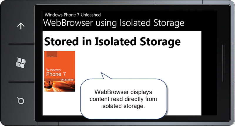
Figure 7.17. Viewing a page from isolated storage
Storing the Sample Web Content
Saving the web page and the image to isolated storage is done by retrieving the IsolatedStorageFile for the app and creating a directory called WebContent in which the content is placed. A simple document is written to a file in the directory, as shown in Listing 7.10.
Listing 7.10. SaveHtmlToIsolatedStorage Method
void SaveHtmlToIsolatedStorage()
{
using (IsolatedStorageFile isolatedStorageFile
= IsolatedStorageFile.GetUserStoreForApplication())
{
if (!isolatedStorageFile.DirectoryExists("WebContent"))
{
isolatedStorageFile.CreateDirectory("WebContent");
}
using (IsolatedStorageFileStream isolatedStorageFileStream
= isolatedStorageFile.OpenFile(
@"WebContentWebpage.html", FileMode.Create))
{
using (StreamWriter streamWriter
= new StreamWriter(isolatedStorageFileStream))
{
streamWriter.Write(@"<html><head></head><body>
<h2>Stored in Isolated Storage</h2>
<p><img src=""Images/Book.jpg"" /></p>
</body></html>");
}
}
if (!isolatedStorageFile.DirectoryExists("WebContent/Images"))
{
isolatedStorageFile.CreateDirectory("WebContent/Images");
}
StreamResourceInfo resourceInfo = Application.GetResourceStream(
new Uri("WebBrowser/ImagePlacedInIsolatedStorage"
+ "/WP7Unleashed200x.jpg",
UriKind.Relative));
using (IsolatedStorageFileStream writeStream
= new IsolatedStorageFileStream(
@"WebContent/Images/Book.jpg",
FileMode.Create, isolatedStorageFile))
{
CopyStreamBytes(resourceInfo.Stream, writeStream);
}
}
}
The image, which is referenced by the img element in the HTML document, is a project item with its Build Action set to Content. This image file is first opened using the static method GetResourceStream of the Application class. It is then converted to a byte array and saved in isolated storage. For the sake of completeness, the Stream related methods are shown in Listing 7.11.
Listing 7.11. CopyStreamBytes and ReadStreamBytes Methods
void CopyStreamBytes(
Stream fromStream, Stream toStream, bool closeToStream = true)
{
if (toStream.CanWrite)
{
byte[] fileBytes = ReadStreamBytes(fromStream);
toStream.Write(fileBytes, 0, fileBytes.Length);
if (closeToStream)
{
toStream.Close();
}
}
}
byte[] ReadStreamBytes(Stream fileStream)
{
/* Read the source file into a byte array. */
byte[] bytes = new byte[fileStream.Length];
int readLength = (int)fileStream.Length;
int bytesRead = 0;
while (readLength > 0)
{
/* Read may return anything from 0 to readLength. */
int read = fileStream.Read(bytes, bytesRead, readLength);
/* When no bytes left to read it is the end of the file. */
if (read == 0)
{
break;
}
bytesRead += read;
readLength -= read;
}
return bytes;
}
Summary
This chapter began by looking at the Image element, how to reference image files, and the effect on sizing by the Image.Stretch property. Setting Visual Studio’s Build Action for a file to Resource causes it to be placed in the assembly, whereas setting it to Content means it will sit outside the assembly in the application’s XAP file.
The chapter then explored the InkPresenter and demonstrated how to create a simple sketch app. You saw how the Background property of the InkPresenter must be assigned to register touch events.
It then moved to the MediaElement, and you saw how audio and video files can be played from the phone or streamed via the Internet. The XNA SoundEffect class is better suited to playing short sound effects.
Deep Zoom and the MultiScaleImage element were discussed, including how they can be used to provide a stunning visual experience while making efficient use of your users’ bandwidth. You saw how to allow the user to manipulate the Deep Zoom image using touch.
Finally, the chapter examined the WebBrowser control, and you saw how to communicate to a web page from Silverlight and vice versa. You also saw how to execute arbitrary JavaScript on a web page to modify page content or to attach new behaviors. You then looked at storing and browsing offline content to decrease network usage.