Working with Mathematical Models
Most of this book focuses on fundamental mathematical concepts and how to employ those concepts using Microsoft Excel. The practical application of mathematics to an actual decision or analysis involves several related computations. These computations must be carefully designed to be valid and useful. The conceptual framework for these related computations is called a mathematical model. One of the primary strengths of Microsoft Excel is the ability to quickly implement powerful mathematical models. When mathematical models are built in Excel, they are often called spreadsheet models. This chapter illustrates some mathematical models created using Microsoft Excel.
4.1 What is a Mathematical Model?
A mathematical model is a simplified representation of a system, either one that existed in the past or may exist in the future. Characteristics of the system are assessed in terms of variables. These assessments may be quantitative, in terms of measurements or counts, or qualitative, in terms of a category or whether a logical condition is true or false. When a model is defined in Excel, a variable is typically a value displayed in a cell.
Mathematical models generally include at least two variables, but often considerably many more. The values of some variables are provided as inputs and the values of other variables are determined by the model. The creation of a mathematical model entails both the definition of its variables and relationships between those variables. Relationships between quantitative variables often take the form of algebraic equations, while relationships involving qualitative variables are often logical, if–then rules. In Excel, these relationships are usually in the form of formulas that determine the value of a variable appearing in a cell.
An example of a simple model would be a model that converts Fahrenheit temperatures to centigrade. In Excel, the Fahrenheit temperature might appear as an input variable in cell A1 and the centigrade temperature as a variable in cell B1. In cell B1, the formula: =(5/9)*(A1-32) would be entered, and it defines the relationship between the two variables. The user of the model can enter any Fahrenheit temperature in cell A1 and will immediately see the corresponding centigrade temperature in cell B1.
To better understand the relationship between Fahrenheit temperature and centigrade temperature, it would be nice to see how centigrade temperature changes in response to changes in Fahrenheit temperature. While this can be explored by changing the value in cell A1, a clearer picture would come from copying the formula in cell B1 to subsequent cells in column B and entering a series of different Fahrenheit temperatures in column A to create a table, as illustrated in Table 4.1. The table can be represented visually in a chart as shown in Figure 4.1. The ability to expand mathematical models into tables and display them in charts is a key reason why Excel is such a popular tool.
Table 4.1. Select Fahrenheit Temperatures and Equivalent Centigrade Temperatures


Figure 4.1. Graph of the relationship between Fahrenheit and centigrade temperatures.
Models can serve different purposes. A descriptive model endeavors to characterize the operation of an existing system in order to get an improved understanding of it. A predictive model seeks to forecast how a system will operate in the future. A normative model tries to determine how a system could best operate in terms of certain performance criteria. The type of model might impact how the model variables, the designation of input variables (for which values are provided by the user), and relationships are designed. However, in Excel it is often possible to create a model and then use it for different purposes by applying some of the solution tools built into Excel.
The remainder of this chapter will provide some examples of mathematical models for a fictitious venture of a summer business selling ice cream bars at a beach resort. In each case, the models will be presented as Excel spreadsheet models.
4.2 A Cost Model and Breakeven Analysis
Suppose three college students want to consider operating a summer business selling ice cream bars at a popular beach site. In order to make this decision, they need to have some understanding of the costs involved.
The students recognize that the total cost will depend on how many ice cream bars they sell, but some components of the total cost are directly related to the number of bars sold while other costs are largely unaffected by the sales volume. If the students wanted to double the number of ice bars they sold, they would need to purchase twice as many bars from their supplier, probably have roughly twice the cost in transporting the ice cream bars from the supplier, and probably about double the electricity cost of keeping the items in a freezer. Costs that change with sales volume are called variable costs. Someone who sold ice cream bars last year, incurred costs of $10,800 for ice cream bars, transportation, and electricity. This vendor sold 36,000 ice cream bars, so the variable cost per unit was $0.30, or =10800/36000.
The costs that are relatively invariant include the cost to rent a small stand, insurance, and city vendor fees. Also, the students need to recoup enough to compensate for not taking another summer job, so they include an “opportunity cost” equivalent to what they would earn elsewhere. These cost categories that are assumed to be the same regardless of the number of ice cream bars sold are called fixed costs. The students decide they will need to cover a total of $40,000 in fixed costs over the summer months when they operate this business.
Based on these estimates, we can develop a mathematical model called a linear cost model. This simple model determines the total cost as the sum of the fixed cost and the variable cost and treats the variable cost as $0.30 times the number of ice cream bars sold. Algebraically, if we let Q represent the number of ice cream bars that the students will sell during the summer and let C represent the total cost, the relationship between these variables is:
C = $40,000 + $0.30Q
We can present this relationship as a table and a chart in Excel. Table 4.2 shows a table prepared in Excel that treats the number of ice cream bars sold as an input variable and shows the corresponding fixed cost, variable cost, and total cost for total unit sales from 0 to 70,000 in increments of 10,000. The fixed cost values in the second column remain at $40,000, while the value in the third column is generated by a formula multiplying $0.30 times the value in the first column for the same row. The total cost is the sum of the values in the second and third columns. The table values are used to prepare the chart in Figure 4.2. From the table and chart, we see that the fixed cost will be the dominant cost component if fewer than 70,000 ice cream bars are sold.
Table 4.2. Fixed, Variable, and Total Cost for Select Production Quantities for Ice Cream Bar Venture


Figure 4.2. Graph of cost components for ice cream bar venture.
In order for this venture to be worthwhile, the students will need to collect enough from sales of the ice cream bars to cover their costs. The total receipts from sales of the ice cream bars will be the revenue of their venture. They will need to decide on a price to charge for the ice cream bars and then hopefully sell enough bars so that the revenue will be higher than the total cost. If the revenue is higher than the total cost they will earn a positive profit. However, if the revenue is less than the total cost, they will have a negative profit, or loss.
Suppose the students decided to charge $1.50 for each ice cream bar. The revenue, symbolized by variable R, would be a function of the quantity Q sold:
R = $1.50Q
The profit from the operation, symbolized by variable Π (pi), would be determined from the difference of revenue and cost:
Π = R – C
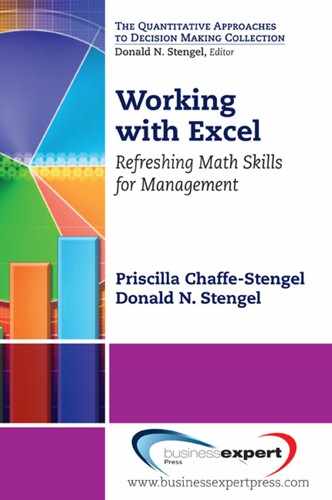
Table 4.3 displays a table of revenue, cost, and profit associated with selected quantities. Figure 4.3 shows a chart prepared from the table.
Table 4.3. Cost, Revenue, and Profit for Select Production Quantities for Ice Cream Bar Venture at Price of $1.50

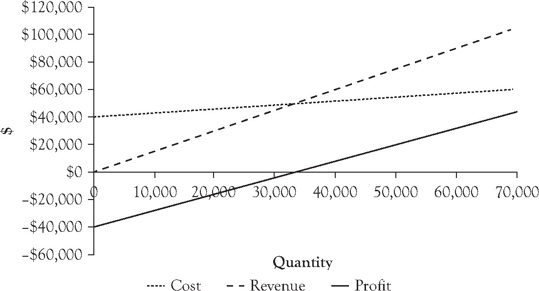
Figure 4.3. Graph of cost, revenue, and profit functions for ice cream bar venture at price of $1.50.
Figure 4.3 indicates that the students will earn a positive profit if they can sell more than 35,000 ice cream bars during the summer. The actual quantity where the result changes from a loss to a profit is known as the breakeven point. A precise value for the breakeven point can be determined in a number of ways. One technique is recognize that each ice cream bar sold results a unit profit contribution represented by the difference between the price charged and the variable cost per unit and the venture needs to accumulate enough unit contributions to offset the fixed cost. So the breakeven quantity in this case would be:

So if the students sell 33,334 ice cream bars or more, they have a profit. Note that the profit line shown in Figure 4.3 crosses the x-axis into positive values at the breakeven point.
Another approach to finding the breakeven point is to consider that the price needs to offset the average cost of an ice cream bar when total cost is divided by the quantity of units sold. Table 4.4 shows the computation of the average cost per ice cream bar at different values of the quantity Q. Figure 4.4 shows a chart with a graph of the average cost with a horizontal line at the price charged of $1.50. Note that the average cost curve drops below $1.50 at 33,334 units.
Table 4.4. Average Cost Per Unit for Select Production Quantities for Ice Cream Bar Venture


Figure 4.4. Graph of average cost curve for ice cream bar venture in comparison to price of $1.50 per ice cream bar.
While formulas to calculate the breakeven volume can be entered into a worksheet cell to display the value, another approach is to use the Goal Seek feature of Excel to find a value of Q that makes the profit exactly zero. To use Goal Seek, we place a tentative value for the breakeven point in a cell and then enter a formula to calculate the profit associated with that quantity in a neighboring cell. Suppose we use cells I2 and J2 for this illustration. Enter 30,000 as a test value in cell I2 and the formula: =1.5*I2-40000-0.3*I2 into cell J1. Initially you will see the value -4000 in cell J2, indicating that the students would lose $4,000 if they only sold 30,000 ice cream bars.
Next, we access the Goal Seek capability built into Excel. In Excel 2007 and Excel 2010, this feature is accessed by clicking “What-If Analysis” on the Data ribbon and then selecting “Goal Seek….” (On earlier versions of Excel, the Goal Seek module is accessed from the Tools menu.) An input form appears requiring three entries. In the “Set Cell” box, we enter J2 as the cell value we want the Goal Seek operation to change as specified. In the “To Value” textbox we enter a zero to indicate that we want the value in J2 to be changed to a zero. In the “By Changing Cell” textbox, we enter I2 as the cell we want Goal Seek to modify to achieve a zero profit. Entering these values and clicking OK will change the value in cell I2 to 33333.33 and the value in cell J2 to zero.
The model can easily be changed to examine the impact of charging a different price. Suppose we wanted to consider charging $2.00 per ice cream bar. Simply changing the prices in column E to $2.00 and looking at the graphs, we see the breakeven quantity drops below 25,000 units. Changing the formula in cell J2 to: =2*I2-40000-0.3*I2 and repeating a Goal Seek operation shows the breakeven quantity is 23,529.4 units.
By exploring other prices, the reader will quickly discover that the higher the price charged, the lower the breakeven sales quantity and that it is possible to compute a breakeven quantity for any price that is higher than $0.30. (However, for prices close to $0.30, the breakeven quantity will be very high!) The ease and speed with which models can be changed is one reason why Excel is such a popular platform for mathematical modeling.
4.3 The Ice Cream Bar Venture Model with a Demand Curve
The analysis in the previous text section determined the sales volume necessary to break even for any given price. However, there is no guarantee that there will be enough customer purchases to reach the breakeven level, and while a higher price will lower the breakeven level, a higher price will also discourage more potential customers from making a purchase. To make our model more realistic, we need to consider how price will affect our potential sales. The standard means of doing that in a mathematical model is with a demand curve.
A demand curve is a relationship between the price that is charged and the maximum quantity of units that would be sold at that price. The convention in economics is to draw demand curves with quantity on the horizontal axis and price on the vertical axis, so for any specified purchase quantity, the demand curve indicates the maximum price the seller can expect to charge and sell that many units. The law of demand in economics states that increases in price will result in decreases in the quantity sold, and vice versa, so demand curves are inversely related in general and negatively sloped when graphed.
One means of developing a demand curve is to estimate the maximum prices that can be charged for selected quantities and then infer a relationship between quantity and maximum possible price that fits those estimates. One simple demand curve is a linear demand curve, which is a straight line on a graph, and requires estimates of only two quantity–price pairs. Based on sales in the prior summer season, the students expect they would sell about 36,000 ice cream bars if they charged a price of $1.50. However, if they raised the price to $2.00 they estimate that the total sales for the summer would drop to 26,000 ice cream bars.
Figure 4.5 shows a graph of the linear demand curve that is consistent with the above quantity–price estimates. Using basic algebra, the following algebraic formula can be derived for this linear demand curve:

Figure 4.5. Graph of linear demand curve for ice cream bar venture.
P = $3.3 – $0.00005Q
where Q is quantity of ice cream bars that the students consider planning to sell and P is maximum price they could charge to sell that many ice cream bars.
With the demand curve, the students can explore what price they should charge, accounting for the reality that a higher price will reduce the potential sales. Recalling from the previous section that the breakeven quantity was 33,334 units at a price of $1.50 and the breakeven quantity at a price of $2.00 was 23,530 units, we see that students can make a profit at either price. However, the expected profits if they sell the amounts estimated from the demand curve will differ. If the students sell 36,000 units at a price of $1.50, the revenue will be $54,000 and the total cost will be $50,800, resulting in a profit of $3,200. If the students sell 26,000 units at a price of $2.00, the revenue will be $52,000 and the total cost will be $47,800, resulting in a profit of $4,200.
We can explore the impact of the demand curve on the revenue, cost, and profit for all possible choices of quantity volume by replacing the price in the revenue function with the relation that links maximum price to quantity from the demand curve equation. The revenue function becomes
R = $3.3Q – $0.00005Q2
since revenue = price * quantity, or R = P*Q = Q($3.3 - $0.00005Q). The cost function is not affected by the demand curve and remains:
C = $40,000 + $0.30Q
The profit function, which is the difference between revenue and cost becomes:
Π = –$40,000 + $3.00Q – 0.00005Q2
Figure 4.6 shows a graph of these three functions for the ice cream bar venture. The graph indicates there is an interval of sales amounts where a profit can be expected if the maximum price is charged base on the demand curve. The maximum appears to be at a volume of approximately 30,000 units. At the same time, it is possible for the venture to have a loss if the volume is too high or too low. At volumes below 20,000 units, despite the fact that a higher price can be charged, there are not enough sales to offset the $40,000 fixed cost. To sell volumes over 40,000 units, the price must be reduced because the margin between the maximum price that can be charged and the variable cost per unit of $0.30 per ice cream bar is not sufficient to offset the fixed cost.
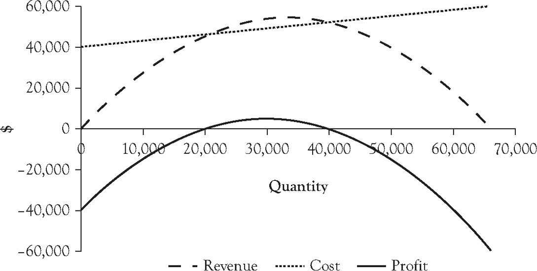
Figure 4.6. Graph of cost, revenue, and profit functions assuming price associated with quantity on linear demand curve.
We can determine the best quantity–price pair from the algebraic equations in the model. Since the profit function is a quadratic function, the maximum will occur at the vertex of the quadratic equation. For a quadratic equation of the form
y = ax2 + bx + c
the vertex occurs at x = -b/2a. For the profit function, the x variable is the quantity Q, the coefficient a = -0.00005, and b = 3. So, for this function, the vertex where profit reaches its maximum is at the quantity of

Using the demand curve, the maximum price that can be charged to sell 30,000 ice cream bars during the summer is $1.80. If you set Q to 30,000 in the profit function, the resulting profit will be $5000.
For Windows users, Excel provides a feature to find the quantity in the mathematical model that maximizes the profit called Solver. Like the data analysis toolpak described in Chapter 3, the Solver comes as part of Excel for Windows, but needs to be installed as an add-in. In Excel 2007 and later, you can activate Solver by clicking the File tab, then clicking “Add-Ins” on the left menu. Next, select “Excel Add-ins:” in the drop-down list box at the bottom of the window next to the label “Manage,” and click GO. A new window of Add-ins will appear. Check the box next to “Solver Add-in” and click OK. (The add-in is available for earlier versions of Excel, but needs to be activated differently.)
To use the Solver to find the best quantity–price pair on the demand curve, we place our guess for the quantity in one cell and a formula with the profit associated with that quantity in another cell. Suppose we enter 36,000 in cell A1 and the formula for profit: =-40000+3*A1-0.00005*A1*A1 in cell B1. In Excel 2007 and Excel 2010, go to the Data ribbon. Solver should be available in the analysis group on the ribbon. Click “Solver” and a form appears. In the box next to “Set objective,” enter “B1.” On the next line, click the radio button “Max.” Under “By Changing Variable Cells:,” enter A1, and click the common button labeled “Solve.” A window “Solver Results” appears. Click OK. If you look at cells A1 and B1, you will see that cell A1 has been changed to 30,000 and cell B1 shows the profit associated with a quantity of 30,000 ice cream bars of $5000.
As we noted in the first section of this chapter, models are simplified representations of a real situation. When the real situation is an estimate of what will occur in the future, such as the ice cream venture, the actual outcome is almost certain to differ from what a model will estimate. The students will decide on a price and find out later how many ice cream bars they will sell. If they charge $1.80, the model estimates they will sell 30,000 ice cream bars and earn a profit of $5,000, but what if the model is wrong?
The students will be pleased if they can sell more than 30,000 units, as this will increase their profit by $1.50 for each additional ice cream bar they sell. However, if the sales fall short of 30,000 units, they might suffer a loss. The breakeven analysis in the previous section provides a means of assessing how much room for error they have and still remain profitable. Repeating the analysis at a price of $1.80 per ice cream bar shows the breakeven point to be only 26,667 units. So, as long as the students can sell at least 89% of the expected volume, they will not lose money. (Recall that the students included in the fixed cost an amount to offset the lost income from not taking a summer internship.)
In the first section of this chapter, we distinguished descriptive models, predictive models, and normative models. Sections 4.2 and 4.3 illustrated a simple example of each. The cost function developed in Section 4.2 was based on known fixed costs and past records of variable costs, so the cost function we developed is really a descriptive model. When we enhanced the model in this section with a demand curve to explore the change in estimated unit sales corresponding to different ice cream bar prices in the upcoming season, we created a predictive model. Finally, when we used the Solver to find the quantity/price point on the demand curve that would generate the highest expected profit, we employed these relationships as a normative model.
The development of useful mathematical models for business decisions requires an understanding of economics, finance, and operations management principles as they apply to a business. For a discussion of the economic reasoning behind the models in Sections 4.2 and 4.3, see the Business Expert Press book, Managerial Economics: Concepts and Principles.
4.4 Planning Daily Operations for the Ice Cream Bar Venture
The models in the previous sections looked at sales for the entire summer season. However, these sales need not occur at a uniform rate each day of the season when ice cream bars are sold. In fact, the students learned that sales can vary considerably from day to day, with the daytime temperature being the dominant influencing factor. On warm days, there are generally more people at the beach location, and those who are there are more eager to buy ice cream bars.
In operating the ice cream bar business, it is important for the students to anticipate the volume of sales for an upcoming day. The students will need to have enough ice cream bars on hand for the day’s sales, but want to avoid having an excessive amount as this would result in extra work effort to keep the bars frozen and avoid spoilage.
The person who operated the ice cream bar business in the prior summer season kept records of his daily sales of ice cream bars. One of the students decided to explore the relationship between those daily volumes and the high temperature at the beach location that day. Table 4.5 shows a listing of daily sales from last year, ranked from lowest to highest, with the high temperature that day in the adjacent column. An examination of the table shows there is a significant relationship between daily sales and the high daily temperature. While the numbers tended to be an average of around 350 bars a day, the lowest daily sale volume was below 100 units and the highest sales volume exceeded 600 units. When daily sales were less than 200 ice cream bars, the high temperature was generally under 70 degrees. When daily sales exceeded 500 ice cream bars, the high temperature was typically above 80 degrees.
Table 4.5. Record of Daily Sales for Ice Cream Venture in Prior Summer and Associated High Temperature, Sorted by Sales Volume
Figure 4.7 presents these data in the form of a scatterplot. Since the purpose of the analysis is to determine how effective the high temperature was in explaining the daily sales, this scatterplot assigns the high temperature as the cause to the horizontal axis and daily sales as the effect (in numbers of ice cream bars sold) to the vertical axis. While the points in the scatterplot form a cloud, the cloud has a definite positive orientation with the cloud trending higher as the high temperature increases.

Figure 4.7. Scatterplot of daily sales and associated high temperature in prior summer, with linear trendline and trendline equation.
The scatterplot in Figure 4.7 has a straight line running through the data. This line is the linear trendline, which is the straight line graph that best approximates the relationship between daytime high temperature and ice cream bar sales in the scatterplot. This trendline is “best” in the sense that if you measure the difference between the sales associated with each point on the scatterplot and the sales on the trendline corresponding to that same high temperature, and then square those differences and sum the resulting squared differences, you get the smallest possible total. Thus, this is called a “least-squares fit.” To see this trendline for a scatterplot in Excel 2007 and later, select the chart and select the ribbon called “Layout” that is in the “Chart Tools” group. On the ribbon, click the button for “Trendline” and then select “Linear Trendline.”
Figure 4.7 also shows an equation for the linear trendline:
y = 12.79x – 636.06
The variable x is the variable on the horizontal axis (high temperature for the day) and the variable y is the expected daily sales according to the trendline equation. To see this trendline on a scatterplot, select the same “Trendline” button used to get the linear trendline, click the menu option for “More Trendline Options,” and then click the radio button for the “Linear” trend/regression type.
The linear trendline equation provides a means of calculating the typical sales last season based on the high temperature that day. If you enter a high temperature in one cell of an Excel worksheet and use the right hand side of the trendline equation as a formula in another cell replacing the x variable with the location of the cell with the temperature value, the value in the cell with the formula will show a typical sales volume at that high temperature. For example, if the high temperature on a summer day in the region was 80 degrees, the typical sales volume was 387 ice cream bars.
The x-coefficient 12.79 in the equation has an interesting interpretation: Ice cream bar sales last year typically increased by about 13 units for each degree increase in the local high temperature. Similarly, an increase of 10 degrees in the high temperature resulted in about 128 more sales of ice cream bars that day, or 10 * 12.79 rounded to the next whole ice cream bar. So, indeed the high temperature has a significant impact on ice cream bar sales.
The trendline equation serves as a descriptive model of typical daily sales last year for a given high temperature. The students would like to have a predictive model that they can use to estimate how many sales to plan for the upcoming day in the next summer season based on a forecast for the high temperature. While it may be reasonable to assume that the relationship between high temperature and daily sales last summer would apply again this summer, based on the analysis in the previous section, the students decided to charge $1.80 per ice cream bar this summer rather than the $1.50 per bar charged last summer. Since the estimated sales for the entire season at a price of $1.50 is 36,000 units, while the estimated sales for the entire season at a price of $1.80 is 30,000, we could make the assumption that a good estimate of daily sales at the higher price of $1.80 on any given day would be 30,000/36,000 or 5/6 of the expected sales at last year’s lower price of $1.50. We can reflect this in the linear trendline model, by multiplying both coefficients in the equation by 5/6. The resulting equation would be:
y = 10.66x – 530.05
At a high temperature of 80 degrees, this model estimates sales would be 323 ice cream bars for the day. Each increase in the high temperature by one degree will typically result in about 11 more unit sales.
The modified model provides a reasonable means of estimating daily sales at the higher price. However, the students realize that even if the model is valid, there will be fluctuation in the actual unit sales from the model forecast. In the case of this venture, it is probably better to overestimate, rather than underestimate daily sales because there is a greater cost to missing sales than there is to handling excess inventory that are not sold. A sales opportunity is lost if they run out of ice cream bars. Looking at the scatterplot for sales last year, it appears that unit sales on any given day only rarely exceeded the estimate from the trendline by more than 120 units. Adjusting this error margin by the 5/6 reduction due to the increased price this next year, the students might expect that their actual daily sales are unlikely to exceed the estimate of their model by more than 100. So, if the students stock at least 100 more ice cream bars than the predicted unit sales from their model, they are not likely to run out or miss too many sales if they do. They decide to adjust their daily stocking model accordingly as follows.
y = 10.66x – 430.05
Where x represents the predicted daytime high temperature. So, a day when the high temperature is forecast to be 80 degrees, they will plan to have about 423 ice cream bars in stock at the beginning of the day.
Although high temperature is an effective technique of estimating demand, the students could consider additional variables, such as the day of the week or whether it is a holiday. They could also create models that adjust the forecast for the following day in light of the errors that occurred between actual sales and the forecast on previous days. These enhancements will not be explored here. However, the interested reader can read a book on time series analysis or multiple regression to understand how to create such models.
4.5 A Capital Investment Decision Model
The students operating the ice cream venture leased a small facility for operating their business near the beach. The owner of the facility indicated that he was planning to sell the facility at the conclusion of the summer season and asked the students if any of them were interested in purchasing it. He said he would sell it for $150,000.
One of the students inherited some money and is interested in the possibility of investing in the purchase of the beach property. However, he wants to make sure that the amounts he will get in terms of net income from owning the property and eventually reselling the property are large enough to justify this investment over an investment in stocks, bonds, or certificates of deposit.
The student decides he will develop a model that estimates the net income he will receive if he purchases the building at the conclusion of this summer season, holds it as a lease property for 5 years, and then resells it. For the purpose of the analysis, he assumes that he will be able to resell the building in 5 years for $160,000. The owner of the building shares his financial records from the building and it appears that the owner will realize an income, net of expenses for upkeep, and property taxes of $10,000 this year. The interested student believes he can raise the lease amount at about the rate of the increase of the cost of living, so he will assume his net income would rise $200 each year he owns and leases the property. Table 4.6 shows a portion of the spreadsheet with the assumed net cash flows for the investment, with Year 0 referring to the present year when the student would purchase the facility if he decides to pursue it.
Table 4.6. Projected Cash Flows for 5-Year Investment in Beach Facility

Note the projected cash flow for Year 5 reflects the lease income, $11,000, plus the assumed sale price of the property, $160,000. A key consideration to his decision is the alternative rate of return that the student expects he could get if he invested the money elsewhere and the riskiness of alternatives compared to this opportunity. The student realizes he would earn less on certificates of deposit, and would probably earn less on bonds, but those investments involve less risk than owning and leasing the beach property. The student decides that the level of risk he faces owning the beach property is equivalent to the risk of purchasing stocks that would expect to return 9% over the next year. So, he decides he will analyze whether this investment would be better than simply investing the money in an investment that returns 9% every year. However, we will build a model that allows the student to change this required rate of return to see how it affects the decision.
One approach to developing a model is to estimate how much money the student would have if he invested the $150,000 and earned 9% a year compounded annually, and then compare that amount to what the student would have at the end of 5 years after reselling the facility. Since the student would realize some income in the previous 4 years, we will assume those amounts would be reinvested and earn 9% a year.
Table 4.7 shows a spreadsheet model to make this comparison. We use the FV function to determine the amounts that would be realized from alternative investments or reinvestments of income in the earlier years. The formula to determine the future value of the net income received is: =-FV(B$1,5-A6,,B6). Recall the negative sign is needed to distinguish cash outflows from cash inflows. Since the formula simply determines the future value of a lump sum for 4 years compounded annually at 9%, there is no payment amount and the third element of the Excel function must be left blank, which is why there is a double comma in the argument.
Table 4.7. Future Value of Income Flows from Investment in Beach Facility at 9% Rate of Return Compared to Investing $150,000 for 5 Years at 9%, Compounded Annually

The FV formula is designed so it can be copied to find the future value of amounts invested or reinvested in future years. Note that the future value of the income in Year 5 and proceeds from the resale of the facility is the same as the actual amount received since there is no time to reinvest these amounts.
Comparing the sum of the future value of the investment of the facility ($223,232.29) to the future value of an alternative investment earning 9% a year ($230,793.59), we see that the student would be better off with the alternative investment in stocks. However, if the rate of return for an alternative investment of equal risk were lower, say 7%, the conclusion would be different and would mean he should change his decision from investing in stocks to purchasing the beach property. Changing the input value in cell A1 to 7%, the facility investment has an accumulated future value of $220,802.51, while the future value of the alternative investment would be only $210,382.76.
Another way of constructing the model is to evaluate the investment alternatives in terms of present value. With this approach we discount any income received in the future to what amount would have to be invested today at the assumed rate of return to have that much at the time it was received. If the sum of these amounts exceed the $150,000 purchase price for the facility, the investment would be worthwhile. Table 4.8 shows the investment decision model using present value. The formula for determining the net present value of the facility investment uses the NPV function: =NPV(B1,B6:B10).
Table 4.8. Net Present Value of Income Flows from Investment in Beach Facility Using 9% Discount Rate, Compared to Upfront Payment of $150,000
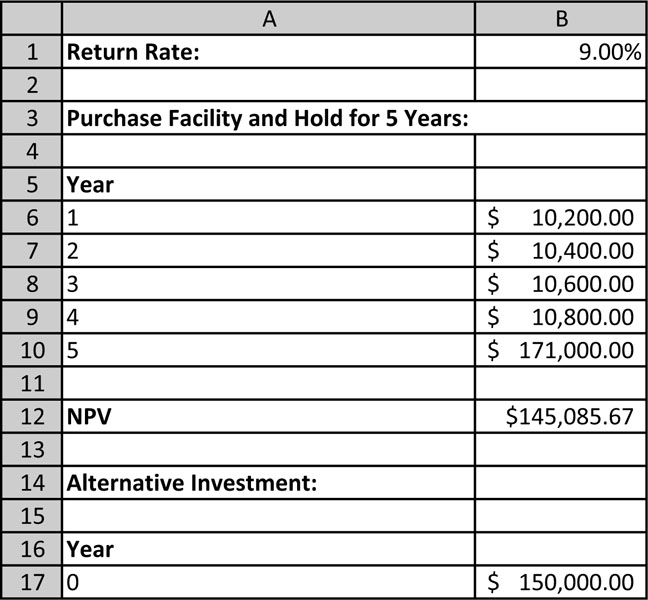
The net present value of the investment in the facility is only $145,085.67. Since this is less than the $150,000 that the student would need to invest upfront, this is not a good investment under the assumption of a 9% rate of return. However, if the assumed rate of return for an alternative investment of equivalent risk were only 7%, the net present value of the facility investment would be $157,429.14 and would exceed the $150,000 initial investment.
Both of the models presented here indicate that the facility purchase is worthwhile if the rate of return expected from the investment is sufficiently low. There is a rate of return where the return from the facility investment is exactly the same as for an alternative investment in stocks. From the analysis earlier in this section, we know that rate will be between 7% and 9%. We can determine what rate of return results in an indifferent conclusion by using the Goal Seek capability we used earlier. Remember that Goal Seek is found by clicking the “What-If Analysis” button on the Data ribbon and then clicking the menu entry, “Goal Seek ….” Using the net present value model, we ask Excel to set the net present value of the facility investment in cell A13 to 150,000 by changing the rate of return in cell B1. The result of doing this operation shows that the student would be indifferent between the investment alternatives for a rate of return of 8.18%. Table 4.9 shows the result of this operation.
Table 4.9. Result of Applying Goal Seek Tool in Excel to Find the Rate of Return for Which the Income Flows from Investment in Beach Facility have a Net Present Value of $150,000

The computation of the rate of return that results in indifference between investing in this project versus investing in another project of equivalent risk is known in finance as the internal rate of return. Excel has a built-in IRR function that allows a user to calculate this rate from a formula. The function is discussed in Chapter 1 in Example 1.14.
This chapter presented several models of typical situations faced by a business. From these examples, we can see that Excel is a flexible and powerful tool for developing mathematical models quickly, enabling the user to rapidly explore the effect of changing assumptions in the model. Although all of the situations examined here were fairly simple, Excel can easily handle more complex decision-making scenarios. From these examples, it is easy to see why Excel is the most popular software tool for developing mathematical models. However, caution should be used to reflect the condition that, in order to use Excel effectively, the user needs to have the basic mathematical understanding to use its capabilities properly.