
As reviewed in the prior chapter, Microsoft Excel has powerful quantitative tools built into its capabilities under the Insert Function toolbar button. This chapter will introduce additional capabilities that greatly enhance the user’s ability to summarize and analyze a set of data. While one of the goals of this chapter is to preview the tools in Excel’s Data Analysis ToolPak, the reader may want to expand their facility with basic statistical analysis by reviewing a companion publication, Working with Sample Data: Exploration and Inference, in the Business Expert Press Quantitative Approaches to Decision Making collection.
3.1 Installing the ToolPak
Excel for Mac systems does not offer the Data Analysis ToolPak. However, if the Apple machine runs Windows emulation software and has Office for the PC installed, it can run the Data Analysis ToolPak.
Excel is often only partially installed on Windows-based machines. To verify installation of the Data Analysis ToolPak on newer versions of Excel, activate the Data tab on the toolbar at the top of your screen. Data Analysis tools should be available on the far right of the Data ribbon. If it does not appear on the ribbon, you will need to activate it. To add the Data Analysis ToolPak in Excel 2010, activate the Files tab and select Options. On the left side of the Excel Options window, activate the item labeled: Add-Ins. The last line of the new window just activated reads: Manage: Excel Add-ins. Click Go and make sure on the next window that the Analysis ToolPak option is selected. Click OK. You should now see Data Analysis appear at the far right of the Data ribbon at the top of your Excel spreadsheet.
For older versions of Excel, click the windows icon in the upper left corner of your screen. Select the Excel Options tab at the bottom of the window and then select Add-Ins from the list on the left of the new window. Highlight the Analysis ToolPak entry and click the OK button. Your computer will connect to Microsoft’s web page and install the program. If you are operating Microsoft Excel 97 or XP, you may need to install the toolkit from the original compact disc (CD) used to load Excel onto your machine.
3.2 Using the ToolPak and Interpreting Results
In newer versions of Excel, the ToolPak is located on the Data ribbon at the top of the Excel window. In Excel 97 or Excel XP, Data Analysis is contained in the pull-down Tools menu. The analysis tools listed are programmed to automate complex, multi-step analyses.
Knowing something about the data in question is important to their numeric summary. The two main types of data are qualitative and quantitative. Qualitative data arise in settings where sampled elements are classified by a key attribute and assigned to categories, such as defective versus acceptable products, commodities whose prices rose as opposed to remained the same or even fell, or the number of sales made using credit rather than debit card, check, or cash. Statistical analysis of these qualitative, or categorical, variables is limited largely to counts of how many elements sampled fall into each category.
Quantitative variables capture data arising from measurements that include, for example, the dimensions of time, distance, length, weight, volume, rates, percent, and monetary value. Sample data generated by measurements take on a value along a number line. Because the data are in the form of numerical values, there is a richer set of techniques for analyzing these data, including several of the statistical functions covered in Chapter 2, like average, median, and standard deviation. A more complete discussion of discrete and continuous variables can be found in Section 3.3 of this chapter and in Chapter 1 of the companion publication, Working with Sample Data: Exploration and Inference, in the Business Expert Press Quantitative Approaches to Decision Making collection. The remainder of this section examines some tools in Excel for analyzing data collected for quantitative variables.
3.2.1 Descriptive Statistics
One of the most useful tools in the ToolPak is Descriptive Statistics. What is important for the appropriate use of the Descriptive Statistics tool is that the data to be summarized represent quantitative measurements taken on individual sampled elements. The tool cannot be used on data that are already summarized or on qualitative data that are generated by counts of elements sorted into categories. The tool requires quantitative data and, from the data, produces an output range of 13 standard values, including estimates of the center (the mean, the median, the mode) and measures of spread (the range, the minimum, the maximum, the sample standard deviation, the sample variance) as well as the sum of all data, and the number, or count, of values summarized. While each of the values presented in the output can be derived individually with equations and formulas, using the Descriptive Statistics tool can give the user a very quick overview of the set of data in question. The tool is applied to quantitative variables and can be used to summarize data with large sample sizes as quickly as with small sample sizes. We will not address kurtosis or skewness here, even though they are measures routinely reported with Descriptive Statistics. Please see Example 3.1, Using the Descriptive Statistics Tool
Example 3.1: Using the Descriptive Statistics Tool
The Question
A sample of eight different vehicles in the corporate car pool is selected and their city mileages per gallon of fuel are measured, producing the values 19.7, 17.6, 21.4, 18.3, 19.5, 18.2, 19.0, and 18.9 mpg. Find the descriptive statistics for the sample.
Using Excel
Enter the label City MPG in cell A1 and the data in individual cells A2 through A9. Activate the data ribbon at the top of the screen and select Data Analysis at the far right end of the ribbon. Highlight Descriptive Statistics on the list of analysis tools. Click OK. On the Input Range, scroll your cursor over cells A1 through A9. Notice that the button for Grouped By Columns is automatically selected. If your data are listed in a row, the button for Grouped By Rows will be selected automatically when you scroll your cursor over the row containing your data. Click the selection Labels in First Row to indicate to Excel that the contents of cell A1 should be used as the label for the output. If there is no label in the lead cell of your data list, leave the selection Labels in First Row unselected. Select Output Range and click your cursor in the field to the right. Either click your cursor on the spreadsheet cell B1, or type the entry B1 into the field. Click the selection Summary Statistics and then click OK. Excel will return the output shown above.
Answer
Table 3.1. Descriptive Statistics, City Mileage for Corporate Car Pool

Discussion
The mean, or average, mileage for the sample of eight cars is ![]() = 19.075 mpg. The middle value, the median, is 18.95 mpg. There is no value that appears more than once, so there is no mode (#N/A). The sample standard deviation is s = 1.168332 and the sample variance is s2 = 1.365. The maximum mileage is 21.4 mpg, the minimum mileage is 17.6 mpg, and their difference is the range of values represented in the sample, which is 21.4 - 17.6 = 3.8 mpg. The total of all values is the sum of 152.6 and the count of values summarized is n = 8. The standard error is useful in comparing sample means. It is the standard deviation among sample means of the same sample size drawn from the same population and is the sample standard deviation, s, divided by the square root of the count, n,
= 19.075 mpg. The middle value, the median, is 18.95 mpg. There is no value that appears more than once, so there is no mode (#N/A). The sample standard deviation is s = 1.168332 and the sample variance is s2 = 1.365. The maximum mileage is 21.4 mpg, the minimum mileage is 17.6 mpg, and their difference is the range of values represented in the sample, which is 21.4 - 17.6 = 3.8 mpg. The total of all values is the sum of 152.6 and the count of values summarized is n = 8. The standard error is useful in comparing sample means. It is the standard deviation among sample means of the same sample size drawn from the same population and is the sample standard deviation, s, divided by the square root of the count, n,  .
.
These summary values coincide with sample values found in earlier examples using the same data.
3.2.2 Building Histograms
The graphic summary of quantitative variables can be presented in various ways. One of the most frequently used displays of quantitative variables is the histogram. A histogram is a column chart, where the height of each column on the vertical axis represents the frequency with which data occur in consecutive, nonoverlapping classes and whose columns are contiguous to convey the fact that there is a continuous scale on the horizontal axis.
To build a histogram, we must first choose an approximate number of classes for the data. While there is no “best” number of classes to divide the data among, a reasonable estimate of k, the number of classes to use, can be formed based on n, the number of values in a data set. In particular, begin with a value k such that 2k > n. So, for example, if we had a set of 50 data values, 25 = 32 which is less than 50, but 26 is 64, which is greater than 50. We would begin by trying 6 classes to divide the data among.
Once you estimate the number of classes to use, divide that number into the range of the data to find the approximate class interval. Round this estimate to a convenient value; most people count and think in multiples of 2, 5, and 10. Determine the lower class limit for the first class by selecting a convenient number that is smaller than the lowest data value in the set. Determine the other class limits by repeatedly adding the class width to the previous class limit. Be sure to mark the midpoint of each class interval on the horizontal axis.
How to Build a Histogram
1. Number of classes
Choose an approximate number of classes, k, for your data.
2. Estimate the class interval
Divide the approximate number of classes (from Step 1) into the range of your data to find the approximate class interval, where the range is defined as the largest data value minus the smallest data value.
3. Determine the class interval
Round the estimate (from Step 2) to a convenient value.
4. Lower Class Limit
Determine the lower class limit for the first class by selecting a convenient number that is smaller than the lowest data value.
5. Class Limits
Determine the other class limits by repeatedly adding the class width (from Step 2) to the previous class limit, starting with the lower class limit (from Step 3).
6. Define the classes
Use the sequence of class limits to define the classes.
Be sure to label the class midpoint on each class on the horizontal axis.
7. Develop the frequency of values in each class
Plot the frequency, or number of values, that occur in each class as the height of the column on the vertical axis. Excel is quite helpful in accomplishing this step.
Excel’s Analysis ToolPak contains a tool that automates the creation of a histogram. Caution should be used in activating it, however, because it can produce class intervals and limits that are not of convenient dimensions. To control the establishment of classes, or bins as they are referred to in Excel, we recommend taking time to define the class intervals and limits prior to activating the histogram tool, then referencing the defined classes as input while using the tool.
Example 3.2: Using the Histogram Tool
The Question
Highway mileage ratings for a sample of 67 model 2011 vehicles are shown in Table 3.2. Use a histogram to graphically summarize the data.
Table 3.2. Highway Mileage Ratings, Model 2011 Vehicles1

Answer
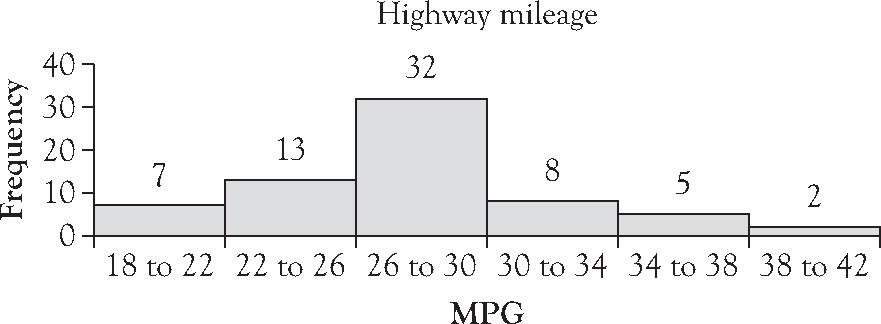
Figure 3.1. A histogram: Highway mileage for 2011 model US vehicles.2
Using Excel
Enter the data in cells A1 through A67. Run descriptive statistics for the data set using the Analysis ToolPak. Note that the maximum value is 40, the minimum value is 18, and the range is 22. The value of 26 is 64 and 27 is 128. Consider using 7 classes because 67 is less than 27. The range divided into 7 classes yields an estimated interval width of just over 3. Round the estimate to 4. If we start with a lower class limit of 18, we can cover the data set with 6 classes as shown in Figure 3.1. Please note: the suggestion of 7 classes is just that. It is a starting place, not a final answer to the number of classes to use in summarizing the data.
In order for the classes to be adjacent, but not overlapping, we set the first bin to have an upper limit of 21.99. Enter the value 21.99 in cell B1. In cell B2, enter the equation: =B1+4 and copy the equation down through cell B6. You should see the values 21.99, 25.99, 29.99, 33.99, 37.99, and 41.99. These will serve as the upper limits of the six classes the data will be collapsed into. Since you want the value 22 to count in the second class, 22 to 26, we list the upper limit of the first class to be just below 22.
Activate the data ribbon at the top of the screen and select Data Analysis at the far right end of the ribbon. Highlight Histogram on the list of analysis tools. Click OK. On the Input Range, scroll your cursor over cells A1 through A67. In the Bin Range, scroll your cursor over cells B1 through B6. Do not mark labels, since we will address that later. Click Output Range, and activate your cursor in the field. Click on cell C1. At the very bottom of the window, highlight Chart Output. Click OK. Excel will return a frequency distribution of the data summarized in cells C1 through D8 in the classes you dictated in the bin range. In cells F1 through K10 will appear a graphic histogram.
Undoubtedly you will want to improve the basic graph.
1. Consider removing the legend. By removing the legend, you will expand the area of the graphic allocated to the depiction of the data.
2. Remove the More category. To delete the More category, click once on the graph. Note that the input data in cells C1 through D8 are highlighted. Grab the lower right-hand edge of the border and drag it to cell D7. The More category should no longer show on the histogram.
3. Reduce the gap width between the columns. To do so, double click your cursor on a column in the histogram. Run the gap width to zero. Should you want to change the color of the columns, that can be done by selecting Fill in the left margin. Select Solid Fill on the right, and Colors to open a color chart to individualize the color for the columns. Before you exit that window, you may want to consider putting a black border around each column to distinguish the boundaries of each. If so, select Border Color in the left margin. Highlight black and click OK.
4. Formalize the bin labels. Instead of 21.99, in cell B1, type: 18 to 22. In cell B2, type: 22 to 26. In cell B3, type: 26 to 30. In cell B4, type: 30 to 34. In cell B5, type: 34 to 38. In cell B6, type: 38 to 42. Those labels should now appear on the bottom axis of the histogram. If the labels do not appear all on one line of text in the graph, highlight the graph, grab the middle of the right edge of the graph and extend the histogram to cover from cell F1 to cell F10. Should you want to increase the font size of the labels, make them bold, or do both, you may need to make the histogram even bigger.
5. Formalize the label for the horizontal axis. To replace the word “Bin,” click the word “Bin” to highlight it and type: MPG. Hit Enter. The axis label MPG should now appear along the bottom axis below the class labels. You may want to increase the font size of the axis label or make it bold. That can be done while the label is highlighted. Click OK.
6. Formalize the label for the histogram. To replace the word “Histogram,” click the word Histogram to highlight it and type: Highway Mileage. Hit Enter. The title of the histogram should now read Highway Mileage. Again, you may want to increase the font size of the chart title or make it bold. That can be done while the title is highlighted. Click OK.
7. Consider adding data labels above each column. To do so, right click on a column so that all columns are highlighted. Select Add Data Labels. Click OK.
Discussion
The modal class, or most frequently occurring class, of highway mileage is 26 to 30 mpg, which, at a class frequency of 32, clearly dominates the frequency of any other class. The highway mileages are slightly skewed to the right. That is, the distance from the midpoint of the modal class, 28, to the upper limit of the highest class (28 to 42, or 14) is greater than the distance from the midpoint of the modal class to the lower limit of the smallest class (28 to 18, or 10).
3.2.3 Finding Rank and Percentile
Using the Rank and Percentile tool in the Analysis ToolPak generates a four-column output with columnar titles: Point, Column 1, Rank, Percent. The first column of the output is entitled Point and replicates the original data list. The second column of the output is entitled Column 1 and contains a list of all data sorted from the maximum to the minimum value for the data set. The third column of the output is entitled Rank and contains the position of each of the data elements from 1 to n, where n is the size of the sample. Of particular interest here is that, for repeated values, the rank represents the median value of the rank for the point’s place in the overall list. So, for example, the mileage value of 30 mpg appeared five times in the original list of data and occupied the 9th, 10th, 11th, 12th, and 13th positions when the original data were arranged in decreasing order. The median rank among those five ranks is (9 + 13)/2 = 11, which is the third rank of the five, or 11th. Excel assigned the tied rank of 11th to each of the five mileages. For second example, the next mileage of 29 mpg appeared four times in the original list of data and occupied the 14th, 15th, 16th, and 17th positions when the original data were arranged in decreasing order. Excel assigned the tied rank of (14 + 17)/2 = 15.5, which was then rounded up to the 16th position. Excel assigned the tied rank of 16th to each of the four mileages. The fourth and final column of the output is entitled Percent and reflects the percentile, the percent of all data elements that fall at or below that value when arranged in decreasing order.
3.2.4 Other Analysis Tools
We have just reviewed three of the analysis tools in Excel’s Data Analysis ToolPak. While there are a total of 19 tools available, many of them are complex tools beyond the scope of this book. Some of them relate to basic statistical analysis and are used and discussed in the companion publication, Working with Sample Data: Exploration and Inference. ANOVA: Single Factor, ANOVA: Two-Factor With Replication, and ANOVA: Two-Factor Without Replication all relate to inferential tests of means taken from multiple populations and are discussed in Chapter 6 of that publication. The F-Test Two-Sample for Variances involves inferential tests for the equality of variances from two populations, most useful in determining which t-test to conduct in determining differences in their means, and is discussed in Chapter 5 of that publication. The regression tool determines whether two or more variables are related and is discussed in its simplest form in Chapter 8 of that publication. The three t-tests automate the comparative analysis of two population means and are discussed in Chapter 5 of that publication, as is the z-Test Two Samples for Means.
3.3 Generating Graphics
Graphic summaries provide a picture of key data that can be used to elicit important questions, fuel understanding, and facilitate communication. Important data tell stories worth listening to and worthy of retelling. Good graphics present the actual data and show causality, multiple comparisons, multiple perspectives, the effects of the processes that lead to their creation, or the effects of subsequent changes made to those processes. They should reinforce the reason the data are significant.
3.3.1 Working with Qualitative Data and Grouped Quantitative Data
As discussed at the beginning of Section 3.2, the analysis of data that assess qualitative variables is limited to assigning the observations to categories and counting the occurrences in each category. Visual summaries of data for qualitative variables by category can be achieved in a column chart or some variant of a column chart, including side-by-side column charts or stacked column charts. Recall that in the construction of histograms, we grouped quantitative data values into classes, which are a type of category. Hence, the techniques for displaying category counts for qualitative variables also apply to the data that have been assigned to classes or categories.
Example 3.3: Forming a Column Chart with a Qualitative Variable
The Question
Use the data in Table 3.3 to develop and interpret a side-by-side column chart showing the retail sales over time of domestic and imported new passenger cars.
Table 3.3. Retail Sales of New Passenger Cars in the United States (in Thousands of Units), 1970–20103

Answer

Figure 3.2. A side-by-side column chart: Retail new passenger car sales in the United States (in thousands of units), 1970–2010.4
Using Excel
Enter the data as shown in Table 3.3, leaving cell A1 blank. In cell A2, enter the category label: Domestic. In cell A3, enter the category label: Imports. In cell B1, enter the year label 1970, and continue, increasing the year label by 5 until you have entered 2010 in cell J1. Enter the appropriate numbers for the selected category and year as shown in Table 3.3.
Highlight the block of cells from A1 through cell J3 entered from Table 3.3. Select the Insert tab at the top of the Excel window. Select Column and click 2-D Column, left-most icon for a side-by-side column chart.
Again you will probably want to improve the basic graph. To insert a chart title, select Layout and highlight Chart Title. Type in the chosen title for the chart.
Discussion
In the 1970s, there was a growth in the purchase of foreign versus domestic cars due to the increase in the price of gasoline. In 1985, sales of cars increased due to the rising value of the dollar. Between 1985 and 1995, the share of domestic vehicles sold increased due in large part to the increased popularity of SUVs. However, in the last decade, the purchase of US cars began to drop due to the increase in gasoline prices, when popularity of comparatively smaller import cars regained market share. Sales of both domestic and import cars dropped noticeably in 2010 due to the global recession.
The side-by-side column chart above allows the reader to examine the patterns in both categories, domestic and imports, displayed across individual years. When the patterns across individual years are less important than the combined pattern exhibited over the entire period of time, a stacked column chart is more appropriate.
Example 3.4: Forming a Stacked Column Chart with Qualitative Variables
The Question
Use the data in Table 3.3 to develop and interpret a stacked column chart showing the sales over time of domestic and imported new passenger cars.
Answer
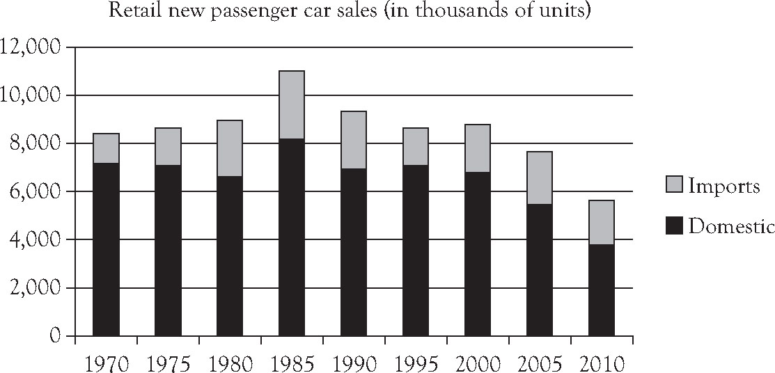
Figure 3.3. A stacked column chart: Retail new passenger car sales in the United States (in thousands of units), 1970–2010.5
Using Excel
Highlight the block of cells from A1 through cell J3 entered from Table 3.3. Select the Insert tab at the top of the Excel window. Select Column and click 2-D Column, left-most icon for a side-by-side column chart.
Again you will probably want to improve the basic graph. To insert a chart title, select Layout and highlight Chart Title. Type in the chosen title for the chart.
Discussion
While it is just as easy to compare domestic retail sales over time in Figure 3.3 as in Figure 3.2, Figure 3.3 provides less direct evidence of comparative changes in retail sales of imported passenger cars. Although the evidence is there, visual comparisons in the retail sales of imports over time are more difficult than in the side-by-side chart provided in Figure 3.2. What is more readily available in Figure 3.3 is the behavior of retail sales of all new passenger cars over time, regardless of origin. Retail sales of new passenger cars was remarkably stable over time, with the exceptional high in 1985 resulting from the increased value of the dollar and the exceptional low in 2010 resulting from the global recession.
When the messages to convey with the data are comparative changes in categories over time, a pie chart may be an effective graphic tool to use.
Example 3.5: Forming Pie Charts
The Question
As various agencies project service demands into the future, demographic changes are often central to those projections. Use the data in Table 3.4 to develop and interpret two pie charts for age groups in the US population in 2000 and 2010.
Table 3.4. US Population by Selected Age Groups (US Census Bureau)6

Using Excel
Enter the data as shown in Table 3.4, leaving cell A1 blank. Begin the names of the age groups in cell A2. In cell B1, enter the year label 2000. In cell C1, enter the year label 2010. Enter the appropriate percentages for the selected age groups by year.
Alternatively, enter decimal values rather than type in percentages. Highlight the cells containing the decimals. In the Home tab, select Cells, Format. On the menu that appears, select Format Cells…. Under the Number tab, select Percentage and input the number of decimal places the values should reflect. Click OK. All values will display as a percent with the designated number of decimal places.
Highlight the block of cells from A1 through cell C5 entered from Table 3.4. Select the Insert tab at the top of the Excel window. Select Pie and click the 2-D icon to make a pie chart.
Answer

Figure 3.4. Pie charts: US population by selected age groups, 2000 and 2010 (US Census Bureau).7
Again you will probably want to improve the basic graph. To insert a chart title, select Layout and highlight Chart Title. Type in the chosen title for the chart. Select Data Labels and click More Data Label Options. Select Category Name, Value, and Show Leader Lines. Click OK.
Discussion
Although the overall population of the United States has grown from 2000 to 2010, which is not shown in the pie charts, the comparative growth rates within the selected age groups differ significantly. The growth rate in the under 18 years category has dropped, as has the growth rate in the category aged 18 to 44 years. This contrasts significantly with the growth rates witnessed in the categories aged 45 to 64 and 65 and older. The population of the United States is aging. Continued growth in the category of 65 years and older can be expected given the increase in the category aged 45 to 64 years. Those service sectors that depend on younger cohorts to fund and focus their expenditures on older Americans are most affected.
3.3.2 Working with Quantitative Data
The tools we used in the previous section can be used to graphically display quantitative data for relatively small samples.
Example 3.6: Forming a Column Chart with Quantitative Data
The Question
According to the Bureau of Transportation Statistics, the total baggage fees collected by airline for the first quarter of 2010, 2011, and 2012 are shown in Table 3.5. Use the data to form and interpret a side-by-side column chart.
Table 3.5. Total Baggage Fees, First Quarter, 2010–20128

Answer
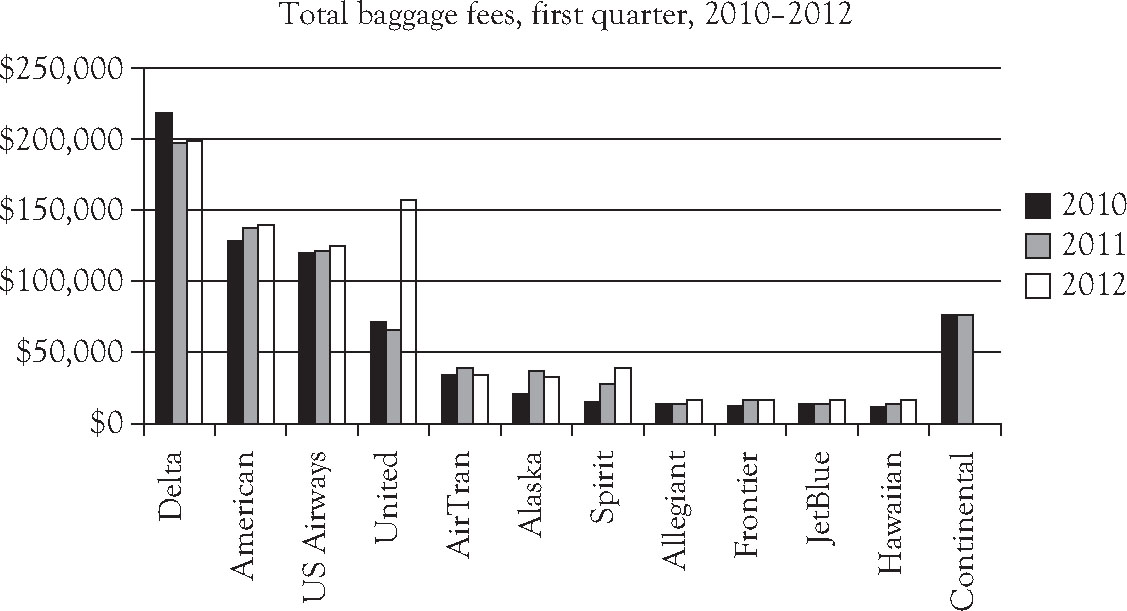
Figure 3.5. A side-by-side column chart: Total baggage fees, first quarter, 2010–2012.9
Using Excel
Enter the data as shown in Table 3.5, leaving cell A1 blank. Begin the names of the airlines in cell A2. In cell B1, enter the year label 2010. In cell C1, enter the year label 2011. And in cell D1, enter the year label 2012. Enter the appropriate baggage fees for each airline and year.
Highlight the block of cells from A1 through cell D13. Select the Insert tab at the top of the Excel window. Select Column and click 2-D Column, left-most icon for a side-by-side column chart.
Again you will probably want to improve the basic graph. To insert a chart title, select Layout and highlight Chart Title. Type in the chosen title for the chart.
Discussion
Continental Airlines ceased to exist in 2012, so it was listed last among the airlines because of its unique circumstance. The most striking pattern shown in the side-by-side column chart is the increase in baggage fees for United Airlines during the first quarter of 2012. However, the two events are related: Continental Airlines merged with United Airlines in late 2011, which probably accounts for the increase in total baggage fees United reported during the first quarter of 2012. Baggage fees converted to a per passenger basis will most likely show a different pattern.
The side-by-side column chart above allows the reader to examine the patterns displayed over time across individual airlines. When the patterns across individual years are less important than the combined pattern exhibited over the entire period of time, a stacked column chart is more appropriate.
Example 3.7: Forming a Stacked Column Chart with Quantitative Data
The Question
According to the Bureau of Transportation Statistics, the total baggage fees collected by airline for the first quarter of 2010, 2011, and 2012 are shown in Table 3.5. Use the data to form and interpret a stacked column chart.
Answer
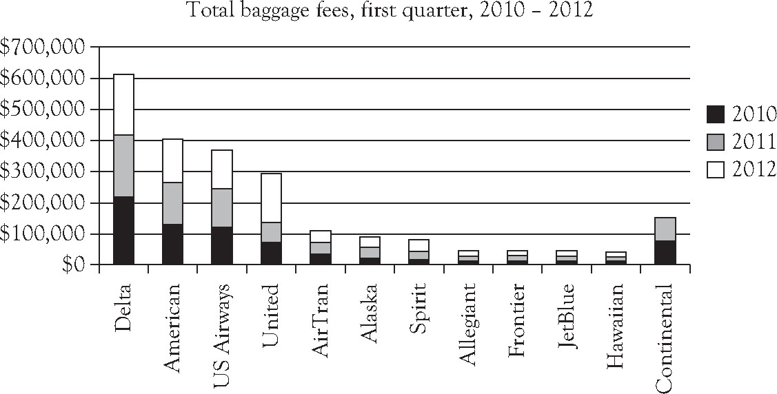
Figure 3.6. A stacked column chart: Total baggage fees, first quarter, 2010–2012.10
Using Excel
Highlight the block of cells from A1 through cell D13 entered from Table 3.5. Select the Insert tab at the top of the Excel window. Select Column and click 2-D Column, middle icon to make a stacked column chart.
Again you will probably want to improve the basic graph. To insert a chart title, select Layout and highlight Chart Title. Type in the chosen title for the chart.
Discussion
Collectively the pattern for Delta Airlines shows it has charged more than other airlines. Were baggage fees converted to a per passenger basis, most likely a different pattern would emerge. Had the merger of Continental and United Airlines been reflected in the graph, again the emerging pattern might have been different.
Summarizing data for continuous variables can be achieved in a histogram as seen earlier in this chapter or a variety of other charts, including line graphs and pie charts.
Example 3.8: Forming a Line Graph
The Question
Of interest to any airline passenger is the on-time performance of the airlines traveled. Airlines have centrally reported their year-to-date on-time flight performances for all years since 1995. Use the data in Table 3.6 to develop and interpret a line graph of the on-time performance of airlines from 1995 to 2011.
Table 3.6. Summary of Airline On-Time Performance, 1995–201111

Answer
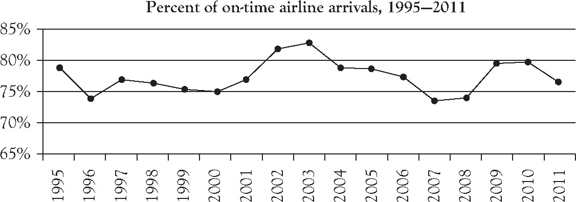
Figure 3.7. A line graph: Percent of on-time airline arrivals, 1995–2011.12
Using Excel
Enter year labels 1995 through 2011 in cells A1 through A17 with their related percent of on-time arrivals in cells B1 through B17.
Highlight the block of cells A1 through B17 and click the Insert tab at the top of the Excel spreadsheet. Select Line, and highlight the left-most icon in the second row, Line with Markers. Left click on the resulting graph and highlight Select Data. In the field of Chart Data Range, scroll over the cells B1 through B17. Under the title Horizontal Axis Labels, click Edit. In the field Axis Label Range, scroll over cells A1 through A17. Delete the legend to maximize the graphic display area.
Again you will probably want to improve the basic graph. To insert a chart title, select Layout and highlight Chart Title. Type in the chosen title for the chart. You may want to individualize the styles and colors for the line and the point markers, as well as the font sizes for the labels and the chart title.
Discussion
On-time arrivals peaked in 2003 but matched their all-time low levels in 1996, in 2007, and again in 2008. Undoubtedly increased security procedures instituted in 2009 after the horrific terrorist attacks in the United States have influenced overall US airline performances including on-time arrivals as well as related on-time departures since the last quarter of 2009.
Quantitative data can also be expressed in a line graph for a cumulative relative frequency distribution. An ogive is a special line graph. A “less than or equal to” ogive is a line graph that captures the percent of all data values in the set that fall at or below the value represented on the horizontal axis. It is useful in answering questions such as: At or below what value do 80% of the data values fall?
Example 3.9: Forming an Ogive
The Question
Returning to the highway mileage ratings for a sample of 67 model 2011 vehicles shown in Table 3.2, form and interpret a “less than” ogive to graphically summarize the data, where the upper class limits are used as labels.
Answer

Figure 3.8. A “less than” Ogive: Highway mileage for 2011 model US vehicles.13
Using Excel
Return to the spreadsheet on which you entered data as shown in Table 3.2. Copy the class labels from cells C2 through C7 and paste them into cells C15 through C20.
Table 3.7. Cumulative Frequency Distributions

Since ogives rise from the horizontal axis, we need to create the interval before our registered mileage readings to show the interval in which there were no mileages at or below that class. So, in cell C14, add a new class label: 14 to 18. In cell D14, type the value 0. In cell D15, enter the equation: =D14+D2. Drag the equation down over cells D16 through D20. That creates a column of the running total of frequencies registered at or below each class. In cell E14, enter the equation: =D14/67. Drag the equation down over cells E15 through E20. That creates a column of cumulative relative frequencies for each of the classes.
Enter the upper class limit of each of the class intervals into cell C24 through cell C30. You should have the label values: 18, 22, 26, 30, 34, 38, and 42. Copy cell E15 through cell E20 and paste values into cell D24 through cell D30.
Highlight the block of cells from C24 through cell D30. Select the Insert tab at the top of the Excel window. Select Line and click the left-most 2-D icon to make a line chart.
Again you will probably want to improve the basic graph. To insert a chart title, select Layout and highlight Chart Title. Type in the chosen title for the chart. Highlight and delete the legend on the right side of the graph to expand the usable display area. Move the four-way arrow cursor toward the vertical axis until it becomes a single arrow; click your left mouse button. In the Axis Options window that opens, select Maximum: Fixed and enter 1.0 to have the vertical axis maximum set at 1.0. Select Major Unit: Fixed and enter 0.2 to retain the horizontal grid lines at 0.2, 0.4, 0.6, 0.8 and 1.0. At the same time, you can individualize the styles and colors for the line and the point markers before you click OK.
Discussion
Comparing Figure 3.1 with Figure 3.8 demonstrates the information each depicts well. Note that the shallow line segment between 18 and 22 mpg indicates comparatively few vehicles were added by the class 18 up to 22. In contrast, the steep line segment between 26 and 30 mpg indicates many vehicles were added by the class 26 up to 30 mpg. In fact, the cumulative relative frequency jumped from around 25% to nearly 80%, indicating the class 26 up to 30 mpg is the modal class and represented nearly 50% of the values in the data set.
3.3.3 Working with Bivariate Quantitative Data
We often find it telling to collect data that track two quantitative variables simultaneously. We may want to look at changes in one variable as it changes with or perhaps even influences values of a second variable. Sometimes a relationship between two numerical random variables becomes apparent by collecting a random sample of measurements of both variables and looking at an x-y scatter diagram of the data. Seldom do we see a relationship between two variables so tightly connected that the scatter diagram maps to a straight line. More likely, the data points are somewhat dispersed, or scattered, around the grid. A cloud of data points that generally rises from left to right provides evidence of a positive or direct relationship between the two variables, whereas a cloud of points that falls from left to right provides evidence of a negative or inverse relationship between x, the independent variable, and y, the dependent variable. A cloud of points that appears as a smattering of points with no direction to them provides evidence that the value of y is unrelated to the value of x. Scatterplots are most compelling when the independent variable is cast as the cause and the dependent variable as its effect. Echoes of the dependent variable as a function of x take on new meaning when depicted in an x-y, an independent-dependent, a cause-effect scatterplot.
Example 3.10: Forming a Scatterplot for Two Quantitative Variables
The Question
Is there a relationship between the annual average 6-month Treasury Bill rates and the inflation rate based on the Consumer Price Index (CPI) for urban Americans? To develop a preliminary sense of an answer, we gathered the 27 observations from 1982 through 2008, as shown in Table 3.8. Use these data to develop and interpret a scatterplot, using the Treasury Bill rate as the independent variable and the inflation based on the CPI as the dependent variable.
Table 3.8. Annual Average 6-Month Treasury Bill Rates with Annual Inflation Based on the CPI

Using Excel
Enter the years 1982 through 2008 in cell A1 through cell A27. Enter the Treasury Bill rate and the inflation based on the CPI in columns B and C, respectively, for each of the years shown in Table 3.8. Note that the data for each variable needs to be listed in a single column, not split into two columns as shown in Table 3.8.
Highlight the block of cells from B1 through C27. Do not include the year in which each of the variables occurred. Select the Insert tab at the top of the Excel window. Select Scatter and highlight the first row, left-most icon, Scatter with Only Markers. Delete the legend to maximize the display area. Select the Legend tab at the top of the screen. Select Axis Titles, and enter the chosen labels for each of the horizontal and vertical axes.
Again you will probably want to individualize the basic graph, controlling fonts, colors, and styles contained in it.
Answer
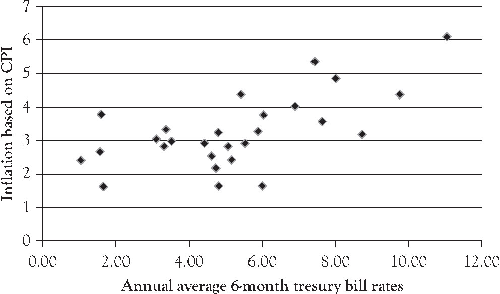
Figure 3.9. A scatterplot: Annual average 6-month Treasury Bill rates with annual inflation based on CPI.
Discussion
In this problem, the annual average 6-month Treasury Bill rate is being used to predict the rate of inflation based on the CPI. So the annual average 6-month Treasury Bill rate is the independent variable, or the cause, on the x-axis, and the rate of inflation based on the CPI is the dependent variable, or the effect, on the y-axis. The data cloud in Figure 3.9 seems to be rising left to right, indicating there is a positive, or direct, relationship between the annual average 6-month Treasury Bill rate and the annual rate of inflation as based on the CPI. If we knew nothing about the average 6-month Treasury Bill rate, we would guess the average inflation rate to be a little over 3%. But if we knew the annual average 6-month Treasury Bill rate was 10%, we would guess the annual rate of inflation to be around 4.5%. This example is developed more completely in Chapter 8 of the companion publication, Working with Sample Data: Exploration and Inference.