
Visual communication is a form of written communication where ideas and information are conveyed through images, shapes, icons, and symbols. It is believed to be the oldest form of written communication as there is evidence to suggest that pre-historic man drew images of animals and rituals among others on cave walls and ceilings. The beauty of visual communication is that by itself, it is language and culture independent. You could practically use it in any part of the world, and you would be conveying the same set of ideas. If visual communication is amalgamated with words, the information that is conveyed becomes more powerful than either one form of communication can communicate on its own. In this workshop, we are going to look into the union on visual aids and words, and the outcome will be exchange of information and ideas quickly and effectively.
In an IT organization, you can typically use visual communication in a number of ways. The idea is to place visual aids in areas that matter, and not overdo it. These are like your trump cards that you utilize at the right place and at the right time. In this book so far, you have seen me use certain visual aids to illustrate certain ideas. I have used a two-dimensional cartoon for illustrating a breakdown in communication in projects, as the visual dimension of the image helps the understanding in a way that words cannot.
In this section, I will showcase a few scenarios where visual communication can be employed. And we will explore a few types of visual communication techniques that are most commonly employed in IT organizations. Remember that different situations demand different types of visual communication, the same type of visual set may not apply for all situations.
Scenario 1: You are in a customer meeting for kick starting a new project for supporting PC hardware and software. The customer has shared the agenda stating that they are keen on understanding the process that our organization would employ in supporting them.
In this case, I have two options. I can tell the customer how the process works through the way of bullets, or show the customer how the process will flow visually. I will provide a demonstration of both. You can be the judge of what works best. Here are the two options:
- Method 1: Bullets
- Customer has a PC issue
- Customer calls the support number
- Level 1 technician logs a support ticket
- Level 1 technician diagnoses and resolves the issue
- If the level 1 technician is unable to resolve the problem, the issue is referred to level 2
- Level 2 technician troubleshoots and resolves the issue
- If level 1 has resolved the issue, then level 1 technician will take confirmation from customer
- If level 2 has resolved the issue, then level 1 technician will take confirmation from customer
- Support ticket is closed post- confirmation
- Method 2: Flowchart
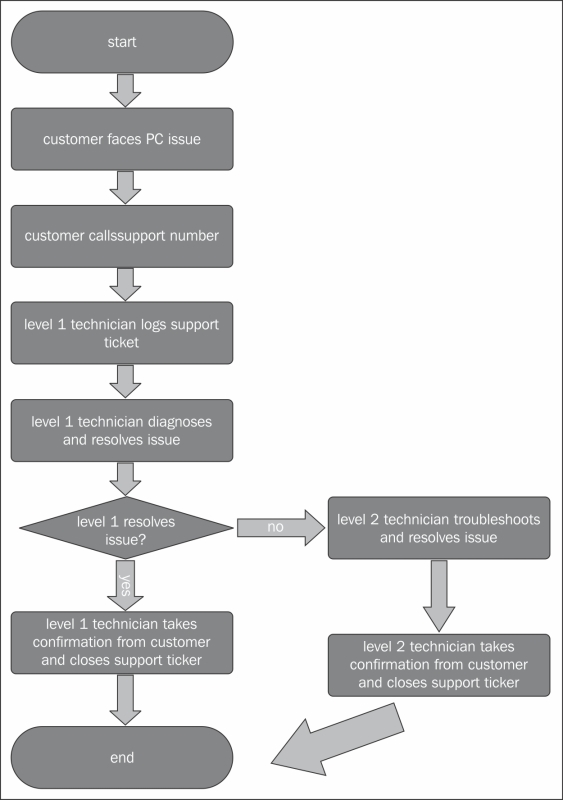
Analyzing the situation. To meet the requirements of Scenario 1, do you feel method 1 is better suited than method 2. Definitely not. The visual appeal that flowcharts provide is unmatchable, no matter how many words you substitute for it. The audience can read and understand method 2 easier than method 1, and the time needed to grasp is quicker too. Thereby, communication renders effective and efficient.
Flowcharts are an integral part of an IT organization's communicative activities. Every objective to be achieved can be broken down into individual steps. Identifying the individual activities and integrating them together to bring out the bigger picture is the ideal way of going about it. The various individual activities and their relationships with one another can be illustrated effectively through a flowchart. Organizations involved in the development of software, the logic behind the coding can be effectively displayed using flowcharts. In projects that employ sequential design process, flowcharts are like gold. The workflow that I used in Chapter 1, Communication Training, to explain communication process is a type of flowchart.
I have provided another sample sequential flowchart that is widely used in IT organizations employing project management methodologies. This illustration is a mere example; you can apply it to any process, or any methodologies you follow. The community that this visual communication is directed towards understands the idea quickly and the image retains in their memory for a longer period—thereby rendering visual communication effective. The example given below is a 5-step waterfall model that is widely used in the software development industry.

You can employ a sequential flowchart to communicate the detailed activities that you are going to perform for a customer. Flowcharting must be employed effectively, and here are some tips to create effective sequential flowcharts:
- Understand the individual activities before starting to draft a flowchart.
- Provide each individual activity with a recognizable name that is meaningful, which provides a basic understanding of what the activity is all about. In the sample flow chart, the individual activity names will point you in the direction of what could take place in the activity.
- Every individual activity has an input, output, and a trigger. Identify these and keep this documented. These may not necessarily go into the flowchart, but it is necessary for explaining the flowchart and training employees on it.
- You can further expand on this concept by tagging responsibilities for every activity. For example, in the sample, we could mention that the customer provides the requirements, the design team provides a solution, and the software team implements the solution and so on.
- I have indicated rectangle boxes only. But, there are a number of symbols that are employed, and each carry respective significance:
- Oval boxes indicate the start or the end of a process/activity.
- Rectangle boxes indicate individual activities as I have illustrated.
- If the activity involves taking decisions, use a decision box that is represented by a diamond box. For example, if the application throws an error, escalate to the coding team or deploy onto the server.
- Input and output to individual activities are represented by a parallelogram.
- The flow of activities from one to another is indicated with arrows.
Scenario 2: Continuing from scenario 1, the customer wants to know how the organization is structured. All customers ask for this information as they like to seek out the escalation paths and negotiate with decision makers rather than people lower down in the chain.
You can provide the information that customer has provided using bullets (textual) or employ hierarchical flowcharts that depict the hierarchical relationships. Take a look at the following sample organization chart and judge whether a customer would be happy to see the flow of information. Here's a sample of the hierarchical flowchart:
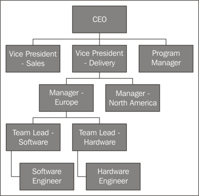
There are a number of types of flowcharts that you can employ. If you are using a software program such as Microsoft PowerPoint, it readily offers a number of flowcharts that you can readily use. I have created the flowcharts using the same software program as well. Remember that every type of flowchart can be used in a particular situation, so use it wisely and prudently.
Scenario 3: Another agenda in the customer meeting that you are in mentions a project that you are going to undertake. The customer wants to know the tentative schedule for the delivery of their project.
- Method 1: Bullets
- Week 1 and 2: Source resources from product vendors
- Week 1, 2, and 3: Interview candidates and bring them onboard
- Week 2: Design architecture
- Week 1 and 3: Discussions around the architecture and finalization
- Week 4: Test procured products
- Week 4 and 5: Implement architecture simulation and test
- Week 6: Deploy architecture
- Week 7: Test and close
In this method, the customer gets a fair view of what is planned for which weeks. But, how easily can it be deciphered if the customer wants to know what is getting done in week 2? Let's try this out visually.
- Method 2: Tables
Here is a visual layout of the same information that is offered in the earlier method:

Green cells indicate the work being accomplished against the activity listed in the respective row. So, if a customer wants to see what is getting accomplished in Week 3, just look at the column under Week 3, and you get all that you need. It is decipherable easier than the text, and provides a holistic view of how things are shaping up.
The example that I provided is a fairly simple one. You can scale it up to any of the scheduling communications that you are in charge of.
Tables and graphs are a form of visual communication as well. They are extensively used in IT organizations mainly when numbers come into play.
The tables that I am referring to here are the arrangement of information into rows and columns. It is effective when comparing different sets of data. Placing data in tables enables you to analyze it easily, and come out with conclusions. When you are conveying information through tables, recipients can quickly grasp the message you are trying to pass, and thus rendering it effective. Here's an example of the sales figures in a year:

You must necessarily employ tables when you are providing data that compares one set to the other—monthly numbers as indicated in the preceding sample. Placing data in tables is the ideal way to justify the analysis you have conducted and decisions that are taken. Remember that when you justify your action with figures, it pretty much seals the deal, and your decision will be accepted. Tables are numbers, and could be straining to the eye and confusing to the mind. To overcome these shortcomings, we can use charting techniques to bring in the visual appeal. Graphs are the quickest way to convince your stand and emphasize the point you are making. Also, it is perhaps the fastest way to communicate information. They are used primarily to indicate trends and display relationships between discrete sets of data.
They can be a particularly useful tool for analysis. One can trend future forecasts using graphs, and perform a variety of actions based on it. Here's a graph for the previous table. See how the communication gets enhanced and becomes effective in conveying the information that you wish to pass across.

The recipient can decipher that the sales were good during the first quarter of the year, and the numbers started to dip in the second quarter. In the second half of the year, sales started to boom again. In the IT world, you can use graphs to highlight your performance to the customer, and highlight the achievement of your team to the senior management and with your team to showcase their achievements. Likewise, employees can employ tables and graphs to indicate a number of types of information that are based on numbers.
To play with numbers and charts, Microsoft Excel is the most apt tool. It is a tool that is most important to all organizations. If you haven't mastered it yet, you must do it sooner rather than later.
In visual communication, imagination is everything. I have provided a couple of different ways of putting information across, and there are a number of other ways the same data could have been visualized.
As a general rule of thumb, any lists that are usually put under bullets, numbers that showcase the performance, and trends can be easily visualized under various forms. You need to put your head into the data you wish to share and the visualization just reveals itself to you. Also, as you gain experience in presenting data, you sync your thinking towards visualizing everything you see. Presentations must be peppered with visuals and that is the best way of enlivening the long hours you end up spending in the meeting room.
Action Point
Exercise (for readers to attempt at the end of this topic followed by a group discussion):
- You are a manager and you have 5 people in your team who have completed a project. You want to show visually the percentage of work each one of them has put in, in getting the project successfully completed. Person 1 has put in 10 percent, person 2-22 percent, person 3-54 percent, person 4-5 percent, and person 5-9 percent.
- Have you heard of SWOT analysis? It stands for strengths, weaknesses, opportunities, and threats. You can analyze almost everything using this analysis. I can analyze a subordinate in my team by stating the strengths the person possesses, their weaknesses, the opportunities that will launch the person to higher limits, and the weaknesses that drag the person down. Now the exercise you need to do is perform this analysis against the customer you service. And, the SWOT analysis must be displayed visually and not just words.