
Chapter 7
Optimize for Clarity
Everything should be made as simple as possible, but no simpler.
—Albert Einstein
The Dalai Lama walks into a pizza joint.
The server asks, “What can I get for you?”
The Dalai Lama considers carefully for a few moments and then says, “Can you make me one with everything?”
(Pause for effect.)
Don’t underestimate your prospects’ ability to misunderstand you.
There are some who believe conversion-rate optimization involves sophisticated persuasion techniques to motivate prospects to convert into customers. And they’re correct. You can use many advanced tactics to enhance motivation, some of which you saw in Chapter 5 (“Optimize Your Value Proposition”) regarding pricing. The field of knowledge is growing rapidly with the research WiderFunnel and others are conducting in the areas of marketing, psychology, and behavioral economics.
Although persuasion is important, clarity is even more so. In many of the website tests we’ve run, improving clarity alone has led to dramatic improvements in conversion rate and revenue.
Your visitors want to understand your value proposition, but they have a limit on the mental processing they will invest in doing that. By optimizing for clarity, you minimize the cognitive load for prospects, which frees up their mental bandwidth to make the conversion decision. The goal of clarity is to minimize cognitive load. Once you’ve optimized for clarity, you can layer on other persuasion techniques to make even greater improvement.
Clarity includes the communication of your value proposition and calls to action through your visual design and copywriting. In this chapter, you’ll learn to test changes in your information architecture; graphic design, including eyeflow, images, and colors; call-to-action offers and buttons; and copywriting, including 15 tips for copywriting with clarity.
Information Hierarchy Clarity
The information hierarchy is the organization system you use to show how information is related. At the website level, this means how the site’s pages are organized; and at the page level, it means how content within each page is organized.
Website-Level Information Hierarchy
You should consider the website-level information hierarchy when testing pages or templates within a larger website. The practice of information architecture (IA) deals with how website pages are organized and linked. An IA site diagram is a type of document commonly used to define where each page sits within the site structure.
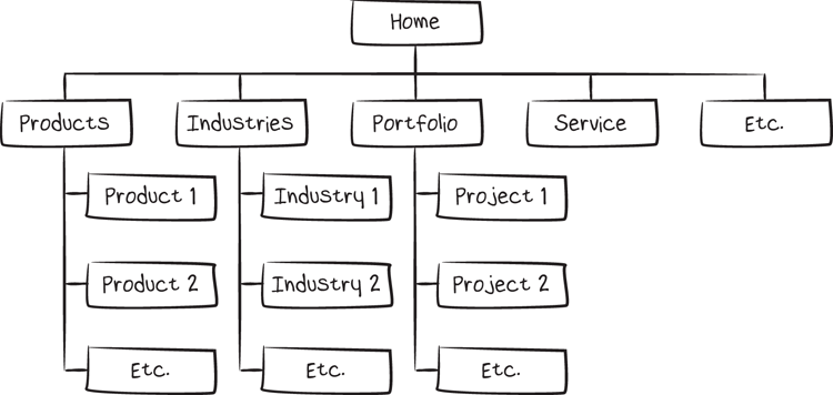
You can test your information hierarchy with hypotheses about how to organize your website’s content on the page or through navigation. Should your top-level pages provide links to category pages, subcategories, individual products, or to calls to action? Should product pages sit within subcategories or be shown as larger product groups with more filters instead?
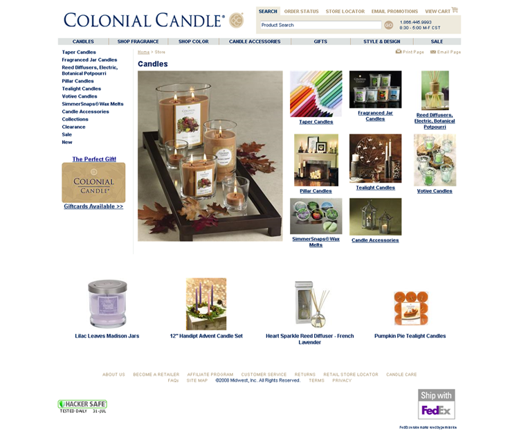
In the case of Colonial Candle, changes on the individual pages modified the site architecture by changing the depth of the links shown. It affected more than just the on-page layout.
Original page
Challenger A
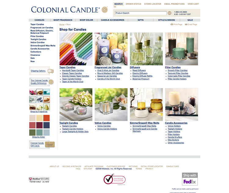
Challenger B—winner
Visitors on the winning page were able to view all product categories on a single page and click directly through to individual product types. On the original page, arriving at those products could have taken several clicks, and the visitor on the top-level page might not have known those products were offered at all.
Page-Level Information Hierarchy
You can also affect the information hierarchy at the level of the individual page. At the page level, a wireframe is a useful tool for planning. It tells you where the content boundaries are and defines the hierarchy of information. A wireframe is a diagram with a simplified view of the content blocks that shows how the main pieces are arranged. It helps focus attention on the eyeflow and content placement without the graphic design or specific copywriting in place.
Wireframes should be in black and white to avoid preoccupation with design elements and are intentionally not pixel-precise. At the wireframing stage, you should be thinking about eyeflow, the content hierarchy, and the visitor decision-making process.
When WiderFunnel ran a landing-page experiment for the CanaDream travel company, for example, we created a wireframe for each variation, as we do with every A/B/n test.
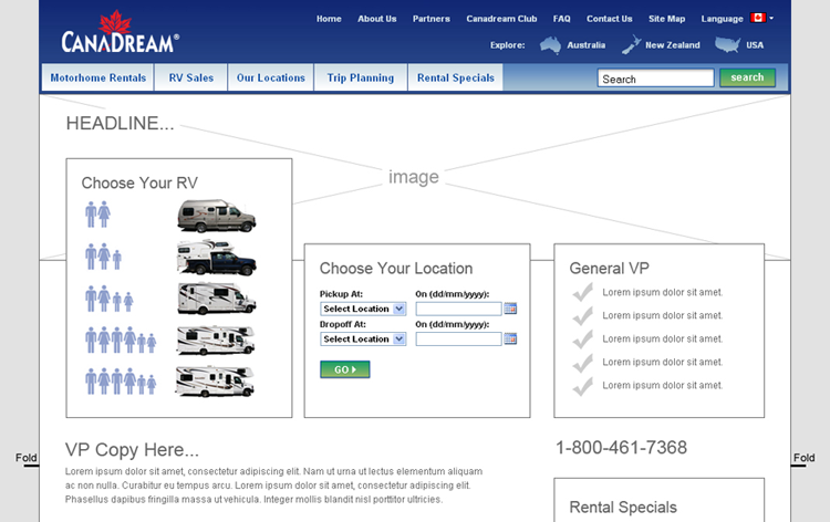
Notice the Fold markings on either side of the wireframe. This tells you (very roughly) the end point of what most page viewers will see when viewing the page. The fold is important to understand when planning your page layout, because it helps define that first impression your page creates. The location of the fold is different on every device, screen size, and web-browser configuration, and you should consider the most common screen resolutions for your visitors.
By planning your information hierarchy and structuring your content, you allow your readers to use less mental energy orienting themselves and deciding where to look first. The organization of your information relates closely to design clarity.
Design Clarity
Conversion optimization requires design that’s on the far end of the “form follows function” spectrum. At the opposite end of the spectrum is design for the sake of aesthetics alone. Design like that is best enjoyed in an art gallery—not on your website.
The purpose of web design is to facilitate communication. Design for conversion doesn’t draw attention to itself, but promotes the content alone. The best design disappears behind your content.
Your design should reinforce your value proposition and positioning. Should it be minimalist or embellished? Bold or subdued? Warm or cool? Your design approach communicates as much about your brand as the words you use. Your understanding of your audience, value proposition, and positioning help inform your design choices.
Design includes more than just colors and graphics. The wireframe you create for your pages, which determines placement of content sections, plays a leading role in how easily your reader’s eye can move through your content.
We’ll get to tactics for enhancing eyeflow clarity in a moment. First you should understand the difference between readability and legibility:
- Legibility tells you whether words can be deciphered. Are they too small, fuzzy, or faint to be read?
- Readability is a less binary, yes-or-no question. It’s the degree to which the text treatment promotes easy reading. Something can be legible without being very readable. Do the color, size, font, and placement of your text entice the reader to want to keep reading, or is reading a struggle? The answer to that question is your readability.
Eyeflow Clarity
The placement of images, graphics, and copy either guide your reader’s eye or block its flow. An ideal content structure minimizes the strain on your reader and allows fast comprehension.
Columns
An experiment that WiderFunnel developed for an online catalog retailer provided a clear example of the importance of eyeflow. In the test, we created several challenger variations to test against the site-wide e-commerce product page template.
Without changing the product descriptions or images, we were able to increase the sales conversion rate by more than 20 percent. The improved content placement and design in the new layouts allowed shoppers to find and understand product information more easily. The website became easier to use, and more visitors to the site made purchases.
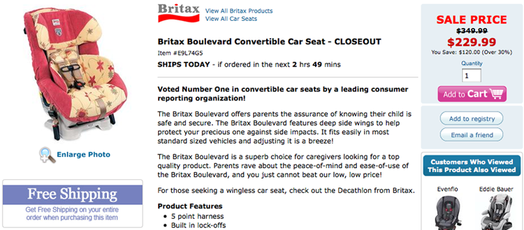
Two of the variations we tested are particularly interesting and illustrate the influence of eyeflow. The wireframes were identical three-column layouts with just one change: the left and right columns were swapped. In Variation A, the product image was on the left with the pricing and add-to-cart button on the right. In Variation B, the product image column was on the right, with the price and add-to-cart on the left.
Variation A
Variation B
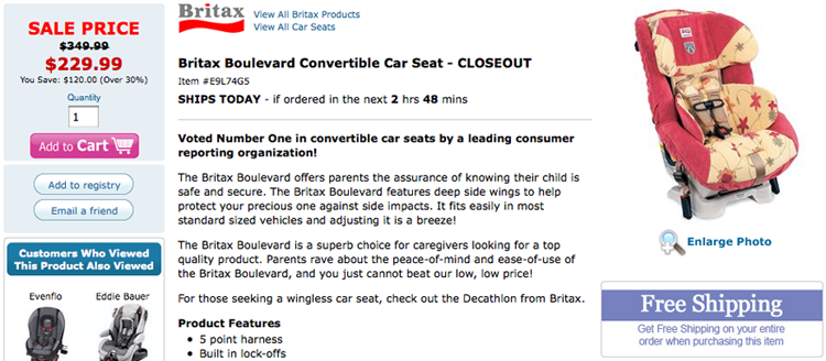
Variation B, with this single change, produced 16 percent greater sales than Variation A. That’s a dramatic impact for any change, especially one that you might consider relatively insignificant.
Why was the column location that important? It changed the eyeflow and content emphasis.
Looking at the context, we understand that many of this retailer’s products have discounted prices. Moving the price to the left column increased the emphasis on the price and reinforced the discount value proposition.
This layout doesn’t work for all retailers and shouldn’t be taken as a general rule. Further testing is likely to find even better layouts for this retailer. This test does demonstrate, however, how important your layout’s eyeflow is when it clarifies your value proposition.
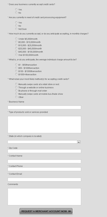
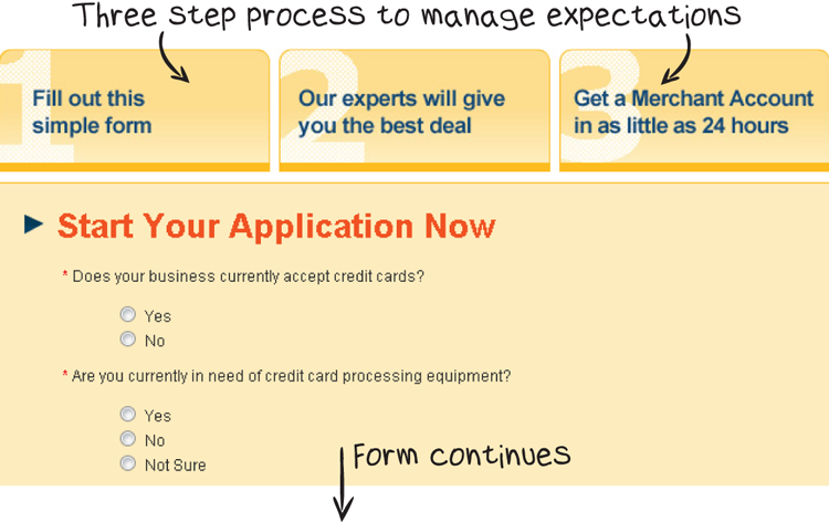
As a general guideline, our tests have found that reducing the number of columns improves conversion rates. This is especially true for forms. I’ve never seen a two-column form out-perform a single column form in a head-to-head test.
2-column form

1-column form
Guides
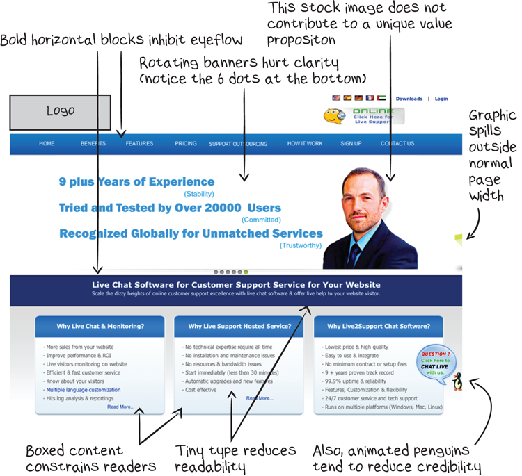
Shapes, lines, and patterns can also block or guide eyeflow. Using horizontal rules and boxes around content tells your readers that they should stop reading or that the content is related to different subjects. These elements should be used carefully to encourage reading.
In the Sims3 case study in Chapter 5, you saw the result of testing in the game-launcher window. During the development of that test plan, one of the important LIFT Analysis points that WiderFunnel’s strategists identified was that the boxed content inhibited eyeflow.
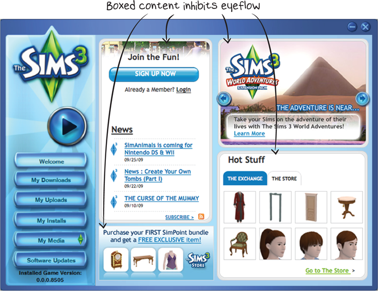
Boxes and lines between content like this create visual barriers for the reader. These barriers create a disjointed eyeflow and increase the reader’s cognitive load.
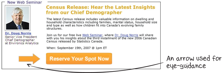
You can also use visual elements to direct eyeflow patterns toward where you want people to look. Remember the eye-tracking study showing the baby’s visual gaze from Chapter 3, “Prioritize Testing Opportunities”? You can use graphical motion with similar effect, as in this example of a test we ran on a webinar ad, which nearly tripled webinar signups. See Chapter 10, “Optimize for Urgency,” for the full case study of that test.
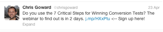
You can even use graphic elements in your tweets. Check out the arrow call to action!
You should test using visual elements to guide your readers toward important content.
Your images can also act as visual guides to bring the reader’s eye to your call to action. If you add captions to your images, they will be some of the most highly read text on the page. I call captions that include an offer statement action captions. You Should Test That!
Image Clarity
The images you use should communicate and support your value proposition. Images that are added just for decoration risk confusing your prospects and reducing clarity.
Particularly for online retailers selling physical goods, the quality of images can affect your sales success. Enlarging images and adding zoom-in functions will help shoppers compensate for their inability to touch the items.
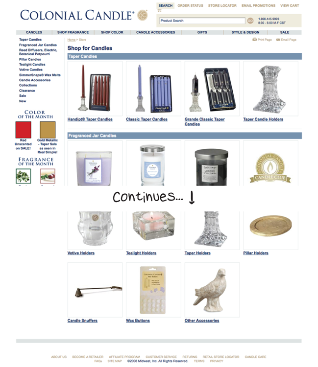
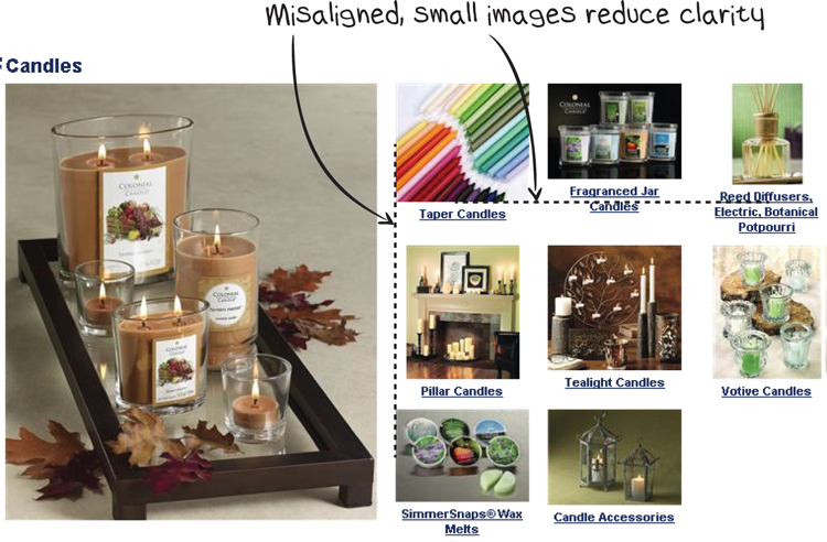
You can also improve clarity and reduce visual processing effort for your visitors with consistent alignment of your images. One of the problems we identified during the LIFT Analysis for Colonial Candle was misalignment of images.
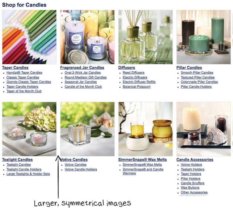
In the winning variations that WiderFunnel created, we enlarged the category images with consistent sizes and visually aligned them horizontally and vertically. Enlarging the images made the detail easier to see, and the consistent alignment removed flaws that attracted the viewer’s eye, which left them free to focus on the image subject.
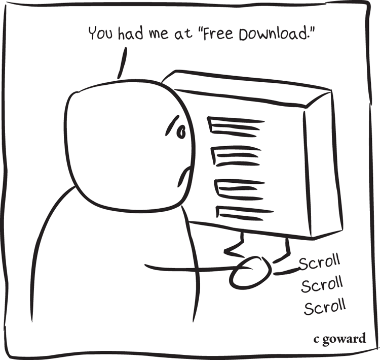
Images are also important for companies with intangible products or services. The challenge for intangibles is how to make the product or service seem more tangible.
Software vendors have traditionally done this by showing product boxes, even for software that can only be purchased via download. Others use screenshots of the product interface so prospects can imagine themselves using it.
Some image concepts can be too clever and cause confusion. For example, Singular Software has developed a popular video-editing support tool called PluralEyes. It synchronizes audio and video clips automatically, dramatically reducing the time and effort needed to edit multi-camera, multi-take, and dual-system audio productions.
When WiderFunnel’s strategists analyzed the PluralEyes landing page, we discovered that their feature image was using an analogy.
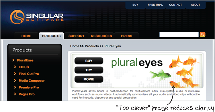
The analogy of the goldfish could be interpreted as the multiple elements (video or audio sources) “streaming” toward a single one. It’s a clever concept. But visitors won’t spend enough time to figure out a clever analogy like that. The first thing that might jump into their minds is, “Is this site selling software or fish food?” The full case study reveals other interesting findings from the test.

- Watch a video
- Buy the software
- Download the free trial
Color Clarity
Color is important for emphasizing significant page elements and enhancing readability. If you have an established brand, most of your color choices are predetermined. In this case, you probably have a graphic standards manual that dictates your color and design choices. If you don’t have graphic standards set, you have more flexibility in choosing colors for graphic elements.
Regardless of whether your business has graphic standards set, you can use color selectively to emphasize important elements over supporting content.
Color Contrast
Three main components of colors are important to understand: hue, lightness (or brightness), and saturation. The hue is what most people think of as the color’s name: blue, red, green, aquamarine, and so on. It can be visualized as the color’s position on a color wheel or spectrum. The farther apart two hues are on a color wheel, the higher the contrast between them. But hue alone doesn’t tell you whether two colors will work well together or even be legible. Hue is less important for readability than lightness.
Contrasting lightness is the most important of the three color components for readability. Lightness refers to how bright the color is. Think of holding a colored piece of paper and walking from a dark room into a lighter room and then out into a bright, sunny day. The lightness of the paper’s color is different in each of those environments.
Lightness can be affected by the hue as well as the degree of shading added to the hue. Yellow is naturally a lighter hue than blue, for example, but you can increase the lightness of blue by adding white or darken the yellow by adding shade. For maximum readability, you should have high lightness contrast between the text and background colors.
A color’s saturation level is the degree to which the hue is fully expressed, at one extreme, or closer to gray, at the other. Saturation is important for design aesthetics, but it’s the least important of the three color components when considering readability.
The combination of black and white is the highest-contrast color choice. The worst combinations use colored text of medium lightness on backgrounds with similar lightness. You can often increase the clarity of your pages by testing dark text on a white background for high contrast. Remember, the purpose of this testing is to increase readability and decrease the readers’ cognitive load.
In a landing-page optimization test we developed for MerchantWarehouse.com, for example, we identified low-contrast text as one of the clarity LIFT Analysis points.
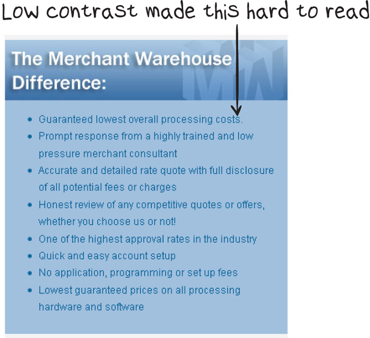
By redesigning the page with greater readability (among many other changes), we increased the lead-generation conversion rate on that page by 15 percent.
Do you have large blocks of white copy on a dark background? Try black text on white. Reversed type (light text on a dark background) can work if the type size is large enough and copy blocks aren’t too long. Reversed type stands out more than standard dark-on-light type, but large blocks of it create eye fatigue.
Color Meaning
Various colors have connotations, and those vary according to cultural expectations. Green can communicate a positive feeling, a “go” from a traffic signal, environmental friendliness, or the color of money in America. On the other hand, it can also imply envy or remind us of Montezuma’s revenge.
Some say that red is best for calls to action because it commands attention. We can’t help but look at a red object in front of us. The color red is actually built into our physiological makeup to grab our attention. Red is also considered to be an auspicious color in traditional Chinese culture, symbolizing good luck and happiness. But it can communicate “stop” or a warning. As the saying goes, when you’re angry, you “see red.” It’s true. When your body senses anger or increased adrenaline, a surge of blood goes to your eyes and tints your vision red. You literally are seeing red!
For conversion optimization, the clarity of the color and design of the elements are usually more important than perceived connotations.
Consistency
Visual consistency is even more important than visual prominence. Although you can use color to highlight important information or draw attention to calls to action, those colors should be consistent throughout the conversion funnel.
Many sites have customized their link colors; for example, the most common standard is to use blue for links. That was originally the only color possible for links, and many people (other than the very young) are accustomed to looking for blue links.
Messing with web standards is done at your own risk. If you’re inclined to use different colors than your visitors expect, You Should Test That!
Call-to-Action Clarity
The sole purpose of your page is to persuade your prospects to respond to your call to action (CTA). I’m often surprised at the effort some websites seem to take to hide their CTAs. It’s as if they’re embarrassed to ask for the sale.
There’s a successful sales principle you should apply to your landing pages. It says, “Close early, and close often.” Whatever form your CTA takes—text link, button, phone number, or embedded form—it should be prominent.
Your CTA will work best if it’s accessible as soon as your prospect has read enough and decided to act. In most cases, calls to action work best when they’re above the fold and at the bottom of your content. You Should Test That!
Buttons are the most popular type of CTA, and many people gravitate toward testing buttons when they first begin testing. Bigger buttons can help on a lot of landing pages that have never been optimized. If your call-to-action buttons aren’t clearly visible on the page, they probably need to be larger.
But where do you stop? At some point, your button will be too large—eventually it may even stop looking like a button. Clearly, the advice to “make your buttons bigger” doesn’t apply to all pages.
There’s also been much (useless) debate about the best button color and design. The best button treatment depends on the rest of your site design, color scheme, brand identity, and target audience. Take a look at the variety of buttons we’ve tested on winning pages. You’ll find the color versions of the buttons in the Color Gallery at the back of the book.


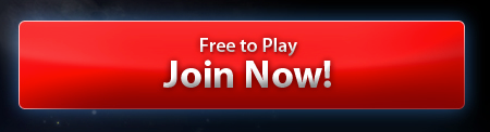


During one string of tests, we tested Big Orange Buttons, and it became an acronym around the WiderFunnel office. We call him BOB. He works hard ;-)

The wording of your CTAs can be even more important than the design and color. At WiderFunnel, we’ve often seen double-digit conversion-rate lift by testing copywriting alone.
Copywriting Clarity
“People don’t want to buy a quarter-inch drill. They want a quarter-inch hole!” So said Harvard Business School marketing professor Theodore Levitt. You may be selling features, but your customers don’t just buy features. They buy solutions. Your prospect may be solving a purely emotional want or a rational need. It may be definable and specific or intangible and general. Your copywriting tone and the value proposition you emphasize will depend on their needs.
If your prospects understand your product and are comparison shopping, emphasize the features they’re looking for. Tell them about the carbide tip and high tensile steel in the drill bit first, and then give them the benefit of those features.
If they’re less informed, they need to understand the benefits up front. Lead with how long-lasting your drill bit is or how fast and cleanly it makes holes compared to alternatives. Then use features as supporting points.
As your industry and the needs of your target audience evolve, so should your copy approach. By continuously testing your copy, you’ll make sure your communications evolve along with the market. Whatever the needs of your prospects may be, a confused prospect won’t buy.
“I’m sorry I wrote you such a long letter; I didn’t have time to write a short one.” This comment, attributed to Blaise Pascal, underscores the challenge of writing with clarity. Concise writing is hard to achieve, yet is just as important for web copywriting as it was for Pascal’s letters.
Here are 15 tips you can use for high-clarity copywriting:
To evaluate your pages for clarity, look at them from the perspective of your prospect and identify potential clarity breakdowns. As an example of this type of analysis, I searched for “e-commerce chat support” and came across the following landing page. It offers an example of common clarity problems.
You may be thinking I’m shooting fish in a barrel. “Chris,” you may say, “Why are you picking on these little companies with obvious conversion problems? Give yourself a challenge.”
That’s a fair comment. Some of the pages we test at WiderFunnel are owned by entrepreneurs and business owners who don’t have teams of marketing specialists and communications experts. But many of our clients are in the Fortune 500 and have highly skilled marketing teams. There are opportunities to improve every communication, no matter the marketer’s level of sophistication.
Conversion-lift opportunities abound in many larger organizations because of committee decision-making, competing time priorities, and the complexity of controlling the sheer volume of pages. Between corporate websites, product-specific websites, marketing campaign sites, and third-party pages, corporate marketers’ attention is split in many directions.
As an example, SAP is a world-class company full of brilliant people. Because they’re bright and knowledgeable, they know they have opportunities to improve through conversion optimization.
The following case study shows an example of a test WiderFunnel ran on one of SAP’s landing pages. The clarity of the eyeflow, copywriting, and CTA were some of the most important aspects we changed to create the winning challenger pages.

- Pages had to include a standard corporate banner at the top, which took up valuable page space.
- Pages could only employ a two- or three-column design, with standard widths for each column.
- Only certain fonts and font sizes could be used.
- Design elements had to stay within an approved brand color palette.
- Images could only come from an approved list.
- Buttons had to use approved colors and sizes.
The LIFT Analysis
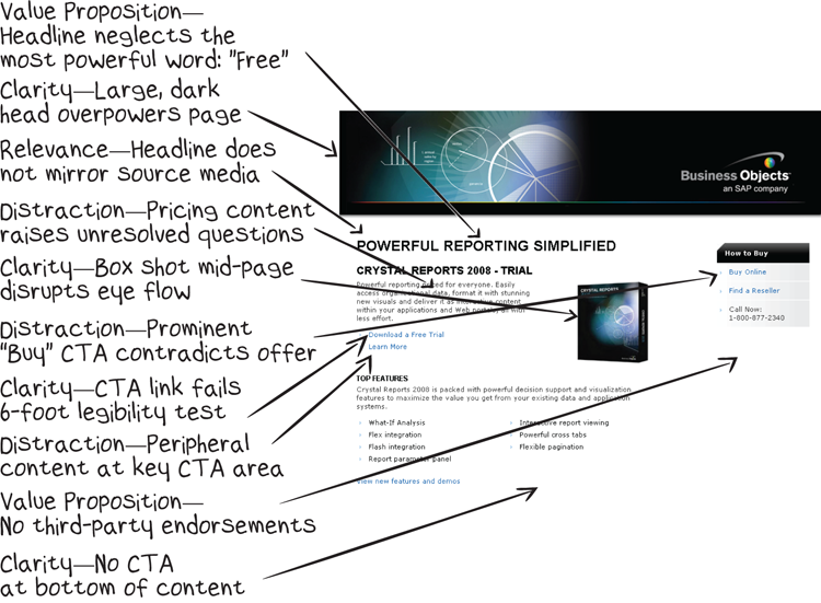
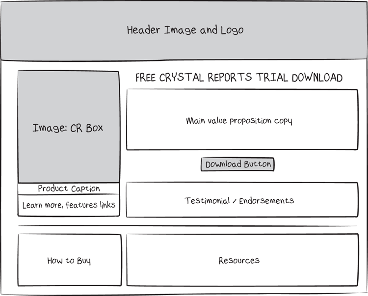
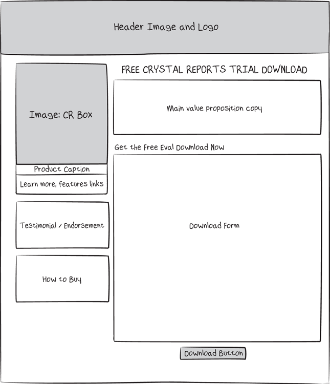
The Variation A landing page
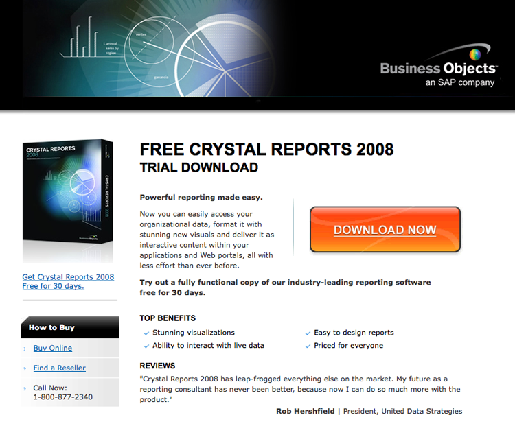
- Improving the prospect’s eyeflow on the page. Working within the corporate design standards, the team employed a two-column design but changed the position of the narrower column from right to left. This move allowed them to place the product hero shot on the left, where it improved eyeflow by leading prospects directly to the headline in the center of the page.
- Using a larger image. Although they wanted to try an alternative image, the team decided that change would violate brand design standards. Instead, they received approval to enlarge the existing image.
- Adding a caption link below the image, which took visitors to the trial download registration page.
- Writing a new headline. WiderFunnel wrote a headline that reinforced the message used in the search ad that brought visitors to the landing page.
- Consolidating information links. WiderFunnel reorganized the links on the control page to reduce distraction from the trial download CTA. Links for customer support, developer resources, training, and additional information about the product were moved to the bottom of the page, below the primary CTA.
- Relocating purchase links. WiderFunnel also moved a box containing links to facilitate immediate product purchases, either online, through the telephone, or through a reseller. That box was moved from the upper right to the left side of the page, just below the product hero shot.
- Enlarging the CTA button. WiderFunnel added a large orange download button (affectionately known as BOB: Big Orange Button). The existing page’s CTA was a text link inviting visitors to download a trial. WiderFunnel believed that design was too small to attract visitors’ attention.
- Traffic was randomly and evenly divided between the three versions of the landing page.
- Each visitor was cookied and always shown the same page variation, regardless of how many times they returned to visit the website.
- WiderFunnel tracked conversion rates for each challenger page and the control.
- Only completed software trial downloads were counted as conversions.
- Variation A, with the large orange button, boosted conversions 32.5 percent over the control page.
- Variation B, despite maintaining the long form, delivered a 17 percent conversion lift over the control page.
Whether you’re a world-leading company like SAP, are just getting your business started, or are somewhere in between, you can test to improve your clarity.
In Chapter 8, “Optimizing for Anxiety,” you’ll see how to tackle one of the drags on your conversion rate: anxiety. You’ll test how to reduce anxiety by satisfying your visitors’ need for privacy, usability, and fulfillment follow-through.