
Chapter 8
Optimize for Anxiety
You only have to do a very few things right in your life so long as you don't do too many things wrong.
—Warren Buffett
Are you a Spiderman fan? I often wonder what makes some superheroes so easy to relate to. Perhaps many of us wish we had a secret identity to change into so we could kick ass, too.
Spiderman also has an appealing sixth-sense power: when danger is near, our hero Peter Parker can always tell because his “Spidey sense” tingles. His sixth sense alerts him so he can avoid surprise dangers. If you were like me as a kid, you may have wished for your own Spidey sense at school to warn you that a pop quiz was about to happen!
It turns out you do have a sense that’s attuned to danger in your environment. And so do your customers. We scan the horizon for dangers and listen to our intuition telling us whether we’re safe to proceed.
This is a good sense to have on alert when we’re rock climbing or riding public transit, but it slows us down in our buying behavior. An anxious mind creates a closed wallet.
Successful consumer sales environments reduce anxiety. Take a walk through your local mattress or major appliance store, and look at the salespeople. I’ll bet you won’t see any tattoos, body piercings, or torn denim. There’s nothing inherently dangerous in those things, but the store owners know that for some people, they would create anxiety.
In this chapter, you’ll see how to avoid creating uncertainty in your prospects’ minds. The most common concerns that users have about websites involve privacy, usability, fulfillment, and effort; you’ll learn how to minimize each of these potential sources of anxiety and then find out how you can use anxiety in your favor to motivate your prospects to act.
Privacy Anxiety
Privacy concerns have been front-page news in recent years. We’ve seen anonymous hackers take down the FBI website, Facebook’s privacy policy smacked down by regulators, and sensitive government and corporate secrets exposed by WikiLeaks. Consumers are concerned about their privacy and the seeming inability of trusted organizations to keep private information just that—private. In this privacy-sensitive environment, it’s more important than ever for you to justify the information you need to collect and assure your prospects of your trustworthiness.
The number of form fields you ask prospects to complete can affect your conversion rate. Asking for too much information (TMI) causes 12 percent of e-commerce shoppers to abandon their carts, according to Forrester research (North American Technographics Retail Online Survey, 2009). In addition, if you ask more questions than your prospects think are necessary, they’ll give fake information. A study by Janrain showed that “88% of online buyers had at some point intentionally left registration information blank or used incorrect information when signing up for a new account at a website” (Consumer Perceptions of Online Registration and Social Login, Jan, 10, 2012).
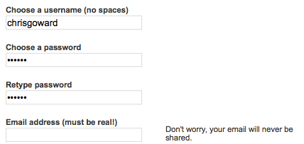
One method you can test is to add help text explaining why you need to collect data or how to use fields, especially for sensitive information. On the Digg signup form, for example, supporting help text appears as the visitor progresses through the form. As the user tabs into the second password field, a step that can be confusing for some people, the help text explains why it’s necessary.

Then, in the next field, the anxiety-producing email-collection step, Digg reduces anxiety with a simple privacy assurance message. Digg doesn’t show all the help text at once, to avoid overcomplicating the look of the form.
Here’s another option: can you move optional form fields to your thank-you page and provide additional benefit for completing them? WineExpress.com uses this method for its newsletter signup funnel. The first step presents a very simple two-field form.

By eliminating optional fields, the site optimizes its subscription conversion rate. Then, on the thank-you page, it gives the option for the subscriber to add their mailing address to also receive the print catalog.
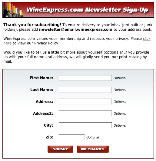
Most companies include the print catalog option within the single form and probably reduce subscriptions because of it.
You can also test using thank-you pages to collect additional demographic and psychographic information to enrich your understanding of your customers. As long as you give a reason that benefits the prospect, many will give you the information. Compare that WineExpress.com example with a signup form for a well-known web-design newsletter.
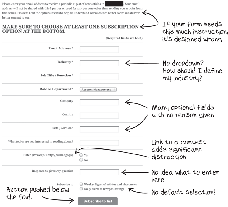
The many optional fields and confusing questions create all manner of anxiety and distraction on this form.
Here’s another example from a well-known B2B company.
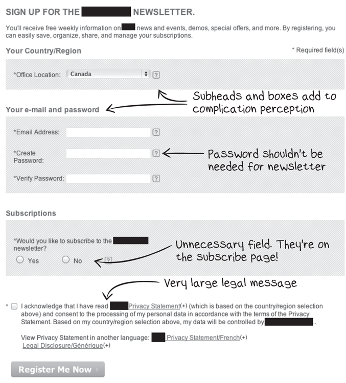
The design and content of this form raise anxiety barriers by creating a perception of complication. Clearly, this legal department could use some restraint. They’re harming the company’s lead-generation results.
The fact that reducing the number of fields on a form increases its fill rate has been well documented. Many tests have confirmed this. Reducing your fields to the minimum required is an accepted “best practice” for increasing conversion rate.
But it doesn’t always hold true. In tests we’ve run at WiderFunnel, we’ve seen many different form options win tests. Sometimes splitting forms into multiple pages has worked better than longer single pages, but in other cases a consolidated single-page form wins. We’ve even seen tests where adding certain fields has increased conversion rate.
In one form test example, during the run-up to the 2010 Winter Olympics, WiderFunnel worked with Elastic Path to optimize e-commerce sales on the Olympics merchandise store. One of the tests the Elastic Path team ran was on the checkout pages.
In an A/B/n split test, the team wanted to test against the original checkout with its four steps: Sign In, Shipping, Billing, and Receipt. The alternative test variation consolidated those four pages into a single-step checkout.
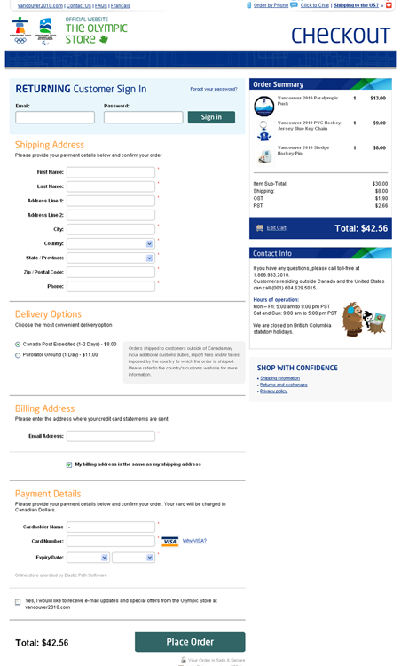
The single-step checkout out-performed the original multistep checkout with a 21.8 percent lift in sales. If you’ve got a retail site, You Should Test That!
Your privacy policy is also an area where you can reduce or create anxiety. For example, MarthaStewart.com offers free email newsletter subscriptions. On the signup page, way down at the bottom, is a small link to the privacy policy.
For now, let’s ignore all the clarity and distraction problems the site has created by offering 18 subscription options and pushing the subtle gray Subscribe button to the bottom of a very long page. Once a visitor clicks the privacy link, they’re in for a daunting read. At 3,700 words, the privacy policy creates anxiety for anyone interested enough to try reading it.

This is a common situation for corporations where overzealous legal teams create unnecessary hurdles for marketing teams to deal with. Even if you’re in this situation and can’t rewrite the privacy policy, you can frame it in a friendlier way. Test creating a summary of the privacy message for subscribers, like this:
Your privacy is important to us. We will never share your email address or other private information with anyone. Period.
You can always unsubscribe at any time.
If you’d like, you can read the full corporate privacy policy.
You can test opening that simple summary message in a lightbox with a link to the full policy for those interested enough to read the entire corporate policy. An even better option, if you can persuade the legal team, is to rewrite the corporate policy to use natural language or write a specific, short privacy policy for newsletters.
Only a small segment of your audience is likely to read your privacy policy. The rest will simply trust their gut reaction about whether the information you’re asking for on your forms is justified.

In the next section, you’ll see examples of forms that create anxiety with both usability and privacy concerns.
Usability Anxiety
Usability refers to how easy your experience is for your prospects to learn and use. The most common opportunities for improving usability relate to forms, website errors, and speed.
Form Usability
Do your forms make your prospects feel stupid? Poor form design, arcane error messages, and stark red error text all say, “Hey, Dummy, why can’t you figure this out?!”
That’s an unfortunate way to start a relationship.
Don’t underestimate the confusion that forms can cause for your prospects. As a sophisticated web user, you’re accustomed to forms and their purpose. You probably spend most of your day online. But think about all the other types of people who will be using your forms: plumbers, teachers, doctors, taxi drivers, waiters, and symphony bassoonists. Many of them won’t be nearly as comfortable online as you are. Help your prospects avoid errors to reduce form anxiety for them and start the relationship more amicably.
Even on the clearest and most straightforward form, your users will make errors. You should design your forms to accommodate them in a friendly way. Allowing users to recover from errors easily will improve your conversion rate.
Signing up for a WordPress blog, for example, shows a low-anxiety method for highlighting form errors.
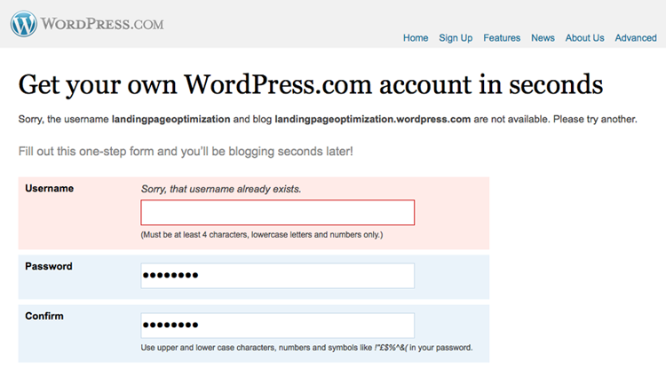
The field that needs attention is given pink shading and a red keyline with a helpful, even apologetic (!), error message. This error handling happens dynamically as the prospective subscriber is filling out the form. The prospect gets immediate feedback and the ability to fix errors during the form-filling process, rather than after the entire form is filled out.
L.L. Bean’s product page forms give another good example of friendly error handling.

When the shopper chooses the item size and then clicks Add to Bag without choosing a color, a message appears over the button, directly in the shopper’s line of sight, along with an arrow pointing at the spot to fix the error.
Compare these with the error handling on the web design newsletter shown earlier.

The error message, “There are errors below,” is nonspecific and doesn’t appear until the user has filled in the entire form and clicked the Subscribe button. With the entire form already filled out, the user needs to figure out which of the 11 fields have caused the errors. The error messages fail to help the user quickly identify the fields to fix, and there’s no visual method of identifying the problem field.
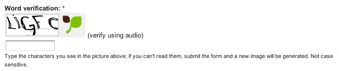
As a final tip on the topic of form anxiety, please don’t use CAPTCHA fields if the form is for important conversions. Companies often use CAPTCHA fields to reduce spam by detecting whether the form filler is a real person. But such fields are also confusing for real people who often make mistakes filling them out and get frustrated with the hassle. Many will give up if they can’t get the CAPTCHA to work the first time.
There are better ways to reduce your spam intake using software rather than making your prospects prove their humanity.
Form design justifies an entire book and, fortunately, Luke Wroblewski has written one that I recommend called Web Form Design: Filling in the Blanks (Rosenfeld Media, 2008). Reading it will give you all the detail you could want about form-interaction design and ideas to test.
Usability testing can be helpful for identifying form problems, too. Asking three or four people to complete your form will uncover any major roadblocks and can seed ideas for new test hypotheses. For more on the subject of usability testing, read Steve Krug’s Rocket Surgery Made Easy: The Do-It-Yourself Guide to Finding and Fixing Usability Problems (New Riders, 2010) and Jeffrey Rubin and Dana Chisnell’s Handbook of Usability Testing: How to Plan, Design, and Conduct Effective Tests (Wiley, 2008).
The important point to take away is that you can improve your forms to reduce anxiety and increase conversions. You Should Test That!
Website Errors
You can make all the conversion-optimization improvements imaginable, but if there are technical glitches on your website, all credibility is lost. Unlike forms, where your prospects may feel stupid, website errors make your company look stupid. Fixing website errors is low-hanging fruit in improving your conversion rates.
Make sure to include a thorough quality-assurance step in your website updates. You should do the following:
- Test all your pages on all major browser and operating system combinations.
- Don’t forget to test interactions like form fields, hover effects, pop-ups, videos, and so on.
- Check your web analytics regularly for 404 page views, and make sure those are fixed.
- Test your website experience with JavaScript and cookie-acceptance turned off.
- Test your ad campaigns in the wild, and follow the conversion path from originating ad through to completed conversion.
- Use a proofreader who hasn’t been involved in the project to compare the design and copy to the live test challengers.
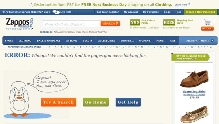
If you do have technical errors, make sure you display friendly error messages, unlike the 404 page on this high-profile consumer brand’s website.

Zappos, on the other hand, has a useful and fun 404 error page with buttons to the most common tasks: search bar, home page, and a help page.
Site Speed
Well-documented studies by Google, Yahoo!, Akamai, and Amazon show that page-load times affect site usage and conversion. Marissa Mayer of Google gave the example of Google Maps in her talk at the Web 2.0 Summit. When the company shrank the Google Maps page size from 100 KB to about 75 KB, traffic increased 10 percent the first week and 25 percent more in the following three weeks. Google also found a 20 percent revenue difference when the main search-results page loaded in 0.9 seconds compared to 0.4 seconds.
Not only does site speed affect conversions, but Google also factors it in to AdWords quality score and organic search rankings. There’s no downside to a fast-loading website.
Effort Anxiety
As you saw earlier with respect to filling out forms, perceived complexity and effort can create anxiety for your prospects. This principle applies to all of your communications, your website, and your landing pages too. If you can make your prospects’ lives easier, they will make your life better by buying from you!
For example:
- Do your product category pages include relevant and easy-to-use filters?
- Do your product pages present the value proposition before the ordering details?
- Are your offers easy to redeem?

- Are the steps to purchase and use your products and services easy to understand?
In a test WiderFunnel ran for AllPopArt, we found that moving the product customization and ordering details below the fold increased sales substantially. For landing-page visitors, reducing the prominence of the product-customization form reduced the perceived complexity and minimized anxiety.

The AllPopArt control page

- Variation A: “Lightbox & CTA.” This design variation tested a number of changes, including more prominent call-to-action areas and clickable value propositions. The overall layout of the page remained unchanged from the control page.
- Variation B: “No +/- Prices.” This variation was identical to Variation A, except that the price of each user-selectable option (such as frame type or materials) was removed and only the total price of the illustration was displayed. The test hypothesis was that removing the text would simplify the page content, improve clarity, and increase sales conversions.
- Variation C: “Horizontal Steps.” This variation was a big departure from the other two. The product description and value propositions were brought to the forefront above the page fold, and user-selectable product options were moved below. Free shipping info was also more prominently displayed as well as thumbnails of samples.
The winning challenger
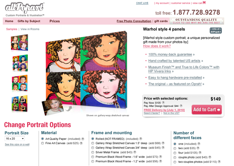
Form fields are one of the least-loved things on the Web. In some cases, such as this AllPopArt example, reducing the prominence of a complex form can boost conversion rates. You Should Test That!
Fulfillment Anxiety
There’s a barrier between you and your online prospects. They can’t physically see you or your products. They can’t tell who’s on the receiving end of their requests for information or purchase. They also may anticipate feeling powerless to get responses to their grievances if things go wrong.
Fulfillment anxiety exists regardless of whether or not your online experience promotes it. You need to include messages that satisfy your prospects’ need for assurance.
Security
The security assurance you need to provide depends on the types of private information you collect and store. One of the most common ways to assure your site visitors that their information is secure is to subscribe to a third-party security symbol like McAfee Secure or TRUSTe. In testing whether these symbols increase sales, I’ve seen mixed results. Some have reported seeing sales increases by adding the badge while others have seen no change or even decreases.
One of WiderFunnel’s clients ran a test in which adding the McAfee Secure symbol in the site-wide shopping cart area reduced e-commerce sales by nearly 2 percent.

By over-emphasizing security, you can create even more anxiety. For visitors who aren’t initially concerned about security, raising the issue can cause them to second-guess their safety. If you use security indicators, You Should Test That!
Fine Print
I came across a landing page recently with this headline:

If you have to include a legal asterisk on your main message, you’ve immediately lost credibility. As it turned out, the disclaimer didn’t need to hurt credibility. The footer said “*Customer count as of Q1 2012.” They should ask themselves whether leaving that out would pose a credible risk.
Legal disclaimers in your marketing communications send a message to your prospects. Do you want them to think of you as trustworthy, honest, and approachable, or legalistic, inauthentic, and difficult?
You should get rid of legal disclaimers and find a way to include the full story in your copywriting. Tell your readers what they need to know in the copy, and you won’t need to hide behind asterisks.
And if you do have to include legal copy, can you write it in natural language? In some organizations, the legal team is known as the “sales reduction department” because of their inflexible approach to customer communications. But there are other, progressive legal groups. Pushing for friendly legalese is worth the effort.
Brand Reputation
Your brand reputation and credibility can add to or reduce fulfillment anxiety. The prospect asks two brand-related questions when making a decision:
- Will this company deliver on its promises?
- What will others think of my purchase?
Third-party credibility indicators can help reduce anxiety for unknown brands, as discussed in Chapter 5, “Optimize Your Value Proposition.” You should test emphasizing those indicators, especially if your brand isn’t in a strong awareness and trust position.
If your industry has accreditations available, especially for services companies, you can also use their logos to lend credibility. For some target audiences, the Better Business Bureau can add credibility and reduce anxiety, too.
Delivery Promise
From the moment your prospect converts into a lead or customer, a virtual timer is ticking in their head until you deliver on your promise. You should set clear expectations for when they will receive fulfillment of your promise.
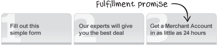
In the MerchantWarehouse.com example in Chapter 7, “Optimize for Clarity,” you saw that we added a message setting the expectation that site visitors can get a merchant account in as little as 24 hours.
Amazon.com sets retail expectations well on its product pages by clearly showing availability and delivery dates.

Once you’ve set expectations, then you have to deliver on them or risk harming your brand.
Guarantees, Returns, and Unsubscription
Your prospects’ biggest fear is post-purchase disappointment. To remove that anxiety, you need to answer the question, “What happens if I’m disappointed?”
Satisfaction guarantees can reduce fulfillment anxiety and increase conversions. If you have a guarantee, you should test how prominent its placement should be. In most cases, a guarantee works best as reference information in a secondary location.

Whether you use a guarantee symbol or a text link, you should link to more information. As you saw in the AllPopArt case study earlier in this chapter, WiderFunnel’s new pages added guarantee information in a pop-up lightbox linked from a bullet list text link.

In WiderFunnel’s tests, we’ve found that pop-up lightboxes work well for providing detail without the added distraction of taking the visitor to a different page.
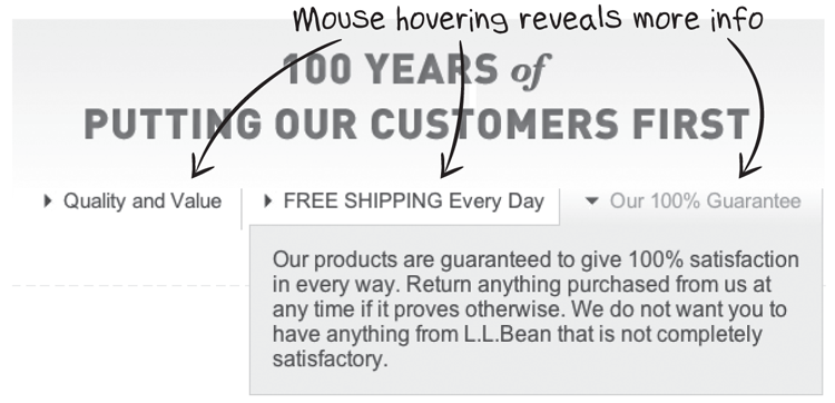
L.L.Bean shows another example of additional guarantee information with a rollover message.
For subscriptions, you should make cancellation seem easy. Wordtracker demonstrates the one-step cancellation at the top of its signup page.

Clicking the “cancel at any time” link opens a pop-up lightbox with a screenshot showing exactly how to unsubscribe in a single step.

If a picture is worth a thousand words, this example should eliminate all cancellation anxiety for the subscriber. You can add similar anxiety-reducing messages for your newsletter or blog subscriptions, too.
Turn Anxiety in Your Favor
Once a person owns something, that thing becomes more valuable to the person than it was before they owned it. This is called the endowment effect. A well-known study led by the Nobel laureate Daniel Kahneman showed that we overvalue what we own by nearly double.
Another study by Ziv Carmon, associate professor of marketing at INSEAD, and Dan Ariely showed the endowment effect increasing peoples’ valuation of NCAA basketball game tickets by 14 times for those who had won a draw to be eligible to purchase tickets. The endowment effect can be a powerful cognitive bias!
The effect is connected to people’s tendency regarding loss aversion and risk aversion. Imagine two scenarios where you need make a choice between two options:
- In one scenario, your choice could result in a bonus of $1,000 if you pick the right option, or nothing if you pick the other.
- In the second scenario, your choice could lead to a $1,000 fine that you have to pay, or nothing.
Which of those decision scenarios makes you feel more anxious?
If you’re like most people, the potential loss of $1,000 creates much more decision anxiety than a chance for a $1,000 bonus. People’s drive to avoid loss is more powerful than their drive for gain.
If your prospects are too comfortable in their current situation, they won’t take the perceived risk of buying from you. The anxiety-causing risks outweigh their desire to gain the benefits of your product or service.
You can test using anxiety as motivation by framing your benefits in terms of loss avoidance. What would your prospect lose out on by not purchasing your product or service?
For example, in a search for business process management (BPM) consulting, one of the landing pages had this headline:

What would be the risks of not hiring this consultancy for BPM consulting?
An alternative headline and subhead could test an “avoiding failure” approach to create anxiety about not obtaining the right advice.

Try turning anxiety in your favor. You Should Test That!
In Chapter 9, “Optimize for Distraction,” you’ll see how to optimize for reducing distraction from elements like product options, competing messages, and images.