
Chapter 3
Prioritize Testing Opportunities
Data is what distinguishes the dilettante from the artist.
—George V. Higgins
You’ve decided that you need to use conversion-optimization testing to improve your conversion rate. But where should you start?
You may be managing a website with many dozens, hundreds, or thousands of pages. You can’t test all of them at once. With limited time and resources to commit, the prioritization of those test opportunities is an important part of your optimization planning.
Even if you had unlimited resources to plan and create tests, you’d face a limiting factor in your traffic volume and seasonality. As you’ll see in Chapter 12, “Analyze Your Test Results,” your tests need to collect enough visitors over an appropriate time period to give you meaningful results. Even with the highest-traffic websites, prioritizing tests is necessary.
In this chapter, we’ll look at how to prioritize to get the best return on your conversion-optimization effort. You’ll see how to prioritize your testing opportunities by understanding the data you should look at, the three criteria you’ll use for prioritization—potential, importance, and ease—and additional qualitative research you can gather to help develop your test plans.
Use Data to Prioritize Tests
You could simply choose a test page based on your gut intuition about which pages are most important, or throw darts at your information architecture diagram, but by now I hope you realize that I’m going to recommend looking at some data to help you decide. Even with all the data available, some intuition is involved in prioritizing your test pages. Although the data may point to a problem in one area, the real problem can sometimes be at an earlier stage in the conversion funnel.
For example, I have often seen examples of high shopping-cart abandonment in e-commerce sites. In many cases, the problem can’t be fixed on the shopping-cart page, though. Visitors are moving from the product detail pages and category pages into the cart to try to find the shipping and returns information, but that information should have been available on the product detail pages. You can often reduce shopping-cart abandonment by optimizing the earlier stages of the buying decision.
You may believe that your conversion-killing culprit is obvious and you already know which page you need to test. Perhaps your website has only a handful of pages or you’re working with a single landing page. If that’s your situation, you can safely skip this chapter.
For most of us, though, prioritizing test pages isn’t that simple—yet we do need to prioritize our test effort. Part of the answer lies in your web analytics data.
Your Web Analytics Data
Your web analytics data will be your most valuable resource to prioritize your tests. There are many options for web analytics tools, and although each has unique features and capabilities, all of them should give reports similar to the Google Analytics reports we’ll look at in this chapter.
Why Google Analytics? Of the seven enterprise-quality web analytics companies Forrester identified in its Web Analytics Wave, Q4 2011 report, Google Analytics is by far the most ubiquitous tool. In fact, many companies that have paid tools like Adobe SiteCatalyst also use Google Analytics to get another perspective and validate each tool’s information against the other.
Throughout this book, most examples use Google Analytics in the screenshots and reports, because they’re most widely relevant. You should be able to find similar reports regardless of the tool you use.
A lot of people will be tempted to skip this chapter and start testing on their home page, thinking it’s “obviously” the most important page. So, we’ll start by addressing that assumption.
Your Home Page Isn’t Your Front Door
Have you noticed how much attention companies pay to their home page? Yet other areas of the website are often more important for driving revenue.
In many organizations, you could add a picture of the Flying Spaghetti Monster to one of your product detail pages and no one would notice; but add a call-to-action button on the home page, and the HiPPO will call to ask if you’ve violated the Graphic Standards Policy. Take a look at your web analytics “top landing pages” report, and you’re likely to see many pages getting entrances and page views. Some may even have more entrances than your home page!
View Data at the Page-Template Level
Even if your home page is the most popular single entrance page, that often isn’t the case if you aggregate all the pages that use the same template. You should do this to determine where you have opportunities to test site-wide template layouts in addition to individual pages.
You may get only a fraction of your entrance visits to any one of your product detail pages compared to the home page. But if you add all the visits to all the product detail pages, there are probably many times as many entrances as occur on the home page.
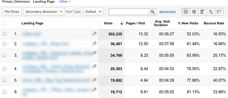
Let’s look at a typical example of an e-commerce site that sells jewelry. If your site has Google Analytics installed, you can follow along by viewing your own Landing Page Visits report: navigate to Content > Site Content > Landing Pages.

Looking at this report, you see the list of the example site’s most popular landing pages. The home page (/index.html) appears at the top with 43,470 landing-page visits in the time period selected.
Google Analytics landing-page visits for a jewelry e-commerce store

This clearly shows the home page as the most popular single page. But this doesn’t mean the home page gets more traffic than all other page templates. When we combine all the same types of pages together at the page template level, we’ll see a clearer picture. If your website uses a content-management system, blog platform, or e-commerce platform with page templates, your testing plan, which we’ll discuss in Chapter 11, “Test Your Hypotheses,” will need to consider whether to test against individual pages or the site-wide templates as your control pages.
Roll up your pages to the template level in your Pages and Pageviews reports to see the templates with the highest traffic volume. Then you can decide whether to test against a site-wide template or an individual page.
By default, each page in your site shows up as a separate row of data in web analytics if it has a unique URL. Notice that the website in the earlier Google Analytics report uses a URL-naming convention in which all the category pages include /category_ in the URL and the product detail pages include /product_detail/. Page-naming URL conventions like this make it easy to aggregate the metrics for the same types of pages by adding a search filter to the list.
To try an example, let’s start by aggregating all the category pages. To do so, add /category_ in the search box at the top of the list, which looks like this:
We end up with a display that filters the report data and only shows the data for category pages that are used as landing pages. At the top of the report are aggregate Visits, Pages per Visit, Average Visit Duration, % New Visits, and Bounce Rate metrics.
The aggregate category pages show many more visits than the home page.

In this case, you can see that the category pages have 56,897 landing-page visits in the same period that the home page had 43,470.
Let’s do the same thing for product detail pages by placing /product_detail/ in the report filter:
Insert graphic
Now we find that landing-page visits for product detail pages total 117,542.
Product detail page metrics show twice as many entrances as the home page.

That means more than twice as many visitors enter the site through a product detail page as enter through the home page!
We’ve only scratched the surface by looking at two site templates. When you consider the many other types of pages on your site, such as those for services, about your company, careers, brands, blog posts, PR, and social media activity, single-purpose landing pages, and more, you can see how quickly the home page can lose its position on the organizational pedestal. Fortunately for you, this means you can safely let the rest of the organization fight over home page real estate while you start on other important pages.
At WiderFunnel, when we begin a series of tests with our clients, we prefer to start optimizing any page other than the home page to avoid political barriers. When we’re ready to approach the home page, we have already done good work under the radar and have test results showing conversion-rate lift to enhance the case for testing the HiPPO’s sacred cow: the home page.
Let’s look at how to prioritize the conversion-optimization opportunities beyond just the home page.
The PIE Prioritization Framework
You need to consider three criteria in prioritizing which pages to test and in which order. They are as follows:
You can quantify each of your potential opportunities based on these criteria to create your test priority list. The most important consideration is the importance of the pages to the company.
Prioritize Pages with High Potential for Improvement
That is, look for the really bad pages. Although I’ve yet to find a page without some potential for improvement, you can’t test everywhere at once and you should prioritize your worst performers.
A certain amount of the personal judgment and experience of the conversion champion comes into play at this stage. This is also where some qualitative data like surveys and user testing can help you generate test hypotheses.
Your web analytics data will point to some of the clear, problematic pages—landing pages with high bounce rates, for instance—but some problem areas won’t be so obvious. If the problem is a high rate of shopping-cart abandonment, for example, your web analytics won’t tell you that your visitors are struggling to find shipping and returns information in earlier stages of their decision-making process. If you work on optimizing the cart, where web analytics points to the problem appearing, you won’t be able to fix the issue. You may actually need to test on your product detail pages, category pages, or the site-wide header or footer area.
None of your data sources, used in isolation, will perfectly identify your conversion opportunities. Let’s look at how to combine information from various sources to paint a more complete picture of your visitors’ experiences on your site.
Top Exit Pages
The last page that someone sees before leaving your website is called an exit page. Your exit rate, which Google Analytics labels % Exit, shows the percentage of visitors to a page who leave your website immediately after viewing that page.
Your top exit-rate pages can identify problem areas. Often you’ll find that people are leaving because those pages aren’t compelling or informative, or the content may not be relevant to the media that drove the visit.
Of course, there also may be a good reason for them to be exit pages, like a post form-fill thank-you page, for example. You need to evaluate the pages in the context of their purpose.
You can find your top exit-rate pages in Google Analytics by navigating to Content > Site Content > All Pages and then sorting by the % Exit column.

If you sort by exit rate, though, you’ll probably end up with a useless report showing 100 percent exit rates for very obscure pages with single-digit visits. Although those may be problem pages, they’re clearly not priorities for testing!

To make this report more useful, you can add a filter to show only high-traffic pages.

Click the Advanced link. Then, in the Page drop-down, select Site Usage > Pageviews and enter a minimum number, like 30,000. Click Apply to generate the report.
Filtered exit-rate report showing only high-traffic pages

Now you’re starting to see a useful exit-rate list! This report will give you some good candidate pages. Many of these are problem pages that should be prioritized for conversion-optimization testing. You Should Test That!
Analyze Your Conversion Funnel
So far, I haven’t discussed the conversion funnel concept. It’s an important part of identifying problem pages. I’ll begin with some definitions.
A conversion funnel has two parts: the persuasive end, also called the top of the funnel, and the transactional end, or bottom.

The persuasive end of the funnel includes your home page, product or service pages, landing pages, internal search results pages, and basic information content pages. These are the areas of the website where you present your value proposition and persuade your visitors that they need to act.
The bottom end of the funnel is where the transaction actions occur. These are transactional pages with forms, shopping carts, and thank-you pages.
The web analytics data we’ve looked at up to this point shows the persuasive end of your conversion funnel. In most cases, those top-visited, entry, exit, and bounce pages reports don’t show the transaction end. But the bottom of the funnel is still important.
The visitors to those pages have been through your site, have read about your products and services, and are considering a purchase. They may be on your lead-generation contact form, newsletter signup page, or e-commerce checkout funnel. They’re your hot leads and are very valuable!
Funnel Drop-Off Rates
Your analytics funnel reports focus on the bottom end of the funnel. You can find it in Google Analytics by navigating to Conversions > Goals > Funnel Visualization. If your primary website goal is a contact form for lead generation, your funnel may show a single step.
A simple lead-gen contact form funnel
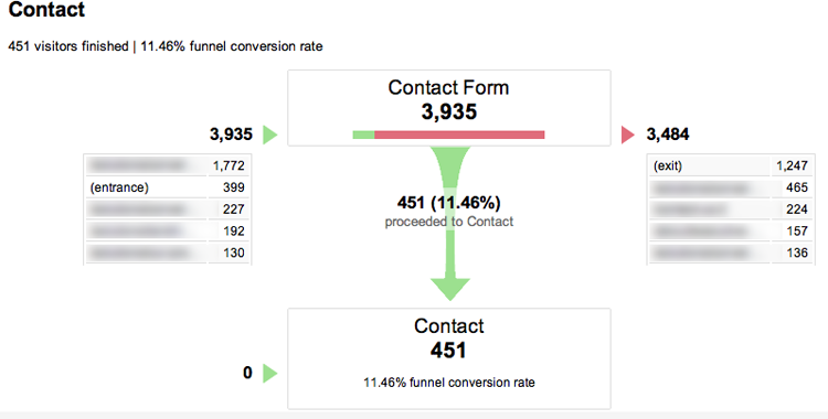
In this case, you see that only about 11 percent of visitors who arrive on the contact form page successfully complete the form and become leads. If 89 percent of the visitors who decided to click a link to contact you abandoned the process, you would probably consider this a low conversion rate.
Once you’ve identified a drop-off step in your transactional funnel, you should ask yourself where the problem is:
- Where are visitors coming from who arrive on this transactional page?
- What could they have been expecting to see here?
- What information could they have been looking for?
- Is there anything on this page that could have stopped them from completing the call to action?
- Did they just not have enough motivation from the persuasive end of the funnel?
We’ll look in more detail at how to analyze the page to create hypotheses for testing in Chapter 4, “Create Hypotheses with the LIFT Model.” For now, to prioritize where to test, you need to make a judgment call about whether the transactional page is the real problem area or if the data is giving an indication of an earlier persuasive problem.
There are lots of great, low-cost ways to improve your judgment call by gathering qualitative data from visitors too.
Gather Qualitative Data
The controlled testing required for conversion optimization is a purely quantitative process. Experiment variations are tested with the goal of achieving statistically significant results. But there is also a place within the process for collecting qualitative data sources. That place is near the beginning, before you’ve developed your experiment hypotheses. As such, this is another important stage in identifying and prioritizing pages whose performance needs improvement.
Qualitative information is useful in three ways:
- It helps the conversion champion identify pages or areas of the website that are causing problems for your visitors.
- It provides context for how your prospects view your products and need to use your website.
- It provides ideas for the conversion champion to develop hypotheses for testing.
There are many methods for gathering qualitative data from your site visitors, such as usability testing, surveys, eye-tracking studies, click-tracking analysis, and heuristic site analysis.
Usability Testing
Usability testing is a popular method for understanding whether visitors are able to complete certain actions on your website. It’s very useful for finding areas where visitors may be uncertain how to complete an action; these may be severe conversion-funnel blockages.
You can get considerable value from simply being in a room with a prospect and hearing their direct input. When it comes to knowing your customer, there’s a lot to be gained from putting a face to the other sources of observation.
The typical process for usability testing is to invite individuals to an observation room where they’re asked to complete a series of specific actions, such as finding a particular product on the site or completing a form. The user is encouraged to verbalize their thinking as they go through the process, which you hope will reveal the barriers and perceptions the website is causing.
The renowned usability expert Jakob Nielsen recommends running usability tests with no more than five users each. He believes this gives the majority of insights to be gained from each study without blowing your budget on large samples. You can find out more in this blog post: www.useit.com/alertbox/20000319.html. Steve Krug, in his fantastic book Don’t Make Me Think! (New Riders, 2005), says you can get away with testing as few as three people to get the majority of benefit.
If you set up your own usability tests, make sure you have the right equipment. You can make video recordings of the user interactions through their own computer cameras with tools like Silverback for Mac and Morae for Windows. These videos are especially useful for convincing others in the organization that your website needs conversion-rate optimization. There’s nothing more persuasive for upper management than watching a video of a real visitor on your site bumbling through your carefully designed experience. Watch how quickly you get support for testing!

Quick and less expensive alternatives to usability testing are also available online at sites like www.usertesting.com, www.trymyui.com, and www.loop11.com. With these services you can submit your pages or design comps and record how online participants respond. You can get much of the same benefit from the online services as from full usability tests, without the high cost.
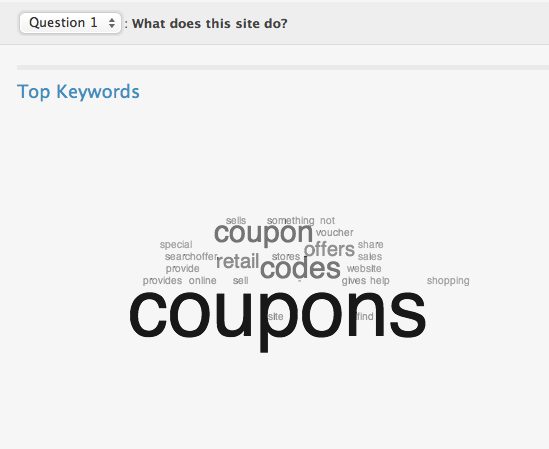
You can simplify your test even more using www.fivesecondtest.com, where you can upload your page layouts, design comps, and screenshots for quick feedback. Participants are shown your page for five seconds and then asked to give their impression of what your page is about. It’s a great way to gauge visitors’ initial understanding of your value proposition.
The fivesecondtest keyword cloud shows visitors’ first impressions of what your website is about.
Usability testing has limitations, as you know from Chapter 2, “What is Conversion Optimization?” and the cost can add up quickly. Other qualitative methods can produce similar information more quickly and at lower cost.
On-Site Surveys
Surveys of your current website visitors can be conducted quickly and economically with one of the many website survey tools available today. For a list of recommended tools, visit YouShouldTestThat.com/Prioritize. By simply adding a piece of script to your pages, you can include surveys that either are user-initiated or automatically pop up when visitors arrive on your page.
The information you gather from surveys is only as good as the questions you ask. Here are three recommended by Avinash Kaushik, who also co-founded the survey company 4Q:
- What is the purpose of your visit to our website today?
- Were you able to complete your task today?
- If you weren’t able to complete your task today, why not?
A pop-up survey on the IKEA.com home page interrupts my visit.

These questions are great for finding usability challenges. If your goal is to generate ideas for conversion-optimization tests, I also recommend adding questions that aim for marketing insights, like these:
- Would you recommend our products or services to others? Why or why not?
- What do you consider to be our product’s or service’s main benefits?
- What product information were you not able to find?
The goal of your questions is to find nuggets of information that show which parts of your value proposition are most important and least understood. These nuggets will lead to hypotheses to be tested.
You’ll be able to think of many other questions, but don’t go overboard. If you want to ask more than four or five, split them into separate surveys to avoid overwhelming visitors and reducing your survey completion rate.
You may find that your visitors say they can’t see information that you think is clear and prominent. This reveals a possible problem with the page layout that can be improved and tested. Your visitors aren’t used to your site and have to figure out where content is placed in addition to understanding the content itself. Any problem you discover is good news. The site has improvement potential!
Although on-site surveys can be helpful to get input about your website usability and product benefits, they can also reduce your conversion rates by interrupting the visitor’s experience. Any distraction can reduce sales—especially something totally unrelated to the goal of the visit. Pop-up surveys can do more harm than good if they’re left on the site for too long, because many visitors find them intrusive.
Customer Email Surveys
You can avoid disrupting your on-site visitors’ experiences by surveying your customers by email. You’ll get a different type of information, but it’s still useful to help create informed experiment plans.
Email surveys are best for learning about customer demographics, needs, product satisfaction, and company perception. The majority of useful survey questions explore the most important product and service features and visit or purchase frequency. Here are some thought-starters for questions you may find useful:
- Which of these is most important when choosing where to buy? (Select all or rank in order of importance.)
- What features are important to you that we don’t offer? (Open-ended.)
- What do you like about us compared to others?
- Which of the following features that we offer were you aware of? (Multiple choice.)
- What features, products, or services do you wish we offered?
- What difficulties did you find in placing your order today? (Multiple choice or open-ended.)
- How often have you purchased this service or product in the past?
- When or in what situations do you use the product or service?
At the end of the survey, don’t forget to include another call to action. These are engaged, valuable customers who can always be more engaged and valuable! Consider a purchase discount as thanks for their help, or a link to download other information, or a newsletter signup.
Email surveys can be great for understanding how your customers perceive you and your products, but they’re not as useful for gaining website-specific insights. A better way to do that is to observe how real visitors use your pages. These techniques include the next two methods of gathering qualitative data: eye tracking and on-page analytics (or click tracking).
Eye Tracking
Although usability testing and surveys give you verbal and written feedback about your site and product, as they say, a picture can be worth a thousand words. That’s why eye tracking and on-page click tracking can help you understand how people are interacting with your website.
With eye-tracking studies, participants are asked to complete tasks on the website, just as in a usability study. An eye-tracking sensor is added to the computer screen; this detects the direction of the participants’ retinas, which is then mapped to the location on the screen. The results from multiple participants are aggregated to produce heatmaps, showing hot spots where visitors gave most of their attention.
Eye-tracking research is a very interesting area that can reveal insights into how people think and how to guide their attention. For example, a test run by the Swedish eye-tracking tool company Tobii tested 106 participants while they viewed two product ads. The only difference between the ads was the position of the baby on the left side of the page. You can find full-color versions of these ads in the Color Gallery near the end of the book.


When the baby was front-facing, visitors were more likely to lock eyes with the image and less likely to focus on the page content. When the baby faced toward the text blocks, the visual hotspots followed the baby’s attention and moved to the text.
This study showed that the images you choose, especially when they involve people, can impact the page’s eyeflow. The implication is that images can help or hinder visitors’ ability to digest the information and can impact the conversion rate.
This is exciting research, but the real impact of these images on your landing-page conversion rates can only be determined through an A/B/n split test. You Should Test That!
On-Page Click Tracking
On-page click tracking can give you insights into how people are interacting with your pages. Although many of the insights could be gleaned from more traditional web analytics tools, the visual presentation of click heatmaps can make it much easier for even nontechnical team members to get excited.
With click heatmaps, you can see where people click, even when they click areas that aren’t links. This can lead to useful insights. For example, collecting click-tracking data on a landing page with a tool like CrazyEgg allowed us to see concentrations of clicks on an arrow that pointed to a call-to-action button.
The click heatmap for this site shows click concentrations on areas other than the call-to-action button.

Without click tracking, you could have assumed that the arrow was used to guide the visitor’s eye to the button. It turns out that some visitors were mistaking the arrow itself for a button. You can fix this confusion by changing the placement of the button or making the arrow clickable, too.
Another cool feature of on-page tracking tools is the scroll heatmap, or scrollmap. Its color-coded gradient shows how far down the page most people scroll.
A scrollmap shows where visitor interest dies off.

The scrollmap shows you why the screen fold is so important. Most visitors are reluctant to scroll very far unless they’re given a compelling reason to. The most important information should be at or near the top of the page. In Chapter 9, “Optimize for Distraction,” you’ll see how to identify distraction problems and optimize above the fold.
There are also tools, such as ClickTale, that record videos of how real visitors navigate your site. You can see what your visitor sees and clicks, page by page. This can be especially useful for analyzing forms, because you can watch people’s failed attempts to complete your transactional funnel.
There’s a lot of overlap in the insights gained from click tracking and eye tracking. Click tracking doesn’t tell you how the content affects people’s attention, but it does tell you how they act and allows you to collect data from a high quantity of visitors in real-life scenarios at low cost. You won’t usually get enough additional hypotheses from doing both for the same target page.
The data from on-page click tracking can help you understand how people are interacting with the site and, when combined with surveys and real user interactions, can provide a rich source of data to generate powerful experiment hypotheses.
Ask Your Mom
Another simple technique for getting insights is the “ask your mom” method. Yes, I’m being serious.
Think of your mom as a typical consumer visiting your website. Will she understand and be able to explain in her own words what your website is trying to communicate? Marketers too often get so trapped in the bubble of their product, industry, and incomprehensible acronyms that they forget how real, live people communicate.
Now, you could literally visit your mom (and you probably should do that more often), but this can also be a mental exercise to get into your customer’s mindset. As David Ogilvy said, “The consumer isn’t a moron; she is your wife.” By practicing empathy for your visitors and putting yourself in their shoes, your task of creating persuasive messages will become much easier.
Having an empathetic mentality is a requirement for successful heuristic evaluations.
The Heuristic Evaluation
One of the most important methods for finding conversion problems is to use a heuristic evaluation, otherwise known as “taking a walk in your customer’s shoes.”
A heuristic evaluation usually involves conversion-optimization experts who can identify likely conversion problems using heuristics (or rules of thumb). An experienced conversion champion can quickly identify common problems based on experience from past test results and use frameworks like the LIFT Model (see Chapter 4) to evaluate conversion pages.
A good conversion champion gathers all the data available from qualitative research sources and uses it as input for heuristic analyses.
Don’t Misuse Qualitative Data
Qualitative information sources can provide raw material from which the conversion champion can develop test hypotheses, but they’re often misinterpreted. There is a significant danger of overconfidence in qualitative information. I’ve often seen companies hold up small sample surveys and single-user testing outputs as if they were conclusive directions for website changes.

Much of the danger is the responsibility of those conducting the studies, who can be tempted to oversell the results. Watch out, for example, for user-testing results that claim something like “75 percent of respondents believe our company offers the low-cost service option” (or whatever you’re interested in studying), when the study included only one or two dozen participants.
The wording in these surveys should be qualified, and you should take care to evaluate the robustness of the findings. Three practices will help avoid this misrepresentation:
- Surveys and studies should never use percentages as findings unless their results are statistically significant.
- Until quantitative testing has been done, the findings in these studies should be qualified with wording like “results imply…” or “findings point to…” or “we have directional results showing that….”
- These studies should recommend the priority findings that should be tested quantitatively rather than being immediately implemented on the website.
The information gathered from the qualitative sources we’ve looked at can be useful for preparing a conversion champion to develop a testing plan. They’re only useful, however, as long as they aren’t trusted to be definitive prescriptions for website changes.
Characteristics of Research Methods

The only characteristic needed to round out controlled conversion-rate optimization testing is input from open-ended feedback to develop hypotheses. That is why combining controlled, quantitative testing with heuristic analysis and other qualitative methods is so powerful. Qualitative information helps identify areas of the site that have severe problems and provides fodder for new hypotheses to be quantitatively tested.
Prioritize Important Pages
Your most important pages are the ones with the highest volume and the costliest traffic. You may have identified pages that perform terribly, but if they don’t have significant volume of costly traffic, they aren’t testing priorities.
Pages with High Traffic Volume Are More Important
Your high-traffic pages are gold. You can use them to test important marketing questions, gain insights to apply to lower-traffic pages, keep your team interested in the continuous learning you’re gathering, and make a big impact on the business. These pages are where you have thousands of beautiful visitors ready to give you their feedback (unbeknownst to them) about what works best.
You also need high-traffic pages to run experiments that complete in a reasonable timeframe. The words reasonable and high-traffic mean different things to different people, so I’ll give you an example. If your test pages or templates have more than 20,000–30,000 monthly unique visitors, then your A/B/n split tests have a chance to achieve statistically significant results within a few weeks. With traffic levels lower than that, you need to prepare to run them over a longer period.
There’s no harm in doing that. You just need to manage your expectations so you don’t get impatient when the test doesn’t complete right away. Don’t plan to run many test rounds in rapid succession on those low-volume areas.
Because your tests on high-traffic pages complete more quickly, you can move on to the next tests sooner, speeding up your optimization progress. From the information you gather on high-traffic pages, you can run more experiments on lower-traffic pages.
For example, you could test five variations of the call-to-action button’s color on a high-traffic landing page. If you found that orange buttons work best, followed by green, blue, gold, and aquamarine, you could decide to test only the two best performers, orange and green, on a lower-traffic page to confirm the result.
Running experiments on high-traffic pages is also more interesting and rewarding. When tests complete quickly, your team is more likely to stay engaged and supportive. In any organization, you need to manage enthusiasm and momentum to get things done. Seeing huge conversion-rate lifts from a test can be a big boost to the team. Waiting around for a test to finish over many months is a downer and can toss a bucket of cold water on your optimization momentum.
Finally, and probably most important, high-traffic pages are more likely to be important to the business. After all, more people are already visiting these pages, so they may have a greater influence than lower-traffic areas of the site. When you find a high-traffic page, You Should Test That!
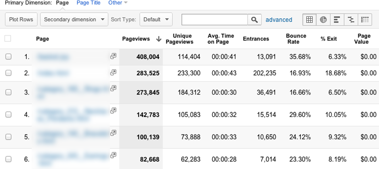
Most-Visited Pages or Templates
High-traffic pages are easy to find. In Google Analytics, go to Content > Site Content > All Pages. By default, the report will sort the pages by pageviews.
The top pages report shows your highest-traffic pages.
Your testing tool will likely report on unique visitors rather than the total number of visits. This is an important distinction to make. Web analytics reports often show pageviews as a primary metric, but pageviews include multiple views from the same people traveling around multiple pages on your site or returning for multiple sessions.
When you’re running a controlled experiment, however, you’re more interested in whether each unique person converted at least once. Once a person has visited your test page and converted, they should be counted as one unique visitor and one conversion. If that was the only person to visit your page, your conversion rate should be reported as 100 percent.
If you were to include multiple visits and pageviews for the same people, the conversion rate reported could be skewed too low because a person could have a single conversion with multiple visits. In that case, your single visitor could have been reported with one conversion over three visits, which would inaccurately show your conversion rate as 33.3 percent. This example underscores one of the reasons to always use a controlled testing tool to run your experiments, as discussed in Chapter 2.
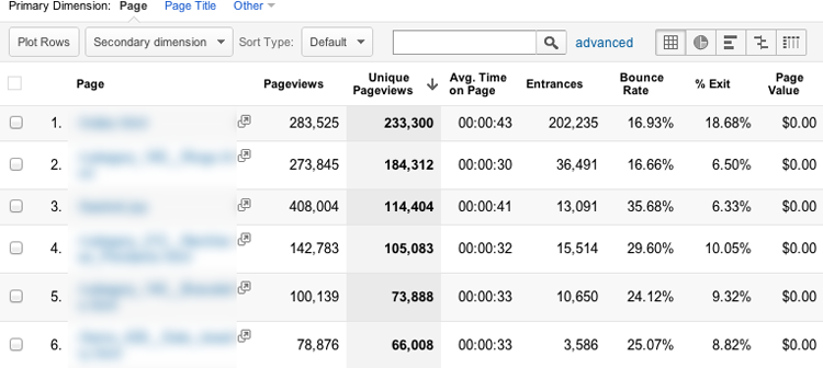
Unique pageviews is therefore a more accurate measure of the traffic volume you should consider. Click the Unique Pageviews column header in your pages report to sort by unique views rather than all pageviews.
Sorting by unique pageviews estimates the traffic volume for your experiments.
You can get an indication of which pages may have significant opportunities for improvement (also known as serious problems!) by looking at the Bounce Rate and Exit Rate (% Exit) columns. A page with a combination of high entrances and high bounces or exits indicates a good testing target page. I’ll say more about pages with potential for improvement shortly.
Top Entry Pages
Your top-visited pages report shows the most popular pages within your site, but it’s also important to look at the most important pages that people first see when they arrive at your site. These are your top landing pages, also called entry pages. You can find that report by navigating to Content > Site Content > Landing Pages.
Top landing pages are your most popular site entrances.
Your top landing pages represent a unique opportunity because they’re the first impression of your business and products for many visitors. These are opportunities for you to test and discover the layout, content, and messaging that convinces your visitors to stick around, engage with your products, and (you hope) become a lead or customer!
Pages with Expensive Visits Are More Important
The cost of bringing visitors to your landing pages is an important consideration when prioritizing testing opportunities. Given a choice between testing on two pages with similar traffic and conversion problems, one with high-cost traffic sources will provide a better return on investment from your conversion-optimization efforts.

Identify Your Visitors’ Sources
How do you drive traffic to your website? Do you focus on organic search traffic by emphasizing search engine optimization (SEO), or do you use paid advertising, or a mix of both? Perhaps you emphasize social media activities or public relations to generate exposure.
You may have offline advertising driving prospects to landing pages or use rented email lists, newsletter sponsorships, or banner-ad placement campaigns to drive traffic. Any of these could represent high-cost traffic that should be prioritized. In each case, you should use a unique landing-page URL (or other tracking mechanisms) so the traffic source can be easily identified and segmented. Each offline source should drive to a specific vanity URL, like www.yourdomain.com/adcampaign, so you can track all the costs and conversions for each source. If you can identify the traffic source, you can attribute the costs and conversions.
Gather Costs for Each Source
Each of your traffic-generation sources has a cost. You’re spending money either directly on sponsorship and advertising fees or indirectly for services like SEO management, social media, and PR activities.
Identifying those source media costs helps you put a value on your website’s visitors. Don’t forget to consider the following:
- SEO management
- Paid search management
- Social media management
- Social media advertising
- Public relations
- Email marketing
- Affiliate programs
- Partner referral activities
- Blogging
- Offline media: TV, print, radio, out of home, and so on
Tally your monthly costs attributed to each marketing activity, and associate the costs with their landing pages.
In many cases, the highest-cost traffic segment is from paid search, and usually the most popular paid search medium is Google AdWords. If you use Google AdWords to drive traffic, this can also be a very easy traffic source to identify by using your web analytics tool or the reports in the AdWords management interface.
To find your highest-traffic landing pages from paid search in Google Analytics, go to Content > Site Content > Landing Pages, click Advanced Segments near the top of the page (just below the Landing Pages headline), and select Paid Search Traffic.
Select the Landing Page Dimension to find your highest-traffic paid search landing pages.

This report gives you the highest-traffic landing pages from paid search. In most cases, the first half-dozen pages represent the bulk of the traffic and also the majority of the total traffic cost.
Your top paid search landing pages are the entry points for a lot of expensive traffic.

Think about it this way: you’re paying for a whole bunch of people to come to your website. For the largest chunk of those visitors, these few pages represent the first impression they have of your company. Are you giving them the best impression? Improvements you make to these pages will improve the experience and conversion rates for a significant portion of your highly qualified visitors and improve the effectiveness of your advertising budget.
Even if you don’t have all your cost data available, make a best-guess estimate for each source. I’m a believer in the power of the Pareto principle: spend the 20 percent of time required to get to 80 percent accuracy. You don’t need to know the costs down to the fifth decimal point to know where your biggest conversion problems are. Get the big picture as a first pass, and you can always improve your accuracy later.
This exercise can be a startling reminder of how valuable your visitors are. Once you’ve gathered your costs, don’t get discouraged if you see surprisingly high costs for your visitors. Rather, let it energize you to focus on improving the website experience you’re sending them to!
Prioritize Easy Test Pages
The final consideration for prioritizing tests is the degree of difficulty a test will take to get running on a page, which includes technical implementation and organizational or political barriers. The less time and resources you need to invest for the same return, the better.
If you estimate that you can achieve the same conversion-rate lift from two conversion-optimization opportunities, tests A and B, and test A would require half the time and effort to implement, then your return on effort for test A will be double that for B.
Ease of testing is especially important if you’re planning to run your tests without an experienced testing team and don’t have a full-service conversion-optimization agency helping you with the technical implementation.
Consider Technical Implementation
Some tests take much more effort and technical expertise than others. In general, tests that include the following elements are more complicated:
- Site-wide elements like buttons, offer banners, and navigation bars
- Alternative site templates like product, category, and site search pages
- Dynamic content
- Pages controlled by a content management system or e-commerce platform
- Alternative flows where multiple pages are varied
- Complex or inflexible forms
- Pages with server-side validation or interaction
- Phone call tracking where the phone numbers need to be consistent site-wide
- Multi-goal tracking
- Experiments with multi-language support
- Pages where multiple stakeholders’ opinions need to be satisfied, which isn’t a technical challenge but does add significant complication
On the other hand, the more technically challenging tests can also be the most rewarding. At WiderFunnel, we have seen some of the biggest improvements from running site-wide template tests on product listing pages, category pages, product detail pages, site-wide lead-generation forms, navigation bars, and add-to-cart functions. Even though these are technically advanced test implementations, the rewards have been well worth the effort.
Site-wide tests, in particular, can be doubly rewarding because of their reach. Tests of site-wide elements and templates affect the majority of visitors to the site, so even small improvements to those pages can have a huge positive impact on business revenue. In the following case study, you’ll see an example of significant revenue lift from a site-wide template test.

- Maintaining or improving a great user experience for LemonFree.com users
- Measuring revenue lift versus clickthroughs and form-fills
- Merging and analyzing data from the testing tool and Google Analytics (GA)
- Calculating statistical significance of Google Analytics results
- Opening additional information pages in a lightbox versus a new browser tab
- Swapping various on-page forms
- Adding and removing links
- Placement of the advertising banner


As the case study shows, although a technically advanced site-wide test can take a little more effort to run, the resulting revenue lift often pays significant ongoing returns.
Consider Organizational Barriers
Even with the most technically easy test pages, you need to consider how easy it will be to get approvals for the test. If you have carte blanche authority to make changes to the website, you don’t need to worry about this, and you’re in a rare and wonderful situation!
In a small company, gaining consent usually isn’t a challenge. In my experience, small companies can often get excellent tests running quickly and make very fast gains. This decision-making speed gives small companies the benefit of being more nimble, which allows them to often gain quickly on their slower, behemoth rivals.
In a large organization, political considerations are a big part of the conversion-optimization champion’s job. You need to understand which stakeholders have a claim on each page and how much resistance you’ll face in getting approvals for a test.
If you’re unsure about the likely ease of approvals, start with a less visible test, such as a landing page or internal website page. After you’ve gotten a win, you can use the data from that successful test in your pitch to run tests on more prominent pages.
Prioritize with a Weighting Table
Once you’ve prioritized your test opportunity pages according to their importance, potential for improvement, and ease of implementation, you can combine these considerations into your test opportunity list. By this time, you may have spent enough time in the data that you know which page to start with. Sometimes the top-priority page sticks out clearly in the data as having high importance, potential, and easy implementation. If so, you should move on to the next chapters and start testing on that high-priority page now. Then, return here to prioritize the next test rounds.
If you have multiple test opportunities you can prioritize, use a weighting table to help with the decision. List your potential test pages in the first column, and add your rating using a scale of 1–5 in the Potential, Importance, and Ease columns. Then sum the columns in the Priority Rating column on the right.

You may find, for example, that your home page has a high rating for Importance in terms of the traffic it reaches and Potential for improvement, but the political barriers push it down the list. Your paid search landing pages may be just as important and potent with much easier approvals. Other pages fall within the priority spectrum, which gives you a prioritized list to focus your effort.
There are no standard rules for which pages are best to prioritize. Your website lives in a unique target market, including factors like your competition, seasonality, and internal cultural environment; all of these affect how your site is used and should be optimized. The priority rating you give each of your potential test pages will depend on this unique business environment.
Reprioritize Regularly
Finally, your prioritization should always be considered a work in progress. After each test, reevaluate the new information you gather from the test results to determine how it affects the priorities. In Chapter 12, you’ll learn how to evaluate test results and assess whether to retest on a page or move on to the next priority.
In the next chapter, you’ll learn how the six conversion factors in the LIFT Model affect your conversion rates and revenue and how to create hypotheses for testing.