
Chapter 9
Optimize for Distraction
It was impossible to get a conversation going, everybody was talking too much.
—Yogi Berra
Steve Jobs built Apple into a $30 billion company with fewer than 30 major products. He was a master of focus.
He once said, “People think focus means saying yes to the thing you’ve got to focus on. But that’s not what it means at all. It means saying no to the hundred other good ideas that there are. You have to pick carefully. I’m actually as proud of many of the things we haven’t done as the things we have done.”
In my early career as a campaign planner in ad agencies, I developed hundreds of creative briefs, some of which went on to produce award-winning ads. To me, the most important part of those briefs was what we called the compelling idea or key message. It was the one idea that, if we could get the target audience to believe it, would create desire for the product.
You can’t create an ad with more than one compelling idea. It just wouldn’t fly. Advertising messages need to focus on the one most important thing to stick in the prospect’s mind.
The thing I did differently than anyone else at the time was to spend a lot of time finding that compelling idea. I explored the research, interviewed product managers, and wrote dozens of options that I winnowed down to the one idea.
Have you done that with your landing pages and conversion funnels? Do you know what your most compelling idea is?
Focus isn’t easily achieved. In this chapter, you’ll see how to create focus by eliminating the distraction of superfluous messages, options, images, and graphics.
Two Distraction Points
Your prospects go through two stages of processing your landing page: the initial impression and the message-consumption stage. These two stages are distinct in their purpose and in the dangers for distraction.
Eye-tracking studies have shown that page viewers form their first impression nearly immediately, often within two tenths of a second. Within that first fraction of a second, the visual layout above the fold is the primary determinant of whether the visitor will continue reading or bounce off the page, and where their eyes will rest.
During the first-impression stage, information processing is entirely based on visual shapes and color. The visitor quickly determines whether the page is attractive or not, copy-heavy or sparse, welcoming or irritating.
After the first impression, the visitor takes up to three seconds to scan the page before their eyes settle on their first area of focus. The reader is looking for visual cues to understand how the page is organized and where the most important information is positioned. If there are too many distraction-causing visual elements, the visitor is likely to bounce off the page within a few seconds.
Once the reader chooses a focal point, the messages become the next distraction barrier. This message-consumption stage can range from several seconds to minutes as the reader scans and jumps around the information to choose which pieces of content are most interesting to read. While they’re processing the page messages, distraction is introduced via competing messages, product options, images, and off-page links.
First-Impression Distraction
The importance of your above-the-fold layout and content can’t be overstated. This part of the page is entirely responsible for the page’s first impression. Even if your page takes a long-copy approach and the purchase decision is made after reading many screens of content, your prospect will decide whether to continue reading based on the above-fold first impression.
Even after the first impression, most visitors don’t scroll very far. As you saw in the scrollmap example in Chapter 3, “Prioritize Testing Opportunities,” most of your readers will only see the top portion of your page content. That is where you should spend the majority of your optimization effort.
Look through Your Prospects’ Eyes
To find your points of distraction, you should evaluate your pages the way your visitors see them. If you have a graphic designer working on your page designs, they probably send you images of designs for your review and approval. Do you view the entire page on your screen to evaluate it? Most people make the mistake of reviewing the content in the context of the entire page. This is misleading.
Your visitors only look at your page one screen-height at a time. You should evaluate your pages in screen-height increments to understand whether there’s enough reason for the visitor to scroll down to the next part of the content.
Don’t forget to take browser toolbar height into account. On a 768-pixel height screen, for example, the viewable height is only about 600 pixels. Look at your web analytics reports to find the most common screen sizes for which to design. You can find this report in Google Analytics by going to Audience > Technology > Browser & OS. Then, beside Primary Dimension in the middle, click Screen Resolution.
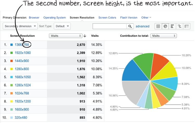
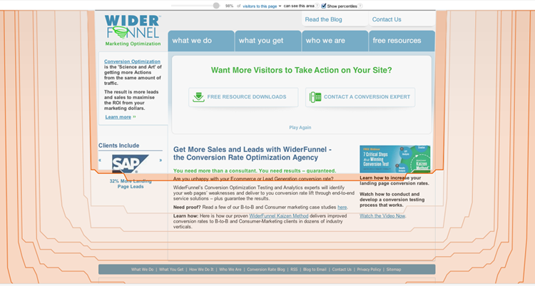
You now see a report showing how much of your pages your visitors can see. For example, the majority of the WiderFunnel home-page content is viewable by 98 percent of visitors.
In Google Analytics, this report is in Content > In-Page Analytics. Click the Browser Size button to see which portions of the page are below the fold. You can adjust the percentage you’re interested in by using a slider or clicking the shade gradations.
Looking at your important pages through this lens will help you see through your visitors’ eyes. Look for the immediate distractions in that above-fold area.
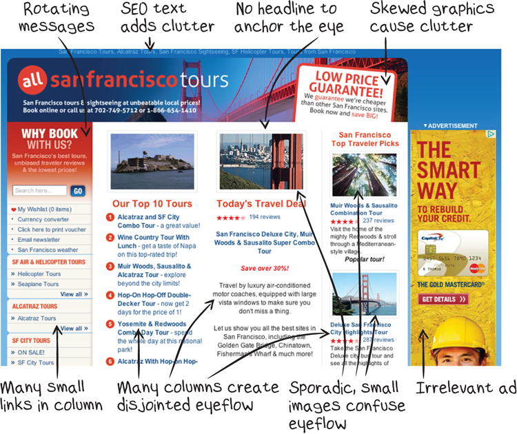
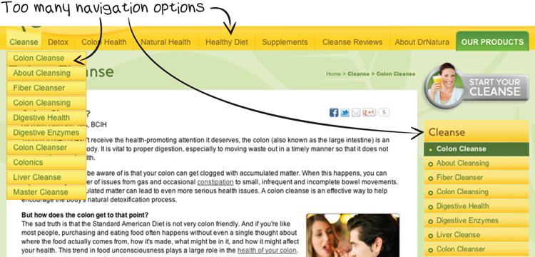
Many landing pages have a deadly combination of visual and message distractions above the fold.
Distraction can be caused even by minor elements like background textures, asymmetrical designs, and complex graphic treatments.
I often squint my eyes during this stage of analysis to approximate the page’s first impression and role-play where my prospects’ eyes will be drawn. As you’ve seen in every stage of analysis in this book, you should try to put yourself in your prospects’ shoes.
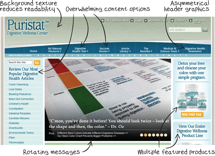
Too Much Content
The most common first-impression problem above the fold is too much content. You can distract visitors with too many columns, redundant content categories, too much text, and too many images.
Too much content crammed into the limited space above the fold doesn’t give the viewer’s eye an easy place to rest and begin the message-consumption phase. And if the starting point for reading a page isn’t immediately apparent, the page is over-working your prospect.
This is a very common problem. Most marketers are terrified that they could be leaving something important off their communications. The temptation to add just one more feature is great, but it doesn’t take long for your pages to become a wash of overcomplication and distraction.
An alternative page layout could solve these distraction problems. For example, it could have a featured product offer to anchor the eye, followed by two main columns to display available product categories and a list of popular tours. The right column could be given less visual prominence and contain contact and reference information.
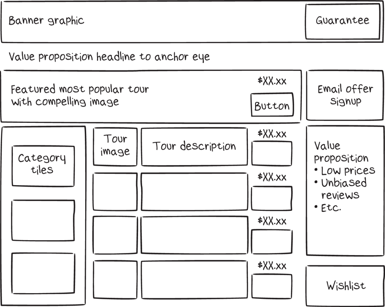
Many alternative layouts could be tested that would reduce distracting content and have the potential to dramatically improve this site’s sales. You Should Test That!
Daunting Text
In Chapter 7, “Optimize for Clarity,” one of the tips was that writing short paragraphs with a large type size improves clarity. Poor copy treatment affects more than just clarity; it can create first-impression distraction as well. Large blocks of copywriting, especially when set in small, low-contrast type, immediately discourage your prospect from attempting to read your content.
Especially above the fold, your paragraphs should be no more than three lines high. Font size and color can also affect clarity; see Chapter 7 for type-size and color-contrast tips.
Complex Graphics
Graphics are used to direct the eyeflow toward the most important content. If the entire page is full of complex graphic elements, they compete for attention and make the page more difficult to digest. Each graphical element—every line, shading, curve, and color—adds to the mental processing required to understand the page.
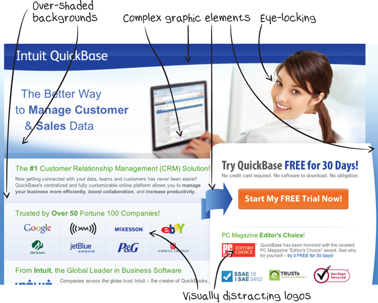
Just as concise copywriting improves your communication, so does eliminating unnecessary graphic elements.
Large Headers
The top part of your page is its most valuable space. Some websites consistently waste those valuable pixels with large areas for header images, logos, taglines, and navigation bars.
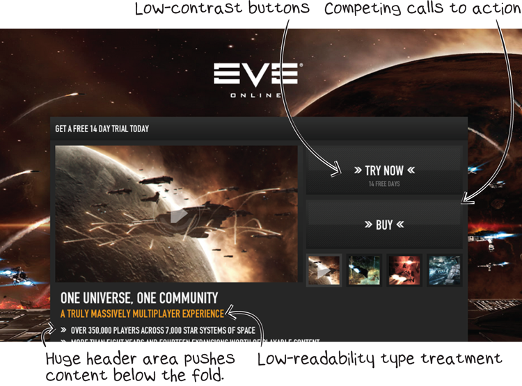
Looking at some page designs, you can imagine the size of monitor the designer was using. Designers should preview their work on a screen similar to the one their prospects will be using. For most websites and landing pages, your header should be close to 100 pixels in height and rarely more than 150 pixels.
Even worse is to have a large header combined with over-complex graphics!
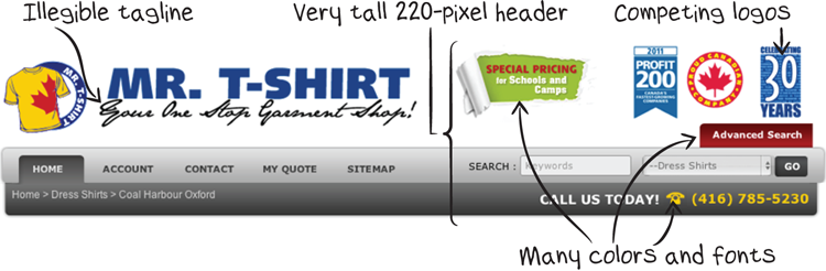
Consider carefully whether additional graphics, logos, and design elements will support your conversions. Logos are designed to attract attention and will compete with your products and message.
Redundancy
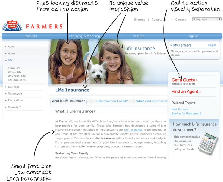
If one call to action is good, two must be twice as good, right? Not if they create visual distraction or confusion.
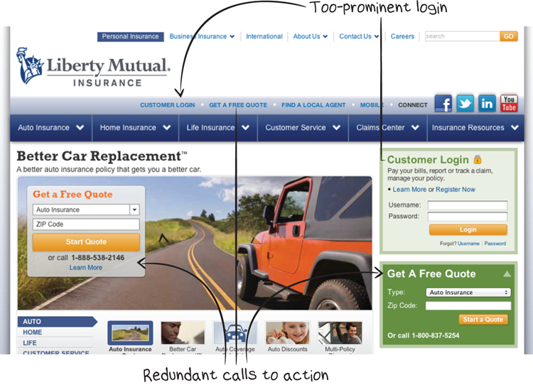
It’s better to create a focused eyeflow leading toward a single call to action. Repetition and overemphasis on secondary content, such as customer login areas, create an unnecessarily busy page.
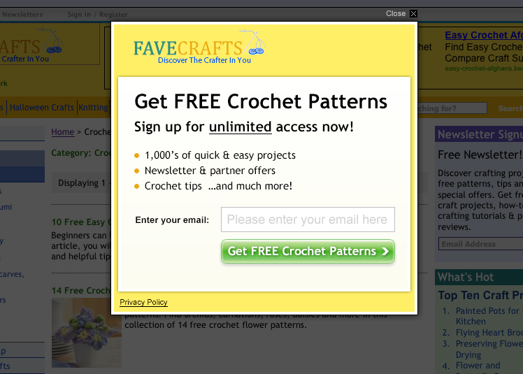
By testing several variations of a newsletter signup pop-up form, Prime Publishing discovered that eliminating distraction dramatically lifted the subscription conversion rate. Check out the details in the following case study.
The control landing page
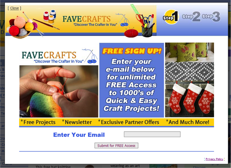
- All imagery was removed to reduce clutter and distraction.
- The amount of copy was reduced to improve clarity of the value proposition.
- Ad copy keywords (“free crochet patterns”) were repeated in the headline to improve relevance.
- Copy was left-aligned to improve eyeflow.
- The call to action (CTA) button was rewritten and made more prominent.
- The input field was enlarged and made more prominent.
- Step indicators were removed.
- The size of the form was reduced to a minimum.
- The color scheme was simplified.
- The Close button was moved to reduce distraction.
- An image caption with FaveCrafts’ positioning statement was added.
- The amount of copy was reduced.
- Ad copy keywords were repeated in the headline.
- Benefit-oriented copy was written.
- Copy was left-aligned to improve eyeflow.
- The CTA button was rewritten and made more prominent.
- The input field was enlarged and made more prominent.
- Step indicators were removed.
- The color scheme was simplified.
- The Close button was moved to reduce distraction.
Winning challenger page
Message Distraction
There’s a logical argument to be made for providing on your pages all the possible options prospects could want. It makes sense to assume that you’ll serve a larger percentage of the audience by offering infinite variety for them to choose from.
But people’s behavior doesn’t always follow logic. (Some would argue that it rarely follows logic.) As Dan Ariely says in his book of the same title, we are “predictably irrational.”
Remember the study of jam flavor selection in Chapter 4, “Create Hypotheses with the LIFT Model”? When the jam table in the store offered more selection, the store saw increased interest in the jam table but decreased sales.
When given too much choice, people freeze. And when given too many messages, none of them stick.
After the first few seconds on your page, your prospect has completed the first-impression stage and will have (you hope) decided to read some of the content. This is the point where the quality of your message and interaction becomes important.
Too Many Messages
You need to focus the messages on each of your pages for maximum effect. This isn’t a new marketing concept. Professional communicators have known for many years that they have a much better chance of communicating anything if they focus on a single message. Politicians have the best results when they stick to their talking points and repeat their position (regardless of whether it answers the question at hand), advertisers’ most effective ads promote a single feature, and mothers all over the world know the importance of repetition to get a single instruction to stick in the child’s head.
The core problem you face is the limited mental processing power of your prospects. With background thoughts, concurrent tasks, fatigue, and interruptions going on, they simply don’t have the bandwidth available.
Throw a baseball at someone, and he may catch it. Throw six, and he doesn’t have a chance. All the messages may be relevant to your prospect, but he’ll be overwhelmed long before he has a chance to consider each one.
The concept may seem simple: focus on a single message to get the message across. But it’s surprisingly difficult to do.
Many forces are pushing you to add distracting messages. Competing stakeholders within the company need to promote their points of view on your pages. Multiple product lines need to be sold. And there’s always the temptation to think that the prospect for widget x is also a good prospect for widget y, right?
Discipline is needed to focus on your primary message.
Irrelevant Content
Remember the San Francisco Tours page earlier in this chapter? One of the problems on that page is irrelevant content. The page displays an ad in the right column that doesn’t relate to the company’s tours. That ad creates a visual distraction that clutters the first impression and also distracts from the message as page visitors try to find relevant and interesting tours.
San Francisco Tours isn’t the only one with this problem. Dell’s home-office laptop page, for example, contains numerous ads and distracting messages that redirect attention away from the primary purpose of the page for the prospect: choosing the best type of Dell laptop for their needs.
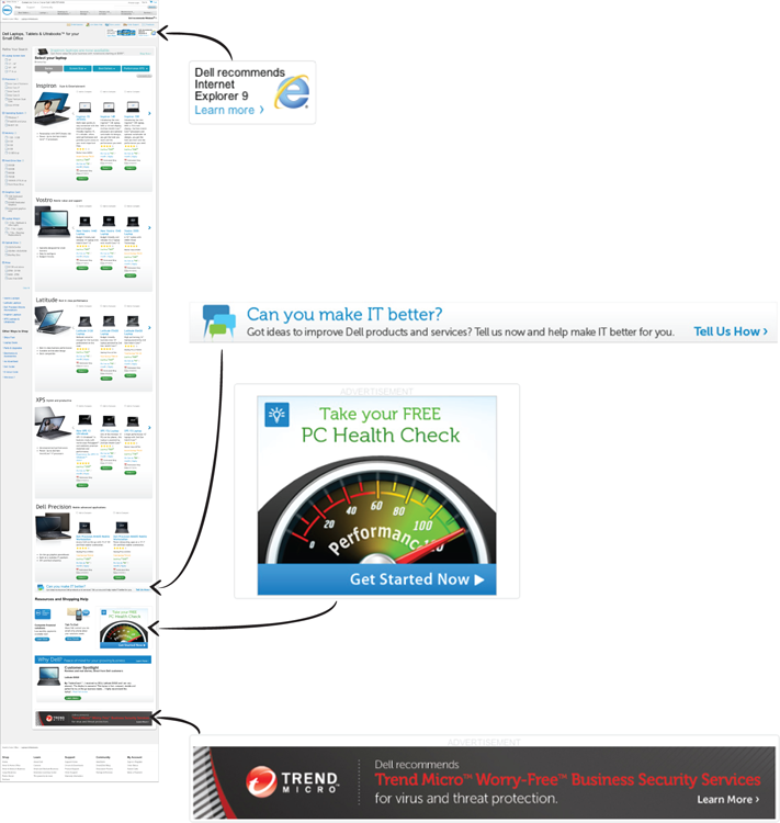
Although the companies are likely making some revenue from those ads, I would recommend testing whether they’re providing a net benefit. The added distraction and reduced credibility from advertising may outweigh the advertising revenue stream. As you’ll see in Chapter 11, “Test Your Hypotheses,” if you’re in this situation, you can test multiple income streams site-wide to determine the mix that maximizes overall revenue.
Too Many Options
An even more important question for Dell could be, is this long and detailed page of laptop specs the best way for prospects to choose their laptop? Maybe that long page with so many product options is overwhelming for shoppers.
Dell could test reducing the information and choices on the page and focusing shoppers’ attention on the most important decisions to make first. Maybe fewer base laptop options could be shown initially.
Incidentally, if you’re in a smaller company, you shouldn’t assume that a big company like Dell, just because it’s successful, shows the best way to present this content. Dell does a lot of testing, but it probably hasn’t tested everything, and its situation also may not apply to yours. I’ve seen many examples of large organizations with limited testing resources and politics that make for poor decisions. Smaller companies often have the advantage of being able to make more pragmatic decisions without political interference.
Another example of product-option distraction is the common section that recommends up-sells and cross-sells.
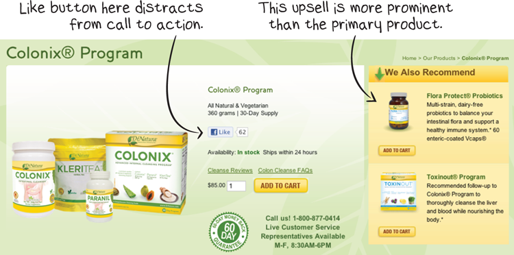
Your prospects have enough work to do to understand the main product. For e-commerce catalogs, you should test the optimal placement for cross-sells and up-sells that maximizes revenue.
Navigation Bars
I’ve often been asked whether landing pages should have navigation bars. Navigation can help when the page includes a high-involvement call to action or complex product decision. A navigation bar showing that there’s a full website can also lend credibility to an unknown brand.
But navigation bars can also be distracting and, in some cases, overwhelming on landing pages.
A lot of e-commerce sites are removing navigation during checkout to minimize distraction. If you test that, make sure you track the average order value for each challenger as well as conversion rate.
Image Distraction
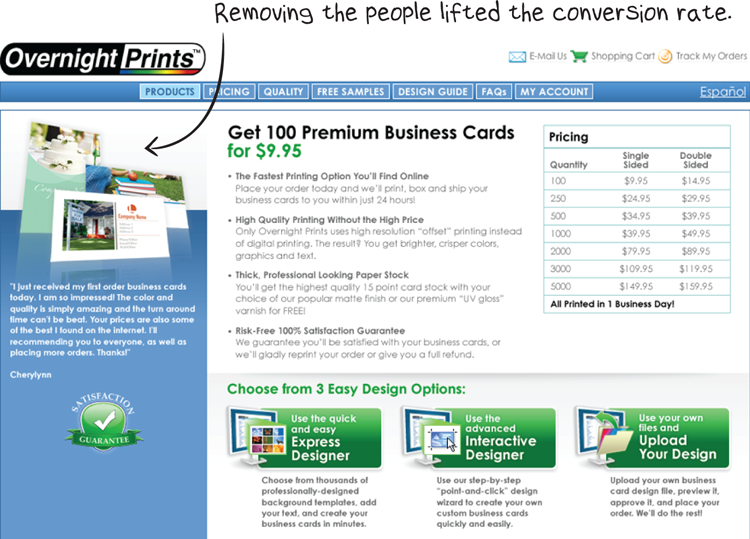
You may not have images that clearly support your value-proposition message. In many cases, it’s better to go without than to use images that don’t directly reinforce the value proposition, or that are overly distracting. Images have powerful effects and can be polarizing.
For example, WiderFunnel ran a test for OvernightPrints.com on a landing page where visitors could design and print their own business cards. In one of the test isolations, we saw the effect of showing standard stock imagery combined with the business card product, compared to showing the business card product image on its own. The page without the people in the left column outperformed the combined image.
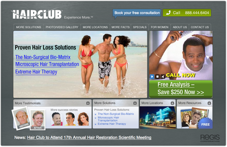
In the next case study, which shows a landing-page test for Hair Club, we found that an old approach using sexy, aspirational images underperformed a design with less-distracting images.

The control landing page
- Hair Club business goals and key performance indicators
- Overall website performance
- Previous test results
- Google AdWords campaigns
- Web analytics data
- The current landing page’s design, copy, layout, and graphics
- Variation A: “Video Testimonials”
- Variation B: “Embedded Call-to-Action Form”
- Variation C: “Before & After Photos”
Winning challenger page
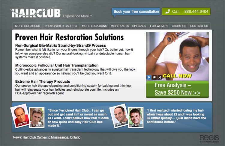
The winning challenger for Hair Club replaced rotating images of beautiful women in aspirational scenarios with rewritten descriptive copy about the service options. One of the standard beliefs in marketing is that “sex sells,” but in WiderFunnel’s testing, we often find that “sex is distracting!”
How can you reduce distraction on your important conversion-funnel pages?
- Can you reduce the number of product options you offer?
- Can you reduce the number of choices your prospects have to make on each page?
- Can you choose less-distracting images or remove images altogether?
You Should Test That!
Continue reading to Chapter 10, “Optimize for Urgency,” to learn how urgency affects your prospects and how you can test to create greater urgency.