Chapter 7. Advanced view controllers
- Working with navigation-based interfaces
- The flipside controller
- The split view controller
- Popover and modal view controllers
- Mixture of view controllers
When we started our look at view controllers in chapter 5, we promised that we’d return to the more advanced view controllers that manage several pages of content at once. That’s the purpose of this chapter: to introduce you to the final fundamental building block of iOS that allows you to build complex multipage applications.
In this chapter, we’ll take an in-depth look at three view controllers: the tab bar controller, the navigation controller, and the unique split view controller (at the time of writing, it’s only available on the iPad). We’ll also take a briefer look at the flipside controller that appears in one of Xcode’s iOS templates and talk about some modal controllers that you’ll see later in the book.
As in the previous chapter on view controllers, we’ll offer skeletal examples: the main purpose is to provide you with the reusable programming frameworks that will let you use these controllers in your own programs. Let’s kick off the discussion with the tab bar view controller.
7.1. The tab bar view controller
Of the multipage view controllers, the tab bar is the easiest to use because it supports simple navigation between several views. Like all the advanced view controllers, it has a complex underlying structure incorporating several objects that work in tandem.
7.1.1. The anatomy of a tab bar view controller
To function, a tab bar view controller requires a hierarchy of at least six objects:
- One UITabBarController
- A minimum of two UIViewControllers
- One UITabBar
- A minimum of two UITabBarItems
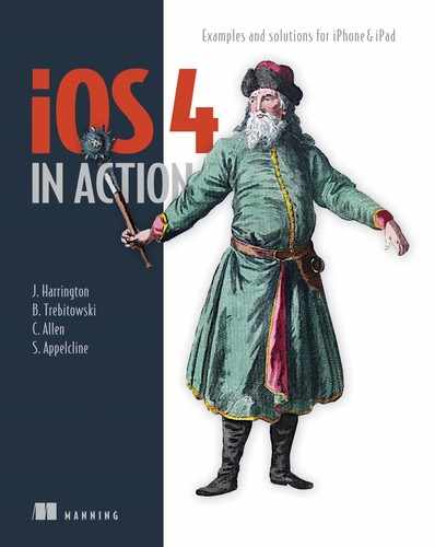
This hierarchy of objects is depicted in figure 7.1.
Figure 7.1. A collection of six objects (at minimum) is required to create a functioning tab bar view controller.
The tab bar controller and its associated view controllers are the heart of this setup. The tab bar controller switches off between different pages, each of which uses a view controller to manage its events. When you create them visually they are automatically hooked up, but you will you need to fill in the controllers’ views when your controllers are ready to go.
The tab bar itself is created automatically when you instantiate a tab bar controller. It displays a set of radio buttons that go at the bottom of the page. Each of those buttons is a tab bar item (which is also created automatically). Each tab bar item then links to an individual view controller. Usually you shouldn’t have to mess with the tab bar; you can make all the modifications you require through either the tab bar controller or the view controllers.
The connection between the tab bar controller and its tab bar is a simple delegation, as you’ve seen in use in previous chapters. The tab bar has a delegate property that’s hooked up to the controller, which must respond to the UITabBarDelegate protocol.
The tab bar controller can also designate a delegate. The controller’s delegate must follow the UITabBarControllerDelegate protocol. This protocol requires response to two types of high-level events: when the tab bar is rearranged and when a view controller is selected.
7.1.2. Creating a tab bar view controller
Each of the advanced view controllers has its own Xcode template that you can use to immediately instantiate the controller. Because this is your first advanced view controller, though, we’ll look at how you create it by hand before we move over to simpler, template-driven object creation.
Creating a Tab Bar View Controller by Hand
To create a tab bar view controller manually, begin with the Window-Based Application template. Use it to create a project imaginatively called tabex. Note that this example will work on any of the devices. After you’ve created the project, open the MainWindow.xib file.
Now, to create the tab bar view controller, follow these steps:
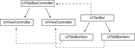
- Drag the Tab Bar Controller object from the Library window (where you’ll find it under Controllers) to the nib display window.
- Drop the controller next to your window object. When you do that, the Tab Bar Controller Main display window appears.
- Dismiss the old Main display; you don’t need it anymore. Instead, you’ll create new objects as subviews of your tab bar view controller.
The results are shown in figure 7.2.
Figure 7.2. Dragging a tab bar controller to the nib display window creates the tab bar interface.
Believe it or not, that’s all there is to it. All six objects of note have been created. The tab bar controller is accessible from the nib display window. The other five objects are accessible from the black bar at the bottom of the Main display window. Click a button once to get its UIViewController and a second time to get its UITabBarItem. Click in the middle of the strip (between the buttons) to access the UITabBar. By selecting these items, you can set their attributes, connections, size, and identity.
We took this slight diversion into the harder side of tab bar controller design to show what all the objects look like. After you’ve seen all the fundamental objects that are created as part of an advanced view controller, you’ve played the Window-Based Application template’s last trick. In the future, we’ll jump straight to the appropriate template for each sort of view controller—starting with the tab bar controller template.
Creating Your Tab Bar Through a Template
It’s even easier to create a tab bar view controller using the existing tab bar template. Select Tab Bar Application when you create a new project. This template sets you up with a tab bar controller much like the one you just created by hand, except it does three additional things:
- The template defines the tab bar controller as an IBOutlet, giving the app delegate access to the object IBOutlet UITabBarController *tabBarController;.
- The template creates the view controller for the first window as part of a special FirstViewController class. You’ll probably want to have an individual view controller class for each tab to take care of events on a per-page basis, but that’s easy to change by adding class files and adjusting the Identity tab for the view controllers. For now, leave things as they are so that we can examine how to work with the default template setup.
- The template associates a second .xib file with the second view. It does this in a way you’ve seen before: by defining a nib Name for the view controller.
For the rest of this section, we’ll assume that you’re working with this prebuilt tab bar controller template as your tabex project.
With a working tab bar controller in hand, you can begin programming multiple pages of screens.
Tab Bars and Toolbars
The UIKit supports two similar interfaces, the UITabBar and the UIToolBar. They each include a strip of icons that goes along the bottom of the screen. Their main difference is in functionality.
The UITabBar is intended as a modal interface that changes the selections when they’re tapped (usually with a permanent highlight). The purpose of the UIToolBar is to provide a menu of possible actions that don’t change the appearance of the selection when tapped (except with a temporary highlight).
Despite their similar appearance, the two items share no inheritance other than a common ancestor in UIView. Consider it convergent evolution.
We’ll present a fully functional example of a UIToolBar in chapter 11.
7.1.3. Building a tab bar interface
At this point, you have a tab bar controller that contains two tabs, each of which has relatively empty content. You also have tabs on your tab bar without pictures and without meaningful names. To build your tab bar interface, you’ll want to adjust all these things.
Adding More Tabs
You can add tabs to the tab bar by dragging a tab bar item to the tab bar. A tab bar item and related view controller are added to the right side of your bar. Go ahead and create a third tab.
To allow for easy access to this new controller’s view, you should create a new .xib file and connect the view controller to it.
Connecting Views
When you have the right number of tabs, you can connect views to each of the tab bar’s view controllers. This can be done in three ways:
- You can input views through .xib files, as noted earlier.
- If a view controller has its own class file, you can add views through the load-View or viewDidLoad method for that class.
- If a view controller doesn’t have its own class file, you can load views elsewhere, such as in the app delegate’s applicationDidFinishLaunching:.
Because the latter two view controllers don’t have their own class files, you’ll see how to create their views using applicationDidFinishLaunching:. It would probably be simpler to create their views visually, but this example will demonstrate how you can use the tab bar controller.
Although you don’t have outlets for the controllers, you can link to them straight from the tab bar controller object, which you do have access to, thanks to that IBOutlet that you’ve already seen. This relates to a concept we discussed when talking about basic view controllers because view controllers have to do MVC management: they should give you easy access to related objects. Within the tab bar controller is a viewControllers property, which is an NSArray list of the view controllers that a tab bar controller contains.
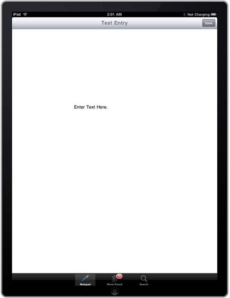
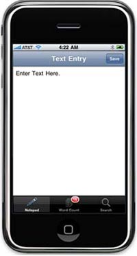
Listing 7.1 shows how to access this information and programmatically build a couple of views for the second and third controllers within tabexAppDelegate.m. This is the skeleton of a simple program that lets you edit a text view in the first window, keep a count of what you’ve written in the second, and search in the third.
Listing 7.1. Tab bar controller setup
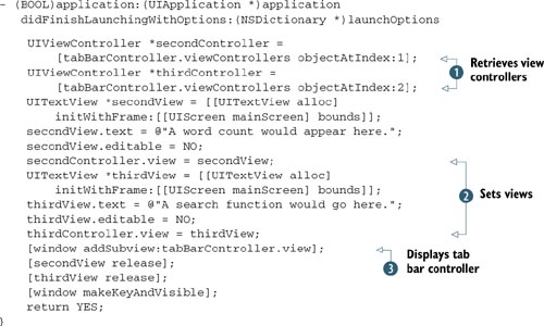
To access the view controllers, you pull elements out of an array using the appropriate NSArray calls  . You then associate views with each view controller, as you’ve done in the past
  . Finally, you link the tab bar controller to the window, using a call that was already sitting in your file when you loaded
it
. Finally, you link the tab bar controller to the window, using a call that was already sitting in your file when you loaded
it  .
.
You now have three modal pages (including that first controller’s page, which we assume was taken care of in its class files, provided by default by the template). Each does what you want, and navigation among them is easy. But you can still do some work to make your tab bar look better.
Modifying the Buttons
Although you have views associated with each button, the buttons say First, Second, and Third, rather than providing any useful clue as to the buttons’ purpose. You can change three things on each button to improve its usability: the icon, the title, and the badge. Figure 7.3 shows the goal, which is to fill out some or all of this information for each of your tab buttons.
Figure 7.3. You can customize tab bars to make navigation clear and simple.
The icon is the image that appears on the tab bar item. This image can be set only when you create a tab bar item. If you were creating the tab bar programmatically, you’d use the initWithTitle:image:tag: method when creating the tab bar item. More likely, you’ll go into Xcode and load a small PNG graphic that you want to use.
This process is similar to incorporating the image into your project in chapter 4. You create a transparent PNG that’s approximately 30 × 30. If your image is too big, the SDK will resize it, but it’s better to start at the right size. After you drag the image into your project, you can access it in the Media Library. We used a Wingdings font to create the simple images that appeared in figure 7.3.
The title is the word that appears on the tab bar. You can set that by going to the field in question in the Attributes Inspector and changing the text there.
If you want to later change the title during runtime, it’s accessible in Xcode. The catch is that these titles aren’t found in the tab bar controller. Instead, they follow the overarching idea of MVC: because a view controller is responsible for an individual view, the controller sets the title of the page. This is done with the view controller’s title property, which we’ve mentioned before and which you’ll meet again:
secondController.title = @"Word Count";
The badge is the little red circle that appears above the title and over the icon on the tab bar. As always, you can change this in the Attributes Inspector, but you’ll usually want to do this programmatically. That’s because the information in a badge is meant to be dynamic, changing as the view changes and alerting a user to new content during runtime. For example, badges tell you when you have new mail or new voicemail.
Getting to the badge property is a two-step process. Start with your view controller. From there, you access tabBarItem, which is a property of the controller that links you to its connected tab bar item, and then badgeValue, which is a property of the tab bar item. Fortunately, you can do all this as one nested line:
secondController.tabBarItem.badgeValue = @"16";
The 16, as it happens, is the initial character count of the main text view. If you were building a live program, you could change this count over the course of your program’s runtime.
Table 7.1 summarizes the three main elements of the tab bar and how to customize them.
Table 7.1. From your view controllers, it’s easy to customize the associated tab bar items.
|
Summary |
Interface Builder |
Xcode |
|
|---|---|---|---|
| badge | Tab bar info | Yes | viewcontroller.tabBarItem.badgeValue |
| icon | Tab bar picture | Yes | Only at init |
| title | Tab bar words | Yes | viewcontroller.title |
There’s one more way to change both the icon and the title of a tab bar item simultaneously: by creating a tab bar item with the initWithTabBarSystemItem:tag: method. Doing so creates a tab bar using one of the constants defined under UITabBarSystemItem, each of which relates to a standard iOS function and correlates a name and a picture with that function.
You’ll probably do this in the Attribute Inspector, where you select a specific identifier instead of entering a title and a picture. Because your third tab allows searches, you can initialize it as a UITabBarSystemItemSearch button, which gives it the title of Search and the picture of a magnifying glass, as shown in figure 7.3.
When you have the tab bar set up, you’re ready to start using the controller.
7.1.4. Using your tab bar controller
The main function of a tab bar is to allow navigation between multiple pages in your application. This is an implicit function of the object, and you needn’t do anything more to enable it. The rest of the tab bar controller’s functionality goes beyond our basic overview of the topic, but we’ll mention it briefly. The two main elements we want to consider are customization and delegation.
Tab Bar Customization
One of the neat things about tab bars is that users can customize them to contain exactly the tab bar items that interest them. This can be done when the number of tab bar items exceeds the allowed space of five items. You can allow this by setting the customizableViewControllers property to include a list of view controllers that the user can change:
tabBarController.customizableViewControllers =
    tabBarController.viewControllers;
The UITabBar reference contains all the information you’ll need on managing customization.
Tab Bar Controller Delegation
As we noted, you can set a delegate for your tab bar controller to hand off the scant amount of event management that it requires. The delegate object must follow the UITabBarControllerDelegate protocol, which is a fancy way of saying that it will respond to two specific events: one when a view controller is selected and another when the tab bar controller is customized. A protocol reference covers the specifics of this.
Two methods are associated with these protocols: tabBarController:did-EndCustomizingViewControllers:changed: reports the end of tab bar customization, and tabBarController:didSelectViewController: reports when the user switches between controllers. The latter is probably more generally useful. For example, you might use it in the word-count example to recalculate the word-count totals whenever a user jumps to the word-count page.
Now that you have a basic example of how to navigate with a tab bar, you’re ready for the next advanced controller: the navigation controller.
7.2. The navigation controller
The navigation controller is probably the most-seen user interface item on the iOS device. Whenever you have a stack of view controllers in which you can move up and down through the hierarchy, that’s the navigation controller at work. It appears in the Text, Calendar, Photos, and Notes iPhone utilities, to name a few.
Working with the navigation controller is a bit harder than working with the tab bar controller, because you have to manage your hierarchy of views live as the user interacts with your program; but the SDK still keeps it simple.
As with the previous view controllers, we’ll look at an overview of the class and then examine how to create, build, and use a navigation controller. Let’s get started with an overview of its hierarchy.
7.2.1. The anatomy of a navigation controller
As with the tab bar controller, the navigation controller involves a hierarchy of items. The UINavigationController sits atop a stack of UIViewControllers that can be pushed or popped as a user moves up and down through it.
Each of these controllers also has an associated UINavigationItem, which sits in the UINavigationBar when it’s active. Each UINavigationItem may also contain one or more UIBarButtonItems, which allow for additional action items to sit on the navigation bar.
To tie things back together, the UINavigationBar is also linked to the UINavigationController so that navigation items and view controllers stay in sync over the course of a program’s runtime. Whenever a UIViewController loads into the UINavigationController, its UINavigationItem also loads into the UINavigationBar.
A minimalistic navigation controller contains just four objects: the UINavigation-Controller, the UINavigationBar, a stack containing a single UIViewController, and a UINavigationItem (which is placed into the UINavigationBar). Presumably, more view controllers and associated navigation items will be added to the stack as the program runs. This is illustrated in figure 7.4.
Figure 7.4. A navigation controller contains at least four objects and may be built into a complex web of interconnections.
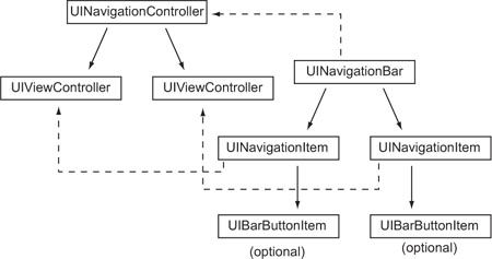
Note how similar this diagram of navigation controller parts is to figure 7.1, the diagram of tab bar controller parts. This isn’t an accident in the drawing, nor do we expect that it was an accident in Apple’s design. The navigation controller works much like the tab bar controller, and you’ll see familiar elements, such as the title of the view controller creating the title within the navigator.
The biggest difference is that whereas the tab bar controller presents a modal paradigm, entirely organized by the controller, the navigation controller creates a hierarchical paradigm. The navigation controller doesn’t have any particular sense of the organization of the entire structure. Instead, a linked list is created, with each navigation item knowing only about the pages on either side of it.
The standard device paradigm is to do hierarchical navigation through table views, each of which contains lists of many different subpages that you can go to. As a result, despite the fact that any UIViewController can sit beneath a UINavigationController, it’s usually a UITableViewController. This is exactly the setup you see in the navigation-based template.
7.2.2. Creating a navigation controller
To create a navigation controller, create a new project (in this example, called navex) using the Navigation-Based Application template. You can page through the .xib file and the Xcode listing to see what you’re given. Let’s start with the .xib files, whose content you can see in figure 7.5.
Figure 7.5. The Navigation-Based Application template contains two .xib files: one for the main view (top) and one for what appears inside the controller (bottom).
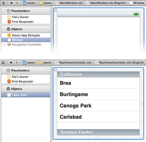
Mainwindow.xib contains a UINavigationController in the nib window with a UINavigationBar hidden under it. The main display window contains a UINavigation-Item and a RootViewController. The latter is a subclass of UIViewController created through Xcode, just as when you designed your own table controller in chapter 5. Note that this sets up the standard iPhone paradigm of navigation controllers being built atop table controllers. The table view controller’s contents are instantiated through a second .xib file, RootViewController.xib, as shown in the table view controller’s attributes window.
RootViewController.xib is a boring .xib file because it contains only a table view. Consider it a good example of how pairing .xib files with view controllers can keep your program well organized.
Finally, if you look at the Xcode files created by the template, you see that the navigation controller is linked to your window in the app delegate file. Among the other default files are the RootViewController class files you’d expect to see. Because you’re working with a table view controller, you know the RootViewController class files will be important when you input the table view’s data.
7.2.3. Completing the navigation controller
At this point, you need to do three things to complete the navigation controller: add a title, add navigation links, and (optionally) add action buttons.
Adding a Title
Like the tab bar controller, the navigation controller takes its title from the title of the individual page’s view controller. All you have to do is define title in your table view controller file:
self.title = @"Color List";
This turns out to be a critical bit of data, because it’s also what the navigation controller uses as a back button when you’re deeper in the hierarchy.
Adding the Links
You could theoretically use whatever method you wanted to link to additional pages via a navigational controller. The default mechanism is to use a table list, and that’s the method you’ll use in this example.
Design your table view controller as discussed in chapter 5, but this time give each table cell an accessory view of type UITableViewCellAccessoryDisclosureIndicator. That’s the standard chevron used to indicate hierarchical navigation.
The following listing includes all the major elements required to define this navigation table in RootViewController.m.
Listing 7.2. A table for a navigator
- (void) viewDidLoad {
     self.title = @"Color List";
         colorList = [NSArray arrayWithObjects:
             [NSDictionary dictionaryWithObjectsAndKeys:
                 @"Red",@"titleValue",
                 [UIColor redColor],@"colorValue",nil],
             [NSDictionary dictionaryWithObjectsAndKeys:
                 @"Green",@"titleValue",
                 [UIColor greenColor],@"colorValue",nil],
             [NSDictionary dictionaryWithObjectsAndKeys:
                 @"Blue",@"titleValue",
                 [UIColor blueColor],@"colorValue",nil],
              nil];
         [colorList retain];
}
- (NSInteger)numberOfSectionsInTableView:(UITableView *)tableView {
     return 1;
}
- (NSInteger)tableView:(UITableView *)tableView
    numberOfRowsInSection:(NSInteger)section {

    return [colorList count];
}
- (UITableViewCell *)tableView:(UITableView *)tableView
     cellForRowAtIndexPath:(NSIndexPath *)indexPath {
     static NSString *MyIdentifier = @"MyIdentifier";
     UITableViewCell *cell = [tableView
         dequeueReusableCellWithIdentifier:MyIdentifier];
   if (cell == nil) {
   cell = [[[UITableViewCell alloc] initWithStyle:UITableViewCellStyleDefault
     reuseIdentifier:MyIdentifier] autorelease];
   } cell.textLabel.text = [[colorList objectAtIndex:indexPath.row]
   objectForKey:@"titleValue"];
   cell.textLabel.textColor = [[colorList objectAtIndex:indexPath.row]
   objectForKey:@"colorValue"];
    cell.accessoryType = UITableViewCellAccessoryDisclosureIndicator;
    return cell;
}
Note
Make sure to declare colorList in the header file.
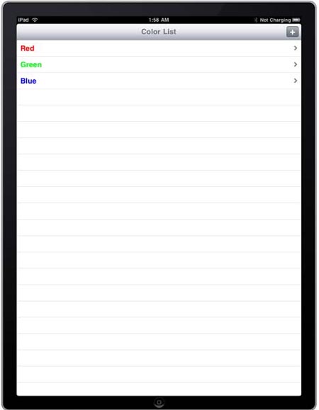
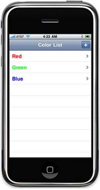
There’s nothing new here, but we’ve included it to clarify the rest of the discussion of the navigation controller. Figure 7.6 shows what this application looks like on both devices.
Figure 7.6. The navigation controller shown on both the iPad and iPhone
Adding Actions
If you want, you can move right on to using your navigation controller. Alternatively, you can do some extra work with buttons. In addition to the standard navigation controls, you can add buttons to the navigation bar. You do so through the leftBar-ButtonItem and rightBarButtonItem properties of the UINavigationItem. A left button replaces the back button, and a right button sits in the usually blank right side of the navigation bar.
As we’ve noted, each view controller is linked to its own navigation item. A view controller can access its navigation item through the navigationItem property at any time.
When you set a button, you must set it to be a UIBarButtonItem object, which you have to create. You can use four init methods, as shown in table 7.2. You’ll probably instantiate the buttons in the viewDidLoad: method, the same place where you should initialize your array for use with the table view.
Table 7.2. You can create navigation bar button items using a variety of methods to get precisely what you want.
|
Method |
Summary |
|---|---|
| initWithBarButtonSystemItem:target:action: | Creates a standard button drawn from UIButtonSystemItem |
| initWithCustomView: | Creates a special button |
| initWithImage:style:target:action: | Creates a button with a picture |
| initWithTitle:style:target:action: | Creates a button with a word |
Note that all the buttons except the custom-view button come with their own target and action links. These are the simpler target-action mechanisms that we alluded to in the previous chapter. They work exactly like the more complex target-action mechanisms but are built in.
Here’s how you can create a button as part of the page represented by your UITableViewController:
self.navigationItem.rightBarButtonItem = [[UIBarButtonItem alloc]
    initWithBarButtonSystemItem:UIBarButtonSystemItemAdd
    target:self action:@selector(changeTitle)];
As you can guess from the title, this button press enacts an innocuous title change, but it would be easy to redraw your table list or even to integrate that button with the navigation itself, perhaps using it as a home button.
At this point, you have a navigation controller that does precisely nothing (other than showing a gray bar with a title) and perhaps a working button. Unlike with the other controllers you’ve met so far, you’ll need to do some runtime work to get your navigation controller operating.
7.2.4. Using your navigation controller
A navigation controller has one core job: to allow a user to move up and down through a hierarchy of pages.
Navigating Forward
To allow a user to navigate to a page deeper in your hierarchy, you need to use the navigation controller’s interface to push a new view controller on top of the navigation controller’s stack, which then causes that new view controller’s view to become the visible view in your program. This is shown in the following listing, which continues to expand on RootViewController.m.
Listing 7.3. Activating a navigation controller
- (void)tableView:(UITableView *)tableView
    didSelectRowAtIndexPath:(NSIndexPath *)indexPath {
    UIViewController *colorController = [[UIViewController alloc] init];
    colorController.title =
        [[tableView cellForRowAtIndexPath:indexPath].textLabel text];
    colorController.view  = [[UIView alloc] init];
    colorController.view.backgroundColor =
        [[tableView cellForRowAtIndexPath:indexPath].textLabel textColor];
    [self.navigationController
        pushViewController:colorController animated:YES];
    [colorController release];
}
To navigate using tables, you must modify the table view controller’s tableView:didSelectRowAtIndexPath: method, which you first met in chapter 5. Clearly, if you’re activating your navigation controller by some other method, you’ll use different means.
When a user selects an item that should lead them to the next page, you have to create the page they’ll go to. You start by creating a view controller. Remember to set title, because it will be the title that appears in your new view controller’s navigation item. Matching the title to the table cell’s text is a common way to set this property.
After you’ve created a view controller, you need to decide how to create its default view. Here, you create a plain view. Prefer to create your view in Xcode? No problem. Use the initWithNibName: method when you create your view controller, visually.
Each view should have different content based on what the user selects. Here, you look at the color of the table cell’s text and then set the whole view to that color. More often, you’ll probably look up an NSDictionary element from the same array you used to fill in your table and use that information to generate a unique page. For example, it’d be easy to pull a nib name out of a dictionary.
After you’ve set up your new page, you send a message to the navigation controller to switch over to it. Note that you can find a reference to your navigation controller by using the view controller’s navigationController property, another of many object links available in the view controller. The push command is simple: it adds a new page to the top of the navigation controller’s stack and sends your user over to it.
Navigating Backward
After you’ve loaded a new page onto a navigation controller’s stack, it appears with all the peripherals you’d expect, including a titled navigation bar with a titled back button (each based on the title property of the appropriate controller). This is all shown in figure 7.7.
Figure 7.7. With a few simple commands, a navigation controller’s setup is largely automated. Here you see the titled navigation bar with a titled back button.
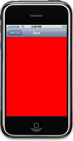
You also don’t have to worry about coding the backward navigation. Clicking the back button automatically pops the top controller off the stack without any work on your part. Moreover, if you want to play with the back button’s title, the tricky part is to define the back button in the root view controller.
Go back to the RootViewController in the view-DidLoad: method, and add the following snippet to define the back button’s title:
UIBarButtonItem *backBtn = [[UIBarButtonItem alloc] initWithTitle:@"Back"
     style:UIBarButtonItemStyleDone target:nil action:nil];
self.navigationItem.backBarButtonItem = backBtn;
[backBtn release];
Other Types of Navigation
Navigation doesn’t have to be just forward and backward. You can also do some slightly more complex things, either during setup or at runtime.
At setup, you can create a navigational hierarchy and push a user into it before they take any actions. You can see this in action in various iPhone programs. Mail always returns you to the last mailbox you were at, whereas Contacts always gives you a back button to return to the Groups page.
You can do fancy things during runtime using three navigation controller methods: popToRootViewControllerAnimated: (which brings you back to the top of your stack), popToViewController:animated: (which returns you to a specific view controller), and popViewController-Animated: (which pops the top controller off the stack).
They’re powerful, although you have to take care when changing the standard navigation paradigm so you don’t confuse your users. But, for example, you could place a UIBarButtonItem in your nav bar that returns you to home from deep in your hierarchy. Alternatively, you might pop the top page automatically after a user takes some action on the page that concludes its usefulness.
Navigators and Databases
So far, you’ve built all your table view controllers—including the one embedded in this navigation controller—using arrays. This is a perfectly acceptable technique for a small, static table. But if you want a bigger or a more dynamic table, you’ll probably want to use a database as your data backend. We’ll present a complete example of how to do so in chapter 9, when we cover the SQLite database package.
Other Methods and Properties
There’s little else to be done with the navigation controller, although you can find a few other properties in the class reference. You can set those properties to modify the look of individual UIBarButtonItems and to set your nav bar to be hidden.
We’ve now covered the two most important advanced view controllers. But before we finish our discussion of the topic, let’s take a brief look at the flipside controller, which exists only as a template, not as a class in the UIKit framework. The template instead creates a subclass of ViewController in your program.
7.3. Using the flipside controller
To create a flipside controller on iPhone, choose the Utility Application template when you start a new project. Please note that this template is only available to the iPhone platform. It creates a small hierarchy of objects, as shown in figure 7.8.
Figure 7.8. Several objects are created in a flipside controller.
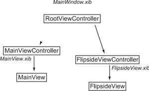
The flipside controller contains three view controllers and two views. Each of the view controllers is a subclass of UIViewController, whereas the views are each a subclass of UIView.
The main view controller is called the Root-ViewController. It’s loaded through MainWindow.xib. Much of the template’s work is done, as you’d expect, through its class files. The Root-ViewController.m file loads the MainViewController (using the initWithNibName: method to load its unique nib file) and then creates a special toggleView method for when the info button at the bottom of the page is pushed. When this happens, the FlipsideView-Controller also loads. The following listing shows this standard method, which you shouldn’t have to modify.
Listing 7.4. The flipside toggler
- (IBAction)toggleView {
    if (flipsideViewController == nil) {
        [self loadFlipsideViewController];
     }
     UIView *mainView = mainViewController.view;
     UIView *flipsideView = flipsideViewController.view;
     [UIView beginAnimations:nil context:NULL];
     [UIView setAnimationDuration:1];
     [UIView setAnimationTransition:([mainView superview] ?
         UIViewAnimationTransitionFlipFromRight :
         UIViewAnimationTransitionFlipFromLeft) forView:self.view
             cache:YES];
     if ([mainView superview] != nil) {
         [flipsideViewController viewWillAppear:YES];
         [mainViewController viewWillDisappear:YES];
         [mainView removeFromSuperview];
         [infoButton removeFromSuperview];
         [self.view addSubview:flipsideView];
         [self.view insertSubview:flipsideNavigationBar
             aboveSubview:flipsideView];
         [mainViewController viewDidDisappear:YES];
         [flipsideViewController viewDidAppear:YES];
    } else {
         [mainViewController viewWillAppear:YES];
         [flipsideViewController viewWillDisappear:YES];
         [flipsideView removeFromSuperview];
         [flipsideNavigationBar removeFromSuperview];
         [self.view addSubview:mainView];
         [self.view insertSubview:infoButton
             aboveSubview:mainViewController.view];
         [flipsideViewController viewDidDisappear:YES];
         [mainViewController viewDidAppear:YES];
     }
     [UIView commitAnimations];
}
Because you shouldn’t need to modify it, we won’t cover all this code; but if you read through it, you’ll find that it includes some nice nuances, including the ability to work with UIView’s simple animation and some different ways to call insertSubview:. This template provides a great example of how to connect multiple Xcode class files and multiple nib files, and reading it can serve as a great tutorial for more advanced work you’ll do yourself.
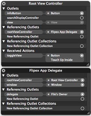
For example, look at the MainWindow.xib file. Note that connections are made to two different files, as shown in figure 7.9. The app-delegate file contains a link to the root-view controller object, whereas the root-view controller file contains links to the info button object and its action. This shows the sort of organization you’ll want to consider for your own projects.
Figure 7.9. Interface objects can be connected to a variety of different files.
Given that, how do you use the flipside controller? All you need to do is lay out objects in the two .xib files and/or make changes to their accompanying class files. Then, you can build controller actions, events, and other activities into the two controller files.
For example, you can make your main view red; then, you can go into the FlipsideViewController.m file and change the default background color to green-Color (instead of its current flipsideColor) to create a simple red and green flash-card, which can be used to express your interest in a conference topic. We’ll also show you how to use a flipside controller to create local preferences on the back side of your program in chapter 8, section 8.2.1. If you ever need a two-sided application, the flipside controller is a great place to get started.
Now that we’ve explored the template view controllers that work on iPhone, we’ll discuss the iPad-specific view controllers.
7.4. The split view controller
The split view controller is an iPad-specific view controller that allows you to separate content into different panes. Although you can implement it a few ways, by far the most common is to have a UITableView on the left and a UIView on the right. Because the split view is made of two views that you have learned about in previous chapters, we’ll focus on the example instead of the individual views.
One of the major places you’ll see this interface component in use is in the iPad’s Mail application. The left pane of the split view controller displays all of your mail messages, whereas the right displays the content of the selected message.
7.4.1. Creating a split view controller
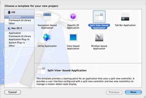
To create a project based on SplitViewController, start by selecting the Split View-Based Application template from Apple’s project templates, as shown in figure 7.10. Titled the project SplitViewx. This will provide you with a complete basic application, including a simple data set.
Figure 7.10. Creating a split view–based application
You’ll walk through the code and modify it to display a list of website bookmarks. When the user taps the bookmark in the left pane, it will load the website in the right one. As you modify the code, we’ll explain in detail how the SplitViewController is constructed. Figure 7.11 shows what the application will look like.
Figure 7.11. The bookmarks application employing a split view
When you first create a split view–based application, a number of files are added to your project automatically. Open MainWindow.xib, and inspect the contents. Figure 7.12 shows the various view elements you see when you click the SplitView-Controller.
Figure 7.12. SplitViewController view elements
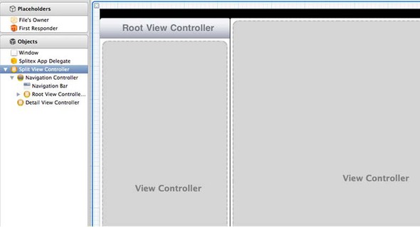
As you can see, the SplitViewController is made up of two main views. The navigation bar in the left view should hint that its view is a navigation controller. The object viewer in the bottom corner confirms this. Notice that the view hierarchy is exactly the same as that for the navigation controller in section 7.2.
The right view is loaded from another nib called DetailView. Double-clicking the blue text labeled DetailView opens it and allows you to modify it as you would any other view. You’ll see that later in the section when you add a web view to the example application.
7.4.2. Building the split view controller
Now that you’ve seen how the views are organized, it’s time to review the code necessary for them to function. As mentioned earlier, the project will contain a sample data set that you’ll modify to fit the application.
The first steps are exactly the same as in section 7.2, when you created the navigation controller. You need to create an array of data, display it in the table view, and respond to actions when a row has been selected.
Declaring the Data Array
Open RootViewController.h, and modify the code to look like the following listing.
Listing 7.5. Declaring the dataset array for the SplitViewController
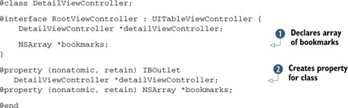
You add and to declare the array of bookmarks to be displayed in the table. For this example, the user can’t modify the bookmarks, so
the array is declared as an NSArray rather than an NSMutableArray.
Now that you have your declaration, let’s synthesize the property and populate the array with various bookmarks of your choice. Open RootViewController.m, and add the code in this listing.
Listing 7.6. Populating the dataset for the SplitViewController
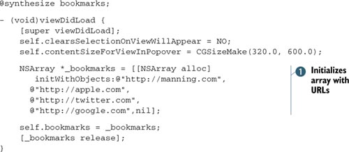
You’ve seen the first line earlier in the book: it synthesizes the bookmarks property, allowing getter and setter methods to be automatically created for it. You initialize the bookmarks array with strings , which are the URLs to be loaded when a given cell is selected. This declaration is similar to the first method implemented
in listing 7.2.
Now that your data has been initialized, you need to implement the delegate methods of the UITableViewController in the left pane of your SplitView.
Tableview Delegate Methods
Because the left pane is a UITableViewController, you’ll implement the same methods to interact with it that you did in listing 7.2. The following listing details the methods for displaying your array of bookmarks instead of the default data.
Listing 7.7. UITableViewDelegate methods for displaying bookmark data
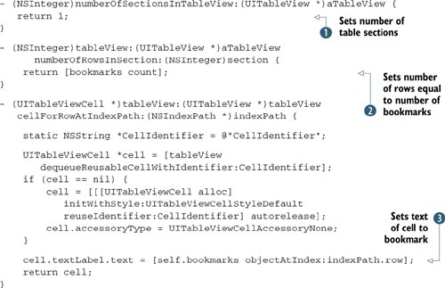
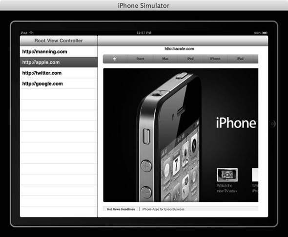
You first set the number of sections for the UITableView to 1 because your dataset doesn’t have any groupings . Next, you return the number of bookmarks in the array . As you’ve seen before, this denotes the number of cells to be displayed in the UITableView. Finally, you set the text of the cell to the URL string of the bookmark . At this point, the application has enough code to display the bookmarks; running it in the simulator looks like figure 7.13.
Figure 7.13. A first look at your bookmark application as shown on an iPad in landscape orientation
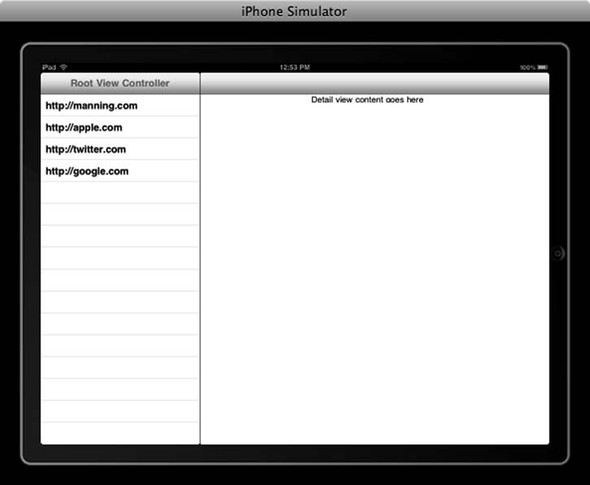
When you select a row in the table, the label updates with text that says something like “Row X”, where X is the row number selected.
Next, we’ll show you how to modify this view to do something a little more interesting. You’ll add a UIWebView to the DetailView and display the page of the selected URL inside it.
Modifying the Detailview
Start by opening DetailViewController.h and adding an IBOutlet for a UIWebView. The code is shown here.
Listing 7.8. Adding an IBOutlet for your UIWebView
@interface DetailViewController : UIViewController
     <UIPopoverControllerDelegate, UISplitViewControllerDelegate> {

    UIPopoverController *popoverController;
    UIToolbar *toolbar;

    id detailItem;
    UILabel *detailDescriptionLabel;

    UIWebView *webView;
}

@property (nonatomic, retain) IBOutlet UIToolbar *toolbar;

@property (nonatomic, retain) id detailItem;
@property (nonatomic, retain) IBOutlet UILabel *detailDescriptionLabel;

@property (nonatomic, retain) IBOutlet UIWebView *webView;

@end
At this point, the code should look pretty familiar. You declare an IBOutlet for a UIWebView. This gives you the ability to control the UIWebView from within your class. Now that the outlet has been added, be sure to synthesize it in the .m file.
Open DetailView.xib, and drag a UIWebView onto the main view. Move the label out of the way if necessary. Make sure you connect your webView outlet from the file’s Owner object to the UIWebView you place on the view. (If you don’t recall how to do this, refer to section 3.4.2.)
Now that all of your views have been created, it’s time to implement the code that actually does something.
7.4.3. Using your split view controller
As you did in section 7.2.4, you’ll implement the didSelectRowAtIndexPath delegate method of the UITableView to respond to the user tapping on a cell. In this example, the user taps on the cell to load the selected bookmark’s website in the UIWebView.
Open RootViewController.m, and modify the code as follows:
- (void)tableView:(UITableView *)aTableView
   didSelectRowAtIndexPath:(NSIndexPath *)indexPath {

       detailViewController.detailItem = [bookmarks
          objectAtIndex:indexPath.row];
}
You don’t modify the code much from the sample code given to you by the project template. Note that you set the detailItem of the detailViewController to your selected URL string. The data type of detailItem is id; this is a generic data type that can be set to any object, making the detailViewController class very dynamic.
Normally, in the didSelectRowAtIndexPath method, you’d initialize a new view controller, set its data, and push it onto the view stack. This isn’t the case when you’re dealing with a split view, because the detailViewController has already been initialized for you—you just want to modify its data.
The last step in displaying the web page is to tell the UIWebView to reload with the selected URL when the detailItem property is set. As mentioned earlier, when the detailItem property was synthesized, the getter and setter methods were automatically created. You can override either one of these methods to modify its functionality. This is what has been done in DetailViewController.m, because you want to update the interface when the detailItem property is modified. Although you won’t modify the code in this method, you do need to modify the code in a method called from it. Open DetailViewController.m, and update the configureView method to contain the following code:
- (void)configureView {
    detailDescriptionLabel.text = [detailItem description];
    NSURLRequest *request = [NSURLRequest
        requestWithURL: [NSURL URLWithString:[detailItem description]]];
    [self.webView loadRequest:request];
}
This code should look very familiar. It’s almost identical to the code you wrote in section 3.4.2 when loading the Apple stock into the web view. This code creates an NSURLRequest with the selected URL and loads it into the UIWebView.
When you run this code in the simulator, tapping on a row loads the selected URL in the web view. But one gotcha remains: the interface doesn’t look right when you switch from vertical to horizontal mode. To rotate the simulator, press Cmd-left arrow or Cmd-right arrow.
7.4.4. Adjusting the interface for vertical and landscape modes
Apple is very clear that all iPad-specific apps should work correctly in both portrait and landscape modes. This is in an effort to enforce the idea that there is no wrong way to hold the device.
Currently, your web view looks fine when the device is vertical, but it’s cut off when the device is rotated to be horizontal. To resolve this issue, you must implement the shouldAutorotateToInterfaceOrientation method of your DetailViewController.
You need to adjust the frame of all the view elements for a given device orientation. Doing so lets you position the view items correctly no matter how the user is holding the device. Update DetailViewController.m to include the following code.
Listing 7.9. Responding to device rotation
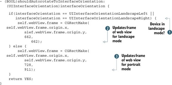
You first determine whether the device is being held in landscape mode . If so, you adjust the frame accordingly . Note that the numbers used to update the frame are picked based on personal preference—you should adjust the frame to what
you feel looks correct for the given orientation. Then, you update the frame of the WebView to look correct in portrait mode .
So far, you’ve explored the view controllers that you might use as the building blocks of your own views. Tab bars, navigators, flipsides, and split views are ultimately tools that you’ll use to construct other sorts of programs. But a couple types of view controllers exist to accomplish specific tasks: the modal view controller and the pop-over view controller.
7.5. Popover and modal view controllers
Technically, a modal view refers to a temporary view that’s placed on top of all the elements of an existing view and then later dismissed. A modal view controller is a view controller that manages such a modal view. The iPhone camera is an example of a view controller that has been presented modally.
The popover view is a lightweight view intended to display data in a specific area. It’s available to the iPad. In contrast to a modal view, the popover view doesn’t consume the entire screen; rather, it’s displayed as a context menu. In the previous example, the split view controller project template gave you a pop-over view for free when the device was in portrait mode.
7.5.1. Creating a popover view controller
A popover view controller is initialized with the view controller containing the view to be displayed inside it. Figure 7.14 shows what this looks like in the previous example when the device is held in portrait mode.
Figure 7.14. A popover view
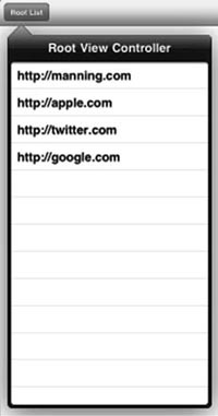
As you can see, it contains the data that is normally displayed in the table view on the left side of the split view. This list is displayed when the user presses the Root List button.
Let’s look at the code for displaying a popover view when a button is pressed, shown in the following listing. This code is taken from Apple’s example of working with popover view controllers.
Listing 7.10. Displaying a popover view when a button is pressed
- (IBAction) buttonPressed:(id) sender {
    MyCustomViewController* content = [[MyCustomViewController alloc]
       init];
    UIPopoverController* aPopover = [[UIPopoverController alloc]
       initWithContentViewController:content];
    aPopover.delegate = self;
    [content release];

    self.popoverController = aPopover;
    [aPopover release];

    [self.popoverController presentPopoverFromBarButtonItem:sender
       permittedArrowDirections:UIPopoverArrowDirectionAny animated:YES];
}
The pattern that this code follows should be fairly familiar to you. It’s similar to the code that handles a touch on a UITableView row. You first initialize the new view controller to display in; this controller is then used to initialize the popover. You basically tell the popover to display the view contents of the view controller it was initialized with.
Finally, you display the popover view near the button the user tapped. Fortunately, UIKit automatically handles the placing of the popover view for you. In addition, it allows you to configure the direction the arrow is pointing in, giving your popover some sort of context.
7.5.2. Creating a modal view controller
Practically, the modal views available in iOS are all “helper” programs. They let you start up a complex graphical interface that’s been preprogrammed by Apple while only managing the responses. You get the advantage of lots of programming (and a standardized interface), and you don’t have to do much yourself.
Whenever you want to display a modal view, you use the UIViewController’s presentModalViewController:animated: method to start it up:
[self presentModalViewController:myPicker animated:YES];
Later, you dismiss it using another UIViewController method:
[self dismissModalViewControllerAnimated::YES];
You can design your own modal view controllers for when you want to have users make a choice before you return them to the regular program. More commonly, you’ll use picker controllers that are intended to be run as modal view controllers.
In chapter 9, you’ll meet the Address Book UI people picker (as well as some related controllers that run inside a navigator), and in chapter 11 you’ll meet the image picker.
7.6. Combining view controllers in universal applications
You learned how to create view controllers inside your application or start an application by using the template under iOS projects. How do you combine these view controllers inside your application for both the iPhone and iPad? In this section, we will talk about how to design universal applications for both the iPhone and iPad and how to combine the view controllers inside the project.
7.6.1. Design universal applications for the iPhone and iPad
There are multiple ways to build a universal application running on both the iPhone and iPad. But think about the user experience before you start to work on the universal application for both the iPhone and iPad. Generally speaking, the application running on the iPhone is limited to the screen size. That’s why you commonly see the combination of table view controller and navigation controller on the iPhone. This pattern works great on the iPhone because the application’s content is well organized under the menu selection user interface, and the information is easy to spot on the go with only one-thumb navigation on the screen.
The split view controller template is created for the iPad only, simply because there is more space available on the iPad for content display and user interactions. The user would expect much more on an iPad application, not only because the content needs to be richer compared to the iPhone, but also because the navigation on the iPad is not limited to one thumb; multitouch gestures are commonly used.
The iPhone, as we mentioned earlier, is limited to 320 × 480 size for the full-screen display. Therefore, you often see navigation controllers with a table view controller as a menu-selection user interface.
When you design an application, it’s recommended that you study the difference in the users’ habits between the iPhone and iPad. Next, let’s talk about common cases for reusing view controllers in a universal application.
7.6.2. Combining view controllers
On the iPhone, you see a navigation controller as a parent view controller. A table view is the child view controller. Based on the user’s selection on the table view, you can present a modal view controller or other view controller for more detailed information. A good example would be the Messages application on the iPhone.
On the iPad, you often see the split view controller template with the popover controller as a menu selection user interface. For example, the Notes application on the iPad is designed based on the split view controller template.
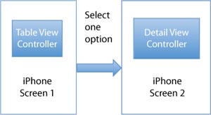
Let’s look at an example; you are about to design an application running on iPhone with a list of selections on table view. When you select one option, a detailed view controller will appear, as shown in figure 7.15.
Figure 7.15. The prototype for an iPhone application with a table view controller and a detail view controller
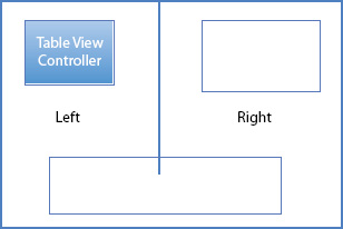
On iPad, the split view controller will be used at the root. Under landscape mode, the menu selection is on the left in the table view and the detailed view controller is on the right side, as shown in figure 7.16.
Figure 7.16. The prototype for an iPad with a split view controller contains a table view on the left and a detail view on the right.
Under portrait mode, the detailed view controller is on the screen. The menu selection becomes a button on the top screen. When you tap the button, the menu selection presents as a popover controller.
You can separate the view controllers between the iPhone and iPad. But that’s a lot of duplicate code inside this project. In this case, how do you reuse the view controllers in the iPhone on the iPad?
The common thing to do is to find the same view controllers in both projects. As shown in the prototype drawings, the table view for the menu selection and the detail view controller are in both the iPhone and iPad design.
Therefore, you can use the same detail view controller and table view controller as your split view controller’s detail view controller and master view controller, respectively.
Sometimes, drawing the prototype on a sketchbook is beneficial. This process helps developers to analyze the structure of the program.
There is more than one way to design a universal application. In this section, we first looked at the user interface design differences on the iPhone and iPad; then we talked about how to combine the view controllers in the universal application. I hope you find the design pattern useful in your own practice.
7.7. Summary
At this point, we’ve finished with what we consider the basic introduction to the SDK. Because this is an introductory SDK book, our main goal has been to show you all the fundamentals before we set you loose in the wilds of iPhone and iPad programming, so you have the building blocks you need when you begin programming on your own.
Let’s briefly review:
- The SDK is built on top of Objective-C and is supported by a large set of frameworks provided by iOS. (See chapters 1 and 2.)
- Programming can be done in either programmatically or visually, supporting two powerful ways to create objects. (See chapters 3 and 4.)
- Basic view controllers take the controller role of the MVC model and allow you to administer your views in a rational way. (See chapter 5.)
- Events provide low-level methods for seeing what a user is doing, whereas actions provide more sophisticated connections to buttons, sliders, text fields, and other tools. (See chapter 6.)
- Advanced view controllers provide you with a variety of ways to navigate among pages. (See chapter 7.)
Although we’ve completed our introduction to the iOS SDK, we’re not finished yet. Our next stop is an in-depth look at the many ways to input data into an application.