Hour 8. Handling Images, Animation, Sliders, and Steppers
,What You’ll Learn in This Hour:
 The use of sliders and steppers for user input
Configuring and manipulating slider and stepper input ranges
How to add image views to your projects
Ways of creating and controlling simple animations
How to change the appearance of the iOS status bar
The text input and output that you learned about in the preceding hour is certainly important, but iOS is known for its attractive graphics and “touchable” user interface (UI). This hour expands our interface toolkit to include images, animation, and the very touchable slider and stepper controls.
We’ll implement an application to combine these new features with some simple logic to manipulate input data in a unique way. These new capabilities will help you build more interesting and interactive applications—and of course, there’s more to come.
User Input and Output
Although application logic is always the most important part of an application, the way the interface works plays a big part in how well it will be received. For Apple and the iDevices, providing a fun, smooth, and beautiful user experience has been key to their success; it’s up to you to bring this experience into your own development. The iOS interface options give you the tools to express your application’s functionality in fun and unique ways.
This hour introduces three very visual interface features: sliders and steppers for input, and image views for output.
Sliders
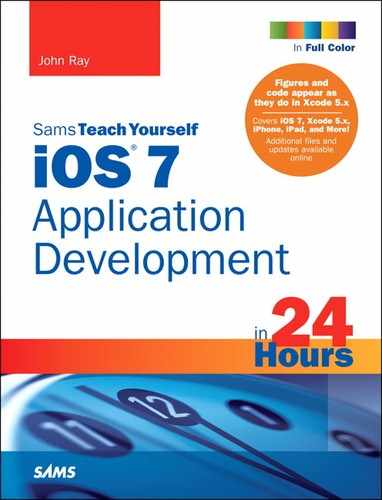
The first new interface component that we use this hour is a slider (UISlider). Sliders are a convenient touch control used to visually set a point within a range of values. Huh? What?
Suppose that you want your user to be able to speed something up or slow it down. Asking users to input timing values is unreasonable. Instead, you can present a slider, as shown in Figure 8.1, where they can touch and drag an indicator (called a thumb) back and forth on a line. Behind the scenes, a value property is being set that your application can access and use to set the speed. There is no need for users to understand the behind-the-scenes details or do anything more than drag with their fingers.
Sliders, like buttons, can react to events or can be read passively like a text field. If you want the user’s changes to a slider to immediately have an effect on your application, you must have it trigger an action.
Steppers
Similar to a slider is a stepper (UIStepper). Like a slider, a stepper offers a means of inputting a number from a range of values visually. How it accomplishes this, however, differs a bit. A stepper, shown in Figure 8.2, offers –/+ buttons in a single control. Pushing a side of the control decrements or increments an internal value property.

You can use steppers as alternatives to traditional text input fields for values, such as setting a timer or controlling the speed of an onscreen object. Because they do not provide an onscreen representation of their current internal value, you must make sure that when a stepper is used to update a portion of your interface that you indicate a change has been made.
Steppers provide the same range of events as sliders, making it possible to easily react to changes or read the internal value property at any time.
Image Views
Image views (UIImageView) do precisely what you’d think: They display images. You can add them to your application views, using them to present information to the user. You can even use an instance of UIImageView to create a simple frame-based animation with controls for starting, stopping, and even setting the speed at which the animation is shown.
With Retina display devices, your image views can even take advantage of the high-resolution display for crystal-clear images. Even better, you need no special coding. Instead of checking for a specific device, you can just add multiple images to your project, and the image view will load the right one at the right time. We do not go through all the steps to make this happen each time we use an image in this book, but later in this hour’s lesson, I do describe how you can add this capability to your projects.
Creating and Managing Image Animations, Sliders, and Steppers
There’s something about interface components that make users take notice. They’re visually interesting, attract and keep attention, and, on a touch screen, are fun to play with. In this hour’s project, we take advantage of all of our new UI elements (and some old friends) to create a user-controlled animation.
Implementation Overview
As mentioned earlier, image views can be used to display image file resources and show simple animations, whereas sliders provide a visual way to choose a value from a range. We’ll combine these in an application we’re calling ImageHop.
In ImageHop, we create a looping animation using a series of images and an image view instance (UIImageView). We allow the user to set the speed of the animation using a slider (UISlider). What will we use as an animation? A field of hopping bunnies. What will the user control? Hops per second for the “lead” bunny, of course. The “hops” value will be set by the slider and displayed in a label (UILabel). A stepper provides another way of changing the speed in precise increments. The user can also stop or start the animation using a button (UIButton).
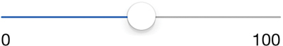
Figure 8.3 shows the completed application with the bunnies at rest.
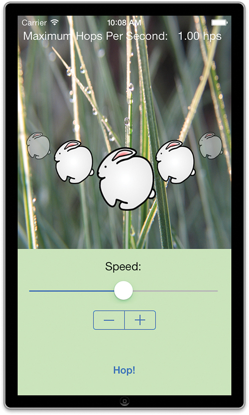
FIGURE 8.3 ImageHop uses image views, a slider, and a stepper to create and control a simple animation.
We should discuss two pieces of this project before getting too far into the implementation:
First, image view animations are created using a series of images. I’ve provided a 20-frame animation with this project, but you’re welcome to use your own images if you prefer.
Second, although steppers and sliders enable users to visually enter a value from a range, there isn’t much control over how that is accomplished. For example, the minimum value must be smaller than the maximum, and you can’t control which dragging direction of the slider (or which side of the stepper) increases or decreases the result value. These limitations aren’t showstoppers; they just mean that you might have to do a bit of math (or experimentation) to get the behavior you want.
1. Launch Xcode, and then choose File, New, Project.
2. Select the iOS Application project type, and then find and select the Single View Application option in the Template list on the right.
3. Click Next to continue.
4. Click Choose to continue.
5. Enter the project name ImageHop.
6. Be sure that the appropriate device is selected, and then click Next.
7. Choose a save location and click Create to generate the new project.
Adding the Animation Resources
This project makes use of 20 frames of animation stored as PNG files. The frames are included in the Images folder within the ImageHop project folder.
Because we know upfront that we need these images, we can add them to the project immediately. Open the project group in the project navigator area of Xcode. Click the main Images.xcassets file to open the project’s image assets. Now, drag the Images folder from the Finder into the column on the left inside the asset library. You’ll see a new Images folder appear within the assets library; this folder contains all the animation images we need for the project.
We can now access the image files easily within our code and the Interface Builder (IB) editor.
Planning the Properties and Connections
In this application, we need to provide outlets and actions for several objects.
A total of nine outlets are required. First we need five image views (UIImageView), which will contain the five copies of our bunny animation. These are referenced through the properties bunnyView1, bunnyView2, bunnyView3, bunnyView4, and bunnyView5. The slider control (UISlider) sets the speed and is connected via speedSlider, and the speed value itself is output in a label named hopsPerSecond (UILabel). A stepper control (UIStepper) gives another means of setting the speed and can be accessed with speedStepper.
Finally, a button (UIButton) toggles the animation on and off and is connected to an outlet toggleButton.
Why do we need an outlet for the button? Shouldn’t it just be triggering an action to toggle the animation? Yes, the button could be implemented without an outlet, but by including an outlet for it, we have a convenient way of setting the button’s title in the code. We can use this to change the button to read Stop when the image is animating or Start when the animation has stopped.
We need three actions. setSpeed is the method called when the slider value has changed and the animation speed needs to be reset. setIncrement serves a similar purpose and is called when the stepper control is used. And toggleAnimation is used to start and stop the animation sequence. As you’d expect, the properties and methods we use in this project will be private.
Now let’s create the UI.
Designing the Interface
With all the outlets and actions we just discussed, it might seem like creating the UI for ImageHop will be a nightmare. In reality, it’s quite simple because the five animation sequences are really just copies of a single image view (UIImageView). Once we add one, we can copy it four times almost instantly.
Adding an Image View
In this exercise, our view creation begins with the most important object of the project: the image view (UIImageView). Open the Main.storyboard file, access the Object Library, and drag an image view into the application’s view.
Because the view has no images assigned, it is represented by a light-gray rectangle. Use the selection handles on the rectangle to size it to fit in the upper center of the interface (see Figure 8.4).
Setting the Default Image
There are very few properties for configuring the functionality of an image view. We are interested in the image property: the image that is going to be displayed. Select the image view and press Option-Command-4 to open the Attributes Inspector (see Figure 8.5).
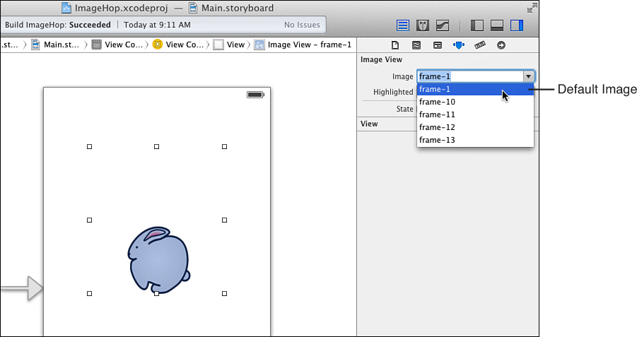
Using the Image drop-down menu, choose one of the image resources available. This is the default image that is shown before the animation runs, so using the first frame (frame-1) is a good choice.
The image view updates in IB to show the image resource that you’ve chosen.
What about the animation? Isn’t this just a frame? Yes, if we don’t do anything else, the image view shows a single static image. To display an animation, we need to create an array with all the frames and supply it programmatically to the image view object. We do this in a few minutes, so just hang in there.
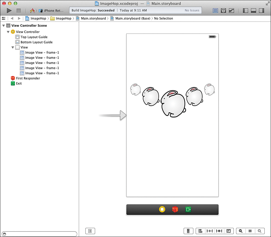
Making Copies
After you’ve added the image view, create four additional copies by selecting it in your UI and choosing Edit, Duplicate (Command-D) from the menu. Scale and position the copies around the first image view. Don’t worry if there is some overlap between the image views; this does not affect the application at all. For my implementation, I also used the Attributes Inspector (Option-Command-4) to set an alpha of .75 and .50 on some of the image views to make them partially transparent.
You’ve just created your field of bunnies. Your display should now resemble Figure 8.6.
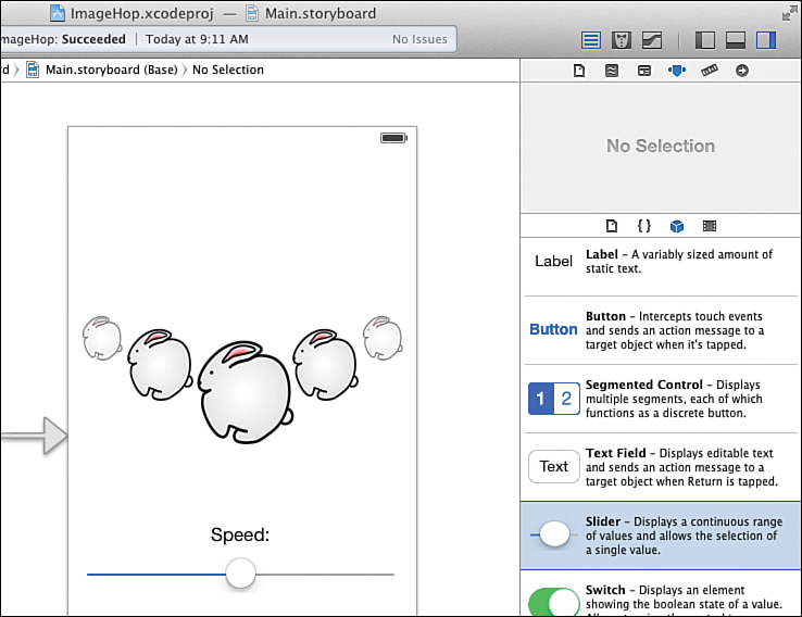
Adding a Slider
The next piece that our interface needs is the slider that will control the speed. Open the Object Library and drag the slider (UISlider) into the view, under the image views. Using the selection handles on the slider, click and drag to size it to take up width of the view, using the alignment guides to leave an appropriate space on the left and right.
Because a slider has no visual indication of its purpose, it’s a good idea to always label sliders so that your users will understand what they do. Drag a label object (UILabel) from the library into your view (just above the slider). Double-click the text and set it to read Speed:. Position it so that it is center-aligned with the slider, as shown in Figure 8.7.
Setting the Slider Range Attributes
Sliders make their current settings available through a value property that we’ll be accessing in the view controller. To change the range of values that can be returned, we need to edit the slider attributes. Click to select the slider in the view, and then open the Attributes Inspector (Option-Command-4), as shown in Figure 8.8.
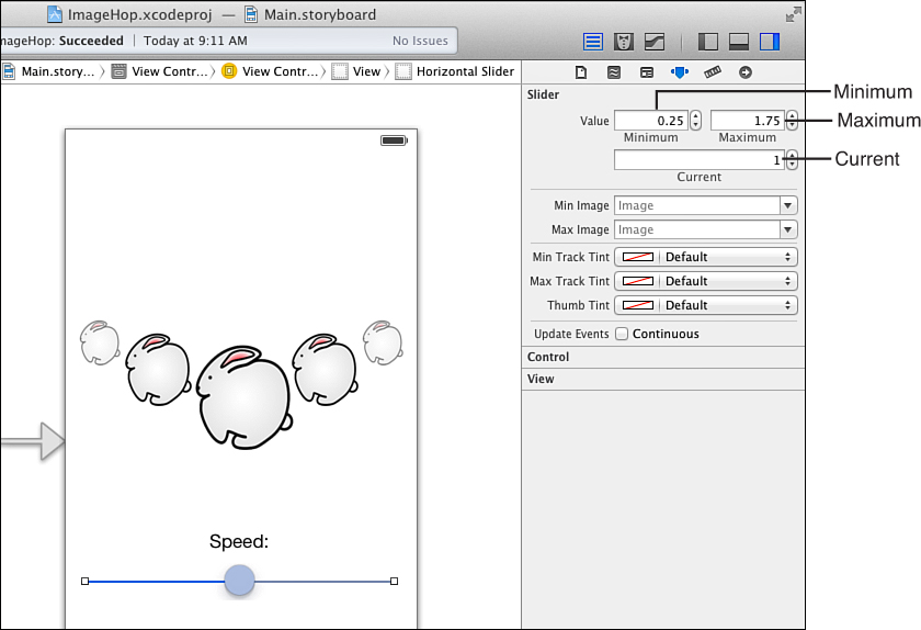
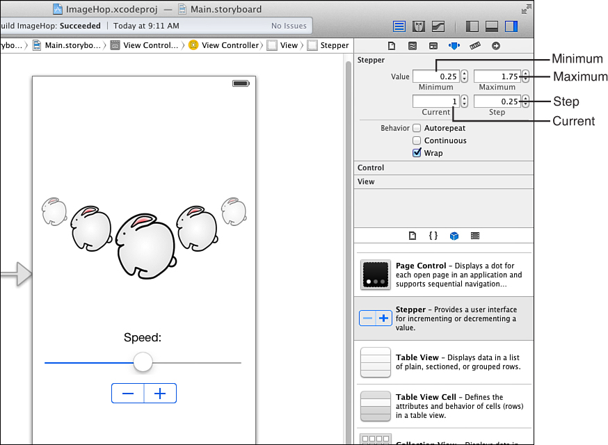
You should change the Minimum, Maximum, and Initial fields to contain the smallest, largest, and starting values for the slider. For this project, use .25, 1.75, and 1.0, respectively.
Make sure the Continuous check box is not checked. This option, when enabled, has the control to generate a series of events as the user drags back and forth on the slider. When it isn’t enabled, events are generated only when users lifts their finger from the screen. For our application, this makes the most sense and is certainly the least resource-intensive option.
You can also configure the slider with images at the minimum and maximum sliders of the control. Use the Min Image and Max Image drop-downs to select a project image resource if you want to use this feature. (We do not use it in this project.)
Adding a Stepper
With the slider in place, our next UI element is the stepper. Using the Object Library, drag a stepper button (UIStepper) into the view. Position the stepper directly below, and centered on, the slider, as shown in Figure 8.9.
Setting the Stepper Range Attributes
Once the stepper is added, you must configure its range attributes just as you did the slider. Ultimately, we want to use the value property of the stepper to change the speed in exactly the same way as with the slider, so the closer the two elements mirror one another, the better.
To set the range allowed on the stepper, select it in the view, and then open the Attributes Inspector (Option-Command-4). Again, provide .25, 1.75, and 1.0 for the Minimum, Maximum, and Current (initial) values for the stepper. Set the step value to .25. This is the amount added to or subtracted from the current value when the stepper is pressed.
Use the Behavior check box to turn off Autorepeating, meaning that the user will not be able to press and hold to continue incrementing or decrementing the stepper’s value. You should also uncheck the Continuous check box so that only distinct events are generated when the user finishes interacting with the control. Finally, turn on the Wrap behavior. Wrap, when on, automatically sets the stepper’s value to the minimum value when the maximum is exceeded (or vice versa), effectively wrapping around the range of values it can represent. If Wrap is off, the stepper stops at the minimum or maximum value and does not change. Figure 8.9 shows the final stepper configuration in the Attributes Inspector.
Finishing the Interface
The remaining components of the ImageHop application are interface features that you’ve used before, so we’ve saved them for last. We finish things up by adding a button to start and stop the animation, a readout of the speed of the lead animated rabbit in maximum hops per second, and a pretty background for the bunnies to hop on.
Adding the Speed Output Labels
Drag two labels (UILabel) to the top of the view. The first label should be set to read Maximum Hops Per Second: and be located in the upper left of the view. Add the second label, which is used as output of the actual speed value, to the right of the first label.
Change the output label to read 1.00 hps. (The speed that the animation will be starting out at.) Using the Attributes Inspector (Option-Command-4), set the text of the label to align right; this keeps the text from jumping around as the user changes the speed.
Adding the Hop Button
The last functional part of the ImageHop interface is the button (UIButton) that starts and stops the animation. Drag a new button from the Object Library to the view and positioning it at the bottom center of the UI. Double-click the button to edit the title and set it to Hop!
Setting a Background Graphic and Color
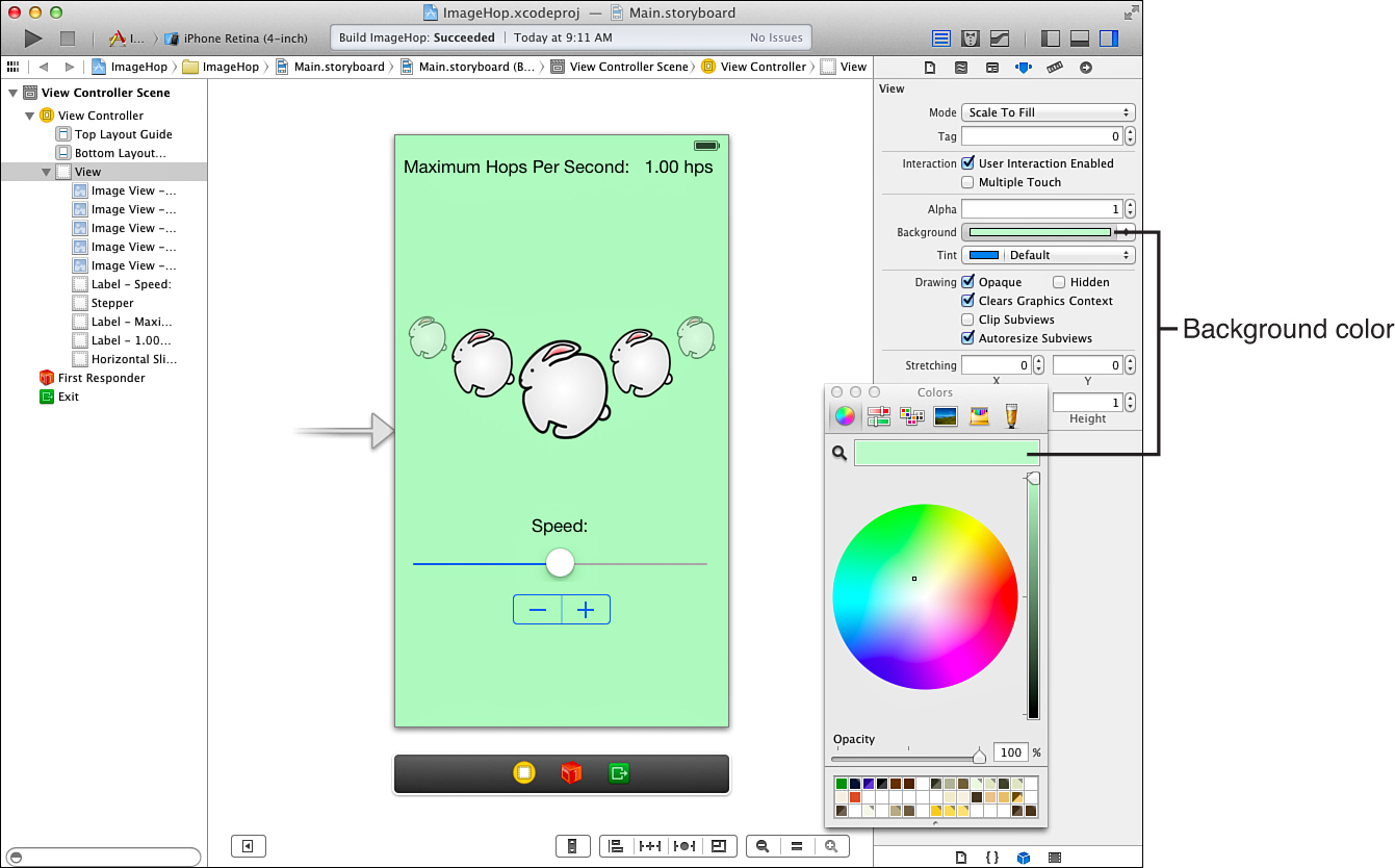
For fun, we can spruce up the application a bit by toning down the blinding-white screen that the iOS views use by default. To do this, click the View icon in the document outline and open the Attributes Inspector (Option-Command-4). Use the Background attribute to set a green background for the application, as shown in Figure 8.10.
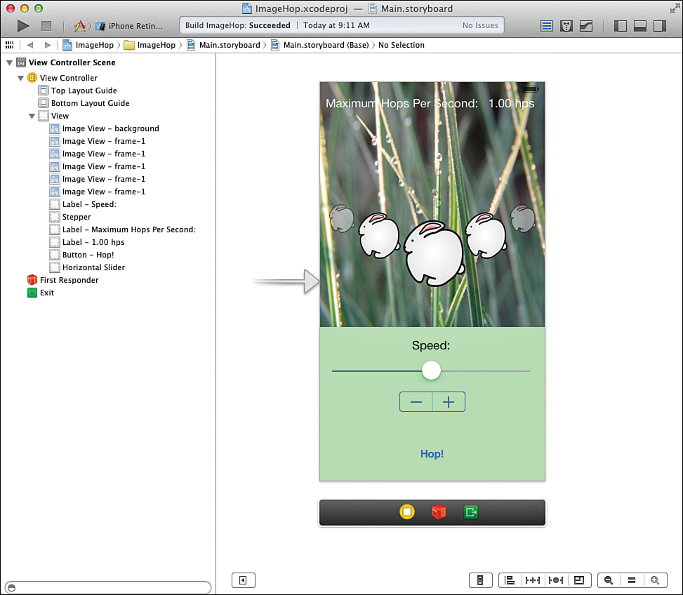
In addition to the color, it would be great if the bunnies could be hopping in grass, wouldn’t it? (Bunnies like grass.) To add a background image, drag another instance of UIImageView to the view. Resize it to cover the image views that contain the bunny animations and stretch all the way to the top of the view. Use Editor, Arrange, Send to Back to place the background image view behind the animation image views and the “hops per second” labels.
With the background image view selected, use the Attributes Inspector to set the Image value to the background image resource that you added earlier in this hour.
Notice that now the “hops per second” labels are difficult to read. To fix this, select the labels and use the Attributes Inspector to set their color to white. Figure 8.11 shows the final application interface.
With that, it’s time to create the outlets and actions and begin coding.
Creating and Connecting the Outlets and Actions
Whew! That’s the most complicated application interface we’ve had to deal with yet. Reviewing what we’ve done, we have a total of nine outlets that need to be created, along with three actions.
In case you don’t recall what these were, let’s review, starting with the outlets:
Bunny animations (UIImageView): bunnyView1, bunnyView2, bunnyView3, bunnyView4, and bunnyView5
Slider speed setting (UISlider): speedSlider
Stepper speed setting (UIStepper): speedStepper
Maximum speed readout (UILabel): hopsPerSecond
Hop/Stop button (UIButton): toggleButton
And the actions:
Start/stop the animation using the Hop/Stop button: toggleAnimation
Set the speed with the slider changes: setSpeed
Set the speed when the stepper changes: setIncrement
Prepare your workspace for making the connections. Make sure that the Main.storyboard file is open in the IB editor and switch to the assistant editor mode. If the ViewController.m file isn’t picked by default, select it from the bar at the top of the editor. Your UI design and the ViewController.m file should be visible side by side.
Adding the Outlets
Start by Control-dragging from the main ImageView instance (the large bunny) to the line following the @interface directive in the ViewController.m file. When prompted, be sure to configure the connection as an outlet and the name as bunnyView1, leaving the other values set to their defaults (type UIImageView, storage Weak), as shown in Figure 8.12.
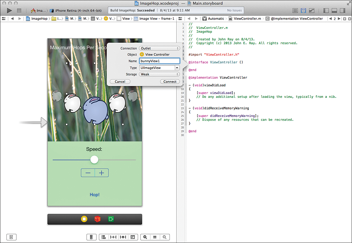
Repeat the process for the remaining images views that we want to animate, targeting each successive connection below the last @property line that was added. It doesn’t matter which bunny is bunnyView2, bunnyView3, bunnyView4, or bunnyView5, just as long as they’re all connected.
After connecting the image views, proceed with the rest of the connections. Control-drag from the slider (UISlider) to the line under the last @property declaration and add a new outlet named speedSlider. Do the same for the stepper (UIStepper), adding an outlet named speedStepper. Finish off by connecting the hops per second output UILabel (1.00 hps initially) to hopsPerSecond and the Hop! UIButton to toggleButton.
Our outlets are finished. Let’s take care of our actions.
Adding the Actions
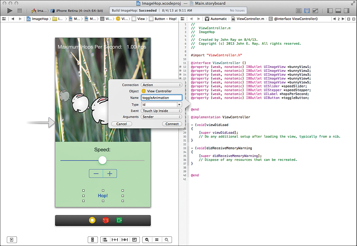
This project requires three distinct actions. The first, toggleAnimation, is triggered when the user presses the Hop! button, and it starts the animation sequence. Add a definition for this action by Control-dragging from the button in your interface to a line below the property declarations. When prompted, set the connection type to Action and provide toggleAnimation as the name, leaving all other values as the defaults, as shown in Figure 8.13.
Next, Control-drag from the slider to a line below the just-added IBAction line. Create an action named setSpeed that is triggered from the UISlider’s Value Changed event.
Finally, create the third action, this one triggered from the stepper, naming it setIncrement and again using the Value Changed event.
To check your work, the @interface block at the top of your ViewController.m file should now resemble Listing 8.1.
LISTING 8.1 The Completed ViewController.h Interface File
@interface ViewController ()
@property (weak, nonatomic) IBOutlet UIImageView *bunnyView1;
@property (weak, nonatomic) IBOutlet UIImageView *bunnyView2;
@property (weak, nonatomic) IBOutlet UIImageView *bunnyView3;
@property (weak, nonatomic) IBOutlet UIImageView *bunnyView4;
@property (weak, nonatomic) IBOutlet UIImageView *bunnyView5;
@property (weak, nonatomic) IBOutlet UISlider *speedSlider;
@property (weak, nonatomic) IBOutlet UIStepper *speedStepper;
@property (weak, nonatomic) IBOutlet UILabel *hopsPerSecond;
@property (weak, nonatomic) IBOutlet UIButton *toggleButton;
- (IBAction)toggleAnimation:(id)sender;
- (IBAction)setSpeed:(id)sender;
- (IBAction)setIncrement:(id)sender;
@end
We’re ready to start coding the implementation of our magical hopping bunny animation. Surprisingly, the code needed to make this work is really quite minimal.
Implementing the Application Logic
The view controller needs to manage a total of four different things to make our application work as we envision.
First, we need to load the image animations for each of the ImageViews (bunnyView1, bunnyView2, and so on); we managed to set a static frame of the image in IB, but that isn’t enough to make them animate. Next, we must to implement toggleAnimation so that we can start and stop the onscreen animation from the Hop! button. Finally, the setSpeed and setIncrement methods must be written to control the maximum speed of the animations.
Implementing Animated Image Views
Animating images requires us to build an array of image objects (UIImage) and pass them to an image view object. Where should we do this? As with setting button templates in the last hour’s project, the ViewDidLoad method of our view controller provides a convenient location for doing additional setup for the view, so that’s what we’ll use.
Using the project navigator, open the view controller implementation file, ViewController.m. Find the ViewDidLoad method, and then add the following code to the method. Note the removal of lines 10–23 to save space (they follow the same pattern as lines 7–9 and 24–26), as shown in Listing 8.2.
LISTING 8.2 Loading the Animation
1: - (void)viewDidLoad
2: {
3: [super viewDidLoad];
4: // Do any additional setup after loading the view, usually from a nib.
5: NSArray *hopAnimation;
6: hopAnimation=@[
7: [UIImage imageNamed:@"frame-1.png"],
8: [UIImage imageNamed:@"frame-2.png"],
9: [UIImage imageNamed:@"frame-3.png"],
...
24: [UIImage imageNamed:@"frame-18.png"],
25: [UIImage imageNamed:@"frame-19.png"],
26: [UIImage imageNamed:@"frame-20.png"],
27: ];
28: self.bunnyView1.animationImages=hopAnimation;
29: self.bunnyView2.animationImages=hopAnimation;
30: self.bunnyView3.animationImages=hopAnimation;
31: self.bunnyView4.animationImages=hopAnimation;
32: self.bunnyView5.animationImages=hopAnimation;
33: self.bunnyView1.animationDuration=1;
34: self.bunnyView2.animationDuration=1;
35: self.bunnyView3.animationDuration=1;
36: self.bunnyView4.animationDuration=1;
37: self.bunnyView5.animationDuration=1;
38: }
To configure the image views for animation, first an array (NSArray) variable is declared (line 5) called hopAnimation. Next, in line 6, the array is started with @[. By initializing an array in this method, all we have to do is provide a comma-separated list of objects followed by a closing bracket, ].
The image objects (UIImage) are initialized and added to the array in lines 7–26. Remember that you need to fill in lines 10–23 on your own; otherwise, several frames will be missing from the animation.
Once an array is populated with image objects, you can use it to set up the animation of an image view. To do this, set the animationImages property of the image view to the array. Lines 28–32 accomplish this for bunnyView1 through bunnyView5 in our sample project.
Another UIImageView property that we want to set right away is the animationDuration. This is the number of seconds it takes for a single cycle of the animation to be played. If the duration is not set, the playback rate is 30 frames per second. To start, our animations are set to play all the frames in 1 second, so lines 33–37 set the animationDuration to 1 for each bunnyView UIImageView.
We’ve now configured all five of our image views to be animated, but even if we build and run the project, nothing is going to happen. That’s because we haven’t added controls for actually starting the animation.
Starting and Stopping the Animation
You’ve just learned how the animationDuration property can change the animation speed, but we need three more properties/methods to actually display the animation and accomplish everything we want:
isAnimating: This property returns true if the image view is currently animating its contents.
startAnimating: This starts the animation.
stopAnimating: This stops the animation if it is running.
When the user touches the Hop! button, the toggleAnimation method is called. This method should use the isAnimating property of one of our image views (bunnyView1, for example) to check to see whether an animation is running. If it isn’t, the animation should start; otherwise, it should stop. To make sure that the user interface makes sense, you should alter the button itself (toggleButton) to show the title Sit Still! if the animation is running and Hop! when it isn’t.
Add the code in Listing 8.3 to the toggleAnimation method in your view controller implementation file.
LISTING 8.3 Starting and Stopping the Animation in toggleAnimation
1: - (IBAction)toggleAnimation:(id)sender {
2: if (self.bunnyView1.isAnimating) {
3: [self.bunnyView1 stopAnimating];
4: [self.bunnyView2 stopAnimating];
5: [self.bunnyView3 stopAnimating];
6: [self.bunnyView4 stopAnimating];
7: [self.bunnyView5 stopAnimating];
8: [self.toggleButton setTitle:@"Hop!"
9: forState:UIControlStateNormal];
10: } else {
11: [self.bunnyView1 startAnimating];
12: [self.bunnyView2 startAnimating];
13: [self.bunnyView3 startAnimating];
14: [self.bunnyView4 startAnimating];
15: [self.bunnyView5 startAnimating];
16: [self.toggleButton setTitle:@"Sit Still!"
17: forState:UIControlStateNormal];
18: }
19: }
Lines 2 and 10 provide the two different conditions that we need to work with. Lines 3–9 are executed if the animation is running, and lines 11–17 are executed if it isn’t. In lines 3–7 and lines 11–15, the stopAnimating and startAnimating methods are called for the image view to stop and start the animation, respectively.
Lines 8–9 and 16–17 use the UIButton instance method setTitle:forState to set the button title to the string "Hop!" or "Sit Still!". These titles are set for the button state of UIControlStateNormal. The normal state for a button is its default state, prior to any user event taking place.
At this point, if you’re really anxious, you can run the application and start and stop the animation. That said, we’ve only got a few more lines of code required to set the animation speed, so let’s move on.
Setting the Animation Speed
The slider triggers the setSpeed action after the user adjusts the slider control. This action must translate into several changes in the actual application: First, the speed of the animation (animationDuration) should change. Second, the animation should be started if it isn’t already running. Third, the button (toggleButton) title should be updated to show the animation is running. And finally, the speed should be displayed in the hopsPerSecond label.
Add the code in Listing 8.4 to the setSpeed method stub view controller, and then let’s review how it works.
LISTING 8.4 The Completed setSpeed Method
1: - (IBAction)setSpeed:(id)sender {
2: NSString *hopRateString;
3:
4: self.bunnyView1.animationDuration=2-self.speedSlider.value;
5: self.bunnyView2.animationDuration=
6: self.bunnyView1.animationDuration+((float)(rand()%11+1)/10);
7: self.bunnyView3.animationDuration=
8: self.bunnyView1.animationDuration+((float)(rand()%11+1)/10);
9: self.bunnyView4.animationDuration=
10: self.bunnyView1.animationDuration+((float)(rand()%11+1)/10);
11: self.bunnyView5.animationDuration=
12: self.bunnyView1.animationDuration+((float)(rand()%11+1)/10);
13:
14: [self.bunnyView1 startAnimating];
15: [self.bunnyView2 startAnimating];
16: [self.bunnyView3 startAnimating];
17: [self.bunnyView4 startAnimating];
18: [self.bunnyView5 startAnimating];
19:
20: [self.toggleButton setTitle:@"Sit Still!"
21: forState:UIControlStateNormal];
22:
23: hopRateString=[NSString
24: stringWithFormat:@"%1.2f hps",1/(2-self.speedSlider.value)];
25: self.hopsPerSecond.text=hopRateString;
26: }
Because we need to format a string to display the speed, we kick things off in line 2 by declaring an NSString reference, hopRateString. In line 4, the bunnyView1 animationDuration property is set to 2 minus the value of the slider (speedSlider.value); this sets the speed of our “lead” bunny animation. This, if you recall, is necessary to reverse the scale so that faster is on the right and slower is on the left.
Lines 5–12 set the remaining image animations to the same speed as the lead animation (bunnyView1.animationDuration) plus a fraction of a second. How do we get this fraction of a second? Through the magic of this randomization function: ((float)(rand()%11+1)/10). The function rand()%11+1 returns a random number between 1 and 10. We divide this by 10 to give us a fraction (1/10, 2/10, and so on). Using float ensures that we get a floating-point result rather than an integer.
Lines 14–18 use the startAnimating method to start the animations running. Note that it is safe to use this method if the animation is already started, so we don’t really need to check the state of the image view. Lines 20–21 set the button title to the string “Sit Still!” to reflect the animated state.
Lines 23–24 create the hopRateString instance that we declared in line 2. The string is initialized with a format of "1.2f", based on the calculation of 1/(2-animationSpeed.value).
Let’s break that down a bit further: Remember that the speed of the animation is measured in seconds. The fastest speed we can set is 0.25 (a quarter of a second), meaning that the animation plays four times in 1 second (or four hops per second). To calculate this in the application, we simply divide 1 by the chosen animation duration, or 1/(2-animationSpeed.value). Because this doesn’t necessarily return a whole number, we use the stringWithFormat method to create a string that holds a nicely formatted version of the result. The stringWithFormat parameter string "%1.2f hps" is shorthand for saying the number being formatted as a string is a floating-point value (f) and that there should always be one digit on the left of the decimal and two digits on the right (1.2). The hps portion of the format is just the hops per second unit that we want to append to the end of the string. For example, if the equation returns a value of .5 (half a hop a second), the string stored in hopRateString is set to "0.50 hps".
In line 25, the output label (UILabel) in the interface is set to the hopRateString.
With that, the slider speed control is in place. Just one more method to implement: setIncrement, triggered by the UIStepper (speedStepper) interface object.
Note
Don’t worry if the math here is a bit befuddling. This is not critical to understanding Cocoa or iOS development, it’s just an annoying manipulation we needed to perform to get the values the way we want them. I strongly urge you to play with the slider values and calculations as much as you want so that you can get a better sense of what is happening here and what steps you might need to take to make the best use of slider ranges in your own applications.
Incrementing the Animation Speed
This hour’s lesson has been pretty intensive, and, if you’re like me, your fingers are probably getting tired of clicking and typing. The bad news is that we aren’t quite done; we still need to implement the setIncrement method. The good news? It takes two lines to complete.
Given all the work required to set the speed with the slider, how is this possible? Quite simple. Because we configured the stepper to generate the same values as the slider, we set the slider’s value property to the value property of the stepper. When that is done, we can manually call the setSpeed method and everything will just work.
Update the setIncrement method stub in your view controller to read as shown in Listing 8.5.
LISTING 8.5 Implementing the setIncrement Method
- (IBAction)setIncrement:(id)sender {
self.speedSlider.value=self.speedStepper.value;
[self setSpeed:nil];
}
The first line, as expected, sets the value property of the slider to the value property of the stepper. While this will trigger the slider to update visually in your interface, it won’t trigger its Value Changed event and call the setSpeed method. We do that manually by sending the setSpeed message to self (the view controller object).
Note
Notice that nil is passed as a parameter when we call setSpeed. By default, action methods are created with a sender parameter that is automatically set to the object that triggered the action. The method can then examine the sender and react accordingly.
In the case of setSpeed, we never used the sender variable in the implementation, so just sending the nil value satisfies the method’s requirement for a parameter, and everything works as expected.
One More Thing... Fixing That Unreadable Status Bar
If you build your application, it will run and behave just as we planned. Unfortunately, you’ll have an iOS 7 status bar that doesn’t quite fit with your background. Instead of a dark status bar lost on a background of lush beautiful grass, wouldn’t it be great to have a light status bar that you can actually read? Unfortunately, there isn’t an IB setting to make this happen; but fixing it is simple. Add the code in Listing 8.6 to your ViewController.m file.
LISTING 8.6 Setting the Status Bar Appearance in preferredStatusBarStyle
-(UIStatusBarStyle)preferredStatusBarStyle{
return UIStatusBarStyleLightContent;
}
This method, added to your view controller, tells iOS what kind of status bar it should display. You can choose from UIStatusBarStyleDefault (a dark status bar) or UIStatusBarStyleLightContent (a light status bar).
Well done. With the inclusion of the status bar fix, you’ve just completed the app.
Building the Application
To try your hand at controlling an out-of-control bunny rabbit, click Run on the Xcode toolbar. After a few seconds, the finished ImageHop application will start, as shown in Figure 8.14.
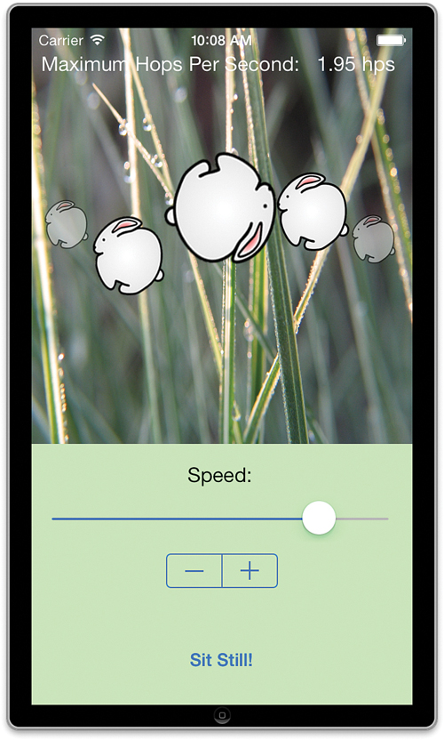
Although ImageHop isn’t an application that you’re likely to keep on your device (for long), it did provide you with new tools for your iOS application toolkit. The UIImageView class can easily add dynamic images to your programs, and UISlider and UIStepper offer uniquely touchable input solutions.
Further Exploration
Although many hours in this book focus on adding features to the UI, it is important to start thinking about the application logic that will bring your user interface to life. As we experienced with our sample application, sometimes creativity is required to make things work the way we want.
Review the properties and methods for UISlider and UIStepper classes and consider how you might use these elements in your own apps. Can you think of any situations where the stepper values couldn’t be used directly in your software? How might you apply application logic to map slider values to usable input? Programming is very much about problem solving; you’ll rarely write something that doesn’t have at least a few “gotchas” that need solved.
In addition to UISlider and UIStepper, you may want to review the documentation for UIImage. Although we focused on UIImageView for displaying our image animation, the images themselves were objects of type UIImage. Image objects will come in handy for future interfaces that integrate graphics into the user controls themselves.
Finally, for a complete picture of how your applications will almost automatically take advantage of the higher-resolution Retina display, be sure to read the section “Supporting High-Resolution Screens in Views” within the Drawing and Printing Guide for iOS.
Apple Tutorials
UIImageView, UIImage, UISlider – UICatalog (accessible via the Xcode developer documentation): Once again, this project is a great place for exploring any and everything (including images, image views, and sliders) related to the iOS interface capabilities.
Summary
Users of highly visual devices demand highly visual interfaces. In this hour’s lesson, you learned about the use of three visual elements that you can begin adding to your applications: image views, sliders, and steppers. Image views provide a quick means of displaying images that you’ve added to your project—even using a sequence of images to create animation. Sliders can be used to collect user input from a continuous range of values. Steppers also provide user input over a range of numbers, but in a more controlled, incremental fashion. These new input/output methods start our exploration of iOS interfaces that go beyond simple text and buttons.
Although not complex, the information you learned in this hour will help pave the way for mega-rich, touch-centric user interfaces.
Q&A
Q. Is the UIImageView the only means of displaying animated movies?
A. No. iOS includes a wide range of options for playing back and even recording video files. The UIImageView is not meant to be used as a video playback mechanism.
Q. Is there a vertical version of the slider control (UISlider)?
A. Not really. Only the horizontal slider is currently available in the iOS UI library. If you want to use a vertical slider control, you can use the horizontal slider, but apply a transformation (basically “spin” it in code). For example, if your slider property is named mySlider, you could add the following to viewDidLoad to turn it into a vertical slider:
CGAffineTransform transformSlider = CGAffineTransformMakeRotation(-M_PI_2);
self.mySlider.transform = transformSlider;
Workshop
Quiz
1. What is one of the limitations shared by the slider and stepper controls (UISlider and UIStepper)?
2. What is the default playback rate for an animation prior to the animationDuration property being set?
3. What is the value of the isAnimating property in an instance of UIImageView?
Answers
1. Both must work with a range of numbers that goes from small to large. They cannot directly map to a range of numbers where a negative number is considered the maximum and a positive is the minimum. This can be overcome, but not without programmatically manipulating the numbers.
2. By default, animation frames are shown at a rate of 30 frames per second.
3. The isAnimating property is set to true when the UIImageView instance is displaying an animation. When the animation is stopped (or not configured), the property is false.
Activities
1. Increase the range of speed options for the ImageHop animation example. Be sure to set the default value for the slider thumb to rest in the middle and update the stepper accordingly.
2. Provide an alternative means of editing the speed by enabling the user to manually enter a number in addition to using the slider. The placeholder text of the field should default to the current slider value.