Hour 7. Working with Text, Keyboards, and Buttons
,What You’ll Learn in This Hour:
 How to use text fields
Input and output in scrollable text views
How to enable data detectors
A way to spruce up the standard iOS buttons
In the preceding hour, you explored views and view controllers and created a simple application that accepted user input and generated output when a button was pushed. This hour expands on these basic building blocks. In this hour, we create an application that uses multiple different input and output techniques. You learn how to implement and use editable text fields, text views, and graphical buttons, and how to configure the onscreen keyboard.
This is quite a bit of material to cover in an hour, but the concepts are very similar, and you’ll quickly get the hang of these new elements.
Basic User Input and Output
iOS gives us many different ways of displaying information to a user and collecting feedback. There are so many ways, in fact, that we’re going to be spending the next several hours working through the tools that the iOS software development kit (SDK) provides for interacting with your users, starting with the basics.
Buttons
One of the most common interactions you’ll have with your users is detecting and reacting to the touch of a button (UIButton). Buttons, as you may recall, are elements of a view that respond to an event that the user triggers in the interface, usually a Touch Up Inside event to indicate that the user’s finger was on a button and then released it. Once an event is detected, it can trigger an action (IBAction) within a corresponding view controller.
Buttons are used for everything from providing preset answers to questions to triggering motions within a game. Although the default iOS button style is minimalist, buttons can take on many different forms through the use of images. Figure 7.1 shows an example of a fancy button with gradients.

Text Fields and Views
Another common input mechanism is a text field. Text fields (UITextField) give users space to enter any information they want into a single line in the application; these are similar to the form fields in a web form. When users enter data into a field, you can constrain their input to numbers or text by using different iOS keyboards, something we do later this hour. You can also enable editing of styles within the text, such as underlining and bold. Text fields, like buttons, can respond to events but are often implemented as passive interface elements, meaning that their contents (provided through the text property) can be read at any time by the view controller.
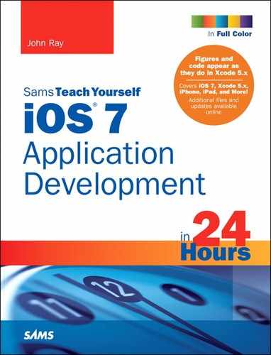
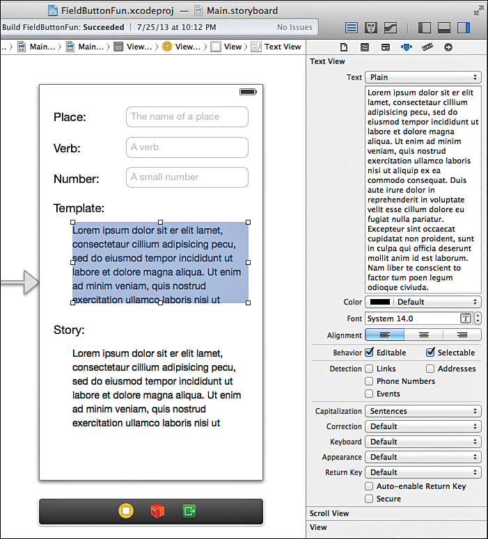
Similar to the text field is the text view (UITextView). The difference is a text view can present a scrollable and editable block of text for the user to either read or modify. These should be used in cases where more than a few words of input are required. Figure 7.2 shows examples of a text field and text view.
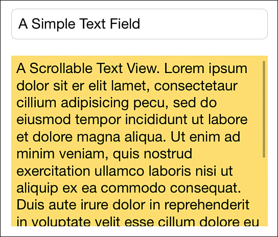
FIGURE 7.2 Text fields and text views provide a means for entering text using a device’s virtual keyboard.
Labels
The final interface feature that we’re going to be using here and throughout this book is the label (UILabel). Labels are used to display strings within a view by setting their text property.
The text within a label can be controlled via a wide range of label attributes, such as font and text size, alignment, and color. As you’ll see, labels are useful both for static text in a view and for presenting dynamic output that you generate in your code.
Now that you have basic insight into the input and output tools we’ll be using in this hour, let’s go ahead and get started with our project: a simple substitution-style story generator.
Using Text Fields, Text Views, and Buttons
Although not everyone will agree with my sentiment, I enjoy entering text on my iPhone and iPad. The virtual keyboard is responsive and simple to navigate. What’s more, the input process can be altered to constrain the user’s input to only numbers, only letters, or other variations. (This varies depending on device.) You can have iOS automatically correct simple misspellings, allow text styling, or capitalize letters—all without a line of code. This project reviews many aspects of the text input process.
Implementation Overview
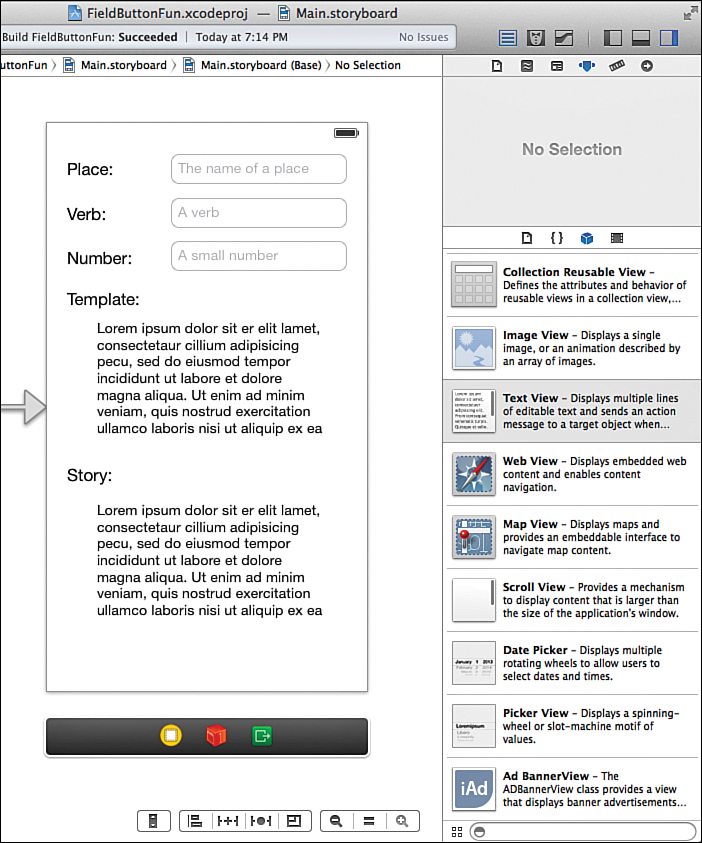
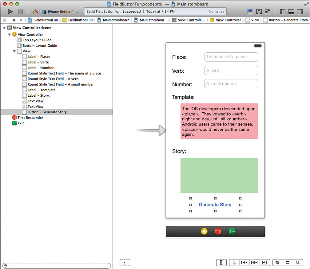
In this project, we create a Mad Libs-style story creator. Users enter a noun (place), verb, and number through three text fields (UITextField). They may also enter or modify a template that contains the outline of the story to be generated. Because the template can be several lines long, we use a text view (UITextView) to present this information. A button press (UIButton) triggers an action that generates the story and outputs the finished text in another text view, demonstrated in Figure 7.3.

Although not directly part of the input or output process, we also investigate how to implement the now-expected “touch the background to make the keyboard disappear” interface standard, along with a few other important points. In other words, pay attention!
We’ll name this tutorial project FieldButtonFun. You may certainly use something more creative if you want.
Setting Up the Project
This project uses the same Single View Application template as the preceding hour. If it isn’t already running, launch Xcode, and then complete these steps:
1. Choose File, New, Project.
2. Select the iOS application project type.
3. Find and select the Single View Application option in the Template list, and then click Next to continue.
4. Enter the project name, FieldButtonFun, be sure that your device is chosen, and then click Next.
5. Choose your save location and click Create to set up the new project.
As before, we focus on the view, which has been created in Main.storyboard, and the view controller class ViewController.
Planning the Properties and Connections
This project contains a total of six input areas that must connect to our code via outlets. Three text fields are used to collect the place, verb, and number values. We’ll access these through private properties named thePlace, theVerb, and theNumber, respectively. The project also requires two text views: one to hold the editable story template, theTemplate; and the other to contain the output, theStory.
Note
Yes, we’ll use a text view for output as well as for input. Text views provide a built-in scrolling behavior and can be set to read-only, making them convenient for both collecting and displaying information.
Finally, a single button is used to trigger a method, createStory, which serves as an action and creates the story text, unlike the preceding hour’s example.
Tip
If UI elements are used only to trigger actions; they do not need outlets. If your application needs to manipulate an object, however—such as setting its label, color, size, position, and so on—it needs an outlet and corresponding instance variable/property defined.
Now that you understand the objects we’ll add and how we’ll refer to them, let’s turn our attention to building the user interface (UI) and creating our connections to code.
Preparing Button Templates with Slicing
In the preceding hour’s lesson, you created a button (UIButton) and connected it to the implementation of an action (IBAction) within a view controller. Nothing to it, right? Working with buttons is relatively straightforward, but what you may have noticed is that, by default, the buttons you create in the Interface Builder (IB) are, well, not very button-like. To create visually appealing graphical buttons that don’t require a new image for each button, we can prepare a button template using a technique called slicing.
The Xcode slicing tool is used to define areas of an image that can be resized when the image is stretched. You can choose to create both vertical and horizontal slices to accommodate both vertical and horizontal stretching. We can use this to create graphically rich buttons that take on any size and look great.
Adding the Images
Slices are added using a tool within the Xcode asset catalog. So, our first task is to add some images.
Inside this hour’s Projects directory is an Images folder with two Apple-created button templates: whiteButton.png and blueButton.png. Within the Xcode project navigator, click the Images. xcassets assets catalog icon. Next, drag the Images folder from the OS X Finder into the left column of the asset catalog in Xcode. Your display should resemble Figure 7.4.
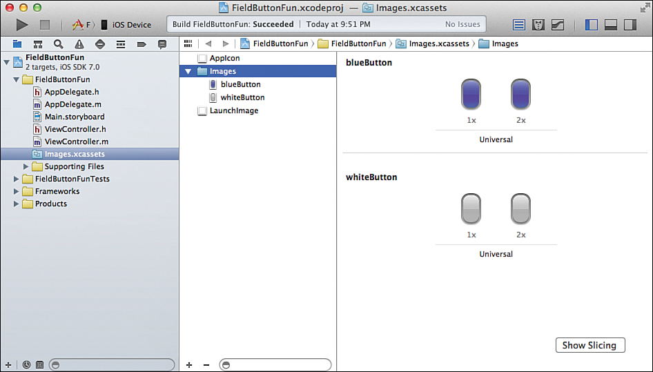
FIGURE 7.4 To use custom buttons, drag the project images folder into the Images.xcassets folder in Xcode.
Creating Slices
Slicing may sound complicated, but it is easy to understand, and even easier to perform. When creating a slice, you visually specify a horizontal or vertical (or both) stripe of pixels within an image. This is the “slice,” and it will be repeated to fill in space if the image needs to grow. You’ll also (optionally) get to choose a portion (also a stripe of pixels) that is replaced by the slice when the image resizes.
To create your slices, first make sure that you’ve opened the asset catalog by selecting the Images.xcassets icon in the project navigator, and then follow these steps:
1. Expand the Images folder within the asset catalog.
2. Select one of the button images to slice; I’m starting with whiteButton.
3. Click the Show Slicing button in the lower-right corner of the asset catalog content area, as shown in Figure 7.5.
4. The screen refreshes to show an enlarged copy of the graphic (both non-Retina and Retina, if available). Click the Start Slicing button on the non-Retina image to begin.
5. Xcode prompts for the type of slicing. Use the buttons, as demonstrated in Figure 7.6, to choose between Horizontal, Horizontal & Vertical, or just Vertical slicing. For our button, we want both horizontal and vertical.
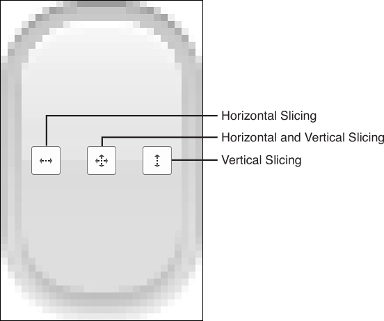
6. The slicing editor displays three dragging lines in the horizontal/vertical directions. The horizontal lines determine the vertical slicing, and the vertical lines determine the horizontal slicing.
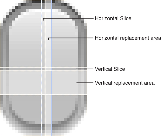
The first and second lines (going left to right/top to bottom) determine the slice that can grow. The second and third lines define the area that will be replaced by copies of the slicing when the image resizes, as shown in Figure 7.7. The second and third lines can be positioned right next to one another if you simply want the stripe to stretch without replacing any other parts of the image.
7. For the button template, we want the pretty, curvy corners to always stay the same; so they aren’t resized. The portion we want to grow is a stripe about 12 pixels in (horizontally and vertically), and can just be a single pixel wide. Drag the first vertical line about 12 pixels in.
8. Drag the second vertical line so that creates a 1-pixel-wide stripe (that is, about 13 pixels in).
9. Drag the third vertical line so that it is right next to the second line; there’s no reason to replace any portion of the image with the repeated stripe. You’ve just completed the horizontal slice.
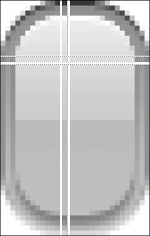
10. Repeat steps 7–9 for the horizontal lines, creating the vertical slice. Your finished slicing layout should look almost identical to Figure 7.8.
Tip
To fine-tune your slices, open the Attributes Inspector while slicing. This shows the position of the slice in pixels and enables you to manually enter X and Y values.
After you’ve finished the slicing for the non-Retina white button, do the same for the Retina version. You’ll need to position your slices about 24 pixels in (versus 12 on the non-Retina). Next, repeat the process for the blue button assets.
When you finish, you’ve created images that can be resized to create attractive buttons regardless of how large the button needs to be. When it comes time to use the images in a few minutes, you’ll treat them like any other image; the slicing is applied automatically when they are resized.
Tip
Slicing works great for buttons, but can be used for any image that you may want to resize. Just set the slicing for the graphics and when you stretch them, they’ll resize using your slicing preferences.
Designing the Interface
In the preceding hour, you learned that the Main.storyboard is loaded when the application launches and that it instantiates the default view controller, which subsequently loads its view from the storyboard file. Locate MainStoryboard.storyboard in the project’s code folder, and click to select it and open the IB editor.
When IB has started, be sure that the document outline area is visible (Editor, Show Document Outline), hide the navigation area if you need room, and open the Object Library (View, Utilities, Show Object Library).
Adding Text Fields
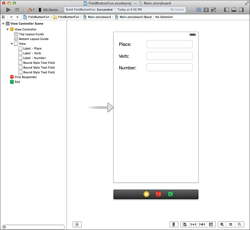
Begin creating the UI by adding three text fields to the top of the view. To add a field, locate the Text Field object (UITextField) in the library and drag it into the view. Repeat this two more times for the other two fields.
Stack the fields on top of one another, leaving enough room so that the user can easily tap a field without hitting all of them. To help the user differentiate between the three fields, add labels to the view. Click and drag the label (UILabel) object from the library into the view. Align three labels directly across from the three fields. Double-click the label within the view to set its text. I labeled my fields Place, Verb, and Number, from top to bottom, as shown in Figure 7.9.
Editing Text Field Attributes
The fields that you’ve created are technically fine as is, but you can adjust their appearance and behavior to create a better user experience. To view the field attributes, click a field, and then press Option-Command-4 (View, Utilities, Show Attributes Inspector) to open the Attributes Inspector (see Figure 7.10).
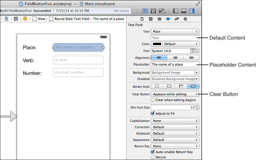
For example, you can use the Placeholder field to enter text that appears in the background of the field until the user begins editing. This can be a helpful tip or an additional explanation of what the user should be entering.
You may also choose to activate the Clear button. The Clear button is a small X icon added to a field that the user can touch to quickly erase the contents. To add the Clear button, just choose one of the visibility options from the Clear button pop-up menu; the functionality is added for free to your application. Note that you may also choose to automatically clear the field when the user taps it to start editing. Just check the Clear When Editing Begins check box.
Add these features to the three fields within the view. Figure 7.11 shows how they appear in the application.
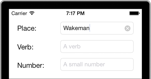
FIGURE 7.11 Placeholder text can provide helpful cues to the user, and the Clear button makes it simple to remove a value from a field.
Placeholder text also helps identify which field is which within the IB editor area. It can make creating your connections much easier down the road.
In addition to these changes, attributes can adjust the text alignment, font and size, and other visual options. Part of the fun of working in the IB editor is that you can explore the tools and make tweaks (and undo them) without having to edit your code.
Attributed Versus Plain Text
In many of controls that allow the display of text, you’ll find the Text drop-down menu that can toggle between Plain or Attributed options. In general, you want to leave this on Plain, but by setting it to Attributed, you can gain much finer control over the layout of the text, as shown in Figure 7.12.
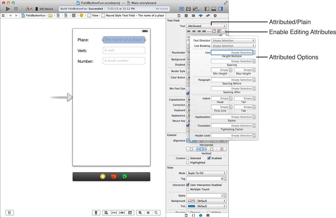
FIGURE 7.12 Attributed text fields and other UI elements offer more detailed control over presentation.
Using this feature, you can provide more richly styled text output and even enable user editing of the text style by simply checking the Allows Editing Attributes check box.
Customizing the Keyboard Display with Text Input Traits
Probably the most important attributes that you can set for an input field are the “text input traits,” or simply, how the keyboard is going to be shown onscreen. Seven different traits appear at the bottom of the text field attributes section:
Capitalize: Controls whether iOS automatically capitalizes words, sentences, or all the characters entered into a field.
Correction: If explicitly set to on or off, the input field corrects (on) or ignores (off) common spelling errors. If left to the defaults, it inherits the behavior of the iOS settings.
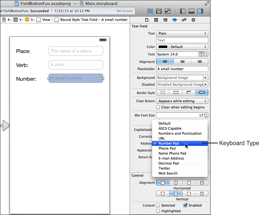
Keyboard: Sets a predefined keyboard for providing input. By default, the input keyboard lets you type letters, numbers, and symbols. A total of 10 different keyboards are available, ranging from Number Pad to Web Search. If the option Number Pad is chosen, for example, only numbers can be entered. Similarly, the Email Address option constrains the input to strings that look like email addresses.
Appearance: Changes the appearance of the keyboard to look more like an alert view (which you learn about in a later hour).
Return Key: If the keyboard has a Return key, it is set to this label. Values include Done, Search, Next, Go, and so on.
Auto-Enable Return Key: Disables the Return key on the keyboard unless the user has entered at least a single character of input into the field.
Secure: Treats the field as a password, hiding each character as it is typed.
Of the three fields that we’ve added to the view, the Number field can definitely benefit from setting an input trait. With the Attributes Inspector still open, select the Number field in the view, and then choose the Number Pad option from the Keyboard pop-up menu (see Figure 7.13).
You may also want to alter the capitalization and correction options on the other two fields and set the Return key to Done. Again, all this functionality is gained “for free.” So, you can return to edit the interface and experiment all you want later on. For now, let’s call these fields “done” and move on to the text areas.
Adding Text Views
Now that you know the ins and outs of text fields, let’s move on to the two text views (UITextView) present in this project. Text views, for the most part, can be used just like text fields. You can access their contents the same way, and they support many of the same attributes as text fields, including text input traits.
To add a text view, find the Text View object (UITextView) and drag it into the view. Doing so adds a block to the view, complete with Greeked text (Lorem ipsum...) that represents the input area. Using the resizing handles on the sizes of the block, you can shrink or expand the object to best fit the view. Because this project calls for two text views, drag two into the view and size them to fit underneath the existing three text fields.
As with the text fields, the views themselves don’t convey much information about their purpose to the user. To clarify their use, add two text labels above each of the views: Template for the first, and Story for the second. Your view should now resemble Figure 7.14.
Caution: Size Doesn’t Matter (For Now)
The size of your iPhone design doesn’t matter at this stage. In Hour 16, “Building Responsive and Backward-Compatible User Interfaces,” you learn how a single layout can work on the multiple screen sizes as well as multiple versions of iOS. Right now, be aware that when you position controls, they probably won’t adjust correctly to work on other devices or earlier versions of iOS. In addition, your layout might not exactly match my screenshots. That’s okay. I don’t want you to get caught up in the details of UI design while you’re still learning to program!
Editing Text View Attributes
Text view attributes provide many of the same visual controls as text fields, including plain and attributed modes. Select a view, and then open the Attributes Inspector (Option-Command-4) to see the available options, as shown in Figure 7.15.
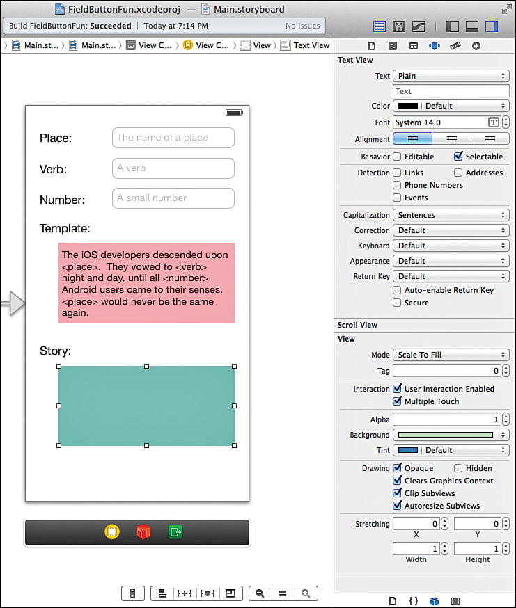
To start, we need to update the default content to remove the initial Greeked text and provide our own input. For the top field, which will act as the template, select the content within the Text attribute of the Attributes Inspector (this is directly below the Plain/Attributed drop-down menu), and then clear it. Enter the following text, which will be available within the application as the default:
The iOS developers descended upon <place>. They vowed to <verb> night and day,
until all <number> Android users came to their senses. <place> would never be the
same again.
When we implement the logic behind this interface, the placeholders (<place>, <verb>, <number>) are replaced with the user’s input.
Next, select the “story” text view, and then again use the Attributes Inspector to clear the contents entirely. Because the contents of this text view are generated automatically, we can leave it empty. This view is a read-only view, as well, so uncheck the Editable attribute.
In this example, to help provide some additional contrast between these two areas, I set the background color of the template to a light red and the story to a light green. To do this in your copy, simply select the text view to stylize, and then click the Attributes Inspector’s View Background attribute to open a color chooser. Figure 7.16 shows our final text views.
Caution: Practice Moderation!
Data detectors are a great convenience for users, but can be overused. If you enable data detectors in your projects, be sure they make sense. For example, if you are calculating numbers and outputting them to the user, chances are you don’t want the digits to be recognized as telephone numbers.
Setting Scrolling Options
When editing the text view attributes, you’ll notice that a range of options exist that are specifically related to its ability to scroll, as shown in Figure 7.17.
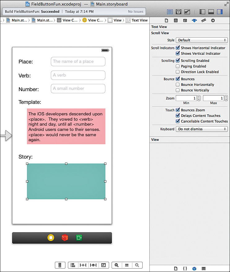
Using these features, you can set the color of the scroll indicator (black or white), choose whether both horizontal and vertical scrolling are enabled, and even choose whether the scrolling area should have the rubber band “bounce” effect when it reaches the ends of the scrollable content.
Adding Styled Buttons
We need a single button in this project, so drag an instance of a button (UIButton) from the Objects Library to the bottom of the view. Title the button Generate Story. Figure 7.18 shows the final view and document outline, with a default button.
Although you’re certainly welcome to use the standard buttons, our goal is do to something a bit more “flashy.” Before we get to the details, let’s see what we can configure using the Xcode button attributes.
Editing Button Attributes
To edit a button’s appearance, your first stop is, once again, the Attributes Inspector (Option-Command-4). Using the Attributes Inspector, you can dramatically change the appearance of the button. Use the Type drop-down menu, shown in Figure 7.19, to choose common button types:
System: The default iOS 7 button style.
Detail Disclosure: An arrow button used to indicate additional information is available.
Info Light: An i icon, typically used to display additional information about an application or item. The light version is intended for dark backgrounds.
Info Dark: The dark (light background) version of the Info Light button.
Add Contact: A + button, often used to indicate the addition of a contact to the address book.
Custom: A button that has no default appearance. Usually used with button images.
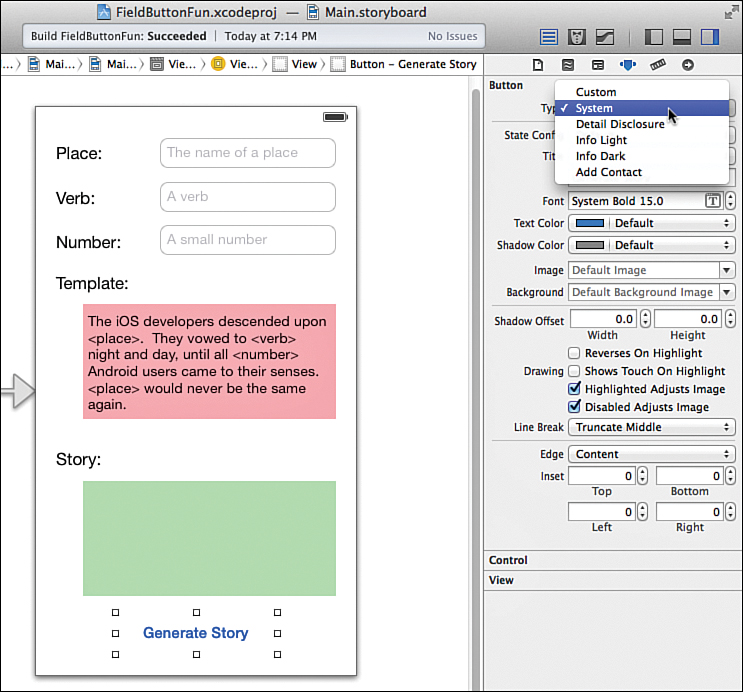
FIGURE 7.19 The Attributes Inspector gives several options for common button types and even a custom option.
In addition to choosing a button type, you can make the button change depending on the current state of user interaction, a concept known as changing state. For instance, when a button is displayed before being touched, it is considered to be in its default state. When a user touches a button, it changes to show that it has been touched; this is the highlighted state. Use the State Config menu to select the button state you want to set up, and then use the various button attributes (images, colors, fonts, and so on) that should be applied in that state.
Other options include the ability to create shadowed text (Shadow Offset), show a tinted color when the button is highlighted, or display a “glow” around a user’s finger when he or she touches a button (Shows Touch on Highlight).
Setting Custom Button Images
Even with all the settings available to configure your buttons, to create truly custom controls, you need to make custom images, including versions for the highlighted on state and the default off state. These can be any shape or size, but the PNG format is recommended because of its compression and transparency features.
After you’ve added these to the project through Xcode, you can select the image from the Image or Background drop-down menus in the Attributes Inspector. Using the Image menu sets an image that appears inside the button alongside the button title. This option enables you to decorate a button with an icon.
Using the Background menu sets an image that is stretched to fill the entire background of the button. The option lets you create a custom image as the entire button, but you must size your button exactly to match the image (or define slices for the image using the Xcode asset catalog). Do you get where we’re heading with this?
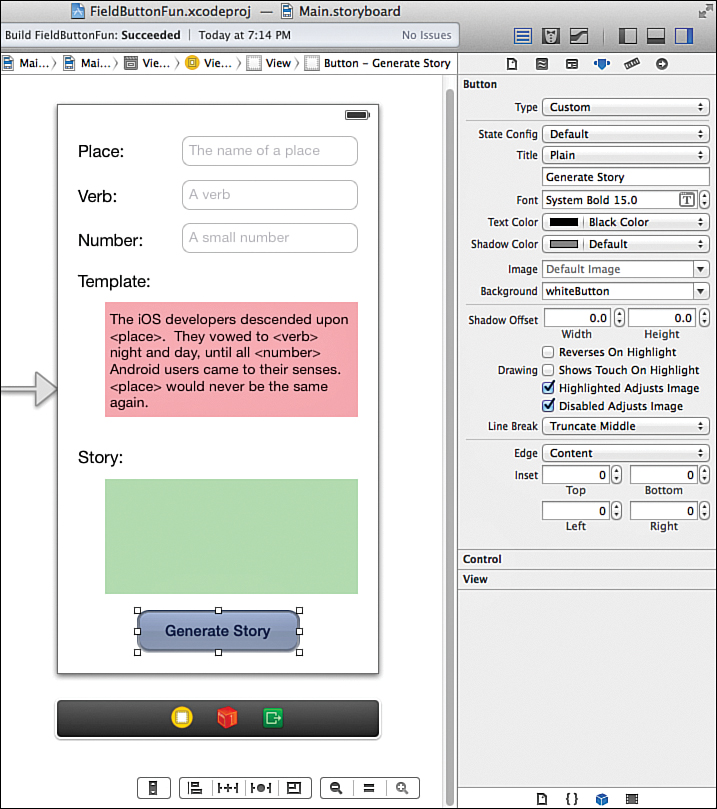
Assuming you followed the steps for defining button templates earlier, you should already have images that can resize to create “pretty” buttons. To create the fancy button for our project, select the UIButton you’ve added to the layout, make sure that the Attributes Inspector is open (Option+Command+4), and then complete these steps:
1. Set the button type to Custom. You can try using the default system type, but it applies its own highlighting effect that (in my opinion) looks “off” when applied to images.
2. Set the State Config drop-down to Default.
3. Use the Text Color drop-down to choose Black Color.
4. Use the Background drop-down to pick the whiteButton image.
5. Your layout should immediately update to show the fancy button. Figure 7.20 shows the button appearance and settings. Be sure to try resizing the button so you can see how the slicing comes into play.
6. Repeat steps 3–5, this time with the State Config set to Highlighted, and choosing white as the text color and blueButton for the image.
Because of the Xcode 5 slicing tools, everything “just works.” Your button looks great, regardless of the size, and you don’t have to write a single line of code to completely customize what it looks like!
Note
Prior to Xcode 5, we had to define resizable images using code, and then add those images to a button through code. For a peek inside this process, I provide you with these two lines from the previous edition of this book:
UIImage *normalImage = [[UIImage imageNamed:@"whiteButton.png"]
resizableImageWithCapInsets:UIEdgeInsetsMake(0, 12, 0, 12)
[self.theButton setBackgroundImage:normalImage
forState:UIControlStateNormal];
If you find this interesting, be sure to read more about the UIImage method resizableImage WithCapInsets and the UIButton method setBackgroundImage:forState in the Xcode documentation system.
Creating and Connecting the Outlets and Actions
With the interface finished, we now have a total of six text input/output areas that we need to access through our view controller code. In addition, we must create an action for the button that will trigger the generation of our story using the template and field contents.
In summary, a total of six outlets and one action require creation and connection:
Place field (UITextField): thePlace
Verb field (UITextField): theVerb
Number field (UITextField): theNumber
Template Text view (UITextView): theTemplate
Story Text view (UITextView): theStory
Action triggered from Generate Story button: createStory
Making sure that the MainStoryboard.storyboard file is open in the IB editor, use the editor toolbar buttons to switch to the assistant mode. You should now see your UI design and the ViewController.m file where you will be making your connections side by side.
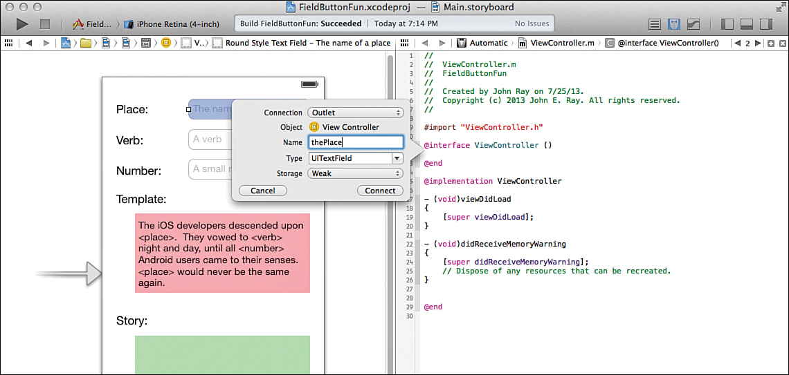
Adding the Outlets
Start by Control-dragging from the Place text field to the line following the @interface directive in the ViewController.m file. When prompted, be sure to configure the connection as an outlet and the name as thePlace, leaving the other values set to their defaults (type UITextfield, storage weak), as shown in Figure 7.21.
Repeat the process for the Verb and Number fields, connecting them to theVerb and theNumber outlets, this time dragging to just below the @property directive created when you added the first output. Connect the text views to theTemplate and theStory outlets. The process is identical (but the type is UITextView.)
That does it for the outlets. Now let’s create our action.
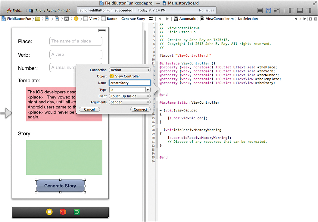
Adding the Action
In this project, we add an action for a method we will call createStory. This action is triggered when the user clicks the Generate Story button. To create the action and generate an empty method that we can implement later, Control-drag from the Generate Story button to below the last @property directive in the ViewController.m file.
Name the action createStory, when prompted, as shown in Figure 7.22.
The connections to our interface are complete. The resulting ViewController.m file should have an @interface block at the top resembling the following:
@interface ViewController ()
@property (weak, nonatomic) IBOutlet UITextField *thePlace;
@property (weak, nonatomic) IBOutlet UITextField *theVerb;
@property (weak, nonatomic) IBOutlet UITextField *theNumber;
@property (weak, nonatomic) IBOutlet UITextView *theTemplate;
@property (weak, nonatomic) IBOutlet UITextView *theStory;
- (IBAction)createStory:(id)sender;
@end
Implementing Keyboard Hiding
Before completing the application by implementing the view controller logic to construct the story, we need to look at a “problem” that is inherent to applications with character entry: keyboards that won’t go away! To see what we mean, start the application again either on your device or in the iOS Simulator.
With your app up and running, click in a field. The keyboard appears. Now what? Click in another field; the keyboard changes to match the text input traits you set up, but it remains onscreen. Touch the word Done. Nothing happens. And even if it did, what about the number pad that doesn’t include a Done button? If you try to use this app, you’ll also find a keyboard that sticks around and that covers up the Generate Story button, making it impossible to fully utilize the UI. So, what’s the problem?
Hour 4, “Inside Cocoa Touch,” described responders as objects that process input. The first responder is the first object that has a shot at handling user input. In the case of a text field or text view, when it gains first-responder status, the keyboard is shown and remains onscreen until the field gives up or resigns first-responder status. What does this look like in code? For the field thePlace, we could resign first-responder status and get rid of the keyboard with this line of code:
[self.thePlace resignFirstResponder];
Calling the resignFirstResponder method tells the input object to give up its claim to the input; as a result, the keyboard disappears.
Hiding with the Done Button
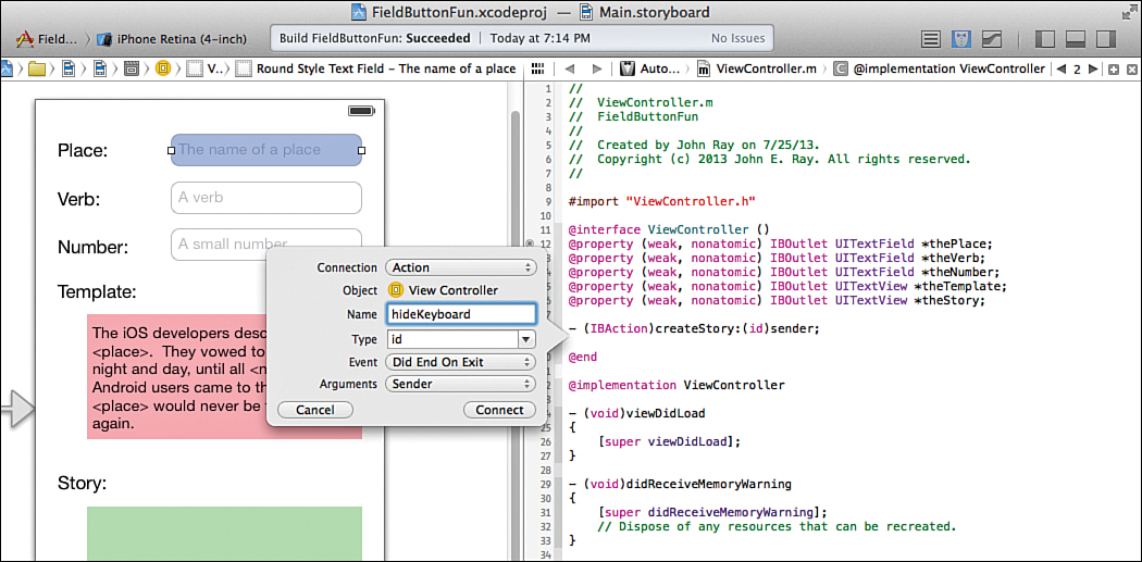
The most common trigger for hiding the keyboard in iOS applications is through the Did End on Exit event of the field. This event occurs when the Done (or similar) keyboard button is pressed.
We’ll implement a new action method called hideKeyboard that is activated by the Did End on Exit events from our fields.
Turn your attention back to the Main.storyboard file and open the assistant editor. Control-drag from the Place field to the line just below the createStory action in the ViewController.h file. When prompted, configure a new action, hideKeyboard, for the Did End on Exit event. Leave all the other defaults the same, as shown in Figure 7.23.
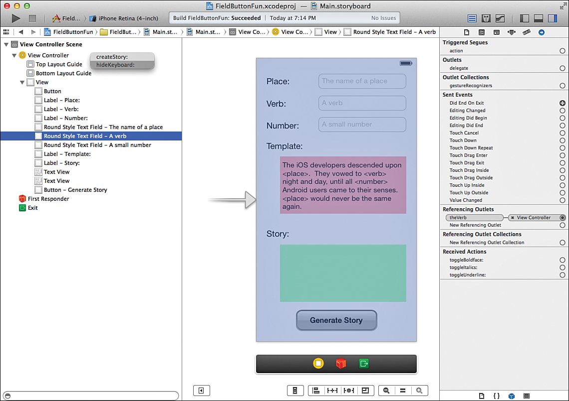
Now you must connect the Verb field to the newly defined hideKeyboard action. There are many different ways to make connections to existing actions, but only a few enable us to target specific events. We’ll use the technique you learned about in the tutorials in Hour 5, “Exploring Interface Builder”: the Connections Inspector.
First switch back to the standard editor and make sure that the document outline is visible (Editor, Show Document Outline). Select the Verb field, and open the Connections Inspector by pressing Option-Command-6 (or choosing View, Utilities, Connections Inspector). Drag from the circle beside Did End on Exit to the View Controller icon in the document outline area. Release your mouse button and choose hideKeyboard when prompted, as shown in Figure 7.24.
Unfortunately, now we run into a problem. The number input doesn’t have a Done button, and the text view doesn’t support the Did End on Exit event, so how do we hide the keyboard for these variations?
Hiding with a Background Touch
A popular iOS interface convention is that if a keyboard is open and you touch the background (outside of a field) the keyboard disappears. This is the approach we need to take for the number-input text field and the text view—and functionality that we need to add to all the other fields to keep things consistent.
Wondering how we detect an event outside of a field? Nothing special: All we do is create a big invisible button that sits behind all the other controls, and then attach it to the hideKeyboard action method.
Within the IB editor, access the Object Library (View, Utilities, Object Library) and drag a new button (UIButton) from the library into the view.
Because this button needs to be invisible, make sure that it is selected, and then open the Attributes Inspector (Option-Command-4) and set the type to Custom and delete the button title. This makes the button entirely transparent. Use the selection handles to size the button to fill the entire view. With the button selected, choose Editor, Arrange, Send to Back to position the button in the back of the interface.
Tip
You can also drag an object to the top of the view hierarchy in the document outline to position it in the back. The objects are layered from the top (back) to the bottom (front).
To connect the button to the hideKeyboard method, it’s easiest to use the document outline. Select the custom button you created (it should be at the top of the view hierarchy list), and then Control-drag from the button to the View Controller line. When prompted, choose the hideKeyboard method.
Nicely done. You’re now ready to implement the hideKeyboard so that the Place and Verb fields can hide the keyboard when Done is touched, or the background can be touched to hide the keyboard in any situation.
Adding the Keyboard-Hiding Code
Because the user could be making changes in four potential places (thePlace, theVerb, theNumber, theTemplate), we must either identify the field the user is editing or simply resign first-responder status on all of them. As it turns out, if you resign first-responder status on a field that isn’t the first responder, it doesn’t matter. That makes implementing the hideKeyboard method as simple as sending the resignFirstResponder message to each of the properties representing our editable UI elements.
Scroll to the bottom of the ViewController.m file to find the hideKeyboard method stub that Xcode inserted for us when we created the IBAction. Edit the method so that it reads as shown in Listing 7.1.
LISTING 7.1 Hiding the Keyboard
- (IBAction)hideKeyboard:(id)sender {
[self.thePlace resignFirstResponder];
[self.theVerb resignFirstResponder];
[self.theNumber resignFirstResponder];
[self.theTemplate resignFirstResponder];
}
You might be asking yourself whether the sender variable isn’t the field that is generating the event. Couldn’t we just resign the responder status of the sender? Yes, absolutely. This would work just fine, but we also need the hideKeyboard method to work when sender isn’t necessarily the field (for example, when the background button triggers the method).
Save your work, and then try running the application again. This time, when you click outside of a field or the text view or use the Done button, the keyboard disappears.
Tip
Starting in iOS 7, you can choose what happens to an onscreen keyboard as you scroll within a view, such as the text views used in this tutorial. To access the keyboard options for a scrolling view, select the view, and then open the Attributes Inspector and look for the Keyboard setting within the Scroll View section.
Implementing the Application Logic
To finish off FieldButtonFun, we need to fill in the createStory method within the view controller (ViewController.m). This method searches the template text for the <place>, <verb>, and <number> placeholders, and then replaces them with the user’s input, storing the results in the text view. We’ll make use of the NSString instance method stringByReplacing OccurrencesOfString:WithString to do the heavy lifting. This method performs a search and replace on a given string and returns the results in a new string.
For example, if the variable myString contains "Hello town", and you want to replace town with world, returning the result in a new variable called myNewString, you might use the following:
myNewString=[myString stringByReplacingOccurrencesOfString:@"town"
withString:@"world"];
In the case of our application, our strings are the text properties of the text fields and text views (self.thePlace.text, self.theVerb.text, self.theNumber.text, self.theTemplate.text, and self.theStory.text).
Add the final method implementation, shown in Listing 7.2, to ViewController.m within the createStory method stub that Xcode generated for us.
LISTING 7.2 Implementing the createStory Method
1:- (IBAction)createStory:(id)sender {
2: self.theStory.text=[self.theTemplate.text
3: stringByReplacingOccurrencesOfString:@"<place>"
4: withString:self.thePlace.text];
5: self.theStory.text=[self.theStory.text
6: stringByReplacingOccurrencesOfString:@"<verb>"
7: withString:self.theVerb.text];
8: self.theStory.text=[self.theStory.text
9: stringByReplacingOccurrencesOfString:@"<number>"
10: withString:self.theNumber.text];
11:}
Lines 2–4 replace the <place> placeholder in the template with the contents of the thePlace field, storing the results in the story text view. Lines 5–7 then update the story text view by replacing the <verb> placeholder with the appropriate user input. This is repeated again in lines 8–10 for the <number> placeholder. The end result is a completed story, output in the theStory text view.
Our application is finally complete.
Building the Application
To view and test the FieldButtonFun, click the Run icon in the Xcode toolbar. Your finished app should look similar to Figure 7.25, fancy button and all!
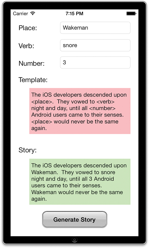
FIGURE 7.25 The finished application includes scrolling views, text editing, and a pretty button. What more could we want?
This project provided a starting point for looking through the different properties and attributes that can alter how objects look and behave within an iOS interface. The takeaway message: Don’t assume anything about an object until you’ve reviewed how it can be configured.
Caution: Plain Is Pretty, Pretty Is Pretty
In this tutorial, we built a button that looks nothing like the default iOS 7 (or even iOS 6) buttons. Be careful, though, when creating “graphically rich” UIs for iOS 7 apps. Apple is embracing a simple and subtle approach to its UIs, so you might want to follow its lead. Create your UI to best fit with the application experience you want for your users.
Further Exploration
Throughout the next few hours, you’ll explore a large number of UI objects, so your next steps should be to concentrate on the features you’ve learned in this hour—specifically, the object properties, methods, and events that they respond to.
For text fields and text views, the base object mostly provides for customization of appearance. However, you may also implement a delegate (UITextFieldDelegate, UITextViewDelegate) that responds to changes in editing status, such as starting or ending editing. You’ll learn more about implementing delegates in Hour 10, “Getting the User’s Attention,” but you can start looking ahead to the additional functionality that can be provided in your applications through the use of a delegate.
In addition, keep in mind that although there are plenty of properties to explore for these objects, there are additional properties and methods that are inherited from their superclasses. All UI elements, for example, inherit from UIControl, UIView, and UIResponder, which bring additional features to the table, such as properties for manipulating size and location of the object’s onscreen display, as well as for customizing the copy and paste process (through the UIResponderStandardEditActions protocol). By accessing these lower-level methods, you can customize the object beyond what might be immediately obvious.
Summary
This hour described the use of common input features and a few important output options. You learned that text fields and text views both enable the user to enter arbitrary input constrained by a variety of different virtual keyboards. Unlike text fields, however, text views can handle multiline input as well as scrolling, making them the choice for working with large amounts of text. We also covered the use of buttons and button states, including how buttons can be manipulated through code.
We continue to use the same techniques you used in this hour throughout the rest of the book, so don’t be surprised when you see these elements again.
Q&A
Q. Why can’t I use a UILabel in place of a UITextView for multiline output?
A. You certainly can. The text view, however, provides scrolling functionality “for free,” whereas the label displays only the amount of text that fits within its bounds.
Q. Why doesn’t Apple just handle hiding text input keyboards for us?
A. Although I can imagine some circumstances where it would be nice if this were an automatic action, it isn’t difficult to implement a method to hide the keyboard. This gives you total control over the application interface—something you’ll grow to appreciate.
Q. Are text views (UITextView) the only way to implement scrolling content?
A. No. You’ll learn about implementing general scrolling behavior in Hour 9, “Using Advanced Interface Objects and Views.”
Workshop
Quiz
1. What tool will you use to create resizable images?
2. How do you get rid of an onscreen keyboard?
3. Are text views used for text input or output?
Answers
1. To define images that can be resized, you’ll use the Xcode slicing tool, found within your asset catalog.
2. To clear the onscreen keyboard, you must send the resignFirstResponder message to the object that currently controls the keyboard (such as a text field).
3. Text views (UITextView) can be implemented as scrollable output areas or multiline input fields. It’s entirely up to you.
Activities
1. Expand the story creator with additional placeholders, word types, and styled text editing. Use the same string manipulation functions described in this lesson to add the new functionality.
2. Modify the story creator to use a graphical button of your design. Use either an entirely graphical button or the stretchable image approach described in this hour’s tutorial.