Hour 12. Making Choices with Toolbars and Pickers
,What You’ll Learn in This Hour:
 The use of toolbars and pickers in iOS application interfaces
How to implement the date picker object
Ways to customize the display of a picker view
The relationship between pickers, toolbars, and popovers
How to implement a single content class for modal views and popovers
In this hour, we continue multiview application development in our tutorials, but our primary focus is on two new user interface elements: toolbars and pickers. Toolbars present a set of common functions in a static bar at the top or bottom of the screen. A picker is a unique user interface (UI) element that both presents information to users and collects their input.
Whereas toolbars are similar to any other graphical UI (GUI) element, pickers aren’t implemented through a single method; they require several. This means that our tutorial code is becoming a bit more complex, but nothing you can’t handle. We need to work fast to fit this in an hour, so we better get started now.
Understanding the Role of Toolbars
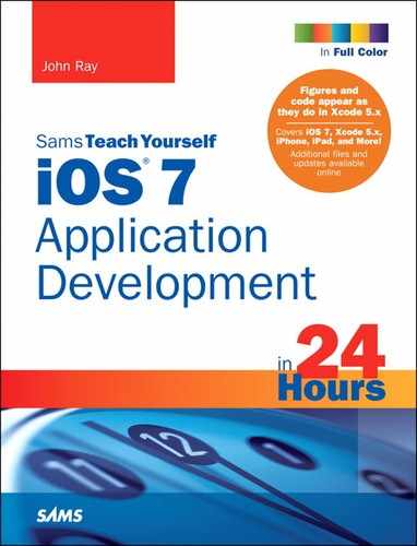
Toolbars (UIToolbar) are, comparatively speaking, one of the simpler UI elements that you have at your disposal. A toolbar is implemented as a slightly translucent bar, either at the top or bottom of the display (see Figure 12.1), with buttons (UIBarButtonItem) that correspond to actions that can be performed in the current view. The buttons provide a single selector action, which works nearly identically to the typical Touch Up Inside event that you’ve used with UIButtons numerous times.
Toolbars, as their name implies, are used for providing a set of choices to the user to perform functions on the content within the main view. They aren’t intended for changing between completely different application interfaces; for that, you want to implement a tab bar, and that’s in the next hour’s lesson. Toolbars can be created almost entirely visually and are the de facto standard for triggering the display of a popover on the iPad. To add a toolbar to a view, open the Object Library and search for “toolbar.” Drag the toolbar object to the top or bottom of your view; iPhone applications usually leave the toolbar on the bottom.
You might imagine that toolbars would be implemented similarly to a segmented control, but the controls on the toolbar are entirely independent objects. An instance of a UIToolbar is nothing more than a gray bar across your screen. For a toolbar to do something, it needs a button.
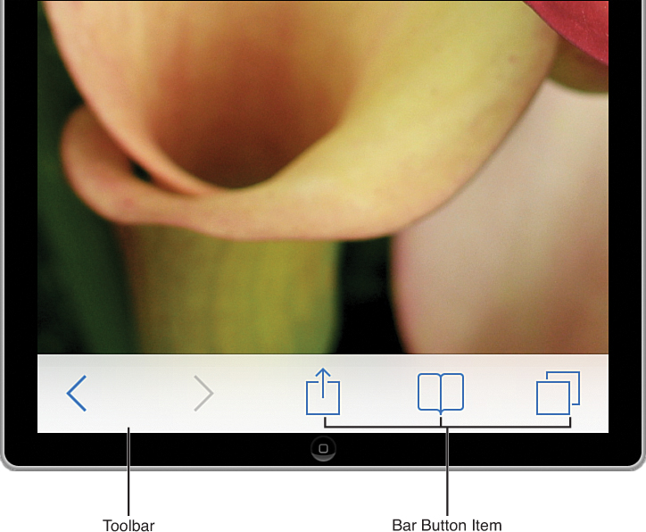
Bar Button Items
If I were naming a button that gets added to a toolbar, I’d call it a toolbar button. Apple named it a bar button item (UIBarButtonItem). Regardless of its name, bar button items are the interactive elements that make a toolbar do something besides look like a stripe on your iOS device’s screen. The iOS Library provides three bar button objects, as shown in Figure 12.2. Although these may appear to be independent objects, they’re really a single thing—an instance of a bar button item. Bar button items can be customized with over a dozen common system button types or set to any arbitrary text or image.
To add a bar button to a toolbar, drag a bar button item into the toolbar in your view. The bar button items will appear as children of the toolbar within the document outline area. Double-clicking the name on a button enables editing, just like a standard UIButton. You can also use the handle on the side of the button to increase its size. What you can’t do, however, is drag the button around in the bar.
To position buttons, you need to insert special bar button items into the toolbar—flexible and fixed spaces. Flexible spaces expand to fill all possible available space between the buttons on either side of it (or the sides of the toolbar). For example, to position a button in the center, you add flexible spaces on either side of it. To position two buttons on either side of the toolbar, a single flexible space between them gets the job done. Fixed spaces are exactly what they sound like: a fixed width that can be inserted before or after existing buttons.
Bar Button Attributes
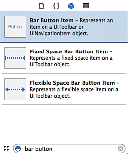
To configure the appearance of any bar button item, select it and open the Attributes Inspector (Option-Command-4), shown in Figure 12.3. You have three styles to choose from: Plain (just text), Bordered (the same as Plain in iOS 7), and Done (bold text). In addition, you can set several “identifiers.” These are common button icons/labels that help your toolbar buttons match Apple’s iOS application standards—including flexible and fixed space identifiers that will make your bar button item behave as either of these two special button types.
If none of the standard button styles work for you, you can set an image to use as a button. The image should be a PNG between 20×20 and 25×25 points. Solid colors are automatically restyled into the toolbar tint, so don’t worry about trying to color-match your bar item text.
Caution: The Toolbar/Popover/Segue Conundrum
Toolbars are easy to add to projects, easy to configure, and have a convenient way to present popovers in code. They also cause a problem that can be maddening to overcome.
When a popover is shown from a UI element, touching anywhere outside the popover, including on the object (such as a button) that made it appear, will normally make it go away. With bar button items, however, it makes a new popover instance appear. In fact, you can keep touching the bar button to make dozens, even hundreds, of popovers on top of each other. Not good.
This is annoying, but when implementing a popover entirely in code, it’s not difficult to set a flag that can be checked to see if a popover has already been displayed and keep a new one from being created. With segues, however, this is impossible. If you define a popover segue from a bar button item in the Interface Builder editor, you cannot interrupt the segue after it starts. As a result, your application will fall prey to the multiple-popover problem, and short of writing your own custom popover class, there’s currently not much to be done about it.
In this hour’s tutorials, I present one possible solution, but I’m hopeful that future versions of Xcode correct this unusual behavior.
Exploring Pickers
Because we’re dedicating a good portion of an hour to pickers (UIPickerView), you can probably surmise that they’re not quite the same as the other UI objects that we’ve been using. Pickers are a unique feature of iOS. They present a series of multivalue options in a clever spinning interface—often compared to a slot machine. Rather than fruit or numbers, the segments, known as components, display rows of values that the user can choose from. The closest desktop equivalent is a set of pop-up menus. Figure 12.4 displays the standard date picker (UIDatePicker).
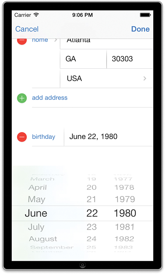
FIGURE 12.4 The picker offers a unique interface for choosing a sequence of different, but usually related, values.
Pickers should be used when a user needs to make a selection between multiple (usually related) values. They are often used for setting dates and times but can be customized to handle just about any selection option that you can come up with.
Note
In Hour 9, “Using Advanced Interface Objects and Views,” you learned about the segmented control, which presents the user with multiple options in a single UI element. The segmented control, however, returns a single user selection to your application. A picker can return several values from multiple user selections—all within a single interface.
Apple recognized that pickers are a great option for choosing dates and times, so it has made them available in two different forms: date pickers, which are easy to implement and dedicated to handling dates and times; and custom picker views, which you can configure to display as many components as rows as you want—using whatever data you want.
Date Pickers
The date picker (UIDatePicker), shown in Figure 12.5, is very similar to the other objects that we’ve been using over the past few hours. To use it, we add it to a view, connect an action to its Value Changed event, and then read the returned value. Instead of returning a string or integer, the date picker returns an NSDate object. The NSDate class is used to store and manipulate what Apple describes as a “single point in time” (in other words, a date and time).
To access the NSDate represented by a UIDatePicker instance, you use its date property. Pretty straightforward, don’t you think? In our example project, we implement a date picker and then retrieve the result, perform some date arithmetic, and display the results in a custom format.
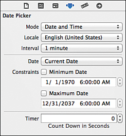
Date Picker Attributes
Like many GUI objects, the date picker can be customized using the Attributes Inspector. For example, the picker can be configured to display in one of four different modes:
Date and Time: Shows options for choosing both a date and a time
Time: Shows only times
Date: Shows only dates
Count Down Timer: Displays a clock-like interface for choosing a duration
You can set the locale for the picker, which determines the ordering of the different components. In addition, you can configure the interval between dates and times, set the default date/time that is displayed, and set date/time constraints to help focus the user’s choices.
Tip
The Date attribute is automatically set to the date and time when you add the control to the view.
Picker Views
Picker views (UIPickerView) are similar in appearance to date pickers but have an almost entirely different implementation. In a picker view, the only thing that is defined for you is the overall behavior and general appearance of the control—the number of components and the content of each component are entirely up to you. Figure 12.6 demonstrates a picker view that includes two components with images and text displayed in their rows.
A custom picker is added to your application using the IB editor; just drag a picker view from the Object Library into your view. Unfortunately, a custom picker view’s appearance is not configured in the Attributes Inspector. Instead, you need to write code that conforms to two protocols—one that will provide the technical layout of the picker (the data source), and another that provides the information it will contain (the delegate). You can use the Connections Inspector to connect the delegate and data source outlets to a class in IB, or you can set these properties in code. Let’s review a simple implementation of these protocols before writing a real project.
The Picker View Data Source Protocol
The picker view data source protocol (UIPickerViewDataSource) includes methods that describe how much information the picker will be displaying:
numberOfComponentsInPickerView: Returns the number of components (spinning segments) needed in the picker.
pickerView:numberOfRowsInComponent: Given a specific component, this method is required to return the number of rows (different input values) in the component.
There’s not much to it. As long as we create these two methods and return a meaningful number from each, we’ll successfully conform to the picker view data source protocol. For example, if I want to create a custom picker that shows a total of two columns, with one selection value in the first, and two in the second, I can implement the protocol as shown in Listing 12.1.
LISTING 12.1 Implementing a Custom Picker Data Source Protocol
1: - (NSInteger)numberOfComponentsInPickerView:(UIPickerView *)pickerView {
2: return 2;
3: }
4:
5: - (NSInteger)pickerView:(UIPickerView *)pickerView
6: numberOfRowsInComponent:(NSInteger)component {
7: if (component==0) {
8: return 1;
9: } else {
10: return 2;
11: }
12: }
Lines 1–3 implement the numberOfComponentsInPickerView method, which returns 2—so the picker will have two components (that is, two little spinny wheels).
Lines 5–12 handle the pickerView:numberOfRowsInComponent method. When the component specified by iOS is 0 (this is the first component in the picker), the method returns 1 (line 8), meaning that there will be one label displayed in the wheel. When the component is 1 (the second component in the picker), the method returns 2 (line 10)—so there will be two possible options displayed to the user.
Obviously, a picker with components that have one or two possible values isn’t very useful—and part of the fun of using a picker is giving the user a UI element that he can flick around. This does, however, make it possible to demonstrate a custom picker without having to fill 10 pages with code.
Once the data source protocol is implemented, we still have one protocol (the picker view delegate protocol) between us and a working picker view.
The Picker View Delegate Protocol
The delegate protocol (UIPickerViewDelegate) takes care of the real work in creating and using a picker. It is responsible for passing the appropriate data to the picker for display and for determining when the user has made a choice. There are a few protocol methods we can use to make the delegate work the way we want, but again, only two are required:
pickerView:titleForRow:forComponent: Given a component and row number, this method must return the title for the row—that is, the string that should be displayed to the user.
pickerView:didSelectRow:inComponent: This delegate method will be called when the user makes a selection in the picker view. It is passed a row number that corresponds to a user’s choice, as well as the component that the user was last touching.
Note
If you check the documentation for the UIPickerViewDelegate protocol, you’ll notice that really all the delegate methods are optional—but unless we implement at least these two, the picker view isn’t going to be able to display anything or respond to a user’s selection.
To continue our example of a two-component picker (the first component with one value, the second with two), let’s implement the pickerView:titleForRow:forComponent method so that the picker shows Good in the first component, and Night and Day as the values in the second. Listing 12.2 demonstrates a simple picker view delegate protocol implementation.
LISTING 12.2 Implementing a Custom Picker Delegate Protocol
1: - (NSString *)pickerView:(UIPickerView *)pickerView
2: titleForRow:(NSInteger)row
3: forComponent:(NSInteger)component {
4: if (component==0) {
5: return @"Good";
6: } else {
7: if (row==0) {
8: return @"Day";
9: } else {
10: return @"Night";
11: }
12: }
13: }
14:
15: - (void)pickerView:(UIPickerView *)pickerView didSelectRow:(NSInteger)row
16: inComponent:(NSInteger)component {
17: if (component==0) {
18: // User selected an item in the first component.
19: } else {
20: // The user selected an item in the second component
21: if (row==0) {
22: // The user selected the string "Day"
23: } else {
24: // The user selected the string "Night"
25: }
26: }
27: }
Lines 1–13 provide the custom picker view with the label it should display for the component and row passed to the method. The first component (component 0) will only ever say Good, so line 4 checks to see whether the component parameter is 0, and, if it is, returns the string "Good".
Lines 6–12 handle the second component. Because it can show two values, the code needs to check the incoming row parameter to see which one we need to provide a label for. If the row is 0 (line 7), the code returns the string "Day" (line 8). If the row is 1, “Night” is returned (line 10).
Lines 15–27 implement the pickerView:didSelectRow:inComponent method. This is an exact mirror of the code that provides the values to be displayed in the picker, but instead of returning strings, the purpose of this method is to react to the user’s choice in the picker. I’ve added comments where you’d normally add your logic.
As you can see, coding the picker’s protocols isn’t something terribly complicated—it takes a few methods, but there are only a couple lines of code.
Advanced Picker Delegate Methods
You can include several additional methods in your implementation of a picker view’s delegate protocol that will further customize the appearance of the picker. We use the following three in this hour’s project:
pickerView:rowHeightForComponent: Given a component, this method returns the height of the row in points.
pickerView:widthForComponent: For a given component, this method should return the width of the component in points.
pickerView:viewForRow:viewForComponent:ReusingView: For a given component and row, return a custom view that will be displayed in the picker.
The first two methods are self-explanatory; if you want to change the height or width of a component or row in the picker, implement these methods to return the proper size in points. The third method is more involved (and for good reason): It enables a developer to completely change the appearance of what is displayed in a picker.
The pickerView:viewForRow:viewForComponent:ReusingView method takes a row and component and returns a view that contains custom content, such as images. This method overrides the pickerView:titleForRow:forComponent. In other words, if you use pickerView:viewForRow:viewForComponent:ReusingView for anything in your custom picker, you have to use it for everything.
As a quick (impractical and hypothetical) example, imagine that we want to present the Good / Day / Night picker as the row text in the first component and two graphics (night.png, day.png) for the rows in the second. We would first get rid of the pickerView:titleForRow:for Component method and then implement pickerView:viewForRow:viewForComponent: ReusingView. Listing 12.3 shows one possible implementation.
LISTING 12.3 Presenting the Picker with Custom Views
1: - (UIView *)pickerView:(UIPickerView *)pickerView
2: viewForRow:(NSInteger)row
3: forComponent:(NSInteger)component
4: reusingView:(UIView *)view {
5:
6: if (component==0) {
7: // return a label
8: UILabel *goodLabel;
9: goodLabel=[[UILabel alloc] initWithFrame:CGRectMake(0,0,75,32)];
10: goodLabel.backgroundColor=[UIColor clearColor];
11: goodLabel.text=@"Good";
12: return goodLabel;
13: } else {
14: if (row==0) {
15: // return day image
16: return [[UIImageView alloc]
17: initWithImage:[UIImage imageNamed:@"day"]];
18: } else {
19: // return night image
20: return [[UIImageView alloc]
21: initWithImage:[UIImage imageNamed:@"night"]];
22: }
23: }
24: }
The custom view logic begins on line 6, where it checks to see what component it is being “asked” about. If it is the first component (0), it should display Good in the UI. Because this method is required to return a UIView, returning @"Good" isn’t a viable option. We can, however, initialize and configure a UILabel. Line 8 declares the label, and line 9 allocates and initializes it with a rectangle 75 points wide and 32 points high. Line 10 changes the background color to transparent (clearColor), and line 11 sets the text of the UILabel object to "Good".
The fully configured label is returned in line 12.
In the event that the method is queried for the second component (1), lines 14–22 are executed. Here, the row parameter is checked to determine whether it is being asked for the “day” (row 0) or “night” (row 1). For row 0, Lines 16–17 allocate and initialize a UIImageView object with a project image resource named day.png. Similarly, lines 20–21 create a UIImageView from the night.png image resource that is returned if the row parameter is 1.
It’s tutorial time. We first ease into pickers with a quick date picker example and then move on to implementing a custom picker view and its associated protocols.
Caution: There’s More Than Meets the Eye
The primary focus of this hour is to explore the use of toolbars, date pickers, and custom pickers, but the fun doesn’t stop there. These tutorials also demonstrate common date functions, as well as an approach to implementing iPad popovers without needing to deal with conforming to the popover delegate protocol.
What we end up creating, in fact, is a custom view controller class that can be presented from a toolbar as a modal view on the iPhone, and a popover on the iPad, using the same code. I want you to finish this hour with an appreciation for the different ways that you can work with and customize objects. In Cocoa Touch and Objective-C, little is set in stone. If you don’t like how something works, change it to suit your needs; don’t let it force you to compromise your application logic.
Using the Date Picker
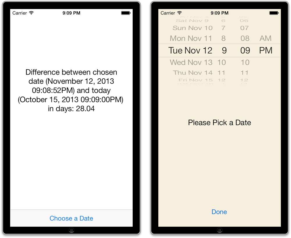
In the first tutorial, we implement a date picker that is displayed from a bar button item centered in a toolbar. On the iPhone, the picker is shown via a modal segue. On the iPad, however, the picker appears in a popover, as required by Apple’s human interface guidelines.
After the user chooses a date, the modal view (or popover) disappears, and a message is displayed that shows the calculated number of days between the current date and the date selected in the picker, as demonstrated in Figure 12.7.
Implementation Overview
We build this project, named DateCalc, using the Single View Application template and following much of the same pattern as we did in the preceding hour’s lesson. Our initial scene contains an output label for the date calculation, along with a toolbar and button. Touching the button triggers a manual segue to another scene—either modally (iPhone) or using a popover (iPad). The second scene contains the date picker and, on the iPhone, a button to dismiss the modal view.
To prevent multiple popovers from showing on the iPad, the initial scene’s view controller has a Boolean property that tracks whether the date picker is visible. If it is, the code won’t allow it to be shown again. In addition, we add a “delegate” property to the custom view controller class that manages the date picker. We use this to store a reference to our initial scene’s view controller. This eliminates the need to worry about the presentingViewController property and all the differences between popovers and modal views. We have one class, and it works the same regardless of how it is presented.
Setting Up the Project
Create a new single-view application named DateCalc. The initial scene/view controller that is created with the template will contain the date calculation logic, but we need to add another scene and view controller that will be used to display the date picker interface.
Adding the Date Chooser View Controller Class
To handle the display and selection of a date using the date picker, we add a class called DateChooserViewController to our project. Click the + button at the bottom-left corner of the project navigator and choose New File. When prompted, choose the iOS Cocoa Touch category and the Objective-C class, and then click Next. When asked to name the class, enter DateChooserViewController and choose a subclass of UIViewController. On the last setup screen, choose your main project code group from the Group pop-up menu, and then click Create.
Next, create an instance of the DateChooserViewController in the Main.storyboard file.
Adding the Date Chooser Scene and Associating the View Controller
Open the Main.storyboard in the IB editor. Display the Object Library (Control-Option-Command-3) and drag a view controller into an empty area of the IB editor (or into the document outline area). Your project should now show two scenes.
Associate the new view controller with the DateChooserViewController class by first selecting the View Controller icon in the second scene within the document outline. Use the Identity Inspector (Option-Command-3) to set the Custom Class drop-down menu to DateChooserViewController.
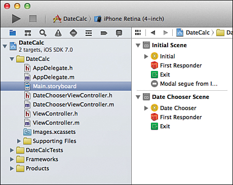
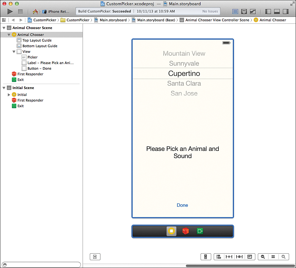
Select the view controller object for the first scene and make sure the Identity Inspector is still onscreen. Within the Identity section, set the label for the first view to Initial. Repeat for the second scene, setting its view controller label to Date Chooser. The document outline will now display Initial Scene and Date Chooser Scene, as shown in Figure 12.8.
Planning the Properties and Connections
Not too many outlets and actions are required in today’s projects. Let’s start with the initial scene, handled by the ViewController class. We have a label that is used for output, represented by private property we’ll call outputLabel. We also have an action, showDateChooser, for displaying the date chooser scene; that will be a private method. In addition to the private property and method, the ViewController class will have a public property that tracks whether the date chooser scene is visible (dateChooserVisible) and a public method for calculating the difference between the current date and chosen date (calculateDate Difference). Why are the first two private and the last two public? The first two are used only by the ViewController class; the second two must also be accessed by the DateChooserView Controller class.
For the date chooser scene, implemented in the DateChooserViewController class, there are two actions: setDateTime, called when the user selects a date in the date picker; and dismissDateChooser, used in the iPhone’s modal view to exit the date chooser scene when a button in the view is touched. Both of these are private. There is also a very important property (delegate) that we add to the DateChooserViewController to store a reference to the initial scene’s view controller. We use this public property to easily access the public properties and methods in the ViewController class.
Designing the Interface
To design the interface, follow these steps:
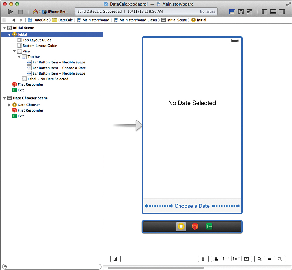
1. Open the Main.storyboard file and scroll so that you can see the initial scene in the editor.
2. Using the Object Library (Control-Command-Option-3), drag a toolbar into the bottom of the view.
3. By default, the toolbar contains a single button named item. Double-click the item title and change it to read Choose a Date.
4. Drag two Flexible Space Button Bar Items from the Object Library and position one on each side of the Choose a Date button. This forces the button into the center of the toolbar.
5. Add a label to the center of the view.
6. Use the Attributes Inspector (Option-Command-4) to increase the default text size for the label, center it, and set it to accommodate at least five lines of text.
7. Change the default text to read No Date Selected.
Figure 12.9 shows my final view.
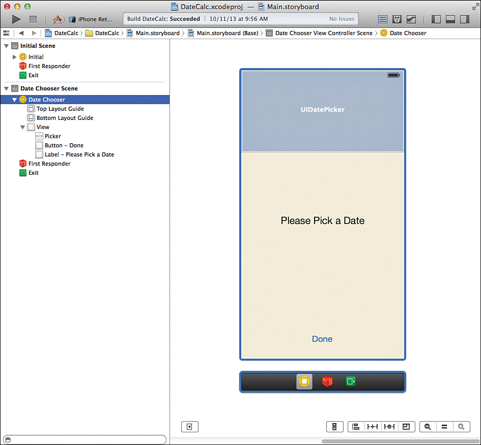
Now, focus on the date chooser scene. For my design, I began by selecting the view and setting its background color to a light beige. This, of course, is unnecessary, but it does provide an additional visual cue to the user that the interface has changed. Drag a date picker into the top of the view. If you’re working on an iPad version of the application, this view will ultimately be presented as a popover, so the upper-left corner of the view is all that will be visible.
Beneath the date picker, drag a label and change its text to read Please Pick a Date. As a final step, if you’re working on an iPhone version of the application, drag a button to the bottom of the view. This is used to dismiss the date chooser scene. Label the button Done. Figure 12.10 shows my finished date chooser interface.
Creating the Segue
Control-drag from the view controller in the initial scene to the view controller in the date chooser scene; you can do this either directly in the document outline area or using the visual representations of the scenes in the IB editor. When prompted for the storyboard segue type, choose Modal (for the iPhone) or Popover (for the iPad). A line labeled Modal Segue from Initial to Date Chooser appears in the initial scene within the document outline. Select this line and open the Attributes Inspector (Option-Command-4) to configure the segue.
Provide an identifier for the segue: toDateChooser. We will be triggering the segue manually, so setting this value is critical for the code to work. That’s it for the iPhone, but the iPad version of the app needs a bit more setup.
Setting the Popover Size and Anchor (iPad Only)
On the iPad version of the application, we need to set an “anchor” for the popover (where it appears from on the screen) as well as its size, as follows:
1. With the segue still highlighted, use the Attributes Inspector to drag from the Anchor field to the Choose a Date button in the initial scene’s toolbar, as shown in Figure 12.11.
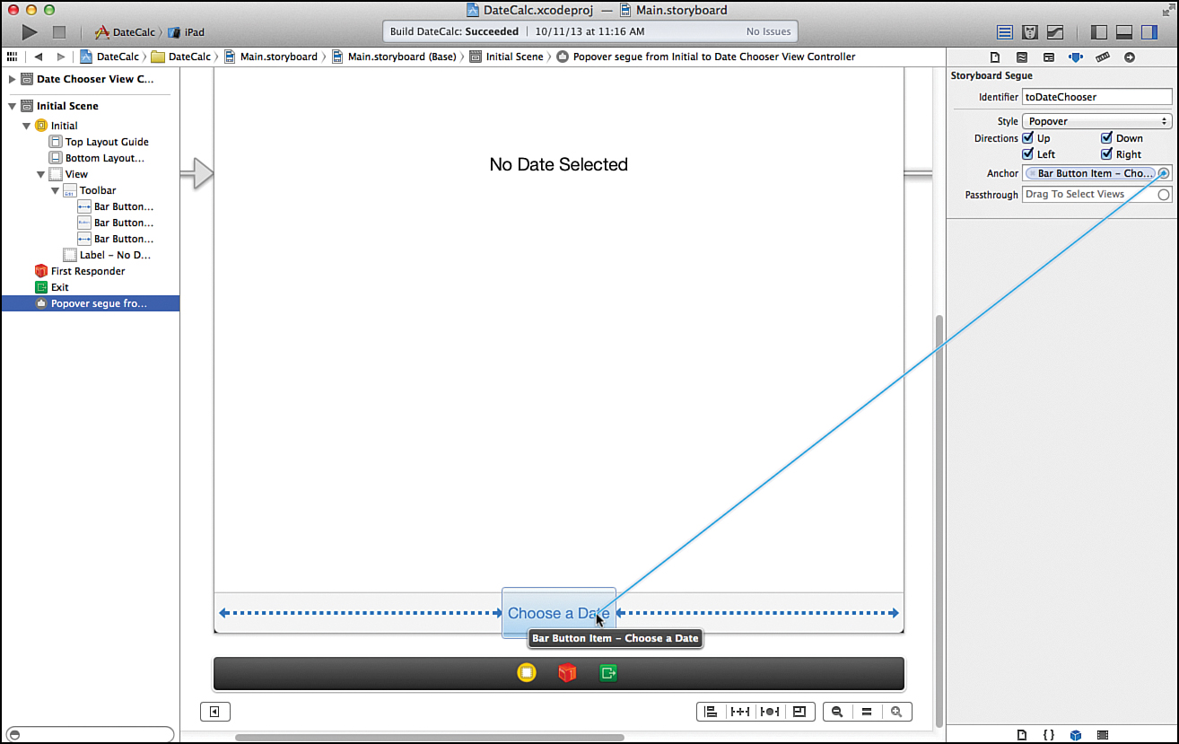
2. Open the date chooser scene in the document outline, making sure that the view object is visible.
3. Select the view object and open the Size Inspector.
4. Set a width of around 320 points and a height of 320 points.
5. Adjust the content of the view so that it is nicely centered. Note that if some of your UI elements are off the screen, you can select them in the document outline and then use the Size Inspector to set their X and Y coordinates.
Caution: Anchors Away
Popover segues created between two view controllers require an anchor to be set. If it isn’t, the application will build and run; as soon as you click the button that triggers the segue, though, the application will crash.
Creating and Connecting the Outlets and Actions
Each of our scenes has two connections to make: an action and an outlet in the initial scene, and two actions in the date chooser scene. Let’s review those now:
outputLabel (UILabel): The label that will display the results of the date calculation in the initial scene
showDateChooser: An action method triggered by the Choose a Date bar button item in the initial scene
dismissDateChooser: An action method triggered by the Done button in the date chooser scene
setDateTime: An action method invoked when the date picker changes its value
Switch to the assistant editor, and begin by wiring up the initial view’s outlet.
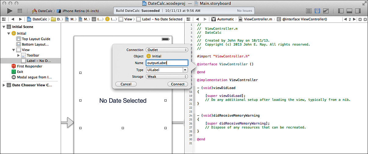
Adding the Outlet
Select the output label in the initial scene and Control-drag from the label to just below the @interface line in ViewController.m. When prompted, create a new outlet named outputLabel, as shown in Figure 12.12.
Adding the Actions
Beyond the single outlet, every other connection in this project is an action. Within the initial scene, Control-drag from the Choose a Date button to below the property definition in ViewController.m. When prompted, add a new action named showDateChooser.
Move to the second (date chooser) scene and Control-drag from the date picker to the DateChooserViewController.m file, targeting below the @interface line. When prompted, create a new action named setDateTime that is triggered on the Value Changed event. If you’re developing for the iPad, you’re done; your users will just touch outside the popover to make it go away. If you’re creating an iPhone app, however, you must Control-drag from the Done button to DateChooserViewController.m. Create a new action called dismissDateChooser that will be triggered from the button.
Implementing the Scene Segue Logic
We need to handle two primary tasks in the application logic. First, we need to handle the interactions between our initial scene’s view controller and the date chooser view controller. Second, we need to be able to calculate and display a difference between dates. We start with the communications between the view controllers.
Importing the Interface Files
In the preceding hour’s lesson, we had two view controllers, but only one of the two needed to access properties/methods inside the other. In this tutorial, the ViewController class needs to access public properties in DateChooserViewController and vice versa.
Add the following line after the existing #import statement in ViewController.h:
#import "DateChooserViewController.h"
Similarly, in the DateChooserViewController.h, add an import line for ViewController.h:
#import "ViewController.h"
Once those lines are in place, our two classes can access the methods and properties defined in their interface (.h) files.
Creating and Setting a Delegate Property
In addition to the two classes being aware of the public methods and properties each other provides, we require a convenient way for the date chooser view controller to access the initial scene’s view controller object. It uses this property to trigger a date calculation in the initial scene’s view controller and to indicate when it (the date chooser) has been removed from the display. Remember that for the popover version of this project, we need to make sure that the application tries to show us just one copy of the popover at a time.
If the project were using a modal segue only, we could use the presentingViewController property within DateChooserViewController, but this property doesn’t work on popovers. To keep things consistent between modal and popover implementations, we add a delegate public property to the DateChooserViewController class.
Edit DateChooserViewController.h and add the following line after the @interface directive:
@property (weak, nonatomic) id delegate;
This defines the new property with a type of id, meaning that it can reference any object we want—just like delegate properties that are built in to Apple’s classes.
To set the delegate property, we can tie into the prepareForSegue:sender method that will automatically be called in ViewController.m when the segue between the initial scene and the date chooser scene takes place. Update ViewController.m to include the method shown in Listing 12.4.
LISTING 12.4 Setting the Delegate During the Segue
- (void)prepareForSegue:(UIStoryboardSegue *)segue sender:(id)sender {
((DateChooserViewController *)segue.destinationViewController).delegate=self;
}
This line of code typecasts the segue’s destinationViewController property to a DateChooserViewController object (which we know it is) and sets the delegate property we created in that class to self (that is, to the current instance of the initial scene’s ViewController class).
Note
Particularly observant readers might be questioning whether we should instead be accessing the contentViewController property so that the code will work with a popover—as we did in the preceding hour. Good news. The destinationViewController property gives us the same reference as the contentViewController but takes less work to access it.
Now we’re all set to communicate between the initial and date chooser scenes. Importing the interface files provided the foundation for referencing public methods and properties between the scene’s view controllers, and the delegate property provides a mechanism for exchanging information.
Our next step is to implement the segue between the scenes and to use the delegate (and another public property we define shortly) to make sure that we don’t try to execute the segue repeatedly and thus inadvertently create multiple copies of the date chooser scene.
Handling the Segue to and from the Date Chooser Scene
In this app, the segue was created between view controllers rather than between an object and a view controller. This is what I’ve been referring to as a “manual” segue, because it will need to be triggered from code in the showDateChooser method. When triggering the segue, we first need to check whether the date chooser is already showing on the screen; we do this via a Boolean public property (dateChooserVisible) that is added to the ViewController class. Update ViewController.h to include this property definition now:
@property (nonatomic) Boolean dateChooserVisible;
A Boolean value is not an object, so the weak keyword isn’t used when declaring the property.
Now, implement the showDateChooser method so that it first checks to make sure the dateChooserVisible property isn’t currently YES, uses performSegueWithIdentifier: sender to initiate the segue to the date chooser, and finally toggles the dateChooser Visible property to YES so that we know it is onscreen. Listing 12.5 shows my implementation in ViewController.m.
LISTING 12.5 Showing the Date Chooser Scene, If Needed
- (IBAction)showDateChooser:(id)sender {
if (self.dateChooserVisible!=YES) {
[self performSegueWithIdentifier:@"toDateChooser" sender :sender];
self.dateChooserVisible=YES;
}
}
At this point, you can run the application and press the Choose a Date button to show the date chooser, but in the case of the iPad, you can show the chooser just one time because we haven’t written code to set dateChooserVisible to NO. iPhone users won’t be able to dismiss the modal date chooser scene because their Done button isn’t wired up yet.
To address the first shortcoming, we can edit the DateChooserViewController.m class to include the viewWillDisappear method. This gives us a nice place to add the necessary code to set dateChooserVisible to NO, right as it is about to be removed from the device’s screen. Because we’re updating this property from the date chooser view controller, we use the delegate property we defined earlier to access dateChooserVisible. Implement viewWillDisappear in DateChooserViewController.m, as shown in Listing 12.6.
LISTING 12.6 Toggling the Date Chooser’s Visibility Flag to NO
-(void)viewWillDisappear:(BOOL)animated {
[super viewWillDisappear:animated];
((ViewController *)self.delegate).dateChooserVisible=NO;
}
The final method that we need for handling our segue is for the iPhone only: dismissing the modal segue when the user presses the Done button in the date chooser scene. You’ve already made the connection to dismissDateChooser; you just need to add a call to dismissView-ControllerAnimated:completion. Listing 12.7 shows the one-line implementation of dismissDateChooser in DateChooserViewController.m.
LISTING 12.7 Dismissing the Modal Scene
- (IBAction)dismissDateChooser:(id)sender {
[self dismissViewControllerAnimated:YES completion:nil];
}
Everything is in place for hiding and showing the date chooser scene via a modal segue on the iPhone and a popover on the iPad. What isn’t finished, however, is the logic for calculating the difference between the current day and the day the user chooses.
Note
In the preceding hour, we used an exit/unwind segue to move back to the initial scene; it was meant as a learning exercise. In this implementation, we just use the dismissViewController Animated:completion method, because it is easier and quicker for a two-scene project.
Implementing the Date Calculation Logic
The most difficult work that we still have in front of us with the date picker implementation is writing the calculateDateDifference logic. To do what we’ve set out to (show the difference between today’s date and the date in the picker), we must complete several tasks:
Get today’s date
Display a date and time
Calculate the difference between two dates
Before writing the code, let’s look at the different methods and data types that we need.
Getting the Date
To get the current date and store it in an NSDate object, all that we need to do is to initialize a new NSDate with the date method. When initialized, it automatically stores the current date. This means that a single line takes care of our first hurdle:
todaysDate=[NSDate date];
Displaying a Date and Time
Unfortunately, displaying a date and time is a bit more tricky than getting the current date. Because we’re going to be displaying the output in a label, we already know how it is going to be shown on the screen, so the question is really, how do we format a string with an NSDate object?
Interestingly enough, there’s a class to handle this for us. We’ll create and initialize an NSDateFormatter object. Next, we use the object’s setDateFormat to create a custom format using a pattern string. Finally, we apply that format to our date using another method of NSDateFormatter, stringFromDate—which, given an NSDate, returns a string in the format that we defined.
For example, if we assume that we’ve already stored an NSDate in a variable todaysDate, we can output in a format like Month, Day, Year Hour:Minute:Second(AM or PM) with these lines:
dateFormat = [NSDateFormatter new];
[dateFormat setDateFormat:@"MMMM d, yyyy hh:mm:ssa"];
todaysDateString = [dateFormat stringFromDate:todaysDate];
First, the formatter object is initialized in a new object, dateFormat. Then the string @"MMMM d, YYYY hh:mm:ssa" is used as a formatting string to set the format internally in the object. Finally, a new string is returned and stored in todaysDateString by using the dateFormat object’s instance method stringFromDate.
Where in the World Did That Date Format String Come From?
Determining the Difference Between Two Dates
The last thing that we need to understand is how to compute the difference between two dates. Instead of needing any complicated math, we can just use the timeIntervalSinceDate instance method in an NSDate object. This method returns the difference between two dates, in seconds. For example, if we have two NSDate objects, todaysDate and futureDate, we could calculate the time in seconds between them with this:
NSTimeInterval difference;
difference = [todaysDate timeIntervalSinceDate:futureDate];
Notice that we store the result in a variable of type NSTimeInterval. This isn’t an object. Internally, it is just a double-precision floating-point number. Typically, this is declared using the native C data type double, but Apple abstracts this from us by using a new type of NSTimeInterval so that we know exactly what to expect out of a date difference calculation.
Note that if the timeIntervalSinceDate: method is given a date before the object that is invoking the method (that is, if futureDate was before todaysDate in the example), the difference returned is negative; otherwise, it is positive. To get rid of the negative sign, we use the C function fabs(<float>) that, given a floating-point number, returns its absolute value.
Implementing the Date Calculation and Display
To calculate the difference and dates, we implement a method in ViewController.m called calculateDateDifference that receives a single parameter (chosenDate). After writing the method for the calculation, we add code to the date chooser view controller to call the calculation when the date picker is used.
First, add a prototype for the public calculation method in the ViewController.h file:
- (void)calculateDateDifference:(NSDate *)chosenDate;
Next, add the calculateDateDifference implementation from Listing 12.8 to your ViewController.m file.
LISTING 12.8 Calculating the Difference Between Two Dates
1: - (void)calculateDateDifference:(NSDate *)chosenDate {
2: NSDate *todaysDate;
3: NSString *differenceOutput;
4: NSString *todaysDateString;
5: NSString *chosenDateString;
6: NSDateFormatter *dateFormat;
7: NSTimeInterval difference;
8:
9: todaysDate=[NSDate date];
10: difference = [todaysDate timeIntervalSinceDate:chosenDate] / 86400;
11:
12: dateFormat = [NSDateFormatter new];
13: [dateFormat setDateFormat:@"MMMM d, yyyy hh:mm:ssa"];
14: todaysDateString = [dateFormat stringFromDate:todaysDate];
15: chosenDateString = [dateFormat stringFromDate:chosenDate];
16:
17: differenceOutput=[NSString stringWithFormat:
18: @"Difference between chosen date (%@) and today (%@) in days:%1.2f",
19: chosenDateString,todaysDateString,fabs(difference)];
20: self.outputLabel.text=differenceOutput;
21: }
Much of this should look pretty familiar based on the preceding examples, but let’s review the logic. First, in lines 2–6, we declare the variables we’ll be using: todaysDate will store the current date, differenceOutput will be our final formatted string displayed to the user, and todaysDateString will contain the formatted version of the current day’s date. chosenDateString will hold the formatted date that is passed to the method, dateFormat will be our date formatting object, and difference is the double-precision floating-point number used to store the number of seconds between two dates.
Lines 9 and 10 do most of the work we set out to accomplish. In line 9, we allocate and initialize todaysDate as a new NSDate object. This automatically stores the current date and time in the object.
In line 10, we use timeIntervalSinceDate to calculate the time, in seconds, between todaysDate and [sender date]. Remember that sender will be the date picker object, and the date method tells an instance of UIDatePicker to return its current date and time in an NSDate object, so this gives our method everything it needs to work with. The result is divided by 86400 and stored in the difference variable. Why 86400? This is the number of seconds in a day, so we will be able to display the number of days between dates, rather than seconds.
In lines 12–15, we create a new date formatter object (NSDateFormatter) and use it to format todaysDate and chosenDate, storing the results in todaysDateString and chosenDateString.
Lines 17–19 format the final output string by creating a new string (differenceOutput) and initializing it with stringWithFormat. The format string provided includes the message to be displayed to the user as well as the placeholders %@ and %1.2f—representing a string and a floating-point number with a leading zero and two decimal places. These placeholders are replaced with the todaysDateString, chosenDateString, and the absolute value of the difference between the dates, fabs(difference).
In line 20, the label we added to the view, differenceResult, is updated to display differenceOutput.
Updating the Date Output
To finish the tutorial, we need to add code to call the calculateDateDifference method so that the display is updated when the user picks a date. There are actually two places we need to call the calculation: when the user picks a new date and when date chooser is first displayed. In the second case, the user hasn’t picked a date and the current date is displayed in the picker.
Start with the most important use case: handling a user’s action by calculating the date difference when the setDateTime method is called. Recall that this is triggered when the date picker value changes. Update the method stub in DateChooserViewController.m with the code in Listing 12.9.
LISTING 12.9 Calculating the Date Difference
- (IBAction)setDateTime:(id)sender {
[(ViewController *)self.delegate
calculateDateDifference:((UIDatePicker *)sender).date];
}
The delegate property is used to access the calculateDateDifference method in ViewController.m. We pass it the date property returned from the date picker, and we’re done. Unfortunately, if the user exits the picker without explicitly making a choice, there won’t be a date calculation displayed.
If the user exits the picker, we can assume that the current date is what the user wanted. To handle this implicit selection, add the viewDidAppear method in DateChooserViewController.m, as shown in Listing 12.10.
LISTING 12.10 Performing a Default Calculation When the Date Chooser Is First Displayed
-(void)viewDidAppear:(BOOL)animated {
[super viewDidAppear:animated];
[(ViewController *)self.delegate calculateDateDifference:[NSDate date]];
}
This is identical to the setDateTime method, but we pass it a new date object with the current date rather than querying the picker. This ensures that a calculated value is displayed, even if the user immediately dismisses the modal scene or popover.
Building the Application
The date picker application is complete. Run and test the app to get an idea for how the different pieces come together. Something to look for during your testing is the behavior of the iPad/popover version of the application. You may have wondered why we update the initial scene’s output label each time the user chooses a new date rather than waiting until the user dismisses the date chooser scene. The reason for this is because, in the iPad version, the initial scene remains visible while the date chooser is displayed in the popover. As a result, the user can actually see live feedback as he picks new dates.
You’ve just implemented a date picker, learned how to perform some basic date arithmetic, and even formatted dates for output using date formatting strings. What could be better? Creating your own custom picker with your own data, of course.
Using a Custom Picker
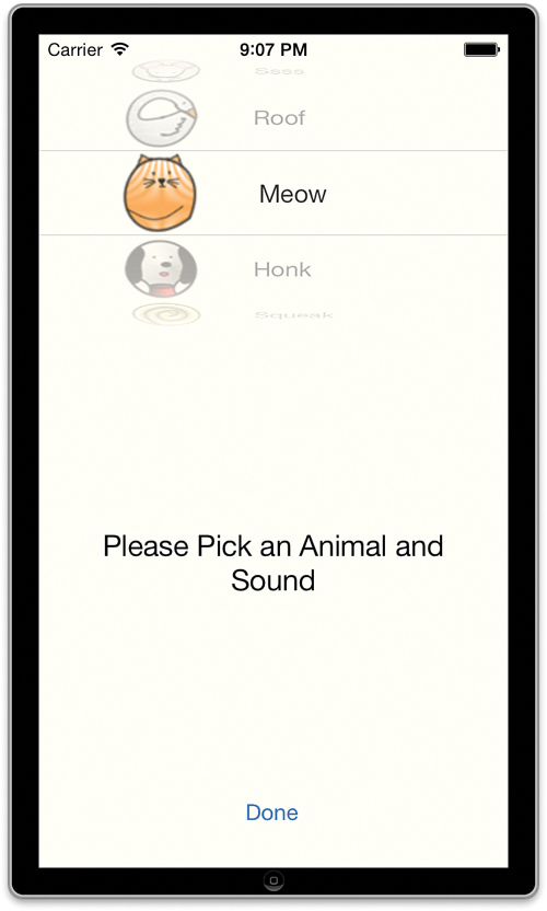
In the second project of this hour’s lesson, you create a custom picker that presents two components, one with an image (an animal) and another with a text string (an animal sound). As with the previous project, the picker is displayed via a modal segue on the iPhone and a popover on the iPad, as shown in Figure 12.13.
When users choose an animal or sound from the custom picker view, their selection is displayed in an output label.
Implementation Overview
While the implementation of the custom picker requires that we have a class that conforms to the picker’s delegate and data source protocols, many of the core processes in this application are identical to the last. An initial scene contains an output label and a toolbar with a single button. Touching the button triggers a segue to the custom chooser’s scene. From there, the user can manipulate the custom picker and return to the initial scene by touching a Done button or, on the iPad, by touching outside of the popover that appears.
We also add the logic, using the same approach as earlier, to prevent multiple popovers from appearing. The property names will change a bit to better reflect their role in this application, but logic and implementation are nearly identical. Because of this similarity, we will work quickly and provide detailed instructions only where the projects differ.
Setting Up the Project
Create a new project named CustomPicker based on the Single View Application template. If you built the previous tutorial for the iPhone, I suggest that you build this project for the iPad (or vice versa). Even though developing for the two devices is almost identical, it’s going to get a feel for using the design tools with the different hardware targets.
Adding the Image Resources
For the custom picker to show animal pictures, we need to add a few images to the project. Because we know upfront that we need these images, we can add them to the project immediately. Open the project group in the project navigator area of Xcode. Click the main Images.xcassets file to open the project’s image assets. Now, drag the Images folder from the Hour’s Projects folder in the Finder into the left-hand column inside the asset catalog.
Open the Images group that appears in the catalog and verify that you have seven image assets in your project: bear.png, cat.png, dog.png, goose.png, mouse.png, pig.png, and snake.png.
Adding the Animal Chooser View Controller Class
Like the DateChooserViewController class presented a scene with a date picker, the AnimalChooserViewController class will handle the display and selection of an animal and a sound. Click the + button at the bottom-left corner of the project navigator and choose New File. Create a new Objective-C class: a UIViewController subclass named AnimalChooserViewController. Place the new class files in your project’s main code group.
Adding the Animal Chooser Scene and Associating the View Controller
Open the Main.storyboard and display the Object Library (Control-Option-Command-3). Drag a view controller into an empty area of the IB editor or the document outline area.
Select the new scene’s view controller icon, and then use the Identity Inspector (Option-Command-3) to set the Custom Class drop-down menu to AnimalChooserViewController. Use the Identity Inspector to set the label for the first view to Initial and the second scene to Animal Chooser. These changes should be reflected immediately in the document outline.
Planning the Properties, Variables, and Connections
The outlets and actions in this project mirror the last, with one exception. In the previous tutorial, we needed a method to be executed when the date picker changed its value. In this tutorial, we implement protocols for the custom picker that include a method that is called automatically when the picker is used.
The ViewController class’s initial scene has a label for output (outputLabel) and an action (showAnimalChooser) for displaying the animal chooser scene—both private. The class also tracks whether the animal chooser scene is visible through a public property animalChooserVisible. The class shows the selected animal/sound using a public method: displayAnimal:WithSound:FromComponent.
The animal chooser scene is implemented in the AnimalChooserViewController class. It features one action (dismissAnimalChooser) used to exit the animal chooser modal scene in the iPhone implementation (private). As with the preceding project, we will implement a public delegate property that stores a reference to the initial scene’s view controller. Finally, there are three private properties (animalNames, animalSounds, and animalImages) referencing NSArray objects. These contain the animal names that we are displaying, the sounds to display in the custom chooser components, and the image resource names that correspond to the animals.
Adding the Custom Picker Component Constants
When creating custom pickers, we must implement a variety of protocol methods that refer to the various components (the spinny wheels) by number. To simplify a customer picker implementation, you can define constants for the components so that you can refer to them symbolically.
In this tutorial, we refer to component 0 as the animal component and component 1 as the sound component. By defining a few constants at the start of our implementation file, we can easily refer to them by name. Edit AnimalChooserViewController.m and add these lines so that they follow the #import line:
#define kComponentCount 2
#define kAnimalComponent 0
#define kSoundComponent 1
The first constant, kComponentCount, is just the number of components that we want to display in the picker, whereas the other two constants, kAnimalComponent and kSoundComponent, can be used to refer to the different components in the picker without resorting to using their actual numbers.
Designing the Interface
Open the Main.storyboard file and scroll so that you can see the initial scene in the editor. Using the Object Library (Control-Command-Option-3), drag a toolbar into the bottom of the view. Change the default bar button item to read Choose an Animal and Sound. Use two Flexible Space Button Bar Items from the Object Library to center the button.
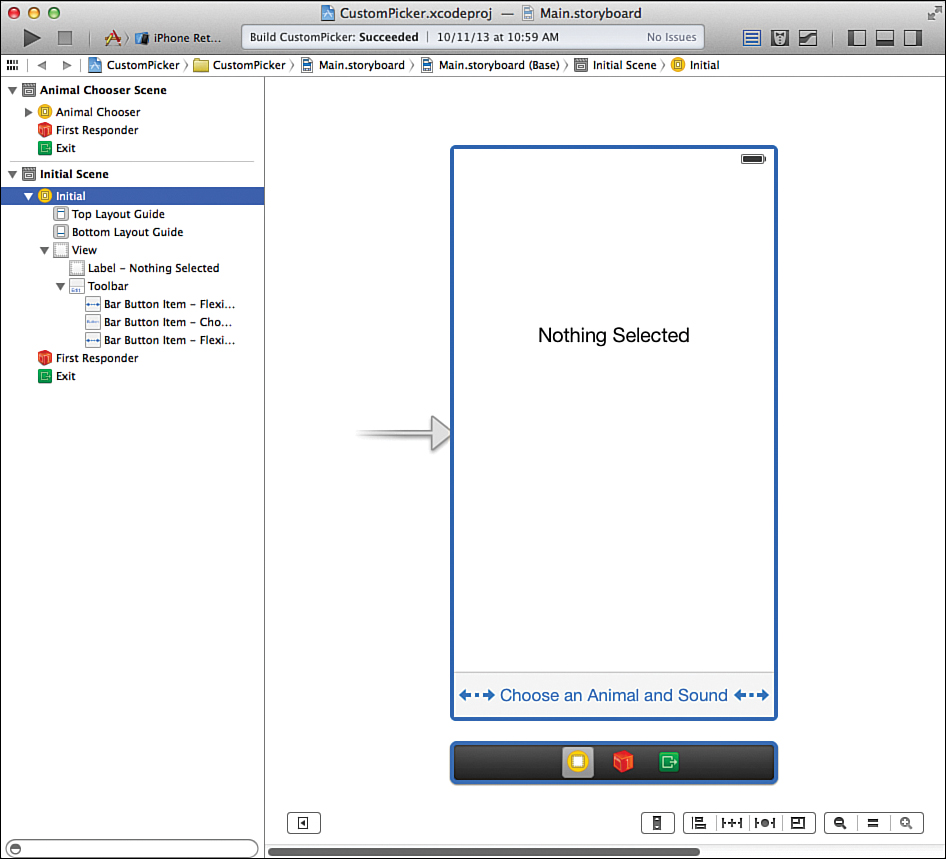
Next, add a label with the default text Nothing Selected to the center of the view. Use the Attributes Inspector to center the text, increase the font size, and set the label to display at least five lines of text. Figure 12.14 demonstrates my initial view layout.
Configure the animal chooser scene as you did the date chooser scene, setting a background label that reads Please Pick an Animal and Sound, but this time drag a picker view object into the top of the scene. If you’re working on an iPad version of the application, this view will ultimately be presented as a popover, so the upper-left corner of the view is all that will be visible.
If you’re working on an iPhone version of the application, drag a button to the bottom of the view and label it Done. This, as before, is used to dismiss the animal chooser scene. Figure 12.15 shows my finished animal chooser interface.
Setting the Picker View Data Source and Delegate
In this project, we have the AnimalChooserViewController class serve double-duty and act as the picker view’s data source and delegate. In other words, the AnimalChooserView Controller class is responsible for implementing all the methods needed to make a custom picker view work.
To set the data source and delegate for the picker view, select it in the animal chooser scene or the document outline area, and then open the Connections Inspector (Option-Command-6). Drag from the dataSource outlet to the Animal Chooser View Controller line in the document outline. Do the same for the delegate outlet. Once finished, the Connections Inspector should resemble Figure 12.16.
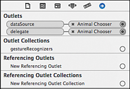
FIGURE 12.16 Connect the picker view’s delegate and dataSource outlets to the animal chooser view controller object.
Creating the Segue
It’s time to make the segue between scenes. Control-drag from the view controller in the initial scene to the view controller in the animal chooser. Create a modal segue for the iPhone or popover for the iPad. A line labeled Popover Segue from Initial to Animal Chooser will show when the segue has been created. Open the Attributes Inspector (Option-Command-4) to configure the segue.
Provide an identifier for the segue: toAnimalChooser. We will use this ID to trigger the segue in our implementation code.
Setting the Popover Size and Anchor (iPad Only)
On the iPad version of the application, set an “anchor” for the popover by opening the Attributes Inspector and dragging from the Anchor field to the Choose an Animal and Sound button in the initial scene’s toolbar.
Select the animal chooser scene’s view object, and then use the Size Inspector to set the width and height to 320 points. Arrange your content so that it is attractively spaced in the scene.
Creating and Connecting the Outlets and Actions
A total of three connections are required (an action and an outlet in the initial scene, and a single action in the animal chooser scene):
outputLabel (UILabel): The label in the initial scene that will display the results of the user’s interactions with the picker view.
showAnimalChooser: An action method triggered by the Choose an Animal and Sound bar button item in the initial scene.
dismissAnimalChooser: An action method triggered by the Done button in the animal chooser scene. This is required only in the iPhone implementation.
Switch to the assistant editor and make the connections within ViewController.m (outputLabel, showAnimalChooser) and AnimalChooserViewController.m (dismissAnimalChooser).
Adding the Outlet
Select the output label in the initial scene and Control-drag from the label to just below the @interface line in ViewController.m. When prompted, create a new outlet named outputLabel.
Adding the Actions
Again in the initial scene, Control-drag from the Choose an Animal and Sound button to below the property definition in ViewController.m. When prompted, add a new action named showAnimalChooser.
If you’re working on an iPhone app, move to the second scene and Control-drag from the Done button to AnimalChooserViewController.m. Create a new action called dismissAnimal Chooser that will be triggered from the button.
Implementing the Scene Segue Logic
As in the preceding previous tutorial, our implementation of the custom picker view requires some special attention. We need to make sure that in the popover version of the implementation the app doesn’t end up displaying multiple overlapping copies of the animal chooser scene. The same process used in DateCalc is followed here.
Importing the Interface Files
Update the interface files for both of the view controller classes so that they import each other’s interface. Add the following line after the existing #import statement in ViewController.h:
#import "AnimalChooserViewController.h"
In the AnimalChooserViewController.h, add an import line for ViewController.h:
#import "ViewController.h"
Creating and Setting a delegate Property
We will again use a delegate public property to access the initial scene’s view controller from within the animal chooser controller. Edit AnimalChooserViewController.h and add this line following the @interface line:
@property (weak, nonatomic) id delegate;
To set the new delegate property, update ViewController.m to include the method shown in Listing 12.11.
LISTING 12.11 Setting the Delegate During the Segue
- (void)prepareForSegue:(UIStoryboardSegue *)segue sender:(id)sender {
((AnimalChooserViewController *)segue.destinationViewController).delegate=self;
}
Handling the Segue to and from the Animal Chooser Scene
In this tutorial, we use a public property (animalChooserVisible) to store the current visibility of the animal chooser scene. Update ViewController.h to include this property definition now:
@property (nonatomic) Boolean animalChooserVisible;
Implement the showAnimalChooser method to call performSegueWithIdentifier: sender if the animalChooserVisible flag is set to NO. Listing 12.12 shows my implementation in ViewController.m.
LISTING 12.12 Showing the Animal Chooser Scene, If Needed
- (IBAction)showAnimalChooser:(id)sender {
if (self.animalChooserVisible!=YES) {
[self performSegueWithIdentifier:@"toAnimalChooser" sender:sender];
self.animalChooserVisible=YES;
}
}
To toggle the animalChooserVisible flag to NO, we set it in the AnimalChooserView Controller.m viewWillDisappear method, as shown in Listing 12.13.
LISTING 12.13 Toggling the Animal Chooser’s Visibility Flag to NO
-(void)viewWillDisappear:(BOOL)animated {
((ViewController *)self.delegate).animalChooserVisible=NO;
}
The iPhone implementation requires that we manually dismiss the modal scene. If you’re building the application for the iPhone platform, implement the dismissAnimalChooser method in AnimalChooserViewController.m (see Listing 12.14).
LISTING 12.14 Dismissing the Modal Scene
- (IBAction)dismissAnimalChooser:(id)sender {
[self dismissViewControllerAnimated:YES completion:nil];
}
That finishes the handling of the popover/modal view segue and all the logic needed to make sure that it works as intended. This leaves us with the implementation of the custom picker view and display of the user’s selection.
Implementing the Custom Picker View
Early in this hour, we presented a possible implementation of a very (very) limited custom picker view. Even though it didn’t represent a real-world application, it is close to what we will need to do to finish this example and create a custom picker that displays images and text, side by side, in two components. We’ll slow things down again and complete this hour’s lesson with a full explanation of the creation of the custom picker view.
Loading the Picker Data
To present the picker, we need to supply it with data. We’ve loaded the image resources, but to provide the images to the picker, we need to be able to reference them by name. In addition, we need to be able to “translate” between the image of an animal and its real name. That is, if a user picks an image of a pig, we want the application to say Pig, not pig.png. To do this, we have an array of animal images (animalImages) and an array of animal names (animal Names) that share the same index. For example, if the user picks an image that corresponds to the third element of animalImages, we can get the name from the third element of animal Names. We also need the data for the list of animal sounds presented in the second picker view component. For that, we use a third array: animalSounds.
Declare these three arrays as private properties in AnimalChooserViewController.m by updating the @interface block at the top of the file. The final implementation should look like this:
@interface AnimalChooserViewController ()
@property (strong,nonatomic) NSArray *animalNames;
@property (strong,nonatomic) NSArray *animalSounds;
@property (strong,nonatomic) NSArray *animalImages;
- (IBAction)dismissAnimalChooser:(id)sender;
@end
Now, we need to allocate and initialize the data in each array. For the names and sounds arrays, we will just be storing strings. In the images array, however, we will be storing initialized UIImageViews. Implement the viewDidLoad method in AnimalChooserViewController.m as shown in Listing 12.15.
LISTING 12.15 Loading the Data Required for the Picker View
1: - (void)viewDidLoad
2: {
3: [super viewDidLoad];
4:
5: self.animalNames=@[@"Mouse",@"Goose",@"Cat",@"Dog",@"Snake",@"Bear",@"Pig"];
6: self.animalSounds=@[@"Oink",@"Rawr",@"Ssss",@"Roof",@"Meow",@"Honk",@"Squeak"];
7: self.animalImages=@[
8: [[UIImageView alloc] initWithImage:[UIImage imageNamed:@"mouse.png"]],
9: [[UIImageView alloc] initWithImage:[UIImage imageNamed:@"goose.png"]],
10: [[UIImageView alloc] initWithImage:[UIImage imageNamed:@"cat.png"]],
11: [[UIImageView alloc] initWithImage:[UIImage imageNamed:@"dog.png"]],
12: [[UIImageView alloc] initWithImage:[UIImage imageNamed:@"snake.png"]],
13: [[UIImageView alloc] initWithImage:[UIImage imageNamed:@"bear.png"]],
14: [[UIImageView alloc] initWithImage:[UIImage imageNamed:@"pig.png"]],
15: ];
16: }
Line 5 creates the animalNames array with seven animal names.
Line 6 initializes the animalSounds array with seven animal sounds.
Lines 7–15 create the animalImages array with seven UIImageView instances loaded from the images that were imported at the start of the project.
Implementing the Picker View Data Source Protocol
The next step is to begin implementing the protocols that the custom picker requires. The first, the data source protocol, provides information to the picker about the number of components it will be displaying and the number of elements within each of those components.
Declare that we will be conforming to the UIPickerViewDataSource by editing AnimalChooser ViewController.h and modifying the @interface line to read as follows:
@interface AnimalChooserViewController :
UIViewController <UIPickerViewDataSource>
Next, implement the numberOfComponentsInPickerView method in AnimalChooserView Controller.m. This method returns the number of components the picker will display. Because we defined a constant for this (kComponentCount), all we need to do is return the constant, as shown in Listing 12.16.
LISTING 12.16 Returning the Number of Components
- (NSInteger)numberOfComponentsInPickerView:(UIPickerView *)pickerView {
return kComponentCount;
}
The other data source method required is the pickerView:numberOfRowsInComponent, which, given a component number, returns the number of elements that will be shown in that component. We can use the kAnimalComponent and kSoundComponent to simplify identifying which component is which, and the NSArray class method count to get the number of elements in an array. Using this, we can implement pickerView:numberOfRowsInComponent using the approach in Listing 12.17.
LISTING 12.17 Returning the Number of Elements per Component
1: - (NSInteger)pickerView:(UIPickerView *)pickerView
2: numberOfRowsInComponent:(NSInteger)component {
3: if (component==kAnimalComponent) {
4: return [self.animalNames count];
5: } else {
6: return [self.animalSounds count];
7: }
8: }
Line 3 checks whether the component being queried is the animal component. If it is, line 4 returns a count of the number of animals in the animalNames array. (The image array would work as well.)
If the component being checked isn’t the animal component, we can assume it is the sound component (line 5) and return the count of elements in the animalSounds array.
That’s all the data source needs to do. The remainder of the picker view work is handled by the picker view delegate protocol: UIPickerViewDelegate.
Implementing the Picker View Delegate Protocol
The picker view delegate protocol handles customizing the display of the picker and reacting to a user’s choice within the custom picker. Update AnimalChooserViewController.h to state our intention to conform to the delegate protocol:
@interface AnimalChooserViewController : UIViewController
<UIPickerViewDataSource, UIPickerViewDelegate>
Several delegate methods are needed to produce the picker we want, but the most important is pickerView:viewForRow:forComponent:reusingView. This method takes an incoming component and row and returns a custom view that will be displayed in the picker.
For our implementation, we want the animal images to be returned for the first component, and a label with the animal sounds returned for the second. Add the method, as written in Listing 12.18, to your project.
LISTING 12.18 Providing a Custom View for Each Possible Picker Element
1: - (UIView *)pickerView:(UIPickerView *)pickerView viewForRow:(NSInteger)row
2: forComponent:(NSInteger)component reusingView:(UIView *)view {
3: if (component==kAnimalComponent) {
4: // Pre-iOS 7 implementation
5: // return self.animalImages[row];
6:
7: // iOS 7 Workaround
8: UIImageView *chosenImageView=self.animalImages[row];
9:
10: UIImageView *workaroundImageView;
11: workaroundImageView=[[UIImageView alloc]
12: initWithFrame:chosenImageView.frame];
13: workaroundImageView.backgroundColor=
14: [UIColor
15: colorWithPatternImage:chosenImageView.image];
16: return workaroundImageView;
17: } else {
18: UILabel *soundLabel;
19: soundLabel=[[UILabel alloc] initWithFrame:CGRectMake(0,0,100,32)];
20: soundLabel.backgroundColor=[UIColor clearColor];
21: soundLabel.text=self.animalSounds[row];
22: return soundLabel;
23: }
24: }
In lines 3–5, we check to see whether the component requested is the animal component, and if it is, we use the row parameter to return the appropriate UIImageView stored in the animal Images array. Wait. No we don’t. Line 5 is all we should have to do to implement a custom picker view using an image, but it is broken in the first releases of iOS 7. If you try to use this approach, your images will flicker in and out of view in the picker.
To get around the iOS 7 problem, my approach is to take the image view we created in view DidLoad and allocate an initialize a new UIImageView with the same size (lines 8–12). Next, I set the backgroundColor property to the image referenced by the original image view (lines 13–15), and then return this new image view in line 16. There is absolutely no reason why this should work and the original method fail, but it does.
After digesting that little nugget of crazy, we can move on to the rest of the code.
If the component parameter isn’t referring to the animal component, we need to return a UILabel with the appropriate referenced row from the animalSounds array. This is handled in lines 18–22.
In line 18, we declare a UILabel named soundLabel. Line 19 allocates and initializes soundLabel with a frame using the initWithFrame method. Remember from earlier hours that views define a rectangular area for the content that is displayed on the screen. To create the label, we need to define the rectangle of its frame. The CGRectMake function takes starting x,y values and a width and height. In this example, we’ve defined a rectangle that starts at 0,0 and is 100 points wide and 32 points tall.
Line 20 sets the background color attribute of the label to be transparent ([UIColor clearColor] returns a color object configured as transparent). If we leave this line out, the rectangle will not blend in with the background of the picker view.
Line 21 sets the text of the label to the string of the specified row in animalSounds.
Finally, line 22 returns the UILabel—ready for display.
Changing the Component and Row Sizes
If you were to run the application now, you’d see the custom picker, but it would look a bit squished. To adjust the size of components in the picker view, we can implement two more delegate methods: pickerView:rowHeightForComponent and pickerView:widthFor Component.
For this application example, some trial and error led me to determine that the animal component should be 75 points wide, while the sound component looks best at around 150 points.
Both components should use a constant row height of 55 points.
Translating this into code, implement both of these methods in AnimalChooserViewController.m, as shown in Listing 12.19.
LISTING 12.19 Setting a Custom Height and Width for the Picker Components and Rows
- (CGFloat)pickerView:(UIPickerView *)pickerView
rowHeightForComponent:(NSInteger)component {
return 55.0;
}
- (CGFloat)pickerView:(UIPickerView *)pickerView
widthForComponent:(NSInteger)component {
if (component==kAnimalComponent) {
return 75.0;
} else {
return 150.0;
}
}
Reacting to a Selection in the Picker View
In the date picker example, you connected the picker to an action method and used the Value Changed event to capture when they modified the picker. Custom pickers, unfortunately, do not work this way. To grab a user’s selection from a custom picker, you must implement yet another delegate method: pickerView:didSelectRow:inComponent. This method provides the component and row where a selection was made.
Notice anything strange about that method? It gives us the component and row the user selected but doesn’t provide the status of the other components. To get the value of other components, we have to use the picker instance method selectedRowInComponent along with the component we’re interested in checking.
In this project, when the user makes a selection, we call the public method displayAnimal: withSound:fromComponent to display the selection in the initial scene’s output label. We haven’t yet implemented this method, so let’s do so now. Update ViewController.h with this method prototype:
- (void)displayAnimal:(NSString *)chosenAnimal
withSound:(NSString *)chosenSound
fromComponent:(NSString *)chosenComponent;
The implementation of the method in ViewController.m should take the incoming parameter strings and display them in the output label. Nothing fancy is required. My implementation is provided in Listing 12.20.
LISTING 12.20 Creating a Method to Display the User’s Selection
- (void)displayAnimal:(NSString *)chosenAnimal
withSound:(NSString *)chosenSound
fromComponent:(NSString *)chosenComponent {
NSString *animalSoundString;
animalSoundString=[NSString
stringWithFormat:@"You changed %@ (%@ and the sound %@)",
chosenComponent,chosenAnimal,chosenSound];
self.outputLabel.text=animalSoundString;
}
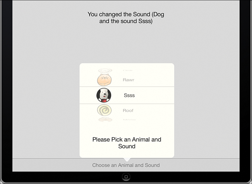
A string, animalSoundString, is created with the contents of the chosenComponent, chosen-Animal, and chosenSound strings. The output label is then set to display the new string.
Now that we have a mechanism for displaying the user’s choice, we need to handle their selection. Implement pickerView:didSelectRow:inComponent in the AnimalChooserView Controller.m file, as shown in Listing 12.21.
LISTING 12.21 Reacting to a User’s Selection
1: - (void)pickerView:(UIPickerView *)pickerView didSelectRow:(NSInteger)row
2: inComponent:(NSInteger)component {
3:
4: ViewController *initialView;
5: initialView=(ViewController *)self.delegate;
6:
7: if (component==kAnimalComponent) {
8: int chosenSound=[pickerView selectedRowInComponent:kSoundComponent];
9: [initialView displayAnimal:self.animalNames[row]
10: withSound:self.animalSounds[chosenSound]
11: fromComponent:@"the Animal"];
12: } else {
13: int chosenAnimal=[pickerView selectedRowInComponent:kAnimalComponent];
14: [initialView displayAnimal:self.animalNames[chosenAnimal]
15: withSound:self.animalSounds[row]
16: fromComponent:@"the Sound"];
17: }
18:
19: }
The first thing that the method does is grab a handle to the initial scene’s view controller in lines 4–5. We need this so we can display the user’s selection within that scene.
Line 7 checks to see whether the selected component was the animal component. If it was, we still need to grab the currently selected sound (line 8). Lines 9–11 call the displayAnimal:withSound:fromComponent method we just wrote, passing it the animal name, using the incoming row to select the right value from the array (line 9), the currently selected sound (line 10), and a string (the animal) to describe the component the user used (line 11).
In the event that the user chose a sound, lines 12–17 are executed instead. In this case, we need to look up the currently selected animal (line 13), and then, once again, pass all the relevant values to the display method to get them onscreen for the user.
Handling an Implicit Selection
As was the case with the date picker, the user can display the custom picker and then dismiss it without choosing anything. In this case, we should assume that the user wanted to choose the default animal and sound. To make sure this is accounted for, as soon as the animal chooser scene is displayed, we can update the output label in the initial scene with the default animal name, sound, and a message that nothing has been selected from a component (“nothing yet...”).
As with the date picker, we can do this in the viewDidAppear method in AnimalChooserView Controller.m. Implement the method as shown in Listing 12.22.
LISTING 12.22 Setting a Default Selection
-(void)viewDidAppear:(BOOL)animated {
[super viewDidAppear:animated];
ViewController *initialView;
initialView=(ViewController *)self.delegate;
[initialView displayAnimal:self.animalNames[0]
withSound:self.animalSounds[0]
fromComponent:@"nothing yet..."];
}
The implementation is simple. It grabs the initial view controller, and then it uses it to call the display method, passing the first element of the animal names and sounds arrays (because those are the elements displayed first in the picker). For the component, it passes a string to indicate that the user hasn’t chosen anything from a component...yet.
Building the Application
Run the application and test your new custom picker view. The behavior of the animal chooser view controller should be nearly identical to the date picker despite the differences in implementation. The iPad version of the picker view (displayed in a popover) updates the output label as soon as a selection is made. The iPhone version does as well, but the view is obscured by the modal scene. Best of all, the project uses a single class and almost identical development to create a UI feature that follows best practices on both the iPhone and iPad. This is something you might want to revisit after learning about universal applications in Hour 23, “Building Universal Applications.”
Further Exploration
As you learned in this lesson, UIDatePicker and UIPickerView objects are reasonably easy to use and quite flexible in what they can do. There are a few interesting aspects of using these controls that we haven’t looked at that you may want to explore on your own. First, both classes implement a means of programmatically selecting a value and animating the picker components so that they “spin” to reach the values you’re selecting: setDate:animated and selectRow:inComponent:animated. If you’ve used applications that implement pickers, chances are, you’ve seen this in action.
Another popular approach to implementing pickers is to create components that appear to spin continuously (instead of reaching a start or stopping point). You may be surprised to learn that this is really just a programming trick. The most common way to implement this functionality is to use a picker view that simply repeats the same component rows over and over (thousands of times). This requires you to write the necessary logic in the delegate and data source protocol methods, but the overall effect is that the component rotates continuously.
Although these are certainly areas for exploration to expand your knowledge of pickers, you may also want to take a closer look at the documentation for toolbars (UIToolbar) and the NSDate class. Toolbars provide a clean way to create an unobtrusive user interface and save a great deal of space versus adding buttons everywhere in your views. The ability to manipulate dates can be a powerful capability in your applications.
Summary
In this hour’s lesson, you explored three UI elements—UIToolbar, UIDatePicker, and UIPickerView—that each present the user with a variety of options. Toolbars present a static list of buttons or icons at the top or bottom of the screen. Pickers present a “slot-machine” type of view where the user can spin components in the interface to create custom combinations of options. What ties these features together is that they are often employed with popovers. In fact, Apple requires that pickers be displayed in a popover.
Although toolbars and date pickers work like other UI elements you’ve experienced over the past few hours, the custom picker view is rather different. It requires us to write methods that conform to the UIPickerViewDelegate and UIPickerViewDataSource protocols.
In writing the sample picker applications, you also had a chance to make use of NSDate methods for calculating the interval between dates, as well as NSDateFormatter for creating user-friendly strings from an instance of NSDate. Although not the topic of this lesson, these are powerful tools for working with dates and times and interacting with your users.
Q&A
Q. Why didn’t you cover the timer mode of the UIDatePicker?
A. The timer mode doesn’t actually implement a timer; it’s just a view that can display timer information. To implement a timer, you actually need to track the time and update the view accordingly—not something we can easily cover in the span of an hour.
Q. Where did you get the method names and parameters for the UIPickerView protocols?
A. The protocol methods that we implemented were taken directly from the Apple Xcode documentation for UIPickerViewDelegate and UIPickerViewDataSource. If you check the documentation, you can just copy and paste from the method definitions into your code.
Q. Should I try just returning a normal UIImageView for a custom picker, or assume I need a workaround?
A. Absolutely give it a try. The documentation for iOS 7 shows that the original method, should work. It just doesn’t work as intended in the first releases of iOS 7.
Workshop
Quiz
1. An NSDate instance stores only a date. True or false?
2. The bar button item and flexible space item are two separate things. True or false?
3. Picker views can display images using the pickerView:titleForRow:forComponent method. True or false?
Answers
1. False. An instance of NSDate stores an “instant in time”—meaning a date and time.
2. False. The flexible space is just a special configuration of the bar button item.
3. False. The pickerView:viewForRow:forComponent:reusingView method must be implemented to display images within a picker.
Activities
1. Update the dateCalc project so that the program automatically sets the picker to the current date when it is loaded. You’ll need to use the setDate:animated method to implement this change.
2. Update the CustomPicker project so that the user is rewarded for matching an animal to its sound. This was the original tutorial, but it had to be shortened for space. Here’s a hint: The animal sounds are presented in the reverse order of the animals.