Chapter 14. User Interfaces with jQuery UI
Introduction
A couple years back, there was a set of quite popular jQuery plugins bundled in a package called Interface, written by Stefan Petre. These offered really great interactions, such as dragging-and-dropping, selecting, sorting, and resizing, and great widgets such as a tool tip, an autocomplete, and an accordion. The 1.2 release of jQuery had some API changes that would’ve required changes to Interface for it to be compatible, but Interface was never updated.
jQuery UI, started by Paul Bakaus, picked up where Interface left off. jQuery UI is a suite of plugins with a consistent API and complete documentation that has been tested in all major browsers. With it, you can create rich web interfaces and rich Internet applications (RIAs). Oh yeah, and the plugins work well together and are easy to use, accessible, extensible, and “themeable.”
jQuery UI is a sister project of jQuery. Version 1.0 of jQuery UI was released in September 2007. Version 1.5 was released in June 2008. About halfway through the development of 1.6, the team changed directions and ended up releasing 1.7 with some major changes, most specifically the introduction of the jQuery UI CSS Framework. jQuery UI 1.6 was released later for legacy compatibility. The latest stable release is 1.7.2 and includes the following interactions, widgets, and effects.
Effects
Basic Usage
This chapter will forgo covering some of the more common ways to use these interactions, widgets, and effects, because they are well covered in demos on the jQuery UI website. These same demos, with full source code and descriptions, are included in every download of jQuery UI, along with full documentation.
How This Chapter Is Organized
The first two recipes get you started by helping you to download jQuery UI, or reference it on a content delivery network (CDN), and include it on your page for use.
The next seven recipes of this chapter cover the jQuery UI API.
This API first built on top of the jQuery plugin pattern but has grown
to include what is needed by jQuery UI widgets, which are a unique
style of jQuery plugin. Namely, they’re state and method calls. So, in
addition to specifying options on init, you can modify options after init. You can also call methods on jQuery UI
plugins to change the state and programmatically trigger custom
events.
The remainder of the chapter focuses on a project where multiple jQuery UI widgets are combined to create a single user interface that includes flexible and themeable controls for a music player.
14.1. Including the Entire jQuery UI Suite
Problem
You want to include the entire jQuery UI suite. This might be because you don’t know yet what parts you’ll use and what parts you won’t. Or it might be because you’ll use enough of the suite that it’s easier or more efficient to include the whole suite, rather than each individual piece you’ll use.
Solution
Link to a jQuery UI theme, then a compatible version of the jQuery script, and then the jQuery UI script:
<link rel="stylesheet" type="text/css" href="themename/jquery-ui.css" />
<script type="text/javascript" src="jquery.js"></script>
<script type="text/javascript" src="jquery-ui.js"></script>
Discussion
This chapter covers the latest stable version of jQuery UI: 1.7.2. It requires at a minimum jQuery 1.3. When you download jQuery UI, included in the ZIP package is the latest stable version of jQuery that is compatible.
Rather than host your own version of jQuery and jQuery UI, you can use Google’s AJAX Libraries API. Simply change your script URLs like so:
<script type="text/javascript"
 src="http://ajax.googleapis.com/ajax/libs/jquery/1.3.2/jquery.min.js"></script>
<script type="text/javascript"
 src="http://ajax.googleapis.com/ajax/libs/jqueryui/1.7.2/jquery-ui.min.js"></script>
Google also hosts the 20 or so themes that are in the jQuery UI ThemeRoller gallery.
<link rel="stylesheet" type="text/css" href="http://ajax.googleapis.com/ajax/libs/
jqueryui/1.7.2/themes/{themename}/jquery-ui.css" />
This includes the 13 images per theme that are referenced by relative URLs in the theme CSS.
You can replace {themename}
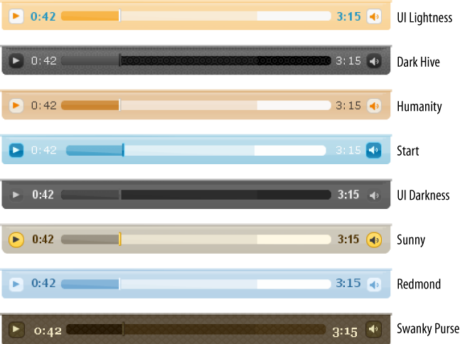
with base, black-tie, blitzer, cupertino, dark-hive, dot-luv, eggplant, excite-bike, flick, hot-sneaks, humanity, le-frog, mint-choc, overcast, pepper-grinder, redmond, smoothness, south-street, start, sunny, swanky-purse, trontastic, ui-darkness, ui-lightness, or vader. For a preview of each of these, see
the jQuery
UI ThemeRoller gallery.
Theming with jQuery UI is well covered in the next chapter. For our purposes, we’ll just be sure to include one of these themes, because a theme is required.
14.2. Including an Individual jQuery UI Plugin or Two
Problem
You only want to use one or two jQuery UI widgets. You don’t want to import the whole library and an entire theme’s CSS. You just want the minimum required to use the plugins you need.
Solution
So, you only want Sortable and Tabs. You have two options for including individual jQuery UI components rather than the entire suite:
Use the jQuery UI Download Builder to create a custom build of jQuery UI containing only those plugins you are interested in. For this example, select Sortable and Tabs. The Download Builder will automatically select any dependencies, in this case, UI Core. The ZIP you download includes a single .js file with UI Core, Sortable, and Tabs:
js/jquery-ui-1.7.2.custom.min.js
Include this file on your page after the jQuery script, which is provided in the same folder:
<script type="text/javascript" src="js/jquery-1.3.2.min.js"></script>
<script type="text/javascript" src="js/jquery-ui-1.7.2.custom.min.js"></script>
Download the jQuery UI development bundle, reference the development-bundle folder in a custom Download Builder ZIP, or use SVN. Each individual plugin file is in the ui subfolder. Reference each file individually:
<script type="text/javascript" src="jquery-1.3.2.js"></script>
<script type="text/javascript" src="ui/ui.core.js"></script>
<script type="text/javascript" src="ui/ui.sortable.js"></script>
<script type="text/javascript" src="ui/ui.tabs.js"></script>
The CSS for each individual plugin is also available in separate files, if you go with the second option (development-bundle). You’ll need to include the core CSS, each plugin-specific CSS, and the theme CSS:
<link rel="stylesheet" type="text/css" href="themes/base/ui.core.css" />
<link rel="stylesheet" type="text/css" href="themes/base/ui.tabs.css" />
<link rel="stylesheet" type="text/css" href="themes/base/ui.theme.css" />
In this case, one of the plugins we’ve selected, Sortable, doesn’t have any plugin-specific CSS.
Discussion
Whether using JavaScript or CSS, there are trade-offs between using a single large include and multiple smaller (overall) includes. It’s not always clear-cut, like “Use individual plugin files in development. Use one large file in production.” For example, it may be simpler in development to point to the whole suite, where performance testing isn’t a big consideration. But then in production you might need to include only the files for the plugins used on each page to minimize load.
On the other hand, for debugging purposes, it may be beneficial to have a script and CSS reference to each plugin file during development, and in production you may use the Google AJAX Libraries API and the visitor’s cache to make up for the file size, even if the file includes functions that are not ever used. The ideal setup will depend on your architecture, how many and which of the plugins you use, and the specific needs of your development and production environments.
14.3. Initializing a jQuery UI Plugin with Default Options
Problem
You want to start using a jQuery UI plugin as quickly and easily as possible, accepting the built-in default options.
Solution
All jQuery UI plugins are called like traditional jQuery plugins, so after you get a matched set of elements, simply call the plugin name as a function on the jQuery object:
<script type="text/javascript">
$(function() {
    $('#topnav').tabs();
});
</script>
Discussion
Because JavaScript is case sensitive, care is taken in the naming of jQuery UI plugins. All jQuery UI plugins start lowercase, and, like the jQuery API, most are only one word. If more than one word is needed, any after the first will start uppercase. There aren’t currently any jQuery UI plugins with more than one word, so here’s a made-up example:
$('p.long').succinct();

$('.short').longerPluginName();
The initialized element gets a class of ui-pluginname. For example, here’s the
before and after HTML if you call $('div').draggable();:
<div>A simple DIV</div>

<div class="ui-draggable">A simple DIV</div>
There are some exceptions to this. The element on which you call
.dialog() gets the class of
ui-dialog-content and is wrapped in
a generated element with a class of ui-dialog. Another exception is if you
call .datepicker() on a text input.
The input will not get the ui-datepicker, but the <div> that appears when the input is
focused has the ui-datepicker
class.
Here are a few points to keep in mind when initializing a jQuery UI plugin:
If you call a jQuery UI plugin
initmethod on a set containing more than one element, it will be called as a separateiniton each element individually. So, the following:$('img').draggable();is equivalent to this:
$('img').each(function() {
    $(this).draggable();
});
Each
DOMElementcan be initialized by each jQuery UI plugin only once. Any futureinitcalls, whether with options specified or not, will be ignored. See later in this chapter for recipes on changing options afterinitas well as destroying a plugin, which undoes aninit. If you really want to, you can callinitagain after that.All options are optional. You can always safely initialize a jQuery UI plugin by simply calling the plugin name method. Not only is it safe, but it should be supremely useful. Each has been designed to have the most common options as defaults. If they don’t make you happy, see the next two recipes.
14.4. Initializing a jQuery UI Plugin with Custom Options
Problem
You want to use a jQuery UI plugin but with options other than those selected by the plugin author to be the built-in defaults.
Solution
Specify default option overrides in an options hash as the first
argument to the plugin init method
call:
$('#myDiv').dialog({
    height: 100,          // overrides default: 'auto'
    width: 350            // overrides default: 300
});
Discussion
Any option values you specify on init will override the default value. All
unspecified options values will maintain the default.
The options hash, whether all defaults or some defaults plus
some custom options, is the basis for the initial state of the plugin.
That state is specific to the combination of that DOMElement with that jQuery UI plugin. For
example, you might initialize a single element with two different
jQuery UI plugins that each has a color option:
$('#myDiv').foo({ color: 'black' });
$('#myDiv').bar({ color: 'green' });
Now, #myDiv, what’s your
foo color? Black. What’s your
bar color? Green. Both are separate
from the CSS color. In some later recipes, we’ll get into how to ask
elements what their plugin values are, as well as how to give them new
values.
Also important to note is now that #myDiv is initialized as a foo and a bar, it is no longer affected by those
plugin defaults. The defaults are only used on init as a template for the plugin’s initial
state.
14.5. Creating Your Very Own jQuery UI Plugin Defaults
Problem
Every time you create a jQuery UI dialog, you find yourself specifying the same few options, among others:
$('#msg').dialog({
    height: 300,
    width: 400,
    draggable: false,
    modal: true,
    buttons: {
        'OK': function(event, ui) {
            $(this).dialog('close'),
        }
    }
    ...
});
You long for your code to be as succinct as it once was. What
happened to the simple beauty of $('#msg').dialog();?
Solution
Override the plugin defaults before init by extending $.ui.pluginname.defaults:
$.extend($.ui.dialog.defaults, {
    height: 300,
    width: 400,
    draggable: false,
    modal: true,
    buttons: {
        'OK': function(event, ui) {
            $(this).dialog('close'),
        }
     }
});
...
$('#msg').dialog();
...
$('#note').dialog();
Discussion
If you were only looking to improve the readability a bit, you
could simply put the options in a variable and pass them to the plugin
init:
var options = {
    height: 300,
    width: 400,
    draggable: false,
    modal: true,
    buttons: {
        'OK': function(event, ui) {
            $(this).dialog('close'),
        }
    }
};

$('#msg').dialog(options);
But this recipe is about more than just readability and code
beauty. It’s about changing the default behavior of a plugin you
didn’t write. Plus, it makes it so you can get back to the simple
no-options init:
$('#msg').dialog();As Dave Methvin famously said, “It couldn’t get any shorter unless it read your mind.”
Of course, you still have the option of overriding even these
custom defaults by passing custom options to the plugin init, as in the previous recipe.
Don’t forget that plugin options are cloned and extended from
the defaults at the time of init.
So, extending $.ui.dialog.defaults
after a <div> has already
been initialized as a dialog will have no effect on that dialog, even
if that init was done with no
custom options. The effect will be on any dialogs initialized after
the defaults were overridden.
14.6. Getting and Setting jQuery UI Plugin Options
Problem
You need to check or change the value of a jQuery UI plugin option after it has been initialized.
Solution 1: Getting the Value
Call the plugin’s option
method, passing the name of the option:
var active = $('#myDiv').accordion('option', 'active'),When called with only an option name, the option method gets and returns the value, so
it’s not chainable.
Solution 2: Setting the Value
Call the plugin’s option
method, passing the name of the option and the new value:
$('#myDiv').accordion('option', 'active', 3);When called with an option name and value, the option method sets the value and returns the
jQuery object, so it’s chainable.
Discussion
The option method get/set
follows the same pattern as jQuery getters and setters such as
.css() and .attr(). If you provide a value, it’s a
setter; if you omit the value, it’s a getter.
As with other jQuery setters, you can set multiple options at
once by passing a hash to the option method:
$('#myDiv').accordion('option', {
    active: 2,
    collapsible: true
});
14.7. Calling jQuery UI Plugin Methods
Solution
Call the jQuery UI plugin name method, and pass the name of the plugin method you want to call as the first argument. For example, to close a dialog, use this:
$('#msg').dialog('close'),If the method takes arguments, pass them after the name of the method. For example, to select the third tab, use this:
$('#nav').tabs('select', 2); // tabs method select accepts a 0-based indexDiscussion
Every jQuery UI plugin provides at least four common base methods:
optionenabledisabledestroy
The option method was covered
in the previous recipe. The destroy
method is covered in a later recipe. The enable and disable methods are pretty self-explanatory.
These work by setting the disabled
option for that plugin, which defaults to false:
$('img').draggable('disable'),

$('#mySlider').slider('enable'),
Calling these methods also toggles the ui-pluginname-disabled class on the element,
which can be used for styling or selecting.
To see whether a plugin is currently disabled, use the option method to get the value of the
disabled option:
var isDisabled = $('#tempature').slider('option', 'disabled'),14.8. Handling jQuery UI Plugin Events
Problem
You need to react to, or be notified of, an event that occurs on a jQuery UI plugin. This could be a dialog opening, an accordion panel closing, or a tab being selected.
In this recipe, we’re going to handle a draggable being dropped
onto a droppable, which triggers the drop event on the droppable element.
Solution 1: Pass a Callback Function to the Event Name Option
On init, or later using the
option method, you can declare a callback function to be called when
that event occurs:
// Declaring an event callback option on init
$('#shopping-cart').droppable({
    drop: function(event, ui) {
        addProduct(ui.draggable);
    }
});

// Declaring an event callback after init using the option method
$('#shopping-cart').droppable();
...
$('#shopping-cart').droppable('option', 'drop', function(event, ui) {
    addProduct(ui.draggable);
});
Note that this solution allows for only one function to be called at each event trigger. You can call multiple handling functions by using a proxy method or by using the bind solution, shown next.
Solution 2: Bind to the Custom Event Using the Event Type
Use the jQuery .bind()
method, and bind to the type of the event:
// Declaring an event callback option on init
$('#shopping-cart').bind('drop', function(event, ui) {
    addProduct(ui.draggable);
});
This binding can be done on the plugin element itself, or some container, taking advantage of custom event bubbling and delegation.
Discussion
Every jQuery UI event receives two arguments, event and ui. The event argument is similar to the
event argument passed to all browser events, such as click and keypress. The difference is that this
is a custom event object. As with browser events, the type can be found in
event.type.
Many jQuery UI plugin events have corresponding browser events
that will typically trigger them. For example, the draggable sequence,
dragstart, drag, dragstop, is most likely triggered by the
browser events mousedown, mousemove, and mouseup. If the custom event was triggered
by a browser event, that browser event will be in the event.originalEvent
property. This can be really useful if you need to determine whether
something was done via the keyboard, the mouse, or programmatically.
Or it can be helpful if you need to find out whether a modifier key
was held while the mouse was clicked or moved.
The ui argument is a hash that contains any values that are particularly
applicable to that event at that time, as well as ones that couldn’t
be had by calling the option or
some other method on the plugin. For example, when a droppable gets a
draggable dropped on it, that draggable element is passed to the drop
event in ui.draggable. The contents
of this ui hash are unique to each
plugin event.
Note that the event name is most often different from the event
type. For example, both Draggable and Slider have a start event. This is the event name. The types of the same are
dragstart and slidestart. Since each plugin has its own
option namespace, each can have the same option name, simply, start:
$('img').draggable({
    start: function(event, ui) {
        //event.type == 'dragstart'
    }
});
$('#mySlider').slider({
    start: function(event, ui) {
        //event.type == 'slidestart'
    }
});
But since events are bound and triggered in the same namespace, a prefix is required to make the event types unique:
$('img').bind('dragstart', function(event, ui) {
        //event.type == 'dragstart'
    }
});
$('#mySlider').bind('slidestart', function(event, ui) {
        //event.type == 'slidestart'
    }
});
This prefix is most commonly the name of the plugin, yielding
event types such as dialogfocus,
tabsadd, and progressbarchange. In some cases, a custom
verb prefix is used instead, if it’s a better fit. So, you use
dragstart instead of draggablestart, and you use slidestart instead of sliderstart.
If the event type prefix happens to match the event name
exactly, it is dropped to avoid a doubling up like dragdrag or slideslide. In these cases, the event type
will match the event name, like drag and slide.
14.9. Destroying a jQuery UI Plugin
Problem
You’re done with a particular plugin, and you want your
element back the way it was. This is bigger than disable; this is un-init.
Discussion
Calling the destroy method
will completely uninitialize that element as that plugin. It will
remove any classes added by the init or any later method call or event. If
the init caused the element to be
wrapped, it will unwrap. It’s like a big undo.
Destroying a jQuery UI plugin doesn’t remove the element from
the DOM. It simply removes that plugin state saved on that element,
putting the element back as close as possible to its pre-init state. After a jQuery UI plugin is
destroyed, it can be initialized as the same again.
If you want to both destroy and remove a plugin element, you can
simply call .remove(). The destroy method will be called automatically
by jQuery UI as it’s removed. This is true even if the element has
been initialized as more than one jQuery UI plugin.
14.10. Creating a jQuery UI Music Player
Problem
You need a music player that supports a common set of interface controls whether the music is being played by Flash Player or HTML5 audio or some other browser audio capability. You need the controls to be accessible, flexible, and themeable. A few basic features will do:
Play
Pause
A track bar to show and control the current point in the playback
A progress meter to show how much of the song is buffered
Volume
In addition to these basic features, you want one more feature. This music player needs to be scalable. The same interface should work at any size, whether resized by the browser, the user, or the application—all the way up to full screen.
Solution
Let’s build a music player using jQuery UI. We’re going to create the play and pause buttons using jQuery UI CSS Framework icons, and we’re going to create the track bar using the jQuery UI Slider plugin. The progress meter will be a jQuery UI Progressbar. Finally, the volume control will be one more jQuery UI Slider. We’ll wrap these elements in a common container to provide for some nice widget theming so that not only will each of our controls be themed but also our music player as a whole will be themed.
Note
We will not be building this music player as a reusable plugin. We’re simply going to wire together some jQuery UI widgets to work as something that will appear to the user as one component. But the music player itself won’t be a jQuery plugin or a jQuery UI plugin. For this recipe, it’s just a collection of HTML, JavaScript, and CSS. That way, we can focus on how to use the jQuery UI plugins underneath, without the additional complexity of building a new plugin out of existing plugins.
HTML5 audio
To keep things simple, we’re going to use a minimal subset of the HTML5 Media Element API. This is available in a number of recent browsers, such as Firefox 3.5. We’ll implement it as a compatibility layer so that another playback mechanism, such as Flash Player, could be substituted easily. For this recipe, we need the following from our audio API:
Start or resume playback (
play)Pause the playback (
pause)Get the length of the song (
duration)Get the current point that the playback is at (
timeupdate)Change to a certain point in the song (
currentTime)Get the volume the song is being played at (
volumechange)Change to a certain volume (
volume)
Assuming an HTML5
audio element exists in
the document, here’s the compatibility layer code:
var $audio = $('audio'), audioEl = $audio[0];
var audio = {
        currentTime: 0,
        duration: secondsTotal,
        volume: 0.5,
        set: function(key, value) {
                this[key] = value;
                try { audioEl[key] = value; } catch(e) {}
                if (key == 'currentTime') {
                        $audio.trigger('timeupdate'),
                }
                if (key == 'volume') {
                        $audio.trigger('volumechange'),
                }
        },
        play: function() {
                audioEl.play && audioEl.play();
        },
        pause: function() {
                audioEl.pause && audioEl.pause();
        }
};
$audio.bind('timeupdate', function() {
        audio.currentTime = audioEl.currentTime;
});
audio.set('currentTime', 0);
audio.set('volume', 0.5);
The music player
Let’s use the CSS class mplayer for our music player. This will be
the class for our main <div>, and will be used as a prefix
in all our CSS rules and jQuery selectors. Here’s the CSS and HTML
for our bare player:
.mplayer { position: relative; width: 40%; height: 2.5em; margin: 50px 0 100px 0; }

<div class="mplayer ui-widget"></div>
I’ve set the width to 40 percent so that we can see we have a flexible player from the ground up. Just resize your browser and watch the player resize. This will be even easier to see when the player isn’t empty.
In addition to the mplayer
class, our main <div> gets
a ui-widget class. This is to
ensure elements within it get styled appropriately. See the next
chapter for more on theming with jQuery UI CSS Framework
classes.
An empty <div> and no
JavaScript make for an invisible and quiet music player. Let’s add a
play button and get our music on.
Play and pause button
There’s not yet a button plugin in jQuery UI. We can make do
in the meantime with an a element
and some semantically named jQuery UI CSS Framework icon
classes:
Here’s the CSS:
.mplayer .buttons-container { position: absolute; top: 10px; left: 10px; }
.mplayer .buttons-container .playpause { height: 1.2em; width: 1.2em; display: block;
        position: relative; top: −2px; left: −2px; }
.mplayer .buttons-container .playpause .ui-icon { margin: −1px 0 0 −1px; }
.mplayer .playpause .ui-icon-play, .paused .playpause .ui-icon-pause { display: none; }
.paused .playpause .ui-icon-play { display: block; }
Here’s the HTML:
<div class="mplayer ui-widget">
        <div class="buttons-container">
                <a class="playpause ui-state-default ui-corner-all" href="#">
                        <span class="ui-icon ui-icon-play"></span>
                        <span class="ui-icon ui-icon-pause"></span>
                </a>
        </div>
</div>
With a couple CSS rules, we’re able to have one button serve
as both the pause and the play button. With the previous CSS, only
one icon, play or pause, will be visible at once, depending on
whether our div.mplayer has the
paused class. But the same HTML
allows for a different designer to decide that both icons will be
visible at once, but perhaps with different colors and opacity,
depending on whether the song is playing.
Here’s the JavaScript:
$('.mplayer .playpause').click(function() {
        var player = $(this).parents('.mplayer'),
        if (player.is('.paused')) {
                $('.mplayer').removeClass('paused'),
                audio.play();
        } else {
                $('.mplayer').addClass('paused'),
                audio.pause();
        }
        return false;
})
.hover(function() { $(this).addClass('ui-state-hover'), },
        function() { $(this).removeClass('ui-state-hover'), })
.focus(function() { $(this).addClass('ui-state-focus'), })
.blur(function() { $(this).removeClass('ui-state-focus'), });
$('.mplayer').addClass('paused'),
Our button needs JavaScript to do the following:
Call the
audio.play()oraudio.pause()function, depending on whether thepausedclass is ondiv.mplayerwhen clicked.Toggle the
pausedclass on the.mplayer.React to mouse and keyboard
focus,hover, andblur. This is where a button plugin might come in handy (there’s one being built), but for a simple icon button like this, it’s not too much code.
Don’t forget the return
false; since our button is an <a> with an href of #.
With jQuery, jQuery UI, and the UI Lightness theme loaded, Figure 14-1 shows what our music player looks like with just the play/pause button.
If you click the play button, it should change to a pause
button. If you click again, it should change back. Also notice that
you get a hover effect, as well as a visual cue, when tabbing in and
out of the button with the keyboard. If you’re in a browser that
supports the audio element and it
has a src attribute that points
to a supported music file, you should even hear something when you
click play.
Current and total time labels
The next step is to add two labels, one that shows the current point we’re at in the song and another that shows the total time in the song. These are pretty straightforward.
Here’s the CSS:
.mplayer .currenttime { position: absolute; top: 0.6em; left: 2.2em;
        width: 3em; text-align: center; background: none; border: none; }
.mplayer .duration { position: absolute; top: 0.6em; right: 2.2em;
        width: 3em; text-align: center; background: none; border: none; }
Here’s the HTML:
<div class="mplayer ui-widget">
        <div class="buttons-container">
                <a class="playpause ui-state-default ui-corner-all" href="#">
                        <span class="ui-icon ui-icon-play"></span>
                        <span class="ui-icon ui-icon-pause"></span>
                </a>
        </div>
        <span class="currenttime ui-state-default"></span>
        <span class="duration ui-state-default"></span>
</div>
Here’s the JavaScript:
function minAndSec(sec) {
        sec = parseInt(sec);
        return Math.floor(sec / 60) + ":" + (sec % 60 < 10 ? '0' : '') +
Math.floor(sec % 60);
}
$('.mplayer .currenttime').text(minAndSec(audio.currentTime));
$('.mplayer .duration').text(minAndSec(secondsTotal));

$audio
        .bind('timeupdate', function(event) {
                $('.mplayer .currenttime').text(minAndSec(audio.currentTime));
        });
We’ve put the current time on the left and total time on the
right, leaving room in the middle for the track bar (see Figure 14-2). We want the current
time to always reflect where we are in the song, so we bind to
audio’s timeupdate notification
event. The event itself doesn’t give us the currentTime. For that, we go to the
audio.currentTime property. We
need a small function to format it as minutes:seconds, since times
in the audio layer are in seconds.
Slider track for song position
Now we’re getting somewhere. Next is our track bar. It
consists of a simple <div>,
but we’re going to give it a track and handle by calling .slider() on it. We’ll use Slider’s range: 'min' option so that the region
between 0:00 and the current time will be shaded. Oh yeah, and we have to set
max to the duration of the song,
in seconds. So if it’s a 3.5-minute song, we’ll set max to 210. No calculations are needed,
because audio.duration already gives us the
total number of seconds in the song. The other defaults for Slider
work for us here: max: 0,
step: 1.
Here’s the CSS:
.mplayer .track { top: 11px; margin: 0 5.2em; margin-top: −2px;
        border-style: none; }
.mplayer .track .ui-slider-handle { border-left-width: 0; height: 1.1em;
        top: −0.24em; width: 2px; margin-left: −3px; }
Here’s the HTML:
<div class="mplayer ui-widget">
        <div class="buttons-container">
               <a class="playpause ui-state-default ui-corner-all" href="#">
                       <span class="ui-icon ui-icon-play"></span>
                       <span class="ui-icon ui-icon-pause"></span>
               </a>
        </div>
        <span class="currenttime ui-state-default"></span>
        <div class="track"></div>
        <span class="duration ui-state-default"></span>
</div>
Here’s the JavaScript:
$('.mplayer .track')
        .slider({
                range: 'min',
                max: audio.duration,
                slide: function(event, ui) {
                        $('.ui-slider-handle', this).css('margin-left',
                                (ui.value < 3) ? (1 - ui.value) + 'px' : ''),
                        if (ui.value >= 0 && ui.value <= audio.duration) {
                                audio.set('currentTime', ui.value);
                        }
                },
                change: function(event, ui) {
                        $('.ui-slider-handle', this).css('margin-left',
                                (ui.value < 3) ? (1 - ui.value) + 'px' : ''),
               }
        })
        .find('.ui-slider-handle').css('margin-left', '0').end()
        .find('.ui-slider-range').addClass('ui-corner-left').end();

$audio
        .bind('timeupdate', function(event) {
                $('.mplayer .track').each(function() {
                        if ($(this).slider('value') != audio.currentTime) {
                                $(this).slider('value', audio.currentTime);
                        }
               });
               $('.mplayer .currenttime').text(minAndSec(audio.currentTime));
        });
Slider handles are center aligned, meaning at the min value, the left half of the handle
goes beyond the left of the slider, and when at the max point, the right half of the handle
goes beyond the right of the slider. We already made the handle
skinnier than normal and got rid of the left border so it sticks to
the range a little better. But we still need a little bit of
adjustment when near the min.
That’s what these lines are for:
slide: function(event, ui) {
      $('.ui-slider-handle', this).css('margin-left',
               (ui.value < 3) ? (1 - ui.value) + 'px' : ''),
      if (ui.value >= 0 && ui.value <= audio.duration) {
               audio.set('currentTime', ui.value);
      }
},
change: function(event, ui) {
        $('.ui-slider-handle', this).css('margin-left',
                (ui.value < 3) ? (1 - ui.value) + 'px' : ''),
}
Also, in the slide
callback, we’re checking whether the value is valid before telling
the audio to go to that point. This is a case where the user is
dragging the slider around, and we need to move around the playback
point in the song. This allows for “scrubbing.” If we only handled
this in the change callback, the
audio wouldn’t change until the user let go of the mouse, after
clicking or dragging the slider handle to a new point. Figure 14-3 shows the slider
we’ve created.
Progress bar in track to show buffering
Get ready for some fun. What if I told you we can call two
different jQuery UI plugins on the same element? It works really
well in this case. We already have a track bar, which we created as
a <div>, calling .slider() on it. In addition to adding a
ui-slider class to our .track element, the jQuery UI Slider
plugin created and appended a couple elements to our track, a slider
handle (.ui-slider-handle) and a
slider range (.ui-slider-range),
since we specified range: 'min'.
Fortunately, that’s as much as it did to our <div>. It’s still a <div>, and it’s still our <div>. So, let’s dual-purpose it and
call .progressbar() on it. This
will make it so our buffer display runs behind the range display
that shows our current time. Check this out.
Here’s the CSS:
.mplayer .ui-progressbar .ui-progressbar-value { border-style: none; }Here’s the JavaScript:
var secondsCached = 0, cacheInterval;
$('.mplayer .track')
        .progressbar({
                value: secondsCached / secondsTotal * 100
        })
        .find('.ui-progressbar-value').css('opacity', 0.2).end();

cacheInterval = setInterval(function() {
        secondsCached += 2;
        if (secondsCached > secondsTotal) clearInterval(cacheInterval);
        $('.mplayer .track.ui-progressbar')
                .progressbar('value', secondsCached / secondsTotal * 100);
}, 30);
There’s no HTML, since we’re reusing the .track element from the previous section.
Oh, and in case you hadn’t noticed, that buffering code is totally
bogus. Well, it works; it just isn’t representing a song being
buffered, only simulating it. But it works great! If you really had
a music resource that was coming in and buffering and your audio API
supported notifying you of that, you’d bind to the event and set the
progress bar value as shown earlier, between 0 and 100. Unlike
Slider, you can’t specify a custom max for progress. But that makes sense,
right? Progress goes from 0 percent to 100 percent.
OK, so we have got some proof-of-concept code here. When the page loads, the buffer progress will race away as if the file is flying in, but not quite as if it’s local. It’s fun to watch. Figure 14-4 shows the progress bar we’ve created. The other thing that’s bogus about our buffer progress indicator? Since it isn’t a real buffer progress, you can jump beyond it. What will happen? That depends on your audio API and backend. So, if you don’t have a buffer progress or don’t want or need one, skip this. Or leave it in for looks.
Volume slider
So, we need to add a volume control. Slider is a good fit.
Drag from volume: 0 to volume: 1 and set step to 0.01:
$('.mplayer .volume').slider({
        max: 1,
        step: 0.01,
        value: audio.volume,
        slide: fnSlide,
        change: fnChange
});
Bam. Why not? Well, that would certainly work. But it would
take up a bit of space. And orientation may be an issue. If we lay
it out horizontally, which is the default for Slider, we’re
competing with the track for horizontal space. Not to mention we’re
“lopsiding” our player. OK, so should we add orientation: 'vertical' to the slider
options? Well, that too would work, but it would mean our player is
now 100 pixels tall and only in order to fit the volume control. The
rest of the controls need just over 30 pixels. There has to be a
better way.
There is. Keep the volume slider’s bar hidden when not in use. We’ll keep the slider handle visible and add a little speaker icon to it. Then we’ll hide the rest by setting the height of the control to 0. When the user hovers over the handle, we’ll set the height to 100 pixels. On mouseout, we’ll remove that, and it will go back to 0 height. Also, with its container positioned absolutely in a relative wrapper, it won’t affect the overall height of the player when it is fully visible.
There’s one problem. When the bar appears, let’s say the volume is at 0.10, or 10 percent. That would mean the handle is near the bottom. Should the handle jump down? Or the bar up? And what about while the user slides it? What if they drag from 10 percent up to 90 percent and then let go? It would jump back down when the bar hides again. Yuck.
So, here’s what we’re going to do. We’re going to keep the
handle fixed the whole time. The user will drag up for increase and
down for decrease. The bar, including the range: "min" shaded portion below the handle,
will move down and up accordingly.
Here’s the CSS:
.mplayer .volume-container { position: absolute; top: 12px; right: 12px; }
.mplayer .volume { height: 0; margin-top: 5px; }
Here’s the HTML:
<div class="mplayer ui-widget">
        <div class="buttons-container">
                <a class="playpause ui-state-default ui-corner-all" href="#">
                        <span class="ui-icon ui-icon-play"></span>
                        <span class="ui-icon ui-icon-pause"></span>
                </a>
        </div>
        <span class="currenttime ui-state-default"></span>
        <div class="track"></div>
        <span class="duration ui-state-default"></span>
        <div class="volume-container">
                <div class="volume">
                        <a href="#" class="ui-state-default ui-corner-all
ui-slider-handle">
                                <span class="ui-icon ui-icon-volume-on"></span>
                        </a>
                </div>
        </div>
</div>
Here’s the JavaScript:
$('.mplayer .volume')
        .slider({
                max: 1,
                orientation: 'vertical',
                range: 'min',
                step: 0.01,
                value: audio.volume,
                start: function(event, ui) {
                        $(this).addClass('ui-slider-sliding'),
                        $(this).parents('.ui-slider').css({
                                'margin-top': (((1 - audio.volume) * −100) + 5) + 'px',
                                'height': '100px'
                        }).find('.ui-slider-range').show();
                },
                slide: function(event, ui) {
                        if (ui.value >= 0 && ui.value <= 1) {
                                audio.set('volume', ui.value);
                        }
                        $(this).css({
                                'margin-top': (((1 - audio.volume) * −100) + 5) + 'px',
                                'height': '100px'
                        }).find('.ui-slider-range').show();
               },
               stop: function(event, ui) {
                        $(this).removeClass('ui-slider-sliding'),
                        var overHandle = $(event.originalEvent.target)
                                .closest('.ui-slider-handle').length > 0;
                        if (!overHandle) {
                                $(this).css({
                                        'margin-top': '',
                                        'height': ''
                                }).find('.ui-slider-range').hide();
                        }
               },
               change: function(event, ui) {
                       if (ui.value >= 0 && ui.value <= 1) {
                               if (ui.value != audio.volume) {
                                        audio.set('volume', ui.value);
                               }
                       }
               }
        })
        .mouseenter(function(event) {
                if ($('.ui-slider-handle.ui-state-active').length) {
                        return;
                }
                $(this).css({
                        'margin-top': (((1 - audio.volume) * −100) + 5) + 'px',
                        'height': '100px'
                }).find('.ui-slider-range').show();
        })
        .mouseleave(function() {
                $(this).not('.ui-slider-sliding').css({
                        'margin-top': '',
                        'height': ''
                }).find('.ui-slider-range').hide();
        })
        .find('.ui-slider-range').addClass('ui-corner-bottom').hide().end();
While it’s being dragged, we’re adjusting the negative
margin-top of the bar in inverse
proportion to the current value, keeping the handle static. This
happens here:
$(this).parents('.ui-slider').css({
        'margin-top': (((1 - audio.volume) * −100) + 5) + 'px',
        'height': '100px'
})
Figure 14-5 shows the volume slider in our player.
This interaction requires recognizing that you’re not dragging the bar, which is what’s moving, in the opposite direction of your mouse. But meanwhile, your mouse, the size of the shaded range, and your volume do move in logical concert: down for down, up for up. Also, if you prefer, you can hover so that the bar appears, move your mouse to the position on the bar where you want to set the volume, and click.
Widget background and top styling
OK, let’s add a couple elements with jQuery UI CSS Framework classes to style the player in a way that matches the controls within it:
Here’s the CSS:
.mplayer .bg { position: absolute; width: 100%; height: 100%; top: 0;
        bottom: 0; left: 0; right: 0; border: none; }
.mplayer .rod { position: absolute; top: −2px; left: −0.4%; right: −0.4%;
        width: 100.8%; height: 3px; overflow: hidden; border: none; }
.mplayer .hl { position: absolute; top: 2px; left: 1%; right: 1%; width: 98%;
        height: 1px; overflow: hidden; border: none; }
.mplayer .hl2 { position: absolute; top: 2px; left: 2%; right: 2%; width: 96%;
        height: 3px; overflow: hidden; border: none; }
Here’s the JavaScript:
$('.mplayer').each(function() {
        $('.bg:first', this).css('opacity', 0.7);
        $('.bg:last', this).css('opacity', 0.3);
})
$('.mplayer .rod').css('opacity', 0.4);
$('.mplayer .hl').css('opacity', 0.25);
$('.mplayer .hl2').css('opacity', 0.15);
Here’s the HTML:
<div class="mplayer ui-widget">
<div class="bg ui-widget-header ui-corner-bottom"></div>
<div class="bg ui-widget-content ui-corner-bottom"></div>
<div class="rod ui-widget-header"></div>
<div class="hl ui-widget-content"></div>
<div class="hl2 ui-widget-content"></div>
<div class="buttons-container">
<a class="playpause ui-state-default ui-corner-all" href="#">
<span class="ui-icon ui-icon-play"></span>
<span class="ui-icon ui-icon-pause"></span>
</a>
</div>
<span class="currenttime ui-state-default"></span>
<div class="track"></div>
<span class="duration ui-state-default"></span>
<div class="volume-container">
<div class="volume">
<a href="#" class="ui-state-default ui-corner-all
ui-slider-handle">
<span class="ui-icon ui-icon-volume-on"></span>
</a>
</div>
</div>
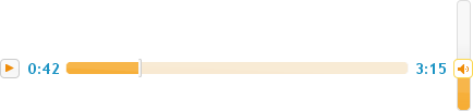
</div>Here we’re using opacity and layering to squeeze a couple more shades out of any jQuery UI theme. Figure 14-6 shows the finished product:
Finally, Figure 14-7 shows a sampling of the jQuery UI music player in a few prebuilt jQuery UI themes.