
Chapter 15. jQuery UI Theming
Introduction
One of the advantages of jQuery UI is its ease of integration into such a wide range of websites and applications. And a major factor for successful integration is the ability to apply a look and feel to jQuery UI widgets that’s consistent with a larger site or system design.
jQuery UI is expressly designed to make custom theming easy. You can create highly customized visual styles for your widgets—that automatically include not only colors and textures but a full complement of interaction states—using the following:
The jQuery UI CSS Framework, a comprehensive set of CSS classes for applying consistent styles and behaviors across widgets
ThemeRoller, jQuery UI’s tool for theme creation
Together, they provide ways to easily and consistently change the look and feel of both official jQuery UI widgets and your own custom components so they blend seamlessly with your site or application.
This chapter focuses how to get the most out of these tools, whether you’re using them to customize an official jQuery UI widget or incorporating them into your own custom development workflow. We’ll start with a summary of the jQuery UI CSS and how it works with ThemeRoller, and then we’ll present four theming recipes in this order:
Styling jQuery UI widgets with ThemeRoller
Overriding jQuery UI layout and theme styles
Applying a ThemeRoller theme to non-jQuery UI components
Referencing multiple themes on a single page
Each recipe starts with a basic sample design challenge and progressively applies techniques to customize the theme. For that reason, you’ll frequently see references from one recipe to another in this chapter.
Before we dive into styling the widgets, it’s important to understand how all of the jQuery UI classes are structured and how they work with ThemeRoller.
Understanding the Components of jQuery UI CSS
Our primary goal when creating the jQuery UI CSS was to simplify the setup process so that developers could deploy widgets quickly and seamlessly in their code without having to sift through complex markup or CSS.
In our early experience integrating third-party JavaScript widgets into our own projects, customizing the appearance of library widgets was significantly harder than setting up the scripts to run properly. Unlike the scripts, which were designed to be customized—core and widget plugin scripts handle complex tasks behind the scenes and configurable options are made easily accessible for customization—widget styles were generally keyed off of a single class or baked into the markup. We had to identify classes in the markup and deconstruct their style rules before we could modify them, which usually involved several hours of sifting through the code and CSS, using Firebug to figure out where classes are assigned or find inline styles, retrofitting background images, and then replacing style rules or editing classes in the markup to make the appearance approximate our project’s design. (And that was only when the code and CSS were reasonably organized and consistent.)
To us, this felt backward; it would be much easier to add a custom look and feel to a mostly unstyled widget than to pick apart the CSS of an already-styled widget and try to figure out which rules can safely be replaced. We resolved to develop a better way to apply styles consistently so they would work coherently across a group of widgets and within a larger site or application design system.
To solve this problem for jQuery UI, we divided the jQuery UI CSS into logical components, similarly to how the scripts are structured, and separated core structural styles required for a widget to function properly (positioning, floats, and padding) from the customizable theme styles (colors and background images). So, the classes that developers can modify to make the widgets match their project are now grouped into two basic categories:
Widget-specific classes include all styles required to format a particular widget’s structure and layout, including positioning, spacing and dimensions, and other layout-related styles to help it function correctly. For instance, Widget classes for the tabs include styles that float tabs so they appear in a horizontal row and selectively hide the associated tab content panels.
Widget-specific classes are included in the accompanying CSS when you download one or more jQuery UI widgets (see Recipe 15.1 to learn how to download and reference jQuery UI CSS). Classes are named for the specific widget they control, and the class name always begins with the prefix
ui-[widgetname], e.g.,ui-tabs.Framework classes apply a customized theme look and feel—including a base font, background colors and textures, font and icon colors, shape (corner radius), and interaction state feedback—across all widgets. Framework classes are named according to their basic purpose—for example, some provide state feedback (
ui-state-default,ui-state-hover) or apply rounded corners (ui-corner-all,ui-corner-top)—and are intended for reuse throughout a website or application. In fact, they can be applied to any widget, including those created by jQuery UI or another JavaScript library or your custom widgets.
In practice, we style jQuery UI widgets by assigning a combination of these classes—one or more descriptive Widget-specific classes along with a series of generic Framework classes—that work together to create the final appearance. For example, look at the markup for the accordion header:
<h3 class="ui-accordion-header ui-state-active ui-corner-top">code</h3>Three classes are applied that assign very specific styles:
ui-accordion-headeris a Widget-specific class unique to this component; it sets structural style rules (positioning, dimensions, margin, padding) but does not apply any colors or images.ui-state-activeis a Framework class that adds the theme colors and background images to show its active state.ui-corner-top, another Framework class, specifies that the header should have rounded top corners.
Although this approach means that multiple classes are assigned to some elements, it’s a powerful system that makes it easy to apply a very lightweight theme to an unlimited number of widgets, even your own custom components. The careful separation of the structural styles from the theme also means that you can drop in a new theme at any time without worrying about it breaking your existing widgets.
We also wanted to make it easy to create a new look and feel, or accurately match an existing design, without deep expertise in CSS or photo-editing tools like Adobe Photoshop. ThemeRoller lets developers edit style rules set by the Framework classes without having to touch the CSS or do any manual image production.
ThemeRoller is a web application that offers a fun and intuitive interface for designing and downloading custom themes for jQuery UI. ThemeRoller provides levers to change the following theme styles:
Base font for all widgets: The base font sets a standard typeface, size, and weight (normal or bold) that will be used throughout all the widgets in the theme. By default, font size is specified in “em” units. We recommend using ems over pixels so text will scale with the widget containers when the user manipulates browser text size, but you can specify pixels if you like. As with standard CSS, it’s good practice to provide a range of fonts in case your first font of choice is not installed on a user’s computer and to end the font string with the generic font style like “serif” or “sans-serif.”
Corner radius: A corner radius can be applied consistently across all widgets in the theme to give them a rounded appearance. Each radius value must be followed by a unit: pixels for a fixed radius, ems for a radius that responds to text size changes, or a value of zero for perfectly square corners. Smaller pixel values make the corners of widgets more square, while larger values make the corners more round.
Note
As of this writing, corners set in CSS3 as we do in the Framework are not supported in some modern browsers, including Internet Explorer. Please see the sidebar in Recipe 15.1 to learn how to bring rounded corner support to these browsers.
Headers, toolbars, and content areas: Each of these levers sets a background color with a semitransparent texture and colors for border, text, and icons. For example, the header style is used for the title bar of a dialog or datepicker and the selected range of a slider or progress bar, while the content style is used for the content area of a selected accordion or tab.
Default, active, and hover states for clickable elements: There are three states that represent different points in the user interaction:
defaultis the standard clickable state,hoveris used to provide visual feedback when the mouse is placed over the item, andactiveis used when the item is currently selected. Each clickable state is defined by a background color with a semitransparent texture and by colors for border, text, and icons. Keep in mind that each state should be different enough to provide adequate feedback to the user.Highlight and error states: These are special styles for communicating states in a system. The highlight state is used on text messages to draw a user’s attention, as well as to indicate today’s date in the calendar widget, and is also useful for highlighting when an Ajax screen update has occurred. The error state can be used to indicate that there is a problem that requires the user’s attention such as displaying a form validation issue or alerting the user to a system failure. Both are defined by a background color with a semitransparent texture and by colors for border, text, and icons. These states should contrast with the standard content text and background colors in your theme and should also be different enough from each other so that it’s clear which one is meant to draw attention versus communicate an alert or warning message.
Modal screen for overlays: The modal screen is a layer that sits between a modal dialog and the page content beneath it and is commonly used to make page content appear temporarily disabled while the modal is showing. This lever styles the modal screen’s background color and opacity. If you don’t want a modal overlay at all for a particular widget, that can be toggled through the widget’s
modaloption.Drop shadow styles: As with the highlight and error states, a dropshadow style can be optionally applied to overlays. Drop shadows have background color, texture, and opacity (like headers and clickable elements), and also have a shadow thickness specifying how far the shadow should be offset from the top-left corner of its component and a corner radius. To make the shadow appear evenly around the component, the top and left offset values should be negative and equal to the shadow thickness. As with standard corner radius, you can set a shadow corner radius in pixels or ems or enter zero to make corners square.
The ThemeRoller interface lets you directly edit all of the previous Framework class styles and preview your design changes in functioning jQuery UI widgets. Once you’ve created a theme, ThemeRoller automatically generates and packages all required CSS and background images—you simply download the resulting theme stylesheet and reference it in your project. (You’ll find ThemeRoller in the Themes section of the jQuery UI site or at http://themeroller.com.)
Now that we’ve reviewed the jQuery UI CSS and ThemeRoller, we’ll look at four recipes that use them to customize themes. First, we’ll start with the simple step of creating a theme and styling widgets with ThemeRoller (Recipe 15.1); then we’ll move through slightly more complex steps of overriding Framework classes for more customized themes (Recipe 15.2), using Framework classes throughout your project (Recipe 15.3), and finally looking at multiple themes on a single page for complex interfaces (Recipe 15.4).
Note
For designers and developers who are interested in editing and previewing themes for jQuery UI and custom ThemeRoller-ready components in place in your website or application, we developed a downloadable ThemeRoller bookmarklet tool. To learn more about and download the bookmarklet, go to ui.jquery.com/themeroller.
15.1. Styling jQuery UI Widgets with ThemeRoller
Solution
Use ThemeRoller, a simple web application for editing the jQuery UI CSS Framework classes to customize the look and feel of the jQuery UI widgets.
Note
This recipe makes the following assumptions:
You have a basic knowledge of how CSS works and, specifically, how styles cascade, take precedence, and can be scoped using selector classes, ids, or elements. (For our recommended resources, please refer to the Appendix at the end of this chapter.)
You’re already familiar with jQuery UI CSS classes. (If not, just review Understanding the Components of jQuery UI CSS.)
Let’s walk through an example.
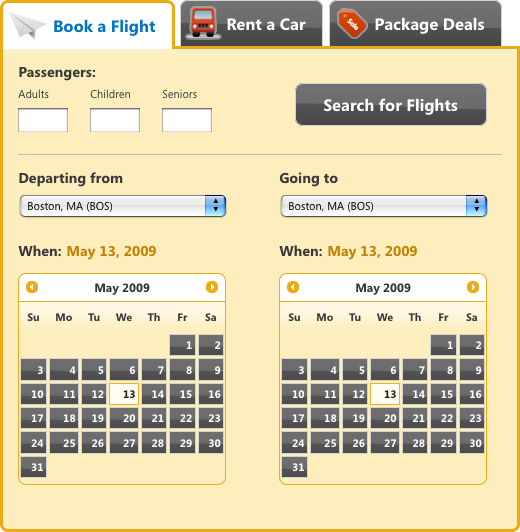
We’re working on a new website for booking travel reservations, and specifically, we’re building out the part of the interface for booking a flight. The design consists of a set of tabs for selecting the type of reservation (flight, car rental, or package deal), and the Book a Flight tab includes a form for entering the number of passengers, selects for the departure and arrival cities, calendars to set departure and return travel dates, and a submit button (see Figure 15-1).

For this recipe, we’ll use the jQuery UI widgets for the tabs and datepickers, and style them with a custom theme created in ThemeRoller. (You can also modify the theme stylesheet beyond the standard ThemeRoller output to more closely match your design—you’ll see how in Recipes 15.2–15.4).
Step 1. Open ThemeRoller
Open the jQuery UI website at http://jqueryui.com and choose Themes from the top navigation bar, or go directly to http://themeroller.com.
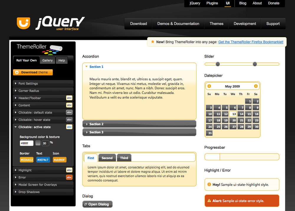
The interface for ThemeRoller is grouped into two main sections, as shown in Figure 15-2:
ThemeRoller toolbar pane in the left column, which provides tools to set and change all style settings in a theme
Sample widgets preview pane on the right for previewing your style selections—each widget is interactive to show the full range of styles (use your mouse to see hover and active styles, for example) and updates in real time when you edit styles using the toolbar
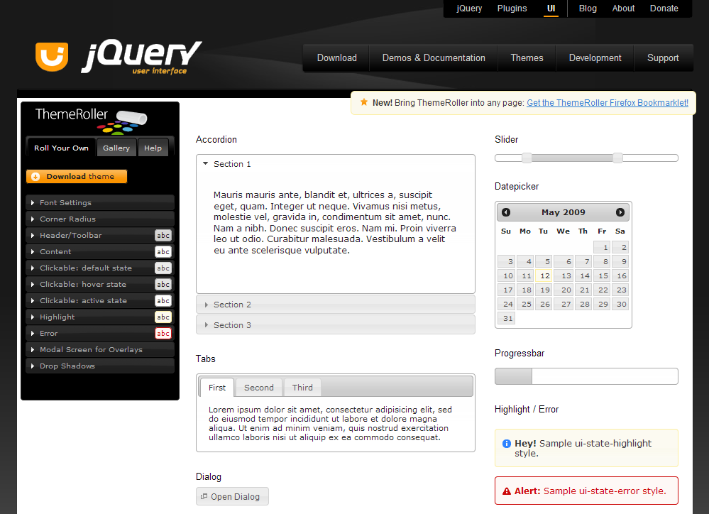
The ThemeRoller toolbar provides two distinct ways to customize themes, accessible with the tabs at the top of the toolbar column:
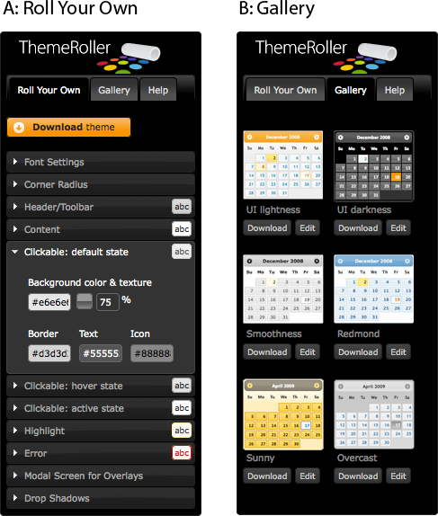
The Roll Your Own tab (Figure 15-3) is the workspace where you create custom styles for your theme. Customizable settings are grouped into sections with inputs and tools for quick style selection, including setting the base font and corner radius across all widgets and setting background colors and textures, text color, and icon color.
Each section is closed by default and displays current styles in the form of a small icon to the right of the label. Open/close sections as needed while you edit, and preview sample widgets to the right, which update to reflect your changes in real time.
Note
JavaScript is not required to use ThemeRoller. If JavaScript is disabled, a Preview button appears that may be clicked to view changes.
The Gallery tab (Figure 15-3) offers a range of preconfigured themes that can be downloaded as is or used as a starting point for a more customized theme.
Step 2. Create and preview a theme
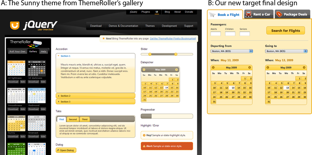
For our travel reservations app, we’ll select a gallery theme called Sunny that’s close to our final design (as shown in Figure 15-4).
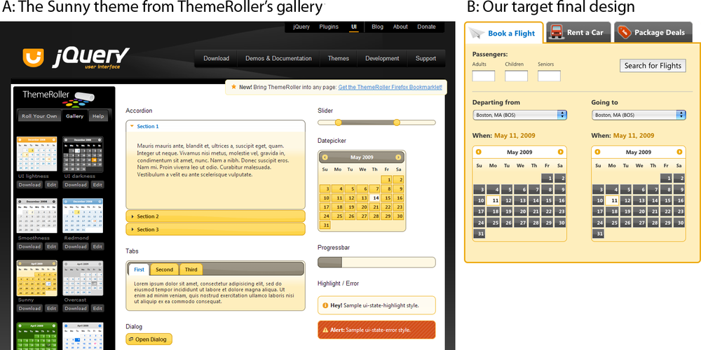
Sunny specifies similar overall background, font face, and font colors to our final design, but a couple of styles will need to be edited to more closely match our design—for instance, Sunny’s tabs are yellow with a gray background, while our tabs are dark gray with a white background.
We can easily change those settings by either clicking the Edit button below the Sunny image in the gallery (which will move you over to the Roll Your Own view) or clicking the Sunny image in the gallery to activate it and then clicking over to the Roll Your Own tab at the top of the toolbar.
Once you have the Sunny settings in the Roll Your Own tab, the toolbar prefills with all the theme’s settings, and you can start editing. Let’s tweak the following settings to make the Sunny theme match our design:
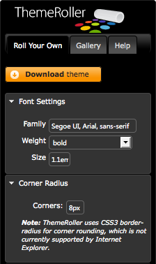
Set the base font for all widgets: The default font in the Sunny theme and our target design seem very similar, but we can simply open the Font Settings section (as shown in Figure 15-5) and either confirm that they are correct or fill in alternate values for font family, weight, and size. The font family accepts multiple comma-separated font names (as in standard CSS notation). Here are some design notes and tips:
By default, the font size is specified in “em” units. We recommend using ems in favor of pixel text sizes so widget text will scale with the widget containers when the user manipulates browser text size.
Provide a range of fonts in case your first font of choice is not installed on a user’s computer. It’s good practice to end a font string with the generic font style like “serif” or “sans-serif.”
Apply a corner radius: Our design includes rounded corners on the datepicker and tabs. You can set a corner radius on jQuery UI widgets in ThemeRoller by opening the Corner Radius section (as shown in Figure 15-5) and entering a value followed by a unit: pixels for a fixed radius, or ems for a radius that responds to text size. Smaller pixel values make the corners of widgets more square, while larger values make the corners more round. For perfectly square corners, set the value to zero.
Note
At the time of writing of this edition, some modern browsers, most notably Internet Explorer, do not support the CSS3
border-radiusproperty and as a result do not render the rounded corner styles applied by Framework classes. Corners appear square instead. If your design includes rounded corners and must render consistently across all browsers, you may want to use a corner-rounding JavaScript library like ddRoundies.We’ve written a basic tutorial on our Filament Group lab explaining how to incorporate ddRoundies into your project: “Achieving Rounded Corners in Internet Explorer for jQuery UI with DD_roundies”.
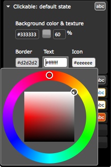
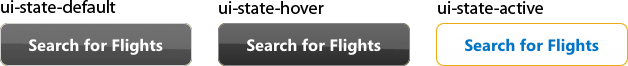
Make the default tabs and buttons gray. Unselected tabs, like accordion section headers or datepicker buttons, are clickable elements, and each is assigned a class that represents its current clickable state: default, hover, or active. In this case we’ll change the default state background color from gray to yellow and update text and border color to match our design (Figure 15-6):
Open the “Clickable: default state” section.
Focus your cursor on the background color field (it contains a hexadecimal value preceded by
#), and pick a new dark gray color or enter a hexadecimal value; in this case we’ll enter the value#333333.The text color is dark gray and now blends with our background, so we’ll also update the default state text color to contrast with the background. We’ll change the text color value to
#FFFFFF.As with the text, the icons that appear in the header are gray and need to be updated so they don’t disappear against the gray background. Let’s give them a value of
#EEEEEE, a color that will complement but won’t appear higher contrast than the text.Finally, let’s change the border color from yellow to light gray; enter value
#D2D2D2.Hit the Tab or Enter key, or click elsewhere on the page, to preview the changes in the widgets on the right.
Update the hover state to match the new tab color: The clickable hover state style is intended to be shown whenever you mouse over a clickable component like a tab, accordion section, or datepicker button. Now that the default state is gray, we’ll adjust the hover state’s background and text colors to coordinate and use a complementary darker shade of gray for the background with white text and icons:
Open the “Clickable: hover state” section.
In the background color field enter the value
#111111.Update the text and icon colors to
#FFFFFF.Let’s also make the border color better match our design by setting it to a slightly darker gray than the default border,
#888888.
Change the tabs and datepicker header backgrounds to white: The header style appears in several jQuery UI widgets: behind the tabs, at the top of datepicker’s month/year feedback and navigation buttons, as the slider range, and as the progress bar completion indicator. In our design the header is a flat white color with gray text and dark yellow icons:
Open the Header/Toolbar section.
In the background color field enter a hexadecimal value of
#FFFFFF.Click the texture icon next to the background input, and choose the first option, “flat.” (Hover over any texture image to see the name.) Doing this removes the background image so that the style only sets a flat background color.
Set the background opacity to 100 percent to ensure that the header is fully opaque.
The text color is white and doesn’t show up on our new background, so let’s change it to dark gray to match our default clickable state,
#333333.Finally, change the border and icon colors to
#EDAA12, and the text color to white,#FFFFFF.
Change the content container border color to yellow: Content borders appear around accordion sections, and define the tabs, dialog, slider, datepicker, and progress bar containers. In the design the border is the same light yellow we used for the header border:
Open the Content section.
Focus on the border color field, and enter the value
#EDAA12.
Update the “active” state border color to blend with the container: After updating the container border color, you’ll see that the selected accordion section and selected tab still have dark gray borders. This color is set with the clickable active state class:
Open the “Clickable: active state” section.
Focus on the border color field, and enter the value
#EDAA12.
Note
You can “save” a theme at any point simply by bookmarking the page; ThemeRoller updates the URL with all relevant styles each time the preview pane refreshes. Bookmark your custom theme—even bookmark multiple themes to compare them side by side—and reload any theme from its bookmark to modify and refine it for download.
Also, for any theme downloaded from ThemeRoller, a complete
theme URL is included in the stylesheet. Open the stylesheet
(e.g., jquery-ui-1.7.1.custom.css), and search
for the comment that starts with this: “To view and modify this
theme, visit http://jqueryui.com/themeroller/...”
At this point, we have made our ThemeRoller theme match the design of our travel reservations app as closely as we can (see Figure 15-7). It’s now ready for download.
Step 3. Download the jQuery UI widgets and theme
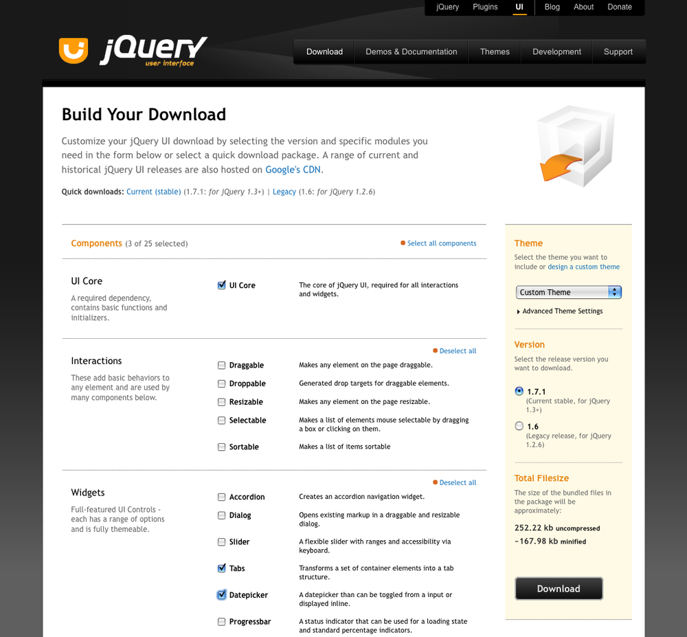
Click the “Download theme” button at the top of the ThemeRoller toolbar’s Roll Your Own tab, which navigates you to the jQuery UI download builder (see Figure 15-8).
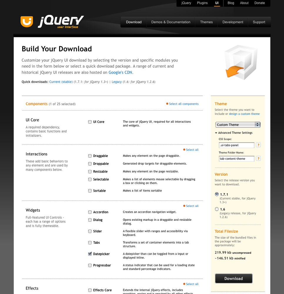
In the right column under Theme, you’ll see Custom Theme pre-selected in the drop-down.
Note
If you chose a default theme from the gallery and made no changes to it, you’ll see the name of that theme, e.g., Smoothness.
Next, we’ll select which jQuery UI components to download with our theme. All are selected by default; simply uncheck those you don’t want to download, or click “Deselect all components” at the top of the Components section to download only the theme stylesheet. For our travel reservations app, we need the jQuery UI core scripts and those for tabs and the datepicker.
Finally, select which version of jQuery UI you’d like to use; the latest stable version is selected by default. Click Download, and save the ZIP file locally. The downloaded ZIP file will be named like jquery-ui-1.7.1.custom.zip.
(The Advanced Theme Settings section in the download builder’s Theme section allows you to download a scoped theme—we’ll get to that in detail in Recipe 15.4.)
Warning
The jQuery UI CSS is updated with each new version of jQuery UI—e.g., new releases will include not only updated scripts but may also include modifications and updates to the CSS as well.
At the time of this writing, the version of jQuery UI is 1.7, and recipes and techniques in this chapter are applicable only to theming features in that version.
Step 4. Merge files into your project directory
Next, we’ll open the ZIP file we downloaded in the previous step and review its contents. jQuery UI files are arranged into the following directory structure; the order of the folders and files may vary depending on your operating system (Figure 15-9 shows the folder opened on Mac OS X).
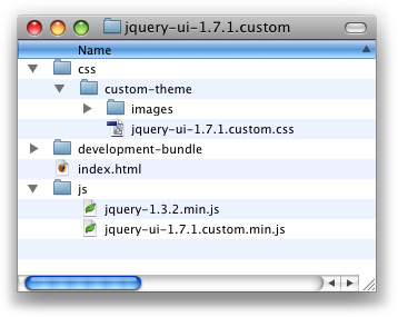
- index.html
Sample markup for the UI components you selected.
Note
If you chose not to download any components, this file will not be included in the download.
- /css
Contains a theme folder (e.g., custom-theme) with the following files:
An images directory with framework icons and background textures.
Your theme stylesheet, e.g.,
jquery-ui-1.7.1.custom.css, which includes the styles you just edited and, if downloaded, the widget-specific styles necessary for the widgets to function properly.
- /js
Compiled jQuery UI JavaScript files.
- /development-bundle
Individual component scripts and CSS used to create the compiled versions found in the css and js folders, open source license text, and related resources necessary for advanced development with jQuery UI.
When working on your own project, be sure to review the markup in index.html and use it as a guide along with the Demos & Documentation at http://jqueryui.com to integrate the component markup and scripts into your project.
For our travel application, we’ll copy the theme folder in the css directory and paste it to the styles directory in our project; to keep it simple, we named the styles folder css to match.
Warning
It’s important to maintain the established directory structure within the theme folder so that the icon images are referenced properly by the theme classes. If you do change the theme directory structure, you will likely have to replicate those changes if later you decide to upgrade to a newer version of the jQuery UI scripts and CSS.
Step 5. Reference the theme stylesheet in your project
Finally, we’ll include a reference to the theme stylesheet in
the <head> of our
page.
Keep in mind that the stylesheet reference should always appear before any references to jQuery UI scripts so that the CSS loads first; this is necessary because some widgets depend on the CSS to function properly.
We’ll reference the theme stylesheet (in bold) before all scripts in our travel reservations app:
<!doctype html>
<html>
<head>
    <meta charset="UTF-8">
    <title>travel application | Book a Flight, Rent a Car, or Find Package
Deals</title>
    <!-- jQuery UI styles -->
    <link rel="stylesheet" type="text/css" href="css/custom-theme/jquery-ui-
1.7.1.custom.css" />

    <!-- jQuery core & UI scripts -->
    <script type="text/javascript" src="js/jquery-1.3.2.min.js"></script>
    <script type="text/javascript" src="js/jquery-ui-1.7.1.custom.min.js"></script>

    <script type="text/javascript">
    $(function(){
        $('#travel').tabs();
        $("#departure-date-picker").datepicker({altField: '#departure-date',
altFormat: 'MM d, yy'});
        $("#arrival-date-picker").datepicker({altField: '#arrival-date',
altFormat: 'MM d, yy'});
    });
    </script>
</head>
When the jQuery UI widget markup and styles are in place for your project, preview your page in a browser to confirm that the styles are being applied correctly. Previewing our travel application reveals that the theme is applied correctly—as you can see in Figure 15-10, our default tabs are gray, the headers are white, and the text and icon colors match our selections.
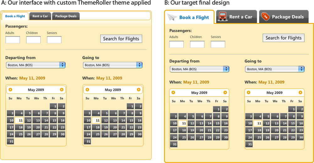
But our interface clearly needs more work to match our target design (Figure 15-10): the tabs are too small and are missing their custom icons, and the datepicker header is enclosed within the datepicker widget when it should appear on top. In Recipe 15.2 we’ll review how to make small adjustments to theme styles so that these elements better match our design.
Note
If the jQuery UI widgets in your page are not picking up the theme stylesheet, double-check the directory path to the theme stylesheet against the reference in your page, and correct any typos. If that doesn’t solve the issue, temporarily disable any non-jQuery styles or scripts to test whether they’re interfering with how the theme stylesheet is loaded or rendered, and fix any related bugs.
Discussion
Since ThemeRoller themes are structured to deliver a holistic experience and apply across multiple widgets, it helps to think about how the various Framework classes interact with one another. If you choose to create your own theme from scratch, or substantially modify an existing theme, here are some points you might want to consider:
To create uniform backgrounds for headers and toolbars and content areas to make the “on” state tab appear seamlessly connected to the visible content panel, and match the content area background and borders to your clickable active state background and borders.
For clickable elements, states should be clearly different enough to provide adequate feedback to the user. Here are a couple of ways to make sure the states work together to deliver distinctive visual differentiation:
Use mirror image textures for the default and active clickable states to achieve a three-dimensional look and feel. For instance, a “highlight” texture for the default button state pairs well with an “inset” texture for the active button state. The button will look like it physically depresses on click.
If you do use the same texture for clickable and hover, make sure the background color and image opacity are different enough (generally at least a 10 percent shift) to provide a clear visual change.
Optimize your theme for speed by using the same image for multiple styles. For example:
When you use the same icon color for multiple states, the stylesheet will make fewer HTTP requests, improving page performance.
You can also use the same background image (color plus texture opacity) for multiple states as well. If you do this, it’s important to make sure that the other style elements—border, text, and icon colors—are distinct enough to make a clear differentiation.
Note
To make changes to your custom theme without having to start from scratch, open the original theme stylesheet, search for the comment that starts with “To view and modify this theme, visit http://jqueryui.com/themeroller/...,” and copy and paste the theme URL into a browser’s address bar to open ThemeRoller with that theme’s settings preloaded.
15.2. Overriding jQuery UI Layout and Theme Styles
Problem
The customized (or standard gallery) theme you created in ThemeRoller, downloaded, and referenced in your project is a partial match to your target design but doesn’t match exactly. You need to modify the styles, but at the same time you want to ensure that edits to these styles don’t make it difficult for you to upgrade to newer versions of jQuery UI scripts and CSS.
Solution
Create custom override styles, scoped to the components that need additional non-ThemeRoller styling, and structure them so that they don’t conflict with or overwrite any standard jQuery UI CSS files.
Note
The following recipe makes the following assumptions:
You have a basic knowledge of how CSS works and, specifically, how styles cascade, take precedence, and can be scoped using selector classes, IDs, or elements. (For our recommended resources, please refer to the Appendix at the end of this chapter.)
You’re already familiar with how to create and edit a theme using ThemeRoller. (If not, review Recipe 15.1, which describes in detail how to create a theme and apply it to your pages.)
Each jQuery UI widget is styled to work out of the box when you download the jQuery UI scripts and a theme stylesheet; no changes to the CSS are necessary to incorporate the widget or styles into your site. But it’s possible that the styling may not exactly match the design conventions established in your project. For example, you may want to reduce the padding or use a custom background image for a header.
Let’s pick up where we left off in the previous recipe and continue working on our travel reservations application. We created, downloaded, and applied the theme stylesheet correctly; however, the default jQuery UI styles for the tabs and datepickers don’t quite match the design for our project, as shown in Figure 15-11.

Step 1. Review the widget markup and styles for jQuery UI plugins
First, we’ll review how classes are assigned in the jQuery UI widget markup to better understand how they’re applied (and can therefore be overridden).
Let’s start with the tabs markup. When the jQuery UI tabs widget is initialized on the page, the plugin script assigns several classes to the widget markup, as shown next. (Please note that this is the markup that is transformed or inserted by the plugin script; it’s the finished product, not the markup served to the page before JavaScript is run.)
Pay particular attention to the classes that begin with the
prefix ui-tabs—the
Widget-specific classes for the tabs—highlighted in bold:
<div class="ui-tabs ui-widget ui-widget-content ui-corner-all" id="travel">
    <ul class="ui-tabs-nav ui-helper-reset ui-helper-clearfix ui-widget-header
ui-corner-all">
       <li class="ui-state-default ui-corner-top ui-tabs-selected ui-state-active">
<a href="#travel-flight" id="tab-flight">Book a Flight</a></li>
       <li class="ui-state-default ui-corner-top"><a href="#travel-car"
id="tab-car">Rent a Car</a></li>
       <li class="ui-state-default ui-corner-top"><a href="#travel-package"
id="tab-package">Package Deals</a></li>
    </ul>
    <div id="travel-flight" class="ui-helper-clearfix ui-tabs-panel
ui-widget-content ui-corner-bottom"></div><!-- /flight -->
    <div id="travel-car" class="ui-tabs-panel ui-widget-content ui-corner-bottom
ui-tabs-hide"></div><!-- /car -->
    <div id="travel-package" class="ui-tabs-panel ui-widget-content ui-corner-bottom
ui-tabs-hide"></div><!-- /package -->
</div><!-- /travel -->
These classes set the styles that control the widget’s layout
and enable it to function properly according to its design. In this
case, they transform an unordered list of links and <div> elements into tabs with
associated content panels. (Widget-specific classes are discussed in
detail in Understanding the Components of jQuery UI CSS earlier in
this chapter.)
They also identify a widget’s individual components—like the header or content panels—and as such they’re ideal for writing override rules to adjust layout features or add customizations like drawn icons. The Widget classes for the tabs mark the following components:
ui-tabsOuter container that wraps around the tab navigation and content.
ui-tabs-navContainer for the navigation options. The tab list items and links are styled using descendant selectors, i.e.,
ui-tabs-nav li.ui-tabs-selectedSelected tab “on” state, which is dynamically by the script. This class is assigned to only one tab at a time.
ui-tabs-panelContent areas that map to tabs.
ui-tabs-hideDefault state for the content panels. They’re hidden until selectively shown by the user.
To see the style rules associated with these classes, open the
theme stylesheet and find (Ctrl/Command-F) or scroll to the block
that begins with ui-tabs. Notice
that the rules only apply to layout characteristics, like
positioning, padding, or border width, and are absent any theme
styles, like background or border colors:
.ui-tabs { padding: .2em; zoom: 1; }
.ui-tabs .ui-tabs-nav { list-style: none; position: relative;
padding: .2em .2em 0; }
.ui-tabs .ui-tabs-nav li { position: relative; float: left;
border-bottom-width: 0 !important; margin: 0 .2em -1px 0; padding: 0; }
.ui-tabs .ui-tabs-nav li a { float: left; text-decoration: none;
padding: .5em 1em; }
.ui-tabs .ui-tabs-nav li.ui-tabs-selected { padding-bottom: 1px;
border-bottom-width: 0; }
.ui-tabs .ui-tabs-nav li.ui-tabs-selected a, .ui-tabs .ui-tabs-nav
li.ui-state-disabled a, .ui-tabs .ui-tabs-nav li.ui-state-processing
a { cursor: text; }
.ui-tabs .ui-tabs-nav li a, .ui-tabs.ui-tabs-collapsible .ui-tabs-nav
li.ui-tabs-selected a { cursor: pointer; } /* first selector in group seems
obsolete, but required to overcome bug in Opera applying cursor: text overall
if defined elsewhere... */
.ui-tabs .ui-tabs-panel { padding: 1em 1.4em; display: block; border-width: 0;
background: none; }
.ui-tabs .ui-tabs-hide { display: none !important; }
Note
Your theme stylesheet will contain the ui-tabs style rules only if you’ve also
downloaded the tabs plugin.
Step 2. Create an override stylesheet
We’ve found the best way to safely fine-tune a widget’s appearance is to write new style rules that override the jQuery UI theme styles and append these “override rules” in a separate stylesheet. Override rules are written against jQuery UI CSS class names and as such must appear in the source order after your theme stylesheet; since styles are read in order, the last style rule always takes precedence.
The jQuery UI library is constantly evolving to include more features with better-streamlined code. By maintaining override styles in a separate file, you can customize the widget styles as much or as little as you’d like and still preserve the ability to easily upgrade the jQuery UI files as needed and simply overwrite your existing theme stylesheet knowing that your override rules remain intact. Override rules can be listed in a dedicated stylesheet for overriding default theme styles, or if you prefer to limit the number of files linked to your pages (and therefore limit the number of requests to the server), append override rules to the master stylesheet for your entire project.
As we work through this recipe, we’ll append override styles
to the master stylesheet for our project, travel.css, just below the block of custom
styles we developed for our application:
/* ----- CUSTOM STYLES for the travel application */
body { font-size: 62.5%; }
fieldset { padding: 0 0 1.5em; margin: 0 0 1.5em; border: 0; }
p, label { padding: 0 0 .5em; margin: 0; line-height: 1.3; }
p label { display: block; }
...
/* ----- OVERRIDE RULES for jQuery UI widgets */
/* tabs background styles go here */
...
And we’ll reference travel.css after the theme stylesheet in
our page:
<!doctype html>
<html>
<head>
    <meta charset="UTF-8">
    <title>travel application | Book a Flight, Rent a Car, or Find Package
Deals</title>

    <!-- jQuery UI styles -->
    <link rel="stylesheet" type="text/css" href="css/custom-theme/jquery-ui-
1.7.1.custom.css" />

    <!-- overrides & custom styles for the travel application -->
    <link rel="stylesheet" type="text/css" href="css/travel.css" />
....
Step 3. Edit the style rules in your override stylesheet
Now that we’ve reviewed how the Widget classes are named and applied, and also how to reference override styles in our project, let’s update our travel reservations application with our customized tabs navigation bar and datepicker header style. We’ll tackle the tabs first.
Scope overrides
The design we created for the tabs is specific to the travel reservations application, and we don’t necessarily want the same customizations, like the icons or font size, to apply to every tab widget in our entire application. To ensure that these styles only apply to the travel application, we’ll scope the override rules to our travel application’s unique ID.
Each new rule will start with the Widget-specific class
assigned to the component we want to change; for example, when
changing styles for the tab’s navigation bar, we’ll write a rule
against the .ui-tabs-nav
class:
.ui-tabs-nav { /* our override style rule */ }And scope it to our travel application by prepending its ID,
travel:
#travel .ui-tabs-nav { /* our override style rule */ }Write override rules
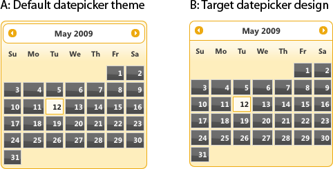
After applying the theme stylesheet, our tab’s navigation panel looks like Figure 15-12: the individual tabs are small and surrounded by a border that’s separated from the outermost container by a few pixels of padding.
However, our design (Figure 15-13) calls for large tabs with icons and without a background—they appear to sit above the tab content.

To override the default tab styles, we’ll make a handful of style changes:
First we’ll remove the outermost border. The entire tabs widget is surrounded by a 1-pixel border and has a few pixels of padding. For the tabs to appear above the content panels, we’ll remove both:
#travel.ui-tabs { padding: 0; border-width: 0; }Next, we’ll flatten the bottom of the tab navigation bar (set the bottom-corner radius to zero) and remove its top and side borders. We’ll also remove any extra padding so that the tabs appear flush with the left side of the widget, and we’ll thicken the border width to 3 pixels to match our design:
#travel .ui-tabs-nav {
    border-width: 3px;
    border-top-width: 0;
    border-left-width: 0;
    border-right-width: 0;
    -moz-border-radius-bottomleft: 0;
    -webkit-border-bottom-left-radius: 0;
    -moz-border-radius-bottomright: 0;
    -webkit-border-bottom-right-radius: 0;
    padding: 0;
}
The tabs are a little too close together, so let’s add some right margin:
#travel .ui-tabs-nav li {
margin-right: .5em;
}
And update the selected tab,
.ui-tabs-selected, so that it appears connected to the tab content area. We’ll increase the border width to 3 pixels so that it matches the design, and we’ll then fix the gap between the tab and content. The amount of space between the tab and its content panel is directly related to the tab navigation bar’s border thickness, so we can close the gap by applying a negative 3-pixel bottom margin:#travel .ui-tabs-nav li.ui-tabs-selected { border-width: 3px; margin-bottom: -3px; }Next, we’ll apply our custom icons. Because each icon is unique to its tab, we can apply each icon as a background image using the unique ID of each tab. (Technically these aren’t override styles, but we’ll need to reference these rules when we style the selected tab’s icon next.)
#tab-flight {
       background: url(../images/icon-tab-flight.png) no-repeat .3em center;
          padding-left: 50px;
}

#tab-car {
          background: url(../images/icon-tab-car.png) no-repeat .1em center;
          padding-left: 45px;
}

#tab-package {
          background: url(../images/icon-tab-package.png) no-repeat .1em center;
          padding-left: 45px;
}
The selected tab uses a slightly different icon that sits on a white, not gray, background. For each tab, we’ll add a rule that keys off the Widget-specific class for the selected state,
.ui-tabs-selected:#travel .ui-tabs-nav li.ui-tabs-selected #tab-flight { background-image: url(../images/icon-tab-flight-on.png); } #travel .ui-tabs-nav li.ui-tabs-selected #tab-car { background-image: url(../images/icon-tab-car-on.png); } #travel .ui-tabs-nav li.ui-tabs-selected #tab-package { background-image: url(../images/icon-tab-package-on.png); }Our tabs should also have more padding and a larger font size:
#travel .ui-tabs-nav a {
     font-size: 1.5em;
     padding-top: .7em;
     padding-bottom: .7em;
}
To finish up the tabs, we’ll adjust the border around the content panel so that it matches the 3-pixel border width we set on the selected tab:
#travel .ui-tabs-panel {
     border-width: 3px;
     border-top-width: 0;
     padding-top: 1.5em;
}
Now that our tabs match the design, let’s update the datepicker’s header. As illustrated in Figure 15-14, with a few adjustments we can make the datepicker’s header component—the bar above the calendar that contains navigation arrows and month/year feedback—appear above, not contained within, the datepicker.
Like the tabs, when the datepicker plugin is initialized on
the page, the script writes widget markup to the page that
contains jQuery UI Widget-specific and Framework classes to set
its structural and themed appearance. In an abridged version of
the datepicker markup, you
can see that Widget-specific classes conform to the naming
convention and begin with ui-datepicker, and identify each
component:
<div id="ui-datepicker-div" class="ui-datepicker ui-widget ui-widget-content
ui-helper-clearfix ui-corner-all ui-helper-hidden-accessible">
   <div class="ui-datepicker-header ui-widget-header ui-helper-clearfix
ui-corner-all">
    <a class="ui-datepicker-prev ui-corner-all">title="Prev"><span class="ui-icon
ui-icon-circle-triangle-w">Prev</span></a>
    <a class="ui-datepicker-next ui-corner-all" title="Next"><span class="ui-icon
ui-icon-circle-triangle-e">Next</span></a>
    <div class="ui-datepicker-title">
       <span class="ui-datepicker-month">January</span><span class="ui-datepicker-
year">2009</span>
    </div>
   </div>
   <table class="ui-datepicker-calendar">
    <thead>
    <tr>
       <th class="ui-datepicker-week-end"><span title="Sunday">Su</span></th>
       ...
    </tr>
    </thead>
    <tbody><tr>
       <td class="ui-datepicker-week-end ui-datepicker-other-month"> 1 </td>
       ...
    </tr>
    </tbody>
  </table>
  <div class="ui-datepicker-buttonpane ui-widget-content">
    <button type="button" class="ui-datepicker-current ui-state-default
ui-priority-secondary ui-corner-all">Today</button>
    <button type="button" class="ui-datepicker-close ui-state-default
ui-priority-primary ui-corner-all">Done</button>
  </div>
</div>
The datepicker Widget classes are assigned the following default style rules:
.ui-datepicker { width: 17em; padding: .2em .2em 0; }
.ui-datepicker .ui-datepicker-header { position:relative; padding:.2em 0; }
.ui-datepicker .ui-datepicker-prev, .ui-datepicker .ui-datepicker-next {
position:absolute; top: 2px; width: 1.8em; height: 1.8em; }
.ui-datepicker .ui-datepicker-prev-hover, .ui-datepicker .ui-datepicker-next-hover {
top: 1px; }
.ui-datepicker .ui-datepicker-prev { left:2px; }
.ui-datepicker .ui-datepicker-next { right:2px; }
.ui-datepicker .ui-datepicker-prev-hover { left:1px; }
.ui-datepicker .ui-datepicker-next-hover { right:1px; }
.ui-datepicker .ui-datepicker-prev span, .ui-datepicker .ui-datepicker-next span {
display: block; position: absolute; left: 50%; margin-left: -8px; top: 50%;
margin-top: -8px;  }
.ui-datepicker .ui-datepicker-title { margin: 0 2.3em; line-height: 1.8em;
text-align: center; }
.ui-datepicker .ui-datepicker-title select { float:left; font-size:1em;
margin:1px 0; }
.ui-datepicker select.ui-datepicker-month-year {width: 100%;}
.ui-datepicker select.ui-datepicker-month,
.ui-datepicker select.ui-datepicker-year { width: 49%;}
.ui-datepicker .ui-datepicker-title select.ui-datepicker-year { float: right; }
.ui-datepicker table {width: 100%; font-size: .9em; border-collapse: collapse;
margin:0 0 .4em; }
.ui-datepicker th { padding: .7em .3em; text-align: center; font-weight: bold;
border: 0;  }
.ui-datepicker td { border: 0; padding: 1px; }
.ui-datepicker td span, .ui-datepicker td a { display: block; padding: .2em;
text-align: right; text-decoration: none; }
.ui-datepicker .ui-datepicker-buttonpane { background-image: none; margin: .7em
0 0 0; padding:0 .2em; border-left: 0; border-right: 0; border-bottom: 0; }
.ui-datepicker .ui-datepicker-buttonpane button { float: right; margin: .5em .2em
.4em; cursor: pointer; padding: .2em .6em .3em .6em; width:auto; overflow:visible; }
.ui-datepicker .ui-datepicker-buttonpane button.ui-datepicker-current { float:left; }
...
This is just a subset of the datepicker’s style rules; to
view all, in the theme stylesheet find the style block that starts
with ui-datepicker.
Returning to our travel application, let’s write a few override rules to make the datepicker’s header appear like our design:
First we’ll remove the padding that separates the header from the datepicker’s outer container:
#travel .ui-datepicker { padding: 0; }Like the tab navigation bar, we want to flatten the bottom and remove its top and side borders:
#travel .ui-datepicker-header {
    border-top-width: 0;
    border-left-width: 0;
    border-right-width: 0;
    -moz-border-radius-bottomleft: 0;
    -webkit-border-bottom-left-radius: 0;
    -moz-border-radius-bottomright: 0;
    -webkit-border-bottom-right-radius: 0;
}
Finally, we’ll remove the border and background image from the next and previous navigation arrows on hover:
#travel .ui-datepicker-prev-hover,
#travel .ui-datepicker-next-hover {
    border-width: 0;
    background-image: none;
}
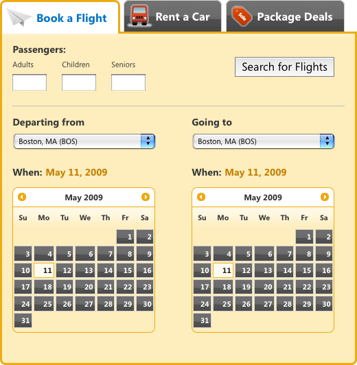
With the override styles applied, our working travel application now accurately matches the final design (Figure 15-15).
Discussion
Consider whether you’d like to apply override rules to all widgets in your project or whether you only want to override theme styles for a subset of widgets. If there’s even a small chance that you may want to present the widget in different ways, apply override styles by scoping them to a container element’s class or ID so that you don’t alter the default formatting of the widget.
Here are some editing tips/reminders:
If you want to remove the bottom border on a widget header, use
border-bottom-width: 0;instead ofborder-bottom:0;. The former will retain the border style and color in the event you want it back.For variation in stacked elements that have the same class, you might disable just the background image in one, letting the difference in background color show through.
If you need to change the color of a particular portion of a widget, design the theme to accommodate that change instead of hard-coding a color into your stylesheet.
If you need to remove a border but would like to keep it there for structural layout, you can set it to transparent. To do this in an IE-safe way, set the border style to
dashed.Use em units whenever possible for structural dimensions such as padding and margins, and more importantly for font sizes. Write styles assuming 1em is the standard widget size, and try not to dip below .8em to keep text legible.
15.3. Applying a Theme to Non-jQuery UI Components
Problem
Other page components—like content boxes, buttons, and toolbars—are sitting next to jQuery UI widgets and have similar types of interactions and behaviors, but their designs don’t match.
Solution
You can assign Framework classes to non-jQuery UI elements to apply the same theme as ThemeRoller-styled elements. (As a bonus, those elements will automatically update when you apply an updated ThemeRoller theme.)
Note
The following recipe makes the following assumptions:
You have a basic knowledge of how CSS works and, specifically, how styles cascade, take precedence, and can be scoped using selector classes, IDs, or elements. (For our recommended resources, please refer to the Appendix at the end of this chapter.)
You’re already familiar with how to create and edit a theme using ThemeRoller. (If not, review Recipe 15.1, which describes in detail how to create a theme and apply it to your pages.)
In the previous two recipes we used ThemeRoller to create and download a theme and then wrote a few CSS rules to override default theme styles and make it more closely match our finished design. Now we’ll take it another step further and apply Framework classes to elements in our project so that they coordinate with the jQuery UI widgets and the theme we created.
Step 1: Review available Framework classes to identify those you can apply to your components
Framework classes are part of the jQuery UI theme stylesheet you download when you create a theme in ThemeRoller. They’re named according to their purpose and apply theme styles like background colors and textures, border and font colors, rounded corners, and icons. Framework classes are built into jQuery UI widgets, but they may also be applied to any other elements—like custom widgets you’ve developed or extended from a third party—to achieve a consistent look and feel across your site or application.
The following is an overview of the classes that make up the framework, the styles applied by each, and general rules for referencing them in your own code.
Note
Unless noted otherwise, all styles set by Framework classes are inherited by child elements, including any text, link, and icon styles.
Layout helper classes hide content or fix common structural issues, like completely wrapping a container around floated child elements:
.ui-helper-hiddenApplies
display:
                none
. Content hidden this way may not be accessible to screen readers..ui-helper-hidden-accessiblePositions an element off the page so that it’s not visible but is still accessible to screen readers.
.ui-helper-resetRemoves inherited padding, margin, border, outline, text decoration, and
list-style; setsline-heightto 1.3 andfont-sizeto 100 percent..ui-helper-clearfixForces nonfloated container elements to completely wrap around floated child elements.
Widget container classes should only be applied to the elements for which they’re named because their child links will inherit styles from them:
.ui-widgetApplies the theme’s font family and size on the entire widget and explicitly sets the same family and 1em font size to child form elements to force inheritance.
.ui-widget-headerApplies bold font.
.ui-widget-contentApplies border color, background color and image, and text color.
Interaction states style clickable elements—like buttons,
accordion headers, and tabs—to
provide the appropriate state feedback as the user interacts with
them; each class applies border color, background color and image,
and text color. The -hover,
-focus, and
-active classes are intended to
replace their CSS pseudoclass counterparts (:hover, :active, :focus) and must be assigned to an element
with client-side scripting. State classes were designed this way to
avoid style conflicts and added selector complexity that occurs when
pseudoclasses are built into the CSS. (If pseudoclasses are
necessary for your project, you can add them to your override
stylesheet as described in Recipe 15.2.)
.ui-state-default.ui-state-hover.ui-state-focus.ui-state-active
Interaction cues style content to convey feedback in the form of highlight or error messaging, disabled form elements, or visual hierarchy. All apply border color, background color and image, and text color:
.ui-state-highlightAssign this class to temporarily highlight a component.
.ui-state-errorAssign this class to any components that contain error messaging.
.ui-state-error-textApplies only the “error” text and icon colors without the background.
.ui-state-disabledStyles a form element to appear disabled using low opacity and therefore works alongside other classes used to style the element. The element is still usable when this class is applied; to disable functionality, use the
disabledform element attribute..ui-priority-primaryAssign this class to a button when its action takes priority over another (i.e., Save over Cancel). Applies bold text.
.ui-priority-secondaryAssign this class to a button when its action is secondary to another (i.e., Cancel). Applies normal font weight and reduced opacity.
Icon classes provide additional feedback in the form of directional arrows and informational symbols, like an x or a trash can to mark a button that deletes. An icon is applied to an element with two classes:
.ui-iconBase class that sets the element’s dimensions to a 16-pixel square, hides any text, and sets the ThemeRoller-generated icon sprite image as a background.
.ui-icon-[type]Where “type” is a descriptor for the icon graphic that will be displayed. Type can be a single word (
ui-icon-document,ui-icon-print) or a combination of words, numbers, and shorthand; for example,.ui-icon-carat-1-nwill display a single caret symbol that points north, and.ui-icon-arrow-2-e-wwill display a double arrow icon that points east-west.
Note
Because the ui-icon base
class affects an element’s dimension and hides all inner text,
it’s good practice to assign icons to their own elements, like
<span> tags, so that the
styles don’t adversely affect any child content or elements. For
accessibility purposes, include a brief description in the icon’s
<span> tag; it’s hidden
from the user’s view but will be available to screen
readers.
Also, each element with the .ui-icon class is assigned a sprite
background image depending on the state of its parent container.
For example, an icon element
within a .ui-state-default
container will display icons
in the ui-state-default icon
color you set in ThemeRoller.
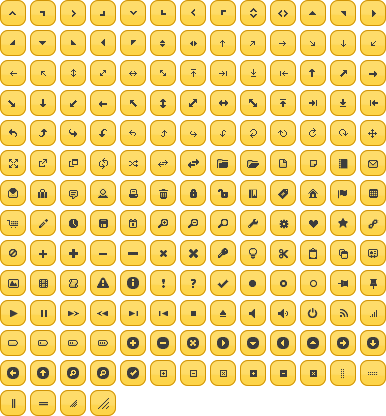
jQuery UI provides a full suite of Framework icons (Figure 15-16). In ThemeRoller you can preview their default and hover interaction states by hovering over an icon in the widget example column, and you can mouse over an icon to see its class name.
Corner radius helper classes apply rounded corners to a subset or all corners of a container. The last segment of the corner class name indicates where the corner will appear, as noted here:
.ui-corner-tlTop left
.ui-corner-trTop right
.ui-corner-blBottom left
.ui-corner-brBottom right
.ui-corner-topBoth top
.ui-corner-bottomBoth bottom
.ui-corner-rightBoth right
.ui-corner-leftBoth left
.ui-corner-allAll four corners
Overlay and shadow classes can be used to add depth and dimension to a site or application:
.ui-widget-overlayApplies 100 percent width and height dimensions, background, and opacity to the modal screen, a layer that sits between a modal dialog and the page content that is commonly used to make page content appear temporarily disabled while the modal is showing.
.ui-widget-shadowApplies background, corner radius, opacity, top/left offsets to position the shadow behind a widget, and shadow thickness (similar to border width).
Because these Framework classes apply theme styles to jQuery UI widgets and can be used to style any component on your page, we can use them throughout an interface to create a uniform appearance. In this recipe, we’ll review how to assign three types of Framework classes:
Clickable state classes, including
.ui-state-default,.ui-state-hover, and.ui-state-activeA corner class,
.ui-corner-allAn interaction cue class for disabling a form element,
.ui-state-disabled
Step 2: Apply clickable-state Framework classes
Let’s continue refining the look of our travel reservations application.
After applying a theme we created in ThemeRoller and modifying default styles with override rules, the interface of our travel application’s flight selector is almost done: the clickable elements in our jQuery UI widgets have a consistent appearance—by default, the tabs and datepicker buttons are all dark gray with a glassy texture.
But our Search for Flights submit button doesn’t conform to this design and instead looks like a standard, unstyled browser button (Figure 15-17). We want it to look more like our polished theme style.

To make the search button look like other clickable elements
in our travel application, we’ll assign the Framework classes that
set clickable state styles—.ui-state-default, .ui-state-hover, and .ui-state-active—to the button markup and
then write a short jQuery script to apply the styles when the user
interacts with the button. We’ll also apply rounded corners with the
same radius value set for the tabs and datepicker widget.
First, let’s assign the default state class to the button so
that it matches the other clickable elements. We’ll simply write (or
copy from the theme stylesheet) ui-default-state into the button’s
class attribute:
<button id="search-flights" class="ui-state-default">Search for Flights</button>Other clickable elements like our tabs have rounded corners,
so we’ll add rounded corners to all sides of the button and append
ui-corner-all to the class attribute:
<button id="search-flights" class="ui-state-default ui-corner-all">Search for
Flights</button>
With these quick additions to the markup, we’ve applied our default theme style for clickable elements to the search button and also made it “themeable”—later if we decide to create and apply a new theme to our travel application widget, the search button will pick up the default clickable and corner styles from the new stylesheet.
Finally, let’s apply the hover and mousedown (active) states to provide visual feedback to users when they’re interacting with the button (Figure 15-18).
To update the button’s appearance on hover and mousedown,
we’ll write a small jQuery script. Since we’ve already downloaded
and included the latest version of the jQuery core library in our
page and have already initialized the widget plugins on DOM ready,
we’ll append a function to the DOM ready block that toggles the
state classes assigned to our search button. As noted in the
following script block, the hover
event contains two functions—the first removes the default state
class and adds the hover state on mouseover, and the second reverses
these class assignments on mouseout—and the mousedown event replaces the default and
hover state classes with the active class:
$(function(){
   // initialize tabs and datepickers
        $('#travel').tabs();
        $('#departure-date-picker').datepicker({altField: '#departure-date', altFormat:
'MM d, yy'});
        $('#arrival-date-picker').datepicker({altField: '#arrival-date', altFormat: 'MM
d, yy'});

   // search button hover & active states
       $('#search-flights')
            .hover(
                function(){ $(this).removeClass('ui-state-default').addClass('ui-state-
hover'), },
                function(){ $(this).removeClass('ui-state-hover').addClass('ui-state-
default'), }
            )
            .mousedown(
                function(){ $(this).removeClass('ui-state-default, ui-state-
hover').addClass('ui-state-active'), }
            );
});
Note
Why write a script to update button states when CSS
pseudoclasses (:hover, :active, :focus) do the same thing? We weighed
this question when designing the jQuery UI CSS and decided against
using pseudoclasses for a few key reasons:
They introduce a degree of complexity to the stylesheet that made it nearly impossible to keep it lean, and including them required that we account for every possible scenario where these states may clash.
They also add CSS bloat and would have significantly increased the size of the stylesheet.
Some browsers, like older but still popular versions of Internet Explorer, only support pseudoclasses on link elements (anchor tags), so we had to create classes for all clickable states anyway.
Ultimately, our button will look like the one in Figure 15-19.
Now that the button is styled to match our application, we can
conditionally add an interaction cue class, ui-state-disabled, to provide visual
feedback when the button is disabled (see Figure 15-20). For example,
let’s assume all fields in our flight reservation form are required
for submission. In this case, the search button should appear
disabled until the user enters a valid entry for every field; when
the form is complete, we’ll enable the button for submission.
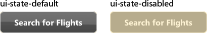
To apply a disabled appearance to our search button, we’ll
append the Framework class ui-state-disabled to our default button.
(Both classes are necessary to create the final appearance because
the disabled state styles simply reduce the default button’s
opacity.)
<button id="search-flights" class="ui-state-default ui-state-disabled ui-corner-
all">Search for Flights</button>
Applying the disabled state class only changes the appearance
of the button and does not affect its functionality; it’s still
capable of accepting user input to submit the form. To ensure that
the button is actually disabled, be sure to add the disabled attribute and value to the button
markup:
<button id="search-flights" class="ui-state-default ui-state-disabled ui-corner-all"
disabled="disabled">Search for Flights</button>
Discussion
Framework classes are designed to be reused throughout an application, and as such they provide developers with a ready set of classes for styling related components in an application, like our travel application’s Search for Flights button, or even your own widgets. Because Framework classes are named according to their purpose, applying them to component parts of a custom widget is fairly intuitive:
Clickable state classes can be added to buttons, links, or other elements that require a hover or active state.
Corner classes can be applied to any element with block properties.
Layout helpers can be used throughout the layout structure for fixing float containers or toggling content visibility.
Interaction cue classes can be assigned to elements that must convey visual priority or error messaging.
Adding Framework classes to non-jQuery UI elements also makes them themeable; if you decide to edit and download an updated theme using ThemeRoller, the new theme will automatically also apply your styles to those elements.
15.4. Referencing Multiple Themes on a Single Page
Problem
More than one theme must be applied to your application and appear on a single page. For example, your jQuery UI tabs must be styled according to a primary theme, and widgets within the tab panels must conform to a different theme.
Solution
Create a second theme using ThemeRoller, and apply it selectively to widgets or components in your application by associating the new theme with a class, an ID, or other scoping selector during the download process.
Note
The following recipe makes the following assumptions:
You have a basic knowledge of how CSS works and, specifically, how styles cascade, take precedence, and can be scoped using selector classes, IDs, or elements. (For our recommended resources, please refer to the Appendix at the end of this chapter.)
You’re already familiar with how to create and edit a theme using ThemeRoller. (If not, review Recipe 15.1, which describes in detail how to create a theme and apply it to your pages.)
jQuery UI themes are intended to create a consistent look and feel in jQuery UI widgets and other interface components across an entire application, but sometimes the design is more complex, and a different look and feel must be applied to certain widgets depending on where they appear in the application.
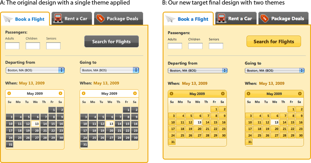
In the case of our travel application, let’s say the designer reviews our final design and feels that using dark gray on all clickable elements makes it difficult to distinguish the reservation type tabs from the form fields within the set. He decides the top tabs should retain their current style, but all interactive components inside the tabs—including the datepickers and search button—should be styled differently and have a yellow default state. Figure 15-21 shows our current and our new design.
There are a couple of ways to create style exceptions for the tab contents. As described in Recipe 15.2, we could write and reference override rules to modify the default theme styles for the datepicker and button. To do that, we’d have to use a design editing tool like Adobe Photoshop to figure out all of the new color hexadecimal values and then produce new yellow background images.
Or, we could just create a new theme in ThemeRoller that matches our secondary theme (in this case, yellow clickable elements), scope it to our tab content area specifically, and then reference it after our original theme stylesheet. The jQuery UI download builder provides a simple interface for scoping a theme in this way: the Advanced Theme Settings area on the Download page can be set to specify a scoping selector—a class, an ID, or other hierarchical CSS selector—that allows you to pinpoint exactly which components will be styled with the additional theme.
Returning to our travel reservations application, at this point we’ve completed the steps described in Recipes 15.1 through 15.3:
Created and downloaded a theme and referenced it in our project (Recipe 15.1)
Wrote and appended override rules to modify a few of the theme’s default styles (Recipe 15.2)
Added a few Framework classes to our search button to apply our theme styles (Recipe 15.3)
Now we’ll review how to scope a second theme and apply it to our project.
Step 1. Create another theme using ThemeRoller
Open the jQuery UI website at http://jqueryui.com and choose Themes from the top navigation bar, or go directly to http://themeroller.com.
We created the original theme to style all of the widgets used in our design. However, in this case we only want to style the widgets within the tab content panel; we can disregard the top navigation tabs for now.
As we did in Recipe 15.1, we’ll start with the Sunny theme, since it closely matches the yellow clickable states and header styles in our new design by default (Figure 15-22).
Note
You can use an existing custom theme as a starting point without having to start from scratch. To do so, open the theme stylesheet, search for the comment that starts with “To view and modify this theme, visit http://jqueryui.com/themeroller/...” and copy and paste the theme URL into a browser’s address bar to open ThemeRoller with that theme’s settings preloaded.
The Sunny theme is very close to our new target design, with a couple of exceptions: the header that sits above the datepicker is gray when ours is yellow, and the content area and active state border color is a darker brown than is specified in our design. We’ll return to the Roll Your Own tab to tweak a few settings:
Change the header background from gray to yellow: The background color and border of our additional theme needs to match that of our “Clickable: default state.”
Open the Header/Toolbar section.
In the background color field enter
#FECE2F; we don’t need to make any changes to the texture or opacity settings.The white text is now barely visible against the yellow background, so we’ll darken it to match the gray text elsewhere in our application; enter the value
#333333.Likewise, the icons in the datepicker header need to contrast more with the background, so we’ll make them medium brown; enter
#A27406.Finally, change the border color to
#D19405.
Change the content and active state borders to light brown: Content borders appear around accordion sections and define the tabs, dialog, slider, datepicker, and progress bar outer containers.
Open the Content section.
Update the border color to match that of the header border,
#D19405.Hit the Tab or Enter key, or click elsewhere on the page, to preview the changes in the widgets on the right.
Step 2. Scope the new theme and download it
When you’re finished editing the Sunny theme, click the “Download theme” button in the toolbar’s Roll Your Own tab, which navigates you to the jQuery UI download builder.
Before we edit the download builder settings, we need to determine which scoping selector we’ll use to apply our new theme to the travel application’s content panels. We want to ensure that we only affect the tab contents and don’t alter the original theme we applied to our top navigation tabs.
A scoping selector is a class, an ID, or an HTML tag that specifically identifies the parent container of the elements we want to style. It’s best to choose a scoping selector with the most limited range so that you don’t inadvertently scope styles to elements that should assume the base theme styles. In our travel reservations application, the scoping selector should identify the container that encloses the tabs’ content and does not also enclose the tabs’ navigation panel.
When we look at the generated markup in our application, we
see that each content panel is assigned the class ui-tabs-panel:
<div class="ui-tabs ui-widget ui-widget-content ui-corner-all" id="travel">
    <ul class="ui-tabs-nav ui-helper-reset ui-helper-clearfix ui-widget-header ui-
corner-all">
       <li class="ui-state-default ui-corner-top ui-tabs-selected ui-state-active">
<a href="#travel-flight" id="tab-flight">Book a Flight</a></li>
       <li class="ui-state-default ui-corner-top"><a href="#travel-car" id="tab-
car">Rent a Car</a></li>
       <li class="ui-state-default ui-corner-top"><a href="#travel-package"
id="tab-package">Package Deals</a></li>
    </ul>
    <div id="travel-flight" class="ui-helper-clearfix ui-tabs-panel
ui-widget-content ui-corner-bottom"></div><!-- /flight -->
    <div id="travel-car" class="ui-tabs-panel ui-widget-content ui-corner-bottom
ui-tabs-hide"></div><!-- /car -->
    <div id="travel-package" class="ui-tabs-panel ui-widget-content
ui-corner-bottom ui-tabs-hide"></div><!-- /package -->
</div><!-- /travel -->
Because the content panel markup appears after and is separate
from that of the tabs’ navigation, we can safely scope our new
styles to the ui-tabs-panel class
without affecting the styles
applied to the top tabs.
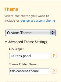
With our scoping selector identified, we can return to the jQuery UI download builder. In the right column under Theme, we’ll specify how this new theme should be scoped within our application. Click Advanced Theme Settings to expand this section; you’ll see two input fields (Figure 15-23):
CSS Scope accepts the scoping selector (class, ID, or HTML tag). When compiling the theme stylesheet, the download builder prefixes every style rule with this value, which applies all style rules only to elements within the specified container.
For our travel reservations application, we’ll enter the class we chose to scope our styles,
.ui-tabs-panel. Be sure to include the preceding period (.) or, if specifying an ID, the hash (#)—these marks are necessary for the stylesheet to render properly.
Note
When this field is left blank, the theme is applied globally across all widgets in your application and is not scoped to any particular container.
Theme Folder Name accepts a folder name for the new theme that’s included in the downloaded ZIP; this folder contains the theme stylesheet and image files. This value defaults to the name of the selected theme, which in our case should be “custom-theme” since we’ve arrived at the download builder after designing a custom theme in ThemeRoller.
When you type a CSS scope in the first field, the download builder suggests a folder name based on that scope. This is meant to be helpful, but you may want to override the suggestion with something more meaningful to your project’s directory structure.
For the travel reservations application, we’ll write our own folder name and use “tab-content-theme” to better describe the folder contents.
Now that we’ve set up the CSS scope and folder name, we’ll select all jQuery UI widgets that will use the new scoped theme (Figure 15-24).
Select which version of jQuery UI you’d like to use (the latest stable version is selected by default), click Download, and save the ZIP file locally (the file will be named like jquery-ui-1.7.1.custom.zip).
Step 3. Merge files into your project directory
The download folder contains the CSS directory (css) with your scoped theme folder; the widget JavaScript (js), which may be a duplicate of what you’re already using (to stay safe, double check before overwriting any files); and the development bundle (development-bundle), which contains individual CSS files used to create the compiled version found in the css folder, open source license text, and related resources necessary for advanced development. The order of the folders and files may vary depending on your operating system (Figure 15-25 shows the folder opened on Mac OS X).
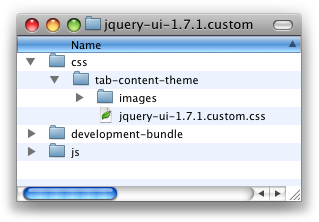
Now we’ll copy and paste the tab-content-theme folder into the styles directory for our travel reservations project.
Warning
It’s important to maintain the established directory structure within the theme folder so that the icon images are referenced properly by the theme classes. If you do change the theme directory structure, you will likely have to replicate those changes if later you decide to upgrade to a newer version of the jQuery UI scripts and CSS.
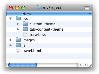
The new theme folder will sit alongside the original theme folder in the styles directory, as shown in Figure 15-26.
Step 4. Reference the scoped theme stylesheet in your project
We’ll reference our scoped stylesheet after the original theme stylesheet and before all jQuery UI scripts. The order in which theme stylesheets are referenced on the page is not important:
<!doctype html>
<html>
<head>
    <meta charset="UTF-8">
    <title>Travel widget | Book a Flight, Rent a Car, or Find Package Deals</title>

    <!-- jQuery UI styles -->
    <link rel="stylesheet" type="text/css" href="css/custom-theme/jquery-ui-
.7.1.custom.css" />
    <link rel="stylesheet" type="text/css" href="css/tab-content-theme/jquery-ui-
1.7.1.custom.css" />

    <!-- jQuery core & UI scripts -->
    <script type="text/javascript" src="js/jquery-1.3.2.min.js"></script>
    <script type="text/javascript" src="js/jquery-ui-1.7.1.custom.min.js"></script>

    <script type="text/javascript">
    $(function(){
        $('#travel').tabs();
        $("#departure-date-picker").datepicker({altField: '#departure-date',
altFormat: 'MM d, yy'});
        $("#arrival-date-picker").datepicker({altField: '#arrival-date', altFormat:
'MM d, yy'});
    });
    </script>
</head>
...
When the theme stylesheet links are in place, we’ll preview the page in a browser to confirm that the styles are being applied correctly. Because we scoped the new theme to the tab content panel, the styles are only applied to the content’s widgets and not to the tabs above, as illustrated in Figure 15-27.
Note
For another example of this technique, visit this article: http://www.filamentgroup.com/lab/using_multiple_jquery_ui_themes_on_a_single_page/.
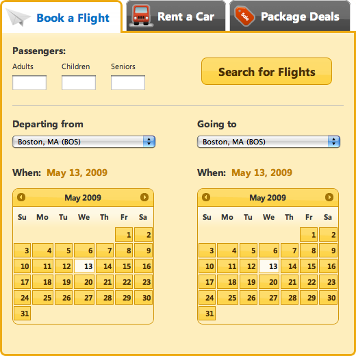
15.5. Appendix: Additional CSS Resources
To get the most out of the jQuery UI CSS Framework and ThemeRoller, it helps to have a basic knowledge of how CSS works and, specifically, how styles cascade, take precedence, and can be scoped using selector classes, IDs, or elements.
We recommend the following books and online resources for a primer on these concepts:
- CSS Basics Tutorial
- CSS Cheat Sheet
- Designing with Web Standards
- Web Standards Solutions
- Eric Meyer on CSS