
There are many reasons to create a hard copy of your lovingly maintained Access data. With a good printout, you can:
Carry your information without lugging your computer around. For example, you can take an inventory list while you go shopping.
Show your information to non-Access users. For example, you can hand out product catalogs, order forms, and class lists to other people.
Review details outside the office. For example, you can search for mistakes while you’re on the commuter train home.
Impress your boss. After all, it’s difficult to argue with 286 pages of raw data.
In Chapter 3 you learned how to print the raw data that’s in a table, straight from the datasheet. This technique is handy, but it provides relatively few features. You don’t have the flexibility to deal with large blocks of information, you can’t fine-tune the formatting of different fields, and you don’t have tools like grouping and summarizing that can make the information easier to understand. As you’ve probably already guessed, Access provides another printing feature that fills in these gaps. It’s called reports, and it allows you to create a fine-tuned blueprint that tells Access exactly how it should prepare your data for the printer.
Reports are specialized database objects, much like tables and queries. As a result, you can prepare as many reports as you need, and keep them on hand indefinitely. Life isn’t as easy if you stick to the datasheet alone. For example, if you’re using the bobblehead database, you may want to print a list of bobblehead dolls with the doll’s name and manufacturer information for your inventory list, and a separate list with prices for your budgeting process. To switch back and forth between these two types of printouts using the datasheet, you have to manually rearrange and hide columns every time. Reports don’t suffer from this problem, because each report is saved as a separate database object. So if you want to print your inventory list, you simply run the DollInventory report. If you want the budgeting details, you fire up the DollPrices report.
Note
This philosophy is the same one that you saw with queries in Chapter 6. Rather than get locked into one set of sorting and filtering options, queries let you cook up every combination you could ever want, and then store each one as a separate database object.
To see one reason why reports are insanely better than ordinary datasheet printouts, compare Figure 10-1 (which shows a datasheet printout) and Figure 10-2 (which puts the same data into a simple report). Notice how the datasheet printout has both wasted space and missing information.
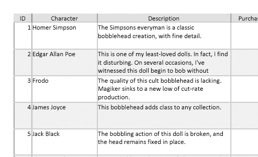
Figure 10-1. Ordinary printouts are notoriously bad at dealing with large amounts of data in a single column. Consider the Description field in this Dolls table. Every record has the same-sized box for its description, which fits three short lines. If the information is larger than the available space (as it is for the Edgar Allan Poe doll), it’s chopped off at the end. If the information is smaller (as with the James Joyce doll), you have some wasted white space to look at.
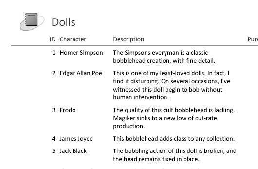
Figure 10-2. In a typical report, you size the column widths, but the height of each row depends on the amount of information in the record. That means each row is just large enough to show all the text in the Description field. Best of all, you don’t need to apply any special settings to get this behavior. Reports do it automatically.
You can take more than one path to create a report. Experienced report writers (like you, once you’ve finished this chapter) often choose to create a report from scratch. Report newbies (like you, right now) usually generate a quick report with a single click. This section covers the simplest method for generating a report.
Note
As you’ll see, the simple approach to creating a report always puts your information in a tabular structure (with columns and rows). You’ll learn how to break out of this design in Chapter 11.
It takes just two steps to create a simple report, and a few more to fine-tune it. If you want to try out this technique for yourself, open the Boutique Fudge database (included with the downloadable content for this chapter, explained in Section 3.4.2.3) or a database of your creation, and follow these steps:
In the navigation pane, select the table you want to use for your new report.
This example uses the Products table from the Boutique Fudge database. You can also create a report that’s based on a query. See the box “Doing the Heavy Lifting with a Query” (Section 10.1.2) for more about this trick.
Choose Create → Reports → Report.
A new tab appears with a simple, automatically generated report. This report arranges information in a table, with each field in the table (or query) occupying a separate column. The Report view looks somewhat like the datasheet, except for the fact that it has nicer formatting and uses space more efficiently, as shown in Figure 10-2.
When you first create a report, the fields are arranged from left to right in the same order that they live in the table. It doesn’t make any difference if you’ve rearranged the columns in the datasheet. However, any columns you’ve hidden in the datasheet (Section 3.1.4) are left out of the report.
Note
You can fine-tune exactly which data appears in your report by removing columns you don’t want and adding new columns. Section 10.1.3 has more about this trick.
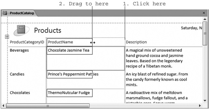
Resize the columns smaller or larger until you have the balance you want.
To resize a column, first click the column header to select it. (A dotted line will appear around the column.) Next, move the mouse to the right-side of the column header, so that it changes into the two-way resize pointer. Finally, drag the column border to the left (to make it smaller) or to the right (to make it larger). Figure 10-3 shows this process in action.
Figure 10-3. Drag the edge of the column to the desired width. A black box shows you the new width. When you release the mouse button, Access changes the column width and moves all the following columns accordingly. To prevent the last column from leaking off the edge of the page, you may need to shrink some columns after you expand others.
Note
You’ll see a dotted line on the right side of your report that indicates the edge of the page. You can resize a column right off the edge of the page—which may make sense if you have dozens of columns, and the only way you can deal with them is to create a printout that’s two pages wide. Generally, though, it’s better to make sure all your fields fit the width of the page, and turn the page sideways using landscape orientation (Section 3.4.1.2) if you need to accommodate more columns.
Arrange the columns in the order you want by dragging them.
To move a column, click the column heading, and then drag the column to a new position.
Optionally, you can tweak the formatting by changing fonts, colors, and borders.
The quickest way to change the formatting of your report is to select the appropriate part (by clicking), and then use the buttons in the Report Layout Tools | Formatting → Font section of the ribbon. Using this technique, you can change how titles, column headers, and data appear. Section 10.3.1 has more on this technique.
Add the finishing touches.
Now’s the time to change the headings, add a logo, and apply page numbers. You’ll learn how to fill in these details starting in Section 10.1.5.
Optionally, choose Office button → Print to print the report now.
You can also adjust the print settings in Print Preview mode (choose Office button → Print → Print Preview), as described in Section 10.2.
Save your report to use later.
You can save your report at any time by pressing Ctrl+S. If you close the report tab without saving it, Access prompts you to make the save. Either way, you need to supply a name for your report.
It’s possible to create reports that have the same names as tables or other data-base objects. For example, you could create a Products report that shows information about the Products table. However, in practice it’s usually better to pick a more specific report name (like ProductsByCategory, ProductListForDealers, and Top50Products). The report shown in Figure 10-2 and elsewhere in this chapter is named ProductCatalog.
You’ve already learned how you can shuffle columns around in a report. However, that’s not all you can move. You can also add space between the rows (see Figure 10-4) and adjust all the following elements:
The logo (in the top-left corner). In a new report, the logo looks like a note-book with a circle around it.
The report title (right next to the logo). To start out, this is the name of the table or query on which the report is based (like Products).
The date and time (which is updated every time you open the report). Initially, this appears in the top-right corner.
The page number. This appears at the center-bottom of each page. In Layout view, Access treats the report as though all the data occupies one page, so you need to scroll to the end to find this element.
The report data (after the title). To change where the table in the report first appears on the page, click one of the column headers, and then drag it down (to add space between the title and the report data) or up (to remove the space).
The totals (at the bottom of some columns). Access automatically adds calculations for numeric fields. For example, when the ProductCatalog report is first created, Access adds a total at the bottom of the Price column that indicates how much it costs to buy one of each product. (This total is of dubious value— to change it, select the column, and then pick another summary option from Report Layout Tools | Formatting → Grouping & Totals → Totals menu.)
If you’re tired of merely rearranging columns, you may want to try adding ones that aren’t already included or removing existing ones that you don’t want. Removing a field is easy: just click to select it, and then press Delete. (You can try out this technique with the Discontinued field in the ProductCatalog report.)
When you create a simple report using the quick creation technique described in Section 10.1.1, you usually end up with all the fields you need. However, there are two reasons why you may need to add an additional field that isn’t already in the report:
You want to add a field that’s hidden in the Datasheet view (Section 3.1.4). When you create a new report, hidden fields are left out.
You want to add a field with related information from a linked table. For example, you could add fields from the ProductCategories table to show information about the category that each product is in.
To add a new field, you need the help of the Field List pane (see Figure 10-5). To show it, choose Report Layout Tools | Formatting → Controls → Add Existing Fields.
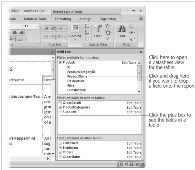
Figure 10-5. The top portion of the Field List window lists the fields from the table (or query) on which the report is based. The middle portion lists the fields in any related tables, and the bottom portion lists unrelated tables (which you probably won’t use). To add a field, drag it from the Field List pane and drop it on your report.
When you add a new field, Access uses the field name for the column heading, which isn’t always what you want. Maybe you’d prefer Product Name (with a space) to ProductName. Or maybe you’d like to shorten ProductCategoryID to just Category. After all, the report shows the name instead of the numeric category ID, because the ProductCategoryID field uses a lookup (Section 5.2.5). Fortunately, renaming the column headers is easy. Just double-click one to switch it into edit mode. You can then edit the existing text or replace it altogether.
Just like tables and queries, you can use several different views to change a report. When you create a report using the quick creation technique described earlier, you begin in Layout view, which is an ideal starting place for report builders. But depending on the task at hand, you may choose to switch to another view. You have four viewing options:
Layout View. Shows what the report will look like when printed, complete with the real data from the underlying table. You can use this view to format and rearrange the basic building blocks of the report.
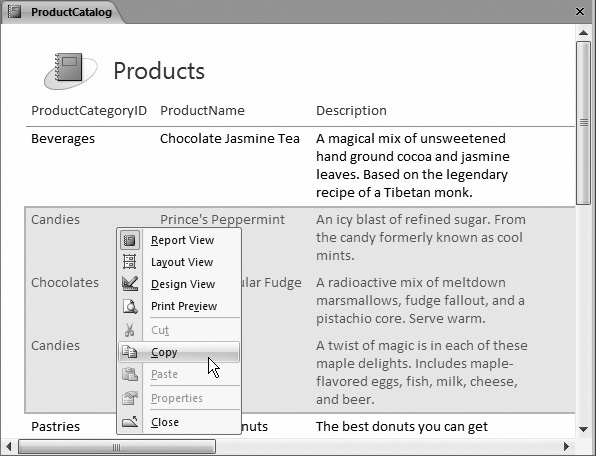
Report View. Looks almost the same as Layout view but doesn’t allow you to make changes. If you double-click a report in the navigation pane, Access opens it in Report view so you can see the data it contains without accidentally changing its design. One common reason to use Report view is to copy portions of your report to the clipboard, so you can paste them into other programs (like Microsoft Word). Figure 10-7 shows how that works.
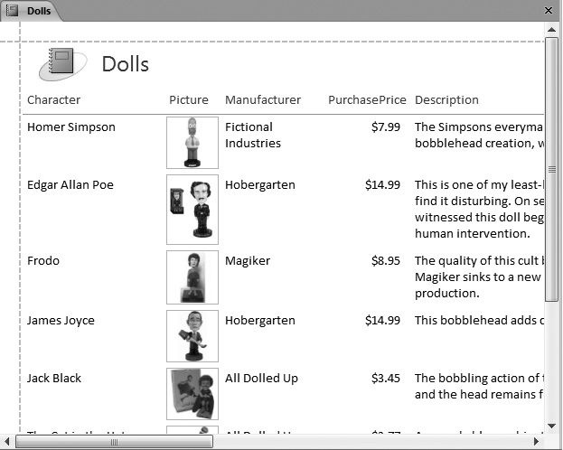
Figure 10-6. You can see this in the sample Bobblehead database examples for this chapter. (They’re available on the “Missing CD” page at www.missingmanuals. com.) The report is named DollsWithPictures.
Figure 10-7. To select a bunch of rows, click in the margin on the left next to the first row you want to select, and then drag down to highlight the rows you want. Then, right-click the highlighted portion, and choose Copy to transfer it to the clipboard, so it’s ready for pasting into other Windows applications.
Note
If you want to transfer the entire content of a report, you should consider the export features described in Section 6.3.1.
Print Preview. Shows a live preview of your report, just like Layout view and Report view. The difference is that the preview is paginated (divided into print pages), so you can figure out how many pages your printout needs and where the page breaks fall. You can also change print settings (like page orientation) and export the complete report, as described in Section 10.2.2.
Design View. Shows a template view where you can define the different sections of your report. It’s not nearly as intuitive as Layout view, but it does give you complete, unrestrained flexibility to customize your report. Access experts often begin creating a report in Layout view and then add more exotic effects in Design view. You’ll learn more about Design view in Chapter 11.
Note
Design view is a throwback to previous versions of Access, which didn’t include the more intuitive Layout view and Report view options. It’s still useful for some tasks, but it’s no longer the central station for shaping and formatting a report.
You can switch from one view to another by right-clicking the report tab title, and then choosing the appropriate view from the pop-up menu. (Or, you can use the Home → Views → View menu or the view buttons in the bottom-right corner of the Access window. It’s just a matter of personal preference.)
After you’ve closed your report, you can reopen it in the view of your choice. Just right-click the report in the navigation pane, and then choose the appropriate view. Or double-click the report in the navigation pane to open it in Report view.
So far, you’ve learned how to quickly create a report based on a table or a query. However, you have another choice—you can start with a blank slate and explicitly add each field you want. Both approaches are equally valid. You may prefer to use the quick creation technique when you want to build a report that closely follows the structure of an existing table or query. Alternatively, if you plan to create a report that uses just a few fields from a table, you may find it’s easier to start from scratch.
Here’s how you create a report from the bottom up:
Choose Create → Reports → Blank Report.
A new, empty report appears in Layout view. The Field List appears on the right, with all the tables in your database.
Add the fields you want from the appropriate table, either by dragging them from the Field List onto the report surface or by double-clicking them.
You can also use fields from related tables. For example, you can create a report that combines product information and the category details for each product.
In this case, the report automatically uses a join query (Section 6.3) to get the results.
When you create a report from scratch, the columns start off with no formatting at all. You’ll need the formatting techniques described in the next section to add color and emphasis.
Add any other elements you want, like a logo, a title, page numbers, and the date.
When you create a simple report, you get all these ingredients for free. Fortunately, it’s just as easy to add them to a report you’re building from scratch. Just head to the Report Layout Tools | Formatting → Controls section of the ribbon (see Figure 10-8).
Figure 10-8. The logo and title typically sit at the top of your report. You can use any picture for the logo and any text for the title. Access gives you more options for the date (Figure 10-9) and page number (Figure 10-10).
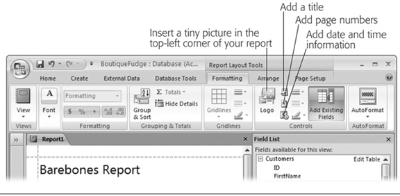
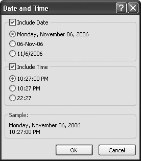
Figure 10-9. When adding date information, you can choose whether to include the date, the time, or both. You also pick the format. Once you’ve added the date information, you can change the font, borders, and colors, as with any other report element.
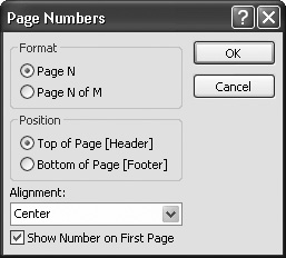
Figure 10-10. With page numbers, you can choose the format, the position, and the alignment. (The position determines whether the page numbers appear above or below the report data. Although you can drag the page numbers around after you add them, Access will shift the report data to make room, based on your choice.)
Once you’ve created the perfect report, it’s time to share it with rest of the world. Most commonly, you’ll choose to print it.
Printing a report is easy—simply choose Office button → Print. But before you inadvertently fire off an 87-page customer list in jumbo 24-point font, it’s a good idea to preview the end result. Access makes it easy with its integrated Print Preview feature.
Tip
You don’t need to open your report to print it. Just select it in the navigation pane, and then choose Print from the Office menu. But beware—when you use this shortcut you don’t get the chance to preview the result and make sure it’s what you want before it pops out of the printer.
To get a preview of what your printed report will look like, right-click the report tab title and then choose Print Preview, or choose Office button → Print → Print Preview. Print Preview mode doesn’t let you make any changes or select any part of the report. You’re limited to zooming in and out, and moving from page to page (see Figure 10-11). When you’re finished looking at your print preview, choose Print Preview → Close Preview → Close Print Preview.
In Print Preview mode, the ribbon changes dramatically. The tabs you’ve grown to know and love disappear, and Access replaces them with a single tab named Print Preview. (This is the same Print Preview tab you saw when you previewed a datasheet printout in Chapter 3.) You can use all the same techniques that you learned in Section 3.4.1.1 to move around the preview, see multiple pages at once (which lets you study where page breaks occur), and change the page margins and paper orientation.
For example, the Portrait and Landscape buttons let you quickly switch between the standard portrait orientation (which places the short edge at the top of the page) and landscape (which rotates the page, placing the long edge at the top). Portrait fits more rows, while landscape fits more columns. Generally, portrait is best, provided it can fit all your columns. If portrait mode doesn’t fit all your columns, you can try using landscape orientation, a smaller font size (Section 10.3.1), narrower margins, or a larger type of paper.
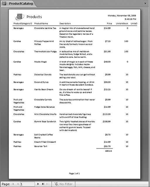
Figure 10-11. To zoom in, click once with the mouse. Click again to zoom back out to the full page view. You can also use the page navigation buttons at the bottom of the window to move from one page to the next, and the zoom slider (not shown) for more precise zooming. But the most useful commands appear in the ribbon, which lets you tweak the print settings and export your report results to another type of file.
Note
Reports always use your standard paper size (which is usually 8.5 x 11 inches, or letter size) when you first create them. However, if you change the size, the new size setting is stored with the report. That means the next time you open your report, it still has the customized paper size. The same applies for the paper orientation setting.
Access has two extra options that aren’t provided in a normal datasheet print preview:
Use the Print Data Only button to produce a streamlined printout that leaves out details like column headers and titles. This option is rarely useful, because the resulting printout is harder to read.
Use the Columns button to fit more report data on a page. This option works only if your report is much narrower than the page width. For example, if your report is less than half the width of the page, you can double-up by using two columns. You’ll need half the number of pages. in Section 11.3, you’ll see how the Label wizard uses a multicolumn report to pack mailing labels on a page.
The Print Preview tab is a bit of an oddity, because it includes a few commands that don’t have anything to with printing your report. The commands in the Print Preview → Data section let you take a snapshot of the current report data, and then export it into some other type of file so you can view it outside of Access or work with it in another program. This technique is a great one to use if you want to share some data with other people (read: impress the boss).
Although Access supports many different formats for exporting a report, you’ll use just a few with reports. (The others are more useful when you’re exporting pure data from a table or query, as explained in Chapter 19.) The useful formats for exporting reports include:
Word. This option transforms your report into a document you can open in Microsoft Word. However, the format Access uses is a bit clumsy. (It separates each column with tabs and each line with a hard return, which makes it difficult to rearrange the data after the fact in Word.) A nicer export feature would put the report data into a Word table, which would make it far easier to work with.
HTML Document. This option transforms your report into a rich HTML document, suitable for posting on the Web or just opening straight from your hard drive. The advantage of this format is that all you need to view it is a Web browser (and who doesn’t have one of those?). The only drawback is that the formatting, layout, and pagination of your report won’t be preserved exactly, which is a disadvantage if someone wants to print the exported report.
Snapshot Viewer. This option creates a .snp snapshot file, which anyone can open to view and print the fully formatted report. In order to view the snap-shot file, you need Microsoft’s free Snapshot Viewer program. (To download it, surf to http://office.microsoft.com and search for “Snapshot Viewer.”) Although the Snapshot Viewer works perfectly well, most people prefer to use the more standard PDF format (next in the list), which provides the same features. (Truthfully, the Snapshot Viewer is a bit of a holdover from earlier versions of Office.)
PDF or XPS. This option lets you preserve your exact report formatting (so your report can be printed), and it lets people who don’t have Access (and possibly don’t even have Windows) view your report. The only disadvantage is that this feature isn’t included in the basic Access package. Instead, you need to install a free add-in to get it (you’ll see how in Section 10.2.3). For more information about the PDF and XPS formats, see the box “Learning to Love PDFs” below.
No matter which format you use, the process is essentially the same:
If you’re not already in Print Preview mode, right-click the report tab title, and then choose Print Preview.
Click one of the buttons in the Print Preview → Data section of the ribbon, depending on the format you want to use for your export.
For example, choose Print Preview → Data → Word to copy the results of your report into a Word-compatible document. Some of the options are stored under the Print Preview → Data → More menu, and you won’t see a PDF export option until you install the PDF add-in (as described in the next section).
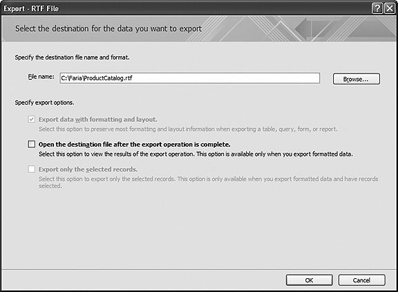
Choose a name for the destination file (Figure 10-12).
The destination file is the place where the exported data will be stored.
If you wish to open your exported file in the related program, check the setting “Open the destination file after the export operation is complete.”
Say you’re exporting a Word document and you choose this option; Access will export the data, launch Word, and load up the document. This is a good way to make sure your export operation worked as expected. This option works only if you have the program you need on your computer.
Click OK to perform the export.
Ignore the other two checkboxes, which are grayed out. They apply only to export operations that work with other database objects.
Choose whether or not you want to save your export settings.
By saving your export settings, you can quickly repeat your export operation later on. For example, if you export to a Word document and save the export settings, you can export the report data tomorrow, next week, or a year in the future. This feature is described in Section 19.3.7 in Chapter 19, which tackles export operations in more detail.
Tip
You don’t need to open your report in order to export it. Instead, you can use all the commands you need straight from the navigation pane. Just right-click the report name, and then choose Export to show a menu of all your export options, from PDF files to HTML pages. You’ll also see a few options that don’t appear in the Export tab of the ribbon, including options for exporting the report to older, almost forgot-ten database and spreadsheet products like dBase, Paradox, and Lotus 1-2-3.
To export a report as a PDF file, you need the “Save As PDF or XPS” add-in. To get it, surf to http://www.microsoft.com/downloads, and search for “PDF”. The links will lead you to a page where you can download the add-in and install it with just a couple clicks.
Once you install the add-in, all your Office applications will have the ability to export their documents in PDF format. In an Access report, you work this magic by choosing Print Preview → Data → PDF or XPS while you’ve got a report in Print Preview mode. Or, you can right-click your report in the navigation pane, and then choose Export → PDF or XPS.
When you export a PDF file, you get a few extra options in the "Publish as PDF or XPS” dialog box (Figure 10-13). PDF files can be exported with different resolution and quality settings (which mostly affect reports that have pictures). Normally, you use higher-quality settings if you’re planning to print your PDF file because printers use higher resolutions than computer monitors.
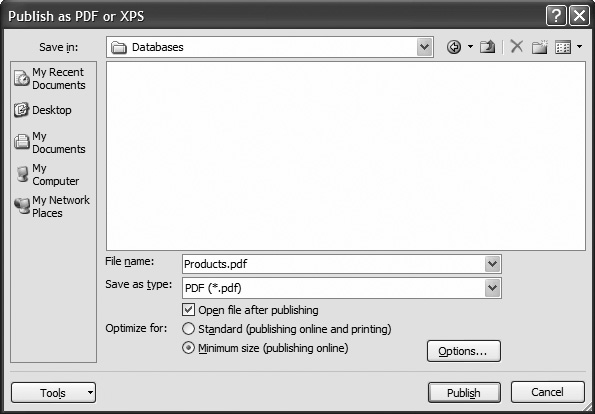
Figure 10-13. The “Publish as PDF or XPS” dialog box looks a lot like the Export As dialog box, except it has a Publish button instead of an Export button. You can turn on the “Open file after publishing” checkbox to tell Access to open the PDF file in Adobe Reader (assuming you have it installed) after the publishing process is complete, so you can check the result.
The “Publish as PDF or XPS” dialog box gives you some control over the quality settings with the “Optimize for” options. If you’re just exporting a PDF copy so other people can view the information in your report, choose “Minimum size (publishing online)” to save some space. On the other hand, if there’s a possibility that the people reading your PDF may want to print it out, choose “Standard (publishing online and printing)” instead. You’ll export a slightly larger PDF file that will make for a better printout.
Finally, if you want to publish only a portion of your report as a PDF file, click the Options button to open a dialog box with yet a few more settings. You can choose to publish just a fixed number of pages rather than the full report.
Tip
Getting the “Save As PDF or XPS” add-in is a bit of a hassle, but it’s well worth the effort. In previous versions of Access, people who wanted to create PDF files had to get another add-in or buy the expensive full version of the Adobe Acrobat software. The “Save As PDF or XPS” feature was originally slated for inclusion in Office (with no add-in required), but antitrust concerns caused an ultra-cautious Microsoft to keep it out. Best of all, the add-in gives you PDF-saving abilities in other Office applications, like Word, Excel, and PowerPoint.
So far, you’ve learned to create simple reports that show all the information you want in a compact table. The only problem with these reports is that they all look the same. If you’re working in a cubicle farm for a multinational insurance company, this drab sameness is probably a good thing. But those who still have a pulse may want to jazz up their reports with borders, exotic fonts, and a dash of color.
The quickest way to apply formatting is to use one of the prebuilt AutoFormats (shown in Figure 10-14) from the Report Layout Tools | Formatting → AutoFormat → AutoFormat list. Each AutoFormat applies a combination of fonts, colors, and border settings. AutoFormats let you transform the entire look of your report in one step, but they don’t give you the fine-grained control to apply exactly the details you want.
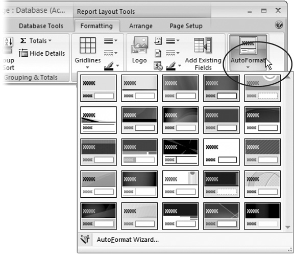
Figure 10-14. Click the drop-down arrow (circled) to see all the available AutoFormats. (Or, if you have a really large monitor, the AutoFormat previews appear right in the ribbon.) Each thumbnail preview shows the colors and a bit of the background that the format uses, but you need to apply it before you can really see what it looks like.
Note
Remember, in order to format a report, it needs to be in Layout view. If you double-click a report in the navigation pane, it opens in Report view. Right-click the tab title, and then choose Layout View to switch over.
You can do a couple other things with AutoFormat:
To apply just part of an AutoFormat, choose Report Layout Tools | Formatting → AutoFormat → AutoFormat → AutoFormat Wizard. In the AutoFormat dialog box, choose the AutoFormat you want. Then, click Options to show three checkboxes at the bottom of the dialog box: Font, Color, and Border. Turn off the checkmark next to the types of formatting you don’t want to apply, and then click OK.
To revert to a plain report with no formatting, choose Report Layout Tools | Formatting → AutoFormat → AutoFormat → AutoFormat Wizard to show the AutoFormat dialog box. Then, choose None in the list of AutoFormats, and click OK.
If you’ve applied some fancy formatting to your report, and you want to save it as your own custom AutoFormat, choose Report Layout Tools | Formatting → AutoFormat → AutoFormat → AutoFormat Wizard to show the AutoFormat dialog box. Then, click Customize, choose “Create a new AutoFormat,” enter a name for your AutoFormat, and click OK. You’ll see your AutoFormat appear in the AutoFormats list.
AutoFormats are a great way to get a bunch of formatting done in a hurry. However, sometimes you want to use more of a personal touch and format the different parts of your report by hand.
To apply more targeted formatting, you need to follow a two-step approach. First, select the portion of the report you want to format. Second, click a command in the Report Layout Tools | Formatting → Font section of the ribbon (Figure 10-15).
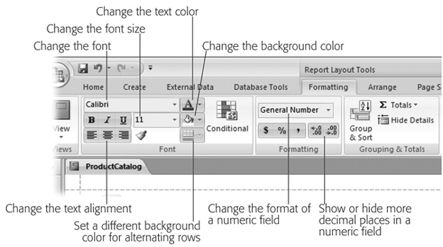
Figure 10-15. The Report Layout Tools | Formatting → Font section is packed with basic formatting tools.
The Layout Tools | Formatting →Font section lets you adjust all the following details:
The font and font size (11-point Calibri is the easy-on-the-eyes standard)
The text alignment (left, right, or center)
The text color and background color
Although you can format the title, date, or page number sections of the report, you’ll spend most of your time formatting the column headers and the column values. To format a column header, click it. To format the column values, click any one of the values in the column. Figure 10-16 shows an example.
You can’t format the individual values in a column. That means that you can format the ProductName column to look different from the Price column, but you can’t format Chocolate Jasmine Tea differently from Prince’s Peppermint Patties. This limitation makes sense—after all, you could have thousands of records, and keeping track of the formatting of each one would be way too much work for Access.
Tip
You have a way around this shortcoming. You can use conditional formatting (Section 10.3.2) to tell Access when it should kick in some extra formatting based on the value in a cell.
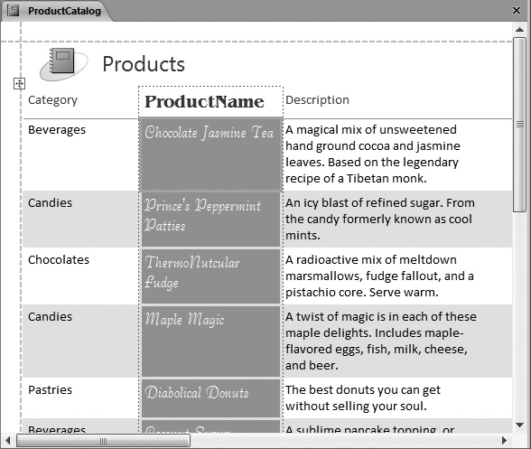
Figure 10-16. Here, the ProductName column is singled out for special formatting. Although it looks like only a single value is selected, Access will apply formatting changes to the entire column.
You can use the Report Layout Tools | Formatting →Formatting section of the ribbon to adjust numeric fields (like the Price field in the ProductCatalog report). You’ll find a drop-down list that lets you pick various options for formatting numbers:
General Number gives a basic, no-frills number. Access gives each value the number of decimal digits it needs.
Currency makes sure each number has two decimal points and gets the currency symbol that’s configured for your computer (based on its geographic locale). Large numbers get thousands-separator commas to separate the digits, as in $1,111.99.
Euro is similar to Currency, except it shows the currency symbol for the euro.
Fixed gives each number the same number of decimal places. (Initially it’s two, but you can use the Increase Decimals and Decrease Decimals buttons, shown in Figure 10-15, to change this.) Large numbers don’t get commas.
Standard is the same as fixed, except large numbers do get the thousands separator comma (as in 1,111.99).
Percent assumes each number is a fractional value that represents a percentage, where 1.0 is 100 percent. So if you have the number 48, Access changes this to 4800.00 percent. (You can change the number of decimal places with the Increase Decimals and Decrease Decimals buttons.)
Scientific displays each number using scientific notation, so 48 becomes 4.80E+01 (which is a fancy way of saying 4.8 multiplied by 101 gives you the number that’s stored in the field). Scientific notation is used to show numbers that have vastly different scales with a similar number of digits. You can change the number of decimal places using the Increase Decimals and Decrease Decimals buttons.
You can also change the number of digits that are displayed to the right of the decimal point by clicking the Increase Decimals and Decrease Decimals buttons in the Report Layout Tools | Formatting → Formatting section of the ribbon.
Here’s a simple but powerful formatting trick: Add a shaded background to every second row. Alternating row formatting gives a bit of polish to the plainest report, but it also serves a practical purpose. In dense reports, the shaded bands make it easier for readers to distinguish each row and follow a row from one column to the next.
To apply an alternating row format, you need to click immediately to the left of any row. At that point, the entire row becomes selected, and the Report Layout Tools | Formatting → Font → Alternate Fill button is turned on. (The Alternate Fill button looks like a mini-grid. It appears right under the Fill button.) You can click it, and then choose a color.
If you click one of the values in the row, the Alternate Fill button won’t be turned on, and you won’t be able to change the alternating fill color.
When you create a new report, your data is arranged in an invisible table. This table doesn’t include any gridlines, so your printouts look sleek and lightweight. But if you’re a closet gridline lover, you’ll be happy to know you can add borders to the report table. It’s up to you whether you want to add them everywhere to keep data carefully regimented in separate cells or just use them judiciously to highlight important columns.
Tip
Gridlines are useful with dense reports where the data may otherwise appear to run together into a jumbled mess. Access gurus know that less is more and using just a few gridlines is usually better than adding them between every column and row.
You can apply gridlines in two ways. The simplest and most common option is to apply them to the entire table. To do this, click anywhere inside the table of report data, and then choose one of the gridline options from the Report Layout Tools | Formatting → Gridlines → Gridlines list (Figure 10-17). Next, use the other buttons in the Report Layout Tools | Formatting →Gridlines section to change the thickness, color, and style (dashed, dotted, solid, and so on) of your gridlines. The box in Section 10.3.2, “Varying Gridlines,” explains the other method for applying gridlines.
Along with report gridlines, you can also use a similar set of border options. The difference between gridlines and borders is that gridlines apply to the table of report data, while borders can be attached to any ingredient in your report.
You’ll find the three border buttons (for choosing border thickness, color, and style) in the Report Layout Tools | Formatting → Controls section of the ribbon. The border options don’t make much sense when you use them on column values, because you’ll end up with a box around each value. Borders are more useful around other report elements, like the report title.
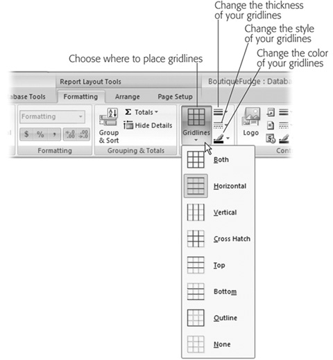
Figure 10-17. The commands in the Gridlines section of the ribbon let you apply gridlines in the most common patterns: everywhere, between columns only, between rows only, around the outside of your data, and so on. You can also choose a line style (solid, dotted, dashed, and so on), thickness, and color.
The average report packs in a lot of information. Some information is more important than other data. For example, you may have good reasons for wanting to spot out-of-stock products, orders over $100, bobbleheads you’ve purchased in the last year, or wedding guests who haven’t sent gifts. With conditional formatting, you can emphasize these pieces of information with different formatting.
The idea behind conditional formatting is that you define a condition that, if true, prompts Access to apply additional formatting to a value in a column.
To apply conditional formatting, follow these steps:
Select a value in the column where you want to apply the conditional formatting.
For example, if you want to highlight products that top $100, click one of the values in the Price column. It doesn’t matter what value you select—a conditional formatting rule applies to every value in the column.
Choose Report Layout Tools | Formatting → Font → Conditional.
If the Conditional button is turned off, you probably don’t have the right part of the report selected. For example, if you select a column header instead of a column value, you can’t apply conditional formatting.
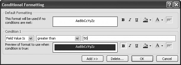
When you click Conditional, the Conditional Formatting dialog box appears with one condition slot. You can use the Conditional Formatting dialog box to define up to three conditions for a column, but one is often enough.
Using the list and text boxes, set the condition that Access should evaluate.
The first drop-down list box lets you choose whether you want to evaluate the actual data in the field (“Field Value Is”) or a calculation that uses that data (“Expression Is”). The simplest and most common option is to base your condition on the field value.
Using the second drop-down list box, choose the type of comparison you want to perform. You can choose to test whether the cell value equals a set number, is greater or less than a set number, or lies within some range of values.
Finally, enter the information that Access should use for the comparison. For example, if you choose to perform a less-than comparison, type in the value that Access should compare against. If you choose to test whether a cell is between certain values, enter both values in this range.
Figure 10-18 shows a completed Conditional Formatting dialog box that tests for high product prices in the Price field.
Click the Format buttons to set the formatting that Access should apply if the condition is true.
This new formatting can change the color of the text or the background fill. It can also apply bold, italics, or underlining to the text. However, you can’t change the font or font size conditionally.
Underneath your condition, you’ll see a preview of the formatting choices you made.
If you want to add a second or third condition, click Add, and then return to step 3.
For example, you could use blue lettering to flag prices over $50 and red lettering if the price exceeds $100. If you have more than one condition that overlaps, Access will apply only the first one that matches.
Tip
To prevent confusion, you can structure your conditions carefully so they don’t overlap. For example, use one condition that matches values between 100 and 499 and another that grabs values of 500 or more.
You can also click Delete to remove conditions. Excel will display a dialog box asking which conditions you want to remove. You can place a checkmark next to the appropriate condition, and then click OK.
Click OK.
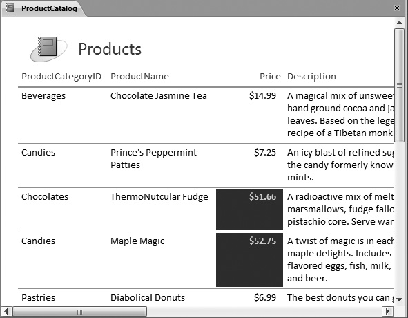
As soon as you click OK, Access evaluates the condition for every value in the column and adjusts the formatting as needed. Figure 10-19 shows the final report.
Reports offer much the same filtering and sorting features that you learned to use with the datasheet in Chapter 3. In addition, you have options for grouping and subtotals, which you’ll explore in Chapter 11.
The ProductCatalog report presents all the records from the Products table. However, reports often need to filter out just an important subset of information. For example, you may want to analyze the sales of products in a specific category or the orders made by customers in a specific city. In the case of the ProductCatalog, it’s logical to leave out discontinued items. After all, there’s no reason for Boutique Fudge to advertise items it no longer sells.
You can pare down the results that are included in a report in two ways. You’ve already learned about one option: creating a query that extracts the results you want, and then using that query to build your report. This option is a good choice if you already have a query that fits the bill or you plan to use this subset of data for several purposes (reports, editing, other queries, and so on).
Another choice is to apply the filtering through report settings. The advantage of this technique is that you can change the filter settings quickly and repeatedly. If you plan to use the same report to print several different subsets of data, this approach is best. For example, you could filter out the products in one category, print them, and then adjust the filtering to select products in a different category, which you could also print.
Report filtering works the same way datasheet filtering does (discussed in detail in Section 3.2.2). You have two options:
If you want to quickly build a filter condition based on an existing value, right-click that value, as shown in Figure 10-20. For example, in the CategoryName field, you can right-click the value “Beverages.” The menu that pops up includes several filtering options based on the current value. Depending on the option you choose, you can include records in the Beverages category, records in different categories, records that have a category name that includes Beverages (like “Alcoholic Beverages”), and so on.
If you need more flexibility to create the filter expression you want, right-click any value in a column, and then look for the filtering submenu. The exact name of the menu depends on the data type. For example, if you right-click the CategoryName field, you see a submenu named Text Filters. If you right-click the Price field, you see a submenu named Number Filters. These submenus include a range of filtering options that let you set specific ranges. For all the exquisite details and help creating a variety of filter expressions, refer to the instructions in Section 3.2.2.
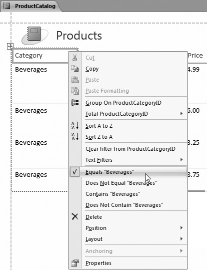
You can apply filters to multiple columns at once. To remove a filter, right-click the column, and then choose Clear Filter.
Ordinarily, a report has the same order as the underlying data source. If you’ve built your report on a query, the order is determined by the sort order you used in the query. If you’ve built your report on a table, the records have no particular order at all, although they’ll typically appear in the order you added them.
Either way, you can apply formatting directly in your report, in much the same way that you can with the datasheet (Section 3.2). Simply right-click the appropriate column header, and then look for the sorting options. The sort commands depend on the data type—for example, you can order text fields alphabetically, dates chronologically, and numeric fields in ascending or descending order.