
Access is ready and willing to store all the details in your database. But sometimes you don’t need to know everything—instead you just want the big picture. You need a way to take your raw data, which may include hundreds or thousands of records, and summarize it in some meaningful way.
You’ve already learned one way to analyze large volumes of information: with a totals query (Section 7.3). Using a totals query, you can take a huge swatch of rows and reduce it to a few neatly grouped subtotals. In this chapter, you’ll learn about two more specialized options for crunching the numbers: crosstab queries and pivot tables.
Crosstab queries and pivot tables play the same role as the totals queries that you’ve already mastered. However, they present the data in a slightly different way. Crosstab queries use extra columns to pack summary information into an extremely tight table. Pivot tables use a drag-and-drop interface that lets you rearrange your summary on the fly to search for different trends and relationships. Both these features get plenty of usage in the toolkit of every Access expert.
Note
To try out crosstab queries and pivot tables, you need data—and lots of it. The sample databases used in earlier chapters just don’t have enough raw data. Instead, the examples in this chapter use some of the tables from Microsoft’s huge AdventureWorks sample database, which has the product catalog and sales data for a fictional bicycle manufacturer. Surf over to the “Missing CD” page for this book (at http://www.missingmanuals.com) to download everything you need.
A crosstab query is a powerful summary tool that examines huge amounts of data and uses it to calculate information like subtotals and averages. If this sounds familiar, it’s because you’ve already seen totals queries do exactly the same thing in Chapter 7.
As with totals queries, crosstab queries use two key ingredients: grouping and summary functions. The grouping is used to organize the rows into small sets. The summary function is used to calculate a single piece of information for each group.
Behind the scenes, crosstab queries and totals queries work in almost exactly the same way. Both take large numbers of records and boil them down to totals, averages, minimums, maximums, and so on. However, there are two important differences.
First, crosstab queries always use two levels of grouping. For example, a typical totals query may group order records by product, so you can see the top sellers and how much cash they bring in. But a crosstab query can analyze sales figures by country and product category. Using this type of analysis, you can quickly see what product categories do well in particular countries.
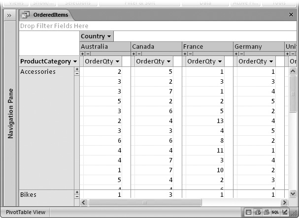
The other difference between totals queries and crosstab queries is the way Access organizes the results. A totals query creates a separate row for each different group. For example, if you’re analyzing sales by country and product category, a totals query gives you a row for each country and category combination, as shown in Figure 9-1, top. A crosstab query works a little differently; it takes the same information and packs it into separate columns, creating a denser view (Figure 9-1, bottom).
Figure 9-1, bottom, shows you what things look like with two levels of grouping: countries and products. But if you want, your crosstab queries can use more than two levels of grouping. (More levels are helpful when you want to perform really detailed analysis—for example, find out what product categories do well in specific countries, states, and cities.) In this case, the last grouping level is used to split the row into columns. Every other level is used to subdivide your results into more rows. If you create a crosstab query that groups sales by product category, product name, and country, you see the result shown in Figure 9-2.
Note
Remember, if you use more than two levels of grouping, the last level of grouping (the one used to create the columns) shouldn’t be related to any other level. However, the other levels can be related. The example in Figure 9-2 works because it follows this rule (grouping by category, product, and then country). The same data grouped differently (for example, category, country, product) doesn’t work nearly as well.

Figure 9-1. Top: In a totals query, each group resides on a separate row, representing the sales of a single product category in a single country. There are 24 groups in all, and this makes for a long, narrow list of results. Bottom: In a crosstab query, Access uses the first level of grouping (in this case, the country) to divide the data into rows, and the last level (the product category) to divide each row into columns. The numbers you see are the same as in the top figure, but now you have just six rows, each with four product groups.

Access gives you two ways to create a crosstab query: You can use the Crosstab Query wizard, or you can build it by hand. Most Access fans prefer to use the Crosstab Query wizard to get started, and then further refine their query in Design view to add other details, like filtering.
In the following sections, you’ll take a crack at cooking up a crosstab query both ways.

Figure 9-3. Consider yourself warned: Don’t group using related fields in a crosstab query. In this example, rows are grouped by product name, and columns are grouped by product category. The problem is that every product is in a single category, so each row has data in just one column—the row for that product’s category. To solve this problem and to create a better summary, you could use three levels of grouping, as shown in Figure 9-2.
The easiest way to build a crosstab query is with the Crosstab Query wizard. If you want to try it out yourself, follow these steps using the AdventureWorks database:
If you want to bring together information from linked tables, start by creating a join query.
In this example, you’ll use the already created OrderedItems join query that draws on a wealth of information about the ordered items, the corresponding products, the customers, the geographic location where they live, and so on. For more information about building a join query of your own, see Section 6.3.
If you decide that you can get everything you need from a single table, you can skip this step.
Choose Create → Other → Query Wizard.
Here’s where the wizard magic begins. A New Query window appears, with a list of the different types of queries the wizard can create.
Choose Crosstab Query Wizard, and then click OK.
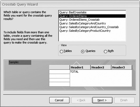
The first step of the wizard prompts you to pick a table or query (Figure 9-4). Make your selection by clicking one of the buttons in the View box.
Select your table. If you want to choose a query, click the Queries option, and then choose your query from the list. Click Next.
In this example, you need to pick the Queries option, and then choose the OrderedItems query.
The next step asks you to supply the grouping criteria that will be used to combine your data into rows (Figure 9-5).
If you’re creating a simple two-level crosstab query, you pick one criterion for rows and one for columns (in the next step). However, it’s possible to pick up to three levels of grouping for rows. This approach works best if the different levels are related. For example, you can choose to group rows by customer country, subgroup each country by city, and subgroup each city by customer ID. See Figure 9-2 for an example of a nicely subgrouped crosstab query.
Add the fields you want to use to the Selected Fields list, and then click Next.
In the OrderedItems example, rows are grouped by the StateProvince field. You can easily change your grouping in the query design window after you try out your query. For example, if you wanted, you could switch the StateProvince field to the Country field. You’ll learn how to manipulate a crosstab query in Design view in Section 9.2.2.
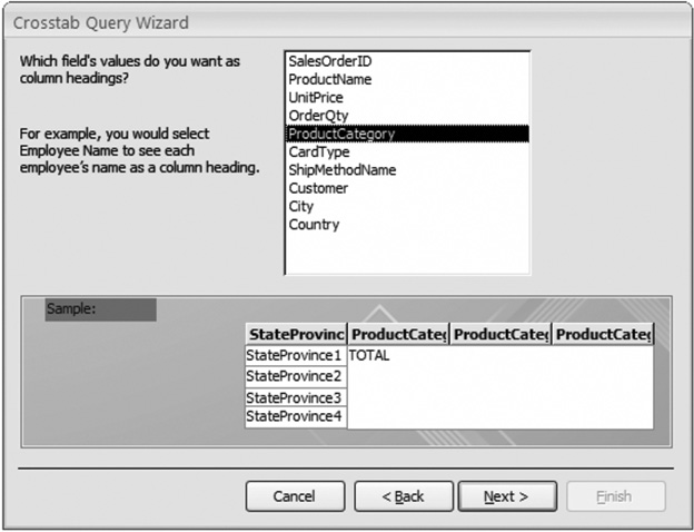
The next step asks you to supply the grouping criteria that’s used to split your rows into columns (Figure 9-6). This time, you can choose only one field.
Choose the field you want to use for column grouping, and then click Next.
In this example, it’s the ProductCategory field.
The last step asks you to pick what calculation you want to perform to create your summary.
Choose the field you want to use for your calculation, and then choose a summary function (Figure 9-7).
For example, you can choose to find the lowest-priced sale, the order with the highest number of units sold, the average item price, and so on. In this example, you’re using the OrderQty field to count the number of items sold.
Figure 9-7. In this example, the Sum function totals up the OrderQty value from each record. For example, this query tells you that you’ve sold a total of 53 items from the Bike category to customers in Alabama. If you want to count how many orders your customers have made (instead of how many items you’ve shipped), you’d need a slightly different query—in this case, you’d use the Count function to count the number of distinct SalesOrderID values.
If you want to show a subtotal for each row, turn on the “Yes, include row sums” checkbox.
The row subtotal is shown in the very first column. For example, if you activate this option with the states and categories query, the total sales for each state are shown in the first column, followed by a category-by-category breakdown (Figure 9-8).
Click Next.
The final step asks you to supply the query name. You can then choose to run the query and view its results, or continue editing it in Design view. If you need to apply filtering, head over to Design view. Otherwise, it’s time to see the fruit of your labor.
Click Finish.


As with any query, you can fine-tune a crosstab query in Design view. You can also create a new crosstab query from scratch by following these steps:
Choose Create → Other → Query Design.
Access creates a new, blank query, and opens it in Design view.
Add the table or query you want to use from the Show Table dialog box, and then click Close.
If you’re using the AdventureWorks database, the easiest option is to choose the Queries tab of the Show Table box, and then add the OrderedItems query.
Choose Query Tools | Design → Query Type → Crosstab.
Access converts your query into a crosstab query. Crosstab queries look like totals queries, with one difference. In the field list at the bottom of the window, you find an extra property named Crosstab (Figure 9-9).
Figure 9-9. Like a totals query, crosstab queries include the Total property where you specify whether a field is used for grouping, filtering, or a summary calculation. Unlike a totals query, crosstab queries also include a Crosstab property where you specify the crosstab placement of the field—in a row, in a column, as a value, or not shown at all (in which case you’re probably using the field for sorting or filtering).
Choose the fields you want to use in your crosstab query.
Every field in a crosstab query plays one of the following roles:
It’s used for row grouping. In this case, set the Total property to Group By and the Crosstab property to Row Heading.
Although the Crosstab wizard limits you to three fields for row grouping, you can actually add a virtually unlimited number of fields for column grouping. Make sure you arrange them in the order you want them applied. For example, if you have two row grouping fields, the field on the left is used first for grouping, and then the groups are subdivided using the next field.
It’s used for column grouping. In this case, set the Total property to Group By and the Crosstab property to Column Heading.
You must use exactly one field for this purpose. Remember, column grouping is applied after your row grouping.
It’s displayed as a value in the table. In this case, set the Total property to the summary function you want to use (like Sum, Count, Avg, and so on), and then set the Crosstab property to Value.
You must use exactly one field for this purpose. However, you can use an expression that performs a calculation based on more than one field. For example, the crosstab queries shown in Figures 9-1 and 9-2 use the expression Revenue: [UnitPrice]*[OrderQty] to calculate the total revenue for each line item in an order.
Tip
You may remember that the Crosstab Query wizard gives you the option of showing the total for each row in a separate column. Figure 9-10 shows how to create the same effect on your own.
It’s used for filtering. In this case, set the Total property to Where, and set the Crosstab property to “(not shown).” Then, fill in your filter criteria in the Criteria slot. (See Section 6.2.1.1 for a review of filter expressions.)
Note
Unfortunately, you can’t use filtering or sorting on the calculated field. That means that if you’re creating a query that totals sales numbers, you can’t filter out just the rows with high sales totals. However, you can perform the same feat with a pivot table, as described in the next section.
Figure 9-10 shows the query definition for the query you built with the wizard in the previous section (Figure 9-8).

If totals queries and crosstab queries just don’t thrill you enough, Access has yet another high-powered feature for summarizing your data. A pivot table is a specialized table that performs the same tricks as a crosstab query—row and column grouping—but has even more muscle. Here are some of the extra features:
Pivot tables can be rearranged at any time. With a quick drag of the mouse, you can convert a sales-by-country summary to a sales-by-customer-age grid. That makes pivot tables great for data exploration, in which you try to ferret out hidden trends and relationships from an avalanche of raw data.
Pivot tables support unlimited levels of grouping. You aren’t limited to one level of column grouping, as you are in a crosstab query. Instead, you can sub-divide your rows and columns into smaller and smaller groups.
Figure 9-10. Notice that the OrderQty field appears twice. The first time, it’s defined as the value that appears in the table grid. The second time, it’s defined as a row heading, which creates an extra column with the total for each row. Using an alias (Section 7.1.2), the extra column is renamed to Total Of OrderQty to prevent confusion.
Pivot tables are collapsible. You can hide row and column groups you aren’t interested in at the moment, and you can dig down into a group to see the individual records it contains. By browsing your data in this way, you can get a better idea of what’s taking place with your data.
Pivot tables support unlimited calculations. Crosstab queries can perform only a single calculation, which is repeated for each group. A pivot table can perform as many calculations as you want, and it stuffs them all into the same cell.
Pivot tables support sorting by your calculated values. For example, if your pivot table adds up total sales, you can sort it so the best performers rise to the top.

Note
Many Access fans lead long and happy lives without ever coming across a pivot table. That’s because it’s a fairly specialized tool, and many experts prefer to perform data analysis in another program (like Microsoft Excel). However, the pivot-table features are worth taking a look at, because they just may come in handy the next time you need to draw sweeping conclusions about how your celebrity-themed pastry company is performing.
Access incorporates pivot tables in a rather unusual way. Unlike totals queries and crosstab queries, pivot tables aren’t a specialized type of query. Instead, Access provides a pivot table viewing mode that you can use with any table or any query.
Note
The reason for this seemingly odd design is because pivot tables are designed to be exceedingly flexible. With just a few mouse clicks, you can rearrange categories or drill down from the summary view to the individual records. In order for this to be possible, the pivot table needs to have the full set of records at its fingertips.
To use the Pivot Table view, open the table or query you want to use, and then choose Home → Views → View → PivotTable View. Alternatively, you can use the tiny view buttons at the bottom-right corner of the window to switch to the Pivot Table view with a single click.
Initially, the Pivot Table view is empty (Figure 9-11).

Figure 9-11. This example shows the Pivot Table view of the OrderedItems query. Currently, there’s nothing to see, because you haven’t yet built the pivot table. A Pivot Table Field List window pops up off to the side with all the fields in your table or query.
Note
Pivot tables work only with a single table or query at a time. So it makes very good sense to create a query that joins all the tables you want, just as you did when you built your crosstab query. You can also use a query to create additional calculated fields (like a field that multiplies a product cost by the number of units).
To create a pivot table, you need to tell Access what field to use for each part of the table. Every pivot table is made up of five ingredients:
Data fields are used to calculate summary values for every group.
Detail fields show individual values for every record in a group. Optionally, you can also show summary information (in which case the detail field acts like a data field).
Filter fields are used to pare down the list of records used to create your pivot table based on the criteria you specify.
Note
The structure of a pivot table is very similar to the structure of a crosstab query—the key difference is that many of the limitations that restrict crosstab queries don’t apply to pivot tables.
The easiest way to get comfortable with pivot tables and their many possibilities is to try your hand at building one. The following steps guide you through the process of creating a simple pivot table that shows a sales summary that’s grouped by country and product category. If you want to follow along, use the OrderedItems query in the AdventureWorks database, which you can download from the “Missing CD” page at http://www.missingmanuals.com. You can then enhance the pivot table to take advantage of its extra features.
Note
Prefer a more visual approach to learning about pivot tables? You’ll also find a screencast—an online animated tutorial—on the “Missing CD” page.
From the PivotTable Field List, drag the ProductCategory field onto the Drop Row Fields Here region.
When you drop the field, Access fills in the names of all the product categories from top to bottom, in alphabetical order (see Figure 9-12). If you want to reverse your sort, just right-click one of the values, and then choose Sort → Sort Descending.
From the PivotTable Field List, drag the Country field to the Drop Column Fields Here region.
When you drop the field, Access fills in the names of all the countries from the list from left to right, in alphabetical order. In other words, each country is listed in its own column.
Figure 9-12. In this example, the list of products has already been added to the row area, and the second grouping criteria (the list of countries) is being dragged onto the column area. Notice that once a field is linked, its name is listed in boldface in the PivotTable Field List.
Tip
If dragging and dropping is a little too awkward, there’s another way to lay out a pivot table. In the PivotTable Field List window, simply select the field you want to add to the pivot table, and then, in the drop-down list underneath, choose where you want to place the field. Finally, click the Add To button (next to the list) to add the field.
Now you need to choose what data you want to examine. Drag the OrderQty field over the “Drop Totals or Details Fields Here” region.
This step fills the pivot table with data (although Access may need a few moments to group all the data if your table is extremely large).
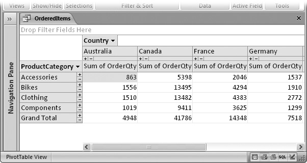
The OrderQty field is added as a detail, which means you see all the records in your table (or query), organized into their respective groups (Figure 9-13).
It’s time to add your summary calculations. Right-click the OrderQty field in the pivot table (any of the OrderQty fields will do), and then choose an option from the AutoCalc submenu.
You can perform all the summary functions that you’re familiar with, including sums, counts, and averages. For example, choose AutoCalc → Sum if you want to find the total product quantity that’s sold in a given category.
All the summaries that you create with the AutoCalc submenu are known as totals. They’re added to the PivotTable Field List window in a Totals group at the top of the list. (Click the +/-box next to the word Totals to open the Totals group.) To remove a total, right-click it in the list, and then choose Delete.
To hide all the details and see just the summary information, right-click the OrderQty field again, and then choose Hide Details.
Once you’ve hidden the details, you get a respectable result that looks more like a crosstab query (Figure 9-14).

Tip
If you know in advance that you don’t want to see details (ever), you can add a total right away. To do so, select the field (in this case OrderQty) in the PivotTable Field List window, and then, in the drop-down list at the bottom of the window, choose Data Area. Then, click the Add To button. You can use this approach when working with huge tables that have thousands of records. In this situation, adding a total is faster than adding the full details from every record.
This is where the fun starts. One of the key benefits of pivot tables is their flexibility. There’s just no limit to how many times you can move fields, how many levels of grouping you can throw into the mix, or how many different calculations you can perform at once.
Here are a few ways to quickly change a pivot table:
To remove a field, right-click it, and then choose Remove. Or, just drag it out-side the Access window (so the mouse pointer becomes an arrow with an “X”), and then let it go.
To move a field from one position to another, just drag the field header to the correct region. For example, you can reverse the example shown earlier by dragging the column field (Country) to the row region, and then by dragging the row field (ProductName) to the column region.
To sort a group, right-click anywhere inside the column for that group, and then choose Sort → Sort Ascending or Sort → Sort Descending. You can use this trick to find the countries and categories that sell the best (or make the most money).
To add more data items, drag additional fields from the PivotTable Field List onto the table. For example, you can calculate the total quantity ordered and the average unit price. You can even add the same field more than once to per-form different summary calculations. Just drag the same field onto the pivot table, right-click it, and then choose an option from the AutoCalc submenu.
To add more levels of grouping, drag additional fields from the PivotTable Field List onto the row or column regions. The trick is to make sure that you place the field where you want it in the grouping hierarchy. For example, if you want to subdivide your country groups into state groups, you need to drop the StateProvince field immediately to the right of the Country field, as shown in Figure 9-15. And if you want to subdivide your product category groups into individual product groups, you need to drop the ProductName field just to the right of the box for the ProductCategory field.
Every time you change the structure of the pivot table, it rescans your table and rebuilds the entire pivot table. If you change the data in the table while the pivot table is open, you can choose PivotTable Tools | Design → Data → Refresh Pivot to force Access to rebuild the pivot table right away.
To get some of the most interesting information from a pivot table, you often need to combine more than one field in an expression. The classic example (which you already saw with the crosstab query earlier in this chapter) is multiplying order quantity with product prices to determine the total sales. You can also multiply product prices with stock numbers to find the value of the inventory you have on hand.

Figure 9-15. Top: Here, the StateProvince field is being placed to the right of the Country field. Columns will now be grouped by Country, and then subgrouped by StateProvince, which is what you want. Notice that Access shows a thick blue bar where the column will appear when you drop it. Bottom: Here, the StateProvince field is being placed to the left of the Country field. Columns are now grouped by StateProvince and then Country. Access lets you do this, but it doesn’t make much sense. Because every StateProvince belongs to a single Country, each group will have exactly one subgroup, which is no help.
This feat also works with a pivot table, but you need to do a bit more work. Here’s what to do:
From Pivot Table view (Section 9.3.1), choose PivotTable Tools | Design → Tools → Formulas → Create Calculated Detail Field.
A multitabbed Properties window appears, with the Calculation tab currently visible (Figure 9-16).
In the Name box, enter a name for your calculated field.
For example, you could enter TotalRevenue.
In the large box underneath the Name box, enter the expression that performs the calculation.
For example, you could enter [UnitPrice]*[OrderQty].
You can use any combination of Access functions and the fields in your under-lying table. (For a refresher on creating expressions for calculated fields, flip back to Section 7.1.) If you forget a field name, you can use the pull-down list under the text box. Just choose the field there, and then click the Insert Reference To button.
Using the other tabs, apply any formatting changes you want for your field.
The other tabs let you control how your calculated field works with other pivot tables (like filtering), and how the field’s formatted. The most useful settings are on the Format tab, where you can set the font, the colors, and (most importantly) the number format. For example, it makes sense to set the number format for the TotalRevenue field to Currency, so it appears with the currency symbol that’s configured for your computer, commas, and just two fractional digits.
Click the Calculation tab (if you’re not currently there), and then click Change to add your calculated field to the pivot table.
If you used the Hide Details button to collapse your pivot table down to just summary information, you won’t see anything in the pivot table. That’s because the calculated field you just added is a detail field. To see the full list of values from every record, choose PivotTable Tools | Design → Show/Hide → Show Details before continuing.
You’ll also see your calculated field appear in the PivotTable Field List. If you want to get rid of it later on, you can right-click the field there, and then choose Delete.
The next step adds a more useful total for your detail field.
Right-click your calculated field, choose AutoCalc, and then pick a summary option (like Sum). You can then right-click your calculated field and choose Hide Details to return to the more compact summary view.
Your total field is added to the PivotTable Field List, under the Totals group at the top of the list. To delete it, right-click it there, and then choose Delete. To remove it from the pivot table but keep it around for possible later use, click the field on the table, and then choose Remove. And if you don’t like the long name of the total (which is usually something like “Sum of TotalRevenue”), right-click it, and then choose Properties to open the Properties window. You can shorten the title in the Caption tab, in the Name box.
Figure 9-17 shows the finished example.


As you’ve seen, pivot tables are a pretty darned helpful tool for creating detailed summary tables. The only problem is that sometimes pivot tables are too detailed—leaving you with summaries that are nearly as detailed as the underlying table.
For example, consider the pivot table shown in Figure 9-17 . When you create this pivot table, you see the information about every product and every geographic region. But what if you want to show only a specific product, a product in a specific category, or products in a specific country or state? In this case, the trick is to hide every category you don’t want to see using collapsing.
The easiest way to expand or collapse information is to use the +/-buttons that appear next to the row headers and column headers (Figure 9-18). This technique lets you expand and collapse all the groups in a particular row or column.
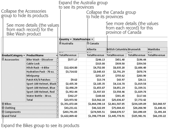
Figure 9-18. Use the plus (+) button to show the details for a collapsed group and the minus (-) button to hide the details for one that’s expanded. In this pivot chart, all the product groups are collapsed except for Accessories. Also, the country Australia is collapsed, so you see only the totals (not the region-by-region breakdown).
If you want to zero in on specific data more precisely, you can expand a single cell. In this case, just right-click the cell, and then choose Show Details. For example, using this technique, you can expand the cell that shows the clothing sales in Australia (rather than all the clothing sales or all the sales in Australia).
Another way to simplify your pivot tables is to leave out some of the data that goes into building them. In order to do this, you use pivot table filtering, which is a lot like datasheet filtering—you tell Access what records you want to use and what ones you don’t care about.
You can use filtering in several ways. The two quickest filtering options are to choose the items you want to see from a list. Here are your choices:
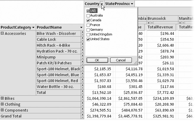
You can filter using the fields that group the rows and columns of your pivot table. For example, you can use this type of filtering to hide countries or product categories you aren’t interested in. To apply this filtering, just click the drop-down arrow at the right of the appropriate field header (Figure 9-19). Then, turn off the checkmark next to each item you don’t want to include in the pivot table. This is similar to collapsing parts of the pivot table (Section 9.3.5), except the information you filter out disappears completely. Not even the totals remain.
You can filter using other fields in the source table. Just drag them from the PivotTable Field List to the Drop Filter Fields Here region just above the pivot table. Once you’ve added a filter field, a drop-down list appears next to the field header. Click the arrow to show the list of all values, and remove the check-mark next to the ones you don’t want to see.
Access also lets you filter for the highest or lowest calculated values in any group. For example, you can use this technique to hide sales data for poorly selling products. To try this out, right-click the header for the ProductName field, and then choose an option from the Show Top/Bottom Items submenu. Perhaps you want to see a fixed number of products (the best or worst 1, 10, 25, and so on) or a percentage (the best 1 percent, the best 10 percent, and so on). Figure 9-20 shows an example.
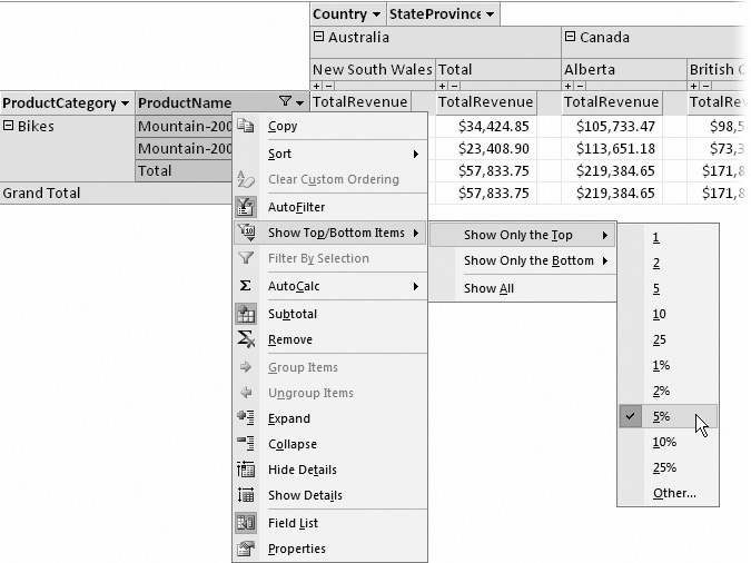
Figure 9-20. Here, the pivot table is cut down to the bestselling five percent of all products. If you have categories that don’t include a product in this range, these categories won’t appear at all. (Incidentally, the top five percent of products leaves you with just two bike models.)
Note
When top/bottom filtering is in place, an AutoFilter icon appears on the right side of the field header (it looks like a funnel). Hover over the icon to find out what filtering is in place. To remove the filtering, click the icon, and then choose AutoFilter. Choose it again to switch it back on any time.
Top/bottom filtering is easy to apply, but if you have several levels of subgrouping, you need to take care to apply it in the right place. For example, consider the pivot table shown in Figure 9-20, which splits up sales by category and product name. If you apply the top/bottom filter to the ProductName field, you see the best one percent of all products. But if you apply the one-percent filter to the ProductCategory field, you’ll see the best one percent of all categories. In other words, you’ll focus on categories that have the most sales rather than hot products.
To understand the difference, consider what happens if the Components category has a large number of slow-selling items that, when totaled together, add up to a lot. When you filter by ProductCategory, you see all the products in this top-performing category. But when you filter by ProductName, you focus on the most popular products and the categories that contain them. In this case, the Clothing category takes the spotlight with a few hot sellers.
Access lets you create charts based on the data in a pivot table report. In fact, every Pivot Table view has an associated Pivot Chart view. To switch from the table to the chart that displays your results graphically, select PivotTable Tools | Design → View → PivotChart View, or use the view buttons at the bottom-right corner of the window.
With the product pivot-table example from earlier in this chapter, the pivot chart lets you easily spot high-flying groups. You just need to look for the biggest bars, as shown in Figure 9-21.
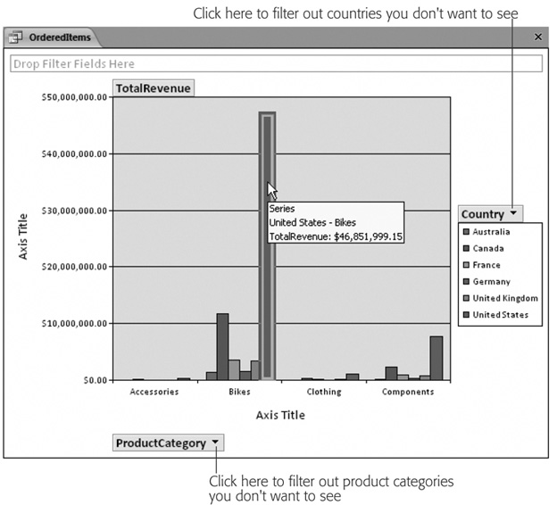
Figure 9-21. This pivot chart shows a pivot table that’s been split into category row groups and country column groups. Each row group appears as a cluster of adjacent bars. You can hover over a bar to see a tooltip that tells you more about it. In this example, the currently selected bar (which is clearly the biggest) shows that bike sales in the U.S. lead all other groups.
Tip
Choose PivotChart Tools | Design → Show/Hide → Legend to see a legend box that identifies your groups.
Like pivot tables, pivot charts are interactive. If you look closely at a pivot chart, you see that the field headers you’ve chosen for rows, columns, and data items appear right on the chart itself. You can use these field headers to change the data that’s displayed, rearrange the grouping levels, or apply filtering, all without leaving your chart. For example, in Figure 9-21, if you want to show fewer countries, just click the Country field header on the right side of the chart. A list of countries appears, with a checkmark next to each country you’ve chosen to display. If you turn off a checkmark, that country disappears from the pivot chart and the underlying pivot table.
Pivot charts aren’t as useful as they first appear. One of the problems is that detailed summary data can’t always be displayed effectively in a chart. If you have a large number of groups (for example, you’ve grouped by product name or by customer city, as in earlier examples), you end up with dozens of bars crammed next to each other, and you won’t be able to read the legend to tell which bar represents which group.
Tip
Before you create a pivot chart, it’s often useful to limit the amount of information in your pivot table. Too much information can lead to a chart that’s dense and hard to read. The easiest ways to hide data are to avoid using too many levels of grouping, and to restrict groups you aren’t interested in, by using filtering, as described in the previous section.
Another limitation with pivot charts is that they don’t give you many options for data visualization. You can change the type of chart that’s used by right-clicking the chart, and then choosing Change Chart Type. A gallery appears with different options. However, most of the charts shown in the gallery, from pie charts to line charts, won’t create a decent display of your data if you have a lot of groups. In fact, really only three other reasonable options are worth trying:
A stacked bar or column chart creates a bar for each group, and then subdivides that bar to show you the subgroups (Figure 9-22).
Figure 9-22. In a stacked column chart, each row group is a single bar. The bar is then subdivided into its column groups. In this example, that means you have one bar for each country, and separate regions in the bar represent sales in different categories for that country. The stacked column chart makes it easier to tell how different categories compare. Clearly, bikes lead the sales in all countries.
A 100% stacked bar or column chart is similar, except it stretches every bar to occupy the full height of the chart. This way, you can really compare the sub-groups (Figure 9-23).
Figure 9-23. In a 100-percent stacked column chart, you can’t tell which country has the most sales, but you can compare the breakdown. For example, you can find out which country makes the highest proportion of its sales from bikes. (In this example, it appears to be Australia, but the other countries are surprisingly similar.)
A 3-D bar or column chart is basically the same as a normal bar or column chart. It just lets you pack the bars from side to side and front to back in a more logical arrangement (Figure 9-24).


If you want to print a pivot chart, just use Office button → Print (or Office button → Print Preview to take a closer look at what your results will look like first).
If you don’t have a color printer, you may have trouble distinguishing the different groups. You can pick specific colors for each group, but it’s a bit of work. Here’s how:

Figure 9-24. In the 3-D column chart, the countries are arranged from left to right, with each product category bar placed from front to back. Sadly, you can’t choose which product category is placed at the front and which one ends up at the back—it’s alphabetic.
Click a specific group somewhere on your chart (like the Bikes group in the Australia column.)
Pause, and then click the group again to select it everywhere. For example, if you click the Bikes group in Australia twice, you wind up selecting the Bikes group in all countries, which is what you want to change.
Choose PivotChart Tools | Design → Tools → Property Sheet from the ribbon to show the Properties window.
Choose the Border/Fill tab. You’ll find options there that let you set the thickness and color of the borders around each column, and the fill color (or pat-tern) that’s used inside the column.
Repeat this process for each group you want to change, until you have a nice set of printer-friendly colors.