
Chapter 17
Fast and Furious Automatic Reporting
In This Chapter
![]() Creating an instant report from a single table
Creating an instant report from a single table
![]() Making minor modifications to your instant report
Making minor modifications to your instant report
![]() Setting up a report step by step with the Report Wizard
Setting up a report step by step with the Report Wizard
![]() Getting a sneak peak at your report-to-be
Getting a sneak peak at your report-to-be
![]() Choosing the perfect layout
Choosing the perfect layout
The fact that you’re reading this chapter right now tells me that either you’ve already been asked to create a report or you’re afraid that might happen. Yes, if you’re like the rest of us, afraid applies now and then — the idea of reporting on a database seems daunting to many users. You might be wondering, “Do I have to learn some really complex Access features? Do I have to master some word-processing program so I can make the report look like more than just a list of records?”
The answers to those questions are no and no. You don’t have to learn anything other than a couple of quick mouse clicks in the Access workspace in order to whip up a snazzy report on the currently open or selected table, in just seconds. And you don’t have to master Word or any other word-processing program to dress up your report and make it look serious and important. No, you have all you need to make a quick, simple, yet professional-looking report, right here in Access 2013.
“But what if I have to report on more than one table?” you’re asking. What if your boss/customer/partner needs a report on data from Table A and Table B, and you know he or she does not want to see certain pieces of data from those tables anywhere on the report? In situations such as these, the Report Wizard comes in handy; using it, you can choose multiple tables as the sources for your report — and even pick and choose which fields to include from those tables.
 Knowing that there are two very simple paths to follow, depending on the report you’re looking for (or that someone else is hounding you for), it’s time to take a look at the two paths and figure out which one is right for you.
Chances are you’ll need both of Access’s simple reporting tools (the Access Report and the Report Wizard buttons) over time — so it’s worth checking them both out now. I start with an analysis of both of them and then get into the procedural specifics of the simplest one first.
Quick and Not-So-Dirty Automatic Reporting
The Access Report and Report Wizard tools make reporting on your database extremely simple. If you use the Access Report tool, Access uses your table (the open or selected one at the time you click the tool’s Report button) to generate a report instantly. You can then go in and tweak margins, fonts, and other formatting so the result looks more like what you’d imagined and/or fits on the number of pages you prefer.
If you use the Report Wizard, you’re taken step by step through the process of choosing which fields (and which tables) to include in your report, how the report will look, and how the content will flow over one or more pages.
Each method has its merits in different situations:
![]() If you want every field in your single table included in your report, and you don’t mind if your report looks a lot like a worksheet or the way your table looks onscreen while you’re in Table view, then the Report tool is for you. It’s quick, and it gives you a report without any formatting or other fanfare required.
If you want every field in your single table included in your report, and you don’t mind if your report looks a lot like a worksheet or the way your table looks onscreen while you’re in Table view, then the Report tool is for you. It’s quick, and it gives you a report without any formatting or other fanfare required.
![]() If you want to choose which fields to include in your report, and maybe want your report to include fields from more than one table, the Report Wizard is for you. It takes a little longer than the Report tool, but the flexibility and ability to customize the report’s appearance through a series of dialog boxes (rather than using multiple tabs and buttons) is a real plus.
If you want to choose which fields to include in your report, and maybe want your report to include fields from more than one table, the Report Wizard is for you. It takes a little longer than the Report tool, but the flexibility and ability to customize the report’s appearance through a series of dialog boxes (rather than using multiple tabs and buttons) is a real plus.
Creating a quick, one-table report
To generate a report on an open table, all you really have to do is click your mouse twice:
1. Click once on the name of the table you want to report on — you don’t need to open the table — in the left-hand All Access Objects panel.
2. Click the Create tab on the Ribbon, and then click the Report button. An instant report appears, as shown in Figure 17-1.
The open table is now a report, laid out exactly as it appeared in Table view — as a series of rows and columns. It has a heading and a small graphic in the upper-left corner, and some color has been added — using a default template — to the field names and the report’s title (which is the same as the table name).
If the Property Sheet panel opened along with your report, you can close it at this point. If you want to use the panel at some point in the future, however — perhaps when making design changes to the report — press the F4 key to redisplay it. Once the panel’s open, you can make changes to the settings for your report, and you learn more about how to do that in Chapter 19.
3. Use the File tab to access the Print command (or press Ctrl+P) if you want to print the report you see onscreen.
You can also display the report onscreen, now and in the future; there’s no requirement that you print the report immediately.

Figure 17-1: You can find the Report button on the Create tab.
To save the report, press Ctrl+S or click the Save button on the Quick Access toolbar. The Save As dialog box appears, as shown in Figure 17-2, and I suggest adding the word “Report” to the default name (which is the same as the table name). It helps later on when you’re making quick selections from the All Access Objects panel to not have two items (the table and the report) with the exact same name.
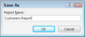
Figure 17-2: Save your report to make it a permanent part of the database.
Your instant report formatting options
Although the Report tool works with only one table or query at a time, it still offers some choices for the way the report looks and how the fields appear in the report.
Did I say something about reporting on queries? Yes, I did! Check out Chapters 12, 13, and 14 for all the basics — and then some — on queries. When you have your own queries put together and run, you can use the Report button to document them!
In the Report Layout Tools section of the Ribbon (the section is displayed after you use the Create tab to generate the quick, one-table report), you can choose from a variety of options for the tabular layout of your report. You can have each record listed on its own row, as a series of columns, or you can stack your fields with the Tabular button in the Table section of the Ribbon’s Arrange tab. The results of clicking the Stacked button are shown in Figure 17-3.
Hey, where is it, you say? If you can’t find the buttons to change your report’s tabular settings, click the Arrange tab, and look at the Table section (far left), also shown in Figure 17-3. There are lots of choices available, and my advice is that you experiment with different layouts, and when you like what you see onscreen, print. If you hate what you’ve done, just keep clicking the Undo button (up on the Quick Access toolbar) until the report is back at its pre–I Don’t Like That state.

Figure 17-3: Change your report layout with a quick click of the Stacked or Tabular buttons on the Arrange tab.
If you hate the report entirely, just right-click it in the left panel that lists the components of your database and choose Delete from the resulting pop-up menu. When a prompt appears, asking whether you really want to delete the report, just click Yes. Remember, all you had to do was click the Create tab and then click Report to make this thing — so how bad would it be to start over?
Rearranging columns
Not only can you pair up your report’s fields vertically, stacking them to keep relevant fields together, but also you can rearrange your columns so that (a) your report’s readers see what they want to see first (assuming they read from left to right) and (b) you can horizontally pair up things that relate to each other. As shown in Figure 17-4, all you have to do to rearrange columns is click on the heading for the column you want to move, and then Shift+click on any data in that column to select the data as well. Then drag the heading and all the data that comes with it. When you release your mouse, the fields — the headings and then the data — are rearranged.

Figure 17-4: Rearranging the original quick Customers report is easy — just drag a column to change its order.
Sizing columns to fit the data
One thing that can be very appealing about a quick report on a single table is the ability to put the entire report on a single page (if you have only 20 or 30 records) or on a series of pages that include all the table’s fields on each page (for large databases with hundreds or thousands of records, but not a whole lot of fields per record). This can be difficult on a report that has a lot of fields or uses all the fields in a table because rarely do they fit across an 81⁄2-x-11-inch sheet of paper. Sometimes you can fit them all across a sheet of paper — if you resize the fields, narrowing them so they’re no wider than they have to be to display the widest entry in the column.
The easiest way to do this is to narrow the columns manually. You can widen all the columns in one fell swoop, but that requires working in Design view, which is discussed way over in Chapter 18. This way is quicker for now.
To adjust columns manually — the one column that’s taking up too much room or each of them, one at a time — simply click the column’s heading and then use the two-headed arrow that appears when you mouse over the column’s right seam to move the seam to the left to make the column header narrower. Then, using the same two-headed arrow, snag the first record in that column and drag it to the same width as you’ve just set the heading. The dragging process is shown in Figure 17-5, where I make more room for long company names, taking space away from Customer ID, where the horizontal space is not needed.
The query advantage
The fact that Access lets you base a report on a query is wonderful. When you build a report on a table, you get a report containing each and every record in the table. But what if you want only a few of the records? Access makes it easy to create a query and then base the report upon that query. (Chapter 12 shows how to make a query.)
The advantages don’t stop there. If you create a query based on multiple tables, Access neatly organizes your results into a single datasheet. This allows you to use the quick, one-click Report tool to report on multiple tables — essentially duping Access into giving you a quick report on more than one table because the tables are part of a single query, and that single query is your Report source. (If you’re unclear on the process of creating a query on multiple tables, take a look at Chapter 12.)

Figure 17-5: Click and drag to widen or narrow your report’s columns, one at a time.
Starting the Report Wizard
So you’ve decided to take things step by step, perhaps because you want to include multiple tables and/or queries in your report. Or maybe you’re still deciding what the best path is, and want to see what’s involved in the process.
The Report Wizard is simple. It requires a few more steps and decisions from you than the Report tool does, but it’s much more flexible than the instant Report tool. Here goes:
1. In your database window, click the Ribbon’s Create tab and then click the Report Wizard button. (It’s right there in the tab’s Reports section.)
The Report Wizard dialog box appears, listing all the fields in the active table. As shown in Figure 17-6, the dialog box offers
• A drop-down list from which you can choose other tables and queries
• Two columns of Selected and Available fields, which you use to determine which fields from the selected table(s) will be used in your report

Figure 17-6: The Report Wizard starts by offering you tables and the fields within them to use in your report.
2. Use the Tables/Queries drop-down list to choose the table you want to start with.
The fields from the table you select appear in the Available Fields box.
3. Add fields to your report by double-clicking them in the Available Fields box.
By double-clicking, you add the fields to the Selected Fields box, and they become part of the report. You can also click a field once and then click the button with a > symbol on it, as shown in Figure 17-7.

Figure 17-7: Add fields by double-clicking them or by using the buttons between the Available and Selected Fields boxes.
4. Repeat Steps 2 and 3 for each table and/or query in the database that you want to include in the report.
If, at any point, you want to add all the fields in a given table or query, just click the >> button to add all the Available Fields to the Selected Fields list.
5. Click Next to move on to the next page of the Report Wizard (see Figure 17-8); then click Next again.
Clicking Next twice bypasses grouping issues, which, for a simple report, are often unnecessary. To explore this step of the Report Wizard in greater detail, check out Chapter 19.

Figure 17-8: Our list of customers will be grouped by their Country.
6. Choose a sort order for your report — typically sorting on the field folks will use to look up information in the report — as shown in Figure 17-9.
For example, if your report documents a list of employees, Last Name might be a good choice. A report on product sales would be useful in Product Number or Product Name order. You can sort by more than one field, choosing up to four fields to sort by and either Ascending or Descending for the sort order on each field. Figure 17-9 shows the City field chosen for sorting in Ascending order, adding to the value of having grouped by Country, so that cities in each country will be in alphabetical order.

Figure 17-9: Sort by the most important field in the table, or the one that will make the most sense to your report’s readers.
Sorting is best done on fields that have either very few entries or a lot of duplicate entries:
• In a name and address list, sorting by Last Name (which may have very few duplicates) will put the list in an order for which there’s very little opportunity for subsequent sorting — because the unique records in Last Name don’t create any groups that can be sorted further.
• If you sort that name and address list by City or State (which may have lots of duplicate entries), a subsequent sort can be done on Last Name, putting each group of people living in the same city or state in last-name order.
• To choose between Ascending (the default) and Descending sort order, you’ll either leave the Ascending button alone (for A–Z sorting) or click it to change it to Descending (for Z–A sorting).
You probably don’t want to use Justified unless your report has very few fields per record.
7. Click Next to display your options for Layout and Orientation.
8. Choose a Layout and an Orientation from the two sets of radio buttons and click Next.
• Layout options (Tabular or Columnar) are simple — you either want to see your report as a list (Tabular) or in sections (Columnar), in which each record appears in a section on its own. Justified is similar to Tabular, but groups the fields in a sort of stacked jumble.
• Orientation decisions (Portrait or Landscape) are generally easier if you envision the report in your head — are there more fields than will fit across a sheet of 8.5-inch-wide paper? If so, choose Landscape to give yourself 11 inches of paper (or 10 inches, to allow for the smallest margin possible) across which your fields will appear.
Figure 17-10 shows a Stepped format chosen at this stage of the Report Wizard and allows the user to set up the layout and orientation for that report.
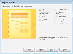
Figure 17-10: Choose your report’s layout in terms of field structure and orientation.
 If you leave the Adjust the Field Width So All Fields Fit on a Page option checked, you run the risk of data being chopped off in the report and rendering the report unusable. If you have more than four or five fields, and if any of your fields have very long entries, turn this option off.
9. Click Next.
A default name for your report now appears in this next step in the wizard, as shown in Figure 17-11.
10. Give your report a name.
Type a name in the long box at the top of the dialog box. At this point, you also need to decide how to finish things up — with a Preview of the report, or by leaping right into Design view to make more changes to your report’s appearance and content. (This part of the process is covered in Chapter 18.) For now, choose to Preview the Report, which is the default.

Figure 17-11: Name your report, or accept the table-name-based moniker that Access applies by default.
11. Click Finish.
The report appears in a Preview window, at which point, you can print it or save it for future use. (Press Ctrl+S, or click the Save button and give the report a name, when prompted, to take care of the saving business.) After you’ve saved it — or if you have no need to save it or continue viewing it — you can close it by right-clicking the report’s tab and choosing Close from the pop-up menu. If you make additional changes and haven’t chosen to save, you’ll be asked if you want to close without saving.
Figure 17-12 shows a preview of a report that lists a series of Customers, by Country (and in order by City within each Country), and that includes contact information for each customer.
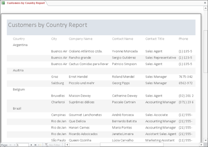
Figure 17-12: Even a simple report with few fields can look important.
Previewing Your Report
When you’re in Print Preview mode (which results from having clicked Finish to complete the Report Wizard process, as described in the steps in this chapter’s previous section), you can’t do a whole lot with your report except print it. But Print Preview shows exactly what your document looks like. Table 17-1 shows the tools Print Preview provides to help with your inspection.


Another way to see a Print Preview — say, for a report you created a while ago and you don’t remember what it looks like on paper — is to open the report (double-click it in the left panel to open it) and then click the File tab. From there, click the Print command, and choose Print Preview from the resulting choices.
Zooming in and out and all around
In Figure 17-12, you see the report. In your preview (assuming you’re working along with me here or have tried this on your own), you may be able to see the entire page of your report. The parts you can see look okay, but how can you commit to printing if you don’t know how the whole page looks? In Figure 17-13, you can click your mouse when the pointer turns to a magnifying glass — as it will when you mouse over the page. You can also use the Zoom tool to choose a lower zoom percentage.
When you move your mouse pointer over the preview of your report, your pointer changes into a magnifying glass. Use this magnifying glass to zoom in to the report and check individual sections:
![]() Just click what you want to see, and Access swoops down, enlarging that portion of the report so you can see it clearly.
Just click what you want to see, and Access swoops down, enlarging that portion of the report so you can see it clearly.
![]() Click again, and your view changes back to the previous setting.
Click again, and your view changes back to the previous setting.

Figure 17-13: When you view the whole page, the report is too tiny to read, yet you can’t see all the content, either.
Clicking any of the page-number buttons (One Page, Two Pages, More Pages) sets the Zoom view to the Fit View setting. When you have two pages showing, the odd-numbered page is always on the left, unlike book publishing, which puts the odd-numbered page on the right (unless the typesetting department is having a very bad day).
If you use the Zoom section of the Ribbon’s Print Preview tab rather than one of the page-number buttons, Access offers quite the selection of Page View options, as you see in Figure 17-14. Set your system to show 1 page or 2 pages — or click the More Pages button’s drop-down list to choose up to 12 pages per screen (of course, you won’t be able to read anything at this setting, but at least you can see how the whole report lays out).
Pop goes the menu
You can right-click anywhere on the Print Preview screen to see a pop-up menu that gives you the choice of switching the zoom or viewing a specific number of pages, as shown in Figure 17-15. When you click the Zoom button drop list in the Zoom section of the Print Preview tab, you get a similar pop-up menu offering various zoom percentages, from 10% to 1000%.

Figure 17-14: Preview up to 12 pages of your report at a time — here, just four are required.

Figure 17-15: Choose the view you want to use or how many pages you want to see at once.
Other than the Zoom submenu, the following useful commands are available when you right-click the Print Preview screen:
![]() Report View, Layout View, Design View, and Print Preview: These four options appear at the top of the pop-up menu and give you lots of ways to look at your report.
Report View, Layout View, Design View, and Print Preview: These four options appear at the top of the pop-up menu and give you lots of ways to look at your report.
![]() Zoom: Enter or choose a zoom percentage.
Zoom: Enter or choose a zoom percentage.
![]() One Page and Multiple Pages: If you choose to see Multiple Pages, you must tell Access exactly how many pages by using the submenu that appears when you make that pop-up menu selection. Drag through the grid (it appears as six blocks to start with), and the grid expands as you drag. Release your mouse button when the grid shows the number of pages you want displayed.
One Page and Multiple Pages: If you choose to see Multiple Pages, you must tell Access exactly how many pages by using the submenu that appears when you make that pop-up menu selection. Drag through the grid (it appears as six blocks to start with), and the grid expands as you drag. Release your mouse button when the grid shows the number of pages you want displayed.
![]() Page Setup: This opens the handy Page Setup dialog box.
Page Setup: This opens the handy Page Setup dialog box.
![]() Print: This opens — yep, you guessed it — the Print dialog box.
Print: This opens — yep, you guessed it — the Print dialog box.
![]() Save As: Choose this command to save your report with a new name and choose what type of object to save it as — Report is the default.
Save As: Choose this command to save your report with a new name and choose what type of object to save it as — Report is the default.
![]() Export: Choose this command to save your Access report in a format used by another program. Your choices include exporting as a Word document, PDF (Portable Document Format) file, text file, XML document, or HTML document.
Export: Choose this command to save your Access report in a format used by another program. Your choices include exporting as a Word document, PDF (Portable Document Format) file, text file, XML document, or HTML document.
![]() Send To: Choose this command and then select an e-mail recipient to send the report to.
Send To: Choose this command and then select an e-mail recipient to send the report to.
![]() Close: This closes Print Preview and prompts you to save your changes, if any, to the report’s design.
Close: This closes Print Preview and prompts you to save your changes, if any, to the report’s design.
Beauty Is Only Skin (Report) Deep
After looking at your report in the Print Preview window, you have a decision to make. If you’re happy with how your report looks, great! Go ahead and print the document. However, a few minutes of extra work does wonders for even the simplest of reports.
Start with the basics in the Page Setup dialog box. To get there, right-click anywhere on the report and choose Page Setup from the pop-up menu. (This command and others hidden away in the pop-up menu are briefly explained in the preceding section of this chapter.)
Use the Page Setup dialog box to fine-tune your report in terms of its Print Options, Page, and Columns settings. You can adjust margins, change orientation, and control how many vertical columns your report content is divided into — all from within this handy dialog box.
The Print Options tab
The Print Options tab of the Page Setup dialog box controls the width of the margins in your report — no surprises here.
Figure 17-16 shows your margin options. The page has four margins, so the dialog box includes a setting for each one (Top, Bottom, Left, and Right).
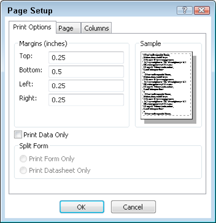
Figure 17-16: Adjusting margins to specify how much white space surrounds your report.
Here is how you set or change margins:
1. Double-click in the appropriate box (Top, Bottom, Left, or Right) and type a new setting.
When you double-click the box, the current entry is selected. Access automatically uses whatever Windows thinks is your local unit of measurement (inches, centimeters, or whatever else you measure with). On the right side of the dialog box, Access displays a sample image, which shows you how your current margin settings work on a page. After editing one margin, you can press Tab to move through the remaining fields (Bottom, Left, and Right, if you started out in Top), and you can adjust each one.
2. Make all the changes you want to your report’s layout, and then click OK.
3. Look at your report in Print Preview to check your adjustments.
If you need to tweak the report, simply go back to Page Setup and play with the options until everything looks just right.
 The last item on the Print Options tab is the Print Data Only check box. (Maybe the programmers couldn’t think of anywhere else to put this box because it has nothing to do with margin settings.) If you select this option by checking its box, Access prints only the data in your records; field headings won’t appear on the printed document. Use Print Data only if you plan to use preprinted forms. Otherwise, leave it alone because your report looks pretty odd without any field labels.
The Page tab
The Page tab of the Page Setup dialog box tells Access about the sheet of paper on which you plan to print your report — including its size and layout — as well as what printer you keep the paper in. You make some of the most fundamental decisions about how your report looks from the Page tab of the Page Setup dialog box. (See Figure 17-17.)
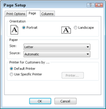
Figure 17-17: Use the Page tab to choose a printer, page size, and more.
The Orientation box sets the direction that your report prints on paper:
![]() Portrait (the way that this book and most magazines appear) is the default choice.
Portrait (the way that this book and most magazines appear) is the default choice.
![]() Landscape pages lie on one side, giving you more horizontal room (width) but less vertical space (height).
Landscape pages lie on one side, giving you more horizontal room (width) but less vertical space (height).
Deciding whether to use Portrait or Landscape is more important than you might think:
![]() For tabular reports, landscape orientation displays more information for each field, thanks to the wider columns. Unfortunately, the number of records you can view per page decreases in the process. (After all, that piece of paper is only so big.)
For tabular reports, landscape orientation displays more information for each field, thanks to the wider columns. Unfortunately, the number of records you can view per page decreases in the process. (After all, that piece of paper is only so big.)
![]() Columnar reports don’t do very well in a landscape orientation because they usually need more vertical space than horizontal space.
Columnar reports don’t do very well in a landscape orientation because they usually need more vertical space than horizontal space.
Your other choices for the Page tab are determined by your printing capabilities:
![]() The Size drop-down list in the Paper section of the tab enables you to choose the size of the paper you want to use. (Refer to Figure 17-17.)
The Size drop-down list in the Paper section of the tab enables you to choose the size of the paper you want to use. (Refer to Figure 17-17.)
![]() The Source drop-down list gives you the option to
The Source drop-down list gives you the option to
• Use your regular paper feed (the Automatic choice).
• Use another automatic source, should your printer be equipped with multiple trays.
• Feed your paper manually into the printer.
![]() The last part of the Page tab lets you choose a specific printer for this report.
The last part of the Page tab lets you choose a specific printer for this report.
Most of the time you can leave this setting alone; it’s useful only if you want to force this report to always come from one specific printer at your location. You can choose either
• The Default Printer option: Access uses whatever printer Windows says to use.
• The Use Specific Printer option: You choose the printer yourself.
If you click the Use Specific Printer option, the Printer button comes to life. Click this button to choose from among your available printers.
The Columns tab
You get to make more decisions about your report’s size and layout on the Columns tab, as shown in Figure 17-18.
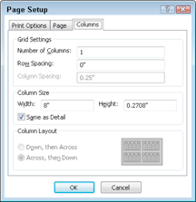
Figure 17-18: The Column Layout area of the Columns tab enables you to format a report with vertical columns.
The Columns tab of the Page Setup dialog box is divided into three sections:
![]() Grid Settings: Controls how many columns your report uses and how far apart the different elements are from each other.
Grid Settings: Controls how many columns your report uses and how far apart the different elements are from each other.
![]() Column Size: Adjusts the height and width of your columns.
Column Size: Adjusts the height and width of your columns.
![]() Column Layout: Defines the way Access places your data in columns (and uses an easy-to-understand graphic to show you as well).
Column Layout: Defines the way Access places your data in columns (and uses an easy-to-understand graphic to show you as well).
 The default number of columns is one column to a page, but you can easily change the setting to suit your particular report. Just keep in mind that with more columns, your report may show less information for each record. If you use so many columns that some of the information won’t fit, Access conveniently displays a warning.
If the number of columns you select fits (or if you’re willing to lose your view of the information in some of your fields), click OK to see a view of how your document looks with multiple columns.
The Grid Settings section of the Columns tab also adjusts
![]() Row Spacing: Adjusts the space (measured in your local unit of distance) between the horizontal rows. Simply click the Row Spacing box and enter the amount of space that you want to appear between rows. Again, this setting is a matter of personal preference.
Row Spacing: Adjusts the space (measured in your local unit of distance) between the horizontal rows. Simply click the Row Spacing box and enter the amount of space that you want to appear between rows. Again, this setting is a matter of personal preference.
![]() Column Spacing: Adjusts the width of your columns. If you narrow this width, you make more room, but your entries are more difficult to read.
Column Spacing: Adjusts the width of your columns. If you narrow this width, you make more room, but your entries are more difficult to read.
The bottom section of the Columns tab, called Column Layout, controls how your columns are organized on the page. You have two options here:
![]() Down, then Across: Access starts a new record in the same column (if the preceding record has not filled up the page). For example, Record 13 starts below Record 12 on the page (provided there’s enough room), and then Records 14 and 15 appear in the second column.
Down, then Across: Access starts a new record in the same column (if the preceding record has not filled up the page). For example, Record 13 starts below Record 12 on the page (provided there’s enough room), and then Records 14 and 15 appear in the second column.
![]() Across, then Down: Access starts Record 13 across from Record 12, and then puts Record 14 below Record 12, and Record 15 below Record 13, and so on.
Across, then Down: Access starts Record 13 across from Record 12, and then puts Record 14 below Record 12, and Record 15 below Record 13, and so on.
If your columns don’t look exactly right the first time, keep trying. Small adjustments to the row and column spacing produce big changes throughout a long report. The onscreen preview gives you an easy way to check how the report looks — and prevents you from killing multiple trees in the quest for perfection.