
Chapter 18
Professionally Designed Reports Made Easy
In This Chapter
![]() Understanding report sections
Understanding report sections
![]() Using text boxes and labels
Using text boxes and labels
![]() Previewing your changes
Previewing your changes
![]() Putting Themes to work
Putting Themes to work
![]() Drawing lines and boxes
Drawing lines and boxes
![]() Adding pictures
Adding pictures
The Report Wizard does most of the dirty work of report creation. However, it has its shortcomings. Most of the Report Wizard’s shortcomings have to do with text — sometimes the text is cut off, it’s not aligned properly, it’s too small, it’s too big — you get the idea.
Along the way, you may not like the Report Wizard’s color choices or design elements as well. Don’t despair. (Hopefully, you’re never at a point in your life where you’ll despair over an Access report, but I have to throw some drama in here somewhere.) Design and Layout views hold the key to unlocking the report of your dreams. (I know — who isn’t dreaming about Access reports?)
In this chapter, I discuss some of the most popular report Design and Layout view tasks. With this knowledge, you can create professional-quality reports and be the envy of the office.
Report Repairs
Design and Layout views are the places to be for tweaking reports — but which view to use and when? Usually your best options are as follows:
![]() Design view: Great for those situations where you want to add new elements (stuff like lines, titles, and subtitles) to the report.
Design view: Great for those situations where you want to add new elements (stuff like lines, titles, and subtitles) to the report.
Figure 18-1 shows a report in Design view.
![]() Layout view: A better choice for when you want to format existing elements. (Layout view shows you actual data as it will appear on the printed page.)
Layout view: A better choice for when you want to format existing elements. (Layout view shows you actual data as it will appear on the printed page.)
Figure 18-2 shows the same report in Layout view.
 You have many ways to change report views. Here are some of the most common:
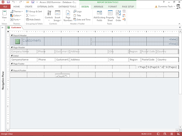
Figure 18-1: Design view is best for adding new design elements to your report.

Figure 18-2: Layout view is best for modifying exiting report elements.
![]() After you create a report with the Report Wizard, the wizard asks whether you want to
After you create a report with the Report Wizard, the wizard asks whether you want to
• Preview the report.
• Modify the report’s design.
Click the Modify the Report’s Design option to send the wizard’s creation straight into Design view.
![]() While a report is print previewed on the screen, use the row of View buttons on the lower-right corner of your screen:
While a report is print previewed on the screen, use the row of View buttons on the lower-right corner of your screen:
• Design view is the last button from the right.
• Layout view is the second-to-last button from the right.
![]() To open a report in Design or Layout view from the Navigation pane, follow these steps:
To open a report in Design or Layout view from the Navigation pane, follow these steps:
1. Right-click the report you want to work on.
A shortcut menu pops up.
2. Select Design View or Layout View from the shortcut menu.
Report Organization
Access provides the following design tools to control the layout of your report — where the report data appears on the printed page and where the pages break.
Structural devices
When you look at a report in Design or Layout view, Access displays a ton of markers (called controls by Access) that are grouped into several areas (called sections by Access). Together, these design elements make up the layout of your report — and determine where the report data appears on the printed page.
Controls
In Design or Layout view, controls show the following:
![]() Where Access plans to put the report elements (such as text, lines, or logos) on the printed page.
Where Access plans to put the report elements (such as text, lines, or logos) on the printed page.
![]() How the program plans to format each element.
How the program plans to format each element.
Access uses three kinds of controls for text, depending on what information the report includes:
![]() Text boxes: Boxes that display a particular field’s data in the report.
Text boxes: Boxes that display a particular field’s data in the report.
Most fields you want to include in the final report are represented as a text box in Design view. (The exception is a Lookup field, which is represented on the report as a combo box.)
![]() Combo boxes: Report combo boxes do not act the same way as form combo boxes. On a report, you’ll see the value of the combo box but will not see the drop-down arrow toward the right end of the combo box.
Combo boxes: Report combo boxes do not act the same way as form combo boxes. On a report, you’ll see the value of the combo box but will not see the drop-down arrow toward the right end of the combo box.
![]() Labels: Plain, simple text markers that display a text message on the report.
Labels: Plain, simple text markers that display a text message on the report.
Sometimes labels stand alone (for example, “Ken Cook Enterprises — Monthly Sales”). Often they accompany a text box to show people who read the report what data they’re looking at (“Customer ID,” or “Product,” for example).
Sections
The sections (report headers, for example) determine where and how often the elements will print.
The report design in Figure 18-3 displays the most common sections (in the order of their appearance on the page).

Figure 18-3: Common report sections.
Chapter 19 shows how to slice and dice your sections. The following information is a summary of the report sections.
Headers
Access provides a pair of header sections for the top of reports.
The header section you use depends on whether you need to print information at the beginning of the report or on every page:
![]() Report Header: Anything in the report header prints just once at the very start of the report — the top of the first page.
Report Header: Anything in the report header prints just once at the very start of the report — the top of the first page.
Typically, a report title appears in the report header.
![]() Page Header: Information in the page header prints at the top of every page.
Page Header: Information in the page header prints at the top of every page.
On the report’s first page, the page header appears below the report header.
Typically, the page header contains column heading labels. You can also add design elements such as lines or shaded rectangles to the page header to separate the data rows from the column headings.
Detail
The Detail section displays the essence of the report — the actual database records. The Detail section appears only once in Design view. However, the Detail section is repeated for every record in the actual report as seen in Layout view.
The report automatically fits as many Detail sections (records) as possible between the header and footer sections on each page of your report.
The data in the Detail section usually fills the majority of each report page.
Footers
Access provides a pair of footer sections for the bottom of reports.
The footer section you need depends on whether you need to print information at the end of the report or on every page:
![]() Page Footer: When each page is nearly full, Access finishes it off by printing the page footer at the bottom.
Page Footer: When each page is nearly full, Access finishes it off by printing the page footer at the bottom.
Common page footer elements are the date and page number.
![]() Report Footer: At the bottom of the last page, immediately following the page footer, the report footer is the last thing that prints on the report. This information prints only once.
Report Footer: At the bottom of the last page, immediately following the page footer, the report footer is the last thing that prints on the report. This information prints only once.
Typically, the report footer contains summary formulas that calculate grand totals for numeric columns (such as total dollar sales).
Page breaks
By default, Access fills each report page automatically with as many records as possible and then starts another page. But Access does provide a couple of ways that you can control how reports start new pages:
![]() Grouping. Places like records together.
Grouping. Places like records together.
For example, you’re printing an order report by month and you want each month to start at the top of a page. If you group the report by month and add a group footer, you can tell Access to start a new page after each month’s footer prints.
For more about putting records into groups, see Chapter 19.
![]() Page Break control. Starts a new page from the point where the control is placed in the Report layout.
Page Break control. Starts a new page from the point where the control is placed in the Report layout.
The following sections show how to add and remove page breaks.
Grouping is much more efficient in controlling page breaks than the Page Break control. Only use the Page Break control if you can’t get the pages to break the way you want with grouping.
Inserting a page break
Here’s how to add a page break in Design view:
1. On the Design tab of the Ribbon, click the Controls button in the Controls group and then select the Insert Page Break button. (See the Ribbon in Figure 18-4.)
The mouse pointer changes to a crosshair with a page next to it.
2. Position the crosshair wherever you want the page break and then click.
A small horizontal line appears on the left side of the report. What you are seeing is actually the selected Page Break control. Click somewhere away from the line, and that line will become a series of dots, as shown in Figure 18-4. From now on, a new page always begins at the spot of the marker.
Removing a page break (or any other control, for that matter)
If you want to remove a page break, just follow these steps:
1. With the report in Design view, click the Page Break marker — those series of dots you can see in Figure 18-4.
Selection markers appear around the Page Break control.
2. Press the Delete key on the keyboard.
Goodbye, Mister Page Break!

Figure 18-4: The Page Break control.
 This will not remove any page breaks that are automatic or created with grouping. Manual deletion will get rid of only page breaks created using the Page Break control.
Formatting Stuff
You can change almost any existing item in a report’s design with the help of the Format tab, which is shown in Figure 18-5. With the Format tab, you can change item properties such as fonts, colors, and borders.

Figure 18-5: The Format tab on the Ribbon.
The Format tab is visible only while a report is in either Layout or Design view. Because you can see the results of formatting changes better in Layout view, the upcoming steps use that view.
To adjust items in your report with the buttons on the Format tab, follow these steps:
1. Click the down arrow at the bottom of the View button on the Ribbon and select Layout View from its drop-down menu.
The report displays in Layout view, and the Format tab appears on the Ribbon.
2. Click the Format tab to select it.
The Format buttons appear on the Ribbon.
3. Click the item you want to format.
A thick border appears around the item, as in Figure 18-6.
4. Click the button for the formatting effect you want.
The appropriate buttons will be enabled for the item you’ve selected. There are two kinds of buttons:
• Toggle buttons (like Bold): They are either on or off.
• Pull-down arrows (like Font): Offer many available choices.

Figure 18-6: The Customers label is selected.
I cover these options in detail later in the chapter.
Repeat Steps 3 and 4 for all of the items you want to modify.
If you make a mistake while formatting, click the Undo button on the Quick Access toolbar or press Ctrl+Z. Your mistake will be whisked away to cyber-neverland.
The following sections step through some of the most common formatting tasks. Just follow the instructions, and your report will look like a million bucks in no time. (Now if you could only sell it for a million bucks!)
Adding color
A little color can help keep report readers awake as they browse through 300 pages of data.
These buttons change the color of labels and text boxes in your report:
![]() Font Color: Changes the color of text in a text box or label marker.
Font Color: Changes the color of text in a text box or label marker.
![]() Background Color: Changes the control’s background color, but not the text.
Background Color: Changes the control’s background color, but not the text.
These buttons are located in both Layout and Design view on two different Ribbon tabs. You can find them in the Font group on the Format tab or the Text Formatting group on the Home tab.
You might find these buttons are easier to work with in Layout view.
Taking control of your report
In addition to Label, Text, and Combo Box controls, more controls are available in Design view by using the tools from the Controls group of the Ribbon’s Design tab.
Some controls work with specific types of fields. For example, a check box can graphically display the value of a Yes/No field.
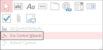
Some of these controls can be a bit complicated to set up. However, Access includes several control wizards to take the pain out of the process. These wizards walk you through the steps for building your controls in the usual wizardly step-by-step process. Just answer the questions, and the wizard does the rest.
A control’s wizard usually pops onscreen automatically after you place the control in the report. If you create a new control but the control’s wizard doesn’t show up to help, be sure that the Use Control Wizards button is turned on. Click the More button (pictured in the following figure on top in Layout view) on the Controls group drop-down list to see the Use Control Wizards button. If it’s on, the Use Control Wizards button will have a colored border around it (pictured in the bottom figure below).

Here is a list of the report controls covered in this book and where you can find information on them:
![]()
![]() The Line, Rectangle, Page Break, and Image controls are covered elsewhere in this chapter.
The Line, Rectangle, Page Break, and Image controls are covered elsewhere in this chapter.
![]() Using controls to create summaries in your report is covered in Chapter 19.
Using controls to create summaries in your report is covered in Chapter 19.
When a text control is selected, the buttons will show you the current font and background colors for the control. To change colors, follow these steps:
1. Click the control to select it.
The control has a thick border around it.
2. Click the arrow to the right of the Font Color or Background Color button.
The menu of colors appears.
3. Click the color you want to use.
The colors are divided into sections:
• Theme: Colors that the experts at Microsoft have determined work well together
• Standard: All colors that have been created for you
• Recent: All colors that have been used in the current Access session on the report
 If you make the text and background colors the same, the text seems to disappear! If this happens, just click the Undo button on the Quick Access toolbar to bring back the original color setting.
Relocation, relocation, relocation
Don’t like that column where it is? The position of your report title got you down? Your line won’t stay in line? You can easily move just about any element (text box, label, line, and such) in a report.
![]() Most elements can be moved in Layout view. You see your data in Layout view, so I recommend that you start there.
Most elements can be moved in Layout view. You see your data in Layout view, so I recommend that you start there.
![]() If you have trouble in Layout view, switch to Design view. For example, I find lines are easier to work with in Design view.
If you have trouble in Layout view, switch to Design view. For example, I find lines are easier to work with in Design view.
 The amount of space between the controls determines the space between items when you print the report:
![]() Increasing spacing gives your report a less crowded look.
Increasing spacing gives your report a less crowded look.
This is appropriate if you have only a few columns on your report and you want to spread them out to fill up the width of the page. For example, a report that shows annual sales by product might have a column for the product description and a column for both the unit and dollar sales. Spread out the three controls to fill up the page width.
![]() Decreasing the space enables you to fit more information on the page.
Decreasing the space enables you to fit more information on the page.
This is appropriate when you have many columns on your report and you want to fit them all on the width of one page. For example, a report that shows dollar sales by month may have 14 columns — 1 for the product description, 12 for the months, and a Total column. Crowd the 14 controls together to fit the page width.
Moving a single control
To move a line, box, label, or text box, follow these steps:
1. Point the tip of the mouse pointer to the item you want to move.
2. Press the left mouse button.
The mouse pointer changes to a four-headed arrow.
3. Drag your item to a new position.
As you move the mouse, the four-headed arrow drags an outline of whatever object you selected.
4. Release the mouse button when the item is in the right place.
If you make a mistake while moving, click the Undo button on the Quick Access toolbar or press Ctrl+Z. This will put the item back where it started.
To move a text box and its corresponding label, follow these steps:
1. Click the text box to select it.
The border thickens around the text box, indicating that it’s been selected.
2. Press and hold the Ctrl key; then click the corresponding label.
The border thickens around both the text box and the label, indicating that they’re both selected.
3. Follow Steps 3 and 4 in the previous procedure to move both controls.
Moving a group of controls
In a columnar report, you can move an entire group of controls in the Detail section. Here’s how:
1. Click one of the controls in the Detail section.
A thick border appears around the item and a Select All box (the little guy containing a four-headed arrow) appears toward the upper-left corner of the group of controls. (See Figure 18-7.)
2. Roll the mouse over the box icon containing the four-headed arrow.
The mouse will change to a four-headed arrow.
3. Drag the group of controls to a new position.
All the controls in the group will move at one time. Everything stays in alignment.
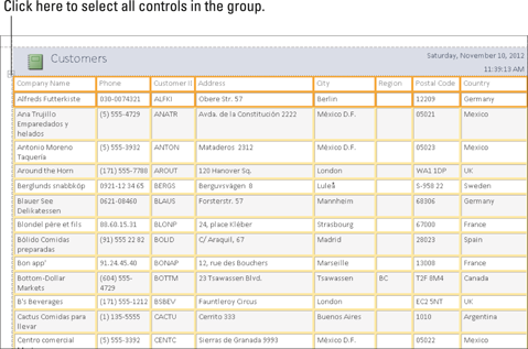
Figure 18-7: Use the Select All box with the four-headed arrow in it to move a group of controls.
One size does not fit all
The Report Wizard as well as the basic Report button do their best to size your report items properly. Very often, however, neither gets it right. A column will be too narrow or too wide, using the space on the page inefficiently. Do you throw your hands in the air and curse at the computer gods? Of course not. You can size any control to your exact needs.
I find that sizing works best in Layout view; you can see the data in the controls as you’re sizing them. You can also size your controls in Design view.
Follow these steps to size a control:
1. Select the item you want to size by clicking it.
The item will have a thick border around it.
2. Roll the mouse pointer to the edge of the selected item.
The mouse cursor changes to a two-headed arrow. See Figure 18-8 for a picture.
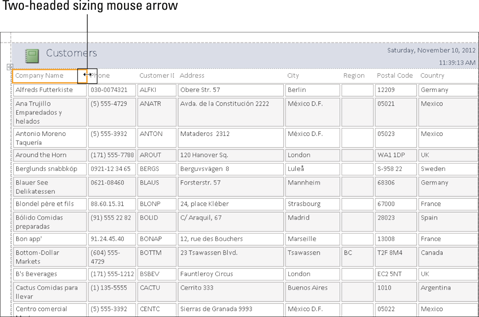
Figure 18-8: Two-headed mouse arrow at the edge of the Company Name label control.
3. Drag your item to its new size.
As you drag with the mouse, the two-headed arrow drags an outline of whatever object you selected to show you its new size.
4. Release the mouse button when the item is the right size.
The item stretches or shrinks to its new size.
Labels can be scaled to the exact size required to display all of the text. To do this, follow Steps 1 and 2 in the previous procedure and then double-click instead of drag. Like magic, Access figures out the correct size for the item and sizes it accordingly.
Spaced-out controls
The spacing of columns is a common problem in tabular reports. The Report wizards tend to butt columns up against each other, sometimes making data difficult to read. If this is the case for you, you can use the Control Padding button located on the Arrange tab of the Ribbon to space everything out a bit.
This adjustment can be done in either Layout or Design view, but I think you’ll find Layout view is easier.
Follow these steps to add space between your columns in Layout view:
1. Click one of the controls in the Detail section and then click the Select All box that appears. (Refer to Figure 18-7.)
The labels and text boxes for all the columns are selected.
2. Switch to the Arrange tab on the Ribbon, if necessary, by clicking it.
The Arrange buttons appear, including the Control Padding button located in the Position group. (See Figure 18-9.)

Figure 18-9: The Position group in the Ribbon’s Arrange tab.
3. Click the Control Padding button.
Four padding choices drop down.
4. Select one of the last three choices to add spacing between the columns and rows.
The first choice (None) will butt all of the controls up against each other, so if your goal is to add padding, you’ll want to avoid that one.
Check your changes in Print Preview (see “Sneaking a Peek,” later in this chapter). Sometimes adding too much space between columns pushes one or more of them off the page. If this happens, experiment with the different choices on the Control Padding button until everything fits correctly.
Borderline beauty
Organizationally speaking, lines and borders are great accents to
![]() Draw your readers’ eyes to parts of the page.
Draw your readers’ eyes to parts of the page.
![]() Highlight sections of the report.
Highlight sections of the report.
![]() Add some style.
Add some style.
The Format tab on the Ribbon contains three commands that work with lines:
![]() Shape Outline
Shape Outline
![]() Line Type
Line Type
![]() Line Thickness
Line Thickness
You can use these commands on a line control to change the appearance of the line or on label and text box controls to add a border to the control. The three buttons are within the Shape Outline button in the Control Formatting group on the Format tab.
Coloring
The Shape Outline button changes the color of lines that mark a text box’s border and lines you draw on your report by using the Line button.
This button works just like the Background Color and the Font Color buttons for text.
To change the color of a line or other control border, follow these steps:
1. Click the item to select it.
The item has a thick border around it.
2. Click the Shape Outline button.
A drop-down display of color choices appears, as shown in Figure 18-10. The colors are divided into sections:
• Theme: Colors that the experts at Microsoft have determined work well together
• Standard: All colors that have been created for you
• Recent: All colors that have been used in the current Access session on the report
• Transparent: No color applied to the object’s outline
Note: The Shape Outline button hangs out in the Control Formatting group of the Ribbon’s Format tab.
3. Click your color choice from the many options.

Figure 18-10: The palette of Shape Outline colors.
Thickening
In addition to colorizing lines and control borders, you can also adjust their thickness:
1. Click a line or other control to select it.
2. Click the Shape Outline button to reveal its choices.
Near the bottom of the Shape Outline drop-down list is the Line Thickness button.
3. Click Line Thickness to reveal a submenu of options, as shown in Figure 18-11.
4. Click the thickness option you want.
Like magic, your line or border thickness changes.
If you make a mistake, click the Undo button on the Quick Access toolbar or press Ctrl+Z to undo your mistake.

Figure 18-11: The seven Line Thickness options.
Changing the type
You can change the type of line displayed by your line control or other control border. The Line Type button handles that job for you. Eight choices are available under this button, as shown in Figure 18-12. Don’t know what I mean by line type? Well, think dotted, dashed, or solid.
To change the line type of a control, follow these steps:
1. Click the control whose line type you want to change.
2. Click the drop-down arrow next to the Shape Outline button to display its options.
3. Click Line Type (the very last choice) to reveal a submenu of line types.
4. Click the line type you want.
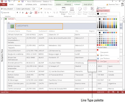
Figure 18-12: The eight Line Type options.
Tweaking your text
You must select the text you’d like to tweak before using any of the formatting tools. With Access labels, all of the text in the label must be formatted the same way. You cannot format one word differently from another. The same is true with the contents of a text box — unless the text box is tied to a Long Text field with its Text Format property set to Rich Text (see Chapter 3 for details).
Fonts
You can change the font or the font size as follows:
1. Select the text you want to change.
2. Click the drop-down arrow to the right of the Font or Font Size list box.
Both list boxes are found in the Font group of the Ribbon’s Format tab.
3. Make a selection from the drop-down list that appears.
To turn on or off the bold, italic, or underline characteristics, select a control and click the appropriate button from the Font group on the Ribbon’s Format tab. The characteristic toggles (switches) between on and off each time you click the button.
Alignment
You can control the alignment of the text within labels and text boxes. To change the alignment of the text for a label or text box, follow these steps:
1. Select the control.
2. Click one of the three alignment buttons found in the Font group of the Ribbon’s Format tab.
Figure 18-13 shows the alignment buttons. Pictured from left to right:
• Align Left
• Center
• Align Right
![]()
Figure 18-13: The three alignment buttons.
Make sure your reports follow these simple rules for your reader’s pleasure:
![]() Align numeric data and dates to the right so the numbers line up correctly. Use the Number group of buttons on the Ribbon’s Format tab to help keep your numbers orderly.
Align numeric data and dates to the right so the numbers line up correctly. Use the Number group of buttons on the Ribbon’s Format tab to help keep your numbers orderly.
![]() Align text to the left.
Align text to the left.
![]() Align your column headings to the data in the column:
Align your column headings to the data in the column:
• Text column headings should align left.
• Number column headings should align right.
Sneaking a Peek
Neither Layout view nor Design view give you a perspective on how the report will look on the printed page. So where can you go to see how the report will print?
Access provides a command called Print Preview that does the trick. To preview your report, click the Print Preview button from the set of four View buttons on the lower-right part of your screen. (The Print Preview button is the second from the left with the magnifying glass on it.)
Figure 18-14 displays a report in Print Preview. Here’s how to navigate it:
![]() Zoom: Click anywhere on the report to zoom in or zoom out.
Zoom: Click anywhere on the report to zoom in or zoom out.
To zoom to a specific percentage of actual size, click the drop-down arrow on the Zoom button in the Zoom group on the Ribbon’s Print Preview tab and then select your size.
![]() Page buttons: Find these on the lower-left part of the Print Preview screen.
Page buttons: Find these on the lower-left part of the Print Preview screen.
• The right arrows move to the next or last pages.
• The left arrows move to the first or previous pages.
• Type a page number in the Current Page box (the one with the number in it), and Access will take you to that page.
![]() Page Size group (on the Ribbon): The buttons change page margins and paper size.
Page Size group (on the Ribbon): The buttons change page margins and paper size.
![]() Page Layout group (on the Ribbon): The buttons change page orientation.
Page Layout group (on the Ribbon): The buttons change page orientation.
![]() Zoom group (on the Ribbon): The buttons change the number of pages that appear in Print Preview.
Zoom group (on the Ribbon): The buttons change the number of pages that appear in Print Preview.
![]() Close Print Preview button (on the Ribbon): Exits Print Preview.
Close Print Preview button (on the Ribbon): Exits Print Preview.
For details on setting margins, paper size, and page orientation, see Chapter 17.

Figure 18-14: A report in Print Preview.
Getting a Themes Makeover
When you want to change the look of the entire report in a few easy clicks, check out the Themes button. When you click this button, Access offers several different format packages that reset everything from the headline font to the color of lines that split up items in the report.
The Themes button is available in either Layout or Design view on the Design tab of the Ribbon.
Follow these steps to apply a theme to your report:
1. Open the report in Design or Layout view.
Right-click on the report in the Navigation pane and choose Design or Layout View from the shortcut menu.
2. Select the Design tab on the Ribbon, if necessary.
The Design buttons appear, including the Themes group.
3. Click the Themes button.
A palette of formatting choices drops down with a variety of color schemes, as depicted in Figure 18-15.
4. Click the theme you want.
Access updates your report with the new look.
If you don’t like any of the prebuilt themes on the drop-down list, use the Colors and Fonts buttons in the Themes group on the Ribbon to design your own. If you like what you created, click Save Current Theme (via the Themes button drop-down menu) to record your creation for posterity.
Adding More Design Elements
Use the controls discussed in this section to enhance the appearance of your report. You’ll see suggestions for the control’s use in each section.
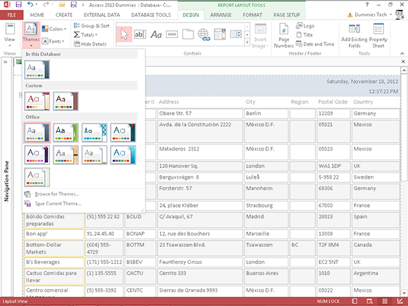
Figure 18-15: Choose the look you like and apply it to the entire report.
Drawing lines
An easy way to make your report a bit easier to read is to add lines that divide the sections. Lines can be added only in Design view.
You can use the Shape Outline button (discussed earlier in this chapter) to dress up your lines.
You must switch to Design view to add lines.
Straight lines
To add straight lines to your report, follow these steps:
1. Click the Line button (the one with the diagonal line on it) on the Controls button menu in the Controls group of buttons on the Design tab.
Your cursor changes to a crosshair with a line trailing off to the right.
2. Repeat these steps for each line you want:
a. Click where you want to start the line.
b. Drag to the location where you want to end the line.
c. Release the mouse button.
Rectangular boxes
The Rectangle button draws boxes around separate items on your report. Rectangles can be added only in Design view. Follow these steps:
1. Click the Rectangle button (the one shaped like a rectangle with a white interior) on the Controls button menu in the Controls group of buttons on the Design tab.
2. Repeat these steps for each rectangle you want:
a. Click where you want to start the upper-left corner of the rectangle.
b. Drag the rectangle shape down to the lower-right corner.
c. Release the mouse button.
Pretty as a picture
You can add some flair to a report by adding a logo. This, of course, also helps identify that the printed document is from your organization. Use the Logo button to add a logo to the report. After you click the button, you will be prompted to select a logo file. By default, Access will place the logo on the upper-left corner of the report.
The Logo button places an Image control on your report. You can find this button on the Design tab’s Header/Footer group.
Adding a logo
You can add a logo in both Layout and Design views.
Pages that contain logos take longer to print. Use your logos wisely:
![]() Headers and footers are the best places for logos.
Headers and footers are the best places for logos.
![]() The Detail section is not a good place for logos.
The Detail section is not a good place for logos.
In the Detail section, you get one copy of the logo for each record on the report. This could greatly slow the printing of your report.
Should you have a report title on the upper-left corner of your report, move the title to the right to make room for the logo before you insert the logo.
If you want to add a logo to your report, switch to Design or Layout view and follow these steps:
1. Select the Design tab on the Ribbon, if necessary.
The Design buttons appear, including the Header/Footer group.
2. Click the Logo button from the Header/Footer group.
The Insert Picture dialog box opens.
3. Navigate to the folder that contains your logo, and select the logo file. (See Figure 18-16.)

Figure 18-16: The Insert Picture dialog box with a logo file selected.
4. Click OK.
The logo is placed on the upper-left part of the report.
After you add a logo, you can size, move, or delete the logo as described earlier in this chapter.