1. Setting Up Basic Assets
Lesson Overview
The way you set up your documents and create your assets will affect how easily and efficiently you can design your work. This lesson will introduce you to some important skills and concepts:
• Organizing your work in Adobe Bridge
• Automatically tracing an image in Illustrator
• Drawing expressively with the Bristle Brush in Illustrator
• Creating a pattern in Illustrator
• Refining a vector graphic in Illustrator with the Blob Brush tool
• Setting up multiple Illustrator artboards for design variations
• Drawing in perspective in Illustrator
• Cropping a photo in Photoshop Extended
• Removing a background in Photoshop Extended
• Removing unwanted objects in Photoshop Extended
• Moving objects seamlessly in Photoshop Extended
• Adding creative blur in Photoshop Extended

You’ll probably need between one and two hours to complete this lesson.
In this lesson, you’ll be working on exciting projects: turning a hand sketch into a pattern, creating expressive artwork, and getting photos ready for a layout. You’ll be preparing assets that you’ll use in a printed and interactive brochure in lessons later in this book.
Organizing Your Work with Adobe Bridge
In this lesson, you’ll set up some of the basic assets that you’ll use for projects in this book. You’ll be working in Adobe Bridge, Adobe Illustrator, Adobe Photoshop Extended, and Adobe Acrobat.
Adobe Bridge CS6 provides integrated, centralized access to your project files and enables you to quickly browse through your creative assets visually—regardless of what format they’re in—making it easy for you to locate, organize, and view your files.
Before you start working on this lesson, make sure that you’ve installed the Creative Suite 6 Design & Web Premium software on your computer, and have correctly copied the Lessons folder from the DVD in the back of this book onto your computer’s hard drive (see “Copying the Classroom in a Book files” on page 3).
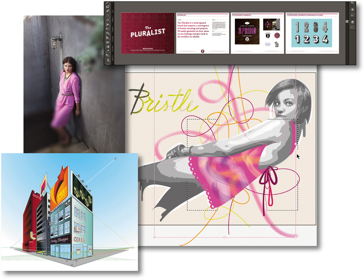
Adding folders to your Favorites
To help you access your files easily, Adobe Bridge adds your Pictures and Documents folders (Mac) or your My Pictures and My Documents folders (Windows) to the Favorites panel by default. You can add as many of your frequently used applications, folders, and documents as you like. In the Preferences dialog box for Adobe Bridge you can even specify which of the default favorites you want to keep in the Favorites panel.
After you’ve copied the Lessons folder from the Adobe Creative Suite 6 Classroom in a Book disc to your hard drive, it’s a good idea to add your Lessons folder to the Favorites panel in Adobe Bridge, so that the files you’ll use for the lessons in this book will be only a click away. You could add your Lesson01 folder right below that and keep it there while you work through this lesson.
1. Start Adobe Bridge CS6. At the top of the Adobe Bridge browser window, make sure the Essentials workspace is selected.
2. Navigate to your Lessons folder, and then select the Lesson01 folder in the Content panel. Drag it into the Favorites panel in the left panel group and drop it under the Pictures folder.
You can also quickly add a folder to your Favorites by Right-clicking / Control-clicking the folder in the Content panel and choosing Add To Favorites from the context menu.
Having your Lessons files easily accessible, will save you a great deal of time as you work your way through the lessons in this book.
Adding metadata
All your documents contain some metadata, such as information about the device with which they were created. You can use Adobe Bridge to add your own metadata to a single file or to multiple files at the same time—without having to open the application specific to those files.
In this first exercise you’ll see how easy it is to add metadata to a file and learn some different ways to mark it, which will make it easier to find and sort.
1. In Adobe Bridge, navigate to your Lesson01 folder to see the files inside. You’ll be working with these files later in this lesson.
If you can’t read all your filenames or the thumbnail images are not big enough, you can enlarge them by using the Zoom slider in the lower-right corner.
2. Select the file Adobe_0367.tif and note the Metadata panel in the right panel group.
3. In the Metadata panel, expand the IPTC Core panel, and type pink, dress in the Keywords text field.

Keywords you enter are searchable in the search field in the top-right corner of an Adobe Bridge window, as well as in Mac OS X Spotlight and Windows Desktop Search. They can also be preserved when exporting versions of the images to share online.
What you just did is enter two keywords, using a comma to separate them so they are entered individually. You can also enter keywords using the Keywords panel that you may see grouped with the Metadata panel, but when you’re entering many types of metadata, you may find it more convenient to enter them in the Metadata panel along with everything else.
4. Press Enter/Return to apply your entries.
When you search for this file in the future, the metadata you just added will help you to find this specific file. Adobe Bridge looks in the metadata fields when you search for a file in Adobe Bridge, and in addition, the search features built into Microsoft Windows and Mac OS X also look for keywords to improve their search results.
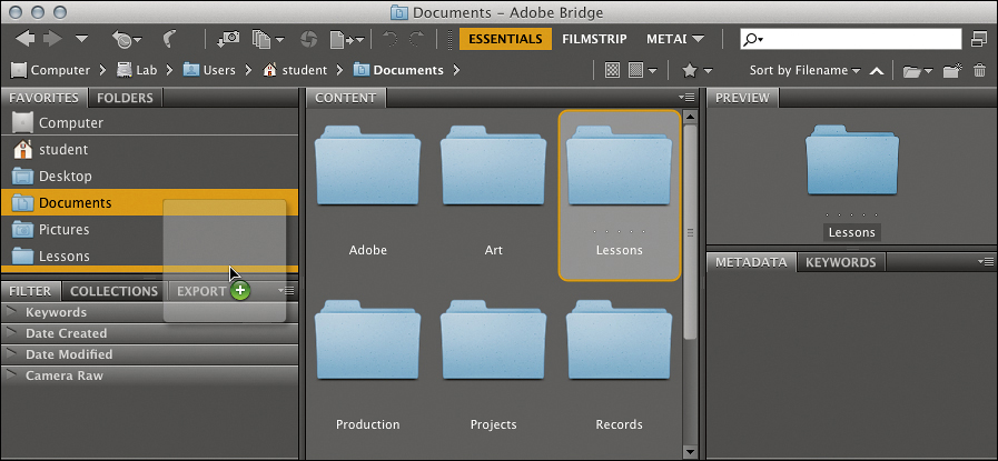
Marking your files with ratings and color labels
When you’re working with a large number of files and folders, assigning ratings and labels is a good way to mark a large number of files quickly, making it easier to sort and find them later.
1. In the Content menu, note the five dots above the filename Adobe_0367.tif, indicating that this file has not yet been rated. Click on the third dot, which will apply a three-star rating—it’s that easy to rate a file.

You can also mark a file visually by assigning a color label.
2. Choose Label > Approved. Your file is marked with a green color label, which you can also see in the right panel group.
This color labeling system is not only useful to help you quickly spot the images you’re looking for, but is also an effective way to sort your images by category, production status, or any other meanings you assign to the labels. This can be a useful organizational tool, especially when different people are working on the same project. You can use the Filter panel to quickly locate files with specific ratings or labels.
3. Right-click / Control-click the image of the woman again, and this time choose Sort > By Label from the context menu. If you had multiple files with the same label, they would now be grouped in the Content panel. You can change the sort order by toggling View > Sort > Ascending Order.
Synchronizing color management
Using Adobe Bridge as your central hub enables you to synchronize the color management settings across all your Creative Suite applications. It’s highly recommended to use this feature so that the colors in your images will look the same regardless of which Creative Suite component application you’re working with.
There are a range of options for synchronizing color management. You can specify your own color settings in the Color Settings dialog box in the relevant Adobe application, and then apply it to all the other Adobe Creative Suite applications in Adobe Bridge, or you can choose one of the Adobe Bridge presets.
1. In Adobe Bridge, choose Edit > Creative Suite Color Settings.
2. The Suite Color Settings dialog box appears. A message at the top of the dialog box tells you whether or not the settings are already synchronized. If they are not, choose North America General Purpose 2 from the Color Settings menu, and then click Apply. If the Apply button isn’t active, select any setting, and then select North America General Purpose 2 and click Apply.
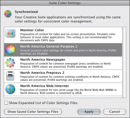
The next time you open the Suite Color Settings dialog box, the message at the top of the Suite Color Settings dialog box should now indicate that all your CS6 applications use the same color management settings.
Creating Artwork in Illustrator
When you’re designing graphics such as logos and corporate identities, it’s an absolute must that your design be scalable, because the graphic will be used in a wide range of applications, from web pages at screen resolution to high-resolution printed matter or even monumental signage. For designing graphics that need to be resolution independent, Adobe Illustrator is the world’s leading vector-based application. Today, other applications in the Creative Suite, such as InDesign and Photoshop, also let you create vector graphics using the Pen tool (among others); however, your best choice is still Illustrator, because it includes the most comprehensive set of drawing tools.
Bitmap versus vector graphics
Pixel- or raster-based applications, such as Photoshop, are unbeatable when it comes to producing photographic or continuous-tone images. However, these images are composed of a fixed number of pixels, resulting in a jagged—or pixelated—look when they are enlarged. The illustration below clearly shows the difference between a resolution-independent vector graphic (left) and a pixel-based graphic (right).

With Illustrator, you create vector graphics—artwork that is made up of points, lines, and curves that are expressed as mathematical vectors. Vector-based graphics are resolution independent—they can be scaled to any size without losing quality or crispness.
Automatically trace an image as a vector graphic with Image Trace in Illustrator
There are times when the job calls for a smooth, scalable vector graphic, such as a logo, but you have a bitmap graphic. Image Trace in Illustrator makes it easy to convert a bitmap graphic to a vector graphic by accurately following its contours and edges.
You’ll trace a scan of a hand-sketched idea, and later you’ll use the traced image as the basis for a pattern.
1. In Illustrator, choose File > New, click the Landscape icon, leave the rest of the settings as they are, and click OK.
2. Arrange the Adobe Bridge window for your Lesson01 folder and the Illustrator document window so that you can see both at the same time.
3. Drag the file diagram013.jpg from the Lesson01 folder in Adobe Bridge, and drop it in the middle of the Illustrator document window; after dragging, you can enlarge the Illustrator document window.
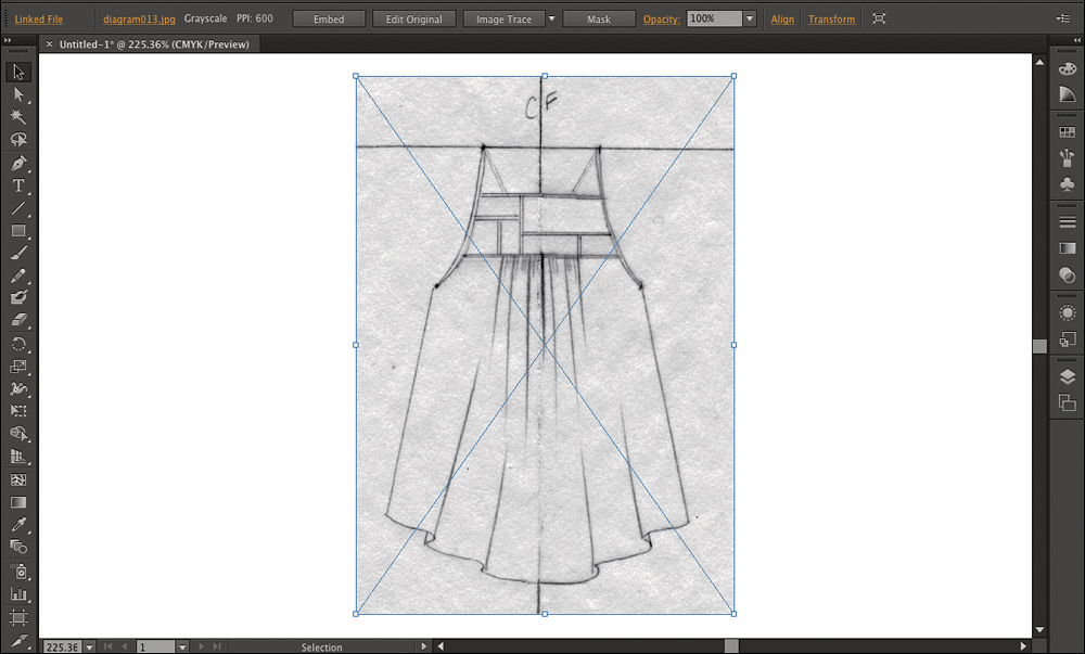
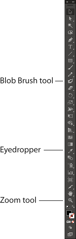
4. Click the Zoom tool (![]() ), and drag a rectangle around the scan to make the scan fill the document window.
), and drag a rectangle around the scan to make the scan fill the document window.
5. In the Control panel, click Image Trace. If a tracing warning appears, click Cancel.
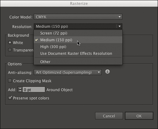
Illustrator warns you if an image is so large that it may take a long time to trace and suggests downsampling the image to a lower resolution. Because this 600 ppi image is a rough sketch, 600 ppi is not necessary, so you’ll resample it to a quarter of that resolution.
6. Choose Object > Rasterize, choose Medium (150 ppi) from the Resolution pop-up menu, and click OK.
7. In the Control panel, click Image Trace.
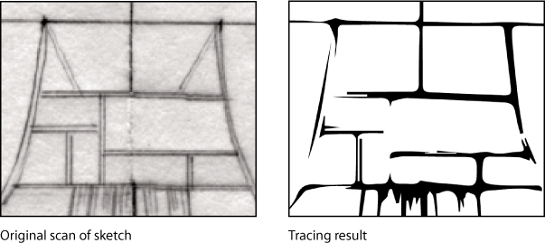
8. With the Zoom tool, zoom into a detail of the sketch. You’ll see that it’s a set of smooth vector shapes. The bitmapped gray tones of the original sketch image were interpreted by Image Trace as sharp, smooth vector paths, replacing the “jaggies” of the pixels of the original bitmap image.
To see the pixels of the original untraced graphic, you can choose Source Image from the View pop-up menu in the Control panel as long as the tracing results have not been expanded.
Because the traced graphic is selected, you can see Image Tracing options in the Control panel across the top of the workspace.
9. In the Options bar, click the Image Trace panel button to see more options that determine the tracing result.
10. In the Image Trace panel, if the Preset pop-up menu doesn’t display Sketched Art, choose it, and make sure the Preview check box is selected. When Preview is not selected, you must click Trace to update the tracing result.
In the Image Trace panel, the Preview check box redraws the tracing result as soon as you change options. If you don’t want to wait for screen redraw before changing additional options, deselect the Preview check box.
The Sketched Art preset allows the traced object to have a transparent background by ignoring white areas. This will be important when you use this tracing as the basis for a pattern over a colored background.
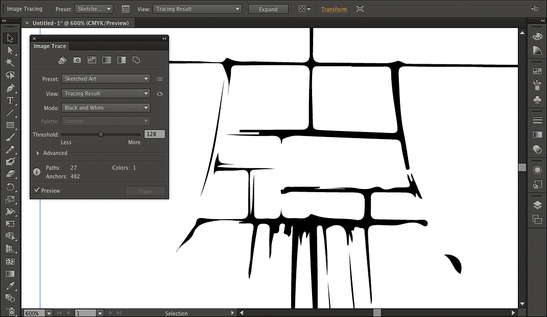
11. In the Image Trace panel, drag the Threshold slider to the right. The line quality of the tracing becomes heavier, because it’s including darker tones of the image in the trace result.
12. Set the slider to 160 to give the trace a loosely sketched look.
13. Close the Image Trace panel, and zoom out until you can see the entire traced sketch with a little space around it.
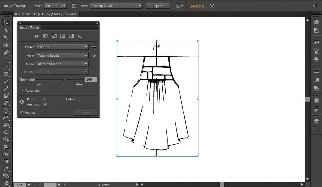
14. Choose File > Save As, name the file Sketch.ai, and save it into your Lesson01 folder. When the Illustrator Options dialog box appears, click OK to accept the default settings. Leave the document open for the next section.
Because Image Trace is nondestructive, it retains the original image so you can always start over. Although you could use the graphic as is, in the next section you’ll apply some additional processing so you can use it as a pattern.
Creating a pattern
The Pattern Options panel, new in Adobe Illustrator CS6, makes it easy to quickly create patterns by creative experimentation. You’ll start with the traced graphic you just created. You can’t directly colorize a traced object, so you’ll expand it into paths.
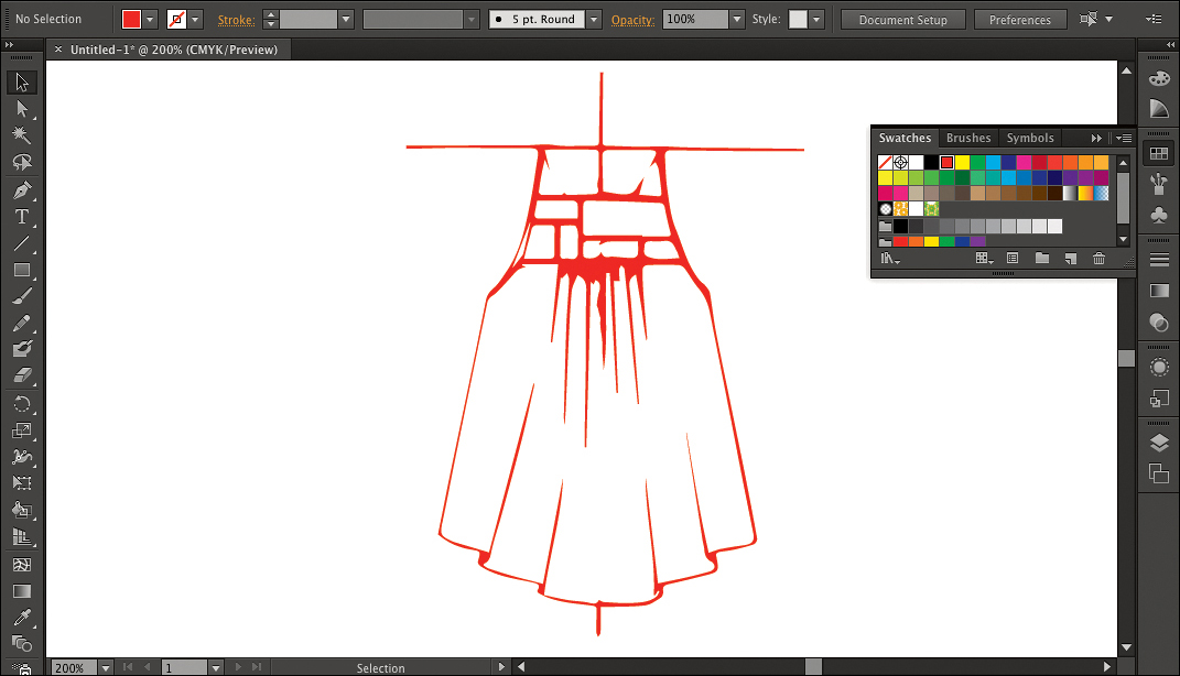
1. If the traced graphic isn’t still selected, click it with the Selection tool.
2. In the Control panel, click Expand.
3. Choose Object > Path > Clean Up, make sure all three options are selected, and click OK. This removes redundant paths generated as a by-product of Image Trace, leaving a simpler graphic that’s easier to color.
4. Click the Fill swatch in the Tools panel, and in the Swatches panel, click a red swatch.
5. Choose Select > Deselect to see how the colored graphic looks now, and then choose File > Save.
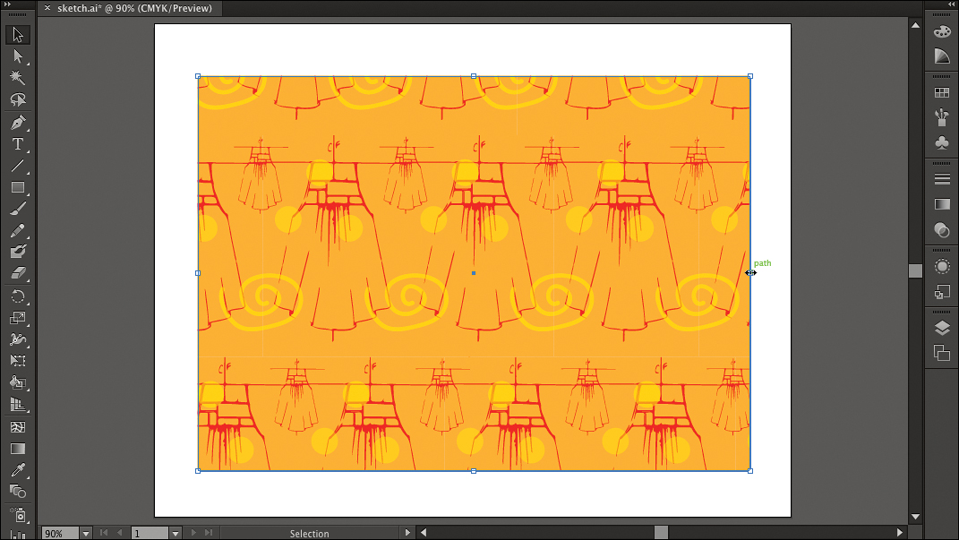
6. Use the Selection tool to select the graphic again, and then choose Object > Pattern > Make. If an alert appears telling you that the new pattern has been added to the Swatches panel, click OK.
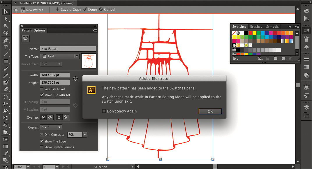
Creating the pattern changes the the document window. There’s now a gray bar at the top of the document window, which indicates that you’ve entered Pattern Editing mode. Because you’re in Pattern Editing mode, the graphic now repeats throughout the document window so that you can preview the pattern as you edit it.
7. Zoom out to see more of the pattern preview.
8. In the Pattern Options panel, click the Pattern Tile tool (![]() ), and use it to drag the handles on the graphic that you’re using as a tile. Notice how dragging the handles controls the spacing between pattern tiles.
), and use it to drag the handles on the graphic that you’re using as a tile. Notice how dragging the handles controls the spacing between pattern tiles.
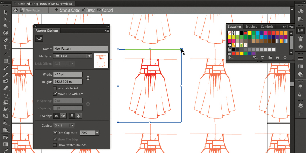
9. With the Rectangle tool, draw a rectangle that matches the pattern tile size. The green Smart Guides help you snap exactly to the pattern tile edges and corners.
10. Click the peach-colored swatch at the top-right corner of the Swatches panel, and then choose Object > Arrange > Send to Back. If there’s a white gap along any side of the pattern tile, adjust the peach-filled rectangle as needed to create a solid background for the pattern.
When you edit a pattern, the gray bar at the top of a document window indicates an isolation mode—a way that Illustrator lets you edit components of an illustration such as groups, patterns, and symbols without risking accidental changes to other parts of the document.
11. With the rectangle still selected, choose Object > Lock > Selection.
12. Choose Select > Select All, and then choose Object > Group.
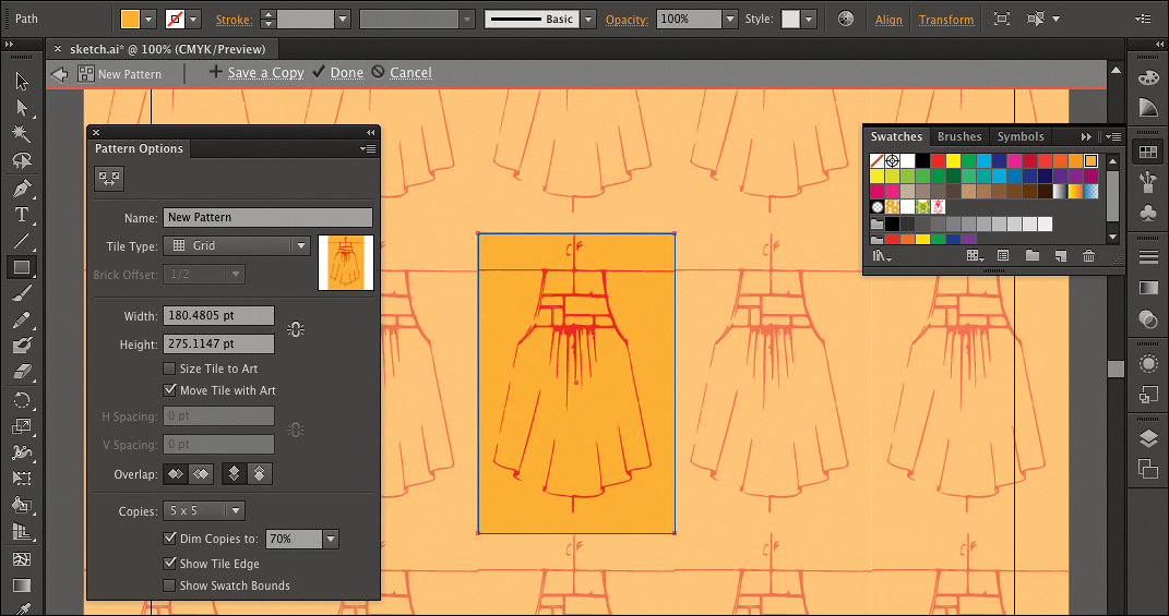
13. With the Selection tool, Alt-drag / Option-drag the sketch to the left to create a copy, and center it over the left edge of the pattern tile.
14. Alt-drag / Option-drag a corner handle of the sketch copy to proportionally scale it down until it’s about a third of the size of the original.
15. If only half of the sketch repeats, click the Left in Front or Right in Front button in the Pattern Options panel until it looks right.
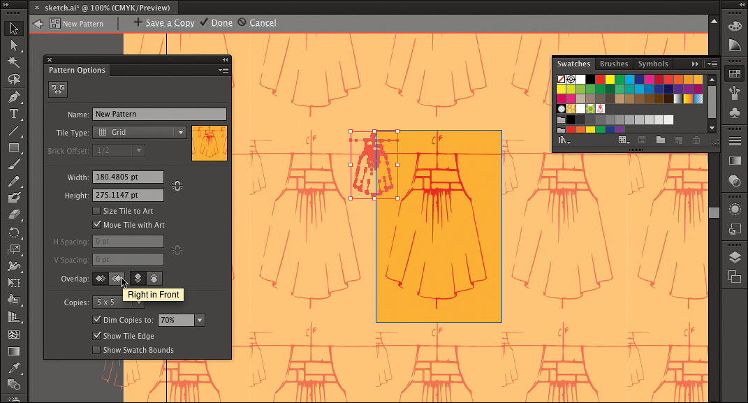
16. In the Tile Type pop-up in the Pattern Options panel, select the Brick by Row and Brick by Column options and observe how they change the pattern offset. Choose the one you like the most. (The Hex by Column and Hex by Row options work properly only with hexagonal pattern tiles.)
17. Choose Select > Deselect.
18. Select the Brush tool, click a yellow swatch in the Swatches panel, and then in the Control panel change the Opacity to 50%. Paint strokes of color into the pattern. To seamlessly tile brush strokes that overlap the tile edge, cross over the same side as the smaller version of the sketch, because that’s the Overlap side you specified in the Pattern Options panel earlier.
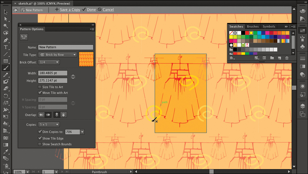
The pattern is now ready, so it’s time to leave Pattern Editing mode.
19. In the Pattern Editing mode bar at the top of the document, click Done. If an alert appears, click OK.
Do not be alarmed when the pattern disappears. It’s saved in the pattern swatch that was created in the Swatches panel when you originally created the new pattern. Now you’ll use the pattern.
20. With the Selection tool, select the traced dress and press the Delete key. After creating a pattern from this graphic, you no longer need it.
21. With the Rectangle tool, drag a rectangle that’s roughly the same size as the page.
22. Click the pattern swatch you created, to apply it to the rectangle. Resize the rectangle to see how the pattern automatically tiles within the object.
23. With the pattern-filled object selected, choose Object > Pattern > Edit Pattern. The document enters Pattern Editing mode, which you can recognize because of the tiled preview and the gray Pattern Editing mode bar at the top of the document window. Click Done to leave Pattern Editing mode, or press Esc.
24. Close the document, saving changes if asked.
Congratulations! You’ve learned how to create, apply, and edit a pattern. You can now use it to illustrate textiles, interiors, or other designs.
Creating a vector graphic with the Bristle Brush
You don’t need to use a painting program to create expressive brush strokes. In Illustrator CS6, the Bristle Brush gives you the creative possibilities of traditional media like watercolors, oils, and pastels while also providing the speed, editability, and scalability you expect with vector graphics. If you have a Wacom tablet, you can control Bristle Brush strokes with stylus pressure, and with Wacom Intous tablets you can also control strokes using tilt angle, bearing, and barrel rotation.
1. In your Lesson01 folder in Adobe Bridge, double-click the file bristle_brush.ai.
2. In the Layers panel, make the Model layer visible by clicking to show the eye icon for that layer.
3. With the Selection tool, select the pink dress.

4. In the Tools panel, click the Drawing Modes icon (![]() ) and choose Draw Inside. This will let you draw freely and keep your artwork inside the dress.
) and choose Draw Inside. This will let you draw freely and keep your artwork inside the dress.
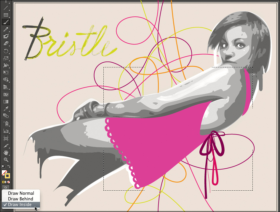
5. Choose Select > Deselect, and then select the Brush tool.
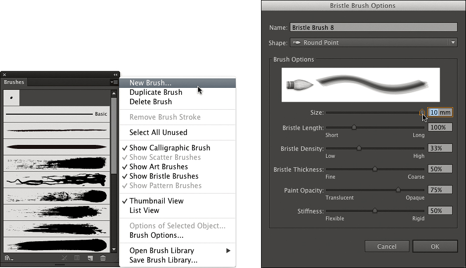
6. Choose Window > Brushes, and then choose New Brush from the Brushes panel menu. In the New Brush dialog box, select Bristle Brush and click OK.
7. In the Bristle Brush Options dialog box, choose Round Point from the Shape menu. Change the Size to 10mm, and then click OK to close the dialog box.
8. In the Tools panel, make sure Stroke color is active, and then in the Swatches panel, select a color that’s different than the dress.
9. Drag the brush inside the dress to paint with broad strokes. Try different colors.

10. With the Selection tool, select the tallest pink swirl behind the model.
11. In the Brushes panel, select the 4.80mm round fan brush named Bristle Brush 6. Notice how the swirl now appears as if it had been painted freehand. In this way, you can easily apply Bristle Brush strokes to a path you’ve already drawn. Feel free to apply other brushes to the remaining swirls.

12. Choose File > Save As, navigate to your Lesson01 folder, name the file bristle_brush_done.ai, and click Save. If warning alerts appear, click OK to close each of them.
13. Close the document.
Refining a vector graphic with the Blob Brush tool
If you have been working with the brushes in Flash and Photoshop, you’ll find similarities in the Blob Brush in Illustrator, which enables you to generate a clean vector shape as you paint. Used in combination with the Eraser tool, the Blob Brush provides a truly painterly, intuitive way to create vector shapes—merging your brush strokes into a single, fluid outline that can then be filled with a solid color or painted with a gradient or even a pattern.
In this exercise you’ll design a variation on an existing graphic by refining the outline of a masthead logo that was traced from handwritten artwork using Image Trace in Illustrator.
1. In your Lesson01 folder in Adobe Bridge, double-click the file check_masthead_black.ai.
2. In Illustrator, select the Zoom tool in the Tools panel, or press the Z key, and then click to zoom in close enough to scrutinize the outline of the logo in detail. Some of the unevenness you see along the edges can be smoothed out with the Blob Brush tool.
3. Before using the brush, first make sure the correct color for the check logo is active. The logo is filled with black and has no stroke. Select the Eyedropper tool in the Tools panel and click on the logo. The Color panel will display a black fill and no stroke.
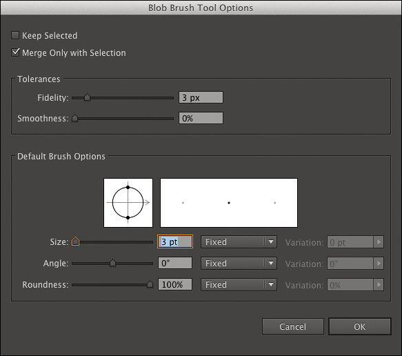
4. In the Tools panel, double-click the Blob Brush tool. Make sure that the Fidelity slider is set to 3 pixels, and that brush Size is set to 3 pt in the Default Brush Options. Then click OK.
5. To demonstrate the refinements possible with the Blob Brush, let’s have a closer look at the letter e in the check logo. Notice the dent in the lower-left side. With the Blob Brush still selected, add a few strokes to smooth the outline.
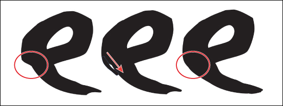
6. If you are not happy with the strokes you just painted with the Blob Brush tool, use the Eraser tool in the Tools panel to correct them—the Eraser tool edits your strokes while maintaining them as filled vector paths.
7. When you’re happy with your refinements to the logo, select the Zoom tool (![]() ), press the Alt/Option key for the Zoom Out mode, and then click on the logo to zoom out until you can see the entire document.
), press the Alt/Option key for the Zoom Out mode, and then click on the logo to zoom out until you can see the entire document.
8. Choose File > Save As, navigate to your Lesson01 folder, name the file check_masthead_done.ai, and click Save; if the Illustrator Options dialog box appears, click OK. Then close the document.
Next, you’ll take advantage of another great feature of Illustrator CS6: multiple artboards, which are like separate pages within one file. You’ll create another artboard for a copy of the logo.
When you create a new Illustrator document, you can specify the number of artboards you want and their size, position, and spacing in the New Document dialog box.
Working with multiple artboards
In Illustrator CS6, you can work with up to 100 different artboards in a single file. You can control the size of the artboards as well as the spacing in between them. Multiple artboards can be named and organized in rows and columns, and can be printed, exported, and saved separately.
Being able to have several artboards within one file suits the way most designers work: Usually, numerous iterations of a design concept are necessary to arrive at the polished final version. To help you create variations, you can quickly copy an object across all artboards.
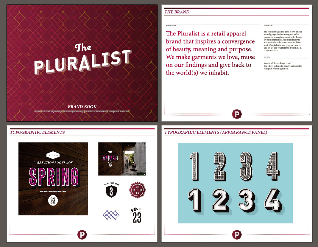
1. In your Lesson01 folder, open the file AI_Artboards.ai.
This file contains four artboards in a horizontal row. You may not be able to see them all right away.
2. Choose View > Fit All in Window. Now you can see all artboards at once.

3. Select the Artboard tool, and click the second artboard to select it.
The Control panel updates to present artboard options; this is where you can set the size, orientation, and name of the selected artboard.
You can freely arrange artboards; they don’t have to be perfectly aligned. In this case, the four artboards will fit better on the screen if arranged as two rows.
4. Under the View menu, make sure Smart Guides is selected. As you drag, green Smart Guides appear to indicate exact alignment of edges and centers.
5. Using the Artboard tool, drag the third artboard until it’s under the first artboard and the green centering Smart Guide appears.
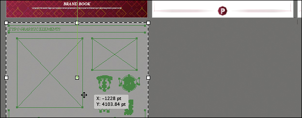
6. Drag the fourth artboard until it’s under the second artboard, and the green centering Smart Guide appears to indicate alignment with the artboards above and to the left.

7. Choose View > Fit All in Window to fit the new arrangement of artboards into the document window.
When you use multiple artboards, you may want to include common elements on all artboards, such as a header or footer. In this document, you’ll quickly repeat one artboard’s elements on other artboards.
8. Choose the Selection tool, and then in the top-right artboard, select the circular P logo at the bottom center of the artboard.
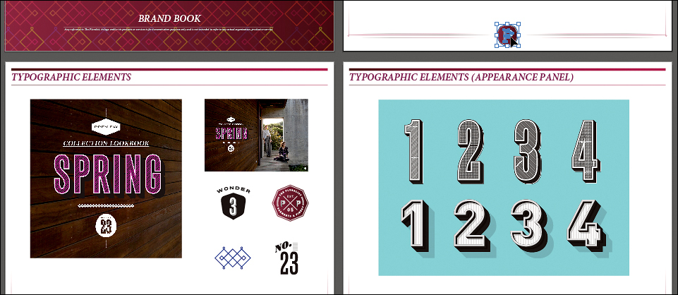
9. Choose Edit > Cut and then choose Edit > Paste on All Artboards. The logo pastes in the same position on all artboards. It shouldn’t be on the first artboard, so simply select that instance of the logo and press Delete.
The multiple artboards in Illustrator are a great example of the way Creative Suite applications specialize in different areas of design. Illustrator artboards are a great way to keep related design pieces together, but they aren’t intended to build text-intensive long documents, such as books. If you want to create a long document with automatically numbered pages, a table of contents, and an index, use Adobe InDesign instead.
10. Choose File > Save As, navigate to your Lesson01 folder, name the file ai_artboards_done.ai, and click Save. Then close the document.
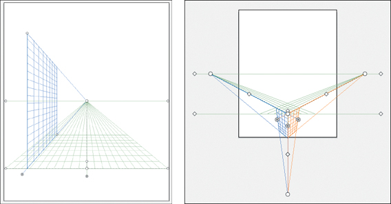
Drawing in perspective in Illustrator
When you want to use linear perspective to create depth in Illustrator CS6, it takes no time at all to set up a perspective grid. You can then forget about the technical points of perspective drawing and simply concentrate on your artwork.
1. In Illustrator, choose File > New, click the portrait (tall) Orientation button, and click OK.

2. Select the Perspective Grid tool (![]() ). The perspective grid appears.
). The perspective grid appears.
3. Try dragging the various perspective grid controls:
• The diamond-shaped handles at the bottom-left and bottom-right move the entire grid.
• The diamond-shaped handles at the far-left and far-right sides control the height of the horizon line.
• The circular handles on the left and right sides of the grid change the angles of each plane.
4. Choose View > Perspective Grid > One-Point Perspective > -[1P-Normal View] to see a preset for one-point perspective. Then choose View > Perspective Grid > Three-Point Perspective > [3P-Normal View] to see a preset for three-point perspective.
Now that you’ve seen how the perspective grid works, you can see it in action.
5. Close the current untitled document window without saving changes.
6. In your Lesson01 folder, double-click the file perspective_start.ai. If a Font Problems dialog box appears, click Open. If you don’t see the building in the figure below, zoom out to find it and then zoom back in.
This is a building that was drawn using the perspective grid. Now you’ll add a couple of windows to it.

7. Choose View > Windows. This brings you to the document view that was saved under the name Windows; if you don’t see all six windows in the following figure adjust your document window and magnification as needed. With the Selection tool, select the second window in the top row, and then choose Edit > Copy.

8. Choose View > Initial View.
9. In the plane switching widget, click the empty area outside the cube to make sure no perspective planes are selected, and then choose Edit > Paste.
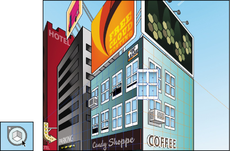
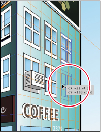
10. In the Tools panel, select the Perspective Selection tool (![]() ) which is grouped with the Perspective Grid tool in the Tools panel (to see both, press and hold either tool in the panel). Click the right plane of the cube in the plane switching widget, and then drag the window you pasted into the empty area to the right of the upper window on the right face of the building.
) which is grouped with the Perspective Grid tool in the Tools panel (to see both, press and hold either tool in the panel). Click the right plane of the cube in the plane switching widget, and then drag the window you pasted into the empty area to the right of the upper window on the right face of the building.

11. Alt/Option-Shift-drag the selected window down to make a copy that lines up with the lower row of windows. As long as you drag with the Perspective Selection tool, the object follows the perspective of the selected plane.
Verifying your document’s quality settings
Before saving graphics, it’s a good idea to verify the quality of your document.
1. Choose Effect > Document Raster Effects Settings. When the Document Raster Effects Settings dialog box appears, change the default Screen Resolution (72 ppi) to High (300 ppi), and then click OK.

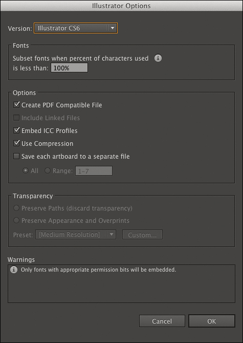
2. Choose File > Save As and save the document into your Lesson01 folder, naming the file perspective.ai. In the Illustrator Options dialog box, make sure the options Create PDF Compatible File, Embed ICC Profiles, and Use Compression are all selected, and then click OK.
3. Close the file.
You’ve completed work on Illustrator elements you’ll use in later lessons. Next, you’ll get photos ready in Photoshop for projects later in the book.
Cropping a Photo in Photoshop
Cropping is a fairly basic task, but one that was completely rethought from the ground up in Adobe Photoshop CS6. Cropping in Photoshop is easier, more intuitive, and less destructive than ever!
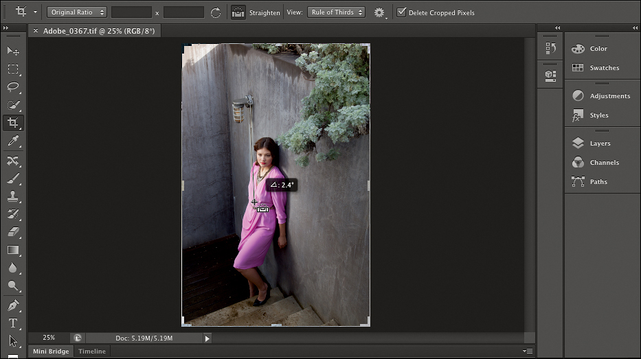
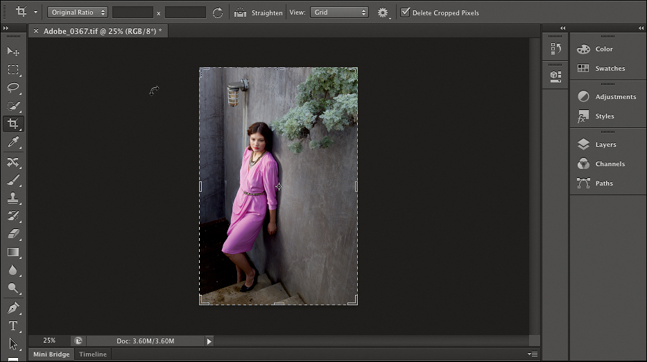
1. In your Lesson01 folder in Adobe Bridge, double-click the file Adobe_0367.tif to open it in Photoshop.
2. In Photoshop, select the Crop tool.
The crop rectangle appears around the image, and inside the crop rectangle is a composition overlay that’s set to the Rule of Thirds by default.
With the Crop tool selected, the Options bar across the top of the document window presents cropping options, including the current aspect ratio and composition overlay.
3. In the Options bar, click the aspect ratio pop-up menu to examine the preset choices, and then make sure Original Ratio is selected to preserve the current proportions of the image.

If you wanted to specify a custom aspect ratio, you’d enter values in the two blank fields in the Options bar, and the pop-up menu would show Custom Unconstrained selected.
4. Click the Straighten tool in the Options bar, position it over the lamp, and drag it down the stain under the lamp. The image is straightened automatically based on the line you drew.
Although the wall is another strong vertical, because it’s off center, we’ll leave it as is because it should have a little bit of perspective based on the downward angle of the image.
5. Drag the top-left corner of the crop box down to resize the crop rectangle until the woman appears under one of the Rule of Thirds guides.
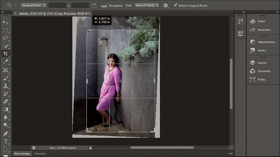
6. In the Options bar, click the View pop-up menu to see the list of overlay options, and then choose Cycle Overlay. The overlay changes to the next one in the pop-up menu.
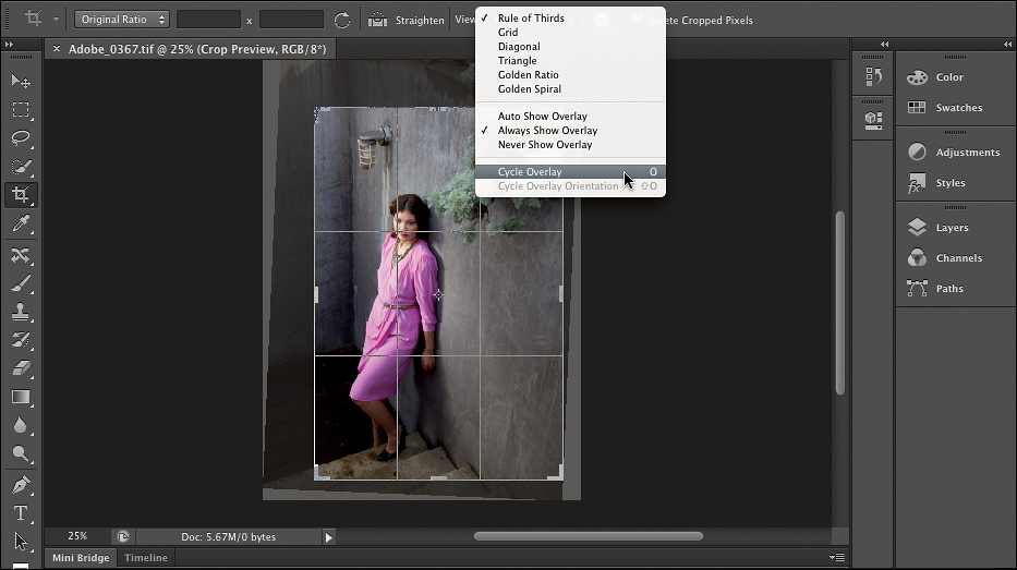
7. Press the O key to cycle to the next composition overlay, and continue pressing O until you see the composition overlay you like the most.
8. In the Options bar, click the Settings menu (the gear icon) to see options that control how the crop rectangle relates to the area outside the cropped image.

9. In the Settings menu, deselect the Enable Crop Shield option, observe the result, and select it again.
The Crop Shield dims the area outside the image to help you visualize the unapplied crop more effectively, and you can customize it in this menu.
10. Close the Settings menu, and then press Return/Enter to apply the crop with its current settings.
11. Choose File > Save.
Adding Creative Blur in Photoshop
Photoshop contains a wide range of blur filters. Some of them, such as Gaussian Blur, are primarily useful in solving production problems. Photoshop CS6 adds a group of three new blur effects specifically intended for creative purposes: Field Blur, Iris Blur, and Tilt-Shift Blur. Using the popular Tilt-Shift Blur as an example, you’ll learn how to control these blur effects using intuitive visual tools. Let’s give it a try!
1. With the pink dress image open from the previous exercise, choose Filter > Blur > Tilt-Shift.
Effect controls appear over the image to control the intensity, location, and rate of change for the blur.
2. Drag the center spot to the part of the image you want to remain in sharpest focus—in this case, the model’s face.

3. Drag the outer circle to set the amount of blur at the extremes of the effect. As you drag, observe the amount of blur, and also notice that the sliders in the Blur Tools panel move. The outer circle is a direct, visual alternative to dragging the sliders in the panel.

The options in the Blur Effects tab control the quality of light in the areas where you’ve applied the most blur.
4. Drag the dots on the solid lines to set where you want the blur transition to start and the angle of the blur.
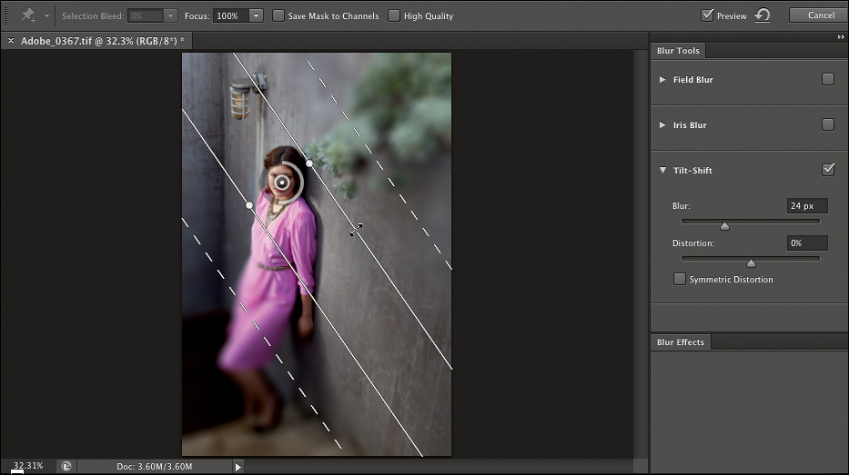
5. Drag the dashed lines to set where the blur transition ends, and where the blur settings are applied at full strength.

6. When you’re done, click OK at the top of the document window. (If you don’t see the OK button, your workspace may be too narrow; press Return/Enter instead.)
7. Choose File > Save As, navigate to your Lesson01 folder, name the file blur_done.ai, and click Save. Then close the document.
Removing a Background in Photoshop
Extracting a subject from a background is one of the most time-consuming tasks a designer faces. The most difficult part of this task is precisely masking out the edge, especially where hair or fur is involved. The new Truer Edge selection technology in Photoshop CS6 offers better edge detection and masking results in less time.
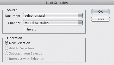
1. In your Lesson01 folder, double-click the file selection.psd to open it. In the Layers panel, select the Original layer.

2. Choose Select > Load Selection, select model selection from the Channel menu, and then click OK.
3. Choose any selection tool (such as the Rectangular Marquee tool), and then click Refine Edge in the Options bar.
4. Click the View icon and choose On Black from the drop-down menu to make the changes easier to see. Then click the View icon to close the drop-down menu.
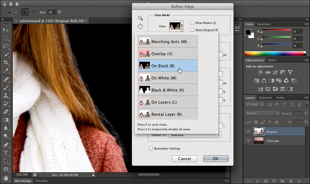
5. Select the Smart Radius check box and set the Radius slider to about 30 px. Watch how the selection edge changes, particularly around the hair. Notice how the selection automatically changes from the jacket to fine hair.
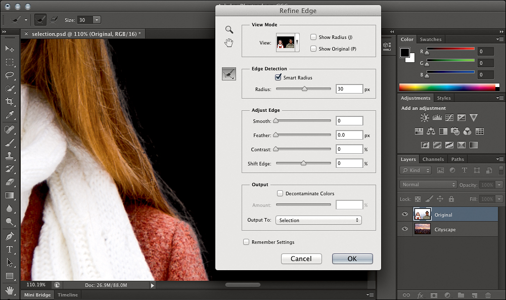
6. In the Refine Edge dialog box, select the Refine Radius tool (![]() ). Drag along the hair edge near the woman’s shoulder to extend the radius outward to include more of her hair. If you want to reduce the radius, Alt/Option-drag the Refine Radius tool along the outside of the selection.
). Drag along the hair edge near the woman’s shoulder to extend the radius outward to include more of her hair. If you want to reduce the radius, Alt/Option-drag the Refine Radius tool along the outside of the selection.

7. Select Decontaminate Colors to remove color fringing by replacing edge colors from the original background with colors from the new background so that the upper layer blends in more effectively. If the initial results don’t seem optimal, you can adjust the Amount slider to achieve the most believeable level of color fringe removal.
8. Choose New Layer with Layer Mask from the Output To menu, and then click OK.
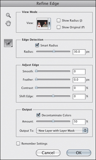
9. In the Layers panel, notice the new layer Original Copy and its mask. Make sure to click the eye icon for the Cityscape layer to display it, and notice how the subject is now composited with the cityscape seamlessly, including individual hairs.

10. Choose File > Save As, name the document selection_done.psd, and click Save. In the Photoshop Format Options dialog box that appears, click OK without changing the settings. Then close the document.
Removing Unwanted Objects in Photoshop
Another traditionally time-consuming task is filling in areas where unwanted objects have been removed. This normally requires manually cloning and patching the empty area where the object used to be. In Photoshop CS6, Content-Aware Fill automatically matches lighting, tone, texture, and noise to make it look like the deleted area never existed.
1. In your Lesson01 folder, double-click the file content-aware.psd to open it. With the Lasso tool, make a rough selection around the man.

2. Press the Delete key. In the Fill dialog box, make sure Content-Aware is selected in the Use menu, and click OK.
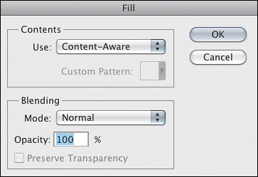
3. The man is deleted and filled in with the surrounding wall texture. Choose Select > Deselect to view the image without the selection.

4. Close the document, and if you’re asked if you want to save changes, click Save
Another valuable use for Content-Aware Fill is removing wires, graffiti, or other fine or thin objects. For this task, it’s better to use the Spot Healing Brush in Content-Aware mode.
5. In your Lesson01 folder, double-click the file content-aware_spot.psd to open it. Select the Spot Healing Brush, and in the Options bar, make sure the Content-Aware option is selected.

6. Drag the Spot Healing Brush along the wire at the top of the image. When you release the mouse, observe how the wire has been removed seamlessly because the surrounding textures and window frames have been detected and matched.

7. Try removing other fixtures in the image as well. When you’re done, close the document, and if you’re asked if you want to save changes, click Save.
Moving Objects Seamlessly in Photoshop
In photographic images, it can be a challenge to reposition objects within the image because cutting out an object in one part of an image leaves behind a blank hole. In Photoshop CS6, the Content-Aware Move tool seamlessly fills in the former position of an object while also blending the object into its new position, saving a lot of time.
1. In your Lesson01 folder in Adobe Bridge, double-click the file Move.jpg.
2. Select the Lasso tool, and draw a selection marquee around the girl on the right. It can be a rough selection; don’t take the time to be exact.

3. Press and hold the mouse on the Spot Healing Brush tool to reveal the tool menu, and then choose the Content-Aware Move tool.
4. Using the Content-Aware Move tool, drag the selected girl to a different part of the image, and then choose Select > Deselect. Notice how the area formerly occupied by the girl has been filled in, and the girl is blended in with her new surroundings.
5. Choose File > Save As, and choose Photoshop from the Format menu. Navigate to your Lesson01 folder, , name the file move_done.psd, and click Save. Then close the document.
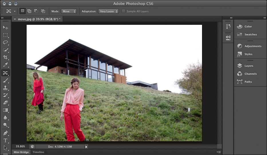
Naturally, this works best if the old and new backgrounds are similar. There may be times when you’ll have to touch up the edges a bit, but in most cases you’ll have saved so much time that it’ll be more than worth it.
Wrapping Up
You’ve learned many of the Adobe Creative Suite 6 Design & Web Premium features that are important for preparing assets for projects. Throughout this book, you’ll see how the assets you worked on in this lesson fit into larger workflows.
Review Questions
1. How can you speed up the process of finding files and folders in Adobe Bridge?
2. Why would you use Adobe Bridge to synchronize your color settings when working within Adobe Creative Suite 6 applications?
3. What is so special about the Blob Brush tool in Adobe Illustrator CS6?
4. What are some practical uses for artboards?
5. How is Content-Aware Fill useful in Adobe Photoshop CS6?
Review Answers
1. Select a file or folder and choose File > Add to Favorites. The file or folder will appear in the Favorites panel in the left panel group of the Adobe Bridge window where you have easy access to it. Alternatively, you can drag the file or folder—or even an application—directly into the Favorites panel.
2. Adobe Bridge provides centralized access to your project files and enables you to synchronize color settings across all color-managed Creative Suite 6 applications. This synchronization ensures that colors look the same in all Adobe Creative Suite 6 components. If color settings are not synchronized, a warning message appears at the top of the Color Settings dialog box in each application. It is highly recommended that you synchronize color settings before starting to work with new or existing documents.
3. While sketching with the Blob Brush tool, you can create a filled vector shape with a single outline, even when your strokes overlap. All the separate paths merge into a single object, which can easily be edited. Using the Blob Brush tool in combination with the Eraser tool enables you to make your shapes perfect, keeping a single, smooth outline.
4. You can use artboards to organize related components of a project in a single Illustrator file, such as an envelope, business card, and letterhead; maintain multiple pages of an interactive online project; or store multiple versions of a project.
5. Content-Aware Fill saves time because it automatically fills in deleted objects by matching the lighting, tone, texture, and noise of surrounding areas instead of requiring you to manually patch the area.