
Chapter 13: Building Apps for Desktop and Mobile
In the previous chapter, we designed an interactive virtual reality (VR) experience using beta document types in Animate based on WebGL standards.
For this chapter, we'll focus on the Adobe Integrated Runtime (AIR) platform and build a small utility application for browsing photographs. To develop this application, we'll need to download and install an AIR software development kit (SDK) and make use of ActionScript 3 (AS3) as a programming language. We'll populate our application with the help of both components and button symbols, two features of Animate that we haven't explored until now. To close, we'll examine how to convert the application for use on iOS and Android.
After reading this chapter, you'll be able to perform the following functions in Animate:
- Learn how to download and install an AIR SDK from HARMAN.
- Lay out an application interface using text, Button symbols, and Components.
- Write ActionScript code within an ActionScript 3 (AS3) Class to develop a simple desktop experience.
- Navigate AIR publish settings and target both desktop and mobile platforms using the same code base.
Technical Requirements
You will need the following software and hardware to complete this chapter:
- Adobe Animate 2022 (version 22.0 or above).
- Refer to the Animate system requirements page for hardware specifications https://helpx.adobe.com/animate/system-requirements.html
The code in action video for this chapter can be found here: https://bit.ly/3Dln3ga
Working with the Adobe Integrated Runtime
In this section, we will download and install an AIR Software Development Kit (SDK) within Animate and configure a new AIR for Desktop document using the chosen SDK version.
AIR is simply one of the most amazingly flexible development platforms available. We went over the general history and usage of AIR in Chapter 2, Exploring Platform-Specific Considerations, but will really dive into building with the platform now. Since it's been a while, I suggest perhaps going back to that chapter to refresh your memory.
We are going to use AIR to build an image file browser application in this chapter. The user will be able to select a folder from their local filesystem, and any image files from that folder will display within a data grid. We'll write a bit of logic so that only image file types will be displayed in the grid. When the user chooses a file from the grid, the image will be rendered within the application.
The first step in all of this is to install an AIR SDK in order to work with AIR documents.
Installing an AIR SDK in Animate
Before 2020, Animate would include the most recent version of the AIR SDK packaged along with it, so it was easy to get started with the platform. Following the June release of that year, users would be greeted with a notice when attempting to create a new AIR-based document for the first time.
The notice appears when choosing AIR for Desktop, AIR for iOS, or AIR for Android from the New Document dialog:

Figure 13.1 – Animate prompts users to install the AIR SDK
The notice reads: AIR SDK is no longer shipped with Animate. In order to enable AIR publishing, please refer to the following link.
Clicking the Enable AIR SDK button at the bottom of the panel brings the user to a page hosted by Adobe (https://helpx.adobe.com/animate/kb/get-started-with-latest-airsdk.html) that explains how to acquire and install the HARMAN version of Adobe AIR.
- To locate and download current versions of the AIR SDK as maintained by HARMAN (version 33+), you'll visit the HARMAN website: https://airsdk.harman.com/download.
If you want to use the older version of AIR that was maintained by Adobe, the final version of the AIR SDK maintained by Adobe (version 32) is now found only through the AIR SDK archives at https://helpx.adobe.com/air/kb/archived-air-sdk-version.html. This is not recommended but may be useful in some scenarios.
Note
While Adobe gave the AIR SDK freely, as its development and maintenance were supported by their tooling, HARMAN does charge a licensing fee for use of the SDK. Thankfully, most users who are not using the SDK for commercial purposes can make use of it for free, with the inclusion of a quick splash screen to help market the technology.
In order to locate and download an AIR SDK on your computer, perform the following steps:
- From the New Document dialog, choose AIR for Desktop from the Advanced category.
- Click the Enable AIR SDK button, and you will be taken to a website with links to various SDK versions.
I suggest visiting the HARMAN site at https://airsdk.harman.com/download as the most recent version of AIR can be found there.
- Once at a download location, agree to the terms of usage and choose which version of the AIR SDK you'd like to download for use in Adobe Animate.
You can choose between macOS and Windows versions and select either the main builds of the SDK or those to be used alongside Apache Flex. When dealing with Animate, you'll seek out the non-Flex builds.
Choose a version of the Full AIR SDK with new ActionScript Compiler to download.
- The AIR SDK downloads to your computer as a .zip archive.
- Open the .zip file and examine the contents. There are a large number of files and folders included, and they are all necessary for a working SDK installation:
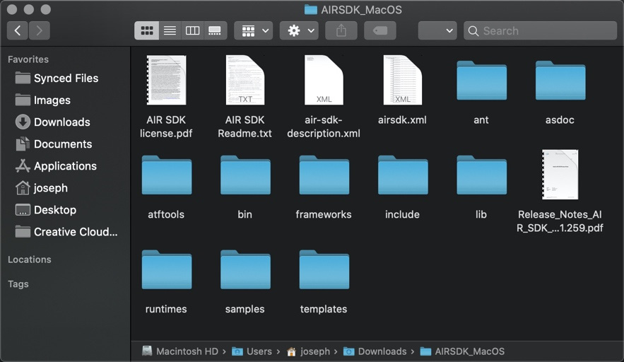
Figure 13.2 – AIR SDK contents
- Developers will often have a specific directory created specifically to house various SDKs and related tools. I suggest naming the folder something such as AIR SDK 33 and placing it in the Documents or User directories since these are both easily located. Place the contents of the .zip file in a new folder with an easily identifiable name.
Note
Apache Flex (formerly Adobe Flex) is a development platform that makes use of Flash Platform technologies, including ActionScript 3.0 and the Macromedia FleX Markup Language (MXML) markup language, for cross-platform application development. You can learn more at http://flex.apache.org/.
Once you have completed copying the .zip archive's full contents into the folder you've created, you'll want to make note of that location when we go to install the SDK in Animate. You can install many different versions of the AIR SDK—just be sure to keep each one in its own unique directory with an identifiable name.
We'll now turn our attention back to Animate to install the AIR SDK so that we can develop applications and games using the technology. Proceed as follows:
- To install a new AIR SDK for use in Adobe Animate, open the software and look at the application menu.
- From the Help menu, choose the option labeled Manage Adobe AIR SDK…:
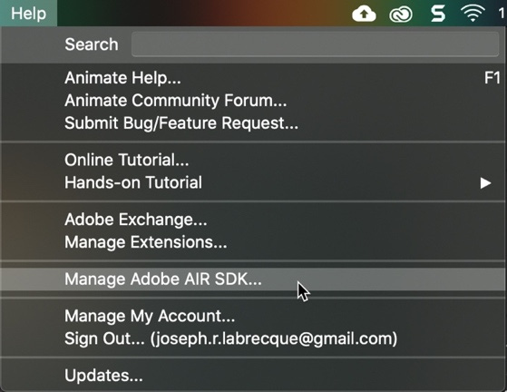
Figure 13.3 – Opening the AIR SDK management dialog
- The Manage Adobe AIR SDK dialog will appear:

Figure 13.4 – There are no AIR SDK versions installed
If you haven't installed any AIR SDK versions in the past, this will be empty, but if you have other versions of the SDK installed, they will appear here.
- Click Add New SDK (the small plus (+) button) to open a browser dialog and use it to locate the folder where you previously unzipped the AIR SDK archive contents.
- Click the Choose button in the file browser dialog with the SDK folder selected to install it as a usable AIR SDK within Animate:
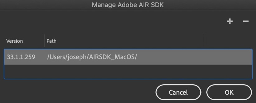
Figure 13.5 – Our new AIR SDK version is installed
- The SDK version and path will appear for the chosen SDK. Click OK to close the dialog.
The AIR SDK is now integrated within Adobe Animate, but we will likely need to provide additional permissions to run and test any documents we create.
Before we do that, we'll need to create a new AIR document and perform some basic configuration to set up our project.
Configuring an AIR for Desktop Project
With at least one version of the AIR SDK installed, we can now create and manage AIR for Desktop, AIR for iOS, and AIR for Android documents. While you might think you have to make platform decisions at this point, these three choices can always be modified even when your application development is complete by switching the target platform. We'll see how to do this at the end of the chapter.
Let's create a new AIR for Desktop document to work with in this chapter:
- Open the New Document dialog once again by choosing Create New or More Presets… from the Home screen in Animate.
- Select the Advanced category and choose AIR for Desktop from the document types listed within:

Figure 13.6 – AIR documents can now be created
Because we have at least one version of the AIR SDK installed and ready to go, Animate now displays the document details along with a Create button.
- Click the Create button to have Animate generate a new AIR for Desktop document.
- In the Properties panel, change the width to 500 pixels (px) and the height to 700 px. Change the background color to black (#000000):

Figure 13.7 – AIR document settings
- Save your document by choosing File | Save from the application menu and provide a meaningful name. I suggest something such as PhotoBrowser.fla for a filename.
Aside from these basic document settings, we'll also add a text-based header to the application to provide it with more of a visual identity before laying out all the interactive components in the next section.
To create a text header for the application, perform the following steps:
- Select the Text tool from the toolbar.
- In the Tool tab of the Properties panel, configure the tool by choosing a font, size, and color:
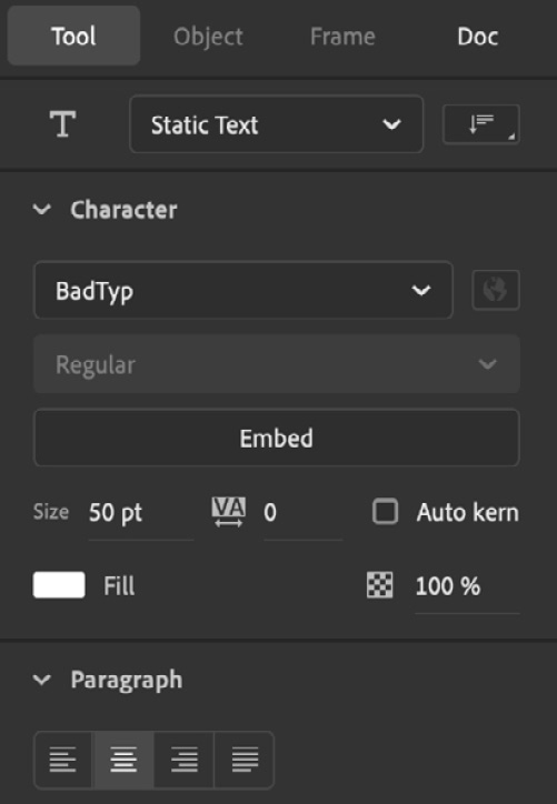
Figure 13.8 – Text tool settings
The text object is non-interactive, so should be set to Static Text. I've chosen an Adobe font called BadTyp (https://fonts.adobe.com/fonts/badtyp) for the text header, made its size 50 pt, and have set the fill color to white (#FFFFFF). In the Paragraph section, I've chosen to Center Align my text.
- Click and drag a new text object across the stage and type PHOTO BROWSER:

Figure 13.9 – The application header
The text object is nearly the size of our stage and the text remains centered.
- Check the Object tab of the Properties panel with the text object selected to verify its Position and Size properties:

Figure 13.10 – Header position and size
The width should be 464 px with an X value of 18 and a Y value of 20. This will position the header down the stage a little bit while also centering it within the application.
Our AIR project is now configured with the appropriate Document Settings and a nice title header for the application.
Testing Your AIR Project
Before we conclude this section, we should ensure that we are able to run the AIR project effectively in order to test features as they are built.
To test an AIR document, the process is very similar to any other document type we've seen. Click the Test Movie button in the upper-right corner of the Animate interface, or you can have finer control over how you test by selecting Control | Test Movie and choosing an option from the menu that appears, as illustrated in the following screenshot:
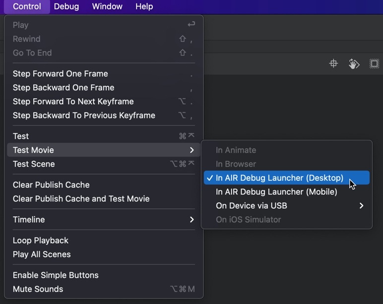
Figure 13.11 – Test Movie menu options
Here is a quick overview of the options presented by this menu:
- In AIR Debug Launcher (Desktop) is the default for AIR for Desktop applications and launches in a very similar way to an ActionScript 3.0 document.
- In AIR Debug Launcher (Mobile) is the default with AIR for iOS or AIR for Android applications and includes a mobile device simulator.
- On Device via USB is an additional option with AIR for iOS or AIR for Android and allows you to test mobile applications directly on device hardware connected by a Universal Serial Bus (USB) cable.
If you are using Adobe Animate on Apple macOS and have downloaded and added the AIR SDK from the internet, you will likely be presented with a number of security warning dialogs when attempting to run an AIR document with the Test Movie option for the first time, such as the following one:

Figure 13.12 – macOS security warning dialog
If this occurs, simply open your Apple macOS System Preferences and locate the Security & Privacy option. From here, choose the General tab and look at the section with the text Allow apps downloaded from, and you should see an alert about either the AIR Debug Launcher (ADL) or the AIR framework processes:

Figure 13.13 – Choosing the Allow Anyway option in Security & Privacy
Choosing Allow Anyway will grant permission for these processes to run without problem from Animate. Depending upon how many dialog warnings you receive, you may need to allow multiple processes before macOS stops alerting you of these processes.
When using Windows, simply provide permission to these processes if prompted by the system dialogs. It is normal for everything to just work without any additional procedures when developing AIR projects on Windows.
In accordance with the documentation from HARMAN, you may want to make one additional change to your application before testing. Choose File | AIR for Desktop Settings to open the AIR Settings dialog. Be sure to choose Application with runtime embedded as the Output as option, as illustrated in the following screenshot:

Figure 13.14 – Setting the application to compile using embedded runtime
This will ensure that your application will compile and run properly in the current and future versions of AIR provided by HARMAN.
In this section, we downloaded and installed an AIR SDK within Animate, allowing us to create AIR documents. We also created and configured a new AIR for Desktop project, added an application title header, and explored the AIR testing options. Coming up, we will focus on the elements required in our application interface to allow a user to interact with the application.
Building a User Interface
In this section, we'll focus on all the interactive parts of the interface we'll build for our AIR application, starting out with a look at how to construct Button symbols, followed by the use of precompiled UI Components, and wrapping up with a more in-depth look at advanced Movie Clip symbol properties.
Let's start off by building a Button symbol that a user will click to choose a folder of photographs within the application.
Working with Button Symbols
Button symbols are not supported in every document type in Animate and are pretty unique as their internal timeline is constrained to four isolated states. Nonetheless, Button symbols are very useful for applications such as the one we are building in this chapter.
The easiest way to start building a Button symbol in Animate is by creating a simple shape:
- Choose the Rectangle Primitive tool from the toolbar:

Figure 13.15 – The Rectangle Primitive tool
- Look at the Tool tab of the Properties panel and set the Rectangle Options value to 4 to enable slightly rounded corners. Set the fill color to a dark gray (#595959) color.
- Draw a Rectangle Primitive across the stage slightly less than its width:

Figure 13.16 – A Rectangle Primitive object
- The object should measure 480 x 60 and have an X position of 10 and a Y position of 150. Verify this through the Properties panel.
- Select the object and choose Modify | Convert to Symbol to summon the Convert to Symbol dialog, as follows:
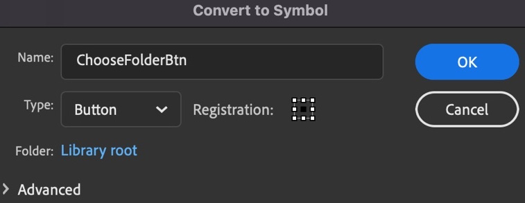
Figure 13.17 – The Convert to Symbol dialog with Button chosen as the type
In the dialog, name the new symbol ChooseFolderBtn, since this is the button a user will click to choose a folder of files. We are creating a Button symbol, so be sure the Type selection is set to Button.
- When finished with the dialog, click OK to create a new Button symbol. The Rectangle Primitive object on the stage becomes a Button symbol instance.
- With the instance still selected, in the Object tab of the Properties panel, enter an instance name of ChooseFolder:
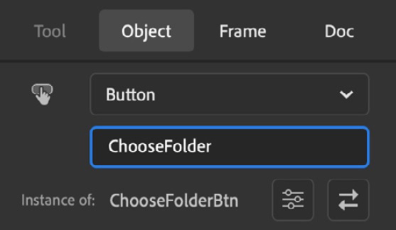
Figure 13.18 – Button with a provided instance name
Recall that providing a movie clip or Button symbol instance with an instance name will allow us to address this object with code.
With our Button symbol created, we can now enter into its internal timeline and complete setting up our button to provide it with a set of interactive states and a text label so that the user knows what the button's function is.
- Double-click the button instance on the stage to enter the symbol and look at the timeline.
- Rename the existing layer Skin as this will hold our button skin variants. Notice that the Button symbol timeline includes four distinct frames with names above each one: Up, Over, Down, and Hit.
- Duplicate the initial keyframe at frame 1 across all four frames by clicking the Insert Keyframe button with frame 1 selected. All four keyframes are identical.
- With each keyframe, we are going to change the color of the shape fill on that keyframe to distinguish between button states, as follows:
a) Up—Leave the color at #595959. This is our resting state.
b) Over—Change the color to a lighter gray color at #999999. This is the hover state.
c) Down—This is the state of the button when pressed. It will be a darker gray fill color at #333333.
d) Hit—You can leave this be, but I like to change any non-visible elements to a vivid green (#00FF00). The Hit state is not rendered visually and determines which pixels count toward interaction with a mouse cursor. You can make the Hit state a completely different shape from the visual elements, but in this case, we want it to be identical.
- Create a new layer above the Skin layer and rename it Text.
- Within the Text layer, use the Text tool to create a simple button label that reads Choose Photograph Folder, as illustrated in the following screenshot:

Figure 13.19 – The completed Button timeline
Use whichever text settings look good. I used a 27 pt, Arial Black font with a completely black fill. Notice that this text spans all four states, though you could create keyframe variants with this layer as well, if desired.
When your internal button timeline is complete, click the Scene 1 label in Edit Bar above the stage to return to the main timeline.
One of our three user interface elements is now complete. For the remaining two elements, we will use prebuilt Components.
Using Components within an AIR Project
Components are a feature of HTML5 Canvas, ActionScript 3.0, and AIR documents. They are prebuilt, modular packages that generally serve a single function. Some function as video playback or a progress bar, or even a data grid or media display mechanism, as we'll see for this project.
Note
The set of available components will differ drastically between HTML5 Canvas documents and all other document types that support the use of components.
We will make use of two different components in this project: the DataGrid component and the UILoader component. Proceed as follows:
- To access any components in an AIR document, we must first open the Components panel. To do so, choose Window | Components from the application menu. You should then see a screen like this:
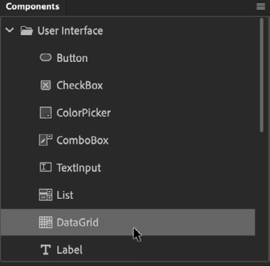
Figure 13.20 – The Components panel
The Components panel lists a number of different component types. We will be using components from the User Interface folder.
- The first component to locate is the DataGrid component. This component is useful for displaying data in columns and rows. Drag an instance of the DataGrid component onto the stage. A placeholder is now visible on the stage.
- Select the component instance on the stage and set its properties in the Properties panel. The width should be 480, with a height 160, and the position should have an X of 10 and a Y position of 220. This places it nicely below the Button instance. Give it an instance name of PhotoGrid.
- The second component to locate is the UILoader component. This component is useful for displaying images and other media. Drag an instance of the UILoader component onto the stage, as follows:

Figure 13.21 – A UILoader instance placed on the stage
A placeholder for this component instance will be visible on the stage.
- Select the component instance on the stage and set its properties in the Properties panel. The width should be 480, the height 300, and it should have an X position of 10 and a Y position of 390. Give it an instance name of PhotoViewer. This places it directly below DataGrid.
- While we can adjust general settings for components within the Properties panel, we need to adjust component-specific settings for our DataGrid component. In order to do this, we will need to invoke the Component Parameters panel. With the DataGrid instance selected on the stage, you will find the Component Parameters button in the Properties panel. It's the one that looks like this:

Figure 13.22 – The Component Parameters button
This opens the Component Parameters panel and displays all parameters for the selected DataGrid component.
- We only need to tweak two of these parameters. Set rowHeight to 40 and horizontalScrollPosition to off. Some of the component parameters can be seen in the following screenshot:

Figure 13.23 – Component parameters
These settings will make each piece of data more clickable, especially if we were to publish this app to a mobile device. UILoader does not require any parameter adjustments. You may need to scroll down in the Component Parameters panel to locate both parameters.
The UI elements of our AIR application are now in place and the project is ready for programming with ActionScript. Here's what it looks like now:

Figure 13.24 – The completed layout
Our UI elements have now been established within the project layout. Before moving on to the next section though, we should explore some additional properties of movie clip symbols, as they are also incredibly useful in building application interfaces.
Exploring Advanced Movie Clip Symbol Settings
We've now established our application interface through the use of Button symbols and components. If you look in the Properties panel with a component selected, you'll discover that these components are actually Movie Clip symbols! Additionally, in place of any of the objects we've used for the layout, Movie Clip symbols are always a great choice for custom interactive controls in AIR applications.
While we aren't going to be using these advanced settings for Movie Clip symbols in this project, it is good to know about them—especially with the relationships that exist between Movie Clip symbols and components.
With the more common Movie Clip settings covered in Chapter 5, Creating and Manipulating Media Content, let's expand on that overview and have a look at the Advanced settings of Movie Clip symbols available to us. To access these advanced properties, select a Movie Clip symbol in the Library panel, right-click to open the contextual menu, and choose Properties…. Once the dialog appears, expand the Advanced settings section.
The first section of the Advanced settings is the most important and appears at the top of the expanded portion of the dialog, as illustrated here:

Figure 13.25 – Movie Clip Advanced settings
The first option you see here is actually more of a design setting than anything to do with development. When enabled, the Enable guides for 9-slice scaling option will allow you to enter into a symbol from the Library panel and modify a set of guides to specify which visual areas of your symbol should scale and which should stay their original size if an instance of the symbol is scaled. This allows a good amount of control for properly resizing UI elements that you create so that different sized instances can easily be created upon the stage from the same exact symbol. This is only available with ActionScript 3.0-based documents.
Below this are the ActionScript Linkage settings:
- Export for ActionScript—This generates a LinkageID property in the Library panel that allows symbol instantiation through code, just as we did with JavaScript in Chapter 11, Developing Web-Based Games.
- Export in frame 1—This makes a symbol marked for export available for instantiation at the beginning of the timeline. Notice that our app exists on a single frame; this is very important for single-frame projects, especially in conjunction with the use of LinkageID.
- Class—You can specify a custom ActionScript 3.0 class for your symbol, otherwise Animate will generate a default one for you.
- Base Class—This is the class that your custom class extends through ActionScript code. It appears in the form of a package, and the default for a Movie Clip symbol is flash.display.MovieClip.
Again, most of these options have to do with ActionScript development. While very convenient, unless you are creating applications or games using AIR, as we are in this chapter, they likely will not matter much.
Following the ActionScript Linkage settings are two additional groups of settings:
- Runtime Shared Library—This option will package up your symbol into a Shockwave Flash (SWF) file, which you can then make available as an online resource only for the intention of sharing linked symbol assets at runtime. This was heavily used while Flash Player was popular but is no longer very useful.
- Authortime Sharing—Somewhat similar to sharing assets at runtime, this option allows the creation of a symbol package that you can share among Animate users to access various shared symbols during authortime, within Animate itself. This fact alone makes this a much more valuable feature and can even be used in other document types, such as HTML5 Canvas.
Most Animate users will have no need for either of these settings, but it is good to be aware of what each is for.
Note
Again, while we won't be using Movie Clip symbols in our project, apart from the existing components, it is good to have an understanding of their advanced properties and settings.
In this section, we built out our entire user interface using custom Button symbols and prebuilt components. We also had a look at advanced symbol properties that tie directly into ActionScript programming. Coming up, we'll start writing all the ActionScript code to drive the functional aspects of the application.
Programming an AIR Application
In this section, we'll use ActionScript to tie all of our interface components together into a unified application. ActionScript is similar to JavaScript in some ways (they are both based on ECMAScript), but very different in other ways, since both are derived from different branches of the specification.
While we could write all of our ActionScript code using frame scripts, it is better to leverage the Object-Oriented Programming (OOP) features that are so prominent in the language and create a Document Class.
Establishing a Document Class
We'll now create a document class and bind it to our .fla document. The document class will exist as a .as file separate from the .fla file. When you use a document class for your project, it must extend either the MovieClip or Sprite classes, depending upon whether you require animation or not in your main document timeline. Extending one class with another will give you access to all the functionality you write, plus all the functionality that is within the base class. It's a powerful way of programming!
Let's go ahead and instruct Animate to create a new Document Class for us:
- Open the Publish Settings dialog from the More Settings button in the Doc tab of the Properties panel.
- Within the Publish Settings dialog, locate the Script selection dropdown and click the small wrench icon to the right of it:

Figure 13.26 – AIR Publish Settings dialog
- This opens the Advanced ActionScript 3.0 Settings dialog:
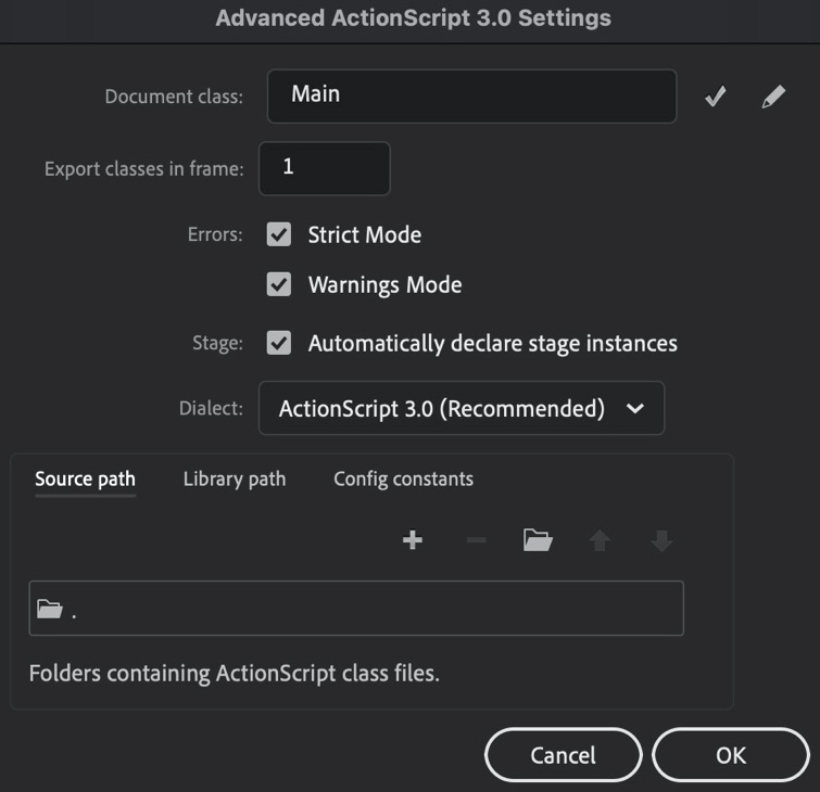
Figure 13.27 – Advanced ActionScript 3.0 settings
This dialog contains imported ActionScript settings for your project. You'll want to check and be sure that Export classes in frame is set to 1 and that Automatically declare stage instances is selected. They should be selected by default, but it never hurts to check.
- In the Document Class input, type in Main for a class name and click the small pencil icon next to it to edit the class definition.
You will likely receive a warning from Animate informing you that it cannot find the specified class file. This is expected, as we have yet to save it! Dismiss the warning dialog if it appears.
A new ActionScript class appears within Animate.
- Click OK to commit your choices, and you'll be left looking at the actual starter code for your class fully displayed with Animate. Notice this is very different from writing code in the Actions panel as your new class opens as a full ActionScript document within the interface.
- Save the class using File | Save and name the file Main.as since a class filename in ActionScript must be identical to the internal class name reference. The filename and class name are both Main.
The newly created document class will look like this:
package {
import flash.display.MovieClip;
public class Main extends MovieClip {
public function Main() {
// constructor code
}
}
}
This is boilerplate code that defines a Document Class named Main, which extends flash.display.MovieClip. Note that we also have to import flash.display.MovieClip in order to use it. Within the class is a single function called a constructor function. Any code within this function runs immediately upon initialization.
Note
Any additional functions we create later will go below the constructor function, one after the other. These functions and any variables created must all exist within the class definition.
Be sure that the class Target dropdown is set to bind to your Animate document named PhotoBrowser.fla:

Figure 13.28 – The target of Main.as is PhotoBrowser.fla
Once everything looks to be set, we can move on to write the rest of our application code within the Main class.
Writing ActionScript Code
The first task we have is to import a set of additional classes to be used within the application. Type the following import statements directly beneath the existing import:
import flash.filesystem.File;
import fl.controls.DataGrid;
import fl.data.DataProvider;
import fl.containers.UILoader;
import flash.events.MouseEvent;
import flash.events.Event;
import flash.events.FileListEvent;
We'll touch upon each of these classes as we get to them in the various functions we'll define further on.
Directly following public class Main extends MovieClip {, enter a set of variable declarations, as follows:
var photoDirectory:File;
var photos:Array;
var photoGridProvider:DataProvider;
These are class-level variables that are accessible from any function within the class. photoDirectory:File will be used to reference a selected folder, photos:Array will hold references to each image file we find, and photoGridProvider:DataProvider will be used to display these files within our DataGrid component.
Note
Variables and other references in ActionScript must be assigned a type through the use of a colon after the name is declared—as AS3 is a strongly typed programming language.
The next lines of code will go directly within our constructor function beneath the line that reads public function Main() {:
ChooseFolder.addEventListener(MouseEvent.CLICK, chooseDirectory);
PhotoGrid.addEventListener(Event.CHANGE, photoSelected);
PhotoGrid.columns = ["Name", "Type", "Size"];
photos = new Array();
photoGridProvider = new DataProvider();
PhotoGrid.dataProvider = photoGridProvider;
The first line adds a MouseEvent.CLICK event listener to the ChooseFolder button symbol instance. When a click is detected, we will invoke a function named chooseDirectory. We also add an Event.CHANGE listener to the PhotoGrid DataGrid component instance. When the selection is changed by the user, the function named photoSelected will fire off. We also set the column names within PhotoGrid directly afterward to Name, Type, and Size.
The remaining lines of code instantiate the class-level variables declared previously.
All that is left is to write the various functions referenced in our listeners and any additional functions they will need to invoke. Add a few line breaks following the closing curly braces below the constructor function to make room, as illustrated here:
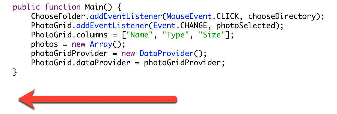
Figure 13.29 – Insert the next function here
We'll begin with the chooseDirectory function and will place it directly after the closing curly brace of the constructor function, as follows:
private function chooseDirectory(e:MouseEvent):void {
photoDirectory = new File();
photoDirectory.addEventListener(Event.SELECT, directorySelected);
photoDirectory.browseForDirectory("Select Photo Folder...");
}
Here is where the photoDirectory file variable is instantiated. This will clear out any existing references from a previous folder selection. We then add a listener to this file of the Event.SELECT type, which will trigger when a new folder is selected and will invoke a function called directorySelected. We have to open a system-level file explorer in order for the user to browse the filesystem and make a folder selection, so use the browseForDirectory() method of the File class to do so.
We'll next write a directorySelected function in response to the folder selection. Place the following code directly beneath the previous function:
private function directorySelected(e:Event):void {
photoDirectory.getDirectoryListingAsync();
photoDirectory.addEventListener(FileListEvent.DIRECTORY_ LISTING, directoryListed);
}
In this function, we first invoke the getDirectoryListingAsync() method to get a list of all the files within the selected directory. We need to listen for an event to tell us when this process has been completed so that we can perform further manipulation on the file references, so listen for the FileListEvent.DIRECTORY_LISTING event, and this will invoke the directoryListed function once it is safe to do so.
The directoryListed function will do most of the work in this application. We'll write it directly beneath the previous function, as follows:
private function directoryListed(e:FileListEvent):void {
photos = new Array();
for(var p:uint = 0; p<e.files.length; p++){
if(e.files[p].extension == "jpg" || e.files[p]. extension == "png" || e.files[p].extension == "gif") {
photos.push(e.files[p]);
}
}
photoGridProvider.removeAll();
for(var i:uint = 0; i<photos.length; i++){
photoGridProvider.addItem({"Name":photos[i].name, "Type":photos[i].extension, "Size":photos[i].size});
}
}
In this function, we start by clearing out the photos array to prepare it for holding the valid image file references from our FileListEvent, which was triggered from the initial folder selection.
We then set up a for loop to iterate over all the files that were detected within this folder. for loops in ActionScript work exactly like they do in JavaScript, if you recall their usage from Chapter 11, Developing Web-Based Games. For each iteration, we check the file extension to determine whether or not it is an image file using the or operator, a double pipe: ||. If it is, we then add the file reference to our photos array.
Once the array is built, containing only image files from the chosen folder, we can populate our DataGrid component with data. First, we will remove any existing data from photoGridProvider so that it is empty. We then run another for loop, but this time it simply adds information about each image file to photoGridProvider, which is then reflected within the visible DataGrid component for the user to select.
The final function to write is the one that is invoked when the user selects an image reference from the DataGrid component. Place the following function directly beneath the last one:
private function photoSelected(e:Event):void {
var selectedPhoto:File = photos[e.target.selectedIndex];
PhotoViewer.source = selectedPhoto.url;
}
This function simply creates a new File variable reference called selectedPhoto and populates it with data from a certain position of the photos array, which matches the row selected by the user as part of the visible DataGrid component on the stage. The source property of our PhotoViewer UILoader component on the stage is then set to the url property of that File reference, thereby rendering the visible image within the UILoader component for the user to view.
For reference, here is the full, completed code for the Main.as class:
package {
import flash.display.MovieClip;
import flash.filesystem.File;
import fl.controls.DataGrid;
import fl.data.DataProvider;
import fl.containers.UILoader;
import flash.events.MouseEvent;
import flash.events.Event;
import flash.events.FileListEvent;
public class Main extends MovieClip {
var photoDirectory: File;
var photos: Array;
var photoGridProvider: DataProvider;
public function Main() {
ChooseFolder.addEventListener(MouseEvent.CLICK, chooseDirectory);
PhotoGrid.addEventListener(Event.CHANGE, photoSelected);
PhotoGrid.columns = ["Name", "Type", "Size"];
photos = new Array();
photoGridProvider = new DataProvider();
PhotoGrid.dataProvider = photoGridProvider;
}
private function chooseDirectory(e: MouseEvent): void {
photoDirectory = new File();
photoDirectory.addEventListener(Event.SELECT, directorySelected);
photoDirectory.browseForDirectory("Select Photo Folder...");
}
private function directorySelected(e: Event): void {
photoDirectory.getDirectoryListingAsync();
photoDirectory.addEventListener(FileListEvent.DIRECTORY_LISTING, directoryListed);
}
private function directoryListed(e: FileListEvent): void {
photos = new Array();
for (var p: uint = 0; p < e.files.length; p++) {
if (e.files[p].extension == "jpg" || e.files[p].extension == "png" || e.files[p].extension == "gif") {
photos.push(e.files[p]);
}
}
photoGridProvider.removeAll();
for (var i: uint = 0; i < photos.length; i++) {
photoGridProvider.addItem({
"Name": photos[i].name,
"Type": photos[i].extension,
"Size": photos[i].size
});
}
}
private function photoSelected(e: Event): void {
var selectedPhoto: File = photos[e.target.selectedIndex];
PhotoViewer.source = selectedPhoto.url;
}
}
}
Once all of your code is written, perform a Test Movie and locate a folder of image files on your system to see the application in action:
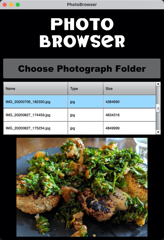
Figure 13.30 – The completed application
In this section, we created our Document Class in ActionScript, bound it to our project, and then wrote all of the code necessary for our application to function. Coming up, we will finish off this chapter with a look at how to convert our AIR for Desktop project to be used on mobile devices.
Converting an AIR Application for Mobile Devices
We developed our application using AIR for Desktop, but it is possible to create versions of the application using AIR for iOS and AIR for Android so as to target mobile devices as well. Since the underlying code is all ActionScript, and AIR includes the capabilities of publishing ActionScript to mobile platform packages, we can often convert our documents without much hassle.
Note
For a refresher regarding the various platforms that AIR can target, you may want to refer to Chapter 2, Exploring Platform-Specific Considerations, and locate the sections on Adobe AIR. To further explore the publish settings available across different AIR targets, refer to Chapter 4, Publishing and Exporting Creative Content.
In order to convert a document from one AIR target to another, perform the following steps:
- With the existing project open, choose File | Save As… from the application menu and save a copy of your .fla file with a meaningful name.
Note that this .fla file will still make use of the Main.as file for all functionality, so you will likely want to re-engineer your class file to be more modular or simply have a unique Document Class for each version of the app.
- Open the Publish Settings dialog from the More Settings button in the Doc tab of the Properties panel.
- Within the Publish Settings dialog, locate the Target selection dropdown and select it to locate alternative AIR runtimes, such as AIR for Android or AIR for iOS, as illustrated in the following screenshot:

Figure 13.31 – Changing the target in Publish Settings
- Click OK and the dialog disappears. Your document will now publish to the platform you've chosen.
Note
Publishing to mobile platforms is complicated, and you will need to register as a developer with Apple or Google to do so. This also involves paying a fee and installing a code-signing certificate. These steps are beyond the scope of this book.
You will likely want to consider some of the mobile-specific classes in ActionScript when looking through your code and testing against mobile hardware. You will also need to take screen size and dynamic interface scaling and positioning into consideration. There is a lot to think about!
Of course, there is a lot more to know about design and development for mobile devices. While such topics are beyond the scope of this book, there are many other resources dedicated to such development.
Tip
I cover a number of mobile-specific design and development considerations and functionalities in my book, Flash Development for Android Cookbook, which is focused on AIR for mobile devices: https://www.packtpub.com/product/flash-development-for-android-cookbook/9781849691420.
In this section, we converted our AIR for Desktop project to target mobile devices through AIR for iOS and AIR for Android.
Summary
In this chapter, we wrote an entire application from scratch using Adobe AIR! We first downloaded and installed an AIR SDK within Animate and then created a new document with that SDK and configured it for desktop usage. Following this, we built the application interface with the use of button symbols and special premade Movie Clip packages called components. Next, we created a new ActionScript class and wrote all of our application code to develop a fully functioning application. Finally, we had a look at how to convert our desktop project for use on mobile devices using the same AIR technologies.
The final chapter of this book is next, in which we'll explore a number of neat ways of extending Adobe Animate yourself or through the work of others.