
Chapter 3
Adding Shapes, Paths, and Custom Shapes
IN THIS CHAPTER
 Editing shapes
Applying fills
Applying borders
Customizing and saving shapes
Using the Pen tool
Discovering Pen tool tips and tricks
You can create your artwork, such as squares, circles, custom shapes, and paths, right in Adobe XD. If you are familiar with Adobe Illustrator, the tools in XD will be relatively easy for you to learn. Keep in mind that you can also create your shapes in Illustrator and copy and paste them right into Adobe XD as well.
It All Starts with a Shape
In this chapter, you discover how to use the Rectangle, Ellipse, Line, and Pen tools to create custom shapes and paths. These shapes can be used for creating UI such as buttons and menus, as well as custom shapes for creating masks.
The basic shapes
You can create a shape such as a rectangle or ellipse simply by selecting the tool from the Tools panel and clicking and dragging where you would like to place the shape on your artboard. Simply by clicking and dragging from the upper-left corner to the lower right, you can create a typical rectangle or oval. Try any of these tips to create rectangles that are more controlled in size:
- Shift-drag to make a perfect square of circle.
- Alt (Windows) or Option (Mac) and drag to pull the shape from the center.
- Alt+Shift (Windows) or Option+Shift (Mac) to pull a perfect square or circle from a center point.
Determining the size
After you have created the square or circle, you can check and change the size by using the Properties panel. In Figure 3-1, you see an active rectangle and its W (Width) and H (Height), as well as its positioning, which is represented in the X and Y coordinates.
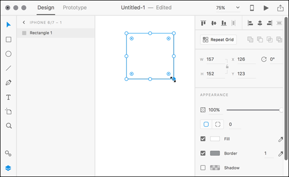
FIGURE 3-1: After you have created a shape, you can see and change properties such as width, height, and positioning.
Note: The shape tools are sticky, and the tool will remain selected until you switch to another tool such as the Select tool. Keep this in mind because if you try to move your shape, you may just accidently create another shape.
Creating a Button
For this section, you are directed through the steps to create a simple button with a solid fill and some text. You will have the opportunity to learn more about more advanced fills later in this chapter:
-
Select the Rectangle tool and click and drag to create a rectangle of any size on an artboard.
In this example, we selected the standard iPhone 6 template.
- With the rectangle still active, type 200 into the Width textbox and 70 into the Height textbox. Press Tab after you type each to confirm the value.
Applying a solid fill
In this section, you add a solid fill color to your shape:
- Make sure your rectangle is still selected. Click the white box to the left of Fill in the Properties panel to open the color picker.
-
Scroll through the colors by clicking and dragging on the Hue slider. After you have entered the hue color that you like, click a color in the color panel to apply it to your rectangle.
 You can save colors that you might use often by clicking the Save Color Swatch plus sign at the bottom of the color picker, shown in Figure 3-2. You can apply transparency to your fill by using the slider on the right side of the color picker window.
 - Uncheck the checkbox to the left of Border to remove the stroke around the rectangle.
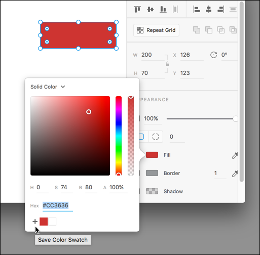
FIGURE 3-2: Apply a color with the color picker. Save a color by clicking on the Save Color Swatch + sign.
Rounding your corners
You can leave the corners square or follow either of these next steps to round the corners of the shape:
-
You can round corners visually by clicking and dragging the corner widgets inside the corners of the rectangles, as shown in Figure 3-3.
Hold down the Alt (Windows) or Option (Mac OS) key and drag one corner radius to make it an independent value. - You can also enter values for your corner radius entering values in the Corner Radios textboxes in the Properties panel. Notice in Figure 3-4 that you can enter different values for different corners.

FIGURE 3-3: Click and drag the corner widgets to round your corners.
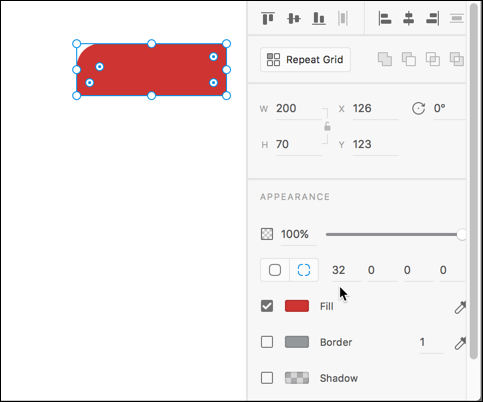
FIGURE 3-4: Enter values into the Properties panel to add varying sizes in the corner radius.
Adding text to your button
Now you add the text to the button:
- Select the Type tool from the Tools panel and then click inside your button. A text cursor appears. Don’t worry about the exact placement of the textbox because this can be moved later.
- Type the word Submit, and then select the text by pressing Ctrl+A (Windows) or Command+A (Mac).
-
With the word selected, change the properties in the Text area of the Properties panel, as shown in Figure 3-5, to select a font and a type size you like. You can also change the alignment by selecting the Left Align, Center, or Right Align buttons.
You can select your current font size in the Font size textbox and press the arrow up or down to increase or decrease the font size. - Click on the Fill box to change the color of your text.
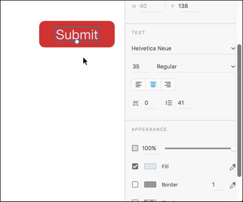
FIGURE 3-5: Select your type properties using the Text section in the Properties panel.
Creating a Border
A border, also known as a stroke, can be applied to any of your shapes and paths. When you create a border, you select both the width and color.
- If you still have your button selected, make sure the checkbox is on to the left of the Border in the Properties panel; then click the box to the right of the checkbox to open the color picker and select a color that you would like to use for your border.
- To select a width, type a value into the Width textbox.
Sampling a color using the eyedropper
Both the Fill and the Border have an eyedropper icon positioned off to the right. You can select the Eyedropper tool in the Properties panel and then click on any color located within your current project. This can be helpful when you have imported images that you want to sample colors from, as shown in Figure 3-6, or if you are trying to match controls that were created in a different application.
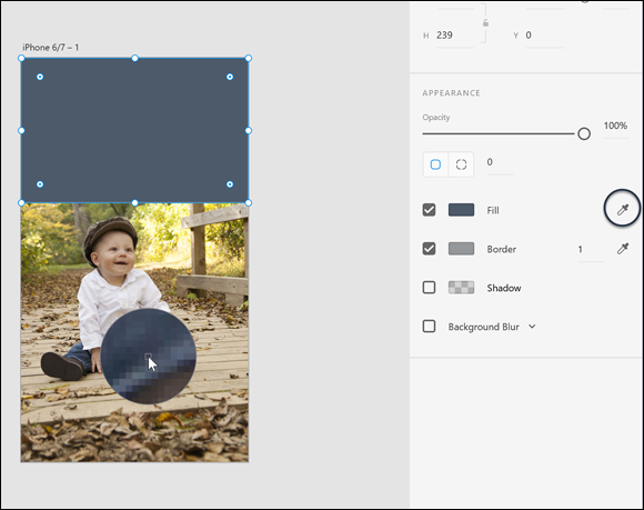
FIGURE 3-6: Use the eyedropper to sample colors from your project.
Creating a gradient
Adobe XD includes advanced tools that make it simple to create gradients. To create and use a gradient in your project, follow these steps:
- Select a shape. At the time of writing, a gradient can only be applied to a fill.
- Click the box to the left of Fill in the Properties panel to open the color picker.
- Click Solid Fill at the top of the picker and select Gradient from the menu that appears, as shown in Figure 3-7. A gradient ramp appears with default colors.
- You can either click the gradient ramp at the top of the color picker to add colors, or click directly on the gradient annotator that appears inside the fill of your object, as you see in Figure 3-8.
- After you click to add a color stop, you can then use the picker to select a color. Continue adding color stops with various colors if you like. Click and drag the color stops to reposition them.
- Remove any unwanted color stops by selecting one and then pressing the Delete or Backspace key.
- Choose a level of transparency by selecting a color stop, and then dragging up or down in the transparency slider on the right side of the color picker.
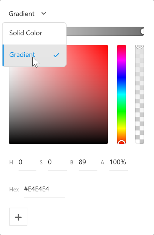
FIGURE 3-7: Select Gradient from the color picker.
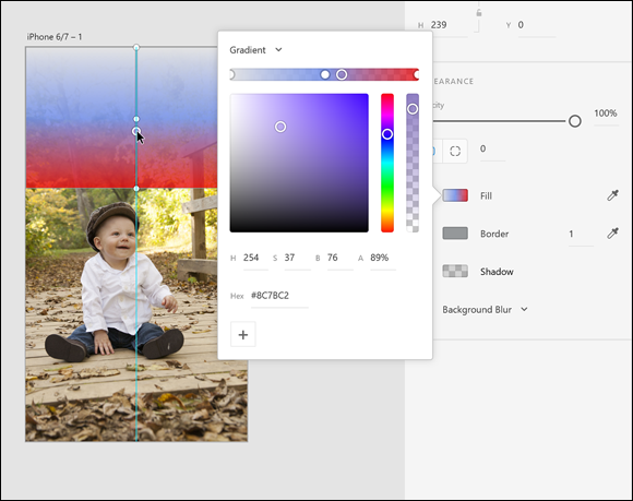
FIGURE 3-8: Click to add color stops to your gradient.
Using the Pen Tool
Using the Pen tool in Adobe XD is very similar to the experience you would have with the Pen tool in other Adobe applications. In this section, you are provided with simple tips in order for you to create your own custom shapes and paths with the Pen tool. See Chapter 4 in Book 5 for Illustrator for more in-depth features that you can take advantage of with the Pen tool in all the Adobe applications.
- Create a straight path by clicking a start point and then Shift-clicking to create an end point. This creates a path that is either perfectly straight, 45 degrees, or 90 degrees.
- If you want to stop the Pen tool without closing a shape, in order to create a straight line, for instance, simply press the Esc key.
- When you make a mistake, press Ctrl+Z (Windows) or Command+Z (Mac) in order to undo the step; keep the Pen tool active so you can continue creating your path.
- Create a curved, Bézier path by clicking and dragging, as shown in Figure 3-9.
- Change the direction of a path by Alt (Windows) or Option (Mac) clicking and dragging on the directional line. (See Figure 3-10.)
- Create a closed shape by clicking and connecting from one point to another. Closed shapes can be filled to create UI elements and masks, as shown in Figure 3-11. More about images and masks is covered in Chapter 5 of this minibook.
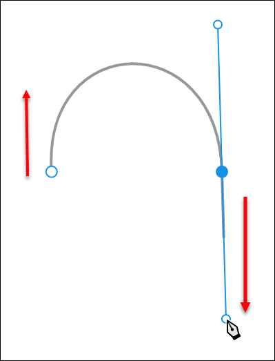
FIGURE 3-9: Click and drag with the Pen tool to create a custom Bézier path.
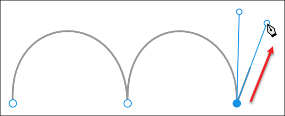
FIGURE 3-10: Hold down the Alt or Option key to change the direction of your curved Bézier path.

FIGURE 3-11: The Pen tool can be used to create custom shapes in XD.
Creating Custom Shapes with the Path Tools
If your goal is to create a custom shape without using the Pen tool, you can take advantage of the Object⇒Path menu items.
To use this menu, you create two or more shapes that you would like to unite together (Add), subtract one from another (Subtract), save only the intersection of several shapes (Intersect), exclude the overlap of several shapes (Exclude/Overlap), or convert a shape to a path so that you can edit it more freely using the Select tool (Convert to Path).
See Figure 3-12 for examples of examples of these path selections.
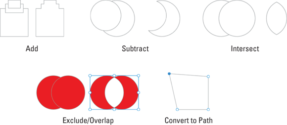
FIGURE 3-12: Examples of the Path tools in the Path menu item.