
Chapter 6
Adding Text to Your XD Project
IN THIS CHAPTER
![]() Reviewing importing onscreen text properties
Reviewing importing onscreen text properties
![]() Adding and stylizing your text
Adding and stylizing your text
![]() Importing text
Importing text
![]() Using the Repeat Grid feature
Using the Repeat Grid feature
![]() Importing updated text into your repeated grid
Importing updated text into your repeated grid
Text in Adobe Experience Design (XD) is used for UI elements such as buttons, for navigational elements such as links to other content, and for general content such as descriptions, directions, lists, and more. In this chapter, you find out how to add text to your UI and control the look using the Properties panel. You also discover how to import text from other sources and create a repeated list of items using the Repeat Grid feature. Keep in mind that the Adobe Experience (XD) application is continually changing through its development, so you may see slight changes in UI.
Adding Text Right in Adobe XD
Adding text is just a matter of selecting the Text tool from the Tools panel and then indicating where you want it placed on your artboard by either clicking or clicking and dragging.
You can see the difference between the methods in Figure 6-1. When you click to create a text insertion point, the text width area is undefined and will run on in a line until you press the Return key. If you want to control the column width, you typically would click and drag to create your text area. The text area can be adjusted using the handles to be larger or smaller.
In Figure 6-1, the text in the top line will go off the artboard unless you create a manual return. The text area in the bottom of the screen allows you to control width and height of the text area with handles.
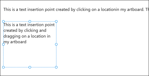
FIGURE 6-1: Comparing clicking and clicking and dragging to insert text.
Adjusting Text Properties
When you have text in your project, you can start changing the text properties. These properties include Font Family, Font Size, Font Weight, Alignment, Character Spacing (kerning and tracking), Line Spacing (leading), Fill, Border (stroke), Shadow (drop shadow), and Background Blur. So let’s review how those properties are applied.
About readability and font selections
The selection of a font is of critical importance. You may have many font choices in your system, but only a select few will cut it as a successful choice for onscreen reading. Some characteristics to look for in your font selection include the following:
- Serif or non-serif? In Figure 6-2, you see a font family in the serif style on the top and one in sans serif on the bottom. Serifs have a slight projection that finishes off a stroke of a letter. Sans serif, on the other hand, does not have that slight projection. Sans serif typefaces tend to look more modern and are a popular choice for interactive applications and websites. In the past, it was believed that font families with serifs were easier to read when there was a large amount of text. Tests performed with eye-tracking devices have proven that there is no major difference in readability between serif or sans-serif, so feel free to pick either style as long as you pay attention to some of the other font characteristics that follow.
- Straight, even line widths: Because your type is going to be created from pixels, it is best not to have lots of variation in the width of your text. In Figure 6-3, you can see the difference, in a pixel preview, between a font choice with variation in the width (top) and a font that is consistent in its width.
- Strong counters: Counters are the holes that you see in letters like “O,” “B,” and “R.” Pay attention to how large those counters are as they can also cause readability issues if they close up when displayed as pixels on a screen. A pixel view of two different font families appears in Figure 6-4; see how the counters look in each in comparison to each other.
- Descenders and cap height: Short descenders and low cap heights are important for readability on the screen. At the top of Figure 6-5 you see a font family with short descenders and low cap heights; at the bottom, a font with long descenders and high cap heights.

FIGURE 6-2: A serif typeface on the top, sans-serif on the bottom.

FIGURE 6-3: The top font has variation in the thick and thin lines that create the font; the bottom font is consistent and easier to read onscreen.

FIGURE 6-4: Look for strong open counters in your font family selection.

FIGURE 6-5: A font family with short descenders and a low cap height is typically easier to read onscreen.
Selecting your font family
Now that you know what makes a better font selection for readability, use the Properties panel to select one. Things to look for when making your selection include the following:
-
Font family: After you have entered some type on your screen, you can select it and choose the Font Family drop-down menu in the Text section of the Properties panel. If you know the font you want, simply start typing the font’s name into the Font Family textbox, and if it is in your system, it will be found in your list.
 Don’t forget that you have fonts available to you through Adobe TypeKit. See Book 1, Chapter 3 for specifics of how to use this great extra feature that comes with your subscription to the Adobe Creative Cloud.
 - Font weight: After you select a font family, you can choose a weight from the Font Weight drop-down menu. Depending upon the fonts that you have in your system, you will have different font weight choices; see Figure 6-6.
- Font size: You can simply type a font size into the Font Size textbox, but if you are not sure what size works best, you can position your cursor underneath the Font Size textbox and click and drag. Look for the double-headed arrow shown in Figure 6-7 before you drag. Dragging up decreases the size; down increases the size.
- Alignment: You can change your selected text to Align Left, Center, or Right using the Alignment buttons in the Text section of the Properties panel.
-
Character spacing: Character spacing refers to the space between characters. This is known as tracking. In Figure 6-8, you see the result of increasing the spacing between characters.
Note in Figure 6-9 that you can use the same click-and-drag technique that is available in the Font Size textbox in order to visually change the character spacing.
- Line height: Line height is leading, the space between the lines of text. This can play an important role in information design, so make sure that you are using this consistently throughout your design. You can also position your cursor below the Line Height textbox and click and drag up or down to decrease and increase your line height.
- Color: Change the Fill color by clicking on the box next to Fill color in the Properties panel. You perform this task the same way you would with any shape. Select the Fill box and select a color from the Color Picker. You can also select transparency for your text from the Transparency slide available on the right of the Color Picker.
- Border: Applying a border puts a stroke around your text. This is not recommended because it may cause readability issues. Use it sparingly and perhaps only for special effects. Figure 6-10 shows an example of a larger typeface that has a thin stroke and a white fill on a darker background. In a situation like this, a border could work, but not with smaller text.

FIGURE 6-6: Choose a font family and font weight.

FIGURE 6-7: Click and drag to visually change the font size.

FIGURE 6-8: Characters at normal spacing, set at 0 (zero) and then set at 150.

FIGURE 6-9: You can also visually change the size of the character spacing by clicking and dragging.

FIGURE 6-10: A small border with a white fill on a dark background.
Importing Text
Of course, you can type directly into Adobe XD, but sometimes it is easier to import text. This can be completed easily using two different methods:
- Cut and paste: You can copy and paste text into Adobe XD from most other applications, including Adobe applications, as well as Word, Google Docs, text applications, and more.
- Drag and drop text: You can also drag and drop .txt files right from folders into XD. Simply select the .txt file and drag and drop it right onto an artboard in XD. The text appears in a new textbox. In the next section, you see how you to drag a .txt file right on top of a repeated grid and have your text replaced instantly.
Using the Repeat Grid Feature
Repeat Grid is one of the top timesaving features in Adobe XD. The Repeat Grid feature allows you to create a set of repeated elements with a simple click and drag. When repeated, you can tweak one set of repeated elements and have those changes reflected instantly throughout the rest of the elements. The steps in this section help you experience this great feature.
It is best to follow along with this section if you can. You can find a sample file that has an image and some text in it in the DummiesCCfiles folder at www.agitraining.com/dummies. Open the XD folder and choose the RepeatGrid-Sample file. Then follow these steps:
- Open a file that has elements that you want to repeat vertically (down) the page. As previously mentioned, you can create your own or use the RepeatGrid-Sample file that has been provided at our site.
-
Select all the items that are to be repeated, and then press the Repeat Grid button in the Properties panel. You could also choose to use the keyboard shortcut, Ctrl+R (Windows) or ⌘ +R (Mac).
Handles appear on the right and bottom sides of your elements, as shown in Figure 6-11.
- Click and drag down on the bottom handle to see that a repeat is created automatically as you drag, as you see in Figure 6-12. Drag beyond the template to extend the artwork outside the bottom.
- Go back to your original art and make a simple change. Perhaps change the type size of the title, or scale the image a bit. Notice that as you make changes in this first item the changes are reflected throughout the repeat. This can be a huge timesaver, but follow along through the next steps to see how you can easily replace the repeated image and text.
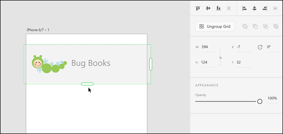
FIGURE 6-11: Select the items that you would like to repeat and then press the Repeat Grid button in the Properties panel.
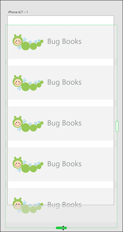
FIGURE 6-12: Repeat selected items easily using the Repeat Grid feature.
Importing updated images into your repeated grid
After you have repeated items, you may want to demonstrate how your application is going to work with more realistic content. The repeated element does not provide an opportunity to show the various data that your app may be offering. In this next section, you take a folder of images and drop them on top of your repeated grid in order to replace your original image. Just follow these steps:
- Locate a folder of images in a format that XD supports, such as JPEG, PNG, or GIF. If you are accessing the DummiesCCfiles folder mentioned earlier, you can find a folder named Insects inside the XD Files folder.
- Position your XD window that contains the artboard with the repeat so that you can see it and also the folder full of images.
- Make sure to select all the images, and then click and drag them onto the Repeated Grid. The images are replaced, as you can see in Figure 6-13.

FIGURE 6-13: You can drag and drop multiple images into the repeated grid to replace your image content.
You can drag images from the Bridge application into Adobe XD as well.
Updating your text in your repeated grid
In this next section, you discover how to update your text in a repeated grid. This is completed in much the same way as with images, but the .txt format is vital to having this process work:
- Create text in any application that can save the file in a Plain Text format — that is, with an extension of .txt. The text can be generated from Notepad, Word, downloaded from Google Docs as Plain Text, or exported from many other applications. For this example, you can use the sample text file named Bugtext.txt in the XD-Files folder on our site.
- Position the folder that contains the text file so that you can see the file and the repeated grid.
-
As with the process of replacing the repeated image, click and drag the .txt file over your repeated grid text, as shown in Figure 6-14. The text is replaced with text from your file.
You can see the example as it appears once the imagery and text have been replaced in Figure 6-15.
- If you extended beyond the viewing area, make sure to click on the artboard name above the artboard to select it.
- Drag the bottom handle to extend to the length of your repeated grid, as shown in Figure 6-16. This allows the screen to be scrolled in the preview. The dotted line represents the area that previews before the scroll.
- Click on the Desktop Preview button and scroll to see your repeated grid in action.
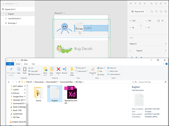
FIGURE 6-14: Click and drag a .txt file over the repeated grid to replace the text.

FIGURE 6-15: The repeated grid with new imagery and text.
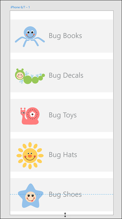
FIGURE 6-16: Click and drag to extend the viewing area of your repeated grid.