
Chapter 11
Using Filters and Effects
IN THIS CHAPTER
![]() Applying effects
Applying effects
![]() Getting to know the Appearance panel
Getting to know the Appearance panel
![]() Discovering graphic styles
Discovering graphic styles
![]() Making artwork 3D
Making artwork 3D
![]() Playing with additional fills and strokes
Playing with additional fills and strokes
![]() Creating the illusion of space and distance with the perspective grid
Creating the illusion of space and distance with the perspective grid
Effects give you the opportunity to make jazzy changes, such as drop shadows and zigzagged artwork, to your Illustrator objects. You can even use Photoshop filters directly in Illustrator. In this chapter, you find out how to apply, save, and edit effects; you also take a quick tour of the Appearance panel (your trusty sidekick when performing these tasks). Keep in mind: Just because you can do something doesn’t mean you always should! Don’t add filters and effects if you believe they will add messiness and distractions to your artwork.
Working with Effects
Adobe Illustrator offers many artistic and creative effects that you can use to add blurs, drop shadows, inner glows, and more. Effects are connected dynamically to the objects they are applied to. You can add, change, and remove effects at any time from the Appearance panel. (Choose Window ⇒ Appearance.)
Understanding the Appearance panel
Using the Appearance panel you can apply multiple effects to one object and even copy them to other objects. Make sure to create a simple object, such as a shape. If the Appearance panel isn’t visible, choose Window ⇒ Appearance to open it, as shown in Figure 11-1, alongside an object with several effects applied to it.
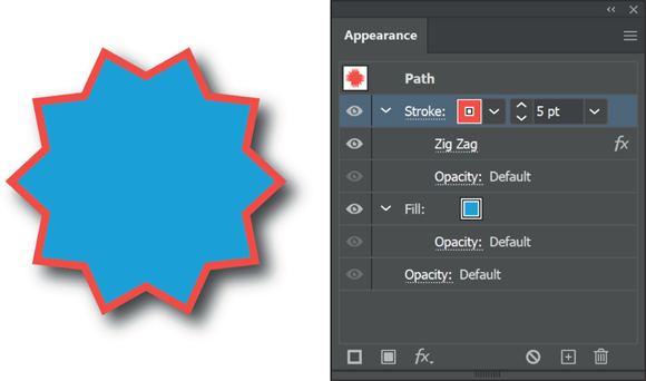
FIGURE 11-1: The Appearance panel not only shows you the properties of an object but also allows you to change them.
If you have no effects applied, you see as a default only a fill and a stroke listed in the Appearance panel. As you create effects, they’re added to this list. You can add more strokes and fills to the list; you find out why that capability is so useful in the following sections.
Applying an effect
In this section, you see how to apply an effect. You can choose from many effects, and they’re all applied in much the same manner. In this example, you create an interesting effect for a border.
Create a new document using any of the default profiles, and then follow these steps to apply an effect:
- Make sure that your Appearance panel is visible. Choose Window ⇒ Appearance and click and drag the panel out of the dock area so that it doesn’t collapse while you’re working.
Select the Rectangle tool and click and drag a rectangle out on the artboard.
Any size rectangle is fine for this example.
- Click Stroke in the Appearance panel, and change the stroke to 3 pt.
- Using Stroke Color in the Appearance panel, assign any color except the default color of black.
- Notice in the Appearance panel, shown in Figure 11-2, that you can select the entire object or just the Stroke or Fill. By selecting one or the other, you can apply an effect to just the stroke or the fill. In this example, select Stroke.
Choose Effect ⇒ Distort and Transform ⇒ Zig Zag.
Choose the settings that work well to make your straight border appear as a zigzag. In Figure 11-3, we selected Smooth to round out the points of the zigzag effect and changed the Ridges per segment to 15.
Keep in mind that you can also use the Properties panel to change the appearance of an object as well. The difference is that once you add multiple effects, you can only access them through the Appearance panel.
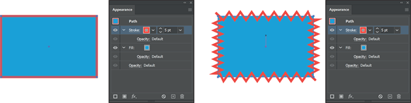
FIGURE 11-2: You can change the stroke and fill attributes right in the Appearance panel. Select only the Stroke, in the Appearance panel and apply a Zig Zag effect.
 Effects are linked dynamically to the object they’re applied to. They can be scaled, modified, and even deleted with no harm done to the original object.
To delete an effect, simply select it in the Appearance panel and then click the Trashcan icon at the bottom of the Appearance panel.
Adding a Drop Shadow effect
Creating a drop shadow is a quick and easy way to add dimension and a bit of sophistication to your artwork. The interaction between the object with the drop shadow and the underlying objects can create an interesting look. To add the Drop Shadow effect to an illustration, follow these steps:
Select the object (or objects) to apply the drop shadow to.
If you like, you can continue using the rectangle you worked with in the preceding section.
- In the Appearance panel, make sure that Stroke is selected.
- Choose Effect ⇒ Stylize ⇒ Drop Shadow.
In the Drop Shadow dialog box that appears, as shown in Figure 11-3, select the Preview checkbox in the lower-left corner.
You now see the drop shadow is applied to only the stroke.

FIGURE 11-3: The Drop Shadow dialog box offers the effect’s options and a preview.
- Choose from the following options in the dialog box:
- Mode: Select a blending mode from this drop-down list to choose how you want the selected object to interact with the objects underneath it. The default is Multiply, which works well — the effect is similar to coloring with a magic marker.
- Opacity: Enter a value or use the drop-down list to determine how opaque or transparent the drop shadow should be. If it’s too strong, choose a lower amount.
Offset: Enter a value to determine how close the shadow is to the object. If you’re working with text or small artwork, smaller values (and shorter shadows) look best. Otherwise, the drop shadow may look like one big, indefinable glob.
The X Offset shifts the shadow from left to right, and the Y Offset shifts it up or down. You can enter negative or positive numbers.
- Blur: Use Blur to control how fuzzy the edges of the shadow are. A lower value makes the edge of the shadow more defined.
Color and Darkness: Select the Color radio button to choose a custom color for the drop shadow. Select the Darkness radio button to add more black to the drop shadow. Zero percent is the lowest amount of black, and 100 percent is the highest.
As a default, the color of the shadow is based on the color of your object, sort of — the Darkness option also has a play in this task. As a default, the shadow is made up of the color in the object if it’s solid. Multicolored objects have a gray shadow.
When you’re finished, click OK to close the dialog box.
Take a look at the Appearance panel, as shown in Figure 11-4, to see that the two Effects that you applied are displayed. Notice that you can turn off and on the visibility of the effect by selecting the Click to Toggle Visibility icon to the left of the effect, and even edit the effect by double-clicking on the effect in the Appearance panel.
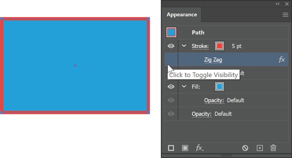
FIGURE 11-4: You can toggle the visibility and edit the effects right from the Appearance panel.
Saving your combination of effects as a graphic style
Graphic styles are an incredible feature that allows you to reuse properties repeatedly on different objects. So, if you always want a .75 dashed line, create it once and then save it as a graphic style. Decide later that you need to change the stroke size to 1 point? No problem. Change it once and it is reflected in all the instances. Read the next section for more details about creating, saving, and editing graphic styles.
- Choose Window ⇒ Graphic Styles, and while you have your rectangle selected, choose New Graphic Style from the Panel menu.
- Name the Style and press OK.
Now make another rectangle, any size, and click the thumbnail of graphic style that you just saved in the Graphic Styles panel.
All the saved attributes are applied to this new shape.
Saving Graphic Styles
A graphic style is a combination of all settings you choose for a particular filter or effect in the Appearance panel. By saving this information in a graphic style, you store these attributes so that you can quickly and easily apply them to other objects later. If you have already created an object with effects in a previous section, you will have the opportunity to save those effects as a graphic style later in this section.
To apply a saved a more complex graphic style, follow these steps:
If the Graphic Styles panel is not visible, choose Window ⇒ Graphic Styles.
The Graphic Styles panel appears. Unless you have added your own style, only some default styles appear in this panel.
Click the Library icon in the lower left of the Graphic Styles panel and select the Graphic Style library named Vonster Pattern Styles, as shown in Figure 11-5.
A second window appears. It’s named Vonster Pattern Styles.
Create a new shape, such as a simple rectangle or an ellipse, and click any graphic style in the Vonster Pattern Styles panel to apply it to an active object.
Look at the Appearance panel while you click different styles to see that you’re applying combinations of attributes, including effects, fills, and strokes. (See Figure 11-6.)
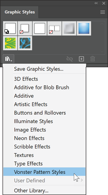
FIGURE 11-5: Access additional graphic styles by selecting the Library icon.
You can store attributes as a graphic style in several ways; we show you two easy methods. If you already applied a combination of attributes to an object, such as the rectangle border that you may have created in the previous section, you can store them by completing one of these tasks:
- With the object selected, Alt-click (Windows) or Option-click (Mac) the New Graphic Style button at the bottom of the Graphic Styles panel. Alt-click (Windows) or Option-click (Mac) allows you to name the style when it’s added.
- Drag the selected object directly into the Graphic Styles panel. The panel stores its attributes, but you have to double-click the new style to name it.

FIGURE 11-6: The Graphic Styles panel stores effects and other attributes.
After you store a graphic style, simply select the object you want to apply the style to and then click the saved style in the Graphic Styles panel.
You can try this by creating another rectangle and then clicking your saved graphic style in the Graphic Styles panel.
Creating 3D Artwork
All Illustrator effects are excellent, but the 3D feature is even better because you can not only add dimension by using the 3D effect, but you can also map artwork (wrap artwork around a 3D object) and apply lighting to the 3D object. You can then design a label for a jelly jar, for example, and adhere it to the jar to show a client.
Here are the three choices for the 3D effect:
- Extrude & Bevel: Uses the z-axis to extrude an object. For example, a square becomes a cube.
- Revolve: Uses the z-axis and revolves a shape around it. You can use this option to change an arc into a ball.
- Rotate: Rotates a 3D object created using the Extrude & Bevel or Revolve effect or rotates a 2D object in 3D space. You can also adjust the perspective of a 3D or 2D object.
To apply a 3D effect, you need to create an object appropriate for the 3D effect. The Extrude & Bevel feature works well with shapes and text. If you want to edit an object that already has a 3D effect applied to it, double-click the 3D effect in the Appearance panel.
To apply a 3D effect, follow these steps:
- Select the object you want to apply the 3D effect to. In this example, select a simple square.
Choose Effect ⇒ 3D ⇒ Extrude & Bevel.
Options for your chosen 3D effect appear. To see the 3D Extrude & Bevel Options dialog box, see Figure 11-7.
- Select the Preview checkbox so that you can see results as you experiment with these settings.
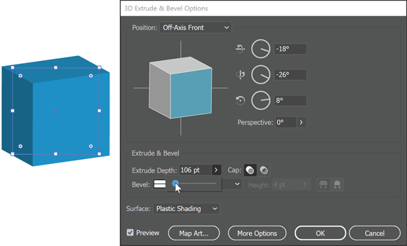
FIGURE 11-7: The Extrude & Bevel Options dialog box.
Click the Preview pane (which shows a cube in Figure 11-8) and drag to rotate the object in space.
It makes selecting the proper angle (or positioning the object in space) fun to do, or you can choose the angle from the Position drop-down list above the preview.
 Never use the Rotate tool to rotate a 3D object, unless you want some funky results; use the Preview pane in the 3D Extrude & Bevel Options dialog box instead.
- (Optional) Use the Perspective drop-down list to add perspective to your object.
In the Extrude & Bevel section of the dialog box, select a depth for your object and a cap.
The cap determines whether your shape has a solid cap on it or is hollow, as shown in Figure 11-8.

FIGURE 11-8: Turn the cap on or off to make an object appear solid or hollow.
Select a bevel (edge shape) from the Bevel drop-down list and set the height using the Height drop-down list.
You have two choices to apply the bevel:
- Bevel Extent Out: The bevel is added to the object.
- Bevel Extent In: The bevel is subtracted from the object.
- Select a rendering style from the Surface drop-down list or click the More Options button for in-depth lighting options, such as changing the direction or adding lighting.
Click the Map Art button.
The Map Art dialog box opens, as shown in Figure 11-9. Use this dialog box to apply artwork to a 3D object.
Using the Surface arrow buttons, select the surface you want the artwork applied to and then select a symbol from the Symbol drop-down list.
The result is shown on the left in Figure 11-9.
- Click OK to close the dialog box.
Keep these points in mind when mapping artwork:
- An object must be a symbol to be used as mapped artwork. You simply need to select and drag to the Symbols panel the artwork you want mapped. By doing so, you make it a selectable item in the Map Art dialog box.
- The light gray areas in the Preview pane are the visible areas based on the object’s present position. Drag and scale the artwork in this pane to place the artwork where you want it.
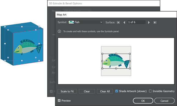
FIGURE 11-9: In the Map Art dialog box, you can select a surface and apply a symbol to it.
- Shaded artwork (enabled by selecting the Shaded Artwork checkbox at the bottom of the Map Art dialog box) looks good but can take a long time to render.
Note: All 3D effects are rendered at 72 dpi (dots per inch; low resolution) so as not to slow down the processing speed. You can determine the resolution by either choosing Effect ⇒ Document Raster Effects Settings or saving or exporting the file. You can also select the object and choose Object ⇒ Rasterize. After you rasterize the object, you can no longer use it as an Illustrator 3D object, so save the original!
Adding Multiple Fills and Strokes
Using the panel menu in the Appearance panel, you can add more fills and strokes. You can use this feature to put differently colored fills on top of each other and individually apply effects to each one, creating truly interesting and creative results.
Just for fun, follow along to see what you can do to a single object from the Appearance panel:
Create a star shape.
Neither the size of the shape nor its number of points matters — just make the shape large enough that it is not too tiny.
- Use the Properties panel to fill the shape with yellow and give it a black stroke; make sure the stroke is set to 1 point.
Choose Window ⇒ Appearance panel.
Notice that the present fill and stroke are listed in the Appearance panel. Even in its simplest form, the Appearance panel helps track basic attributes. You can easily take advantage of the tracking to apply effects to just a fill or a stroke.
Select only Stroke in the Appearance panel.
This is so that the next effect applied only applies to the stroke, not the fill.
- Choose Effect ⇒ Path ⇒ Offset Path.
In the Offset Path dialog box that appears, enter –10 pt in the Offset text box and select the Preview checkbox, as you see in Figure 11-10.
Notice that the stroke moves into the fill rather than on the edge.
Change the offset to a number that works with your star shape and click OK.
Depending on the size of your star, you may want to adjust the amount of offset up or down.

FIGURE 11-10: Select to offset just the stroke of an object.
You can add multiple fills to an object. You would do this if you want to apply a pattern, gradient, or any other fill, and use transparency of blending options in order to see each of the fills in a unique way. This can be lots of fun when trying to create interesting textures.
From the panel menu of the Appearance panel, select Add New Fill to add a new fill to the star shape. Click the arrow to the right of the new fill color swatch to open the Swatches and change the color of the new fill, as shown in Figure 11-11.
You will not see this other fill yet, as it is perfectly positioned under the original fill.

FIGURE 11-11: Change the new fill to a different color right in the Appearance panel.
- Make sure the top Fill is selected in the Appearance panel and choose Effect ⇒ Distort and Transform ⇒ Twist.
In the Twist dialog box that appears, type 45 in the Angle text field and select the Preview checkbox, as you see in Figure 11-12.
Notice how only the second fill is twisted.

FIGURE 11-12: Choose to twist one of the fills.
- Click OK to close the Twist dialog box.
Select the top fill from the Appearance panel again.
Always be sure to select the fill or stroke you want before doing anything meant to change just that specific fill or stroke.In the Transparency panel (choose Window ⇒ Transparency), select 50% from the Opacity drop-down list or simply type 50% in the Opacity text field.
Now you can see your original shape through the new fill.
With the top fill still selected, change the color or choose a pattern in the Swatches panel for a truly different appearance.
Continue playing with combinations of fills and strokes for hours if you want. We hope that this process “clicks” and that you can take it further on your own.
Using the Perspective Grid
You can create and edit artwork based on the perspective grid feature, shown in Figure 11-13. The grid is a huge help in creating successful perspective illustrations. To access the Perspective Grid you can click on the Perspective Grid tool, or press Shift+P. Keep in mind that if you do not see the Perspective Grid tool, you can select the Edit toolbar button at the bottom of the Tools panel, then locate the Perspective Grid tool in the list of available tools and drag it to your existing Tools panel.

FIGURE 11-13: Build and edit illustrations by using the Perspective Grid tool.
To quickly show or hide the default perspective grid, press Ctrl+Shift+I (Windows) or ⌘ +Shift+I (Mac).
To select the perspective plane you wish to draw on, click the Plane Widget that appears in the upper left, as shown in Figure 11-14. To draw with no perspective, click the gray area surrounding the grid, but yet still inside the circle.
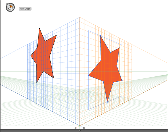
FIGURE 11-14: Click a plane to activate it before adding a shape. In this example, the left star had the left grid active, and the second star had the right grid active.
![]() You can use the Perspective Grid tool on the toolbar to fine-tune the grid.
You can use the Perspective Grid tool on the toolbar to fine-tune the grid.
Here are some simple steps to help you start using the perspective grid:
- Create a new document and turn on the perspective grid by pressing Ctrl+Shift+I (Windows) or ⌘ +Shift+I (Mac).
Select a shape tool, such as the Ellipse, and click and drag it to create the shape on the perspective grid.
Notice that the shape’s perspective is controlled by the grid. Remember that you can use the circle in the upper left to change which plane you are drawing to.
- Select the Perspective Selection tool. If you don’t see it, you can press Shift-V to change to that tool.
Using the Perspective Selection tool, click and drag the shape to see that it’s adjusted in position and location using the perspective grid.
Figure 11-15 shows the result of dragging an ellipse with the Perspective Selection tool. You can resize and clone in perspective by Alt- or Option-dragging the selected object.
Note that you can also select and drag the grid itself by using the Perspective Selection tool.

FIGURE 11-15: Click and drag to change the perspective using the Perspective Selection tool. In this example Alt/Option was held down to clone the star in perspective.
Choose View ⇒ Perspective Grid, as shown in Figure 11-16, and then select the type of perspective to apply.
In this step, you further customize your grid and choose other options to make your illustrations more precise.

FIGURE 11-16: Customize settings for the perspective grid by using the View menu.