
Chapter Eight
Working with Color
Adding color to a publication can make the difference between drab and dazzling. InDesign provides many features for creating several different kinds of colors and applying them to text and objects.
In this chapter you’ll learn how to use commands in the Swatches panel to add process and spot colors, tints, multicolor gradients, and mixed ink colors and how to use the Gradient and Color panels to quickly build and apply gradients and colors on the fly. In addition, we’ll take a brief look at InDesign’s color management capabilities and show you how to specify color settings.
If you intend to create a color publication, you’ll probably want to add some colors to your InDesign layout, after which you can apply the colors to text, object backgrounds, and strokes. The Swatches panel (Windows > Swatches) displays a list of available colors, including spot colors, process colors (CMYK), tints, gradients, and mixed ink colors, as well as controls for creating new colors and managing colors.
The method for adding a spot color or a process color is much the same. To add a spot color:
1. Choose New Color Swatch from the Swatches panel menu.
2. In the New Color Swatch dialog box (Figure 73a), choose Spot in the Color Type menu, and then choose a spot color library in the Color Mode menu.
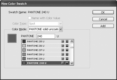
3. Select a color from the scroll list or enter a number in the field above the scroll list.
4. Click OK to add the color to the Swatches panel and close the dialog box, or click Add to add the color to the Swatches panel and keep the dialog box open so you can add more swatches.
1. Choose New Color Swatch from the Swatches panel.
2. In the New Color Swatch dialog box (Figure 73b), choose Process in the Color Type menu, and then choose CMYK or a process color library, such as FOCOLTONE or TRUMATCH, in the Color Mode menu. If you choose CMYK, use the Cyan, Magenta, Yellow, and Black controls to define the color. If you check Name with Color Value, a process CMYK color is automatically assigned a name that includes its CMYK percentages (for example, C=30 M=100 Y=50 K=0). If you uncheck Name with Color Value, you can assign a name of your choice.

3. Click OK to add the color to the Swatches panel and close the dialog box, or click Add to add the color to the Swatches panel and keep the dialog box open so you can add more swatches.
After you create a color, it is added to the list of swatches in the Swatches panel, and you can apply it to text, fills, and strokes. (See #61 and #62 for information about applying color to fills and strokes.) The spot color icon
![]() is displayed to the right of the names of spot colors in the Swatches panel; the process color icon
is displayed to the right of the names of spot colors in the Swatches panel; the process color icon
![]() is displayed next to process colors.
is displayed next to process colors.
If an object is selected when you create a new color, the color is applied to the object’s stroke or fill, depending on whether the Stroke box or the Fill box is selected in the Tools panel. If nothing is selected when you create a new color, the color becomes the default stroke or fill for new objects created with the drawing tools (with the exception of the three frame tools).
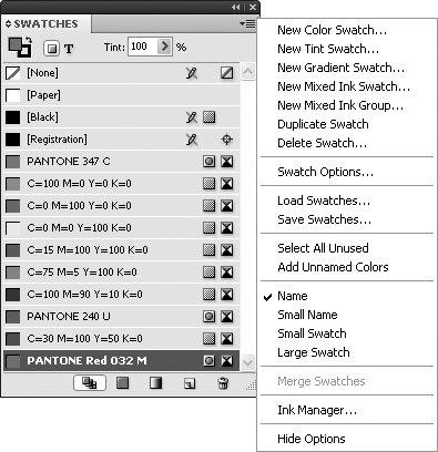
The Swatches panel and its menu (Figure 73c) contain many controls and commands for working with colors. In addition to commands for creating new spot and process colors, tints, gradients, and mixed ink colors, the Swatches panel menu includes commands for:
• Deleting (Delete Swatch) and modifying swatches (Swatch Options).
• Exporting (Save Swatches) and importing (Load Swatches) swatches.
• Displaying swatches in the panel (Name, Small Name, Small Swatch, Large Swatch).
A gradient is a smooth transition from one color or tint to another color or tint. A well-designed and well-placed gradient adds movement and contrast to a page—both of which add visual appeal. InDesign lets you create multicolor gradients and apply them as fills and strokes to text and objects.
The most efficient way to use a gradient is to first add it to the Swatches panel list, after which you can apply it to text and objects.
To create a gradient:
1. Open the Swatches panel (Window > Swatches) and choose New Gradient Swatch from the Swatches panel menu.
2. In the New Gradient Swatch dialog box (Figure 74a), enter a name for the gradient in the Swatch Name field and choose Linear or Radial from the Type menu.
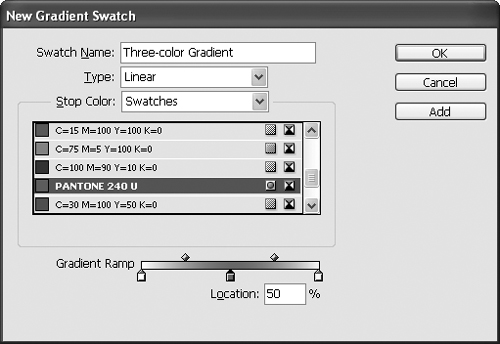
3. The Gradient Ramp displays the gradient. Below the ramp, color stops—the small, colored squares—show the colors in the gradient. Above the ramp, small diamonds indicate the midpoints between pairs of colors. To specify the start color, click the white square at the left end of the Gradient Ramp, and then use the controls in the Stop Color area to assign a color. Click the black square at the right end of the Gradient Ramp to specify the end color. The controls in the Stop Color area vary, depending on the choice you make in the Stop Color menu. If you choose Lab, CMYK, or RGB, the controls let you create new colors. If you choose Swatches, the document’s swatches (spot and process colors, gradients, tints, and mixed ink colors) are listed.
4. To add a color to a gradient, click just below the ramp. A color stop is added where you click. Use the controls in the Stop Color area to change the color.
5. To delete a color from a gradient, click its color stop and drag downward. You can also modify a gradient by dragging color stops and midpoints or by selecting a color stop or midpoint and changing the Location value.
6. When you’re ready to save a gradient, click OK to add the gradient to the Swatches panel and close the dialog box. Or, click Add to add the gradient to the Swatches panel and keep the dialog box open so you can add more gradients. After you create a gradient, you can apply it to text, objects, fills, and strokes in the same way you apply spot and process colors (Figure 74b).

In addition to creating gradient swatches that are displayed in the Swatches panel list, you can use the Gradient panel (Window > Gradient) to create gradients on the fly (that is, without having to open the New Gradient Swatch dialog box). If you create a gradient using the Gradient panel, the gradient is applied to the fill or stroke of selected text or objects, depending on whether the Fill box or the Stroke box is selected in the Tools panel. If nothing is selected when you create a gradient, it becomes the default stroke or fill for new objects created with the drawing tools (with the exception of the three frame tools).
The controls in the Gradient panel are similar to the controls in the New Gradient Swatch dialog box. The gradient ramp works the same as the gradient ramp in the New Gradient Swatch dialog box with one exception: To add a color stop, drag a swatch from the Swatches panel and release it on the ramp. Release the swatch on an existing color stop to replace it. The Type menu and Location fields are the same as those in the New Gradient Swatch dialog box. The Reverse button lets you flip a gradient, and the Angle field lets you rotate a linear gradient.
The Gradient tool provides another option for applying a blend. To use the Gradient tool, first apply a gradient to the fill or stroke of an object or text. With the object or text still selected, select the Gradient tool, and then click and drag on the page. The spot where you click is the start point of the blend; the spot where you release the mouse is the endpoint of the blend (Figure 74c).

In addition to creating and applying spot and process colors, tints, and gradients, you can create mixed ink colors that combine a spot color with one or more spot or process colors. For example, if you’re working on a publication that uses black and one Pantone color, you can create a mixed ink color that combines a tint of black and the Pantone color.
To create a mixed ink color:
1. Open the Swatches panel (Window > Swatches) and choose New Mixed Ink Swatch from the Swatches panel menu.
2. In the New Mixed Ink Swatch dialog box (Figure 75a), enter a name for the mixed ink. (It’s a good idea to include the names and percentages of the component colors.)

3. Click the empty square to the left of each color you want to include.
4. For each color you choose, enter a tint value from 0% to 100% by adjusting the slider or entering a value in the % field.
5. When you’re done choosing colors and specifying tints, click OK to add the mixed ink color to the Swatches panel and close the dialog box, or click Add to add the mixed ink color to the Swatches panel and keep the dialog box open so you can add more mixed ink colors. After you create a mixed ink color, you can apply it to text, fills, and strokes in the same way as you apply spot and process colors.
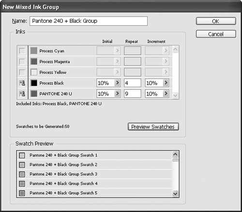
You can create mixed ink color swatches one at a time by choosing New Mixed Ink Swatch from the Swatches panel menu, or you can create several variations of a particular combination of colors at once by choosing New Mixed Ink Group. In the New Mixed Ink Group dialog box (Figure 75b), select the colors you want to include by clicking the empty box next to them. For each color, specify:
• The percentage of the starting tint in the Initial field.
• The number of times you want to repeat the increment in the Repeat field.
• The amount of change between tints in the Increment field.
Figure 75b The New Mixed Ink Group dialog box lets you mix several combinations of tints and colors at once. In this example, a Pantone spot color—Pantone 240 U—is combined with black. 10% tint increments of Pantone 240 U (starting at 10% and repeating nine times) are mixed with 10% tint increments of black (starting at 10% and repeating four times). These settings produce a group with 50 mixed ink colors. You can see the first five colors in the Swatch Preview area.
Like the Gradient panel, the Color panel (Window > Color) lets you create colors on the fly—that is, without having to open the New Color Swatch dialog box. Generally, it’s a good idea to choose New Color Swatch from the Swatches panel menu when you need a new color because the color is added to the Swatches panel list and you can apply it whenever you want. That said, the Color panel (Figure 76) provides a quick alternative for creating colors.

Stroke and Fill Defaults for Objects and Text
If you take a close look at the Color panel, you’ll see two small buttons below the Fill and Stroke boxes: Formatting Affects Objects
![]() and Formatting Affects Text
and Formatting Affects Text
![]() .
.
When Formatting Affects Objects is selected, changes you make in the Color panel are applied to selected objects. If nothing is selected, the changes are used as the default fill or stroke settings for the drawing tools (with the exception of the three frame tools), depending on whether the Fill box or the Stroke box is selected in the Tools panel.
When Formatting Affects Text is selected, changes you make in the Color panel are applied to all text within selected text frames. If nothing is selected, the changes are used as the default fill or stroke settings for text in newly created frames, depending on whether the Fill box or the Stroke box is selected in the Tools panel. The Tools panel and Swatches panel also include Formatting Affects Objects and Formatting Affects Text buttons.
The controls in the Color panel are similar to the controls in the New Color Swatch dialog box. To create a color:
1. Choose Lab, CMYK, or RGB from the Color panel menu to specify the kind of color you want to create. The color controls displayed depend on the selected color model. A color spectrum is displayed below the tint percentage fields and sliders.
2. Click the spectrum or use the fields and sliders to specify color settings.
To add the color in the Color panel to the Swatches panel list, choose Add to Swatches from the Color panel menu, drag the Fill box from the Color panel to the Swatches panel, or click the New Swatch button at the bottom of the Swatches panel. To add all colors you’ve applied using the Color panel to the Swatches panel list, choose Add Unnamed Colors from the Swatches panel menu.
When you create a color using the Color panel, it’s applied to the current selection. If nothing is selected, the color is the default color for the fill or stroke of new objects (except for frames created with any of the three frame tools), depending on whether the Fill box or the Stroke box is selected in the Color panel or Tools panel.
Color management is the process of transforming colors to compensate for the different capabilities of devices such as monitors and printers so that colors look as consistent as possible throughout your workflow. Providing a brief how-to about color management is a little like providing a brief how-to about nuclear physics. Thick books by smart people have been written about the physics, physiology, and psychology of color and managing color in a publishing workflow. It’s hard to reduce the topic of color management to a single bit of advice. That said, it’s easy to enable InDesign’s color management feature, and with minimal effort you can set up a simple color-managed workflow.
By default, color management is turned on in InDesign. If you use InDesign as part of Adobe Creative Suite, you can use Adobe Bridge to synchronize color settings across all applications so that colors look the same throughout the suite.
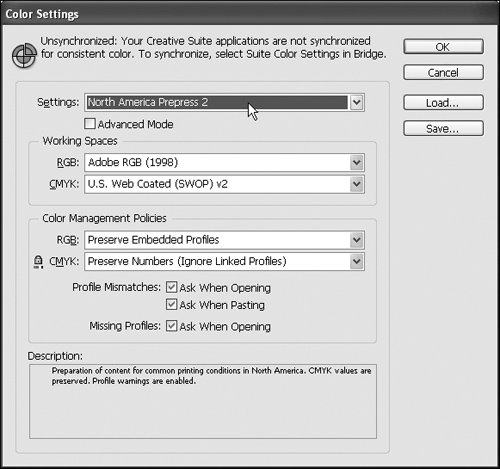
To set up color management in InDesign, choose Edit > Color Settings. The Settings menu in the Color Settings dialog box (Figure 77) offers several options. Choose the option that is most appropriate for the kinds of publications you create with InDesign:
• Choose Monitor Color only if you create designs for video or onscreen presentation.
• Choose North America General Purpose 2 to use typical settings for publications that will be printed with desktop printers (laser and inkjet) and for onscreen publications in North America.
• Choose North America Prepress 2 to use typical settings for publications that will be printed on a printing press in North America.
• Choose North America Web/Internet to use typical settings for onscreen presentation in North America.
If you’re knowledgeable about color management and aren’t satisfied with the default settings in the Color Settings dialog box, you can specify custom settings. Click Save to save custom settings in a file you can share with colleagues and clients.
If you use InDesign as part of Adobe Creative Suite, InDesign’s color management settings are automatically synchronized with the other applications. When you first open the Color Settings dialog box, “Synchronized” is displayed in the upper-left corner to let you know that the settings are in synch with the other Creative Suite applications. If you change any of the settings in the Color Settings dialog box, “Synchronized” changes to “Unsynchronized.”