
Composing the Figure within an Environment
The illustration visible in today’s fashion lifestyle market is driven by concept, style, and composition based on text, promotion, or mood. Although the market may occasionally incorporate an image of a single figure to promote a product or clothing, or to illustrate an article, the format of a loosely drawn single figure captured in a wash and floating in a space and framed by type is now rarely seen.
Whether advertising a luxury cruise, a campaign promoting jeans in an urban location, or using a surrealistic approach to conceptualize an illustration for a website, most illustrations for the fashion lifestyle market will incorporate something other than the idealized single figure.
So far, we have investigated the properties and specific characteristics of the figure using shape, line, and value with selectivity as the guiding light. We have also on occasion introduced the idea of composition, whether drawing the figure in five shapes or observing the figure in a structured frame. It is now time to utilize this information and to incorporate some of the ideas of verticals, horizontals, and diagonals to help enhance the composition and to place the figure in the environment. Foreground and background graphic elements will be introduced as well as using value to create a sense of depth.
Take a look around you. You are in an environment; an environment composed of shape, line, values, texture, verticals, horizontals, diagonals, and so on. Most importantly, you are a shape within a shape surrounded by other shapes. Creating a composition involves communicating various elements as shapes and configuring those shapes together to form a whole.
In essence, you have been working on your compositional skills since the word “shape” entered your drawing vocabulary. Whether you realized it or not, you have been making compositions throughout this book; you have been doing this while observing and analyzing the figure in terms of shapes and then selecting specific shapes to construct that figure.
Now we will place the shape of the figure within a framed shape and accentuate that shape by using selectivity and some of the principles of composition in choosing shapes to complement the figure.
There are several compositional tools that you can use to help you arrange your shapes: symmetrical or asymmetrical composition; the rule of thirds; the use of scale, repetition, and pattern; positive and negative space; and color and value. These will all work alongside the use of verticals, horizontals, and diagonals that will be explored in the final part of this chapter. Incorporating all these principles opens all sorts of possibilities to create an interesting visual. It is your movie, so to speak, and you are the director composing the frame. The possibilities are endless.
Perspective
The first principle to help in composing the figure in an environment is linear perspective. There are three variations of perspective: one-, two-, and three-point.
To incorporate perspective into any composition, it is essential to first establish a horizon line in the layout. This line is the equivalent of the viewer’s eye level. Visualize this horizontal line as the line in a landscape where the land meets the sky. The point on the horizon line where objects receding into space seem to vanish is called, of course, the vanishing point. The number of vanishing points indicates the type of perspective; hence, one-, two-, and three-point perspective.
The simplest method of placing a figure in a space is one-point perspective, where there is one vanishing point on the horizon line. All lines that are parallel to our central line of vision as it recedes into space will converge at an established vanishing point. Picture a set of railroad tracks that begin as two separate parallel lines and appear to merge as they meet at the vanishing point.
Directions
This exercise is not unlike the one for line quality (see pp. 88–89), where we placed three figures into one frame in the foreground, middle, and background. Here the technical use of one-point perspective will you give you further insights into what gave those compositions a sense of depth.
Step One
Draw a frame and divide it in half horizontally with a horizon line. Place a dot, to represent the vanishing point (VP), in the center of the horizon line (see Figure 1).
Step Two
From the vanishing point, draw four diagonal lines to the corners of the frame (see Figure 2).
Step Three
Draw a framed square around the VP and have the edges of the square line up with the diagonal lines extending from the VP. You now have a simple room with a floor, ceiling, and two walls (see Figure 3).
Step Four
Divide the rest of the space up using additional guidelines that extend from the VP (see Figure 4).
Step Five
Designate the floor space by coloring in this area (see Figure 5).
Step Six
Using the guidelines, start to decorate the room. Begin by placing shapes in the foreground. Starting with the wall space, draw a rectangular shape that would represent the edge of a framed painting inside the guidelines. Color this in a dark hue (see Figure 6).
Step Seven
Extend the edges of this frame into the background, again using the guidelines to help you. Color this area in a lighter tone of the color you used for the outside frame (see Figure 7).
Step Eight
Now put a table into the composition. Since the painting comes to the edge of the room, set the table against the other wall a bit farther back from the foreground. Following the same format as the painting, first put in the front edge of the table. Using the guidelines, draw in the top of the table, extending it so that it recedes into the background (see Figure 8).
Step Nine
Then add the back legs of the table. Initially you can add as many guidelines as you like to place shapes into a composition. However, to avoid having too many lines, simply add them as necessary to extend a line to the shape you are placing in the frame. In this case, the front legs of the table do not line up with any of the guidelines. To know how to place the back legs correctly, draw a guideline from the bottom of the front of the table legs to the VP and use this as the guide to place the back legs of the table (see Figure 9).
Step Ten
Now we can start to add figures into the environment. Place a full figure in foreground, and attempt to have it overlap the painting or table to give an additional sense of space (see Figure 10).
Step Eleven
Now place another figure farther into the space to companion the foreground figure. Note the position of the foreground figure and where the horizon line meets the foreground figure, somewhere around the hip line.
Assuming that the second figure is of the same height and measurements as the foreground figure (in this case we will clone the foreground figure), reduce the size of the cloned figure and position it on the horizon line close to the foreground figure, right by the hip line. If you are coloring this figure, color it with a lighter tone of the foreground figure (see Figure 11).
Step Twelve
The addition of a third figure farther into the space gives the impression of an even deeper room. Again, position the figure with the hip line close to the horizon line. Use a color that is one tone lighter than that of the second figure (see Figure 12).
Note:
Make sure that any element or form that you add into the layout is on the same eye level and plane as the rest of the elements in the composition. You do not want to create an awkward composition by placing a figure seen from a high eye level into a perspective that is developed from a low eye level.


Directions
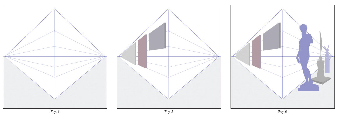
Two-point perspective incorporates an angular view where the lines receding into space converge at two separate vanishing points on the horizon line. Imagine standing on a street corner and looking down each street converging at that corner. The street ends would each represent a vanishing point (VP).
Step One
Draw a frame and divide it in half with a horizon line and mark two vanishing points at the far ends of the horizon line. Divide the horizon line in the center with a vertical to establish the viewer’s central line of vision (see Figure 1).
Step Two
Mark the central vertical line with two points, one at the top and one at the bottom. Draw guidelines from the two vanishing-point dots to the marked dots on the central vertical line. You should now have a diamond shape (see Figure 2).
Step Three
Extend additional guidelines from the vanishing points to the middle central line (see Figure 3).
Step Four
Designate a floor space by coloring in this area (see Figure 4).
Step Five
Now imagine that this is an art gallery. Using the guidelines, much as you did in the one-point exercise, begin to fill the gallery wall with artwork. Choose one wall space and, beginning with the foreground, add in some simple shapes to mimic the shapes of canvases (see Figure 5).
Step Six
Balance the other gallery wall by adding some sculptures. Overlap the artwork to give it an additional sense of depth. Note that even though the sculptures are of different dimensions, they are still positioned using the guidelines as they recede in space toward the vanishing point (see Figure 6).
Step Seven
How about adding some purveyors of art to inhabit the environment? Begin with a figure in the foreground. Assuming that the gallery viewers are closer in dimension, use the guidelines, as you did in one-point perspective, and be a bit more exacting than you were with the sculptures to position them accurately into the space. Identify where the foreground figure falls on the horizon line—in this case somewhere around the waist—and add a smaller figure and position this figure’s waist close to the horizon line as well; it need not be exact, as different poses will need subtle adjustments. Note that the brown figure on the other side of the gallery is smaller in scale, but close in height to the black figure (see Figure 7).
Step Eight
Add more people to the environment using the guidelines (see Figure 8).
Note:
Perspective is not a fail-proof science and as you incorporate and explore the different types of perspectives, you will discover that it may not always seem correct.
You would be right in that estimation. Trust your intuition and eye when using these principles and allow yourself the poetic license to adjust and move elements as they are appropriate to your composition.


Directions
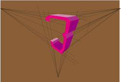
Three-point perspective uses and exaggerates a vantage point that is seen from either above or at ground level: a bird’s-eye view, or a frog or worm’s-eye view respectively. Imagine looking up at a building in a city, or looking down from the top of a building into the street. Three-point perspective creates the illusion of objects that recede to the right and left as well as either upward or downward. In addition to the two vanishing points, as demonstrated in two-point perspective, there is a third vanishing point that is far above or below eye level.
We begin again by establishing the horizon line. In this example, this exercise will be based on a viewpoint from below (ground level rather than eye level).
Step One
Draw the horizon line lower into the frame and mark two VPs at the far ends. Divide the horizon line in the center with a vertical guideline and mark this with three points, one at the bottom, one midway above the horizon line, and one at the end of the vertical line (see Figure 1).
Step Two
As in two-point perspective, draw guidelines from the horizon VPs to the bottom and midway point on the center line to form a diamond-like shape (see Figure 2).
Step Three
Now we need to establish the vertical vanishing point. To do this, add two additional points to bookmark the bottom center point. From these two lines draw in guidelines to the vertical VP (see Figure 3). Note the three vanishing points in your frame.
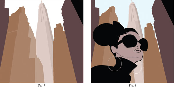
Step Four
Start adding in the cityscape. To establish how the guidelines help shape the perspective, add a building in the background. Begin with the center line, using the vertical guideline to lay in the shape of a building. Begin at the top of the VP of the vertical line and, following the guidelines, extend the outline of the building, much as you did in one- and two-point perspective to lay in the outline of the form (see Figure 4).
Step Five
Continuing from the middle-ground shape, add in some buildings to the left and right side, overlapping the center shape, and gradually adding the foreground buildings to the composition (see Figure 5).
Step Six
Color in the shapes from the foreground to the background using the darkest tone for the foreground and the lightest for the background (see Figure 6). If you would like to give the cityscape some definition, add in some dark and light values on the angles of the buildings (see Figure 7).
Step Seven
Place a figure into the cityscape to accentuate the forced perspective (see Figure 8).
Note:
For the purposes of demonstrating the vanishing points, all of the vanishing points were visible in the framed space. In reality, these vanishing points will probably be far in the distance, beyond and outside of the given framed space.
Note continued:
In the exercises shown, all of the vanishing points were centered to demonstrate the different perspectives. Depending on your viewpoint and eye level the VPs would usually not be centered and static. Shifting the vanishing point farther off to the side in one-point perspective and varying and contrasting the view of the vanishing points in two-point perspective, (seeing more of one than the other), and shifting all three VPs in three-point, will allow for a more vibrant composition.


5.4 Symmetrical and Asymmetrical Composition
There are two types of composition: symmetrical and asymmetrical. A symmetrical composition is one that is usually centered and has a mirrored effect. In this system, the space is divided in two with evenly spaced shapes that are balanced accordingly, and one side of the composition seems to mimic or mirror the other. This symmetrical composition creates a static presentation that lacks energy (see Figure 1).
An asymmetrical composition, on the other hand, is not bound by any rules confining shapes or forms to specific areas. It is not centered and does not follow rhythm or reason. The elements can be juxtaposed in any manner within the composition, creating an energy that is more dynamic than the static composition of a symmetrical design (see Figure 2).

Fig. 1

Fig. 2
Balance is the main driving force behind a successful illustration. There are endless possibilities to creating an asymmetrical composition, and a trained eye and a good dose of selectivity will create one that is both inviting and interesting to the viewer. The freedom extended through an asymmetrical layout does not, however, invite specific principles for designing the space as in a symmetrical design, where everything has a definite placement. Experimentation and knowledge of shapes and their diversity will eventually inform your compositions. There is one principle, however, known as the rule of thirds, that can be used as a guide to assist your eye in designing and positioning the elements within your composition.
We saw in the previous section on symmetrical and asymmetrical composition how the placement of objects or forms can affect the dynamics of that composition. The principle behind the rule of thirds is that by placing elements slightly off-center you will create a more interesting composition that is more attractive to the eye. Just as drawing a frame enables you to be conscious of the space you are creating within it, drawing a grid that divides the picture plane into thirds allows you to place the forms off-center and realize how to push the exaggeration when moving the forms around in an asymmetrical composition.
Figure 1 illustrates how the composition is not utilizing the space to create variety. The figure is centered and the colored wall echoes the figure and divides the frame in half. The sofa and table occupy the horizontal midsection and the lights, although in the top tier of the grid, are positioned in the center of that tier.
Now compare Figure 1 with Figure 2. In Figure 2, the figure, although still occupying much of the middle grid, is off-center, occupying both the first and middle frames of the grid. The figure is also positioned closer to the bottom tier of the grid rather than dead-center as it was in Figure 1. The colored wall has almost been pushed out of the middle frame and creates a dynamic contrast with the negative space that now monopolizes the frame. The sofa has been positioned farther into the bottom tier, while the table is now pushed farther into the middle left of the frame and behind the figure. The lights, in contrast to Figure 1, have been cropped and extend only partway into the upper tier of the grid. The idea is to not be repetitive with your positioning of the elements; use the grid as a rough guide to train your eye to be visually aware of positioning and spacing.

Fig. 1

Fig. 2
The principle of scale (playing one size against another) can be useful in creating a composition that is unique. This allows each shape to retain its own individual characteristics that work to complement those of other shapes. Exaggeration is essential to create great graphic compositions. If you are going to make the effort to play one shape against the other, why not push it to its limit. Either exaggerate it, or don’t bother, that is my feeling; it is much easier to go the distance and then pull back than to play it safe and inch your way out, gradually increasing the scale. If you are entertaining the idea of creating a dynamic composition then playing it safe is not an option. Scale is just such an opportunity.
Look at Figures 1, 2, and 3. In Figure 1, the skater and the trees are similar in scale. In Figures 2 and 3, the skater and the trees were enlarged or reduced in an exaggerated method to create a spatial and visual dynamic. Scale is also another method to communicate space and depth. Scale and exaggeration equal the unexpected and the unexpected keeps the viewer interested.

Fig. 1

Fig. 2
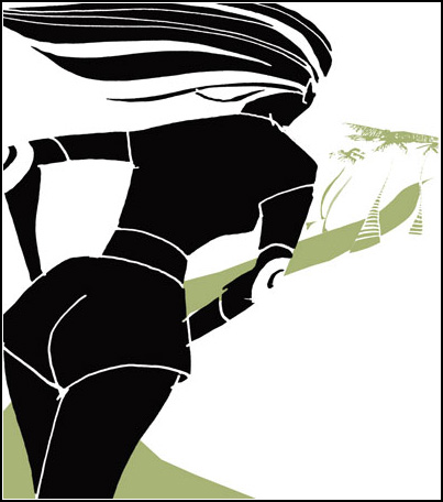
Fig. 3
5.7 Positive and Negative Space
A composition is a sum of its parts, and that includes the areas not occupied as well as those that are. The negative spaces should be considered as important as the positive ones.
Graphically, the fewer elements or shapes you have to work with, the more important those elements become. Be attentive in how you push, pull, and exaggerate all of the shapes in the composition. The goal is to entertain the eye by keeping it interested, and redundancy and similarity will not achieve this goal. In Figure 1, the positive and negative shapes seem balanced. Now observe the variety of the negative shapes in Figure 2 and how they each have a unique character and personality.

Fig. 1

Fig. 2
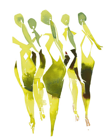
Another method you can use to entertain and seduce the eye of the viewer is to use repetition or pattern in a composition.
The use of repetition or pattern allows for a harmonious design in the composition. A repeated use of a shape, line, texture, or value creates a visual rhythm that allows the eye to move or bounce over the work. Not a bad way to seduce the viewer. Repeating a similar shape or element is defined as repetition—think of a flock of birds. The repetition of the same graphic element is generally recognized as a pattern—think of a textile repeat or design. Figure 1 uses the repeated motif of the chairs to create a rhythmic pattern that flows through the composition. In Figure 2, chairs are used in a repeat pattern to form a backdrop for the repetition of figures in the foreground.
When introducing a pattern into an illustration, think of the illustration as a whole—think shape. Shape is the key to adding a pattern or texture. If the composition does not have an interesting play of shapes then the patterns will not accentuate the illustration. Think about composition and how the visual is divided into various shapes—large, small, positive, negative, and contrasting. Add the patterns to those shapes that seem best suited to complement them. A composition devised of multiple patterns can be intriguing, but the eye will eventually need a rest stop. Attempt to keep an area devoid of pattern to allow the eye to rest. Keep in mind that the absence of a pattern in one area can accentuate and complement a pattern in another. Patterns should be incorporated to enhance the main focus of the illustration, the figure, or visual, and should not overwhelm the subject.
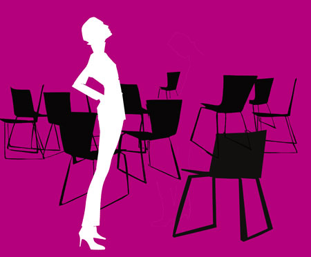
Fig. 1

Fig. 2
5.9 Value and Color in Perspective
As you have witnessed, there are numerous ways to create the illusion of space and depth in a composition: using scale to indicate something large in the foreground and something small in the background; overlapping of forms—placing one object in front of the other; cropping of large objects outside of the picture plane; and, of course, linear perspective. Value, color, and their placement in the composition can also indicate depth and space.
Atmospheric perspective describes how the atmosphere affects the appearance of an object in space. The clarity of an object receding in space is affected by the layers of air, moisture, dust, and pollutants that act as a filter to veil the appearance of the object. Objects closer to the viewer are distinct and contrast strongly with the background; objects receding into space begin to lose their contrast with the background. This happens because the strong, bright colors in the foreground become less saturated and begin to mimic the value and color of the background, becoming dull with a blue-gray cast. Sound familiar? We were first introduced to this idea in line quality, where strong, dark, clear lines indicated the foreground figure and faint, pale, light lines dictated a figure in the background. Same premise. In the same way, warm colors also advance toward us and cool colors recede, so bright colors work best in the foreground and cooler colors in the background.
Compare Figures 1, 2, and 3. Observe the differences between each and how the use of value and color seem to pull and push the shapes into the foreground and background. Look at the placement of value and the use of atmospheric perspective. Is one more successful than the other? If so, can you analyze the reasons why?
Figure 1 inverts the idea that warm colors come forward and cool colors recede. The two figures are mostly colored in cool blues and purple; this is incongruous with the warm acid green of the building in the background on the far right, which seems to be pushing for attention and wants to come forward.
Figure 2 seems more natural. As they should be, the cool colors are mostly in the background and the warm colors have rightfully taken up residence in the foreground figures on the skin and suit.
Figure 3 is primarily a study in how value affects depth. Still respectful to the premise of warm and cool colors, this figure uses the theme that the darkest value is closest and becomes paler as it recedes in space. Both Figures 2 and 3 work to communicate depth; however, Figure 3 exaggerates the premise of value (what is closer will be deeper in value) more than Figure 2.
Note how in Figure 3 the foreground figure’s suit is the strongest value and contrasts sharply with the background; every form behind this shape decreases in value as it recedes into the landscape, escalating with the background building on the far left, which seems to disappear into the skyline.

Fig. 1

Fig. 2

Fig. 3
Creating an interesting composition with a figure in a given space relies not only on the position or pose of the figure but also on balancing elements in the drawing that accentuate the shapes in the space and complement the positioning of the figure. If the figure is the centerpiece of the art then the surrounding shapes should enhance and complement that centerpiece.
Opposites attract, as we have seen in the previous chapters, and it makes perfect sense to use a vertical to complement a horizontal. Combining verticals with horizontals will elicit a confident, stable composition, as we saw demonstrated in the rule-of-thirds figure (see p. 123). Diagonals, on the other hand, contribute to a layout that has a visual sense of movement created by the opposing directional lines and shapes.
The use of diagonals will help create a dynamic composition, whether alone or combined with a horizontal or vertical shape. When in doubt, use a diagonal format to give action and energy to what would otherwise be a static layout. Playing diagonals against each other allows the eye to move through the space. The key is to recognize the diagonal and emphasize the slant by exaggerating the direction and using an opposing diagonal to further accentuate the movement.
Compare Figure 1 to Figure 2. Both seem to have a sense of movement due to the background diagonal lines. But which layout has a more dynamic feeling of that movement? Figure 2 uses the vertical position of the traveler and pushes that vertical into a diagonal slant. Exaggerating the diagonal direction of the background lines emphasizes this slant. Together, this push and pull of both the figure and the background create a tension that is visually more dynamic and seems to communicate the traveler’s movement through the airport terminal.

Fig. 1

Fig. 2
Assignments
Draw three frames:
A. A square
B. A tall, vertical rectangle
C. A long, narrow, horizontal rectangle.

Begin with the square frame. Observe the shape of the frame. Think of how best to nurture an interesting graphic to move the eye using the following elements:
1. a road
2. a mountain range
3. a cactus
4. a bird
5. the sun.
These elements should be contrasting in shape and character. The elements also can be used to fulfill the various premises of line, shape, and value. Incorporate as many of the principles of composition as possible: scale, diagonals, repetition, perspective, and positive as well as negative space should be considered. Repetition would necessitate multiplying one of the elements. You can also think about designing your layout using the rule of thirds. Be conscious of exaggeration and the placement of elements in the foreground, middle, and background areas of the layout.
Once the square frame is complete, turn your attention to the tall, vertical frame and incorporate the elements into this space. Observe the layout and characteristics of the elements in the first exercise and be conscious not to repeat the style, characteristics, or layout of those elements in the second frame.
Repeat the process into the narrow, horizontal frame.
Assignment 2
Continue to challenge your eye and knowledge by creating diverse frames within which to create a composition. Create five elements of your own and compose those elements into the spaces you created. Begin to create compositions that reflect the fashion or lifestyle market. You could choose five or more elements that are fashion-oriented and create a composition using the principles as above to place those elements into the space. Consider using some of the ideas of composition outside of the usual framed space.
Assignment 3
Do a portrait of a celebrity. Use the idea of incorporating just five shapes or elements into the portrait. Use the outside contour drawing of the celebrity to compose the five elements. Because the elements are essential to communicating the celebrity, your freedom of placement will be limited; however your selection and choice of rendering of those elements are only as limited as your imagination.
Passages is an illustration created with brush combining ink and color dyes on watercolor paper. The play of positive and negative shapes defines the figures, while the incorporation of accident and chance in the application of the ink gives the illustration a sense of depth and movement despite the absence of line.