
Line Quality
Line is the pulse of a drawing. It can beat like a drum or rise and fall like the notes of a violinist. It is limitless in its possibilities and nuances. It can be sensual, reserved, immediate, studious, or minimal; it can wreak havoc or organize chaos; it can capture emotion, energy, movement, and flair all at once.
Line has no boundaries; it is as limitless as the artist’s imagination. Line is an extension of the artist’s personality. It emulates from a physical connection of hand, medium, and surface. Egon Schiele defined his drawings with a selective, sensual line of varying weight; Tina Berning’s fluidity of line has a life of its own; while John Jay Cabuay’s confidence and command of line surfaces as a rhythmic form of energy.
Until this point we have been using contour line as a tool. A contour line is a descriptive device to form designated shapes. The contour line we utilized had no personality. It was of one value without any nuances of color, movement, or weight. The grace and versatility of line, absent in the previous chapters, will now come into play. Shapes will be ever-present and important as we proceed through this chapter; your knowledge of shapes will allow you to utilize line confidently and nurture your draftsmanship and eye.
In this chapter we explore line quality—the character and variety of line as demonstrated through the use of weight, texture, or value. Line quality can be evasive, as it is derived from an individual perspective and will have a personal relationship to its creator. There are some guidelines, however, to help nurture an understanding of line quality and allow those ideas to filter through the drawing in a cohesive manner that will flow through the figure. The following foreground, middle-ground, and background exercises are devised to simplify line quality in terms of dark, medium, and light values that will be used to communicate depth and space.
Composition, which has been touched upon in previous exercises, will rise to the fore and will play an intricate role in communicating those same ideas of depth and space.
4.1 Foreground, Middle Ground, and Background
Preparation
For the next three exercises, the following supplies are necessary:
One pad of 18 x 24in (A2) white all-purpose paper or comparable
Charcoal pencils—hard to medium
Kneaded eraser
The use of a model as well as three separate model stands is ideal for this exercise. “Ideal” is the key word; I have often taught classes where only one model stand was available and I moved that model stand accordingly to reflect the three different positions we will use in these exercises. When no model stand was available, masking tape was applied to the floor space to form similar square areas.
The idea of introducing line works best when using a live model. If, however, a photo is the only option available, choose three different photos of fashion figures that are the same size in scale and are viewed from the same eye level or perspective; you can substitute the three photos for the three positions of the model.
Position the first of the model stands closest to your drawing area, which will be the foreground figure. Next, position the second model stand farther away for the middle-ground figure, and position a third stand as far away as possible for, of course, the background figure.

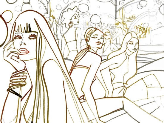
Melanie Reim’s image, Racetrack, uses different qualities of line in the foreground, middle, and background. A continuous line of energy flows in a diagonal movement back and forth across the composition, boldly defining figures in the foreground, suggesting activity in the middle ground, while blurring the imagery in the background. Reim’s skilled eye and deft hand coordinate in a seemingly effortless quick motion to give depth to the composition and interest to the characters, drawing the viewer into the image.
Directions
Have the model assume a pose on the first model stand (the foreground position).
Onto your paper draw a square framed area, 10 x 10in (25 x 25cm) or larger. Observe the figure and think about how you will position this figure within the framed space. You will need to pay attention to the composition of the various figures in your drawing and how they are positioned in the given space. It is perfectly permissible, and indeed preferable, to overlap and eventually crop the figures.
This first drawing will be considered as a drawing of the figure in the foreground. This is the figure that is closest to the viewer and therefore will be the largest figure or shape in the frame. This figure could be exaggerated; the space this figure occupies should be given great attention. Cropping of this figure is necessary to create exaggeration.
All foreground figures will most likely monopolize a great deal of the positive space but leaving room for the addition of other figures.
Step One
The foreground figure is cropped and positioned to the right with areas of negative space (see Figure 1). Begin to draw the model within your frame with a solid black and exaggerated thick contour line. Continue to see in terms of shape, although in this exercise you do not need to be so strict about only drawing shapes.
Step Two
Draw the foreground figure in a framed space as before, but with a tighter crop (see Figure 2). This “close-up shot“ should be positioned to the right and divide the compositional space in half.
Step Three
The foreground figure should now be centered in the framed space (see Figure 3), leaving negative spaces for the inclusion of additional figures.

In this composition, I made the foreground figure occupy the full height of the frame, placing the image to the left and cropping it to create exaggeration.
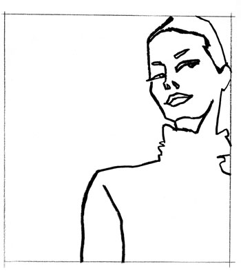
Fig. 1

Fig. 2
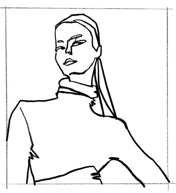
Fig. 3
Directions
Next, have the model take a pose on the middle-ground model stand. Observe and think about the placement of this figure. Keep in mind that you will need to leave enough space for a background figure to be incorporated into the space as well. When drawing the middle-ground figure, use a thinner gray line in contrast to the value of the line used for the foreground figure. Be creative with your placement of this figure; crop again if need be and think how the model’s position might best serve the composition of the foreground figure.
Step One
Take the first composition for the previous exercise (see pp. 84–85) and add in a middle-ground figure. Make it smaller in scale, lighter in tone, and positioned to left of the original foreground figure, as if exiting the framed space (see Figure 1). Draw the middle-ground figure‘s head turned toward the viewer, bringing the attention back to the foreground figure.
Step Two
Now take the second compostion from the previous exercise. Include a middle-ground figure, positioned directly behind and overlapping with the foreground figure (see Figure 2), thus creating a greater sense of depth.
Step Three
Using the final composition from the previous exercise, add in a middle-ground figure that is much smaller in scale (see Figure 3). This will create an exaggerated sense of space.
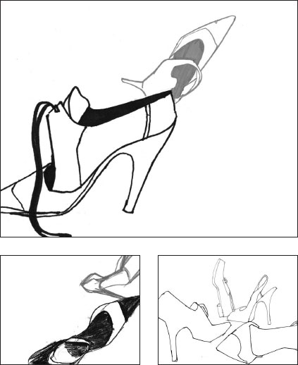
The shoes placed in the middle ground in the compositions by Gabriel Ayala (top), Tim Patterson (bottom left), and Cesar de la Rosa (bottom right) are drawn with a finer, gray line and are overlapped by the foreground shoes to create a sense of space.

Fig. 1
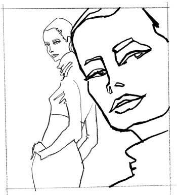
Fig. 2

Fig. 3
Directions
Now have the model take a pose on the third model stand and use this for the background figure. Look at your compositon of the foreground and middle-ground figures. Think about where best to place the background figure within the space.
The line to communicate the background figure should be faint and airy, almost on the verge of disappearing. This line should have no resemblance to the lines of the other occupants of the space. Using this faint line, draw the entire figure. Place this figure far in the background to create a contrast with the large cropped foreground figure. If the foreground figure is the largest then the background figure will be the smallest, probably drawn from head to toe, and will disappear into the background. If it suits the composition, the figure can be cropped to the left or right, or drawn behind one of the foreground figures or another in the background.
Observe the composition of the three figures and evaluate whether you are satisfied with the arrangement. Is there space for additional figures farther in the background? Would these figures enhance or detract from the current composition?
Once you understand the idea of drawing the figure with different line qualities, the use of three model platforms is unneccesary. One model stand in the same position will suffice. Have the model take a pose and decide whether to use the pose for your foreground, middle, or background figure. It is easier to begin this exercise with the placement of the foreground figure, as that is usually the figure that takes up most space; however, it is up to your personal sense of composition as to how to begin the placement of figures. I would advise, nevertheless, always saving the background figures for the final placement.
Meow Mix is a preliminary inked drawing that demonstrates how line quality and scale can be used to communicate depth and space. Color was later incorporated into the illustration via Photoshop.
Step One
Following the first composition from the previous exercise (pp. 86–87), add in a background figure that is is smaller in scale and lighter in tone than the middle-ground figure (see Figure 1). Position this behind the foreground figure, creating depth. Additional background figures (also lighter in tone) break up the compositional space and create the illusion of further space.
Step Two
Taking the second composition from the previous exercise, draw a background figure that is cropped out of the framed space, but facing into it (see Figure 2). This brings the focus on to the foreground figure.
Step Three
For the third composition, the middle-ground figure from the final composition in the previous exercise (see p. 87) is turned into a background figure. This is achieved by the addition of a new figure that is larger in scale and deeper in value (see Figure 3). Again, additional background figures divide the space and create depth.
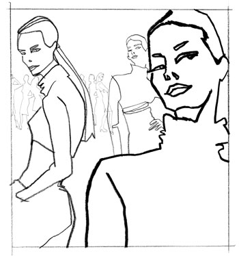
Fig. 1
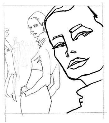
Fig. 2

Fig. 3


Line quality alone can give movement, weight, and depth to any drawing, as evidenced by this selection of work by Eva Hjelte (top left), Barbara Pearlman (top right), Joe Eula (below left), and David Wallin (below right).
4.2 Using Line Quality to Illustrate Depth on the Figure
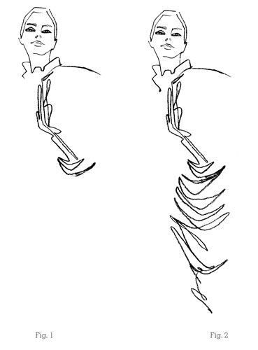
If you accomplished the goal of creating depth in a given space by using three lines of different weights and values, then you will easily be able to translate that premise into this exercise. The previous exercise used line variation to communicate space and depth by using a thick, dark line to represent the figure in the foreground and a faint thin line to represent the figure in the background. The middle-ground figure was of a line quality somewhere in between that of the foreground and that of the background.
Those three line qualities will now be used to translate depth onto a single figure. The premise is the same. The area of the figure closest to you would be considered the foreground area and, therefore, will be drawn with the darkest, thickest line, and so on. There are two minor differences between these two exercises: the flow and the merge.
The flow of the line and how seamlessly it merges into different line qualities will depend on how much pressure you exert on the charcoal, pencil, or brush you use.
Preparation
For the next three exercises, the following supplies are necessary:
One pad of 18 x 24in (A2) white all-purpose paper or comparable
Charcoal pencils—hard to medium
Kneaded eraser
To help distinguish the features on the model that are closest to you from those farther away, ask the model to take a pose that exaggerates this idea, for example, thrusting one arm forward and positioning the other one behind her.

Note:
This is a practical skill that will take a little practice. You can always use a scrap piece of paper, and, starting from the top of the page, slowly draw a very pale line that gradates into a thick, dark line as it reaches the bottom of the page. Create variations on this exercise as you feel more confident, going from thick to thin to thick, and so on.
4.2 Using Line Quality to Illustrate Depth on the Figure
Directions
In this exercise we will incorporate all three line qualities into one line to draw one figure. The idea remains the same, but this line will have a bit more energy and variance as it evolves from a thin pale line to a thick dark line and vice versa.
Step One
Proceed slowly to start with. Think in terms of shapes when observing, and make an allowance for the flow of your line to move freely around the figure.
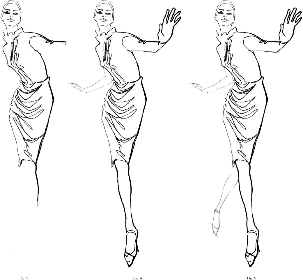
Press slightly down onto the paper with your medium and start with the middle ground, or center of the figure, using the quality of line here to inform the foreground and the background lines (see Figures 1–2).
Step Two
Push the difference of weights between the thick and thin lines as they describe the figure. Skim the surface with your charcoal as you draw the areas farthest away lighter and smaller. Exaggerate what is closer by making it a little larger in scale and by pressing harder to give a darker, thicker line (see Figures 3–5).
The method you improvise will depend on your view of the figure and confidence in handling the medium. Keep in mind the ideas incorporated in Chapter 2, which addressed verticals, diagonals, and horizontals in the figure, and use this information as an additional guide to move your line through the figure. Using line quality is an intuitive process and this exercise is a guide to nurture your exploration of line quality. The drawing need not be tight. It would be a disservice to nurture a line rich in line quality and have it be contained and strained. Give it freedom of mobility.
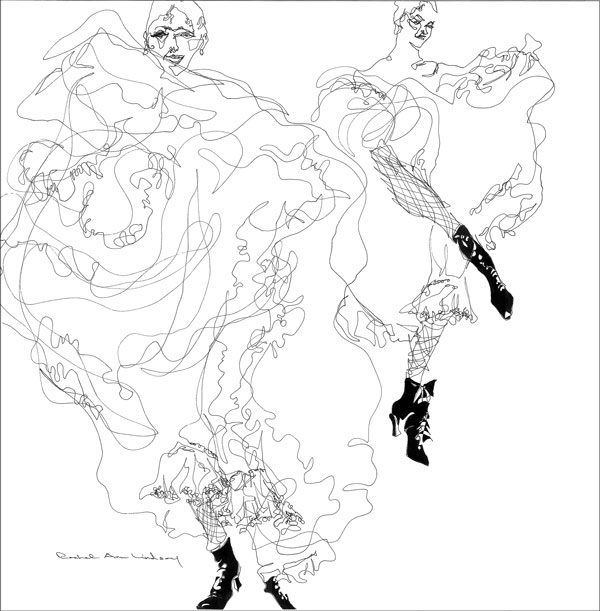
The flamboyant qualities and movement of the cancan dancers’ costumes are perfectly portrayed by Rachel Ann Lindsay using continuous line, in which the pen never leaves the page.
Con-tin-u-ous adjective
1. continuing without changing, stopping, or being interrupted in space or time.
Encarta World English Dictionary
If we now merge the definition of continuous with that of line quality and think rhythm, music, energy, grace, flow, and sensuality, we have a definition of continuous line.
As you may have noticed in the previous exercise, the textured cables of the sweater and the folds of the skirt of the middle area of the figure were handled in a continuous line method. The line was allowed to glide over the area and was not too exact in replicating what was present.
A continuous line has a life of its own and should be allowed the freedom to explore the white space of paper as a continuum of the artist’s vision. Imagine a violinist playing a piece of music.
As the violinist plays, note the consistent gliding of the bow back and forth across the strings, in turn creating an unbroken musical line that rises and falls in volume, tempo, and artistic interpretation. All arts are related on many levels and one of the universal themes in art is how the artist, author, or musician allows a personal vision to intuitively affect and influence their work.
Continuous line is an ideal place to consider how to incorporate an individualistic viewpoint into your work. A line that flows through the hand to the paper as a result of observation is relative to the artist’s relationship to the visual. This cannot be taught. It is a learned skill developed through practice, integrity, and a passion for drawing. It is an experience unique to the individual, and what is right for one artist may be the antithesis of the ideal for another.
What can be taught, however, is a method to begin to explore these ideas. Therefore, in this exercise, we will look at some ideas of continuous line.
Preparation
For this exercise, the following supplies are necessary:
One pad of 18 x 24in (A2) white all-purpose paper or comparable
Charcoal, pencil, pastel, crayons, markers, pen, oil stick, or any medium that can move without needing to be replenished
Note:
There is only one rule for this exercise: once you put pencil or charcoal to paper you will make a commitment to complete the drawing without lifting your medium off the paper. That’s it.
Directions
The goal with continuous line is to allow a freedom of movement and enable a trust between your eye and hand. The line should sweep and glide and examine areas with no regard to borders or boundaries. This freedom to move every which way could court chaos and not make sense visually. Therefore, a keen sense of selectivity and observation will nurture a more studied and descriptive drawing.
Where your drawing commences will be up to you. This is an opportunity to recreate your drawings in a different way, so you might want to start your drawing in a place you have never started from before; maybe the middle of the figure, the eye, or the feet.
Here are some initial guidelines to help you begin investigating continuous lines.
Step One
Choose an area near the top of the figure as a starting point and have your line move diagonally through the figure to an ascertained ending point. Have your line slowly move back and forth between these two points (see Figure 1).
Step Two
Use the idea of shapes, negative, large, or otherwise, to border the continuous line and control chaos (see Figure 2).
Step Three
Layer in the line to create a deeper value, as you did in the Dark Values exercise (see pp. 76–77). It is acceptable to backtrack and layer in a deeper value to help describe some areas.
To give additional depth and interest to the drawing, incorporate some of the line quality used in the previous exercise (see pp. 92–93). Use pressure and, thinking about the violinist, vary the pressure on your medium to create a variety of line quality (see Figure 3).
Step Four
When the drawing is almost complete, evaluate which areas of the drawing might need some additional information to clarify the visual. Add a second color or begin to add a second continuous line that emanates from a different area than the first line (see Figure 4).
Explore different variations of continuous line as well as exploring different media or combinations. A stiff line that zig-zags through the drawing has a harder edge and could be ideal to capture a male figure; a more studied, angular line can be incorporated to describe architectural features (see p. 98, Figures 5–8); a fluid, soft line that swirls can be used to denote softness or textured patterns such as lace, embroidery, or hair (see p. 99, Figures 9–12).
The key to using a continuous line is to allow the line the freedom to move through the figure with light-handed guidance from the artist. It is playful in nature, so use this playfulness to your advantage. Don’t restrict its movement or your possibilities.
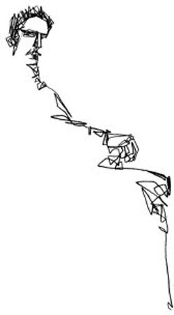
Fig. 1

Fig. 2
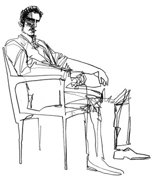
Fig. 3
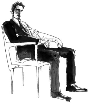
Fig. 4
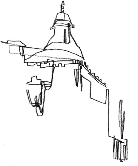
Fig. 5
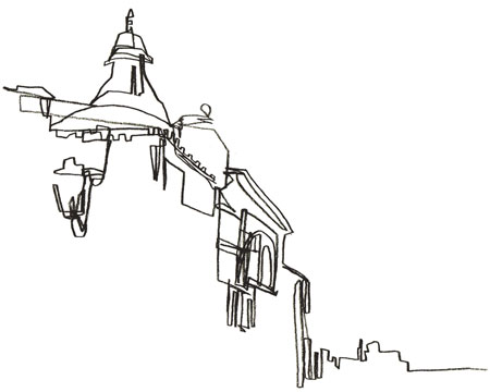
Fig. 6
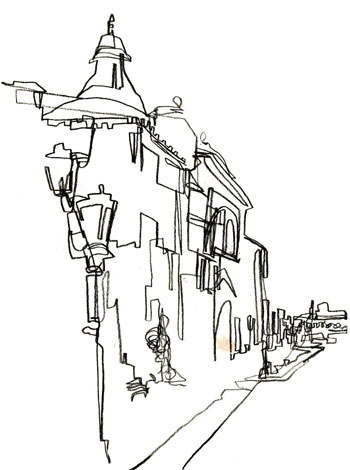
Fig. 7
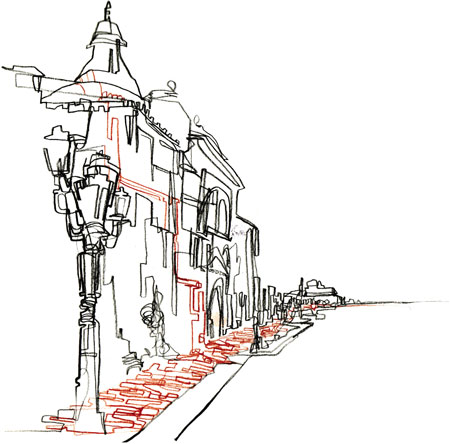
Fig. 8

Fig. 9

Fig. 10
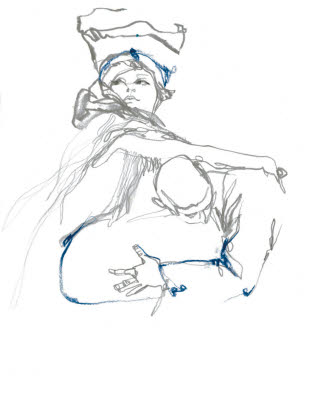
Fig. 11

Fig. 12
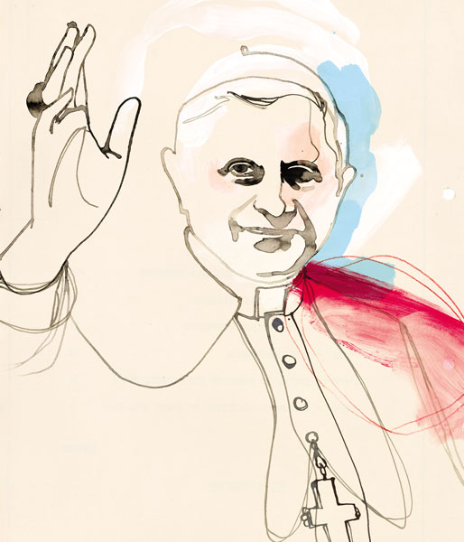
This illustration of Pope Benedict XVI by Tina Berning for The New York Times Magazine uses a studious line to capture the eye.
The studious line and the continuous line both share the characteristic of a traveling line. However, while the continuous line travels across the figure in a somewhat rhythmic flow, the studious line is observant, slowly capturing a particular area within the figure.
The aim of the studious line is to capture as much information as possible with fine attention to detail as it moves from one location to another. Unlike the continuous line, the flow of a studious line can be broken if it seems necessary to invest time in another area of interest; so, while the line may flow in a specific direction it can also linger on an area until it has been duly captured before moving on. A studious line is adept at capturing patterns, prints, and features such as the eyes, recording every eyelash, or the intricacy of flowing hair. While being very observant, the studious line is also a free spirit.
Preparation
For this exercise, the following supplies are necessary:
One pad of 18 x 24in (A2) white all-purpose paper or comparable
Charcoal, pencil, pastel, crayons, markers, pen, oil stick, or any medium that can move without needing to be replenished
Directions
In the same way that you did for continuous line, choose an area near the top of the figure to begin. Invest some time in observing the visual and determining which area lends itself to being fully investigated with a studious line. Is there an intricate pattern or print or any area that is an interesting resource of textural information waiting to be recorded?
Step One
Allow your line to move freely, extending itself to investigate the figure (see Figures 4 and 7) or until it rests on an area that you find intriguing (see Figure 1).
Step Two
Evaluate where to go next or which area might also lend itself to the observant character of a studious line (see Figures 2, 5, and 8).
Step Three
If the intent is to further communicate a pattern or textile on the figure, allow the direction of the studious line to inform the direction of the print or pattern (see Figures 5 and 9).
Step Four
From this point, it would make sense to step back from your drawing, take a breath and then decide what is needed to complete the drawing (see Figures 3, 6, and 10).

Fig. 1
Fig. 2
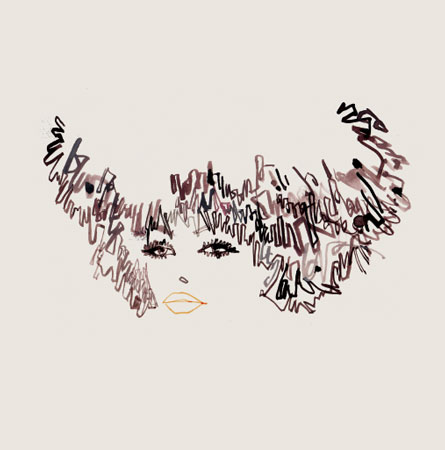
Fig. 3
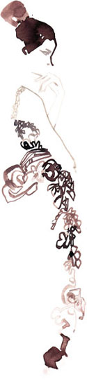
Fig. 4
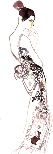
Fig. 5

Fig. 6

Fig. 7
Fig. 8
Fig. 9
Fig. 10

Fluid line is used here to caricature the two Afghan hounds and portray the girls’ hair. The best companion for line is a shape. The solid black and white shapes of the figures accentuate the fluidity of the line, which lends an air of grace to the illustration.
While the studious line is enamored of capturing detail, the fluid line moves to a different rhythm. Carefree, whimsical, and flowing with flair, the name alone signifies the characteristics of a rhythmic line.
A fluid line can be used to describe movement, the folds or drapes of a garment as it responds to the movement or pose of the figure, or the windblown effect of hair or fabric. It can be used to create a whimsical visual regardless of subject matter. All of these features are synonymous with fashion drawing.
You have already witnessed some of the properties of the fluid line in continuous line, where the direction of the line moved in a flowing motion from one point to another (see pp. 94–99). Line quality also gave an indication of fluid lines by using different weights of line to describe space (see pp. 90–93).
Fluid line is a combination of both of these tactics. It flows and also uses a variety of line quality to dance around with an energy and lightness that conveys a sense of spirit and movement.
Despite this cavalier reputation, a fluid line is as knowledgable as a studious one. But, unlike the studious line, it is usually accomplished with a quick movement of hand to paper. These movements are exacted with a courageous leap of faith and based upon a solid understanding of the figure and form. This confidence allows the line to flow with purpose.
A drawing incorporating fluid lines without any understanding or purpose may serve as a hollow gesture. Anyone can do a drawing with flowing lines without any understanding of why these lines are present, but the effect serves only as camouflage to distract the viewer from the lack of draftsmanship, knowledge of anatomy, or of how to draw the figure.
Preparation
For this exercise, the following supplies are necessary:
One pad of 18 x 24in (A2) white all-purpose paper or comparable
Charcoal, pencil, pastel, crayons, markers, pen, oil stick, or any medium that can move without needing to be replenished
Directions
Observe the figure, evaluating which areas could be communicated with a fast movement of line. Begin your drawing at the top of the figure and use your fluid line with a rapid movement indebted to your knowledge of the figure or visual. It would be prudent to begin the flowing line close to the figure and emanating outward away from the figure.
Step One
If you wish to incorporate a variety of line quality, follow the premise from pp. 90–93 and keep the deepest value of line close to the figure and fade the line as it moves away (see Figures 1 and 3).
Step Two
This line can also be used as a means of whimsical stylistic expression (see Figures 2 and 4).
Step Three
Use the fluid line to accent and give further movement to an area such as the hair (see Figure 5).
Step Four
Once complete, revisit the drawing and add further fluid lines or details to communicate the visual (see Figures 2, 4, and 6).

Fig. 1
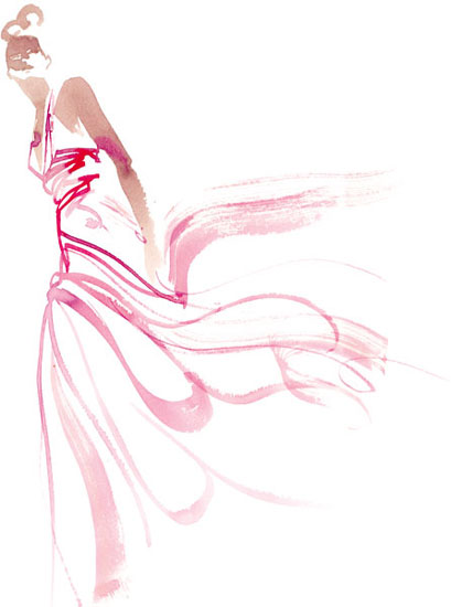
Fig. 2
4.5 Fluid Line

Fig. 3

Fig. 4

Fig. 5

Fig. 6
The aim of this assignment is to reinforce the various exercises that you have completed so far in this book. There has been a lot of information to process, and an ideal way to document your knowledge of this information is to do a series of drawings that enables you to recap the ideas presented in each chapter. Incorporating this information onto one sheet of paper will also prove invaluable to you as a means of charting your progress. It is also a visual resource showing you how observation and thought can guide your drawings.
Preparation
For this exercise, the following supplies are necessary:
One pad of 18 x 24in (A2) white all-purpose paper or comparable
Charcoal, pencil, pastel, crayons, markers, pen, or oil stick
Directions
Onto a large sheet of paper, draw a frame 18in wide x 13½in high (46 x 34cm). Divide this frame into 8 smaller frames of 4½in wide x 6¾in high (11 x 17cm).
In order to fill each frame, you will be required to use your knowledge and command of the vocabulary of shape and line. It is most beneficial to fill in each frame one after the other in one sitting. Examine each drawing as you proceed and compare it to the previous drawing. Push the opposition factor in each drawing to make each completely different.
Frame 1
Draw a figure in strict straight lines.
Frame 2
Draw a figure in straight and curved lines in three shapes.
Frame 3
Draw a figure in five to seven shapes. Think of mapping, using the idea of a black shape that helps describe the visual.
Frame 4
Draw two figures, one in the foreground and one in the back or middle ground in gray and black values. Compose the figures limiting the number of shapes and use the premise of straight and curved lines to contrast the differences between the two figures.
Frame 5
Starting from the upper left-hand corner and working into the lower right-hand corner, do a continuous-line drawing.
Frame 6
Draw a figure using a negative, a black, and a gray value shape. Include an area of continuous line.
Frame 7
Color in this box with a neutral color or paste in a piece of gray paper. Draw the light values on the figure in white. Use a black shape to hold the figure.
Frame 8
Do a drawing of the figure that combines at least three or four of the previous exercises.
Note:
All of the exercises in this assignment incorporate the premise of composition as an essential component; cropping and the positioning of the figure should be considered.
The use of a model is ideal. If this is not practical, however, a small mirror can suffice and a series of self-portraits can substitute for the model.