
Finding Your Voice
“There is a vitality, a life-force, an energy, a quickening that is translated through you into action and because there is only one of you in all of time, this expression is unique. And if you block it, it will never exist through any other medium and be lost.”
Martha Graham, dancer and choreographer
There is no proven method or specific technique to teach you how to discover your voice. No one creates a style overnight. Time, experience, and an innate awareness of your particular place in time will nurture the development of your style.
Your environment and taste in music, fashion, clubs, trends, and art will determine your outlook and affect your work. Artists are visual recorders of life. The more exposure we have to different venues, events, and experiences, the richer the resources we have to draw upon. Keep a sketchbook and record everything, everywhere, whenever possible. Don’t rely solely on the web for reference; create your own folder of references that reflect your eye and not the eye of another artist. Have available a digital camera and create files of visual reference. Visit art galleries, take a class, be an active participant in life and allow that experience to filter into your work.
Your personal sense of style, fed by your observations, will enable you to choose the words from the vocabulary we have been studying throughout the book—shape, line, value, and composition—that will help create your individual drawing style.
Using the Vocabulary
The overriding principle in the exercises has been selectivity based upon thought and observation. Through your use of selectivity, you subconsciously employ your personal sense of style. Allowing selectivity to govern the choice of words you use means that you can create work that is confident, graphic, and informed.
By using the vocabulary when you are drawing, you are choosing the words to communicate with your audience. How you use the words is your choice, but the richer and more extensive your vocabulary, the richer your options of communication.
In this chapter we look at a range of styles and discuss how choices from the vocabulary have been used to create each unique image.
In this first set of drawings, we will look at how the use of shape can underpin any style of drawing. We were first introduced to the concept of shape in Chapter 3. Through the exercises in that chapter we began to understand why shape is essential to creating and seeing in terms of composition.
Whether incorporating line, texture, value, or color, thinking in terms of shape will allow you to recognize the elements of the composition and how to design those elements to great effect.
All of the illustrations accompanying this section are designed around the idea of shape. All are designed with a nod to selectivity and incorporate the compositional principle of repetition.
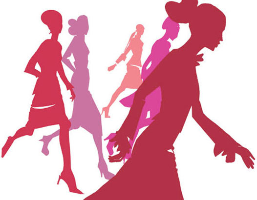
This drawing incorporates contrasting shapes, each of which is exaggerated to complement the surrounding shapes. This is achieved by using the premise of opposition in the shape of the figures; the diagonals are also exaggerated to give a sense of movement to the silhouettes.
Selectivity was used in the choice of color and also in the use of negative shapes. The use of one-point perspective communicates depth, which is enhanced through the use of monochromatic color saturation from the foreground to the background figures.

Selectivity is apparent in this illustration in the use of one large shape—the red gown. The minimal use of color creates a dramatic narrative, which is further enhanced by the additional premise of negative shapes. The loose brush stroke of the gown contrasts with the definite black silhouettes of the paparazzi that anchor and complement the figure.

The simple shapes in this illustration of shoes use negative as well as positive shapes, while the asymmetrical design and use of diagonals give the composition a rhythmic movement.
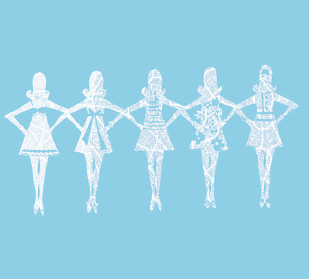
Opposition and contrasting shapes are used in this illustration to break up the repetitious nature of the identical figures. The repeated pattern of the cut figures uses the negative shape to create variety.
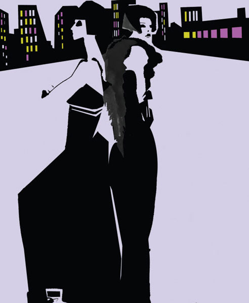
Here, one large black shape is used economically to frame the negative shapes of the figures. A static symmetrical layout is balanced by the rhythmic pattern of the windows of the cityscape. The figure on the left is composed of exaggerated straight lines, while its mirror on the right complements it with the use of curved lines.
We started in Chapter 1 by looking at the integrity of line, while in Chapter 4 we explored different line qualities and their characters. We learned how line can be aloof or full of emotion, straight, curved, spontaneous, or studied and seemingly infinite in its ability to communicate anything and everything. Line is the immediate extension of the self and the pulse beneath the drawing.
Line should and will become an essential part of your visual vocabulary as an artist and illustrator.
In this section, all the images are based upon line and show how the selection of lines of different character from straight to studious can lend energy and expression to your style.

The movement of the skaters is accentuated by the addition of exaggerated fluid lines on the figures’ trailing scarves. The figures themselves are drawn in a contour line with the addition of a wash of color to form the illusion of a skirt.

This illustration of geisha is created entirely with line—straight/curved, thin/thick, studious/ continuous, and fluid.
Straight and curved lines define the form of the geisha, the structure of the umbrella, and the patterns gracing the kimonos. The floral hair accessories, the cherry blossoms in the fan, and some of the pattern on the kimonos are a combination of straight, curved, continuous, and studious lines. Some of the studious lines that form the hair are also used as a framing device to define the face. A variety of line quality, both thick and thin, is evident in the folds and form of the kimonos, nurturing an illusion of depth.
A thick fluid line moves diagonally in the foreground figure’s kimono while a smaller, looser version is visible in the background figure’s fan. The shape of the umbrella is a combination of straight and curved lines and is designed with a repetitive line pattern of a snowflake. The red shape that serves as a backdrop to the pattern is the only solid shape in the illustration.
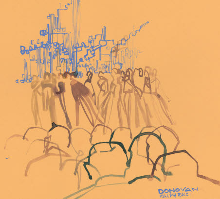
Here, fast energy lines are incorporated into a sketch of a fashion show. Overlapping contour lines are employed to give a feeling of movement to the audience. The models on the runway are drawn with a variety of line quality to emphasize depth and are complemented by the continuous thin line of the backdrop.
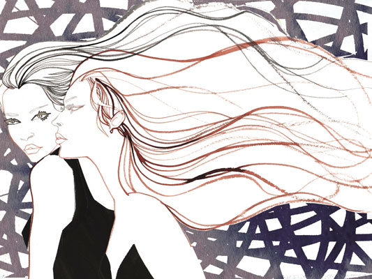
Contour lines define the outline of the face and figures in this illustration. Studious lines examine the eyes, while flair lines of various weights overlap and flow throughout the hair. A large background composed of overlapping thick lines that form a pattern holds the figures. The addition of four contrasting black shapes subtly complements the various lines.

This quick gesture drawing of the figure is composed entirely of lines. Four curved lines of various qualities and textures compose a shape that frames the face. A contour line describes the figure and helps to frame the negative shape of the face.
As we have worked our way through the exercises in this book, and acquired an understanding of different words in the vocabulary, we have followed a progression from line, through shape, value, and composition. In this section we look at how shape can be used to complement line, and vice versa.
If shape is considered the soul of a dynamic composition then line pulsating through the work can be considered its heart. The combination is brilliant. Playing one off against the other is the start of a strong graphic illustration. Adding the capricious nature of line to shape can animate and energize what would otherwise be an interesting yet static illustration.
The illustrations in this section show that the use and balance of line, shape, and color in a drawing can make an arresting and dynamic image.
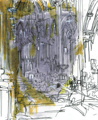
The addition of a washed shape within this illustration of the interior of St Patrick’s Cathedral in New York creates the illusion of depth despite the use of contour line for the majority of the illustration. This illusion of depth is further nurtured by the use of shapes and line in white, which also illuminate the cathedral. The lines and shape work together to create an interesting balance without one monopolizing the other.
Lines of different characteristics overlap and blend against a static backdrop of solid shapes that serve to embellish the movement of the line.
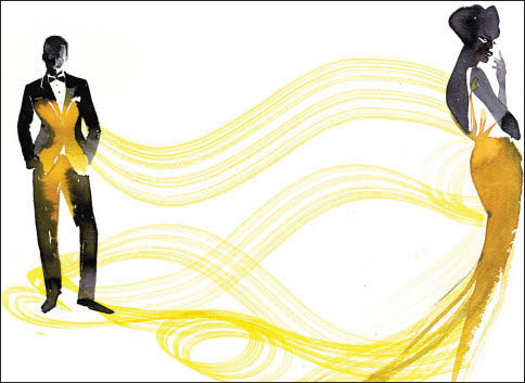
Fluid lines emanate off the gown of Sophia Loren in this illustration, entitled Urgent. The concept revolves around a gown that left a gold imprint on Ms Loren’s co-star, Cary Grant, in the film Houseboat. The use of fluid line incorporates movement as well as the illusion of Ms Loren’s ability to enchant. The addition of the dark static shapes complements the movement and direction of the lines.

The composition of the shapes of the dogs and walkers are animated with the whimsical fluid lines of the leashes that dance between the shapes.

Shape and line are blurred in this illustration of luncheon in the country and the city. The use of an identifiable contour line seems limited to the face and features. The rest of the elements in the illustration are a combination of line and shape and are sometimes indistinguishable from one another.

Here the definite form and line of the figures are balanced by the use of colored shapes to fill in the shape of the gown. The shapes follow the direction of the lines and, as we saw in Chapter 8, decrease in saturation and repetition farther away from the viewer.
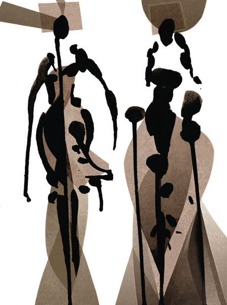
Tobie Giddio embraces the idea that pushing the envelope is far more interesting than floating in one’s comfort zone; one glance at her work is confirmation of that. Her ability to balance a graphic abstraction with an organic and Zen-like sensibility, as in this screenprint, Beings, creates work that is timeless and intriguing, with a beauty that leaves the viewer spellbound.