
Beginning a Vocabulary of Shapes
I love shapes. Plain and simple. Big or small, busy, clean, textured, patterned, in color value or black or white, silly or serious—shapes rule! Shapes are one of the most important elements in observing and creating visual art. They are the guiding force in layout, design, and composition, whether in drawing, painting, sculpture, or photography, or the creation of a garment. Look around and you will find yourself surrounded by shapes of all sizes, positive as well as negative, composed of light, shadow, texture, and pattern.
We are introduced to shape from an early age and taught to differentiate between a square peg and a round one. Most of us were unconsciously introduced to the language of shapes when we first put crayon to paper and colored inside the lines of a simple illustration in a coloring book. Those contour drawings were made up out of various shapes that together composed a single image. Each shape was closed up with borders to allow us to color inside the line.
Understanding shape, and seeing the world around you in terms of shape, will allow you to break down what you see into simple forms, thus allowing you to draw, paint, or create a dynamic illustration.
In this chapter you will learn how to use shape—or, more correctly, how to incorporate shape into a drawing. You will also have an opportunity to exercise selectivity and communicate your personal style and viewpoint.
Be warned that there will be much examination and discussion of shapes in this chapter, as well as in the chapters to come. You will learn to see and communicate in shapes—it’s a great language.
Beginning a Vocabulary of Shapes
Through simple exercises using line, and thinking about contrasting the differences (opposition), we will deconstruct the figure in terms of shape and use that deconstruction to build a blueprint of the figure. The blueprint is the initial step from which you can build; with a solid foundation to start from, the possibilities are endless. In the previous chapters, we used selectivity to elicit a stronger graphic image. Selectivity will again be a constant companion to the use of shape in this chapter; you will be asked to think first and use your mind more than your drawing medium.
When observing the figure we see a composite of light and value, textures and patterns, colors, lines, and folds. It can seem overwhelming to the untrained eye. Therefore, the exercise of using the balancing act establishes a starting place to begin the drawing. The restrictive practice of using straight and curved lines forced you to analyze the figure—actually the shape of the figure—and break down some of the overwhelming information into simple lines. Chapter 2 offered a guide to seeing the figure in terms of the verticals, horizontals, and diagonals inherent within it while also demonstrating how to push and pull those factors to elongate and create a cleaner image. All of these premises should be incorporated into the following exercises on shape.
Less is More
In this chapter you will again be editing and selecting in your quest to communicate the figure in terms of shape. This might seem straightforward, but the challenge is to identify the shapes that seem to communicate the image best. In composition and graphic art, the simpler the layout and design the greater the impact that image makes. So too with communicating the figure in terms of shapes. The fewer the number of shapes you use the more important those shapes become. Consider the idea of creating a composition where, in a square frame, you have drawn 579 shapes of similar shape and size to fill the entire space. The importance and prominence of the shapes as individual shapes will diminish as you continue to add more into the space. Now take that same space and draw three shapes of varying form and size within it. Each of those shapes now takes on a specific characteristic and becomes unique in its own form, and will complement the other shapes. That is, of course, if there is thought behind the selection of those shapes; without thought and selectivity, filling a space with less could be just that—less. The key here is to observe, think, be smart, select, and develop a drawing that, regardless of the number of shapes it contains, is interesting and dynamic.

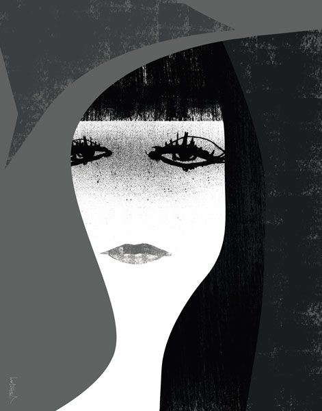
In this illustration, Chuck Nitzberg uses the premise of selectivity to compose a face in a series of shapes. Each shape has a distinct character of line, media, or texture. The shapes complement and contrast one another, creating a sense of tension and drama that compels the viewer to take a second glance.
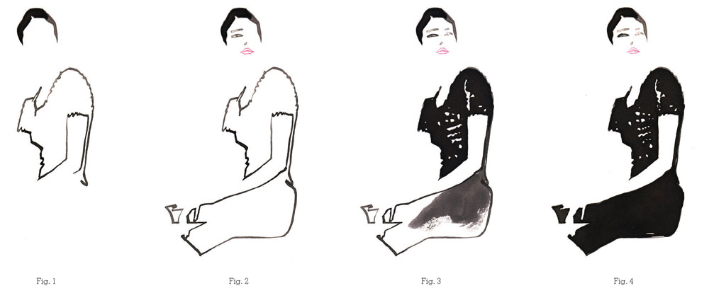
3.1 Drawing the Figure in Three Shapes
I am often asked when directing this exercise if the figure should be drawn in geometric shapes such as circles, squares, or rectangles. The answer is no. The drawing may observe those elements, but should reflect the reality of the figure and not abstract it in geometric forms. When you are attempting to draw and observe the figure, therefore, you will not be exaggerating the figure into a cubistic form.
The key to achieving the desired goal of using shape is observation and thinking. We sometimes rely on what we know rather than what we see: if I asked you to draw an eye from memory, you could; if I asked you to draw a pant leg, I’m sure you could, but your drawings would probably lack depth and integrity as they would have no basis in reality. Drawing what you see rather than what you know, however, will make your drawings far more believable.
The previous chapters explored the figure in simple terms of a contour line and communicated the form of the figure in one shape—the contour line encompassed the entire shape of the figure. Now we will divide the figure into three distinct shapes. In this exercise, negative spaces, such as those between the arms or legs, are not considered to be part of the three shapes.
Preparation
For this exercise, the following supplies are necessary:
One pad of 18 x 24in (A2) white all-purpose paper or comparable
Charcoal pencils—hard to medium
Kneaded eraser
3.1 Drawing the Figure in Three Shapes
Directions
First, have the model take a pose. Spend a minute or two observing the figure before you start drawing, and mentally break up the figure into three shapes. In order to draw the whole figure it will be necessary to combine shapes, since the figure is composed of many different shapes.
Using the balancing act, begin by drawing the figure from the head. Close up each shape before you move on to the next, as if you were creating a simple image for a coloring book. This will allow you to observe, think, and communicate the shape as you proceed through the figure.
Make the drawing interesting and inventive. It would be easy to draw the head as one shape, the torso as another, and then make the bottom of the figure the third shape. That would be expected. Make the viewer work. Do not let them off too easily. Think selectivity!
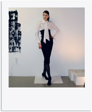
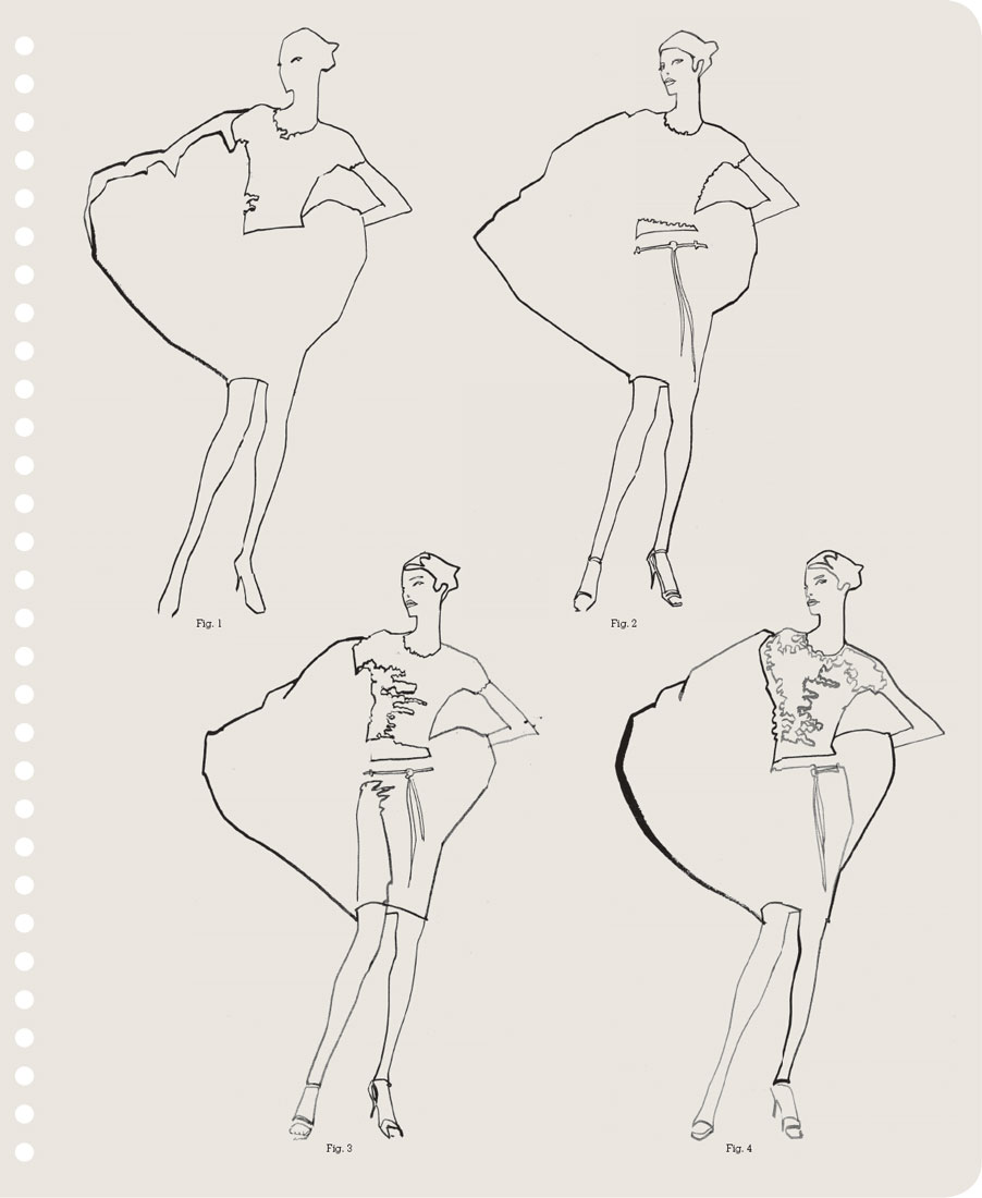
The illustrations here show that there is no single way of doing this exercise. You can unite different areas of the figure into any one shape. In Figure 1, for example, the head, upper torso, scarf, and arms are drawn in one shape, the rest of the torso and the right leg in another, and the left leg in a third.
Which do you think best communicates the figure? Do you feel that each brings a different perspective to the drawing?

In this illustration of shoes and gloves, Bo Lundberg has repeated a single shape to convey each accessory. His use of negative shapes and line to contrast and define the images adds further interest to the composition.

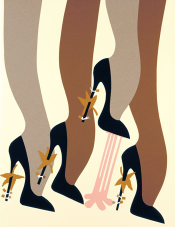
Michael Roberts’s witty image, from his book Fashion Victims, illustrates the perils of walking in high heels on the sidewalk and is an exercise in the minimal use of shapes. A collage rendered by hand in cut paper, the skillful handling of shape, color, rhythm, and selectivity enhances the movement of the legs and directs attention to the single pink shape in the illustration.
3.2 Drawing the Figure in Five Shapes
After completing the last exercise, your drawings will look edited. Selectivity will have guided your observation and will have resulted in a well-thought-out drawing and composition. Now we will up the ante and communicate the figure in five shapes. Following the same guidelines as in the three-shape exercise, continue to observe, think, and create. This time, if it seems applicable, add the negative shapes as well. You can either add these after all five shapes are complete or as you work through the figure.
Preparation
For this exercise, the following supplies are necessary:
One pad of 18 x 24in (A2) white all-purpose paper or comparable
Charcoal pencils—hard to medium
Kneaded eraser

3.2 Drawing the Figure in Five Shapes
Directions
In the same way as in the three-shape exercise, first have the model take a pose. Spend a minute or two observing the figure before you draw, and mentally break up the figure, this time into five shapes.
Using the balancing act, begin by drawing the figure from the head and close up each shape before you move on to the next.
Here Figures 1 and 2 show how you can be even more inventive when using five shapes. Figures 3 and 4 show how using selectivity and adding a few more shapes can bring even more definition to your drawing.
Test Your Skills
Have a model take a pose for five minutes. Examine the figure from head to toe, but do not draw anything; just mentally record what you see. When the five-minute period is over, have the model break, then quickly sketch in line what you remember, taking no more than five minutes.
Then have the model resume the pose and check your drawing against the pose for accuracy. Now repeat this idea with another pose, only this time when you are observing the figure and mentally recording the pose, break the pose up into five to seven shapes. Then draw what you remember in shapes. See if you were able to communicate the pose more correctly by breaking the figure into shapes rather than line.

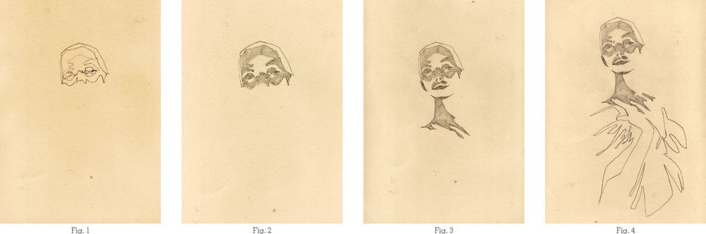
Fig. 1

Fig. 2

Fig. 3

Fig. 4

Sonya Suhariyan uses a myriad of shapes to communicate the figure in this illustration. Key shapes are identified with which to compose the figure; each shape is then filled with numerous other shapes and patterns. Even the negative shapes between the arm and the body and behind the figure are filled with pattern and color.
For this exercise, start by thinking about a paint-by-number kit. The line-art image is broken up by a series of shapes; many shapes to be exact. The idea behind mapping the figure in this exercise is based on the same premise. Three, five, seven to hundreds if not thousands of shapes could be used to communicate the figure. In this instance, try breaking up the figure into seven shapes. Once you have completed the seven shapes, choose one of the shapes, go into that shape, and add three to five shapes within it. For instance, if you choose the face shape, you might add an eye, mouth, and the shadow of the nose shape. Think of it as creating a map of the figure with seven continents and adding countries to some of those continents; maybe inside those countries adding states, then within those towns and cities.
Preparation
For this exercise, the following supplies are necessary:
One pad of 18 x 24in (A2) white all-purpose paper or comparable
Charcoal pencils—hard to medium
Kneaded eraser
Directions
Starting from the head again, observe the figure and break it down into seven shapes.
Go into those shapes and start to add other shapes. Perhaps there is an area such as the skirt or top, for example, where a lot of information could be recorded, which you can communicate with a large number of shapes.
To succeed you must use selectivity. If you look at Figure 1 (overleaf), you will see that there is no diversity of shapes or use of selectivity, whereas in Figure 2 you can see selectivity. Look at the figure’s right upper torso and arm where there are no additional shapes, or very few, whereas the area immediately adjoining it—the waistline and scarf—are filled with more shapes. The “blank” area is contrasted by a more patterned area, the one framing the other.
Figure 3 is a combination of interesting shapes—contrasting, complementary, large, small. In Figure 4, additional details begin to occupy these shapes, like towns and villages in the various countries of a map, giving depth to the head, defining and contrasting the fabrics of the large evening coat and the intricate bodice, and introducing narrow horizontal details to the waistband and hemline of the skirt to echo and reinforce each other.
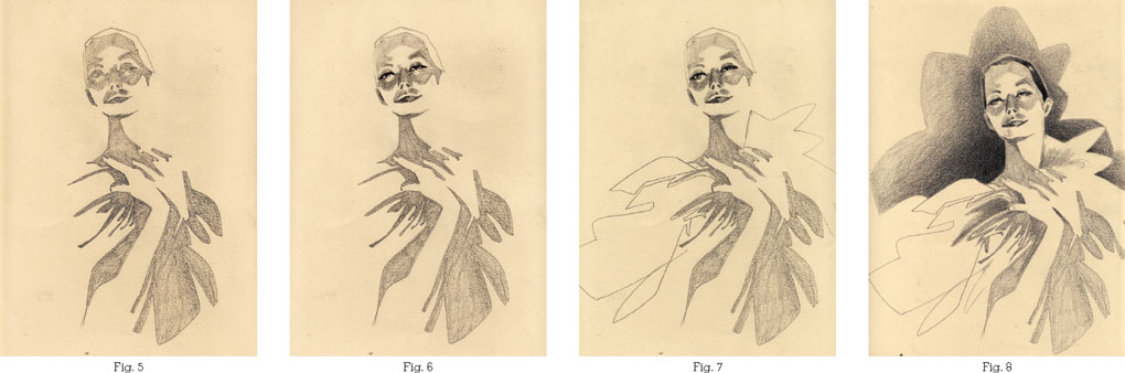
Fig. 1
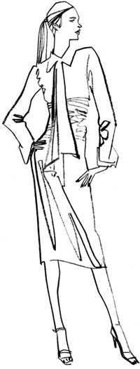
Fig. 2

Fig. 3
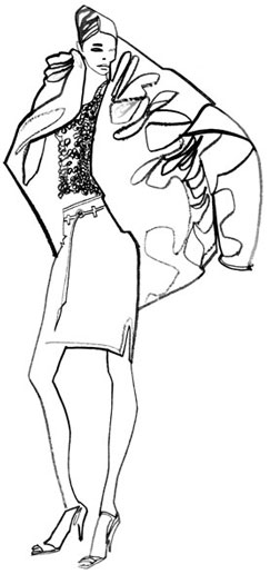
Fig. 4

In his portrait of Daniel Craig, John Jay Cabuay employs a series of contrasting shapes: the rounded shape of the actor’s face contrasts with the vertical lines of the hand holding the gun; the large shape used to portray the actor’s clothes is set against the detail of the face; white is contrasted with black; and the negative shape of the red background is set against the figure.
In this exercise you will be thinking outside the box, or rectangle, or head, or skirt, or arms, or legs, or shadows. Too often it is tempting, when making a drawing composed of shapes, to draw a hair shape, a head shape, a torso shape, an arm shape, a skirt shape, a belt shape, a leg shape, and a shoe shape. Just as you tired of the repetition of the previous sentence, so too will a viewer tire with the obvious in your drawings.
To help counteract this problem, and build on the skills we practiced in the previous sections, we will now concentrate on looking for contrasting shapes. Contrasting shapes are shapes that complement each other in some way—a long shape with a short shape, a vertical with a horizontal, for example. Using contrasting shapes is an important key to holding the attention of the viewer and also in determining your vision. Your selectivity in choosing shapes of different characters that play upon each other not only nurtures your draftsmanship, but also allows you to see anew and reinvent the figure in interesting patterns of varying shapes.
This is similar to the way you used opposition with line. You will again be using all the concepts with which you are now familiar: opposition, verticals, diagonals, horizontals, straight line, curved line, and push and pull. Unconsciously, you were already doing this when you drew the figure in a limited number of shapes. You had to select those most interesting to you and also those that best communicated the figure. Now we are going to apply the idea of contrasting shapes against a backdrop of terms with which you are already acquainted.
Preparation
For this exercise, the following supplies are necessary:
One pad of 18 x 24in (A2) white all-purpose paper or comparable
Charcoal pencils—hard to medium
Kneaded eraser

Directions
Throughout this exercise, think about using opposition. You will start by observing the figure and using the premise of five to seven shapes; then begin to communicate the figure in terms of long, short, diagonal, horizontal, busy, simple, and interesting shapes.
Step One
First, analyze the figure in terms of shapes. Are there any shapes visible that are contrasting in character? Look at the figure and try to find shapes of various sizes that are not too repetitive. As in mapping the figure, less is more; if you have only five to seven shapes to choose, select wisely and choose those that will be independent of each other.
In Figure 1, the head and torso combine with the skirt and supporting leg to create a vertical rectangular shape. Played against this elongated shape is the small diagonal face shape and combined arm shape. Glance at the three triangular shapes visible between the negative space of the arms and see how these were pushed slightly to make one narrower and one wider and then played against the horizontal waist shape. All three of these shapes, although close in character, are exaggerated to give each shape a personality. The last shape of the leg uses the slit of the skirt to elongate it and make it more interesting.
Step Two
Expand the horizons of selection by using not only the solid shapes visible, but also the shapes that form shadows, light, folds, or nuances in the pose and clothing that could make for interesting shapes (see Figures 2, 3, 4, 5, and 6).
Figure 2 combines the face and torso shape, while mapping in a smaller busy shape for the shadow of the eyes and the bridge of the nose. The skirt shape is reinvented by using light and shadow on the figure to incorporate the light shape that falls on the rear of the figure and extends the shadow of the skirt shape into the kneecap.
Figure 3 uses the shadow again to reinvent the skirt, while Figures 4, 5, and 6 use the light and texture of the beading on the top to create a specific rounded shape that complements the more angular character of the shadow and folds of the skirt.
Keep in mind that the exercises reflect my personal choices and are indicative of the procedure. There is no right or wrong. Let your inventiveness be a guide and challenge yourself not to be repetitive in selecting the shapes.
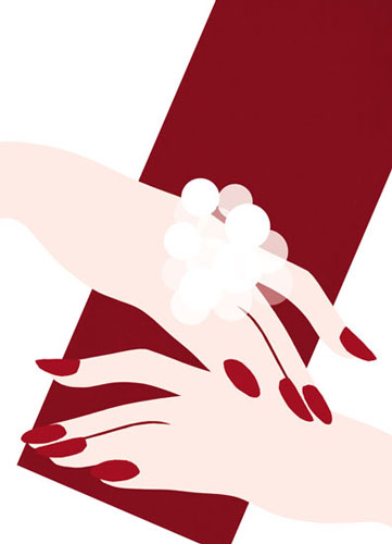
In this illustration, Sirichai has used selectivity in his choice of shapes: a single shape encompasses both hands, contrasted with the repetition of the red fingernails, while the solid diagonal shape of the bag contrasts with the more ethereal quality of the hands.


Daniel Egnéus uses one large shape—the deep mauve of the upholstery—to frame the figure in this illustration.
The bigger the better. Shapes of varying sizes or characteristics create a drawing or illustration that is attractive and will gain the attention of the viewer. That is one of the goals of analyzing the shapes of the figure and choosing accordingly. There are numerous variations on playing and choosing shapes that are different; however, one in particular is a major asset to illustration—locating a large shape within the figure. A large shape can serve as a framing device, a breathing space for the eye, or an area that will complement other shapes of different character. When you allow editing to inform your work, the more minimal and selective your shapes are, and the more important those shapes you do choose become.
In Figure 4 of the Mapping the Figure exercise (see pp. 49–51), the puffa jacket is not only the largest shape, but also the only large shape. It could dominate the drawing, but, played against the other shapes with their different characteristics, it responds to and contrasts with them, rather than monopolizing the figure.
Inside the large shape of the puffa jacket, a continuous line unravels, making indefinite smaller shapes that define its folds and quilting. For the most part, though, the large shape is kept empty and as such gives some breathing space. The use of a large shape not only complements its companion shapes but also adds drama to a drawing. If colored in, it can become a useful backdrop for the visual.
Of course, some poses and clothing naturally lend themselves to a large shape, such as the puffa jacket. However, even in the simplest poses a large shape can be found, either as a discrete area of the body or the clothing, or by combining a few shapes together.
Preparation
For this exercise, the following supplies are necessary:
One pad of 18 x 24in (A2) white all-purpose paper or comparable
Charcoal pencils—hard to medium
Kneaded eraser

Step One
Observe the figure. Locate a shape that is large or has the potential of being a large shape. For instance, in Figure 1, in which the model is also wearing a puffy coat, the size of the coat is pushed and exaggerated to make a shape that was large even larger.
Step Two
If the possibility of finding a large shape in the costume or garment of the figure is not viable, then you may combine two or three shapes to make one large shape (see Figure 2).
Step Three
As demonstrated in the Contrasting Shapes exercise (see pp. 53–55), incorporate the shapes inherent in shadows, forms, pleats, light, or characteristics of the clothing. Allow poetic license with a nod toward exaggeration to guide you in selecting and communicating those shapes (see Figure 3).
Step Four
Once you have five to seven shapes, including a large shape, try some mapping within a few shapes to further define the figure (see Figure 4).
This illustration, of John Galliano’s Fall 2004 couture collection for Christian Dior, utilizes the large shape of the evening jacket to both frame and complement the silhouette of the figure.

In this illustration for Residence Magazine, Bo Lundberg has chosen to portray three areas using one large black shape. This grounds the illustration and defines the table, vase, and TV screen, the figure, and the piano—and also contrasts with the patterned white shape of the chandelier.
At this point you may be anxious to begin using the vocabulary of different shapes to create a finished drawing. Understandably as artists we like to invest more time in creating a finished drawing than in the preliminaries. Trust in the fact that the time you have invested up to this point was well invested. Every artistic discipline has a foundation formulated to allow the artist to build upon, explore, and nurture their work.
Now that you have attained a knowledge of shapes and line you will be able to use that knowledge consciously or subconsciously to break down a visual quickly and create a drawing that has integrity and is visually graphic, compelling, and solid.
The exercises you have completed so far will serve as a foundation for layering in value, texture, color, or line. In this next exercise we will begin to incorporate solid areas of value, starting with a black shape. Using the same premise as before, we will break the figure up into five to seven simple shapes and then choose one that will best use the black to accentuate the figure.
Preparation
For this exercise, the following supplies are necessary:
One pad of 18 x 24in (A2) white all-purpose paper or comparable
Charcoal pencils—hard to medium
Kneaded eraser
Black pastel or cone
If you have been using a charcoal pencil up to this point, you can color in the black shape with it, but you will be working over a large area and the broad side of a black cone or pastel stick will cover this area more quickly and efficiently.
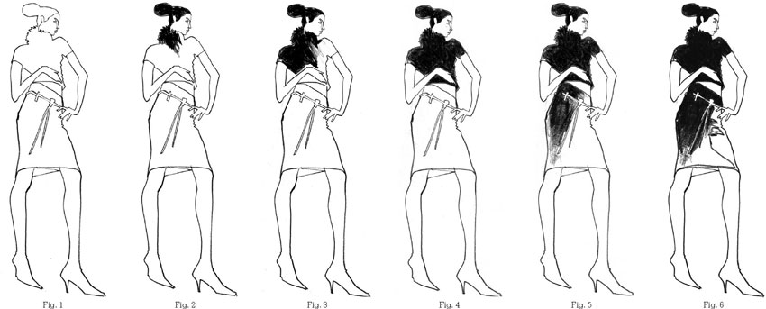
Directions
The goal of this exercise is to use the black shape to show as much of the figure as possible. We will begin slowly by finding a shape that lends itself to being black. Simple in value, the black will make a stark contrast to the white of the paper and the delicacy of the line. You can also use the black shape to help define one of the positive shapes of the figure by helping to draw what is not visible with five to seven shapes. Therefore, you need to choose your shapes carefully, using the black shape to cover as much of the figure as you can. You can even allow the black shape to break through the boundaries of some of the shapes and encompass more of the figure.
Try to resist the impulse to use the black to color in a small shape like the lips or a pocket or belt buckle for this exercise.
Step One
By now you should be familiar with using selectivity to guide you and with implementing opposition and contrasting shapes. Using these concepts, begin by drawing the figure in five to seven interesting shapes, not including the negative shapes. As in the contrasting and large shape sections (see pp. 52–55 and 56–59), incorporate the shape of shadows or light, or folds and accents specific to the pose and the clothing.
Step Two
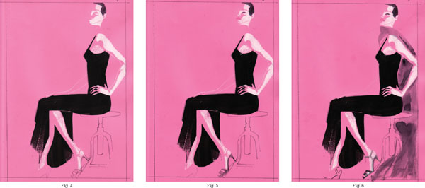
Starting at the top of the figure and working your way down, use a black pastel or conté to fill in your chosen shape. In Figure 2, the shape of the hair is filled in before moving down to the collar. You can include some additional mapping of the shapes here to define the features as you progress down through the figure.
Step Three
Following the direction of the shapes, continue to add in the black. Here a diagonal direction is used (see Figure 3).
Step Four
You can choose how to extend the black shape as you continue to work your way down the figure. Here, once the top has been filled in, the decision has been made to continue into the skirt (see Figures 4–5).
Step Five
You can continue to include mapping in the different shapes of the clothing. Here it is used to create more definition in the skirt, where the shape of the shadow on the skirt is penciled in to guide the movement of the black (see Figure 6).
Step Six
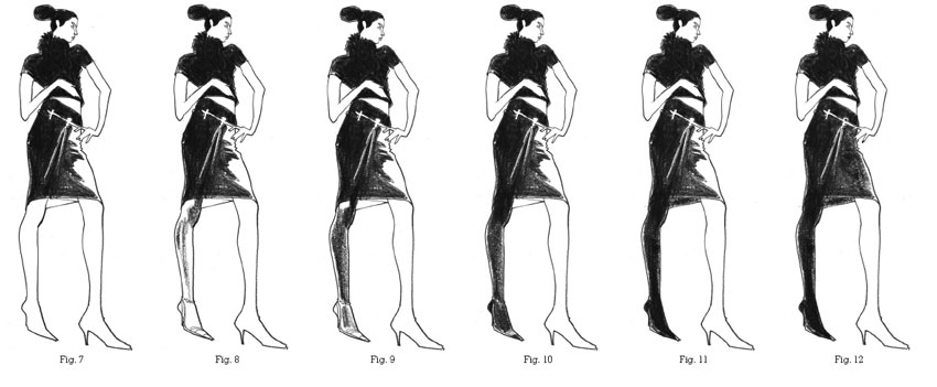
Continue to extend the black shape down through the figure. Here the black shape has been extended to the hem of the skirt before breaking through the hemline of the right leg and defining the shape of the shadow on the leg (see Figures 7–8).
Step Seven
The black shape can be used to add definition. In Figures 9–11 the black is used to add definition to the supporting leg and shoe.
Step Eight
Finally, black can be used to add detail to the figure. Here it is used to fill in smaller shapes like the upper lip and fingernails (see Figure 12).
In his illustration, All Cats are Gray, John Jay Cabuay uses gray shapes to depict the hat and lips in contrast to the white of the skin tone and the black used for the hair and eye shapes. The use of gray softens the harshness of the black and results in a very graphic image in which the eyes are the most arresting feature.
Not everything in life is in black or white. Black with white makes for a powerful graphic, but one that could have limitations. Black and white lack value, the ingredient that can provide a greater sense of depth.
In this exercise, we will use gray to accent and complement the black and white areas of a drawing, adding depth and form to the figure. This exercise will also help you to see the figure in terms of gray. The addition of a gray area or shape allows the illustration to reflect the nuances visible in the figure such as the shadows or highlights as well as the tints and tones of the features and skin. Black was used in the last exercise to aid selectivity and help communicate as much of the figure as possible. Its use was limited to areas within the clothing or to depict shadows; it was not used to describe the skin, face, or features other than the lips. The addition of a gray shape creates variety and interest and can be used as a tool to describe the darks and lights on a figure. Gray can best be used to communicate those areas that black would distort or abstract.
There are numerous methods for exploring the grays in the figure and, combined with different media, there are endless variations. Here we will be completing two exercises that accomplish this goal.
Preparation
For this exercise, the following supplies are necessary:
One pad of 18 x 24in (A2) white all-purpose paper or comparable
Three gray conté crayons or similar pastels, preferably in the cool rather than the warm family:
1. Light gray
2. Medium gray
3. Dark gray
Depending on the size of your drawing, using pastels for this technique can be awkward. It may be difficult to capture a small area of a shape using a large unsharpened tool. Using a thin pastel stick or conté rather than a large pastel will allow you to define the area more successfully. Although a colored pencil might be ideal to cover the smaller areas, it has its limitations in expressing weight and depth and it is too time-consuming to use for covering a large area of the figure. If you are using a model, have the model do a series of three to five ten-minute poses.

3.7 Exercise 1: Gray Shapes with Line
Directions
For this exercise you will be asked to communicate the figure in four values: white, light gray, medium gray, and dark gray. Analyze the figure in terms of a gray scale, from light to dark. The lightest will be represented by white (in other words, do not fill in this area); darkest will be represented by the dark gray medium. Between these two ends of the scale you will use the light and middle gray media.
Step One
Before you put conté or pastel to paper, visually break the figure up into five to seven simple, interesting shapes. Using the lightest gray, draw the figure with line in those five to seven shapes. Use your selectivity and incorporate nuances or shadows that you feel would describe the figure (see Figure 1).
Step Two
Once you have drawn the figure, begin at the top and start laying in your lightest grays; if an area is the lightest, select that area as a white shape to play against the grays. Attempt to fill in the shape completely to the edge of the line so that the line is almost obscured. Continue through the figure until you have colored in all of the light gray shapes you selected (see Figure 2).
Step Three
Next, begin adding in the middle grays, again starting at the top of the figure and working your way down (see Figure 3).
Step Four
Complete the layering of values with the darkest value (see Figure 4).
Step Five
Once completed, if necessary, map in some additional shapes to realize the figure fully (see Figures 5–6).
If you have completed this task and want to challenge your eye and skill a bit further, continue to Exercise 2 (overleaf).
Note:
Find several high-contrast photos of darks and lights from a newspaper or magazine. Draw a frame and use the premise of the gray shapes to organize the darks and lights from the photo into the frame. See the darks and lights as shapes. Attempt the same exercise using a color such as sepia or brown. After several attempts using the sepia colors, try the same exercise using one color in a monochromatic scheme. Add black and white to vary the values of the color.

3.7 Exercise 2: Gray Shapes without Line
Directions
In this exercise we will avoid using line to draw in the gray shapes initially, and instead will draw the gray shape area without an outline.
Step One
Starting again at the top of the figure, begin to draw in the shape of the first value you see—in this instance, the hair shape. Color that shape in fully before proceeding to the next shape (see Figure 1).
Step Two
Move slowly through the figure, filling in each shape. Continue in a rhythmic motion until you have completed the figure (see Figures 2–10).
The absence of line is a good method to train your eye and will sharpen your draftsmanship. It is easier to fill in the simple larger areas than the more intricate areas such as the hands. If you feel the need to draw in the shape of the smaller areas and then fill them in, give yourself permission to do so. It is a greater challenge, however, to complete and color each shape as you progress.
As in Exercise 1 (see pp. 66–67), leave those areas that are lightest white and use the gray to hold those areas of clothing. Here the light gray is used to hold the scarf shape.
Step Three
The absence of line may mean that some areas of the figure are not defined. Incorporating some elements of the environment, such as the model platform, wall, or shapes visible in the pose, may help to define such areas (see Figure 11).
Note:
Choose two complementary colors such as red and green. Create a landscape within a frame, preferably from observation. It could be a view from a window, a park, or taken from a photo. Analyze the visual and recreate it in light, medium, and dark values. Use the complementary colors (red and green, or purple and yellow, for example) to create the three values. Layer one color onto another to create a mixed neutral color. Increase the saturation of one color to vary the darks and lights within the image.

Stina Persson’s haunting image uses negative shapes, framing the face and leaf shapes with light washes of watercolor.
Accentuate the negative. Your visual vocabulary should now include a solid understanding of shapes. You may even be seeing life in a different way and breaking up everything in terms of shapes. This is not unusual; I have had many students comment that everywhere they turn they see shapes. It is the same as learning a new language; when you are finally able to communicate in that language, everything begins to make sense.
Selectivity has been the guiding premise throughout this book. Your knowledge of editing and your ability to communicate the figure with fewer lines or shapes will now come into play with an exercise that will use absence of value or line to draw an area of the figure.
What you leave out will be just as important as what you choose to convey. In any drawing, the viewer recognizes those areas left out, usually by their shape. To make these shapes, which are known as negative shapes, recognizable, you need to use the adjoining shapes to bookend and frame the negative space. To achieve this, you may have to create a pose with the model whereby some of the figure that will be communicated as the negative shape is backdropped by shapes of solid value; for example, an arm held across the figure, where the arm is the negative shape, is framed by the darker value of the clothing.
Incorporating a large shape and perhaps one in black will best accentuate the negative shape. If the pose of the figure does not accomplish this then incorporate some of the environment or add a graphic element or shape to backdrop the area that is in a negative form. In the previous Gray Shapes without Line exercise, for example, the platform was incorporated into Figure 11 to help describe the negative area of the pant leg. You could also add a line here and there to help define some of the negative area.
Preparation
For this exercise, the following supplies are necessary:
One pad of 18 x 24in (A2) white all-purpose paper or comparable
At this point you can bring in different media, such as ink. The use of digital techniques also makes its first appearance in this exercise, with the use of Photoshop. Color is also added for the first time.

Directions
Observe the pose of the figure and think how best to use the positive shapes to frame the negative shapes. Could you use a large shape, perhaps a black one that might hold the whole figure? Areas that are light in value are easiest to use as the negative shapes. Positioning these areas in front of the solid shapes, such as placing the arms in front of a black area, will create a backdrop to hold the negative shapes.
Begin at the top of the figure and start drawing in a shape and filling it in before you progress to the next area.
Fill in the shape as in the Gray Shapes exercises. When you arrive at the shape that is negative, use your draftsmanship skills to put in the next shape without drawing a line to hold it. Be courageous! Your failures will determine your growth far more than your successes. Be willing to make mistakes and do not pencil in the area as a guide to fill in later. That would be counter-productive to training your eye. In the future it may be prudent to do this, but for now use whatever skills you have and make the leap.
Step One
First decide which is your negative shape. In this exercise, the decision was made to have the lightest area, the skin, as the negative shape. The shape of the hair, therefore, was filled in to hold the face shape. The eye rather than the brush was used to mentally draw the figure from the edge of the ears to the neck in order to place in the neckline and shoulders of the dress (see Figure 1).
Step Two
You can add the shape of the features to help define the face (see Figure 2).
Step Three
Continue to carefully draw around the negative shapes. Here, the arms are defined as the negative shape. The beading on the dress is also used as a series of negative shapes (see Figure 3).
Step Four
Use a solid value to fill in the areas around the negative shapes. In Figure 4 solid black is used to help bookmark the negative shape of the arms. The beading was revisited and edited a bit more.
Step Five
Try to find shapes that complement each other. The legs were drawn initially as one gray shape in Figure 5 to see how this would complement the black shape. The stool acts as a linear contour shape in light gray, and opposition is used to give character to the negative spaces between its legs. The splash of ink, although not intentional, was kept as a choice.
Step Six
Continue to refine your drawing, looking at how the shapes work with each other. Here, the leg shape, which had been filled in as one gray value, looked visually confusing. To correct this mistake and separate the legs, a deeper gray was used to fill in the back leg shape and accentuate the front leg left in a lighter gray (see Figure 6).
Step Seven
Notice that in Figure 6 your eye will fill in the shape of the back arm as well as the shape of the neck and head so that the drawing is complete. Figure 7 shows how to further define the negative shapes by drawing in the shape of the neck and the back arm in pencil and using Photoshop to add a rectangular frame of color.

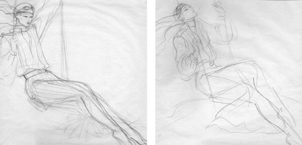
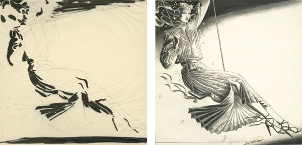
In this series of unpublished sketches by Antonio Lopez, entitled Amelia, for Bloomingdales department store, we can see how the preliminary studies of line and value developed into a finished illustration of dark and light shapes.
In simple terms, value means the darkness or lightness of a color. A light source will illuminate the figure and play upon its various planes and contours, casting a shadow in those areas not directly visible to the light. Light and shadow are elements that not only create depth but also allow for an observation of the form and a particular rendering of the form.
In photography, shapes of light and shadow are incorporated into the composition, and the photographer has a trained eye to decipher these shapes. The same principles apply to drawing. The following exercises allow you to deconstruct the figure in terms of lights and darks, and show you how to recognize and select those shapes. Now that you have a good command of shapes, it should be easier to break down the figure in these terms.
There are numerous methods to explore the values on the figure. In the following three exercises we will use the light, medium, and dark values to communicate the lights and darks. In the Gray Shape exercises, we began to explore the idea of incorporating the values of the figure into the drawing, whether it was a shadow on the face or the clothing. Now we will focus on capturing and exaggerating the light areas and the shadows that form on the figure due to a strong sense of light.
In the first exercise the goal is to communicate the figure entirely through the presence of the shadow that is cast by a strong light source. In the second you will focus on the light areas and, for the first time, we will begin to consider composition by introducing a frame. In the third we will combine the use of light and dark values from the previous two exercises, creating a truly three-dimensional figure.
Preparation
For these exercises the following supplies are necessary:
For the first exercise, colored paper of a light value, such as a pale gray, taupe, or brown.
For the second exercise, colored paper that is dark enough in value to show off the white, black, and gray conté charcoal, pastel, or pencil. If the idea of using a color seems attractive, choose one that will not wrestle with the white for attention. Avoid colors that are neon or too bright as they will compromise and overwhelm the drawing of the light on the figure.
For the third exercise, use a colored paper that will be medium in value to allow the addition of a dark and light medium.
You will also need:
Black charcoal or pastel
White conté, pastel, or pencil
Gray conté, pastel, or pencil
You will need to have a strong light source to exaggerate the lights and shadows of the figure. Position the light source to the left or right of the model to create this play of darks and lights on the figure.

Directions
In this exercise, you will be working with a limited palette of black and various tones of black that form grays. You will be using those values to communicate solely the shapes of the shadow on the figure without using any outside line to define the figure. The figure will be defined only by the shapes of shadows. The light areas of the figure will be seen as negative shapes and will be the color of the paper. Depending on the direction of light, there may be a shadow of the figure in the background that could be incorporated into the drawing to accentuate, contrast, and hold the white areas of the figure.
Step One
Observe the form of the figure, particularly the shapes of the shadow on the figure from the top down. It may be prudent to do a series of quick studies to see how you might select and interpret the shadows (see Figure 9). To better discern the shapes of the shadows, you can squint; this will eliminate the shadows that are not prominent. Be decisive; if there is an area you are unsure about, leave it out—just communicate the areas that are most visible. Use a very light line to first draw in the shape of the shadow. When you have completed an area, begin to fill in that shape with a light to medium gray value (see Figures 1–2). If you are using a charcoal pencil, lightly color in the shape to the same value as the outside line, much as we did in the Gray Shape with Line exercise (see pp. 66–67).
Step Two
Continue drawing in the shadow shapes, gradually filling in each section as you progress through the figure. Emphasis should be placed on the face (see Figures 3–5) .
Step Three
Once you have drawn and filled in all of the shadow shapes selected, observe the figure once again. Starting at the top of the figure, begin to fine-tune the features and layer in the darker-value shapes to further define the figure.
Notice that by using the shape of the shadow without a definitive outside line you have drawn the figure as well as most of the definition of the figure. At this point in the drawing, your selection will become more important; your editing decisions will affect the graphics of the visual. Remember that less is more (see Figures 6–7).
Step Four
Usually when you are using a strong light source there will be an interesting shadow that may help define the areas not drawn. A shadow is the perfect device for poetic license and allows the artist to stylize and use the shadow as a graphic component. In Figure 8, the background shadow is stylized into the shape of a flower, which mimicks the model‘s garment and complements and frames the negative shapes. Alternatively, you could use a geometrical element that may be a feature of the background to serve as a framing device.


Directions
You probably noticed in the previous exercise that while you were drawing in the dark shadows of the figure you were also capturing the light areas. In this exercise, the focus will be on those light areas; you will also be incorporating a large shape to help anchor the light shapes. Light does not have boundaries when directed at the model; it envelops the whole figure. For this exercise, however, we will limit the light to just the face and skin and use a large black shape to anchor and contrast the white shapes. This exercise will also introduce the idea of drawing a frame on your paper in which to place the figure. Previously, we have been focusing on the idea of composing the figure with shapes; drawing a frame will also allow you to think about the shape of the entire figure and how best to compose that shape within a given space.
Step One
Draw a small frame onto your paper. You can draw this by hand or with a ruler depending on your personal taste. Observe the figure and think about composition, or how you would like to position the figure within the frame. Seeing the figure as a shape should give you an advantage in placing this shape within the frame. Think about the space not being occupied by the figure. The space that is not occupied is as important as the space occupied.
Into this frame do a simple contour drawing of the figure in a light pencil, not unlike the ones we drew in Chapter 1. Simplify the figure and keep the shape clean and empty. Place the figure wherever you think best shows it off within the frame. You may wish to move it to the left or right or, more dramatically, crop the figure. If cropping the figure is your choice, make sure to crop the figure in a manner where the face or part of the face is visible (see Figure 1).
Step Two
Observe the figure, this time focusing on the white or light cast upon it. Draw in the shape of the light areas from the top down with your white medium and then carefully fill in the selected shapes until the figure or your selection is complete. Unlike the previous exercise there will be no layering in of the brightest value on the figure. A subtlety in the shading and use of the white may capture the nuances in the light, but a solid white would work just as well (see Figure 2).
Step Three
If the necessity of drawing in some of the figure allows you to place some of the light on the figure accurately, then draw that area in a light line that you can eventually fill in (see Figure 3).
Step Four
Once the white is complete, analyze the figure to see if there are any solid areas that may complement the white areas, such as the hair or clothing, or a large shape that will help communicate the areas that are not visible (see Figure 4).
Step Five
Once the figure is defined, begin to fine-tune the details or features if necessary. Fine-tuning your drawing should occur toward the end rather than in the beginning. This way you will leave yourself open to the options of what and what not to edit. Here the face is defined with the addition of an eye, while a little color has been brought into the picture by using red to define the lips (see Figure 5).
Step Six
Finally, the back arm was deleted and, instead of using a shadow behind the figure, the scarf was used to define the negative shape. The scarf was added in a gray value so as not to distract from the black and also to hold the negative shape between the arm and body and define the edge of the frame (see Figure 6).


3.9 Exercise 3: Dark and Light Values Combined
Directions
To continue this journey of communicating values, we will now combine the two previous exercises into one drawing. When lighting the figure you have probably already discovered that the values are nuanced in tone. For the purposes of simplifying the figure it is best to limit these many tonalities and retain a graphic dynamic. You can do this by limiting the palette in the same way you did in the gray exercises where light, medium, and dark grays were used (see pp. 66–69).
Again, be selective. Since the dark value will simultaneously define the light value and vice versa, select whichever seems the more prominent and use the alternate value sparingly as a simple accent. You can also incorporate black as well as a negative shape and try out color or use a different medium.
Be courageous and explore the various options. As artists we learn much more through failure than success, and unless you are willing to fail you will never achieve the latter. An accident may be the genesis of a new direction and be responsible for a fantastic image.
Step One
After doing a few studies, tackle the figure directly from the top of the composition. Decide which value—dark or light—will dictate the figure and apply accordingly (see Figure 1).
Step Two
You can use the garment to create a graphic element; in Figure 2 the red scarf has been used.
Step Three
Analyze the drawing. Think about where and what to incorporate next; is there an area that could be identified as a negative shape? If there is, define it with line and fill in with the same value (see Figures 3–4).
Step Four
At this point, decide on a graphic element to include in the background to complement the figure. Use your imagination (see Figure 5).
Step Five
Once completed, add in the alternate value to define and accent the figure; in this case a subtle definition of light on cheekbone and eyelid has been used (see Figure 6).
