Chapter 10
Data Entry
Data entry on mobile devices is particularly tricky because of our fat fingers and the devices’ smaller screens. There are literally hundreds of data entry patterns currently in use, and you could write an entire book specifically on this subject. Actually, my friend and mentor Luke Wroblewski did exactly that by writing an excellent book called Web Form Design: Filling In the Blanks (2008, Rosenfeld Media). In this chapter, rather than covering every conceivable input strategy currently in use, we concentrate on the trickiest aspects of Android forms, which people most often get wrong.
10.1 Pattern: Slider
Web page developers for years tried to popularize sliders and make them part of the standard HTML development toolkit. Many rejoiced that sliders came standard with the Android data entry widgets because, frankly, sliders are cool. Unfortunately, along with the sliders came a whole scope of issues that can sometimes be hard to pinpoint.
How It Works
Sliders come in two types: single and double. In addition to that, each type of slider can enable a continuous adjustment or have a set of predefined positions that customers can select from.
Example
To see how these two types of sliders work, it is instructive to compare two different apps: Trulia and Zillow. Trulia (see Figure 10-1) solves the price data entry problem using a dual slider.
Figure 10-1: The Trulia app uses a dual slider.

On the other hand, Zillow offers the same price entry but has two single sliders (see Figure 10-2).
Figure 10-2: The Zillow app uses two single sliders.

The Trulia slider does not display the minimum and maximum range of values before the sliders are moved. Strictly speaking, neither does Zillow—instead it displays text $0 and No Maximum, which carries no information useful for the customer.
When and Where to Use It
Single sliders are intuitive for entering individual values. Dual sliders are great for ranges of values such as search filters and form values that include ranges.
Why Use It
Sliders are intuitive—they match what we call affordance—a quality of the control that makes it right for a particular task. In other words sliders just “feel right” for a particular task of dialing a value in a range. Sliders translate well from the physical world to the touch screen, where they look and feel great and are easy to manipulate without taking up a lot of space. Compare sliders to twist knobs, another physical control that can serve a similar function. In contrast to sliders, knobs do not translate as well to the touch screen, are hard to “turn,” and usually take up more screen real estate than sliders. Dual sliders in particular are useful for bounding the interval within the specific range.
Other Uses
Single sliders with discrete values are interchangeable with Stepper controls, which are covered in the next section of this chapter. Sliders with Histogram and Slider based on Inventory Counts are two great experimental patterns that are variations of the standard slider that are unfortunately not common. These are described in the “Pet Shop Application” section.
Pet Shop Application
You can read about a Pet Shop dual slider example, which uses a Slider with Histogram design pattern, in Chapter 8, “Sorting and Filtering,” in the section 8.3 “Pattern: Filter Strip.” Sticking with the same example (that is, using sliders for entering price ranges on a search filter screen), can you use a dual slider to enter a price range without running into the issues listed in this pattern’s “Caution” section? One way you can accomplish this is to use sliders with discrete values arranged according to inventory counts. Here’s the explanation.
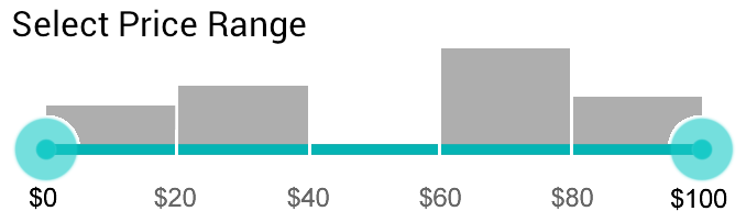
A typical price slider is arranged in a linear pattern, which means that an equal distance movement of the slider axis represents an equal absolute change in value. For example, in a five-position slider, the price can go from $0 to $100 in $20 increments, as shown in Figure 10-3 (numbers in gray are optional).
Figure 10-3: Each mark on the axis represents an equal absolute change in value on a linear price Slider.

Although this is intuitive, this design makes it easy for your customers to shoot themselves in the foot, especially if the range is wide and the inventory is not equally distributed. For example, as explained in the “Caution” section, a customer might select a range of $40 to $60 in which the inventory is simply zero, not knowing that there is a whole wagonful of puppies in the $62–$65 range, literally—For a Few Dollars More (with apologies to Clint Eastwood and Western film lovers everywhere). This is where a Slider with Histogram (as shown in Figure 10-4) is helpful. The idea behind this experimental pattern is simple: The 50 to 100 pixels above the fixed position slider is the histogram representing the inventory in a particular section of the linear price range. Large numbers of dogs show a large bar, and smaller numbers show a proportionally smaller bar—that’s it.
 Figure 10-4: A linear price Slider with Histogram pattern provides more information.
When using a Slider with Histogram pattern, you can still dial the part of the range with low inventory; it is just difficult to make that mistake accidentally because the inventory counts are clearly shown in the histogram. You can use the Slider with Histogram pattern where a standard discrete position Slider pattern would be used, taking up only a little more vertical space in exchange for a satisfying customer experience.
Another way to implement a Slider pattern without resorting to histograms, is to arrange the slider intervals based on the inventory counts. To do this, divide your entire inventory—say, 100 puppies—into five intervals, and you get 20 puppies per interval. Now scan the price range to figure out the price (rounded to the nearest dollar) that corresponds to the approximate inventory count of 20. Say the first 19 puppies cost between $0 and $60, (recall we assume no inventory in the $40 to $60 range). The second 21 puppies fall in the $61 to $65 range, and so on. Figure 10-5 is an example of what such a slider might look like (compare it with Figure 10-3).
Figure 10-5: The alternative price slider is based on the inventory counts.

Which implementation should you choose? It depends on the task. Most people don’t mind paying a few dollars outside the budget, but they absolutely hate getting zero results. If inventory is less than 20 items in a specific interval, that is not a satisfying result for most tasks, so you must use one of the other approaches to create a better experience. Both the Slider with Histogram and Slider Based on Inventory Counts patterns are far superior to the traditional Slider pattern. Breaking the interval by price is the flexible approach because it shows the distribution clearly, while never causing a zero-results condition. If the customer’s price range is larger than that of a single 20-puppy interval, he can simply select a larger interval using the dual Slider. (Looking for the code for these experimental sliders? Visit the companion site for this book, http://androiddesignbook.com, for downloadable sample apps and source code.)
Tablet Apps
Sliders perform well in tablet apps. Make sure you heed the warnings in the “Caution” section; in particular, opt for the slider with discrete values instead of a continuous slider to ensure accuracy—it’s harder to adjust a continuous slider accurately on a larger device. Take care of the device ergonomics, and avoid placing sliders in the middle of the screen. Instead, place the sliders near the top of the screen next to the right or left margin, optimized for one-handed operation with the thumb while the fingers hold on to the back of the tablet.
Depending on the design and purpose of your app, experiment by having two sets of sliders on the left and right sides of the screen to be adjusted by left and right hands, respectively. This would be especially interesting for apps such as music synthesizers. Finally, experiment with placing sliders vertically along the edge of the tablet (top to bottom) rather than horizontally from left to right, which is the easiest position to adjust precisely.
 Caution
Keep the following considerations in mind when using the Slider pattern:
- Make sure reasonable values can be entered easily: Kayak offers an example of a continuous dual slider for filtering hotel prices. To get a hotel in Los Angeles you can afford on a humble Mobile UX Design Consultant’s salary, you must place the pegs right on top of one another (see Figure 10-6). This adjustment is anything but precise. For large ranges, consider using the version of the slider based on inventory counts, as described in the “Pet Shop Application” section.
Figure 10-6: The continuous price slider fails to dial a reasonable hotel price in Los Angeles on the Kayak app.

- Show the range: Speaking of range, it’s a great idea to show the actual range of prices available in the entire collection, as the Kayak app does in Figure 10-6 ($16 to $750) as opposed to using arbitrary numbers such as $0 and Max (refer to Figures 10-1 and 10-2). Neither Zillow nor Trulia show the true max and min associated with local home inventory. Imagine how useful these sliders would be if they actually said from the beginning that the range was from $476,000 to $3,234,700. Showing the range also helps avoid “dead zones,” such as looking for a home in San Francisco priced less than $476,000, which yields zero results. Be aware of how filtering affects the inventory; it is best to rely on the range of the overall collection without the filters applied.
- Don’t cover the numbers: While the customer adjusts the slider, the numbers should be shown above the pegs, where the fingers do not cover them. Placing the numbers below or to the side of the slider is not as ideal. The Kayak slider (refer to Figure 10-6) is good in this regard: The range is covered while the customer adjusts the slider, but the actual filter value is not, which is about the best you can do on a mobile device.
- Opt for a slider with discrete positions: Continuous sliders are sexy in principle, as is the idea of dialing the exact number and getting just the inventory you want. But the reality is that sliders are hard to adjust exactly—both in the physical world and on touch devices. That’s why you almost never see a slider for volume adjustment on a stereo. Ironically, the larger the device, the harder it seems to adjust the slider precisely. This is the consequence of Fitts’ Law: The time required for the action is dependent on the distance and size of the target. In other words, it’s difficult to adjust a tiny peg of the slider 1/32 of an inch in the middle of a large tablet.
Continuous dual sliders also make it easy to over-constrain the range. To use the Pet Shop example, creating a continuous slider that enables the customer to dial a price of $45.50 to $46.10 yields a zero-results condition and does not serve the customer well. On the other hand, sliders with discrete positions (stops) are much easier to adjust. There is also less possibility of dialing a range that is too small.
Don’t forget to consider the Slider with Histogram or Slider Based on Inventory Counts patterns. As described in the “Pet Shop Application” section, these experimental Slider pattern modifications offer a more resourceful user interface (the interface that helps customers act effectively and feel more capable) to avoid most of the pitfalls typically associated with Sliders.
Related Patterns
10.2 Pattern: Stepper
When the task calls for dialing a small whole number from 0 to 5, use a Stepper control.
How It Works
The Stepper is a native Android control that consists of the narrow text field flanked by minus and plus sign buttons.
Example
An excellent use of the Stepper is to dial the number of rooms and number of occupants on the search page from the Kayak app, as shown in Figure 10-7. Note the good use of reasonable defaults: Most people using the app are business travelers who travel alone and need only a single room so the Stepper controls are set to 1 in each case.
Figure 10-7: The Kayak app makes excellent use of the Stepper pattern.

When and Where to Use It
Whenever the customer needs to quickly enter a number between 0 and 5 where there is limited screen real estate, the Stepper pattern is the logical choice. A typical use is to adjust item counts during a purchase. Normally, the stepper value is submitted via a separate Submit button.
Why Use It
A stepper takes up little space and enables direct engagement. Like the Slider pattern discussed earlier in this chapter, the stepper can be manipulated directly on screen, without the need to pop up the keyboard or use additional layers, keyboards, or lightboxes. The Stepper pattern is self-explanatory and easy to use.
Other Uses
One interesting variation of the Stepper pattern is to use it as a row-level repeating UI control as a method to add items directly to the cart. This is how the Peapod app uses a customized Stepper control (see Figure 10-8). The first action is a simple Buy button. After the customer taps the Buy button, the item is added to the cart, and the button turns into a stepper.
Figure 10-8: The Peapod app uses Stepper as a row-level auto-submit control.

Whenever the customer taps a + or – button, the stepper control submits the new item count in the shopping basket to the server. This obviously slows things down a bit. However, most items come in only ones, twos, and threes, enabling this method to work well for shopping orders such as groceries, where total number of products purchasedin a single shopping trip can be quite large, but individual item counts per product tend to be low.
One variation of the Stepper pattern as implemented by Peapod is the custom editable central text field. When the customer taps the central text field, the lightbox control launches so that the customer can edit the field directly (see Figure 10-9). So when the customer wants to buy those 99 Bottles of Beer for his Wall, he can do it easily by entering 99 using the lightbox keyboard.
Figure 10-9: When the customer taps the center of the custom Stepper pattern implementation in the Peapod app, the numeric keyboard lightbox opens.

Without this customization (using the standard stepper control) the customer would have to tap the + button and submit the new count of beers to the server 98 times—as tedious as the famous song. (If you don’t know the complete lyrics, check out http://99-bottles-of-beer.net/, which offers 1,500 different code variations in different programming languages with which to render the song.) Unfortunately, this unique customization is not discoverable—a better version of this is shown as part of our trusty Pet Shop app.
Another nice-to-have customization that allows steppers to enter larger numbers is press-and-hold: This action can be used to increment the count and accelerate the rate of increase with a longer button press. This is a very old pattern for devices using touch affordances. Of course this modification does not work for row-level Steppers that submit the value to the server with every tap.
Pet Shop Application
As mentioned, although Peapod’s custom implementation of the Stepper pattern is highly effective, the discoverability of the editable text field in the center is quite low because the custom Peapod stepper looks similar to the standard Android stepper, which unfortunately does not have this direct data entry functionality.
Figure 10-10 is a hand-drawn wireframe of a custom version that takes care of this problem by moving the minus and plus buttons slightly further apart from the text field, making them round instead of square and enlarging the text field by a small amount. The resulting control looks customized but still carries all the correct stepper affordances; in other words, it’s clear that the customer can tap – and + to increase and decrease the count in the middle.
Figure 10-10: This wireframe shows the use of the custom Stepper pattern implementation as a row-level, auto-submit control in the Pet Shop app.

At the same time, this custom stepper also makes it more obvious that the customer can tap the middle text field directly to launch a “dial a number” lightbox. I also simplified the direct data entry lightbox from the one used by Peapod. Compare Figure 10-11 with Figure 10-9. Note the number in the textbox starts out highlighted for direct editing.
Figure 10-11: This is a simplified dial-a-number lightbox design.

The row-level arrow is omitted on the right in Figure 10-10, relying instead on people tapping the picture or item title to see the details. This is an example of the Tap Anywhere Android design principle discussed in Chapter 2, “What Makes Android Different.”
Tablet Apps
Stepper works the same way for tablet implementations as it does for mobile phones. Remember that tablets are likely to display more rows than smaller mobile devices, so if you have a repeating in-row stepper control, you may want to make sure there is enough room to tap the –/+ buttons and also that the stepper control is positioned along the left or right margin of the device so that the customer can tap the control with a thumb while the rest of the fingers still hold on to the device.
Caution
Do not attempt to use the standard Stepper pattern implementation for routinely entering numbers greater than 5. If you need to enter larger numbers, use the custom version described in the “Pet Shop Application” section. However, be aware that even the custom control does not accept numbers larger than 99 unless you make more modifications. Stepper is not for entering large ad-hoc numbers. For large numbers, instead use the textbox with the Input Mask pattern discussed in the “10.8 Pattern: Text Box with Input Mask” section later in this chapter.
You can use both a single slider and stepper to enter numbers 0 through 5. Which one you use depends on the exact nature of the app. Stepper is more flexible and can be used to enter numbers greater than 5 on occasion, whereas slider implies a bound (fixed) range of values.
Finally, ensure that steppers have good default values. The ideal mobile control is the one that has the value your customers already want, so they do not need to adjust it.
Related Patterns
10.3 Pattern: Scrolling Calendar
When it’s necessary to enter a date, most apps opt for a calendar that paginates by 1 or 2 months. This is traditional, but it’s also tedious. A much slicker alternative is the Cadillac of Calendar Patterns: the Scrolling Calendar.
How It Works
The calendar control is the continuous scrolling ribbon of dates ordered in fixed columns by day of the week, with months separated by a thicker line.
Example
This pattern was designed by Alan Cooper and first described in his book About Face: The Essentials of User Interface Design (IDG Books, 1995—the updated third edition of this classic work on interaction design was published in 2007). However, it took more than 15 years for someone with the courage and vision to try it in a major application. That company was Kayak, which currently boasts one of the best implementations of this pattern available on the market. (See Figure 10-12.)
Figure 10-12: The Kayak app includes an excellent implementation of a scrolling calendar.

This calendar design takes advantage of the fact that although the number of days in a month changes from month to month (and sometimes year to year, as in February for leap years), the days of the week repeat continuously and unerringly—Monday through Sunday. Thus, the scrolling calendar consists of a ribbon that scrolls through seven columns representing repeating days of the week: Monday, Tuesday, Wednesday, and so on. Thus, even though the line separating the individual months is jagged, the dates flow through the days of the week in a continuous stream of numbers.
Note the additional “name of the month” feature is at the top of the page. As the month advances during scrolling, the name of the next month is partially displayed in the register. The customer can also paginate through the months in a more traditional manner by using the side arrows.
When and Where to Use It
Any time you need to enter a date that might be 1 or 2 weeks to several months in the future, the Scrolling Calendar is an excellent pattern to call upon.
Why Use It
Pagination of the calendar is a paradigm as old as the Gregorian calendar, which is old—430 years old as of the date of publication of this book. Essentially this includes the mental models of the physical wall calendar you flip pages on, which is not exactly the most modern implementation. As Alan Cooper eloquently points out in About Face, it’s time for a modern and user-friendly design. I consider the Kayak mobile app implementation more usable even than its desktop website—an impressive accomplishment!
Other Uses
I used this Calendar pattern in a client app for a major U.S. retailer with one variation: The month on top of the scrolling calendar reflected the month selected, not the month displayed (as in the Kayak example). The default view is today’s date. After the customer selects another date,the register displays the month of the new selection, regardless of the scroll state of the wheel.
To know which month currently displays in the scroll wheel, customers must rely on the three-letter abbreviation printed below the number 1 in the cell representing the first of the month. If you try this method, keep in mind that the range of available dates for that client goes to only approximately 2 months, which makes scrolling convenient, but also limited. If you have a longer time period to cover, you may want to stick with the Kayak implementation that dynamically shows the month displayed in the wheel as the calendar scrolls below.
Be aware that the Scrolling Calendar pattern is not just for dates; any continuous strip of timeline, including months, years, and most commonly hours of the day can be shown in a scrolling format that emphasizes the range between the two points.
Pet Shop Application
A wireframe for the Pet Shop app would not differ from the Kayak app, so it isn’t reproduced here. However, feel free to indulge in a little practice by drawing this pattern yourself.
Tablet Apps
On a tablet device, a scrolling calendar would most likely be implemented as a popover. Remember to pop it up near the top half of the page and close to either the right or left side of the device for easy operation without taking your hands off the device. The top-right corner would likely be ideal for most people. Remember to plan for vertical and horizontal orientations of the tablet and accommodate both orientations in your popover placement and sizing.
Kayak does not currently do this well in the landscape (horizontal) orientation (see Figure 10-13). The lightbox that contains the calendar is located smack in the middle of the screen, making it necessary to let go of the edge of the tablet to scroll and select, even on the 7-inch device. This interaction is even more awkward for larger tablets.
 Figure 10-13: The Kayak app places the scrolling calendar too far from the edge on tablets.

A much better approach would be to display the scrolling calendar to the right of the main form so that it’s within easy reach of the thumb of the right hand.
Caution
Remember to indicate the dates that are not available by graying them out. If it’s important to your application, indicate today’s date by putting the gray text “Today” in the cell under the number. Finally, don’t forget that this pattern enables you to indicate gracefully a range of dates that spans a month or more, such as the length of stay, by highlighting the cells in the range for one-half a second just before the contents of the screen are sent to the server.
If your customer attempts to enter a date that is not allowed, make sure to message him before resetting the date to the first allowable date, and keep the customer on the scrolling calendar screen. Kayak currently does not do this, which makes the workflow confusing. Here is how the functionality currently works. Say the departure date is set to November 14 and the return date to November 18. The customer means to change the departure date to November 13, but mistakenly changes the return date instead. Obviously, this is Kayak, not Isaac Asimov’s time-travel novel, so it’s impossible to return before you arrive. However, instead of alerting the customer properly, Kayak silently resets the return date to be 1 day after the departure date—to November 15 in this case. (See Figure 10-14.)
Figure 10-14: This is an antipattern. The Kayak app resets an incorrect end date silently, without any messaging.

Correct messaging around error conditions like this are the key to a successful, satisfying experience because date entry is unusually confusing to most people and causes multiple usability issues in user testing. Chapter 16, “Date Filters,” in my Designing Search (2011, Wiley) book covers the details of data entry and display functionality.
Related Patterns
10.4 Pattern: Date and Time Wheel
For complete flexibility in entering dates and times from an arbitrary length of time in the past or future, use the Date and Time Wheel pattern.
How It Works
When the customer needs to select a date, she taps the date or time field, which displays a lightbox of all the date components in a vertical picker format.
Example
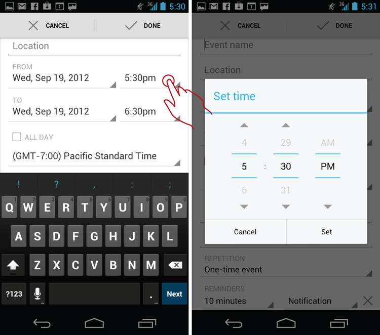
Google Calendar provides a reference implementation example for this pattern (see Figure 10-15). Both date and time are shown on one line—a convenient and flexible, yet space-saving, arrangement. The presence of the Date and Time Wheel control is indicated with the Android’s signature folded-corner triangle. Tapping the Date control brings up the Date Picker lightbox.
Figure 10-15: This is the Google Calendar app’s reference implementation of the Date picker in the Date and Time Wheel pattern.

When the user taps the Time, the Time picker lightbox displays (see Figure 10-16).
Figure 10-16: Here’s the Time picker lightbox of the Date and Time Wheel in the Google Calendar app.
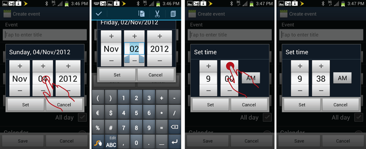
Android 2.3 and earlier wheel controls had to be adjusted by tapping the +/– buttons on the control or by tapping the textbox in the middle and editing the value directly via the keyboard (see Figure 10-17). There was no ability to use multitouch to “spin the wheel.” If the person wanted to advance the values faster, she would hold down the appropriate + or – button.
Figure 10-17: This is the implementation of the Date and Time Wheel pattern in the Google Calendar app on Android 2.3.
Perhaps to use the back-door approach to get around the patent issues, or simply because the Apple’s iOS Multitouch Picker control was cool, the Community Android developers created a similar after-market control called the Android Picker widget (http://code.google.com/p/android-wheel/), which is shown in Figure 10-18.
Figure 10-18: The Alarm Clock Xtreme app uses the Android Picker widget.

Starting with the Ice Cream Sandwich version (4.0) of the Android OS, the standard +/– wheel widget also includes the iOS Picker functionality for direct manipulation of the wheel’s selection by swiping, as shown in Figure 10-19. For lack of a better name for this mode of adjustment, I call this swiping multitouch mode the Wheelie mode.
Figure 10-19: Android 4.0 includes the Wheelie mode in the Date and Time Picker lightbox, as shown in the Google Calendar app.

When and Where to Use It
Any time you need to enter an arbitrary date or time, this is the standard pattern to use. However, be aware that unlike the Scrolling Calendar pattern, this pattern does not show ranges. This pattern is also subpar for removing disallowed states (as described in this pattern’s “Caution” section), so if the range of dates functionality is important to your app, you may want to look at the alternative patterns such as Scrolling Calendar or Dual Combo Wheels (see the “Pet Shop Application” section) for both the dates and time ranges entry.
Other uses of the wheel include any continuous ranges of strings 1 to approximately 20 characters. The only requirement to using the wheel control is that the values be obviously consecutive (numbers in order, seconds, months, and days of the week) and that the value can be displayed on a single line.
Why Use It
The Date and Time Wheel pattern is the standard pattern recommended by the Android OS, which enables complete flexibility.
Other Uses
Did you notice that the date and time entry required separate sets of multiple taps? If not, revisit Figures 10-15 and 10-16. With complete freedom comes complete responsibility. Entering dates and times like this is like playing Robinson Crusoe on a deserted island and having to make your shoes from scratch out of palm leaves and vegetable fibers. Yes, you don’t have to go to the office every day where someone tells you what to do. But no, you can’t get any Italian leather loafers in your size, and you have to chop all your own firewood. For most people, too much control is just as bad as too little. Having to use multiple taps to enter date ranges is excessively tedious, and it’s why many people absolutely hate to enter dates on mobile devices.
So what’s a designer to do? As it turns out, people rarely enter events years in advance. Most people do wait for the 2nd of January to start planning New Years’ resolutions. (Shocking!) If you take that into account and let go of some of the flexibility of the separate Date and Time Wheel controls, a simple modification of the pattern takes care of the excessive taps issue. Figure 10-20 shows the iPhone screenshot of the date entry screen from the Pocket Informant app. The CombinationWheel control employed by the app consists of three parts: day of the week/date, hour, and minute.
Figure 10-20: This Combination Wheel Date and Time Picker control is from the Pocket Informant iPhone app.

Having all the controls in the single wheel takes care of having multiple taps to open first the date wheel and then the time wheel, while still allowing plenty of flexibility. What you give up is the ability to easily pick anything, say, 10 years in advance. Most important, you can add a critical piece of data that was not available in the original design: the day of the week. Think of this Date and Time Wheel pattern implementation as a Robinson Crusoe who works remotely from his island on his MacBook Pro, ordering his Nike flip-flops from Zappos—all while sipping a frosty margarita.
Pet Shop Application
Imagine using a modified Date and Time Picker to book an appointment with a vet. Figure 10-21 shows a simple wireframe of what this implementation might look like on Android.
Figure 10-21: This wireframe shows a Combination Wheel Date and Time Picker for the Pet Shop app.

A combination control enables your customers to enter the date and time, and it shows the day of the week, which is important if you actually, you know, have stuff you need to do on certain days.
Another great solution would be an experimental pattern of dual composite sets of wheels for setting both from and to dates on the same screen, as shown in Figure 10-22.
Figure 10-22: This experimental pattern of Dual Combo Wheels would enable the user to set to and from times and dates in one shot.

This experimental pattern makes it much easier to enter dual dates on small tablets, allowing key information, such as the day of the week, to be clearly visible for both dates. This pattern would be particularly good for setting travel dates and meeting appointments on larger mobile devices and would cut down on taps while greatly improving clarity. You can even add the calculator of the event duration—handy indeed.
Tablet Apps
Although the Date and Time Wheel is a standard Android widget, it’s actually hard to use on a tablet. Because the control is so tiny, it’s difficult to swipe it using a normal-sized male thumb. This makes it hard to use the Wheelie mode of the Android control on a large device. (This is the same Fitts’ Law at work on tablets once again as discussed previously in this chapter in the “10.1 Pattern: Slider” section.) On the other hand, the individual up/down arrows seem to work well on tablets, so the preferred implementation keeps the older Android 2.3 interaction mode, which disables the multitouch swipe control. To advance this wheel, the customer taps the +/– buttons (in this case the up/down arrows) and holds down the buttons to make the wheel advance faster (see Figure 10-23).
Figure 10-23: This is how the Calendar Android date wheel is implemented on a Galaxy Tab 2 7-inch tablet.

Note the scrolling calendar added to the right of the control. It’s a nice touch; however, it does make it hard to adjust the control with the right hand, forcing left-handed use of the wheels or letting go of the device with the right hand. It might be better to swap the placement of the calendar and wheels to improve ergonomics.
Just as with the older Android 2.3 wheel implementations, you can adjust this control directly by tapping on the date and typing in the value using the keyboard (see Figure 10-24) .
Figure 10-24: You can type the date directly into the Calendar Android date wheel on a Galaxy Tab 2 7-inch tablet.

This interaction is currently reserved only for tablets and pre-4.0 Android devices. Directly typing the value into the wheel is not available on the Android 4.0 mobile phone implementations of this pattern.
Caution
The general difficulty of swiping in the Wheelie mode was previously mentioned. This is inherent in the control, so there is little you can do about this, but you should generally be aware of the issue and look for the fix in later versions; increasing the height of the control, for example, would make it easier to use the swipe gesture.
On the other hand, there are some issues you do have control over. Watch out for the following:
- Allow complete 360: Be sure to allow each wheel to be turned completely around. For example, if the customer wants to select 40 minutes, she can start with 00 and go forward 01 to 40, or go reverse, 59 to 40. This helps avoid situations in which the larger number, such as 59, is selected and the customer must spin all the way back to 00 to reset the control. This also applies to on/off switches such as AM/PM. The current implementation of the Calendar does not enable this (compare Figures 10-16 and 10-21).
- Message entry errors and help recover: If the business logic does not enable the customer to enter certain dates, the wheel control should message out the bad selection right on the date wheel lightbox itself without going to the main screen. Current behavior of the Google Calendar app in Android 4.0 is the antipattern; it accepts the bad To entry of September 19, which occurs before the From date of September 26, and then simply resets the To date back to the 26th without bothering to let the customer know that anything went wrong(see Figure 10-25).
Figure 10-25: This is an antipattern; the Google Calendar app simply swallows date entry errors.

Remember: Dates are tricky. In the United States, many people make a mistake of entering the wrong AM/PM marker for appointments that span the noon hour, so they accidentally end up with meetings lasting more than 24 hours. If the person makes a mistake, the last thing you want to do is “swallow the error.” As discussed in Chapter 9, “Avoiding Missing and Undesirable Results,” you must let your customers know the correct system state and help them recover as soon as possible. That does not mean popping up errors all over the place. If you use a single composite wheel to enter both date and time (refer to Figures 10-20 and 10-21), you can slowly rotate the date dial to the next date using a smooth transition, while they are adjusting the time or AM/PM wheel. Most people notice the movement of the date wheel transition easily, and that is usually enough to cause them to self-correct. Another pattern that makes immediate error reporting and correction in-situ easy is the dual composite wheel experimental pattern shown in Figure 10-22, which would enable even more sophisticated business logic, such as excluding holidays or weekends, and, of course, not allowing the To date to be prior to the From date.
Related Patterns
10.5 Pattern: Drop Down
Whenever you need an arbitrary value in the list of allowable values, Drop Down (also called Spinner or Select) is the natural pattern to call upon.
How It Works
When the customer taps the control’s value, the popover box is launched with all the available Select values. Selecting one of the values from the list replaces the default value with the new value. Tapping outside the popover cancels the Select action.
Example
A typical example comes from the Trulia app (see Figure 10-26), where the customer uses the Drop Down to select a number of bedrooms and bathrooms in the search.
Figure 10-26: The Trulia app includes a typical Drop Down implementation.

Despite there being a reference Android 4.0 implementation, a different version of the control is offered by the competing app Zillow. Zillow’s version of the Drop Down pattern (see Figure 10-27) looks a little different, but it performs the same function.
Figure 10-27: The Zillow app implements the Drop Down pattern a little differently.

When and Where to Use It
Use the Drop Down control any time you to need to allow the customer to pick from a list of 2 to 20 item sections that do not necessarily follow a specific sequence. The Drop Down control is also useful when the item text needs to wrap. You can use the Drop Down pattern in place of the radio buttons sequence.
Why Use It
The Drop Down pattern binds the value of a variable to a specific set of predefined values. It’s intuitive to use and easy to operate.
Other Uses
One of the best applications of the Drop Down pattern is as an auto-suggest element. For example, in the Calendar app a modified Drop Down Combination control provides a space to type a few characters of the person’s name and provides the auto-suggest list of contacts that can be selected to fill the Contacts field. This is an effective variation of the Drop Down pattern. Not only does the customer provide the criteria for selection (the initial few characters), but the Drop Down control is also augmented with a small thumbnail of the person’s face to ensure slickness and positive identification. Where the picture is not available, the app substitutes the generic “portrait” thumbnail (see Figure 10-28).
Figure 10-28: The Calendar app includes an implementation of the Drop Down Combination control with pictorial and text values.

See more about this pattern in the “10.9 Pattern: Textbox with Atomic Entities” section.
Pet Shop Application
For the Pet Shop app, I created a slick variation of the regular select with the pictorial content for selecting the type of pet the customer might want to search for (see Figure 10-29). For example, the customer can search for Cats, Dogs, Reptiles, and so on, and each type of pet is shown in the drop-down with a handy thumbnail. The thumbnails aren’t drawn—this is just a wireframe. When you can practice drawing this pattern, and if you are so inclined, you can make your own pretty icons for each type of pet.
Figure 10-29: Check out the Pet Shop app implementation of the Select control with pictorial and text values.

Tablet Apps
On a tablet, this control works just the same way it does on the mobile device. As always, if you expect your customers to manipulate the control often, be sure to place the popover next to the right or left margin for easy reach with the thumb.
Caution
Don’t use this control for more than approximately 20 items. Scrolling through it might be tedious for your customers. A good alternative when you have more items might be the Dedicated Selection Page Pattern, or even a Combination Select control with a search function (refer to Figure 10-28).
Be aware that although the Drop Down pattern is quite versatile, it has limited styling options. For example, if you want to show a picture, text, and dollar value on a sky blue background, you must customize. When you do decide to customize, be aware of the competing pattern of a Dedicated Page Select (discussed in Chapter 12, “Mobile Banking”) that discusses the differences between Drop Down and Dedicated Page patterns in more detail.
Some older or custom Drop Down controls enable the label to be on top of the control. Depending on the desired functionality, this might be a good idea—even though it is not strictly necessary. However, it is a good idea to implement the header that tells the customer what he is selecting in standard long-list implementations that are popped up in a lightbox window that darkens the background or obscures the page, to the point that makes it hard to determine the context of the selection. Use your own judgment here. Read more about this topic in Chapter 11, “Forms.”
Be sure to create a good default value for the control—do not force the customer to make extra selections when not necessary. Be aware that any selection from the Drop Down involves at least two taps: one to open the control lightbox and one to select the item.
If the number of options is small (less than or equal to 5) and the value is numeric (such as number of passengers and rooms) consider using the Stepper control instead, as described in section 10.2. Stepper is much more elegant and is contextual in its selection. In other words, Stepper makes values inside it transparent to the customer and enables the customer to change the selection in the page itself, without popping a lightbox that can disorient him.
Related Patterns
10.6 Pattern: Multiple Select
Sometimes, a single-select drop down does not quite measure up to a task that requires enabling the customer to select multiple values from a list. In those cases, Multiple Select is the logical answer.
How It Works
The drop-down version: When the customer taps the control, a popover box opens with a set of check boxes that enable the selection of multiple values from the list shown in the popover. After the selection is completed, the customer taps the Done button to apply the selections or the Cancel button to discard the changes and close the popover.
The gallery version: The customer can select one or more items from the gallery or list by tapping and holding down one of the items. This switches the gallery into a Multiple Select mode, which enables the customer to pick one or more items and perform actions on the selected items.
Example
One example of the Drop-Down Multiple Select control is to apply groups to a contact in the Contacts app (see Figure 10-30). The Multiple Select control enables the customer to pick one or more groups from the list and add the new contact to them.
Figure 10-30: This is the Drop Down implementation of the Multiple Select pattern in the Contacts app.

When and Where to Use It
Any time your customers might want to select more than one item from a long list, the Multiple Select pattern is the way to go.
Why Use It
Sometimes, selecting one item at a time is simply too slow. The Multiple Select pattern provides flexibility. For bulk operations (such as selecting multiple spam messages in Gmail app) the Multiple Select pattern provides a graceful and usable alternative to performing the delete action one item at a time.
Other Uses
Another variation of this pattern is to select multiple items from the Gallery, such as the Android Photo Gallery app implementation. For the Gallery, multiple actions may include sharing, deleting, or even rotating the selected photos (as shown in Figure 10-31).
Figure 10-31: The Gallery variation of the Multiple Select pattern is in use in the Photo Gallery app.

To enter the multiple select mode, the customer must tap and hold one of the items in the gallery. After that a single tap is sufficient to add to the multiple selection.
For the Drop Down version of a Multiple Select control, one interesting feature is the ability to add a new element. Figure 10-32 shows the Contacts app again, but this time the customer taps Create New Group, so she gets a separate pop-up for entering a new group name.
Figure 10-32: Another variation of the Drop Down Multiple Select pattern is being able to add a new value in the Contact app.

Pet Shop Application
One idea of demonstrating the Multiple Select pattern in the Pet Shop app is to use it to pick pets you are interested in to add them to a wishlist for possible future contact with the seller. Actually, this is straightforward to wireframe, as shown in Figure 10-33.
Figure 10-33: Using a Gallery Multiple Select in the Pets list of the Pet Shop app might look like this.
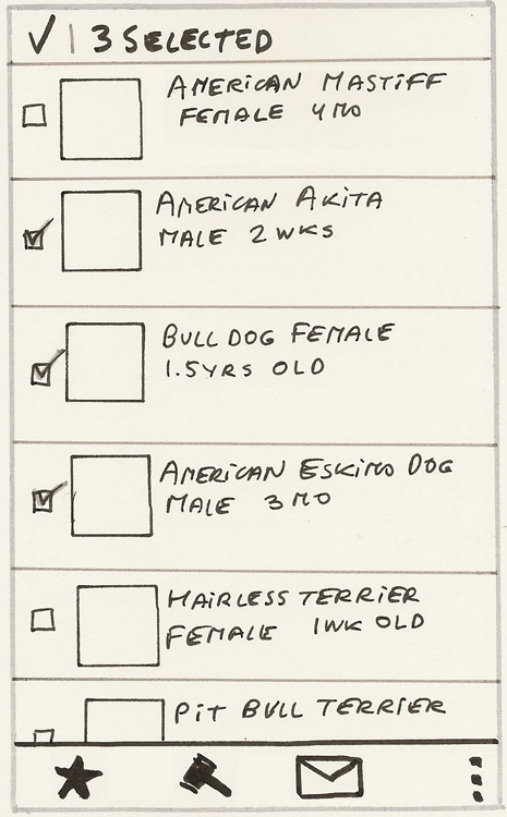
This Pet Shop functionality works similar to the way Gmail app Multiple Select works. In contrast to the Photo Gallery app, the check boxes are shown all the time, and as soon as an item is selected, the contextual menu on the bottom floats up, revealing the actions that can be taken on the selected items (in this case, Wish List, Bid, and Contact Seller). Tapping the check box on the top of the page exits the Multiple Select mode, releasing all of the selections and removing the bottom action bar.
Tablet Apps
Customers using tablets presumably have a bit more time for leisurely contemplation and to perform maintenance tasks; therefore, they might draw upon a multiple select even sooner than their mobile counterparts. It’s not uncommon to provide Multiple Select functionality for tablets, and it works great to accommodate those urges to tidy up a gallery or add some group information.
Caution
This option tends to be less discoverable—that is, it is not obvious how to enter a Multiple Select mode in some apps, such as the Photo Gallery. If this function is essential for your app, be sure to provide a quick tutorial overlay. See Chapter 5, “Welcome Experience,” for ideas.
Related Patterns
10.7 Pattern: Free-Form Text Input and Extract
Whenever customers need to enter random text, give them this basic text input pattern.
How It Works
The customer taps the text field, and the soft keyboard comes up from the bottom of the page, while the focus is placed into the text field. If the field is below the fold, the form scrolls so that the text field is in focus just above the keyboard. The customer enters a desired value for the text field via the keyboard.
Example
One example of this pattern is the Contacts app (see Figure 10-34) . The Contacts app appears with the soft keyboard already in place, ready to enter values.
Figure 10-34: This typical textbox implementation is in the Contacts app.
Turning the mobile device horizontally while maintaining focus on the textbox launches an important variation of this pattern: the Extract Text Input (see Figure 10-35).
Figure 10-35: The Extract Text Input variation is displayed when a device is in the horizontal orientation.

When and Where to Use It
Use this pattern any time you need a free-form text input, such as the name, description, status update, and the like. The Extract version of the pattern is particularly useful for longer messages, such as an e-mail message body, because it make the input field larger; so the customer can see two to three lines of text at the same time, and has a larger soft keyboard, which for many people allows for more precise typing.
Why Use It
This pattern is the standard control to enter text via a keyboard on Android.
Other Uses
Starting with the Nexus phone in the Android 4.0 OS, any form field that accepts text also accepts voice input. Tapping the microphone button on the keyboard (or on some models, swiping across the keyboard horizontally) brings up the voice input mode. The keyboard swiping method is less discoverable, so fewer people know about it.
This voice input function is handy, especially for status updates or longer fields like an e-mail body. Unfortunately, it’s still somewhat incomplete because the customer needs to tap the Next button to send the update or move onto the next field. (See Chapter 7 for discussion of the differences between standard voice input and the true convenience of digital assistants such as Siri.)
Pet Shop Application
This implementation is straightforward, so I did not create a wireframe for it; however, you can practice on your own.
This is a good place to mention the one recommended departure from the sticky-note wireframe style of the previous chapters: not to draw various keyboards in the sticky-note Pet Shop app wireframes. Drawing keyboards is tedious and time consuming, and it yields no tangible benefit in user testing. Instead, do what works: Simply print and cut out various keyboards and glue them onto smaller sticky notes using a glue stick or tape. Once created, you can place these sticky-note keyboards on top of the wireframed screen to simulate the keyboard coming up from the bottom. Then these paper keyboards can be moved down as needed to give the participants the feel of a complete sequence of filling out fields on the page. The sticky-note keyboards can be reused on other screens and projects, as needed.
Tablet Apps
On tablet devices, there is far more real estate for the form, so the form never enters the “extract” mode. Typically, the form just scrolls up to where the target field comes up just above the keyboard, regardless of the orientation (see Figure 10-36).
Figure 10-36: This is how a textbox implementation looks in the Calendar app on the 7-inch Galaxy Tab 2 running Android 4.0.

Unfortunately, flipping the tablet from vertical to horizontal orientation and back again sometimes closes the keyboard. This is definitely a bug; the keyboard should stay open until dismissed or until the customer taps Done or goes to the next field. See more about keyboards in the following “Caution” section.
Caution
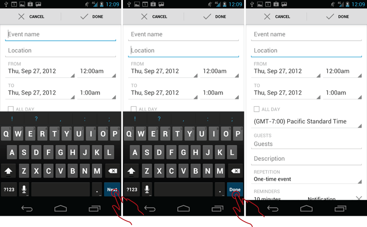
The only button that the Android toolkit provides for navigating between the text fields of the form is the Next button, which changes to Done when the last consecutive text field is traversed (see Figure 10-37). This works okay as long as your text form fields are a single line.
Figure 10-37: The Next and Done buttons appear on textboxes in the Calendar app.
Unfortunately, things break down when your form includes a multiline text field, such as a long description, which omits the Next or Done button in favor of the Enter key. If you happen to be in the multiline field, the keyboard remains on the screen until the form is submitted. So in effect, for the entire remainder of the form, the customer is left scrolling the form up and down with her finger to move into the next field in a small fraction of what remains of the screen real estate above the keyboard, while the system focus remains on the multiline description field. This is an antipattern, as shown in Figure 10-38.
Figure 10-38: In Google Calendar, the keyboard for a long description field remains on the screen even while the focus shifts to other controls.

You might say that the standard behavior is to use the hardware Back button to exit the keyboard while in the multiline description field. That is true; this function is available. However, the discoverability to use the hardware Back button to get rid of the keyboard is low. This function is counterintuitive because the multiline entry field looks exactly the same as the single-line field, minus that critical Next/Done button. To add to the confusion, this same multiline text field has an explicit Done button when viewed in a horizontal format (see Figure 10-39). The Landscape Done button moves to the next field, whereas the Portrait Done button actually submits the form!
Figure 10-39: In Google Calendar, Done buttons in landscape and portrait perform diametrically opposite functions.

The absence of the way to exit the long field explicitly (that is, the Next/Done button) means that you must be careful with the keyboard behavior, especially in portrait mode on smaller mobile devices where the keyboard obscures most of the rest of the screen. For this reason, the keyboard should collapse as soon as the customer taps any other form field, regardless of type.
You should also avoid using the keyboard Done button as a “form submit” that sends the form to the server. At present, the prevalent paradigm is for the Done button in the keyboard space to dismiss the keyboard. If you do use the keyboard button to submit the form, at the least, label the button with a distinct label, such as Go, and make sure the form submits only from the last field in the form. If space permits, it is best to provide a separate dedicated button for the Submit function.
One last note of caution: When your form or lightbox contains a single text field, strongly consider launching the form with the keyboard already in place to save your customers an extra tap. For example, in the Contacts app, when creating the new group, the lightbox with the single entry field is shown without the keyboard. The customer must tap the field to launch the keyboard. Another weird thing happens after the customer taps the OK button on the lightbox: The focus shifts upward to the Address field (see Figure 10-40).
Figure 10-40: In the Contacts app, the single text entry lightbox is launched without the keyboard and focus shifts randomly.

A better interaction would be to launch the lightbox with the keyboard already in place (refer to the second screen from the left in Figure 10-40) and shift the focus to the groups Multiple Select field after the new group name has been selected.
Related Patterns
10.8 Pattern: Textbox with Input Mask
Sometimes, we know more about the specific content of the text field, for example, that it contains an e-mail. In those cases, use the textbox with the Input Mask pattern.
How It Works
When the field accepts only specific data, such as e-mail, phone number, Social Security number, or ZIP code, the system can provide the right kind of keyboard to facilitate data entry. Also, depending on the location of the field label, it can optionally show the input mask inside the field.
Example
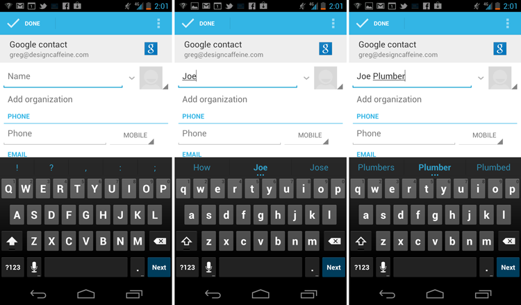
When adding a new contact, the Name field provides a “Name” in-field label shown in a lighter gray font inside the entry field (see Figure 10-41). The in-field label remains in place until the customer starts typing.
Figure 10-41: The Name field label acts as a kind of input mask.

You can think of the Name label as a kind of input mask. Some people might disagree, saying don’t mix apples and oranges; they would argue that, strictly speaking, Name is not an input mask, but a field label—and that’s okay. On a mobile device, with the tight screen space available, the differences between the functions of input masks and labels are, at best, a bit blurred, if not entirely muddled. Despite being open to all sorts of characters, the Name field has some restrictions, such as field length, which is always limited to some practical number (for example, 100 or 255 characters) and disallows the “enter” character (also called “new line” or “carriage return”). This makes the Name field different, from, say the Notes field. The Notes field enables up to 1 Mb of text data and accepts a press of the Enter key to add a new line to the text. In this way, it is useful to think of anything written inside a field that also happens to shape the customer’s expectations of the format and allowable values as a kind of input mask.
So what is the Input Mask pattern good for? One useful feature is to facilitate the correct data entry by launching the right kind of keyboard. For example, notice in Figure 10-42 how the soft keyboard changes accordingly when the Name, Address, Phone Number, and E-mail fields are entered; that is the implicit input mask at work.
Figure 10-42: Implicit input masks launch various types of mobile soft keyboards.

The Name and Address both provide voice input capabilities, whereas Email provides a handy @ sign (which can be hard to find on the standard keyboard). Most of the new Android 4.0-style minimalist native form fields are going to be limited to this type of implicit input mask—that is, an input mask that is logically implied by the label.
For fields that have explicit persistent labels, a better customer experience is possible—one that provides a label and a separate input mask. For example, in the registration form for Kayak, as shown in Figure 10-43, the Email label to the left of the field also enables the input mask [email protected] that explicitly shows the expected field value format and the “required” input mask for the Password field.
Figure 10-43: The Kayak app uses explicit input masks.

This explicit input mask reduces input errors because it shows the field format ahead of time and also keeps the label present during data entry. Of course, nothing comes free, particularly on mobile devices (just ask AT&T about their texting plans), and the resulting form sacrifices some of the length of the label. And some minimalists would argue this format also adds extra “noise.” I disagree. Although the Kayak form does looks a bit busier than the native Android form designs, it is a small price to pay for improved clarity.
When and Where to Use It
Any time you need your customers to enter data structured in some way, you should ideally show the desired format of the field inside the field as an Input Mask pattern and launch the appropriate soft keyboard.
Why Use It
Mobile devices are notoriously poor at capturing keyboard input. Fat fingers, multitasking, and being jostled in the bus or metro are all contributing factors to this issue. Input masks reduce data entry errors and therefore should be used whenever possible to produce a better mobile experience.
Other Uses
As discussed earlier, for fields that allow a wide range of possible values, an implicit simple mask such as Phone Number is sufficient. However, if your app requires enforcing a specific format for entry, you can use the effective experimental variation, as shown in a high-resolution wireframe in Figure 10-44.
Figure 10-44: This experimental pattern puts a static input mask inside the Android 4.0-Style phone number field.

Compare this wireframe with Figure 10-42. Interestingly, this format actually reduces clutter because the input field no longer carries the same label (Phone) twice: once inside the field and once above the field. Luke Wroblewski first proposed this idea in 2010 at his Mobile Inputworkshop at Design4Mobile in Chicago (http://static.lukew.com/MobileInput_LukeW.pdf). This is an excellent approach to implement the Text Input with Input Mask pattern because it reveals the format of the expected entry ahead of time, so there are never any surprises about the strange separator characters popping up seemingly at random all over the place (as discussed later in the “Caution” section). Unfortunately, to this day, this remains largely an experimental pattern and has not gained wider adoption.
Pet Shop Application
For the Pet Shop app, you can use a different tactic for the Phone Number field in the Pet Registration Form. Because the app accepts both U.S. and international phone number formats, you can choose to make the input mask simply say 111-111-1111 (see Figure 10-45). This should accommodate both the formats with and without the country code and phone number extensions.
Figure 10-45: This wireframe for the Pet Shop app demonstrates implied and static input mask patterns.

On the other hand, the second field is the Social Security number of the pet’s owner: a well-formed nine-digit number. For this field use Luke Wroblewski’s idea of a static input mask inside the field.
Tablet Apps
The input mask applies even more strongly to tablets because the screen has plenty of real estate to provide a separate label and a static in-label input mask. Unfortunately, most native reference form implementations (such as Calendar) fail to take advantage of the cornucopia of screen space and consequently do not provide additional input instructions, even when abundant space is available. Instead, the Contacts app in the Galaxy Tab 2 7-inch Tablet with Android 4.0 reveals the format gradually using a loose dynamic input mask. As shown in Figure 10-46, the system initially removes a perfectly good “–” separator character that the person initially types as part of 415–222 and replaces it with the ( ) format as the customer continues to type (415) 222–33, surprising him with the additional characters popping up in the field. On the other hand, as shown on the right side of the figure, the Galaxy Tab 2 tablet also seems to enable all sorts of nonsensical user formatting that can be used to, seemingly at random, override the native dynamic input mask.
Figure 10-46: This antipattern in the native Calendar app on the Galaxy Tab 2 uses a loose dynamic input mask.

Sometimes the system overrides the format the person puts in, and sometimes it doesn’t, creating a confusing experience. This implementation is not recommended. It is always best to reveal the formatting information upfront, if possible.
Caution
Although this pattern is thankfully becoming rare, some apps strictly auto-format the text input as it is typed; that means the system immediately removes any characters it deems inappropriate, even when they are part of the mask. As Luke Wroblewski so eloquently showed in his article “Input Masks Design,” (December 13, 2008, http://www.lukew.com/ff/entry.asp?756), this kind of strict dynamic input mask is actually an antipattern because it creates a confusing interaction when handling in-field characters that are part of the mask.
For example, as shown in Figure 10-47, while entering $60,000.00 into a strict dynamic input mask field, the system swallows the $ character after it’s typed and further formats the commas in a way that’s entirely different from the decimal point, which all adds up to a confusing interaction.
Figure 10-47: It’s an antipattern for a strict dynamic input mask to remove characters as they are typed.

Another thing to keep in mind is to not go overboard on the keyboard specificity. For example, the specialized time entry keyboard from the Pocket Informant Android App, as shown in Figure 10-48, actually tries to limit the hour entry to the numbers 1 and 0 for the first digit then to the numbers 0 through 9 for the second digit, which depends on the first digit typed. This is presumably meant to help people avoid typing nonsense entries such as 91 hours. Unfortunately, the result is rather confusing because keys on the keyboard light up and go dim for no apparent reason while the customer enters even a simple time such as 8:00 AM, which distracts the customer greatly from the primary task.
Figure 10-48: Disabling Keyboard Keys is an antipattern.

Avoid disabling the specific keyboard keys because it is overkill and a (fortunately rather rare) antipattern.
Finally, at all costs avoid breaking up fields into their component parts. For example, don’t abstract the U.S. three-digit area code into a separate field in front of the phone number. This is an antipattern and creates a confusing interaction. Fortunately, this has become rarer in recent years.
Related Patterns
10.9 Pattern: Textbox with Atomic Entities
Some textboxes are used as a kind of search box to locate and enter specific discrete, nondivisible system objects, also called atomic entities.
How It Works
The customer starts by typing a few characters that identify the atomic (also called discrete) entity, and the system performs a dynamic look up, returning the auto-suggestions, usually as a drop-down below the textbox. As soon as the customer taps one of the auto-suggestions or the typed characters resolve themselves into a single entity, that entity is added to the textbox. If multiple atomic entities are allowed in the same search box, the focus remains in the textbox, enabling the next text entry, which is input the same way.
Example
An excellent example of this pattern is the Invite field in the native Android Calendar app (see Figure 10-49). The customer can enter one or more people who are pulled in dynamically from the Contacts database.
Figure 10-49: The textbox with Atomic Entities pattern works well for adding Contacts to a Calendar Invite.

If one of the contacts is not recognized (for example, Joe Plumber), the system forms a red box around the unrecognized contact. The customer can then edit the name or delete the entire entity with a single tap of the Delete button on the keyboard.
When and Where to Use It
Use this pattern any time you enter one or more discrete entities from a long collection (50 or more objects). Typical uses include Contacts, Social Media Connections, Countries, and Airports.
Why Use It
As the information in the world becomes richer and more ubiquitous, more collections begin to qualify as “large,” so they become awkward to enter using a drop-down/select control. Textbox with Atomic Entities pattern provides a robust solution for this problem. You can use it to search the server or operate on local databases that are cached on the mobile device entirely on the client side.
Other Uses
Smashing Magazine published an article that provided an excellent argument for using an Atomic Entity approach for a control that can be used to enter one of today’s 249 countries, rather than using an overly long drop-down (“Redesigning The Country Selector,” by Christian Holst, November 10th, 2011, http://uxdesign.smashingmagazine.com/2011/11/10/redesigning-the-country-selector/). Incredibly, no one has yet implemented this Country Selector in the mobile app. The text field auto-suggest search Christian created is robust and intuitive, surfacing more common items (United States) higher in the list than the less common ones (United Emirates). Add to this a few techniques discussed in Chapter 9, “Avoiding Missing and Undesirable Results,” such as a quick controlled vocabulary substitution (Holland to Netherlands), and you have a chance to create an industry-defining mobile experience. Other capabilities of this pattern include the ability to enter new entities on-the-fly, as dictated by the purpose of the app. For example, the Calendar app enables the entry of a well-formed e-mail address directly, instead of picking an existing entity from the Contacts database.
Pet Shop Application
According to the current version of Wikipedia, there are from 400 to 600 different dog breeds. When registering a dog in the Pet Shop app database, you can use the list to form a controlled vocabulary from which the owner can select a breed of a dog. The wireframe set is fairly straightforward (see Figure 10-50).
Figure 10-50: Adding a dog breed using the textbox with the Atomic Entity pattern is quick and intuitive.

The owner starts typing the first few letters, and a list is shown to him of the dog breeds that match the entry. The owner can then continue typing (up to the full name of the breed) or simply select the breed he wants from the list of auto-suggestions. The pet breeds do not change often, so these can be cached in a small database on the mobile device, providing a smooth and responsive experience.
Tablet Apps
This pattern should work the same for the tablets as it does for the mobile apps but fit more auto-suggestions. Remember that depending on the orientation, the auto-suggestion layer can display below the field (vertical tablet orientation) or to the right of the field (horizontal orientation). Don’t get caught up with following the mobile implementation.
Caution
Remember to test boundary conditions. What happens when the invite has more people than can fit on a single line?
Related Patterns
10.7 Pattern: Free-Form Text Input and Extract