Chapter 4
Mobile Design Process
What makes an effective mobile design process? At the end of the chapter, I describe an end-to-end mobile design process case study that showcases the sticky-note mobile design methodology used throughout the book. However, before you jump to this section, I want to discuss the challenges of designing in the mobile age and some approaches to adopting the classic User-Centered Design (UCD) techniques to the new medium so they remain effective and relevant.
Observe Human-Mobile Interaction in the Real World
In the past, context was one of the considerations when designing software, but it often took the back seat to other methods of analysis. Why is that? Because, ladies and gentlemen, before the arrival of mobile devices, the context was a computer that the customer would sit in front of, unless you were designing a computerized coffee maker (vile abomination!). Thus at the moment of interaction with your software, your customers were basically sitting down in chairs in front of computer screens with keyboards and mice.
In contrast, in mobile design, context is king—context that you and your team should ideally observe first hand, in a real world. It is no longer possible to reliably imagine and model how the interaction would proceed (a person sits in front of the computer, grabs the mouse, and so on) because the person’s behavior and her interaction with the device is highly dependent on context. Even fundamental design parameters like device orientation and hand grip change dramatically when the customer is standing on a busy street corner and looking at a map; sharing photos of the kids while sitting on the couch with a spouse; talking with one’s boss one-handed while trying to park the car; or reading while riding the city bus. To really understand what happens, you and your team have to get out there to observe these interactions first hand, as they happen. And while you are out there, simply asking questions is no longer enough to get accurate and precise data. To make solid design decisions, ideally you should observe behaviors using a realistic prototype of your app as a tool for eliciting these behavioral responses.
Your Prototyping Methods Must Allow for Variety in Form Factors
For many years, the same old fight between Mac and PC has dominated the tech landscape, followed by the browser wars. From the standpoint of the User Experience (UX) design, the PC was somewhat different from the Mac, but from the standpoint of the customer, the two were perhaps not that different—both operating systems used a mouse, keyboard, and large screen. Also, because the majority of software being produced was built for the Internet browser, the experience was largely device-independent. Yahoo! and Facebook looked similar in Internet Explorer on Vista and in Safari on Mac OS X.
In contrast, the age of mobile touch computing yielded a tremendous variety of platforms and device form factors. Small phones, large phones, small tablets, mid-size tablets, and large tablets are widely available for sale today, and all demand different approaches to software design because of ergonomics, form factors, and general patterns of use (such as joint ownership of larger tablets). These differences are discussed in Chapter 3 “Android Fragmentation,” and are considered throughout this book.
However, phones and tablets are not the only platforms you need to worry about. Futuristic installations of Android OS in everything from ski goggles to refrigerators and cars are only a matter of time. All these installations require considerable changes to the user interface to fit the specific needs of the device. That means that the old model of wireframing no longer reflects the rich and variable reality on the ground. In order to understand design constraints for these objects, you need to modify your design approach to include the physical form factor of the device, as well as transient elements such as animations and transitions.
Your User Testing Must Allow People to Explore the Natural Range of Motion, Voice, and Multitouch
When it comes to mobile design and testing, forget everything you know about interacting with a computer. The uniform mode of interacting with a computer via only mouse and keyboard does not apply to mobile devices. Much of what the mobile age is all about is taking advantage of the body’s natural motions: scratching to dig deeper, shaking to say no, and bringing the phone to your ear to speak. From voice recognition digital assistants to pedometers that use the body’s swaying motion along with GPS on-board sensors to determine the speed and quality of daily physical activity, today’s mobile devices are using an unprecedented array of motion, voice, and multitouch gestures to obtain increasingly complex inputs from customers. In order to design effective interfaces, your prototype and the customer experience testing techniques need to account for a full range of these new modes of interaction with the devices.
Touch Interfaces Embody Simplicity and Sophistication
Browser and OS-based software that runs on large screens could afford to have ill-conceived advertising modules while still succeeding in converting customers because of the high tolerance of complexity, fairly large screens, and relatively high degree of focus that customers had on your software just by virtue of having to sit down at a chair to use the computer.
The mobile age is all about, well, mobility. That means your customers’ attention is even more scattered than ever before, more, even, than anyone thought possible just five years ago. This means that interfaces need to be simple. That’s not to say “simplistic”—as Edward Tufte famously said, there is an ocean of difference between simplicity and simple-mindedness. Instead, the software needs to take on the burden of complexity that was heretofore acceptable to pass on to the consumer.
Don’t misunderstand: People actually want to do more with smartphones and tablets than they could do with the web. You simply can’t afford the perception of complexity anymore. So in touch interfaces, you have a unique customer interface that is not complicated, but very sophisticated. This means that a device’s touch interfaces are, in many respects, easier to prototype than desktop web interfaces—especially when it comes to low-fidelity methods like paper prototyping—as long as the moderator makes an effort to probe the less tangible aspects of the interface.
Delight Is Mandatory
Delight, fun, and games existed under the old PC and Mac system. However, the majority of “fun” was devoted to specific activities, such as computer games. The new mobile platform has grown up on games. The games are in its blood and DNA. Thus, no matter how boring and trivial the task, designers need to make sure that the software is as delightful as possible, even if “delight” simply means the software helped the customer complete the task as quickly as possible.
Increased gamification is a natural outcome of the new platform, and, as John Ferrara says in his book Playful Design (Rosenfeld Media, 2012), the experience of play must be delightful as a stand-alone activity, not feel tacked on as an afterthought onto some other agenda. This means that the best mobile experiences must behave and feel more like games. The small size of the screen makes it inevitable, for example, that fun elements (such as transitions) play a big role in the experience. In contrast, the old browser model had minimal transitions. This means that while you are prototyping the design of your app, you must allow time to explore the elements of transitions, delight, and gamification.
Tell a Complete Story—Design for Cross-Channel Experiences
Using a PC or Mac was almost always work. With the exception of a few hundred super-geeks who took their computers to the restroom with them and refused to shower so that they could spend as little time as possible offline, most people would have dedicated “online” or “computer” time to accomplish digital tasks. In contrast, many “normal” people have their mobile devices with them at all times. More and more, there are increasing numbers of people that sleep, eat, and even go to the restroom (shocking!) with their digital devices. Because of the incredible array of on-board sensors (microphone, GPS, light sensor, camera, near field communications [NFC], touch, motion, and so on) the mobile experience creates a completely unprecedented connection between offline (also known as “real-world”) and digital realities. It’s as though we have acquired a new organ that enables us to connect to the unseen digital worlds of Facebook, read QR codes and NFC chips, and access interconnected digital information such as maps and reviews in the moment we need the information. This new “mobile organ,” which is always with us, is a completely different way to easily and quickly access and manipulate information.
Today, it is safe to assume that the “mobile organ” will be used to augment every traditionally offline experience, such as a visit to an amusement park, a shopping trip, and even a hike in the woods. As a designer, you need to pay close attention to the spaces between interactions, where a mobile device is used to interact with other channels. For example, someone might start a task on a mobile device, continue on the desktop and social networks, and finish it in the physical store. These quick tasks that appear to be done “on the side,” at the spur of the moment, or while waiting for some other event to occur might just be your primary mobile use cases.
Now that you know some of the challenges you are facing, the following section includes a mobile design case study that will help you understand how you can put all this information together into a User-Centered Design (UCD) process that works for mobile.
Mobile Design Case Study
I used a lightweight Agile mobile design process to help deliver a radical innovation: an authentically mobile “60-second listing” flow for the ThirstyPocket iPhone app, which will also be shortly coming to the Android Marketplace. This project is an illustrative case study of how to apply UCD to mobile design. This case study is provided merely as an illustration of some of the concepts discussed in the preceding sections, such as lightweight prototyping. You may have to adjust your design approach and process based on your particular situation. The key is to stay flexible while remaining customer-focused.
Step 1: Scope, Concept, and Planning
Before proposing any design solutions, start by having a kick-off meeting to understanding the who, where, how, and how much questions, otherwise known as context, persona, vision, and budget. Depending on the project, this could be as simple as writing these in a one-sentence format. It is critical that the entire team agrees to these four points, and any questions are called out, so they can be answered through research.
Context: Where Will the Product Be Used?
As noted above, context is the key to creating a great mobile design. You must know where your potential customers are, what equipment they use, what else they are doing at the time of interacting with your app, and what emotional state and concerns they have about the process. All of these factors will help drive the design and ultimately determine your choice of a final design approach and the list of features and system behaviors your product should have. During the planning and scoping phase, you need to write down the team’s current thinking to have a starting point for customer research. For the ThirstyPocket app, the context was “Garage sale in an urban area.”
Persona: Who Is the Target Customer?
You may start out knowing this, or the idea of a target customer may evolve from the internal discussion or field research. Regardless of how you arrive at the insight, it is essential to have an agreement of who the solution is supposed to target, even if your assumption is not correct. If the team disagrees on the target persona, go ahead and document this—disagreements point to areas where more research is needed. Although recommended, you don’t need to spend a lot of time developing sophisticated, detailed personas for your mobile project. Sometimes a one-sentence “persona sketch,” such as a simple “young college student, not a lot of money or time” that we agreed upon for ThirstyPocket, could be enough to jump into testing. The most important function of the persona is the sense of team cohesion and empathy toward the struggles and challenges faced by the target customer. If you are feeling strange about coming up with a persona sketch without a lot of information, keep in mind that having fictional personas are better than none. At least you will have documented your team’s assumptions, so you can quickly discover if they are not correct and update as necessary when you jump into field research.
Field Research and Contextual Interviews
After the context and persona sketch is complete, jump into testing! For ThirstyPocket, we visited plenty of garage sales and interviewed people who fit the target profile about selling their stuff to get a better understanding of the challenges of the existing selling systems and workflows and people’s frustrations with the process. As you do your research, be sure to go on field studies together with other team members and discuss findings and brainstorm ideas immediately after the research sessions. This is especially great to do over a coffee, lunch, or dinner following the research session. No great documentation is needed—simple paper sketches and idea drawings shared in context with the entire team are often the best ways to come up with great ideas, improvements, and product vision. Don’t forget to test your assumptions and correct the persona sketch and context understanding as necessary.
Vision: How Will the Product Be Used?
How do you envision the product being used? Is it a long engagement or a quick information snack on the run? How often does the customer engage? What triggers the engagement? What is the service window when the customer interacts with your app? Does the interaction span multiple touch points, and must customers come back at some later time? Does your app require preparation or training? What happens front stage, between customers? What happens back stage on the software or service side of the equation? Ultimately, your job is to understand and sharpen your complete vision as part of your design process. For the ThirstyPocket app, we came up with a cool slogan: “List your item in 60 seconds.” Your vision for how the product will be used should ideally be rooted in direct team observation of the target customers in target context. From this point, it is very easy to jump into the next section, “Step 2, Design Workshop.”
Budget: How Much Time and Money Do You Plan to Spend on Design and Development?
UX design is only a small piece of the product development puzzle. Take the time to understand how the design fits into your overall development plan and work within your timelines to make the most of your team’s technical capabilities. A typical design process takes anywhere from 3 to 6 months. For the ThirstyPocket app, the budget was set for 3 months.
After you’ve established your context, persona, vision, and budget, you can move on to the design workshop described in the next section.
Step 2: Design Workshop
At the start of the workshop, and before you propose any design solutions, you must first focus on nailing down four essential pieces of information: personas, context, scenarios, and vision. You focus on driving the shared team-wide understanding and buy-in by developing use-case scenarios and a beefed-up vision statement, which help you fill in any missing pieces in the framework you developed in the first step. In the case of the ThirstyPocket app, use case scenarios and vision were updated as follows:
- Scenarios: Selling a car in the neighborhood, around the 5-mile range; selling tickets at the last minute while at a concert using texting/phone for communication.
- Enhanced Vision: Local, social, e-commerce. Seeing the product in person and paying in cash, like a garage sale. No shipping. Only a single picture. Natural, easy, and simple selling process, with no registration/login.
After you nail down the four essentials, and often during the process, you generate ideas by working collaboratively as a team.
It is a good idea to always approach the design process with multiple directions in mind, injecting a rigorous discipline into the brainstorming process. Rather than getting excited about the particular approach, document it quickly and then set it completely aside, asking the following questions:
- “Is there another way to design this?”
- “What if you start with X instead of Y?”
- “Can you make it more like X?”
- “Can you make the new workflow fit the existing customer behaviors?”
- “Can you make this workflow feel more like a game?”
Storyboarding is an excellent technique to document various design ideas in context and as they happen through time. The key is to keep the actual interface design portions to the minimum and instead describe how the app will be used in the mobile context. For ThirstyPocket, the approach shown in Figure 4-1 fit well with both scenarios, and it fulfilled the larger product vision.
Figure 4-1: This is the storyboard for the ThirstyPocket app selling process.
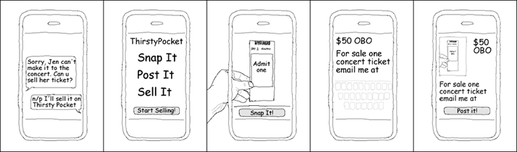
For example, the storyboard documents the following scenario: A young person named Gene is heading to a cool concert in a car with a bunch of friends. Suddenly he gets a text—his friend Jen can’t make it! Could Gene sell her ticket? “No problem,” replies Gene, “I can sell it on ThirstyPocket.” This opening storyboard is important because it shows the context of interaction. It should convey something about the scenario as well as setting up a strong sense of place where the scenario is happening.
Gene next fires up the ThirstyPocket app (“Snap it, Post it, Sell it!”), and proceeds to tap Start Selling! This action opens the built-in camera, and Gene taps the Snap It! button to take the picture of the ticket he is looking to sell. Gene fills out a quick description and taps the Post It! button on some kind of a preview screen. And there you have it—a simple, quick, locally focused selling flow without a great deal of interface details.
During the workshop you concentrate on speed, quickly exploring various design scenario storyboards on a whiteboard or with small rectangular sticky notes. You must strive first and foremost for mutual understanding and strong vision, not exhaustive documentation. A full description of storyboarding techniques is outside the scope of this book. Check out the incomparable Making Comics (Harper, 2006) by Scott McCloud, and visit the companion site for this book, http://AndroidDesignBook.com, for more examples of mobile storyboards and use cases.
During the workshop, encourage everyone on your team to draw and participate. High-value production storyboards are not necessary. If a whiteboard full of chicken scratches surrounding stick people is enough for the entire team to “get” the particular mobile scenario, that’s all you need. After you have the key use-case scenarios story-boarded, it’s time for “Step 3: Wireframe and RITE Study with Sticky Notes.”
Step 3: Wireframe and RITE Study with Sticky Notes
As discussed earlier in the chapter, due to unusual design constraints of mobile, the commonly used UCD process of creating computer-generated wireframes and then building a high-fidelity prototype does not always work for mobile design.
Instead of spending a lot of time and effort creating high-fidelity wireframes, set up a cheap and efficient Rapid Iterative Testing and Evaluation (RITE) study as the core of your design process. Do RITE studies as early as possible in the design process and you will reap the benefits of creating more delightful, usable, and successful mobile products in less time than you ever thought possible.
The RITE study (you can call it “RITE test” if you like, though I prefer the term “study” to emphasize the design changes) I typically recommend is conducted using 9 to 12 participants in three to four rounds (3 participants per round). The critical component of a RITE study is to allow time between rounds for updating the prototype to fix the issues discovered during the previous round’s testing. Basically a RITE study is a series of design/test pairings where the prototype is rapidly changed as needed based on feedback from the customers, engineers, and management.
RITE studies have been a part of the UCD toolbox for many years. One simple modification I came up with to enable RITE to work well as a core of the mobile design process is to employ the prototype made from sticky notes.
Mobile sticky-notes prototypes offer many advantages. To begin with, a pack of large sticky notes (I prefer to use 3 × 5 inch size) has the dimensions that resemble those of a typical mobile phone. That means that there is no need to create any external cases, boxes, or anything else to resemble the mobile device; the pack of sticky notes is a complete solution.
Sticky-note prototypes are cheap, are easy to create, and they are fairly robust. They can be dropped from any height without disintegrating or even so much as falling apart into individual pages. You won’t have any issues handing a pack of post it notes to a complete stranger on the street or in the coffee shop and asking him some questions about your app (most people would not have the same light-hearted feelings about handing their precious late-model mobile phone to a complete stranger). If the participant happens to accidentally drop the sticky-note “phone,” it will not be damaged, and if they happen to run off with it, you will only be out about a dollar!
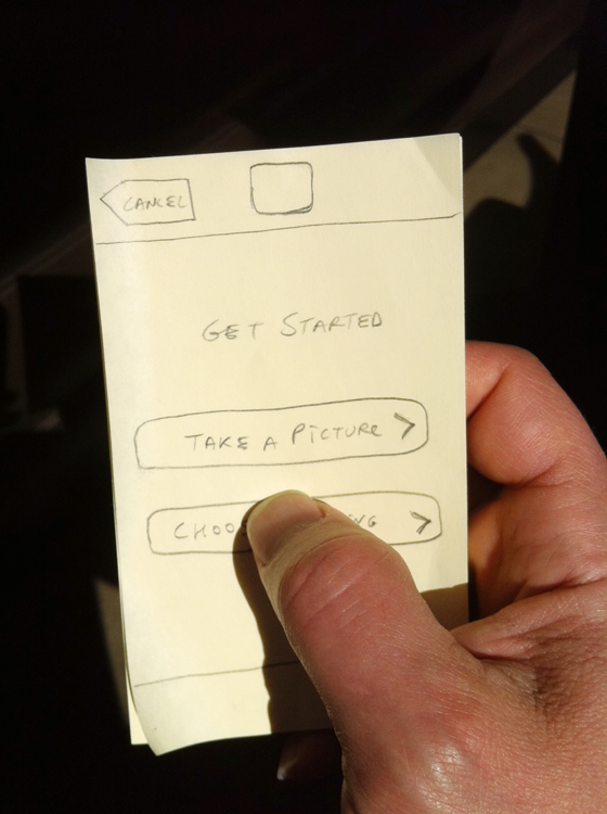
As shown in Figure 4-2, a pack of sticky notes closely resembles the form-factor of the mobile device, so this simple yet sophisticated prototype enables you to test the natural ergonomics, multitouch, and accelerometer motions—something traditional wireframes simply cannot accomplish.
Figure 4-2: Using a pack of sticky notes to simulate a phone is an effective, lightweight prototyping technique.
Sticky-note prototypes are easy to fix: If you discover issues with the design, you can fix the interface right then and there, using an eraser and a pencil, or a new sticky note re-drawn with a fine-point permanent marker. Likewise, if you want to test an alternative flow, you can draw a new screen design in a few minutes and compare its performance with that of an existing idea almost immediately, when you hand it to the next evaluator. This ease of use helps your design evolve quickly, especially if your entire core team is present at these test sessions.
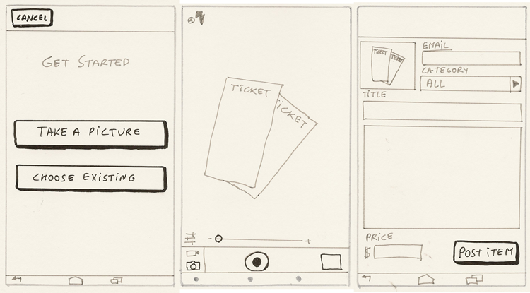
Figure 4-3 shows how I used the sticky-note method to wireframe the original “Sell your item in 60 seconds” flow I tested for ThirstyPocket.
Figure 4-3: This is the mobile design prototype for early testing that I created using sticky notes.
Because I have personally experienced excellent results using my sticky-note prototype approach, and I firmly believe that it will help you reach your design goals, I have created 3 × 5 inch sticky note wireframes for most of the design patterns in this book. As you explore this prototyping technique, here are a few things to keep in mind:
- When using the sticky-note pack to approximate the mobile device, you do not need to draw an additional box on top of the sticky note to represent the screen. To save time, as well as to make the drawing more understandable, go ahead and assume that the entire sticky-note surface is the screen of the mobile phone. For Android phones you should add the device’s hardware buttons (Return, Home, etc.) where appropriate.
- All drawings in this book are black and white, executed using Pigma Micron pens with Archival Ink. This is done for legibility. In real-life prototyping I use a simple mechanical #2 pencil so that I can immediately erase or update any elements on the “screen.” You can use any pen or pencil you like, black or color.
- I use a ruler liberally while drawing my wireframes. This is because drawing a straight line, especially while making rapid changes in the field, can be a bit of a challenge. Whether or not you decide to use a ruler, it’s best to be consistent in your technique throughout the prototype, so as not to distract your study participants. There are various templates and other drawing aids out there to help you. I am not a fan of anything other than a small transparent triangular ruler. Remember: The key is not the best drawings, but the fastest and most efficient way to test concepts. The easiest drawing process is the best. Use whatever works for you and conveys your designs most effectively.
- Sticky-note prototypes can be branched easily. This is done through handing the evaluator only the first “screen” stuck on top of the sticky-note pack. Once the evaluator taps a button or performs some function on that screen, I can select the appropriate next screen to show out of the pack of alternatives I hold in my hand, out of the view of the evaluator. This way the testing can be very realistic: If the next evaluator taps a different control, he receives a different screen, allowing for testing of branched and round-about workflows, backtracking and other real-life behaviors. This capability of the prototype yields rich and robust behavioral data.
- With a bit of practice, sticky-note prototypes can also be used to test transitions. If transitions are important to your interaction, try “slipping in” the next “screen” while saying something such as, “Let’s say the next page comes up from the bottom like so. How does that feel for you?” If the participant responds with something noncommittal such as, “Fine,” ask her if she would prefer a different transition instead, or if this movement has some sort of meaning to her. You might need to do a complex transition more than once to convey it properly. You may also wish to draw individual transition states on separate sticky notes (see “Storyboarding iPad Transitions,” Boxes and Arrows, January 5, 2011, http://www.designcaffeine.com/articles/storyboarding-ipad-mobile-transitions/).
- Keyboards are easily mocked up by having another smaller sticky note that can be overlaid on top of the sticky-note pack “device” the study participant is holding. This way any screen can be converted into the “keyboard entry screen” dynamically at any time during the test. This technique gives additional flexibility to the prototype while removing the chore of drawing a complex keyboard design element over and over again.
- Remember to revisit your storyboard. Your wireframe’s workflow should follow your product vision. For example, compare Figure 4-1 with Figure 4-3; you can see that the wireframes are a natural extension of the original vision with a few more details and interface elements added. For example, shortly after I started the testing, it became apparent that people sometimes wanted to take a bunch of pictures first and sell items later. Thus, I added another screen that gave the customer a choice: Take a Picture or Choose Existing (picture) (refer to Figure 4-3). These kinds of changes are common. They are the reason you want to test your idea on paper in the first place! If the change is drastic enough, you must update your vision storyboard accordingly after you learn new insights during your RITE study. In this case, the additional page did not change the basic storyboard scenario—it merely added fidelity to it—so there was no need to change the original vision storyboard (refer to Figure 4-1).
Sticky-note prototypes enable you to quickly and inexpensively explore multiple design approaches while dispensing with elaborate camera equipment and other gadgets. Sticky-note prototypes also enable you and your entire team to escape the confines of the office and boldly go to where the mobile interaction is actually taking place: coffee shops, busy street corners, taxis, and subways. There is tremendous value in putting your paper prototypes in the hands of potential customers in situ, on location where the interaction for which you are trying to design is actually taking place.
At the same time, study participants can be comfortable brainstorming valuable ideas because the prototypes do not have that “finished” look. This leads to powerful collaborative “jam” design sessions with the customers that take place directly in the context where they would be using your creation. These sessions yield invaluable insights you directly incorporate into your designs, much faster than you ever thought possible. That is why I included hand-drawn sticky-note wireframes with nearly every design pattern in the book. Hopefully, these will give you an inspiration to build your own sticky-note prototypes and test them in context, directly with your target customers. If you need help, please visit the companion site for this book (http://AndroidDesignBook.com) where I host videos of example hands-on RITE studies using sticky-note prototypes, mobile use case storyboards and many other resources designed to help you get the most out of this powerful technique.
Step 4: Visual Design
A RITE study is not the final deliverable; it’s merely a key step in the design process. The best way to think about your design process is that the state of your prototype and deliverables should reflect the overall state of completion of your product. That’s why early in the process, you will be able to move quickly by employing a lightweight design process to focus on designing the rough flows and screen layouts that work for the customer. After the rough flows have been worked out and tested, it’s time to move on to the final step: visual design.
It is customary to employ visual designers and content managers to give the final project that showroom luster. Although the visual design is not the focus of this book, Chapters 1 and 2 include a few essential pointers on the subject.
It is worth noting that visual design can both enhance and detract from the interaction design intent. Sometimes visual design can make a big difference. Thus it is a good idea to test the app a few more times to ensure that, despite the evolution of the design, the final version remains true to the original vision storyboard’s simplicity and elegance. Styling can be key to creating (or destroying) emotional connections, so it can be worth testing for that as well.
To run the final tests, simply hand the testing device (careful now!) to the person whose opinion you are interested in, perhaps while waiting in line at a coffee shop. Say, “Let me know what you think about the app, and I’ll buy your morning coffee.” This final testing of five to eight people should take no longer than an hour or so. This is an excellent test: Your final flow should ideally take no longer than it does for a person to reach the coffee counter during the morning rush, and the interface should be engaging and self-explanatory enough for the person to manipulate while in the decaffeinated state of mind.