Chapter 11
Forms
Data entry on a small screen is fascinating, but customer inputs must be combined together in forms to ultimately enable interaction. Luke Wroblewski made an eloquent statement about filling out forms in Web Form Design: Filling in the Blanks (2008, Rosenfeld Media): “Forms suck.” That’s the reality. This chapter is mostly about how to make them suck less on Android devices—and in some cases, even make filling out Android forms downright fun.
11.1 Pattern: Inline Error Message
Whenever an error occurs when you fill out a form, the Inline Error Message pattern provides the standard way to help the customer out of it.
How It Works
When an input error occurs, the system notifies the customer which fields need to be corrected. Generally you can recognize two components of the Inline Error Message: a field-level error indicator and a general error message (usually on top of the screen).
Example
Visual error indicators differ greatly between apps. My favorites are positive visual indicators such as icons combined with the traditional red color, such as the reference implementation from the registration flow of the Calendar app (see Figure 11-1), which adds a red round (!) icon on the right side of the textbox if the person attempts to move past the e-mail field.
Figure 11-1: This implementation of the Inline Error Message pattern is from the Calendar app.

The Calendar app does not show a message in addition to indicating a missing value in the field. Although it’s often preferable to show the message and indicate which field has an issue, sometimes the answer is obvious, especially for shorter forms.
An alternative to this example is the eBay app’s registration form. In Figure 11-2 you can see that the form messages field-level errors by putting a red box around each field and places a composite error message on top of the form in red font.
Figure 11-2: The Inline Error Message pattern in the eBay app uses two ways to alert the customer of issues.

In the eBay implementation of this pattern, all the fields that have an issue receive the red border. This is the correct way to implement this pattern.
Both the Calendar and eBay forms disable the Next/Continue button, which provides a further indication that something has gone awry and the form is not yet ready for submission. Read more about this in the "11.5 Pattern: Cancel/OK" section.
When and Where to Use It
Any time you need to show your customers that they made an error in the form, this is the default pattern to use.
Why Use It
This pattern has stood the test of time and has proven to be the most usable way to show form errors.
Other Uses
One potential modification that you can make for long forms, such as the eBay registration, is to show the error message as a toast alert (see the next section, "11.2 Pattern: Toast Alert"). The advantage of doing this is that the error message is shown to customers even though they have scrolled down past the message (which is hidden from view on top of the page). Compare the toast alert wireframe shown in Figure 11-3 to the message on top of the page shown in Figure 11-2.
 Figure 11-3: This proposed wireframe provides an alternative implementation (the Toast Alert) of the eBay app's Inline Error Message.

One disadvantage to using the Toast Alert pattern with the inline error message is that the overall error message is not “resident.” In other words, the alert disappears after a few seconds, which could be confusing to customers if the message is long and contains detailed instructions as to how to solve the issue. For example, if your password error message reads something like “Your password needs to be 8 characters long and contain 3 special characters, 3 numbers, and 2 letters, upper and lowercase, and it cannot be the same as 10 previous passwords, nor can it contain the name of a movie character like C3PO or Darth Vader or Han Solo or Leah Buns or…,” you may not want to use the Toast Alert. (And you may just want to consider making it a wee bit shorter and easier for your customers. See the “11.2 Pattern: Toast Alert” section for more discussion.)
Pet Shop Application
Because I am a fan of short registration forms and error messages on top of the page, the example shows you how to sketch a simple inline error with the top message for registering with the Pet Shop app (see Figure 11-4).
Figure 11-4: This wireframe of the Inline Error Message pattern is for the Pet Shop app user registration form.

The form takes advantage of having an e-mail address on hand on the mobile device, so it prefills the e-mail address field but still enables the customer to change it if necessary. The app uses phone device ownership as a two-factor authentication pattern (read more in Chapter 12, “Mobile Banking”) and use the Login Accelerator pattern (see the “12.1 Pattern: Login Accelerator” section in Chapter 12) to secure the account with only a four-digit combination.
In the left wireframe, the customer just started to fill out the form. On the right side you see the form with the inline error, as the customer missed entering the name of his pet, his e-mail address, and the four-digit PIN, all of which are required. I used the same round red icon on the top level message to indicate the field-level error. This is intentional—both icons are similar in shape and color to draw attention to the tie-in of the message above the form to all the error fields below.
Tablet Apps
In tablet apps, there is a bit more room, both vertically and horizontally. Because of that, the message on top of the page is easier to find (see Figure 11-5) and is most likely to be displayed above the fold, making the toast alert modification described earlier unnecessary.
Figure 11-5: The Inline Error Message pattern in the eBay app registration form works even better on a 7-inch Galaxy Tab 2 with Android 4.0.

Another thing all that wonderful extra space lends itself well to is more detailed instructions located next to the field. Depending on the device orientation and form design, these can be shown on the right of the label or immediately below it. Figure 11-6 shows a wireframe of the example of how that might look in a vertical (top) and horizontal (bottom) tablet orientation. Unfortunately, today this largely remains an experimental pattern.
Figure 11-6: These proposed wireframes of the Inline Error Message pattern in the eBay app registration form provide extra field-level help information.

 Caution
Beware using only color gradations to indicate problem fields, as eBay has done. People that are color-blind (which is approximately 3 percent to 5 percent of the population, depending on gender, location, and other factors) may have trouble picking out the fields with a red box around them. A good test is to print the error and nonerror states in black and white to check if there is enough contrast between the states. As you can see with the eBay form example, there is enough contrast between the error and nonerror states (see Figure 11-2), though just barely. When in doubt, it is best to use a secondary positive error indicator, such as an icon in the field or next to it, as shown in Figure 11-1 and in the Pet Shop app wireframe in Figure 11-4.
Related Patterns
11.2 Pattern: Toast Alert
Toast Alert is named thus because in the original implementation the alert layer would pop up from the bottom of the screen like a piece of bread popping out of the toaster. The actual transition of the alert popping up is much slower than the bread ejected from your toaster—the latter always seems to fly out with the force equal to that of a conductive payload coming out of the railgun, but hey, you can’t beat those sweet Android food metaphors. The current Android 4.0 implementations of the Toast Alert have a variety of entrance motion variations, including just appearing on the screen. Today, the name “Toast Alert” is used mainly as a way to distinguish general messages that do not have buttons and go away by themselves after a short time from so-called Pop-up Alerts (see the next pattern) that do have buttons and remain on the screen until customers take action to dismiss them.
How It Works
When the condition that generates the toast alert is met, the screen displays a small overlay window with the specific message, icon, or both. After a specified time period (usually a few seconds) the alert window disappears. The alert window can also be dismissed before the time period has elapsed by tapping on the alert window or anywhere else on the screen. The entrance and exit of the alert window are sometimes performed as an animated transition, which may include darkening of the background application window.
Example
One example of this pattern is a white Toast Alert that comes up when the Trulia app loses a network signal (see the left side of Figure 11-7). Its counterpart on the Kayak app is black (which is pictured on the right side of Figure 11-7).
Figure 11-7: The Trulia (left) and Kayak (right) apps use the Toast Alert to indicate a weak network signal.

The more “traditional” implementation of the Toast Alert used for confirmation comes from the LinkedIn app. The Alert comes up if the customer has any messages and after accepting an invitation to connect, for example. In both cases, the alert comes up from the bottom and overlays the results. (See Figure 11-8.)
Figure 11-8: The “Traditional” Toast Alert comes up on the bottom of the page in the LinkedIn app.

The Toast Alert pattern is great to communicate confirmation of a dynamic system action that requires a network call.
Yet another implementation of this pattern comes from the Amazon Fresh app (see Figure 11-9) when the customer adds an item to the cart. Note the Toast Alert actually comes up on top of the page, pushing down the search results, so the toast falls out of the toaster, as it were.
Figure 11-9: The Amazon Fresh app's confirmation Toast Alert displays on the top of the page.

Because the alert is on the top of the page and (though you can’t tell) it’s actually a solid red high-contrast color, the fingers never cover it up, as they do on the LinkedIn app. This enables Amazon Fresh to keep the alert small, so it does not cover up any results, and the customer can keep on shopping without any interruptions. The alert is also close to the shopping cart icon, the badge on which gets incremented each time the alert pops down, reinforcing in the customer’s mind the tight relationship between the alert and the count of items in the shopping cart. There is one bad thing about this implementation: The results keep moving up and down on the screen; so if the customer is too quick with her finger, she can miss the next Add to Cart button or add the wrong item by mistake.
When and Where to Use It
Any time you have a transient condition that needs to be communicated to the customer but does not require confirmation or any other action on the part of the customer, use the Toast Alert pattern. Toast Alert is particularly good as a confirmation device.
Why Use It
The Toast Alert pattern juxtaposes nicely against its ugly stepsister, the Pop-up Alert. Unlike the Pop-up Alert, the Toast Alert doesn't need an explicit function to be dismissed; it just goes away by itself, which is convenient on a small mobile screen.
Other Uses
See "11.4 Pattern: Callback Validation."
Pet Shop Application
Figure 11-10 shows the Toast Alert that comes up after the item has been added to the shopping cart using the interface shown. The Toast Alert comes down from the top of the page (refer to the Amazon Fresh example in Figure 11-9) but this time, the alert comes on top of the search results, partially covering up the top result on the page (instead of moving the results down, as Amazon Fresh does).
Figure 11-10: The Alternative Confirmation Toast Alert drops down over the top of the search results in the Pet Shop app.

Thus you still get the benefits of the alert that comes close to the shopping cart icon and one that is not covered up by fingers holding the device. However, you also solve any issues that involve wrong buttons being pressed due to the search results inventory moving up and down. The only thing that could be the fly in the ointment in this case would be that the top search result is partially covered up. However, due to the nature of the Toast Alert, it is easy to dismiss it by tapping anywhere on the screen, so if the customer wants to get to that first result, all she has to do is tap anywhere onscreen (including the alert), or simply wait 1 second, and the alert disappears, so the result becomes accessible again. The message can be varied so that it does not get boring.
Tablet Apps
In tablets even more than on mobile devices, you must be concerned about fingers covering up the alert. You also have another problem to deal with: A much larger screen, which means the customer’s attention can be anywhere, and she may not see the alert. That said, an alert that comes down from the top middle of the screen, regardless of the orientation, is usually a safe way to go, especially if it’s done in contrast colors and includes a quick, smooth animated transition. Figure 11-11 shows one example from the N.O.V.A. game on the tablet.
Figure 11-11: Here is the Welcome Toast Alert on the top of the page in the N.O.V.A. Game app on a tablet.

Caution
A cautionary example of using this pattern is as a warning that additional actions are needed, as exemplified by its use in the Peapod app (see Figure 11-12) to indicate that the quantity is too high and the customer needs to call customer care. This use of the Toast Alert is an antipattern because this alert text is complex, yet by its nature, the Toast Alert disappears too quickly to read and fully grok the message properly. In addition, Toast Alert is particularly poor for recommending further actions because traditionally tapping the alert or any negative space around it should simply dismiss the alert, leaving the confused shopper to wonder where exactly does she need to go from here to call customer care.
 Figure 11-12: This long and complicated Peapod app Toast Alert that requires customer action is an antipattern.

If you need to give your customer a choice of whether to perform a certain action, a Pop-up Alert, which is discussed in the next section, makes a better choice.
Related Patterns
11.3 Pattern: Pop-up Alert
Earlier in the chapter, this pattern was called "the ugly stepsister" of the mobile alert magic universe. This is because everyone and their evil stepmother try to make a Pop-up Alert into a princess, which it isn’t. However, used properly, Pop-up Alert reveals its inner beauty as the industrial-strength flow disrupter.
How It Works
When an alert condition occurs, the system pops up a lightbox, while also often darkening the background of the current task. The popup requires the customer to choose one of the actions that displays on the alert, which use up to three buttons on the bottom of the popup window.
Example
A typical implementation of a three-button Pop-up Alert is shown in Figure 11-13.
Figure 11-13: The Mailchimp app includes a typical Pop-up Alert with three buttons.

Note that the alert stops the proceedings, requiring the customer to take one of the three actions offered by the popup.
Another appropriate way to use the Pop-up Alert is as a warning about the system state; as shown in Figure 11-14, it warns about the battery running low.
Figure 11-14: This system Pop-up Alert warns about a low battery.

In this case, the task is interrupted to convey the urgency of the message and to convey a call to external action: Connect charger.
When and Where to Use It
Use this pattern when you need to disrupt the current task flow with an alert that requires the customer to take a (preferably urgent) action. Pop-up Alert is the atomic bomb of the alerts arsenal; use it with caution.
Why Use It
Sometimes things go wrong and you do need to shout “Stop the presses!” The Pop-up Alert does the trick and suspends all other operations of the device until the customer takes some action.
Other Uses
One of the often overlooked ways to use the Pop-up Alert is as a rather benign Welcome tutorial, such as the example in Figure 11-15 from the native Maps app.
Figure 11-15: You can use the Pop-up Alert as a Welcome tutorial this example from the Maps app.

Another way is to use it to display the legalese of the terms and conditions, as shown in Figure 11-16 for the Google Plus app.
Figure 11-16: The Google Plus app uses the Pop-up Alert pattern for the terms and conditions.

For more information about terms and conditions and Welcome tutorials, see Chapter 5, “Welcome Experience.”
Pet Shop Application
In the Pet Shop app, you can use the Pop-up Alert to give the customers a reminder of the benefits that come with registering their pet. (See Figure 11-17.)
Figure 11-17: The Pop-up Alert is used as a reminder to register in the Pet Shop app.

The reminder has only a single button—OK—and is shown only one time when the app first loads.
Tablet Apps
Tablet app designers must be especially careful with the use of the Pop-up Alert because it can take over the entire large surface area of the tablet. (See Figure 11-18.)
Figure 11-18: The terms and conditions in the eBay app on a 7-inch Galaxy Tab 2 display as a Pop-up Alert.

The buttons on the bottom are fairly awkward to tap and can be hard to find. If you do end up using this pattern, consider smaller size modal windows that sit on top of the existing content background, leaving some empty space around the edge of the popup.
Caution
In his seminal book About Face (2007, Wiley), Alan Cooper famously called the Pop-up Alert pattern “stopping the proceedings with idiocy.” That’s a perfect description of using the Pop-up Alert incorrectly, and there are many ways to do this, so much so that I selectively chose the examples for this “Caution” section.
One of the common antipatterns is discussed in Chapter 9, "Avoiding Missing and Undesirable Results." It uses the Pop-up Alert to show no results conditions, as the Booking.com app does in Figure 11-19.
Figure 11-19: The Pop-up Alert can be an antipattern if it shows a no results condition as it does in the Booking.com app.

Another misuse of the Pop-up Alert is to use it to show that the wrong data has been entered via a wheel control, as shown in Figure 11-20. Refer to Chapter 10, “Data Entry,” for the right way to show Date and Time wheel input issues.
Figure 11-20: This Pop-up Alert antipattern shows the Date and Time Wheel input errors in the Booking.com app.

But the Pop-up Alert misuse prize goes to the Yelp sign-up form, which uses it to reveal form errors, one at a time. The proceedings are stopped by the idiocy of having a Facebook sign-up pop-up alert, which sets up the playing field nicely for all the other pop-up errors, that march across the mobile screen like an out of tune Highland Pipe Band. The Pop-up Alert Legion Antipattern is shown in Figure 11-21.
Figure 11-21: In the Pop-up Alert Legion antipattern, multiple Pop-up Alerts show form input errors one at a time in the Yelp app.

This is the equivalent of “slapping” your customer “with a splintered ruler,” one strike for each mistake he makes (as Alanis Morissette so brilliantly sang in “All I Really Want”). This antipattern will annoy your customers and greatly negatively impact the completion rate of your form. As egregious as this sequence of Pop-up Alerts looks, this pattern is unfortunately fairly common. A much better alternative is to use the Inline Error Message pattern described earlier in this chapter; not only does it avoid the strike of the ruler (having to tap OK on the Pop-up Alert, which many people equate to acknowledging that they are “idiots”), but it also shows all the missing and error fields at the same time, so the customer can correct them all at once and resubmit the form correctly.
Related Patterns
11.4 Pattern: Callback Validation
Sometimes, it’s impossible to validate form inputs in-situ using only client-side code. The Callback Validation pattern is the mobile equivalent of the Ajax call that allows an asynchronous server trip for more sophisticated dynamic database-driven validation.
How It Works
When a chunk of customer-input data needs to be validated on the server, the system detects when the input is completed and issues an asynchronous server call to validate the data, returning with one of two states, OK or Fail. Fail states are often accompanied with the dynamic suggestions meant to help customers correct the error condition.
Example
A great example of the Callback Validation pattern is the Twitter app registration form.
The Twitter app waits for a delay of approximately ½ to ¾ of a second (500 to 750 milliseconds) in the typing of an @username and uses that delay as a starting point to issue the server-side lookup call to determine if the username is available. The typing delay is a more robust and satisfying way to issue the lookup call than waiting for the press of the Next button or an OnBlur event, even though it results in a lot of “false negatives” when the customer has not yet finished typing the full username.
When and Where to Use It
Any time the client-side validation does not provide enough information or robustness and a server-side trip is necessary, use the Callback Validation pattern as a preferred method of validation.
Why Use It
As the speed and availability of mobile networks keeps improving, the customers are beginning to have expectations of near-instant contextual feedback. The Callback Validation pattern satisfies their craving for nearly real-time system response by looking at the break in the typing pattern instead of waiting for the submission of the entire form to report the error.
Other Uses
Callback Validation is not just for usernames. You can use it for any kind of entry that needs to be validated using a server-side call—for example, airport names; hotel, flight, or car availability dates. Or you can use it for potentially any dynamic entity that can also be entered using a server-side variation of the Text Box with Atomic Entities pattern (discussed in Chapter 10).
Pet Shop Application
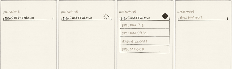
With more than 7 billion people in the world today, picking a clever yet unique username is becoming more and more of a challenge. Actually, it is a task that is important enough to use a dedicated page for picking a username and providing some auto-suggestions, as the hand-drawn example in Figure 11-23 demonstrates.
Just as the Twitter app detects a brief break in the typing, the Pet Shop app would do the same. However, in addition to saying that the username is taken, the app also offers some clever suggestions based upon the customer information entered in the previous screen (not shown). Data such as fragments of the area code, street address, ZIP code, pet type (dog, cat, or “bulldog”) can all be used to help people create suggestions.
Tablet Apps
If you need your app to display auto-suggestions in addition to the dynamic validation, it helps to have a dedicated page for this type of interaction, as shown in Figure 11-23. However, a separate page is not necessary, especially on larger devices like tablets. Tablets should use this Callback Validation pattern more, which will probably occur in the near future. This pattern is especially pertinent for tablets because many of these devices operate on a strong Wi-Fi signal, rendering response capabilities that are similar to those of desktop web apps, where the Callback Validation pattern using Ajax is an accepted and expected part of the web.
Caution
As with any mobile pattern that requires a server-side call, be aware that the signal may not go through, so build a robust backup strategy for validation using a server-side call after the entire form has been completed. It might show exactly the same UI as it would when the asynchronous call has been issued, even though the original asynchronous server call did not go through.
The Callback Validation pattern as used by Twitter strongly drives the “append” strategy of error recovery; in other words, the customer is most likely to recover from the error by appending additional characters to his username, as shown in Figure 11-22. If that is acceptable for your app, this version of the Callback Validation pattern works great. As an alternative, you might present some auto-suggestions alongside with a statement that the username is not available, as shown in the Pet Shop app section.
Figure 11-22: The Twitter app includes an excellent implementation of the Callback Validation pattern.

Figure 11-23: The Pet Shop app sports Callback Validation with auto-suggestions.
Related Patterns
11.5 Pattern: Cancel/OK
For designing forms, at some point in the process, clients inevitably ask, "Should I position the buttons as OK/Cancel or Cancel/OK?" This pattern describes how to position action buttons and hopefully to help you avoid 3-hour meetings devoted solely to this topic.
How It Works
Action buttons are positioned as Cancel/OK on the top or bottom of the form. The primary button is on the right and is sometimes larger or implemented with a more saturated color and/or icon. Often, the primary action button is disabled at the beginning of the process before a valid value is entered into the text field. (The last option is not recommended; see the "Caution" section.)
Example
The reference example of this pattern shows the action buttons positioned on top of the form in Android Calendar, as shown in Figure 11-24. The buttons remain on the screen even when the form scrolls up and down.
Figure 11-24: This reference implementation of the Cancel/OK pattern is from the Calendar app.

Even though both buttons have the same gray color saturation, they have different icons, with the OK (Done) presented as the check mark and Cancel as an X.
The reference implementation of lightboxes also follows the Cancel/OK pattern, as shown in Figure 11-25 for the Calendar and Contacts apps.
Figure 11-25: This second reference implementation of the Cancel/OK pattern is shown in lightboxes from the Calendar (left) and Contacts (right) apps.

The OK button is disabled for the Contacts app lightbox because there isn’t yet a valid value in the form field. This is a common part of the pattern for simple forms or those that implement the Callback Validation pattern, but you must be cautious when disabling the action button (see the later "Caution" section for this pattern).
An alternative implementation with the buttons on the bottom of the screen is the search form from the Trulia app, as shown in Figure 11-26.
Figure 11-26: This form (with buttons at the bottom) from the Trulia app is a great alternative Cancel/OK implementation .

Even on the black-and-white picture you can tell that the primary action button (Find Homes) is much wider and more saturated in color (in real life it’s dark orange) than the secondary button. Also Trulia uses descriptive verbiage on the button instead of the generic Search or OK.
When and Where to Use It
This is the standard pattern that should be used for every form in your application.
Why Use It
Why implement action buttons as Cancel/OK instead of vice versa? This is not an idle question. Ergonomically speaking (read more about device ergonomics in Chapter 3, “Android Fragmentation”), the button on the left is easier to tap when operating the mobile device one-handed. Why would you want to override this natural convention and switch the buttons? The Cancel/OK convention on mobile stems from the early mobile phone app designs, which come from the western convention of reading from left to right. Following this convention, buttons on the left (Cancel) usually take you closer to the top menu or home, whereas the buttons on the right (OK) take you deeper into the Information Architecture (IA) of the device down to the leaf node of whatever function you are looking for. Thus the convention of Cancel/OK has taken a firm root in the smartphone design, even though some apps still refuse to follow it.
Other Uses
What should you do when you have only one button? If you follow the same convention (that the right side is equivalent to more or deeper into the IA), you should put it on the right side of the screen. However, for a single button, the ergonomic considerations often win, as in the example from the Contacts app shown in Figure 11-27, which places the button on the top left.
Figure 11-27: A sole Done button is on the left side of the screen in the Contacts app.

In the Android OS, the menu is traditionally assigned to the right side of the screen. Thus the menu button placement often wins the right side when competing with a sole action button (which then goes on the left).
Another great solution to the sole action button placement is to make a single large button across the entire width of the screen, as shown in Figure 11-28 on the Kayak search form.
Figure 11-28: A sole OK button spans the width of the screen on the Kayak search form.

Unfortunately, although they're functional, large buttons that span the width of the device tend to look a bit goofy and old-fashioned, especially on larger tablet-like devices such as the Galaxy Note. If large cartoony buttons offend your sensibilities, you may want to consider making a slightly smaller button that can still be centered in the middle, as on the Contacts app (see Figure 11-29).
Figure 11-29: The Contacts app uses a smaller sole Add Another Field button in the middle of the screen.

Provided the sole action button is sized to at least 30 to 50 percent of the width of the screen, the central placement is both attractive and ergonomically satisfying, which makes the design in Figure 11-29 a good choice.
Pet Shop Application
The Pet Shop app follows the Trulia model to make the primary action button Register Pet stand out with both size, color, and a check mark icon. Refer to Figure 11-4 to see how this looks in a hand-drawn wireframe.
Tablet Apps
This pattern applies to tablets with the caveat that the entire button group be placed along the right edge of the device for easy accessibility without compromising hand position on the tablet. The example from the Calendar app in Figure 11-30 includes a good version of the recommended implementation, even though the buttons are reversed (OK/Cancel instead of Cancel/OK).
Figure 11-30: The Calendar app includes a good placement of the Cancel/OK button group on the top-right edge in the Samsung 7-inch tablet; although, the buttons are reversed.

Provided the action buttons are near the edge of the screen, the top placement is preferable to placing action buttons at the end of the form because of the better ergonomics. Top placement buttons are easier to find and enable optional form fields to be ignored without having to scroll all the way to the bottom of the form. The information in the "Caution" section does not apply to tablets. Unlike the smaller mobile devices, tablets are held in two hands, so there is no hand contortion needed to tap the top action buttons.
Unfortunately, tablet apps often ignore both ergonomics and conventions and place action buttons in a haphazard manner, which is an antipattern, as the lightbox in Figure 11-31 demonstrates.
Figure 11-31: The haphazard placement of the action buttons in the Calendar app on a 7-inch Samsung Galaxy Tab is an antipattern.

Even though the lightbox is fine, the action buttons are in the wrong order. The OK button is far away from the fingers of the right hand (which is the dominant hand for the majority of the population), and both buttons are presented in the same size and visual treatment. Set is a smaller word label than Cancel, which means that the primary action button is further de-emphasized! (The label “Set” is also unexpected; the more standard label for this action would be “OK.”) Finally, note that the Cancel button is also much too close to the scrolling calendar, suggesting that it might be hit by accidental swiping. Altogether, this “antipattern smorgasbord” creates a strong possibility that people will often tap the Cancel button by mistake instead of tapping the Set button and thus will be frustrated several times a day—each time they need to add an appointment.
Caution
Should you place actions at the top or at the bottom? It depends. The action buttons positioned at the top are easy to find, which is essential for a form like the New Event form in the Calendar app (refer to Figure 11-24) because most fields are optional, and in 90 percent of the cases, the customer will not scroll to the bottom of the screen.
However, obvious placement comes at a price of ergonomic accessibility: Buttons at the top are difficult to tap with one hand. This is both good and bad. Top placement is bad because most people expect to operate their device one-handed. For precisely the same reason, the top placement of action buttons is also good because the action buttons are out of the way and are unlikely to be tapped by accident.
For a one-time registration form, top placement is a good choice because you want your customers to be careful while filling out the form. However, for the Calendar app’s New Event form, it’s a bad choice because people want to comfortably use one hand to accomplish routine tasks like entering an appointment. Then why are the buttons at the top? For the Calendar, the optional form field requirement wins out, so the action buttons get top placement; placing them at the bottom of the form would require a lot of scrolling every time your customers fill out the form. For the Calendar app’s New Event form, having the customer contort his hand to tap the top action button is the lesser of two evils.
Should you disable the primary action button until the form is filled out correctly? No. Disabling the primary action button is usually not recommended unless the form is simple or uses a Callback Validation pattern. If the action button is disabled in a long form and something that's not obvious is missing, the customer will need to hunt around the screen. That puts him at risk of not finding whatever it is that is missing/incorrect, which increases the chance that he will abandon the form altogether from sheer frustration. For example, if the action button were disabled in the Yelp form shown in Figure 11-32, the customer may never find out that he is missing the required Picture field, as it is nowhere labeled as required. And furthermore, pictures are not usually required in forms.
Figure 11-32: If the Sign Up button was disabled in this Yelp form, the customer may never find out that the Picture field is required.

However, because the action button is available and active, the customer may try to submit the form and get the error, which facilitates the corrective action. The result is a more robust and customer-friendly experience. In that case, even this rudimentary Pop-up Alert is better than no error reporting, which is what the disabled action button is tantamount to. (Recall that you should not use the Pop-up Alert pattern Yelp uses for reporting form errors—use Inline Error Message instead (see the “Caution” section for “11.3 Pattern: Pop-up Alert”). However, if you decide to ignore this warning and go with the disabled primary action button in your form, at least make sure you do some customer testing of the finished interface.
Should you make the primary action stand out compared to the secondary action?Absolutely. The recent trend has been to make both Cancel and OK look the same, as in the Kayak app refine screen shown in Figure 11-33. This is an antipattern.
Figure 11-33: Antipattern: Cancel and OK look the same in the Kayak app refine screen.

This is a bad decision because customers rely on subtle visual cues such as color saturation, size, text, and placement to make the choice of which button to tap. Do help your customer out, if you can, by making it absolutely obvious which button to push. As Steve Krug so famously quipped, “Don’t make me think!” in his seminal book by the same title (2005, New Riders). This advice goes double for small mobile screens, where text on the button is often difficult to read in bright sunlight or because the device screen vibrates while the user walks or rides in a vehicle.
Related Patterns
11.6 Pattern: Top-Aligned Labels
When it comes to labels, top-aligned is the standard implementation.
How It Works
When the form is presented to the customer, form labels appear above the fields.
Example
The Android reference implementation is the Calendar app’s Add Event form, which is a frequent example in this chapter. (See Figure 11-34.)
Figure 11-34: The Calendar app implements the Top-Aligned Labels pattern.

Calendar uses the standard Android 4.0 Ice Cream Sandwich OS visual scheme, so the labels appear in a smaller uppercase font, whereas the in-field Input Mask appears in a slightly larger mixed font. This can create a bit of confusion because everything runs together, especially on mobile devices with smaller screens.
A more OS-agnostic presentation of labels is on the eBay app registration form, as shown in Figure 11-35.
Figure 11-35: The eBay app uses a device-agnostic style for the Top-Aligned Labels pattern.

eBay’s form fields are actual full boxes, which separate from the field labels better and create an overall cleaner user interface than the reference Android OS implementation. However, that is solely my opinion. What is a well-researched fact is that mixed case text offers better readability than all uppercase text. Presumably this insight applies equally well to form labels, so you might want to take that into account.
When and Where to Use It
Any time you present your customers with a mobile form, you should use top-aligned labels.
Why Use It
According to Luke Wrobleski’s research that he presented at Design 4 Mobile, Chicago 2010 (http://www.lukew.com/presos/preso.asp?23), which is supported by my user research, top-aligned labels offer the best all-around versatility and usability on mobile.
Here’s how top-aligned labels compare with other types of labels:
- Left-aligned labels: Compared with the top-aligned labels, left-aligned labels limit the size of the readable portion of the field, as shown in the form from Southwest in Figure 11-36. Note that even a modest-length e-mail address does not fit completely into the input field.
Figure 11-36: The left-aligned labels in the Southwest app limit the visible portion of the field.

- In-field labels: In-field labels are another popular alternative to the Top-Aligned Labels pattern. In-field labels generally work fine for short forms, such as Login, but they make it easy to get lost in a long form.
Figure 11-37: The in-field labels in the PayPal app make it hard to tell what field is being filled out.

In contrast to other labeling strategies, top-aligned labels do not have any of these inherent limitations. They use the entire width of the mobile screen; have complete flexibility to employ any format mask; and remain labeled throughout the form’s life cycle. This makes top-aligned labels the best all-around choice for mobile forms.
Other Uses
You can also use top-aligned labels to identify the entire group of related controls, such as in the implementation from the Contacts app shown in Figure 11-38. In this case, the blue Events group label (plus a blue underline) delineate a group of two events.
Figure 11-38: In this implementation, the Top-Aligned Labels pattern is used to label a group of Events fields in the Contacts app.

Pet Shop Application
Throughout this book, the Pet Shop app designs mostly follow the standard Android 4.0 Ice Cream Sandwich OS visual design guidelines for fields and their labels. Refer to Figure 11-4 to see how this looks in a hand-drawn wireframe.
Tablet Apps
Tablet apps enjoy ample real estate, so the Top-Aligned Labels pattern is not a requirement for tablets. However, it is easier to simply follow the mobile design conventions for forms, and that’s exactly what most tablet apps do. Unfortunately, the vertical space is limited when the tablet is in the horizontal orientation, especially with the soft keyboard onscreen (see Figure 11-39).
Figure 11-39: Top-aligned labels limit vertical space for tablets in the horizontal orientation.

One experimental pattern to try out for this situation is to make the labels fluid. When in the horizontal orientation, make the labels left aligned; when in the vertical orientation, make the labels top aligned. Figure 11-40 is a hi-def wireframe of what such a form might look like (compare it with the Figure 11-39). Because I haven’t seen this customization, it remains an experimental pattern.
Figure 11-40: In this experimental pattern, labels adjust to optimize space based on the tablet's orientation.

Caution
When using the Top-Aligned Labels pattern, you must be aware of the vertical space taken up by the label. This is particularly important for the group labels mentioned in the "Other Uses" section because those labels take up an additional 36 pixels of vertical space (see Figure 11-41).
Figure 11-41: A group label takes up 36 pixels of vertical space.

Thirty-six pixels does not seem like a lot, but it adds up quickly for long forms. Also, group labels add a vertical line, which could confuse things a bit with the new Android 4.0 visual scheme, which is almost entirely composed of horizontal lines. Avoid using group labels for simple forms. (See Figure 11-42 for an example of an antipattern of group labels in the Contacts app.)
Figure 11-42: Using group labels for nongroup fields is an antipattern in the Contacts app.

The entire form in Figure 11-42 would be much cleaner and save approximately 180 pixels (5 group headings × 36 pixels each = 180 pixels) of vertical space if it used the standard single-field labels. You can always create groups dynamically, as the customer fills out the form, and update from single-field labels to group labels as needed—for example, if the customer adds another phone number, thereby turning a single field into a group of similar fields.
Related Patterns
11.7 Pattern: Getting Input from the Environment
Desktop forms are keyboard-centric and get little information from the environment. In addition, environmental information is not that useful; most desktop web forms are filled out in the office or at home, so the environment remains static and yields little useful information. In contrast, mobile forms are frequently filled out on the go, so they can often benefit from surprising amounts of environmental data collected with a mobile device.
How It Works
Whenever the form needs to be filled out, the mobile device uses the read out of the on-board sensors (voice, gestures, accelerometer, location, images, video, and ambient light) as form input.
Example
Chapter 7, “Search,” describes at length how voice can be used as an input mechanism. Gestures as input are used often in games such as Angry Birds, Fragger, Hungry Shark, Grabatron, and Burn the City—although you rarely consider game inputs to be forms. (Although of course that’s exactly what they are.) Figure 11-43 shows a welcome animation that explains the gestures for putting everyone’s favorite angry bird into explosive action.
Figure 11-43: Gestures are used as input in the Angry Birds game.

Gestural input doesn't need to be limited to games, however. Map-based inputs are fairly common, with the on-screen map area (located by pinching and stretching gestures) used to constrain the corresponding list in the example from Trulia shown in Figure 11-44. Zooming out on the map presents a longer list of homes, going from three (in the screens on the left) to seven (in the screens on the right).
Figure 11-44: Map gestures are input in the Trulia app.

Gesture-based character input has a long history on touch devices, starting with Graffiti apps in the early versions of the Palm Pilot. The latest iteration of the original Graffiti input method is the Gesture Search app from Google Labs. Gesture Search enables simple phone operations and shortcuts to be performed by drawing letters and symbols using the entire screen as a touch pad and the finger as a stylus. The interface also enables customers to erase letters by drawing a horizontal line. (See Figure 11-45.)
Figure 11-45: Gesture Search uses sophisticated gestural form input.

Another popular option to get input from the environment is to use Location as an input. As Luke Wroblewski reported in his Design 4 Mobile 2010 workshop, location can be obtained by the mobile device through many means, each of which has different performance characteristics, such as speed, precision, and effect on the device battery. Although the mobile industry usually abbreviates the entire bundle of location services as “GPS”, Global Positioning Service (GPS), the satellite navigation system, is only one of the ways the phone obtains location information. It is the most accurate method; it can locate the mobile device to approximately 33 feet, but it can take anywhere from 2 to 10 minutes to obtain the position. Also, using GPS drains the battery quickly.
Another popular location service is triangulation using multiple cell towers. Cell tower triangulation has a negligible effect on the battery and provides nearly instant location information to a range within 1,600 to 8,200 feet for a single tower and 328 to 4,600 feet for multiple towers.
Most mobile devices obtain location information via a combination of both methods (plus Wi-Fi, when available). When location function is first called, most people observe the phone drawing a large circle initially based on the cell tower triangulation. If GPS is enabled, the location circle gets progressively smaller, and the location gets more precise in a few minutes as the GPS comes online. Location is a favorite input for mobile devices because it is useful for local in-person interactions, such as those facilitated by Yelp (see Figure 11-46).
Figure 11-46: The Yelp app makes effective use of location-based form input.

Image-based input is becoming increasingly common as well, particularly to take a picture of a QR code. QR codes can have a variety of payloads, depending on the size of the code and encoding density—from a chunk of text nearly the size of the American Constitution (4,296 characters to be exact) to phone numbers and URLs, all of which can be used as simple form inputs. QR codes can also encode a variety of specialized formats, such as MeCARD, which contain complete structured data that can be interpreted for the purposes of filling out a form. Out of the many QR code readers currently on the market, Red Laser remains one of the easiest to use and the most versatile (see Figure 11-47).
Figure 11-47: The Red Laser QR code reader is in action reading a business card with a URL payload.

But do you need encoding to use images as form input? Not necessarily. One brilliant example of using simple pictures to establish the connection between physical and virtual is the Amazon Remembers feature of the Amazon.com mobile app. (See Figure 11-48.) Amazon Remembers uses a combination of the optical recognition and Mechanical Turk service to interpret pictures of most items that can be bought on Amazon.com. All the customer needs to do is take a picture. The picture is then seamlessly uploaded to Amazon.com, often coming back within seconds with the identity of the item and access to price, options, description, and, of course, reviews and the ability to buy the item or add it to your wishlist, truly connecting the physical item and its virtual informational footprint.
Figure 11-48: Amazon Remembers uses simple pictures as form inputs.

Brilliant services like Amazon Remembers give you a hint of things to come in the field of the Internet of Things that Bruce Sterling talked about in his amazing book Shaping Things (2005, The MIT Press). The term Internet of Things was first used by Kevin Ashton in 1999 and refers to uniquely identifiable objects (things) and their virtual representations in an Internet-like structure. The Internet of Things is a dynamic global network infrastructure with self-configuring capabilities based on standard and interoperable communication protocols, where physical and virtual “things” have identities, physical attributes, and virtual personalities; they use intelligent interfaces, and they are seamlessly integrated into the information network (http://en.wikipedia.org/wiki/Internet_of_Things).
When and Where to Use It
Any time you have a form, you should be immediately thinking, “What inputs can I get from the environment?” Can you use gestures, location, pictures instead of the keyboard, and native input controls?
Why Use It
Environmental inputs are not just more fun than regular inputs. They are functional as well, providing more efficient and effective input strategies uniquely suited to mobile devices.
Other Uses
Getting input from the environment does not need to be done one alternative technology at a time. Using a combination of various methods can also be effective. For example, Yelp gives an excellent demonstration of the combination of accelerometer, GPS, and video used as inputs in its augmented reality feature, Monocle (see Figure 11-49).
Figure 11-49: Yelp’s Monocle demonstrates the effective use of location, accelerometer, and video form inputs.

Likewise, don’t be shy about requesting form input help from external resources, such as remote virtual assistants. Apps such as YCard use a Mechanical Turk remote assistant service to interpret image-based input of business cards. The customer takes the image of a business card and then remote virtual assistants read it using a combination of Optical Character Recognition (OCR) and human eyes to input the information into a standard desktop form. The entire process is quite fast; it takes only 30 minutes or less. As you can see from Figure 11-50, the app even reads Chinese characters and translates them into English. This is a classic use of a Virtual Assistant pattern mentioned in Chapter 7 that uses images as input.
Figure 11-50: YCard uses image form input in combination with Mechanical Turk services.

Other OCR/Mechanical Turk services are used in financial apps to do everything from depositing checks to compiling and categorizing expense receipts.
Pet Shop Application
In the Pet Shop app example, when the customer takes a picture of his pet, in addition to storing the picture, the app will attempt to use optical recognition technology to determine what kind of pet it is (see Figure 11-51). For example, a “simple” learning program can recognize whether this is a picture of a dog and a more sophisticated algorithm can figure out the breed and approximate age of the pet, making data entry easier.
Figure 11-51: The pet registration form uses image as input in combination with a Mechanical Turk service.

Developing a service like this is definitely not trivial; there are probably only a handful of people in the world who could code an algorithm with the precision necessary to reliably tell, for instance, a Labradoodle from its constituents, Labrador and Poodle. However, the Mechanical Turk model can work reasonably well, provided the app workflow affords a built-in delay that enables a remote virtual assistant to review the picture and perform identification and data-entry work. As Tim Ferris mentioned in his book The 4-Hour Workweek (2009, Harmony), companies such as Brickworks India offer relatively inexpensive remote virtual assistant services that can be configured on the back end as a Mechanical Turk for all kinds of applications.
A better question to ask would be whether it is worth making the pet owner wait 30 minutes to enter three pieces of data at further risk of offending the customer by guessing the breed incorrectly. (Or worse, saying something is a cat when it’s actually a dog. Imagine the insult!) This rather contrived example points out some limitations of the pattern. However, for many mobile applications, outsourcing complex form data entry to a Mechanical Turk Virtual Assistant service holds a great deal of promise. Just make sure that the “juice is worth the squeeze.”
Tablet Apps
You can use tablets in the same way as mobile devices. One of the biggest complaints that customers had of the Chase iPad app (one of the first financial apps made specifically for a tablet) was that it could not deposit checks remotely by taking a picture of them in the same way that the Chase mobile app could do. The firm customer expectation for tablet apps seems to be that they will do more, not less, than their mobile counterparts.
Caution
The earlier Angry Birds example underscores an important point: When using gestures, provide clear, actionable instructions on how to perform them. The best way to do that is to use a Watermark pattern, which is covered in Chapter 13, “Navigation.”
Related Patterns
11.8 Pattern: Input Accelerators
The previous section about getting input from the environment discusses getting data into the mobile device using a variety of on-board sensors. This section discusses ways to retain data between visits and present this data at strategic points of the workflow to re-engage the customer in the previous task.
How It Works
When the customer performs complex, time-consuming data-entry tasks such as entering dates and addresses, the system remembers what was entered and surfaces it at the proper time during a future engagement.
Example
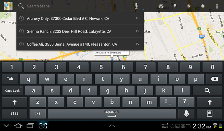
The Maps app is an excellent all-around app that is made even better by using Input Accelerators. When the Maps app launches, it displays the map of the immediate area. Tapping the search function brings up a search box with the auto-suggestion layer prepopulated by the previous search requests (see Figure 11-52).
Figure 11-52: The Maps app includes an excellent auto-suggest layer Input Accelerator.

This is extremely handy because the addresses are hard to type and difficult to recall, yet a simple act of navigation to your destination is likely to be interrupted multiple times with tasks like calling, texting, and music listening. In addition, many of the destinations a customer visits are likely to be visited more than once, as are some common queries like “Coffee” or “Starbucks.” Finally, the layer offers the Tap-Ahead pattern—the ability to enter the query into the search box but retain it in the editable mode.
When and Where to Use It
Any time your customers might want to redo the same complex data entry more than once, you should use this pattern. Look particularly for dates, addresses, city names, contacts, titles, descriptions, and other similar data entry fields.
Why Use It
Entering anything on a mobile device is hard. Forcing your customers to not only remember but also re-enter the same data is downright evil. Don’t be evil.
Other Uses
On a related note, the most important accelerator you can provide is to ask people to enter less information. The Yelp sign-up form discussed earlier in the "11.3 Pattern: Pop-up Alerts" section makes a great negative example. It never makes clear which fields are required, until the customer scrolls to the bottom and sees the Gender (optional) field. Also surprising is that the Yelp sign-up form requires a picture, which is highly nonstandard. No matter how many accelerators you put into your forms, nothing affects the form completion rate as much as having extraneous fields. Remove extra information requests, and wherever possible use smart defaults and direct manipulation controls.
Pet Shop Application
An open auto-suggest layer is not the only way to implement Input Accelerators. Sometimes, you need to give your customers an option to recall field values individually. A common example is that of planning a trip—a typical customer would want to try several different combinations to find the best overall value. For example, a customer may initially want to fly in on Thursday morning and fly out on Sunday night. However, Sunday night flights may be overbooked, so she might want to try returning on the preceding Saturday or next Monday instead, keeping the original Thursday departure date. Input Accelerators make this sort of exploring much easier. One way to implement them is shown in Figure 11-53 in the hand-drawn wireframe for the Pet Shop Travel app (Best Vacations for You and Your Pet).
Figure 11-53: This experimental form of the Input Accelerator pattern uses a drop-down in the Pet Shop app's travel date inputs.

The wireframe in Figure 11-53 implements individual Input Accelerators on both the Departure and Return date fields via a drop-down that's hidden under a down arrow in front of the field. If the customer wants to recall one of 10 previous values, she would just tap the arrow to get the drop-down layer showing the previously entered values. Putting the arrow in front of the field reinforces the subtle suggestion of looking there first and keeps the input accelerator safely away from the calendar button. In this way a great number of useful date combinations can be explored quickly, and a date doesn’t need to be entered more than once.
Tablet Apps
Tablets have plenty of real estate to show previous values. There is literally no excuse not to show previous search results as an Input Accelerator on a tablet.
One great option is to share the cache data across multiple devices, as the Maps app does on the Android 4.0 platform (see Figure 11-54).
Figure 11-54: The Maps app shares Input Accelerator values across devices.
Do keep in mind the device orientation. Even though the Maps app screen in the vertical orientation on the tablet has a lot of space, the width of the auto-suggest is too small to read the values comfortably (see Figure 11-55).
Figure 11-55: The width of the auto-suggest Input Accelerator is too small to accommodate most values in the vertical orientation.

Caution
With any great power comes great responsibility. Avoid caching sensitive information such as credit card numbers, unless your app specifically advertises this feature. When recalling details like bank account and credit card numbers, it is best to cache them on the server and provide a 2-Factor Authentication (see “12.1 Pattern: Login Accelerator” in the next chapter) to access the data.
Remember to provide a way to clear the previous entries cache on the device for the entries that your customer wants to keep private. I haven’t found a setting that clears the Map app cache, for example, or controls cross-device sharing.