In order to produce an architectural approach for your CSS, it’s important to clearly establish your goals and then settle on a general methodology. In this chapter we propose goals, guidelines, and methodologies for your consideration.
Approach
When working on web development, it’s important to build a consistent approach that is sensitive to external factors and business demands. There are also considerations for our development team to be sure we can rapidly produce the desired results, and that the web site continues to look and work as expected as content is added and changed over time.
Since both element and component are technical words with a specific meaning in the context of the Web, we will use the word widget to refer to reusable building blocks made up of HTML+CSS.
While many frameworks will implement a widget with either a native or framework-based web component, this is neither a requirement nor a goal of good CSS architecture.
Goals
We should be able to design a modularized widget with HTML and CSS that stands on its own without depending on external CSS.
When we drop a widget into our web site, we want it to take on the overall look and feel of our site and brand.
It shouldn’t be necessary to artificially boost specificity or precedence (such as by adding an ID selector or !important annotation) to style a widget as intended.
General content edits in an HTML document (inserting images, adding paragraphs, adjusting rows/columns in a table, adding items to a list, etc.) should not necessitate updates to the style sheets.
It should be easy for someone new to join our team and figure out how to make adjustments to the design of our pages and widgets.
Our styles should be easy to read, understand, and troubleshoot.
The design of our web sites should be easy to re-theme without impacting the layout and functionality of the site.
It should be straightforward to make design changes (such as colors and typography) without needing to use search-and-replace on the CSS properties across our style sheets.
We should be able to adjust the styles of Widget-A and Widget-B independently, without worrying about changes to one impacting the other unintentionally.
User’s wishes with regard to style should be respected to improve their experience and overall accessibility.
In his 2012 blog post about CSS architecture,1 Philip Walton issued an important reminder: “stripping [sic] all presentational code from your HTML doesn’t fulfill the goal if your CSS requires an intimate knowledge of your HTML structure in order to work.”
Guidelines
Avoid class names that mirror the name of the tag they are on, attribute values, or pseudo classes (e.g., no more <button type="button" class="button"> or <input type="password" class="password">).
Avoid generic class names such as content, container, wrapper, right, and left. These names don’t provide any meaningful understanding as to their usage or intent, and they are subject to naming collisions with other style sheets on our project or with third-party libraries.
Generally, avoid using IDs as selectors.
Prefer selector specificities between [0 1 0] and [0 2 2]. Any lower and you run the risk of leaking styles into the rest of your site. Any higher and you risk overwriting inheritance or making a value unintentionally sticky. Higher specificities also risk being overly verbose and either brittle or difficult to understand. Use higher specificity selectors with purpose and care.
Avoid using !important in your style sheets and inline styles in your HTML.
Optimize your CSS architectural decisions for the developer experience, and the ease and accuracy of ongoing changes, rather than becoming overly concerned with performance of the style sheets.
Choose a consistent naming strategy.
Separate concerns.
Use child and sibling selectors only when necessary (ideally just within a widget), but avoid the use of descendant selectors as they have an unknown amount of impact.
Methodologies
CSS Methodologies
Year | Creator | Methodology: Official Web Site |
|---|---|---|
2008 | Nicole Sullivan | |
2009 | Yandex | |
2012 | Jonathan Snook | SMACSS: http://smacss.com/ |
2015 | Harry Roberts | ITCSS3: https://itcss.io/ |
One thing the following methodologies have in common is the heavy use of classes in both the HTML and CSS. They all agree on one specific point – the only use classes serve in the HTML is for CSS or JavaScript binding.
It is important to point out that many CSS professionals mix and match their favorite parts of each of these methodologies. As always, choose what works for you and your team, but be consistent about it.
OOCSS
Originally presented by Nicole Sullivan at Web Directions North, Object-Oriented CSS (OOCSS) borrows concepts from Object-Oriented Design in order to provide structure to CSS. The Object in OOCSS is what we have been calling a widget and is defined by Sullivan as “a repeating visual pattern, that can be abstracted into an independent snippet of HTML, CSS, and possibly JavaScript. That object can then be reused throughout a site.”4
Separate structure from skin
Separate container from content
OOCSS Example HTML
Separate Structure from Skin
Structure (or layout) refers to the location of elements on the page, or the function and interaction of those elements. Layout properties include those items that impact size and position of elements, such as height, width, margin, padding, and overflow.
Skin (or theme) refers to the visual aspect of the elements. Theme properties include color, border, box-shadow, font, and opacity, among others.
OOCSS Separate Structure from Skin
This approach allows theming to be applied to a wide range of elements and maintained in just a single location. In order to implement OOCSS as intended, it will be necessary to add classes to the HTML to avoid relying solely on the semantics of the HTML.
Separate Container from Content
OOCSS Separate Container from Content
Buttons look the same regardless of location, unless the HTML specifies something else via class.
All elements with the call-to-action class will have the same look, regardless of tag or location.
Looking at the HTML for the button, I can easily find its ruleset.
Avoids artificially inflating the specificity allowing styles to be predictably overridden when necessary.
While these are general guidelines without providing too many specifics, there are no apparent problems with following these recommendations.
However, do keep in mind that CSS requires every property to have a value, so any values not provided will use defaults. Also different elements (say, <a> and <button>) have different default values for these properties and a different default appearance. So when using an approach like OOCSS and leaning on class selectors without an accompanying type selector, consider what might happen when this class is applied to a new element with different defaults.
BEM
BEM stands for Block, Element, Modifier , which summarizes the naming convention used and overall approach to organization. The “Block” in BEM refers to our concept of the reusable widget. The use of “Block” and “Element” in BEM is unfortunate as the naming overlaps similar, but not identical, HTML concepts with those same names. (To avoid confusion we’ll use the BEM concepts in italics within this chapter.)
One common question in BEM is how to decide if a given item should be a block or an element. The general guideline is that if the section of code cannot be used separately from its parent container, then it’s an element. If it can be reused independently, then it’s a block .5
BEM Example HTML
Simplified BEM HTML
One goal of BEM is to flatten the structure inside of a block so that the related CSS doesn’t necessarily have to change if the nesting of the HTML changes. In the example from Listing 9-4, we could change from using <ul> and <li> tags to using <div> tags for the nav__item and the CSS would not need to change. As this illustrates, BEM discourages using HTML elements as CSS selectors .
Another goal of BEM is predictable and consistent naming and simple maintainability. For instance, it should be very easy to perform a text search on a project to find everywhere a given class name is used, making it possible to remove unused rules from our style sheets with confidence.
One benefit of BEM is that the style sheet can be very easily broken into multiple files with a high degree of confidence, based upon block.
The use of modifiers in BEM contradicts the recommendation of OOCSS to create general-purpose and reusable styles that represent the skin or theme. This can be at least partially overcome using SCSS mixins, but is a difference worth noting. While it makes BEM very predictable, it greatly reduces the ability to compose reusable styles in favor of being very explicit .
SMACSS
Base – The base rules establish the defaults. Each rule should generally apply to just one element. This is a great place for normalization and base font size.
Layout – This is where we put the dimensional and positioning declarations, along with any glue we may need for our widgets to work together.
Module – These are where we find the reusable widgets in SMACSS. These modular design units such as callouts, sidebars, and login forms are defined here.
State – Most web applications reveal a large amount of state visually within the design components, which belong here. This may include such values as visible/hidden, active/inactive, hover, focus, and expanded/collapsed.
Theme – Declarations that impact the look, feel, and brand (but not the layout or functionality) are generally thematic. This is similar to the skin concept from OOCSS.
The purpose of categorizing things is not to create artificial barriers, but to better codify repeating patterns within the design.8 SMACSS does not penalize exceptions to the categorization guidelines, but simply recommends that exceptions be justified as advantageous.
Class Naming
SMACSS Naming
SMACSS Example CSS
Recommendations
- 1.
Improve semantics – This means making it easier for developers to understand how and why widgets and elements are being used.
- 2.
Increase orthogonality – In the SMACSS book, Snook states the goal as “Decrease reliance on specific HTML,”9 which simply means restructuring of HTML should have minimal impact on our CSS.
Trigger layout-specific changes based upon a layout class, not a page name.
Use module (widget) class names instead of HTML elements in selectors.
Avoid setting thematic defaults on common elements such as input fields, buttons, and tables.
As you’ve probably noticed, these recommendations closely mirror those we established at the beginning of the chapter, which were derived from our exploration of software architecture in Chapter 1.
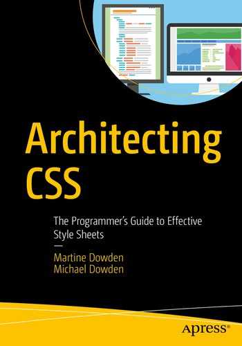
ITCSS
ITCSS Diagram
Settings – Intended for preprocessors, this layer includes variable definitions and site-wide settings such as font and colors. Should generally not output any CSS.
Tools – Global mixins and functions for further reuse. This is primarily intended for preprocessors and should generally avoid outputting CSS.
Generic – Normalization and reset of styles, CSS variables, and box-sizing settings. From this layout on should produce CSS. This is similar to the base rules category in SMACSS.
Elements – Default styles for standard HTML elements.
Objects – Class-based selectors which define reusable framework objects such as the OOCSS Media Object.
Components – This is where our widgets come into play and the majority of styles will be in the Objects or Components layers.
Utilities – Helper classes that may need to be able to override everything earlier in the triangle. For example, show/hide classes.
Rather than defining naming or design practices, ITCSS recommends a specific structure and organization of the style rules themselves, without providing too much detail around what sorts of rules are permitted.11 As such ITCSS is fully compatible with OOCSS, SMACSS, and BEM.
Processes
One of the important roles a software architect often fills is to help establish good processes and practices for their team. It’s important that your processes fit into the larger framework of web site publishing and delivery.
Imagine you are building a web site that pulls content from a Content Management System (CMS) which is managed by the company’s marketing team. While it may be possible to modify the output produced by the CMS or to train the marketing team to add classes to certain elements, this may put too much pressure on the content team. It may be more reliable to simply write CSS that achieves the desired results with the content you receive. In this example the web development team has control over some of the HTML, but not all of it.
Decision Making
CSS Reuse Dilemma
Set Default Font
Most style sheet authors choose to cascade font default from the body tag as shown in Listing 9-9 rather than using the universal selector; however, both are technically possible. Because the universal selector has a specificity of zero, any rule will override it; however, since it’s set on every single element, simply resetting the font on a the <p> element will not change the font for any child elements such as anchor tags, definitions, buttons, labels, and so on. To achieve this behavior (which is the default when depending on inheritance from body), we need to either apply the change to each subelement individually or use the universal selector again.
Class names only provide meaning to page authors and developers. Your choice of class names should reflect this. Your class names do not convey any meaning whatsoever to user agents or systems and are never displayed to the human visitors to your pages.12
How big is your project/how big will it get (widgets, files, etc.)?
How big is your team/how big do you expect to grow?
Do you need to support interchangeable themes?
Do your developers have more control over the HTML or the CSS (many applications involve pulling content, data, or styles from external sources)?
Linting
One way to help ensure cross-browser compatibility, accessibility, and generally good code is via linting. Linters are tools that check syntax and formatting for errors. Depending on the tool used, some will also check for inefficiencies or problematic patterns. The W3 has a validation service13 but many prefer to validate code as they go. Tools such as CSS Lint can be run in the browser14 via command line15 or even as editor extensions.16
Precompiled CSS, such as Sass or Less, will not compile if not valid, so linting is much less of an issue. However, linters do exist for precompiled CSS languages and can prove very helpful in debugging and in flagging potentially problematic rule combinations and redundancy.
Testing
Like most code, CSS can be tested. There are a number of libraries available to do just that. There are two main ways that CSS can be tested: via unit tests or snapshots.
Unit Testing
Unit testing CSS involves checking that styles that are expected to be applied are in fact set on the element. Libraries such as Quixote17 test that what is being rendered in the browser is what the author intends. The author can select a specific element by class or ID and verify any CSS property.
When using precompilers, mixins can also be tested. Similar to functions, mixins have inputs and outputs; therefore, outputs can be tested based on input passed. Libraries such as Barista18 or True19 can make sure that mixin outputs match the author’s intent.
Visual Regression Testing
The other way to test CSS is through visual regression testing. Libraries such as Cypress20 or Jest21 provide a framework to take and compare snapshots. By checking current snapshots against the reference ones, developers can be notified of unintended side effects when CSS is changed. Any nonmatching snapshots will raise a flag for the author to check on.
Code Review
Consistency in implementation
That architectural decisions are being followed
Minimal code repetition
Furthermore, code reviews are an opportunity to have open discussions about architectural decisions and specific consequences of those decisions. Code reviews should never be used as a way to judge other developers, but as a forum for sharing knowledge, learning from each other, and ensuring the long-term success of your team and project.
Summary
Goals and guidelines that can help assess various options
The CSS methodologies OOCSS, BEM, SMACSS, and ITCSS
Processes you can use to evaluate your decisions to stay on track
Now you’re ready to select and implement a CSS architecture methodology on your own projects! Best of luck, and happy coding!