When writing CSS, it doesn’t take very long for most developers to realize that the same code, when run in different browsers or even on the same browser but on a different device, just doesn’t behave in the same way. This chapter covers browser differences and techniques to handle cross-browser compatibility.
Browser Support
When testing a layout, it is important to test the application in multiple browsers, because they do not all use the same layout and JavaScript engines, which lead to variation in how they interpret code. Table 5-1 lists some common browsers and their engines.
Table 5-1
Browser Technologies
Browser
Layout Engine
JavaScript Engine
Chrome
Blink, WebKit
V8
Firefox
Gecko, Quantum
SpiderMonkey
Internet Explorer
Trident
Chakra, JScript
Microsoft Edge
EdgeHTML, WebKit (on IOS), Blink (on Android) – switching to a Chromium platform1
Chakra
Opera
Blink (Chromium)
Chrome V8
Safari
WebKit
Nitro
The layout engine is responsible for how the page should look. It determines, based on the CSS, how the view should be laid out, painted, and animated. See Chapter 1 for rendering details. Furthermore, many are available as open source and are maintained by different groups and agencies, allowing for differences in the implementation and status of any given specification.
For example, the scroll-snap-type CSS property, part of the Scroll Type Module whose first public draft was published in March of 2015 and now is a candidate for recommendation, has2 vastly different support and implementation across browsers. This leads to behavior differences. See Table 5-2 for browser-specific support details.
Table 5-2
Browser Support for Scroll Snap by Browser Version3
Looking over time, it is clear that using this property would yield different results across browsers. Furthermore, browsers include CSS defaults, and these also have slight differences.
Browser Defaults
When writing HTML where no CSS is applied, certain tags have default styles such as the header tags (see Figure 5-1).
Figure 5-1
Default Styles
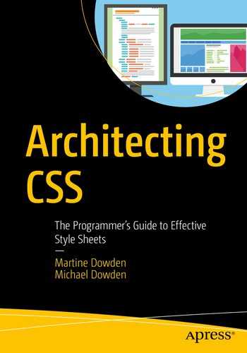
Browsers, however, don’t use the same style sheets and therefore don’t have the same default. Although mostly similar, there are some subtle differences. Textarea, for example, will behave differently in Safari vs. Firefox (see Figures 5-2 and 5-3).
Figure 5-2
Firefox
Figure 5-3
Safari
Notice the default typeface in the textarea; in Firefox it is a monospaced font vs. a sans-serif in Safari. The alignment also differs slightly. On Firefox, the textarea is aligned to the baseline of the text, while in Safari it hovers slightly above the baseline. These subtle differences can be infuriating when trying to get a design to look and behave the same across browsers and versions.
A robust technique for counteracting this is to manually set defaults so that all browsers are running off the same base styles. Although this does not address compatibility differences, it will address subtle unintended behavior differences such as the one outlined earlier.
CSS Reset
CSS reset is a file that takes all the defaults sets on elements by the browsers and “resets” them. The goal is to take element styles and bring them all to the same consistent baseline in order to reduce or eliminate inconsistencies that exist between browsers. There are many options out there, but a commonly used one is by Eric Meyer (see Table 5-3), one of the pioneers of CSS reset. Whichever one you use, there isn’t a one size fits all, and it probably will need to be customized to your particular project.
Normalize is a project published by Nicolas Gallagher and Jonathan Neal in August of 2016. It focuses on fixing known differences between browsers. This approach is radically different to a CSS reset which aims to prevent differences by flattening the default styles. Normalize retains the defaults. By adding normalize as the first CSS to be loaded in a project, either by making it the first style sheet to be imported or by including it in the project’s CSS as the first CSS to be applied, the variations are already dealt with and focus can shift to achieving the layout rather than fighting with subtle differences between browsers (for where to find normalize, see Table 5-4). Worth pointing out is that many CSS frameworks and libraries, such as Bootstrap, already include some form of normalization. It is worth double-checking that any UI library or framework being used doesn’t already account for differences to prevent unnecessary bloat.
Although normalizing base styles addresses differences in CSS defaults, it does not address differences in implementation or support.
Note
Normalize and reset are not being endorsed in any way, and the quality and relevance of any package can be subject to rapid change. Please research any dependencies you intend to use.
Browser Compatibility
Cross-browser compatibility, making sure the UI looks the same across multiple browsers, ranks right up there among the hardest things to do in CSS. There are multiple ways to tackle this problem and they are often used in combination with one another.
Vendor Prefixes
When functionality for a browser is still experimental or is nonstandard, browsers used to make them available using vendor-specific prefixes. Although this may help in reaching similarity across user agents, using CSS that relies on vendor prefixes in production is not a good idea as the implementation is experimental and may not follow the specification. Because historically developers have been using these prefixes in production, browsers are increasingly moving to placing nonstandard and experimental features behind feature flags to end this practice; however, many are still actively in use (see Table 5-5).4
Table 5-5
Vendor Prefixes
Prefix
Browsers
-webkit-
WebKit-based browsers (Chrome, Safari, etc.)
-moz-
Firefox
-o-
Pre-WebKit versions of Opera
-ms-
Internet Explorer and Microsoft Edge
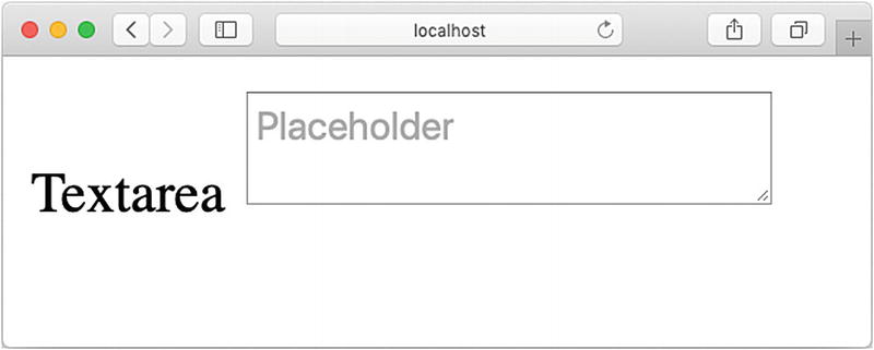
Internet Explorer 11 (IE), for example, has a nonstandard implementation of grid. Its implementation is based on the April 7, 2011, working draft rather than the candidate recommendation.5 Therefore, vendor prefixes must be used in order for grid to work in IE. However, even with the use of prefixes, behavior still differs. In IE, explicitly positioning each element in the grid is necessary but not in other browsers where they will set themselves in the next available space. Furthermore, some aspects of the current specification, such as grid-gap, are simply missing. Listings 5-2 and 5-3 show the code to achieve the same layout in IE and Firefox when using grid. Both will use the same HTML (Listing 5-1). Their respective outputs are shown in Figures 5-4 and 5-6, while Figure 5-5 shows IE without vendor prefixes.
<body>
<div class="grid-container">
<aside>My Aside</aside>
<section>Section 1</section>
<section>Section 2</section>
<section>Section 3</section>
<section>Section 4</section>
</div>
</body>
Listing 5-1
Grid HTML
html, body {
padding: 36px;
margin: 0;
}
.grid-container {
display: grid;
grid-template-columns: 1fr 1fr 1fr;
grid-template-rows: 5rem 5rem;
grid-gap: 1rem;
}
aside {
grid-row: 1/3;
background: lightgray;
}
section {
border: solid 1px gray;
}
Listing 5-2
Grid Without Vendor Prefixes
Figure 5-4
Grid in Firefox
When the same code found in Listing 5-2 is run in IE, no grid is rendered and the elements are simply stacked on top of each other (Figure 5-5).
Figure 5-5
Grid Without Vendor Prefixes in IE
This is because grid, a value of display, does not exist. To access grid functionality in Internet Explorer, vendor prefixes need to be used.
html, body {
padding: 36px;
margin: 0;
}
.grid-container {
margin: -.5rem;
display: -ms-grid;
-ms-grid-columns: 1fr 1fr 1fr;
-ms-grid-rows: 5rem 5rem;
}
aside {
background: lightgray;
-ms-grid-row-span: 2;
margin: .5rem;
}
section {
border: solid 1px gray;
margin: .5rem;
}
section:nth-of-type(1) {
-ms-grid-column: 2;
-ms-grid-row: 1;
}
section:nth-of-type(2) {
-ms-grid-column: 3;
-ms-grid-row: 1;
}
section:nth-of-type(3) {
-ms-grid-column: 2;
-ms-grid-row: 2;
}
section:nth-of-type(4) {
-ms-grid-column: 3;
-ms-grid-row: 2;
}
Listing 5-3
Grid with Internet Explorer Vendor Prefixes
With -ms vendor prefix and substituting grid-gap for margins, the same layout can be achieved (Figure 5-6).
Figure 5-6
Grid with Vendor Prefixes in IE
Fallbacks
A better solution to vendor prefixes when a browser does not support a property is to create a fallback. When a browser encounters a property or value it does not support, it will ignore it, and therefore, the previously set value will be maintained. If the element does not have a previously set value or does not inherit a value, the default will be used.
For example, (at the time of this writing) cross-fade has an experimental version, behind a vendor prefix (-webkit) in Safari and is unsupported in Firefox. To start using it, a fallback can be created. Listings 5-4 and 5-5 show the use of cross-fade and its fallback (Figure 5-8 shows the desired output).
First, a background image is set, then it is overridden by the cross-fade using the vendor prefix, and finally, it is overridden again by the standard cross-fade. Browsers that don’t support cross-fade or the vendor prefix version, such as Firefox (Figure 5-7), will display just the background image.
Figure 5-7
Fallback to Background Image
Browsers which do support a vendor prefix, such as Safari (Figure 5-8), will display the experimental versions.
Figure 5-8
Cross-Fade
Finally, browsers that support the final version will display the specification-defined cross-fade.
Supports At-Rule
The @supports at-rule allows for checking if a particular property and value pair is supported or not, allowing the user experience to be customized accordingly. This feature is generally well supported apart from IE. The expression @supports(property:value {} returns true when the property is supported, while @supports not (property:value){} is true for when it is not. Styles within the selector are only applied if the selector returns true. These can be conjoined with either the and or or operators to create new expressions. Generally it is prefered to use @supports for progressive enhancement of newer features, while fallbacks can be used to provide backwards-compatibility with older browsers.
To see @supports in action, let’s look at the backdrop filter, which works in Opera but not in Firefox. Listings 5-6 and 5-7 show the use of @supports to create conditional styling using support.
<body>
<div class="container">
<p>Lorem ipsum dolor sit amet, consectetur adipiscing</p>
</div>
</body>
Listing 5-6
Cross-Fade Fallback HTML
html, body {
padding: 36px;
margin: 0;
}
.container {
background-image: url('art.png');
padding: 1rem;
}
p {
background-color: rgba(255, 255, 255, 0.6);
backdrop-filter: blur(20px);
margin: 5rem;
padding: 1rem;
}
@supports not (backdrop-filter: blur(20px) ) {
p {
background-color:white;
}
}
Listing 5-7
Cross-Fade Fallback CSS
When backdrop-filter is supported, the paragraph background is blurred and at a 60% opacity (Figure 5-9). When it isn’t, the paragraph background is set to white with full opacity to increase legibility that would have been gained from blur (Figure 5-10).
Figure 5-9
backdrop-filter
Figure 5-10
Fallback
Project Defaults
Resetting browser defaults helps with creating consistency across browsers. Creating application defaults can help create consistency across the application. This is especially important when working with component-based architectures. Separating out theme from layout will also help with consistency. Style can be set on the elements themselves and base classes to be reused throughout the application. If the theme is changed, these changes only need to be updated in one place. Furthermore, when creating new views, the only concern becomes layout as the theme is already taken care of. Listings 5-8 and 5-9 are a sample excerpt; Figure 5-11 shows the output.
<body class="view">
<h1>Theme</h1>
<div class="container">
<div class="card">
<div class="header">Header</div>
<div class="body">
<p>Lorem ipsum dolor sit amet, ... </p>
</div>
<div class="actions">
<button>My Button</button>
<a>My Link</a>
</div>
</div>
<div class="card"> ... </div>
<div class="card"> ... </div>
</div>
</body>
Listing 5-8
Default Styles HTML
body {
--border: solid 1px rgba(0, 0, 0, .2);
--dark: rgba(0, 0, 0, .87);
--light: rgba(255, 255, 255, .87);
--shadow: box-shadow: 5px 5px 5px var(--dark);
color: rgba(0, 0, 0, .87);
font-family: sans-serif;
}
h1 { font-family: cursive; }
a {
font-size: .75rem;
font-variant: small-caps;
text-decoration: none;
}
button {
background: none;
border: var(--border);
border-radius: 45px;
box-shadow: var(--shadow);
box-sizing: border-box;
font-size: .75rem;
font-variant: small-caps;
padding: .5rem 1rem;
}
.actions {
align-items: center;
border-top: var(--border);
display: flex;
justify-content: flex-end;
margin-top: 1rem;
}
.actions > * { margin-left: 1rem;}
.card {
border: var(--border);
border-radius: 3px;
margin-bottom: 1rem;
}
.card > div { padding: 1rem; }
.card .header {
background: rgba(0, 0, 0, .87);
color: rgba(255, 255, 255, .87);
}
/* Layout */
.container {
column-width: 30rem;
}
Listing 5-9
Default Styles CSS
Figure 5-11
Theming
By setting variables, default styles on elements, and creating default container classes, like the .card class in Listing 5-9, a theme can be created. Properties one might include in as part of the theme are things that revolve around look and feel such as color, typography, borders, padding, and so on. From there, creating views becomes easier because the primary concern remaining is layout. By setting up default theming, even in a component-based architecture, the look and feel, or brand, can be kept consistent. Furthermore, updating the theme can be as simple as changing the custom property values.
Summary
This chapter covered browser differences and techniques to standardize CSS across them. Techniques for dealing with differences in CSS support in different browsers were also discussed. Finally, theming was addressed. The next chapter will look at supporting user interaction using transitions and animations.