This book on Cascading Style Sheets (CSS) takes a very different approach from most. It isn’t trying to teach you how to design web pages and, aside from a cursory overview, isn’t focused on teaching you how to use CSS. This chapter introduces the focus of this book, which is how (and why) to treat CSS as a programming language.
Classification
Cascading Style Sheets (CSS) are a web technology that allows layout, theme, and style to be applied to a document. In most common cases the document in question is a Hypertext Markup Language (HTML) file and the rendering is performed by a web browser.
Often CSS is seen as a design tool since it allows the author or designer of a web page to determine the visual look of that page. Because of its control over the final look of a web page, CSS has a direct impact on both usability and accessibility. Due to these factors, creating style sheets and writing CSS are sometimes assumed to be design tasks, and it may be the designer on a software team who is tasked with maintaining the style sheets.
“CSS had one feature that distinguished it from all the others: It took into account that on the Web, the style of a document couldn’t be designed by either the author or the reader on their own, but that their wishes had to be combined, or cascaded, in some way; and, in fact, not just the reader’s and the author’s wishes, but also the capabilities of the display device and the browser.”1
At its core, then, CSS puts control in the hands of both authors and readers. This makes it somewhat interactive and subjects it to the will of the reader of a web page, since they are able to influence the final look of a page based upon their own preferences. Most often when author intent meets the end-user influence to create a unique hybrid output, this is known as programming. So this begs the question: Exactly what is CSS? Should writing style sheets be considered programming, and should those who write CSS be considered programmers?
For starters, just like popular programming languages such as JavaScript and Python, CSS is a language. As shown in the “Structure” section, CSS has a specific syntax that must be followed and the rules you write cause actions to be performed. Additionally, the WorldWideWeb Consortium (W3C) refers to CSS as a language.2
One measure of a programming language is to ask if it is Turing complete. Skipping the formal definition, the simple explanation of a Turing complete language is one that can solve any arbitrary computation. Note that this isn’t a strict requirement and there are some very useful programming languages that are not Turing complete, most notably Structured Query Language (SQL) and Regular Expressions (RegEx). However, if a language can be shown to be Turing complete, it should remove all doubt about its classification. The combination of CSS + HTML has received the formal proof necessary to be classified as Turing complete.3
This means that CSS + HTML meets the requirements for any general-purpose programming language, and that writing CSS and HTML counts as programming. This means that you are most definitely a programmer (or web developer, if you prefer).
Language Features
Despite the classification of CSS as a programming language, we can probably agree that using CSS + HTML for general programming tasks wouldn’t be particularly convenient. That is because this really isn’t the point of CSS (or HTML).
Variables
Functions
Calculations
Imports
Scope
Comments
Polymorphism
Mixins
Extension
Namespaces
List and map data structures
Mathematical expressions
See Chapter 2 for a more in-depth exploration of the CSS language features and Chapter 7 for more on CSS precompilers.
Structure
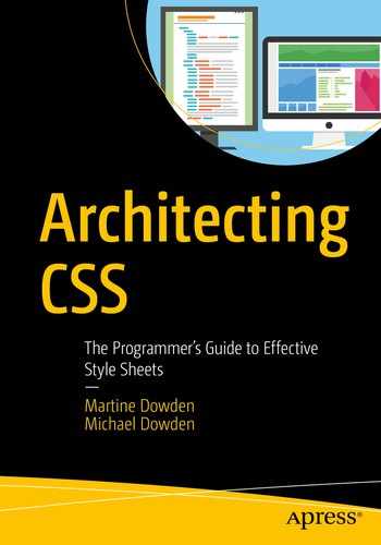
It is important to note that CSS is a declarative language rather than an imperative one. This means that rather than writing code that tells a web browser how to apply styles to a page, we instead tell the browser what styles to apply and where to apply them. These declarations are called rulesets in the specification, but may be referred to simply as rules.

CSS Ruleset
Each declaration is made up of a property-value pair. As of this writing, the CSS Working Group listed 564 possible properties. Each property must be supported by the user agent (typically a web browser) for it to have any effect. Unsupported properties are simply ignored.
Rulesets may be further grouped and modified by at-rules such as @media or @supports and are collected into style sheets. A style sheet is simply a text file with a .css extension that contains any number of rules which describe the presentation of a document or web page.
Software Architecture
Once we accept that CSS has all the sophistication of a programming language, we need to accept the implication that we must treat style sheets like code. This means that we can take advantage of many principles, best practices, and design patterns of software architecture and apply them when writing CSS.
You may find the term software architecture used interchangeably with the term software design. This is common within the industry and both terms refer to the same high-level design thinking and process methodology. Since CSS is often used for visual design, we chose the term architecture throughout this book to avoid any confusion between these concepts.
Software architecture looks at the structure and components of a system and weighs the pros and cons of various possible combinations and approaches. The strengths, weaknesses, and limitations of various systems and approaches should all be considered. The architect’s approach is much more of the high-level bird’s-eye view than a developer’s (although often the same person will do both).
For example, if you wanted to animate an image moving across the page when a button is clicked, how would you implement that functionality? Would you use CSS or JavaScript? Would you use an <img> element, Scalable Vector Graphics (SVG) , or Canvas? Which will yield the smoothest visual animation? Which approach will be the easiest to maintain when requirements change? These are the types of questions that software architecture attempts to evaluate.
You do not have to start from scratch when making these types of decisions. There are some well-established principles of software architecture and best practices that can guide you on your journey to more strategic decision making with regard to CSS.
Separation of Concerns
The term separation of concerns is credited to Edsger Dijkstra4 and refers to the idea that it is very helpful for us to focus on one aspect of a problem at a time. As shown later in the “Web Architecture” section, a web application separates content, style, and actions and even uses different technologies for each of these concerns.
CSS Areas of Concern
Now, let’s say you have a style sheet with 20,000 rulesets. This is clearly unmanageable and these rulesets need to be split into multiple files. How do you determine how many files you need and which rulesets go into each file? One approach is to split files based upon concern (e.g., layout vs. theme), while another approach would be to group rulesets based upon the specific components to which they apply. This question is quite fundamental to the discussion of different CSS architecture models in Chapter 10.
Two of the most widely accepted principles of software architecture, cohesion and coupling, serve to better define the idea of separation of concerns. These metrics were first published in Structured Design5 and have since become standards in software engineering.
Cohesion
Cohesion can be described as a measure of responsibility. It is a qualitative measure of the breadth of different tasks or effects a given unit of code is responsible for and the nature of the relationship between those tasks or effects. Traditionally there are seven levels of cohesion ranked from coincidental (worst) to functional (best).
- 1.
Lack of side effects – If a function does just one thing, then there is little risk of side effects or unintended consequences from its use.
- 2.
Only one reason to change – Every time code changes, it increases the risk of introducing errors and bugs. If we reduce the number of changes, we can diminish risk. Additionally, this helps avoid side effects from system-wide change.
The goals of both cohesion and single responsibility are to promote simplicity and reduce risk, which are important goals for all of our architectural decisions.
Coupling
Coupling describes the interdependence between two or more units of code. Loose coupling is associated with good cohesion and generally describes a module with good reusability that may be updated independently of other modules with minimal impact on the overall system. This is an important attribute of robust and flexible systems.
Tight coupling is associated with poor cohesion and describes modules that are hard to test or modify independently. Such modules generally cannot be reused freely and may require larger testing efforts when changed. Favor looser coupling whenever possible.
When building web applications, we will find a lot of value in decreasing the coupling between content and design. Ideally we should be able to create style sheets that work for a wide range of content without adjustment. When we achieve this, we may say we have orthogonality.
Orthogonality
While an important and common term when discussing system design, the word orthogonality has accumulated some disfavor in recent years. This is likely due to a combination of misuse and poor definitions leading to it sometimes being described as “technobabble.”6 However, orthogonality is an important concept that is directly related7 to cohesion and coupling, and it will factor into many decisions we discuss later in this book.
Orthogonality describes a relationship that is cooperative without being codependent, where two things work together toward a common goal while maintaining a level of independence.
In mathematics the simplest form of orthogonality of two vectors is when they are perpendicular to each other, meaning they form a right angle and intersect only once. Orthogonality can also be described as statistical independence, meaning two (or more) factors that vary without being influenced by one another
Taken into computer software, we use orthogonality to describe a relationship between two modules or components that are able to change independently of one another. For example, an HTML page may be considered orthogonal to its CSS if we’re able to edit an HTML file to change the content and/or structure of the page with no corresponding change to the CSS, but the visual design of the page remains unaffected after the change.
In fact, this separation of concerns between document layout and structure is one of the original design considerations behind CSS.
Nontechnical Factors
In order to exercise separation of concerns, we must first practice the art of breaking down complex and challenging problems into simpler pieces. Often we find that seemingly impossible tasks are simply large accumulations of a great many simple tasks. In learning to see the individual pieces, we now have the building blocks that we need to create solutions.
Beyond the technical aspects of software architecture, there are practical considerations that must weigh into our decisions.
Cost of Maintenance
It’s easy to buy into the idea that the cheapest thing to build today is the best financial decision; however, the true cost of ownership of a software product must include the ongoing cost of maintenance in the calculation. Often the thing that is the cheapest to build may be the most expensive to maintain. Perhaps we can purchase an existing third-party library or template and pull in updates from them instead of building and maintaining ourselves?
Development Time
We’re often working on tight deadlines in an ongoing effort to deliver value to our customers and produce revenue for our company. The total time and effort of an architectural decision is an important decision point as it may affect both cost and timeline. Sometimes it’s worth taking a big hit initially to ramp up on a new approach that will be faster over time. Other times we need to acknowledge that going with things we’re already familiar with is the best choice. But do consider that development time is very expensive, so sometimes a decision that seems trivial (shaving 10 seconds off page reload time during development) may pay dividends later (10 seconds x 100 times a day x 260 work days x 5 developers = 15 days a year in savings).
Developer Satisfaction
While the technical and financial impact of our decisions are relatively straightforward, the impact decisions can have on morale are just as important and easy to overlook. So when deciding between CSS, Sass, and Less or selecting your next CSS framework, the attitude and buy-in from your team is an important consideration. Sometimes the friction can be the usual resistance to change or the pace of change; sometimes it’s a legitimate concern that the decision is not the best fit for the product or team. Yet other times it’s because the developers don’t feel the decisions are helping them build useful skills. Take these concerns seriously because morale affects performance, quality of life, and turnover.
Best Practices
It is important to acknowledge that the study of architecture revolves around defining solution patterns for common problems, but also that there is no absolute answer. No single approach is always right and no single decision will work in all cases. Practicing architecture is all about understanding your available options, weighing the positive and negative outcomes of each one, and then making a decision. Documenting these decisions, and the reasoning that went into them, is another important part of being an architect. It’s essential that we – and others – can learn from both our successes and our failures.
There are a series of practices that are generally good defaults in decision making. Not that they are always the right answer, but that using them absent any compelling reason to the contrary will generally produce good results.
Don’t Repeat Yourself
Often referred to as DRY, Don’t Repeat Yourself indicates that duplication can be an antipattern. When a bit of code is duplicated ten times within a project, this means we must update ten places anytime this code changes. If we only update eight of these places in a future update, we may find that hard-to-diagnose bugs stick around long after we thought they had been fixed.
The same can be true for CSS – duplicating the same rulesets and declarations can lead to additional maintenance effort and inconsistency in appearance over time.
There are a number of available mechanisms to reduce duplication in our style sheets including cascading, inheritance, variables, and mixins.
Occam’s Razor
The logical razor credited to Occam is: “Do not multiply entities without necessity!”.8 While Occam never wrote these exact words, this principle comes from his work on problem solving, making it relevant to a programming context. The principle of Occam’s razor is perhaps better known as “the simplest working solution is likely the best one.”
A logical razor is a rational principle used to shave off possible but unrealistic or unlikely explanations for a given phenomenon.9
Simplicity provides great value to our code. It can make code easier to debug, easier to read, and make it easier for new teammates to get up-to-speed. Also, this provides an excellent default barring any external factors – the simplest solution we can come up with should be sufficient for many cases.
You Ain’t Gonna Need It
Sometimes referred to as YAGNI, the principle of You Ain’t Gonna Need It is that we should generally avoid adding anything to our code that we don’t have a specific requirement for. We should generally avoid premature optimization by keeping our code as simple as we can until there’s a compelling reason to do otherwise. Often this even means ignoring the DRY principle until we know that we’ll need a bit of code three to four times or more as the cost of minimizing duplication may be too expensive for just two to three cases.
Learn from Others
Use existing architectural patterns and approaches, such as those presented in Chapter 10. Use Google to find other people with similar challenges and learn from them. Take to social media to get help from colleagues.
Web Architecture

Browser Engine10
All of the source files must be retrieved from a web server, and then the text must be parsed according to its type. The HTML and JavaScript combine to build and manipulate the Document Object Model (DOM) , which will be described in more detail in the following text. The Style Engine combines the DOM with the CSS to produce a layout, including any media files such as images or video. But even this layout is just a nonvisual model that must be rendered onto the screen using the paint and composition steps.
While it is not necessary to fully understand all of the activities undertaken by the browser, the relationship between HTML and CSS is of particular interest throughout this book. Since we’ve already covered an explanation of CSS, an overview of HTML and the DOM is provided in the following sections.
HTML
Link to External Style Sheet
Self-Contained Styles
Inline Styles
There are a large number of CSS features that are simply not available using inline styles, including most of the at-rules. Additionally, this “breaks” cascading and inheritance, which is described in more depth in Chapter 3.
The fact that an HTML document must specify its own style sheets implies an authoritative relationship from the document to the style sheet. A style sheet does not get to specify what documents it belongs to, but it can specify selectors and conditions that determine the situations where rules get applied to a document, a concept which gets expanded upon in the following chapters.
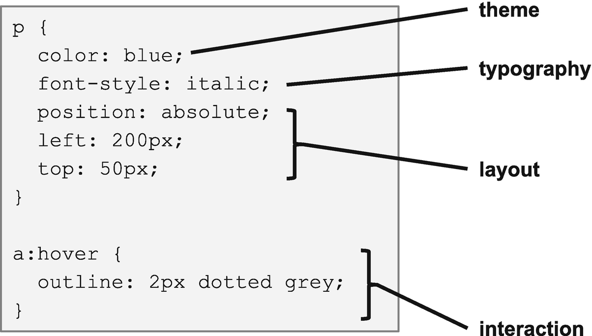
HTML Structure
As illustrated earlier, HTML is made up of tags which are demarcated by angle brackets. An HTML element refers to the entire content of a tag, from the first angle bracket of its opening tag to the last angle bracket of its closing tag. Some elements, such as <img>, have no body and thus no closing tag. Some elements, such as <div> or <button>, may contain text or even other tags between their open and closing tags. All tags may have attributes such as ID, class, or title. Some tags have mandatory attributes, which are required to be considered valid.
There are CSS selectors for tags, attributes, and values, which will be covered in detail in Chapter 2. One thing worth noting here is that some HTML tags exist primarily to provide semantic context.
Semantics is the branch of linguistics and logic concerned with meaning. When applied to code, including HTML, we use the word “semantic” to indicate a word or tag that conveys a meaning or purpose beyond serving as a simple label.
For example, <div> can be used to group any arbitrary set of tags, but all this communicates is a generic division or grouping. The <nav> tag indicates navigation, <article> indicates independent and self-contained content, and <aside> indicates related but secondary content, much like the preceding Note. This additional meaning is helpful for user agents and screen readers, but can also be used within our CSS to write more robust and meaningful selectors.
Document Object Model

Document Object Model
Every item in the DOM is called a node. A node may be an element, attribute, or text, reflecting the underlying HTML. Also like HTML, elements have attributes. All of these can be read and modified directly using JavaScript for dynamic web pages.
Note that CSS doesn’t factor into the DOM directly. However, it is possible to use the DOM to alter visual output by directly modifying the class or style attributes. Looking back at Figure 1-5, we see that the DOM provides the structure that the Style Engine applies the CSS to when producing a layout.
History of CSS
October Browser: WorldWideWeb, Tim Berners-Lee – first web browser | 1990 | |
1993 | January 23 Browser: Mosaic – first browser to show with images inline with text | |
October 1 WorldWideWeb Consortium (W3C) Founded December 15 Browser: Netscape Navigator 1 | 1994 | October 10 CSS first proposed by Håkon Wium Lie |
August 16 Browser: Internet Explorer 1.0 | 1995 | April 10 Browser: Opera 1 |
1996 | December 17 Cascading Style Sheets, level 1 (CSS1) Recommendation, W3C | |
May 12 A List Apart, Jeffrey Zeldman | 1997 | |
August Web Standards Project (WaSP) | 1998 | May 12 Cascading Style Sheets, Level 2 (CSS2) W3C Recommendation |
1999 | June 22 First 3 CSS3 Drafts: Color Profiles, Multi-column layout, and Paged Media | |
April 14 CSS3 Introduction, W3C Working Draft | 2000 | |
2002 | October 10 Wired News CSS Redesign11 | |
January 7 Browser: Safari 1 May 7 CSS Zen Garden, Dave Shea | 2003 | February ESPN CSS Redesign12 |
2004 | November 9 Browser: Firefox 1.0 | |
October Sass CSS preprocessor | 2005 | |
2007 | July 4 CSS-Tricks, Chris Coyier | |
December 11 Browser: Google Chrome 1.0 | 2008 | |
2009 | August Less CSS preprocessor | |
April caniuse.com | 2010 | |
2011 | June 7 Cascading Style Sheets, Level 2 Revision 1 (CSS 2.1), W3C Recommendation | |
June 19 Media Queries, W3C Recommendation13 | 2012 | |
2013 | November 7 Style Attributes W3C Recommendation14 | |
March 20 CSS Shapes Module Level 1 W3C Candidate Recommendation15 | 2014 | |
2015 | December 3 CSS Custom Properties for Cascading Variables W3C Candidate Recommendation16 | |
March 1 CSS Flexible Box Layout Level 1, W3C Candidate Recommendation17 | 2016 | September 29 CSS Grid Layout Module Level 1, W3C Candidate Recommendation18 |
September 25 Scrollbars Module Level 1, W3C First Public Draft19 | 2018 | November 6 Selectors Level 3, W3C Recommendation20 |
November 24 Writing Modes Level 3 W3C Proposed Recommendation21 | 2019 |
Creation of CSS
Affecting the visual style of a web page was a known problem from the very beginning of the Web. Initially some basic visual controls were built into HTML, but problems with this approach were quickly identified. As mentioned at the beginning of the chapter, many people proposed, and even implemented, mechanisms for styling the Web, and during this time Håkon Wium Lie proposed the idea of CSS. Together with Bert Bos, he developed a proposal which was submitted to the newly formed W3C.
Lie and Bos went on to found the first W3C CSS Working Group along with Chris Wilson and Vidur Apparao, with Chris Lilley as the first WG Chair. The CSS level 1 recommendation was published 2 years later in 1996.
Dr. Håkon Wium Lie
In 1994 Håkon Wium Lie joined the WorldWideWeb project at CERN where he joined web pioneers Tim Berners-Lee and Robert Cailliau. In this first year, he drew upon his background in electronic publishing from the MIT Media Lab and produced the proposal for CSS. He went to work for W3C the following year, on the CSS Working Group.
Lie became the CTO of Opera Software in 1999, which was the most CSS-friendly browser at the time. He continued in that role until 2016 when the company was sold.
Dr. Bert Bos
While Håkon Wium Lie was working on his proposal for CSS, Bert Bos was producing his own stream-based style sheet proposal.22 He reviewed the initial proposal for CSS and he and Lie determined that the two proposals could be combined. During the transition of the WorldWideWeb project out of CERN in 1995, Bos was hired to the newly formed W3C, where he continued working with Lie on the CSS1 specification.
Bos remains an active member of the CSS Working Group, having previously served as a chairman of the group. Together with Lie, he wrote Cascading Style Sheets: Designing for the Web, one of the very first books on CSS.
Chris Lilley
Chris Lilley started establishing web standards as a member of the Internet Engineering Task Force (IETF) working on HTML 2.0 and the PNG graphics format. He joined the W3C in 1996, initially working with graphics and fonts, chairing a Working Group on Web Fonts. When the CSS Working Group was formed a year later, he became the chair of this group. The following year he began 10 years as chair of the W3C Scalable Vector Graphics (SVG ) Working Group. Over the years Lilley has authored and edited a large number of web and graphics specifications, and books on the same.
Chris Wilson
Chris Wilson was a founder of the first CSS Working Group and was credited by Håkon Wium Lie as the programmer who actually added CSS to Internet Explorer version 3, before the specification was even finished.23 He has remained active in the W3C ever since, where he has held positions including chair of the Web Platform Incubation Group, chair of the HTML Working Group, and a member of the Advisory Board. He worked on Internet Explorer for Microsoft until 2009, and in 2010 he joined Google where he works on Chrome, specifically augmented and virtual reality capabilities.
Vidur Apparao
Vidur Apparao joined the initial CSS Working Group while working as Chief Architect at Netscape, where he was working on the Gecko Layout Engine. In addition to his work on the CSS group, he also contributed to the Document Object Model recommendations. After more than a decade as a web architect, Apparao has continued his career as a cloud software executive.
Early Adoption
Before CSS was to become a well-known and proven technology, a few early web sites would need to take the plunge and update their old HTML3 web sites with inline styles to a more “pure” CSS-based layout and theme.
This new design is more accessible, faster to download, more flexible and much easier on the Web server itself. Anyone interested in the future of the Web need look no further than this.24
While Wired was making their big announcement, another team at ESPN was working hard on their new web site. Announced just 4 months later, their big victory was the (nearly) tableless layout.25 By proving that building sites with CSS-based (instead of table-based) layouts could work for sites receiving millions of monthly pageviews,26 these two web sites helped solidify the place of CSS as a powerful web standard.
Early Advocates
Without early advocates to inform and educate web developers, we might have a very different Web today. A large number of developers, including the authors of this book, were educated and inspired by these advocates, and this book does not stand alone but builds upon their years of work.
A List Apart
The very first major effort for web and CSS education and advocacy got its start as an e-mail list. A List Apart was founded in 1997 by Jeffrey Zeldman, who was soon joined by Eric Meyer. This early mailing list has grown into an entire ecosystem, including books and conferences, which continue to be influential to this day.
Jeffrey Zeldman
Jeffrey Zeldman started his career in web design in 1995, after a decade in advertising copywriting. The year after starting A List Apart, he cofounded the Web Standards Project (WaSP) along with George Olsen and Glenn Davis, starting a career-long push for open web standards. Zeldman was inducted into the SXSW Interactive Hall of Fame in 2012 and was the first person to ever receive the honor.27
Eric Meyer
Along with Håkon Wium Lie and Tim Boland, Meyer developed the very first test suite for CSS1 which was intended to help assess conformance to the standard. He joined WaSP the same year and cofounded its CSS Action Committee. Meyer has written six books on CSS along with countless articles for some of the most influential web design publications, including A List Apart. He also founded the css-discuss mailing list, and cofounded An Event Apart with Jeffrey Zeldman. In 2006 Meyer was inducted into the International Academy of Digital Arts and Sciences for his international work on HTML and CSS.
CSS Zen Garden
In 2003 a magical new web site was launched which demonstrated the power of CSS. CSS Zen Garden had a unique approach – it provided a fixed HTML document which designers were encouraged to style and theme as much as they wanted, using nothing but CSS (and images). By preventing edits to the HTML, web designers were forced to decouple their design implementations and the result was magical. The first few themes were provided by the site author, Dave Shea, but soon designers around the world were submitting their themes for consideration. This provided a powerful, hands-on lab that proved once and for all that CSS had a place as a first-class citizen of the web ecosystem.
In 2005 Dave collaborated with Molly Holzschlag to produce a book, The Zen of CSS Design, which sold over 70,000 copies and became the international standard for web design for some time.28
Dave Shea
Shortly before launching the CSS Zen Garden, Dave Shea started a weblog about web design titled mezzoblue. For the next few years, he became a prolific blogger, providing valuable insights on a wide range of topics. Shea was active in the Web Standards Project as well as writing for A List Apart.29
Molly Holzschlag
While the Web was being conceived at CERN, Molly Holzschlag was launching her career in Internet technology. She published her first book on web design in 1996, going on to write more than 35 books on web technology and design. She has been widely recognized as one of the most influential women on the Web.
Holzschlag has worked directly with CERN, AOL, Microsoft, BBC, eBay, Opera, and Netscape to ensure browsers support modern standards. She has been project leader for WaSP, chair of the W3C CSS Accessibility Community Group, and a W3C invited expert to both the Internationalization Guidelines, Education & Outreach Working Group, and the HTML Working Group.30
CSS-Tricks
It is unlikely that anyone reading this book has performed a search for answers about CSS without coming across the CSS-Tricks web site created by Chris Coyier. For more than a decade, this web site has been sharing practical tips and tricks about CSS and other web development topics.
Chris Coyier
In 2007 Chris Coyier founded CSS-Tricks as a personal blog about CSS. Today the web site hosts articles from a large number of web developers and designers, including many listed in this chapter. Together with Tim Sabat and Alex Vazquez, Coyier founded CodePen, a very popular online code editor and sharing platform.31
CSS Today
The CSS Working Group at the W3C is still going strong under fantastic leadership. The current modular approach to CSS level 3, along with a new trend of evergreen browsers, has led to a steady pace of progress. The following are a handful of active and influential people who, in addition to many of those already mentioned, are continuing to improve the state of CSS.
Rachel Andrew
Rachel Andrew is the author of more than 20 books about web development. She was a member of WaSP and is an invited expert to the W3C CSS Working Group. She is a Google Developer Expert, contributor to A List Apart, and the Editor in Chief of Smashing Magazine.32
Jen Simmons
Jen Simmons is a designer and advocate at Mozilla, where she works on Firefox specifically the Grid Inspector. She has spoken at many conferences, including An Event Apart and SXSW. Simmons is an active member of the W3C CSS Working Group where she has been extremely influential in the design and deployment of CSS grid layout. She has been an active web developer since 1998 and her clients have included CERN, the W3C, and Google.33
Nicole Sullivan
Nicole Sullivan is a popular speaker, with her conference appearances including An Event Apart and SXSW. She has coauthored two books on web performance and is an advocate for CSS and web standards. Sullivan started the Object-Oriented CSS (OOCSS) project which provides an architectural framework for CSS. Along with Nicholas Zakas she also created CSS Lint, a tool which helps catch common CSS errors.34
Miriam Suzanne
Miriam Suzanne is a project manager, user-experience designer, and front-end architect. An accomplished writer and novelist, she authored Jump Start Sass and is a staff-writer for CSS Tricks. Suzanne is a member of the Sass core team, and creator of popular open-source tools including Susy, True, and Herman. She is an Invited Expert with the W3C CSS Working Group and a teacher for the Mozilla Developer channel, producing resources for web professionals including tools, videos, articles, and demos. Suzanne is an international conference speaker and in 2017 she won the “Best Of” speaker award at CSS Dev Conference.35
Summary
The names of the various parts of a CSS ruleset
That CSS is a programming language and why this is important
How a user agent such as a web browser applies CSS to a web page
In the next chapter you will get a review of the basic CSS language features, with special attention to advanced and less commonly used language features.