For CSS there are several preprocessors available. These will take data, written in their own particular syntax, and then output CSS for the browser to consume. The benefit of these includes access to functionality such as color-editing functions or nesting rules that are not yet available in CSS. They also gave us access to CSS variables before they were supported by the language itself. Some of the most popular processors include Sass, Less, and Stylus.
Examples in this chapter will use SCSS.1 These techniques are available using other preprocessors; however, feature availability and syntax will vary based on the preprocessor used.
Implications for Architecture
The way in which code is organized and architected can be very different when using preprocessors than when using pure CSS because of added functionality, such as mixins and the ability to extend classes. The ability to compute values in ways simply not available outside of preprocessors today brings the ability to write DRY semantic code. It can be defined in just one place and then reused throughout the style sheet not much differently than some of the object-oriented principles used in other programming languages.
The downside of using preprocessors is that they add a layer of complexity to the application that does not exist when using pure CSS. Even though some preprocessors, such as Less,2 can be run in the browser directly, it is not recommended for production use because it is less performant and reliable than plain CSS. When using preprocessors, we therefore need some sort of build step in order to compile the code into CSS.
Debugging can also be a challenge, especially when using some of the more complex or advanced features of the code. This stems from the CSS being generated not matching one-to-one with the code being written. For example, the properties and attributes being added to a class could come from a mixin (more about mixins later in this chapter) rather than part of the ruleset. The CSS being applied is the output, not the mixin itself, so tracking back to which mixin created the output can be difficult. Sourcemaps can help with this. A sourcemap is a file that can be generated with the CSS which links the output back to the code that generated it. But again, this needs to be set up specifically as part of the build process.
So first, before even choosing the processor to be used, the question of whether the added complexity is necessary should be asked.
Nesting
CSS
Nested SCSS
As much as it makes it very easy to know that the styles set on the list item will only be applied to the navigation list items, nesting makes it really easy to create overly specific rules. In the preceding example, nesting the list item inside of the unordered list is superfluous and does not add any value. Having it nested under the navigation only, one level higher than its current location, would be sufficient.
Nested SCSS
The ampersand refers back to the parent element, so the hover is placed on the anchor tag when it is a link, or a visited link. Nesting here makes it very clear that the hover, focus, and active selectors are all children of a:link and a:visited.
Nonnested CSS
Without nesting, it is more difficult to tell at a glance that links and visited links also have styles for hover, focus, and active states. Furthermore, the nested code is more concise and does not repeat the root elements, decreasing the chance of typos or errors.
Care when nesting must be taken in order not to create rules that are overly specific. This happens when elements are nested too deep. However, it can help with code legibility.
Color Functions and Variables
Variables, although available today in CSS as discussed in Chapter 2, were first made available through the use of preprocessors. The CSS version (custom properties), although influenced by preprocessor variables, does have some advantages over the preprocessor variables. Custom properties can be accessed and changed via JavaScript, while preprocessor variables cannot. In creating the CSS output, preprocessor variables do not remain variables; they are replaced by their assigned value. CSS custom properties, however, stay variables and can be manipulated at any time, including during runtime.
Color Values and Usage
 |
The colors can be set to semantic names based upon what their usage will be and then manipulated using color functions when the color value or saturation needs to be altered (Listing 7-1).
Colors
By using color transformation functions and variables, not only don’t we have to remember the exact values for each of the colors and any variations we may have in use, but we also increase our ability to keep our theme consistent. Furthermore, if the colors were to change, this could be done in one place. The eventuality of a color changing is why color names should be based upon their usage rather than their actual color. If the variable name was $pink, for example, and the accent color was changed to purple, we would now have to either find the variable name everywhere and update it, or we would have a variable name that does not represent the color that is assigned to it. Situations like this make maintainability very difficult and code confusing. Selecting semantic variable names is incredibly important to the maintainability of the code.
Mixins
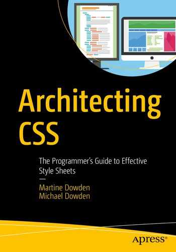
Mixins allow developers to create sets of properties and values that can easily be reused throughout the application.
Simple Mixin
Simple Mixin
Parameters
Mixin with Arguments
Arguments
Mixin with Arguments and Logic
CSS Output
Mixins Output
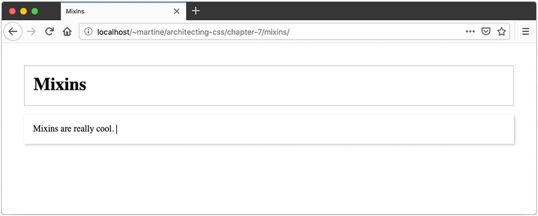
Informational Boxes HTML
Informational Boxes SCSS

Informational Boxes
Even though the padding could have been included in the mixin, it is separated out into its own class because when a mixin is added, it does its computation and outputs all the code each time; therefore, mixins are not a good use case for static information. Static styles are simply programmatically being copied over into each class increasing the size of the CSS and therefore upload time. Classes, defaults on elements, or the use of the @extend at-rule are much better options for static styles.
@extend
Extend, unlike mixins, prevents the duplication of code in the resulting CSS. While a mixin copies the declaration block for each selector it is included within, extend creates a single declaration block and consolidates the selectors.
The advantage of this methodology is in creating base classes for basic styles toward which semantically named classes will be pointed. The code is neither duplicated nor copied and prevents the use of numerous nonsemantic classes on an HTML element. For code maintainability it also means that the style of the elements is controlled in the CSS. If the style coming from extending another rule is no longer wanted, we need only to remove the @extend. By simply adding the class name to the HTML instead of using @extend , we would have had to edit the HTML in order to change look and feel. By using @extend instead of adding the same class name to a multitude of elements, we continue to maintain a separation of concerns. Our elements can have class names that match their purpose, rather than how they display, and we handle the styling via the CSS.
Informational Boxes HTML – Revisited
Informational Boxes SCSS – Revisited
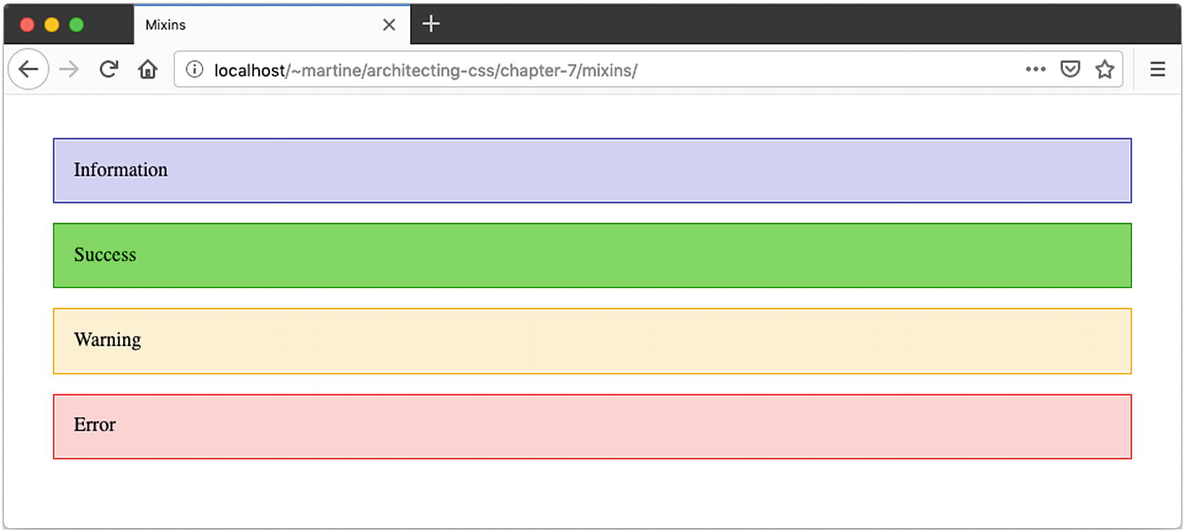
Informational Boxes – Revisited
Informational Boxes – Revisited Output CSS
Notice the message class now has multiple other selectors as well, but was not duplicated in the output.
@Import
Imports allow the user to create partial files in which variables, mixins, and reusable code can be placed. Sass imports work similarly to CSS imports in that it copies the SCSS they contain to the style sheet they are being imported by. They must therefore be used with caution. It is very easy to bloat code by repeatedly importing an entire theme, for example, into each component. Sharing mixins and variables, since they are not copied, but produce an output within a style, is a perfect application of the use of @import, because unlike classes, they do not get copied.
Creating import files to have information accessible from anywhere in the application becomes very interesting when dealing with components because more often than not, such as when using Angular out of the box or creating component in JavaScript and Shadow DOM, the CSS is scoped and therefore in a separate file or area of the application than the rest of the CSS. Adding variables and mixins to a partial – a file to be imported into other files that do not have a use on its own – helps keep the code DRY.
Partials are sometimes denoted by having an underscore at the beginning of their name to separate them from style sheets.
@import
Summary
In this chapter we looked at a very small subset of functionality brought to use via the use of preprocessors. We looked at mixins, imports, extends, color function, and variable and how they impact how we might organize and structure our application’s CSS. In the next chapter, we will look at how JavaScript can interact with our CSS especially in the context of modern frameworks.