In a real-world application, your CSS does not function in isolation. This chapter covers some of the important considerations of a modern front-end web application, including how your choice of CSS or JavaScript frameworks may impact your application styles.
JavaScript
OK, yes this is a CSS book, so why are we suddenly talking about JavaScript? The reality is that a significant amount of front-end development is done using some sort of framework and/or UI library, many of which rely on JavaScript. Furthermore, JavaScript is often used to manipulate CSS as a result of state change or user interaction.
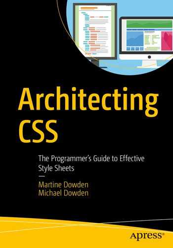
Most Popular Programming, Scripting, and Markup Languages in 2019 According to Stack Overflow
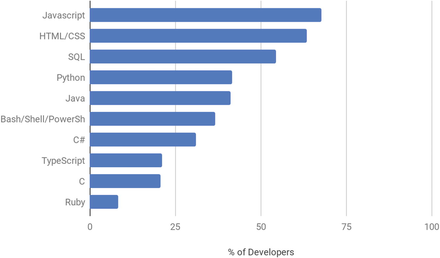
Most Popular Web Frameworks in 2019 According to Stack Overflow
Manipulating CSS Using JS
CSS Altering JavaScript Methods
Property and Methods | What It Does | Effects on Specificity |
|---|---|---|
element.ClassList • add() • remove() • replace() • toggle() • item() • contains() | Reads and manipulates the classes attached to a particular element. | Because styles are being applied by referencing classes, cascading and inheritance will not be significantly impacted. |
element.style Examples: elem.style = "color: blue, font-size: 12px" Or elem.setAttribute("style", "color:blue; font-size: 12px" Or elem.style.color = "blue" | Adds styles inline on the element. | Very difficult to override because they are inline. If the element already has inline styles, they will be overridden by what is being applied by the JavaScript. |
Both a huge advantage and risk, JavaScript has the ability to easily override anything declared by CSS but does not have to.
If we don’t want to mix CSS rules in our JavaScripts, the methods given to us via classList allow for adding and removing classes to the element without ever touching the CSS itself. This brings with it the huge benefit of styling definition staying in CSS files and not being split between JS and CSS files.
Affecting styles or the DOM itself brings the advantage that the specificity of CSS being applied matters very little since it will be overridden. Via this technique, regardless of any other context, as a developer, we can dictate that if a user performs a certain action, or a particular state is achieved, a particular set of styles will be applied regardless of other styling, or context. This technique is often used to show and hide dialog boxes, for example, notification messages. The advantage of this technique is that the style changes can stay with its trigger, or action, and regardless of context, the styles being applied will not be overridden by preexisting CSS.
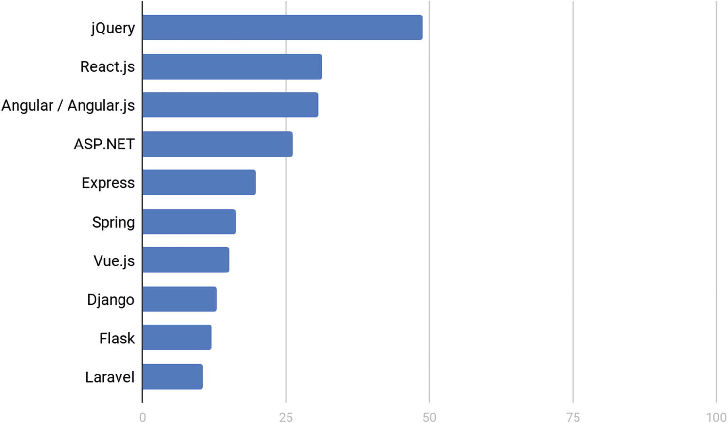
Animation Listener HTML
Animation Listener CSS
Animation Listener JavaScript
Animation Listener Output
The button triggers the JavaScript to disable the button and add a class of rotate which makes the image spin once. Because on page load, we set up the JavaScript to listen for animation’s ending, once the animation is terminated, we can reset the page. The button is reenabled, and the rotate class is removed. In this example, even though we are manipulating the CSS with JavaScript, the CSS classes are still defined and maintained in the CSS file, and therefore, inheritance and cascading are not altered or affected.
Component-Based Architecture
When using component-based architecture, it becomes very important not only to theme your application to your application’s brand/specification, but also the UI library itself. Each library will have various levels of themability and intricacies in terms of ease, as well as what is actually possible to style. When selecting a UI library, understanding the customizability and how themable a library or framework is can save you from a lot of headaches down the road. Encapsulation – restricting the component CSS to the component itself – allows for writing CSS that only applies to a particular component and not to the rest of the application. If a UI library’s components has very strict encapsulation and few theming options, it will be incredibly difficult to style.
There are many different libraries and frameworks that create or use components. Each has slightly different implementations. We are not going to look at all of them. When looking at how modern-day JavaScript frameworks create and interact with components, most either use web components or emulate them. Worth noting is that especially if the component is emulated, it will behave slightly differently than what I will be describing in the following text. Angular has an emulated model and continues to support an equivalent shadow piercing combinator (::ng-deep) but can be set to use web components instead, or set to have no encapsulation at all. In React, it depends on how the CSS was set up in the project. The options also run the gamut. Understanding exactly how much encapsulation your framework provides will help make better decisions as to how to structure your CSS.
Libraries and Frameworks
By definition, libraries are collections of declarations that the application will use. A framework is an abstraction and provides basic functionality, or a skeleton for the application. A framework may contain one or more libraries.
UI libraries such as jQuery UI3 or Angular Material4 provide a series of components or widgets that can be added to an application. They come ready made with styles and functionality. To customize their looks, they need to be themed. Theming can either be done via tools, which spit out the necessary CSS such as themerollers, or be done more manually following guidelines. Either way, the themability and therefore customizability of the said library will vary. The variability is a direct result of how the components are constructed and how easy the author has made it for element to be customized. Further customization beyond what the theme will allow can often prove quite difficult and result in using extremely specific selectors, such as the use of !important. It is therefore very important, when considering libraries, to look into what theming capabilities it has as well as how easy it is going to be to customize so its elements can match your application.
The architecture of the library itself may also affect how it is used and in some cases may provide for multiple approaches. Bootstrap5 is interesting because its structure allows for two radically different implementations, each with their downfalls and benefits.
The first, and probably most common implementation, is importing both the CSS and JavaScript directly in the page, from a local source, via CDN, or using a package manager such as NPM, NuGet, or RubyGems. The framework in its entirety is available and being applied. This means that a number of classes already have styles added to them and are ready to use on the web site. Some components, like modals, have functionality that relies on JavaScript associated with them. These will also be readily available.
- 1.
Naming is no longer semantic.
- 2.
The styles are essentially being controlled by the HTML.
- 3.
Everything is imported in its entirety even if it’s not being used.
Bootstrap HTML
Bootstrap CSS

Bootstrap Output
If the btn or the btn-warning class is updated, all buttons that include this generic class across the application will be updated, whether a call to action or not. The class gives no indication of what it might be used for, or worse, such as in this example, it is being used because of its color, rather than for a warning. The only other option is to go find all the call to actions in the application and update their class name.
Rather than the style sheet controlling how elements look, the style is now tightly bound to the HTML. This is also true of the layout, wanting to change the aside to taking a third of the page rather than a quarter would involve going to each page, and updating the HTML.
Bootstrap Mixins HTML
Bootstrap Mixins SCSS
This approach is not going to be as easy to get up and running with. Since it uses SCSS, it will require the ability to process SCSS into CSS. Knowledge of SCSS and of what is available for mixins in the framework is also required. Once past the setup and learning curve, however, we get some great benefits. Because we are now assigning the styles to classes via @include and @extend instead of applying generic class names to elements in the HTML, we know our elements will look the same on all the pages. Elements across the entire application can also be updated from one place rather than searching the site for all instances of a particular concept. Lastly, only the parts of Bootstrap I am using are being imported which reduces page weight.
Whenever trying to theme a component library or tweaking the styles from a CSS framework, specificity can sometimes be challenging to wrangle, as the library or framework may already be using selectors that are quite specific; therefore, it may be tempting to use !important. Here be Dragons!
Although there are situations where there truly is no other choice, or important truly is the lesser evil, these instances are few and far between.
The use of !important increases the precedence of a declaration making it very difficult to overide or to include in a normal cascade. No longer can you target a more specific selector to change the style of the element. You now need another more specific important. This vicious cycle makes code incredibly difficult to debug and maintain and even harder to expand.
So when overriding styles, take care that if you do use !important, it is done sparingly and with intent rather than frustration.
Knowing the architecture of the library selected, and its capabilities, will help make informed decisions as to how to structure your code for better long-term maintainability and performance.
Web Components
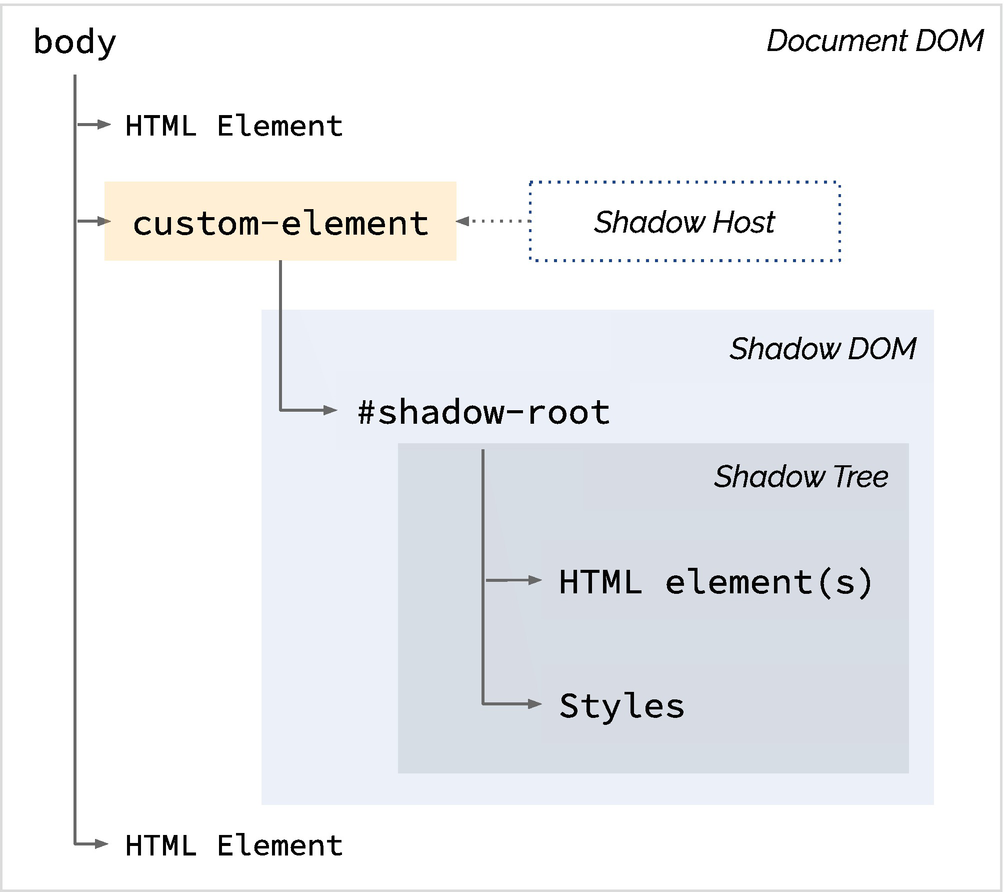
Shadow DOM
Components created using this technique are fully encapsulated, and the author has complete control as to what the consumer will be able to style vs. not because everything within the Shadow DOM is akin to a black box from the perspective of the parent page or component. For a short while, we were able to ignore the encapsulation by using shadow piercing combinators such as >>> or ::deep, but these have been deprecated or removed from most browsers in favor of the upcoming CSS Shadow Parts 6 specification currently being refined. Even after this new specification is implemented, however, the author of the component will still control what users will be able to fiddle with; specificity, !important, and shadow piercing combinations will continue to fail to edit styles that the component author did not open to being altered.
Web Component HTML
Web Component JavaScript (script.js)
Web Component CSS (card.css)
Web Component Page CSS (styles.css)

Web Component Output
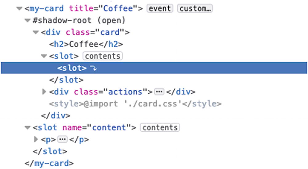
Node Tree Including Slots
Some styles do bleed into the component. Elements in the slot or classes assigned directly to the host (the custom tag) are subject to both the component styles and page styles. Notice the paragraph tags in Figure 8-6; they take styles from both the parent and the component as described below.
:host is more specific than the browser defaults, and in turn, .dark is more specific than :host.
So why did the header also become monospace, when the buttons were unaffected? By adding a font-family of sans-serif to .dark, we essentially set monospace as the default font-family on the :host, that is as far as we can pierce into the component. The buttons have their own typeface specified inside the component CSS which is overriding the :host default and were therefore unaffected. Further attempts to reach into elements inside the component via specificity, such as doing .dark button { ... } even if no styles are set for that property, will not work.
The reason we were able to style the paragraph tags, and will continue to be able to do whatever we want with them, is because they are in a slot. The contents of the slot are actually being controlled by the parent. Looking at the DOM tree, one can see that the slot content lives outside of the shadow tree as seen in Figure 8-7.
The slot inside the shadow tree is nothing more than a placeholder. The content of the slot is in a sibling node of the shadow-root, and not in the shadow-tree itself. It is therefore not encapsulated like the rest of the component and can be styled like any other element on the page. Because it is a child of the host, however, styles assigned to the shadow host will cascade normally to those elements.
Styling Applications That Use Web Components
When creating an application that uses components, it is easy to start thinking only in terms of small reusable items and to lose sight of the greater picture. Consistency of typeface, colors, button styling, and so on across the application is something I think we can all agree is a good thing. However, if we are rewriting those styles in every component, we are setting ourselves up for discrepancies and a maintainability nightmare. How tightly encapsulated the components are affects the approach.
Sample Variable File
Sample Theme File
Once these two files are set up, components should only need to worry about layout and exceptions, things that are specific to that component and nothing else. A great gauge of a style or set of styles belonging in one of these files would be if you find yourself copying and pasting the same thing over and over again. If this is the case, it is time to consider whether these styles need to be imported or set as defaults somewhere.
If the components are tightly encapsulated and a theme file that cascades styling throughout the application is not possible, variables that can be imported become really critical. Importing an entire theme file into every component will just bloat the application because even though maintained in one place, it will essentially be copied in each component. Possibilities here include the use of preprocessors in order to create mixins, or breaking the theme file up into smaller chunks, buttons, tables, links, and so on so that only the needed portions get imported.
Summary
In this chapter we covered the common interaction mechanisms between CSS and JS to show how JS interacts with (and sometimes interferes with) our style sheets. We also looked at how the architecture of the libraries we use can affect how we structure our code. In the next chapter we will dive into various architectural best practices along with specific CSS architectural patterns, showing their strengths and weaknesses.