Individual elements form a layout when they are put together on a page. Using CSS we rely on the box model to control the width and behavior of each element without the layout. To control how elements place themselves in relationship to each other, we can use properties such as display and float. In this chapter we define the box model and look at float, flex, inline-block, and grid for specific layouts.
Box Model

Box Model
Each of these properties, including the content, will be governed by dimension, type, positioning, relationship to other elements, and external information.
Box Sizing
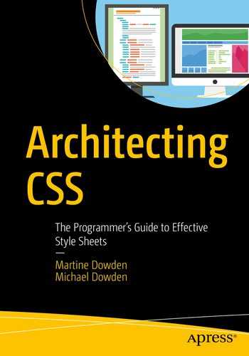
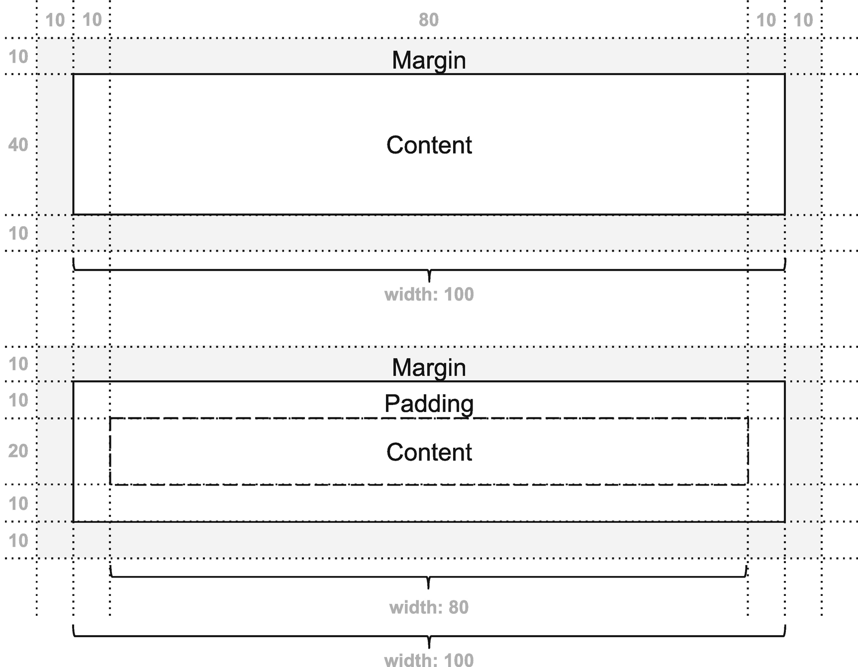
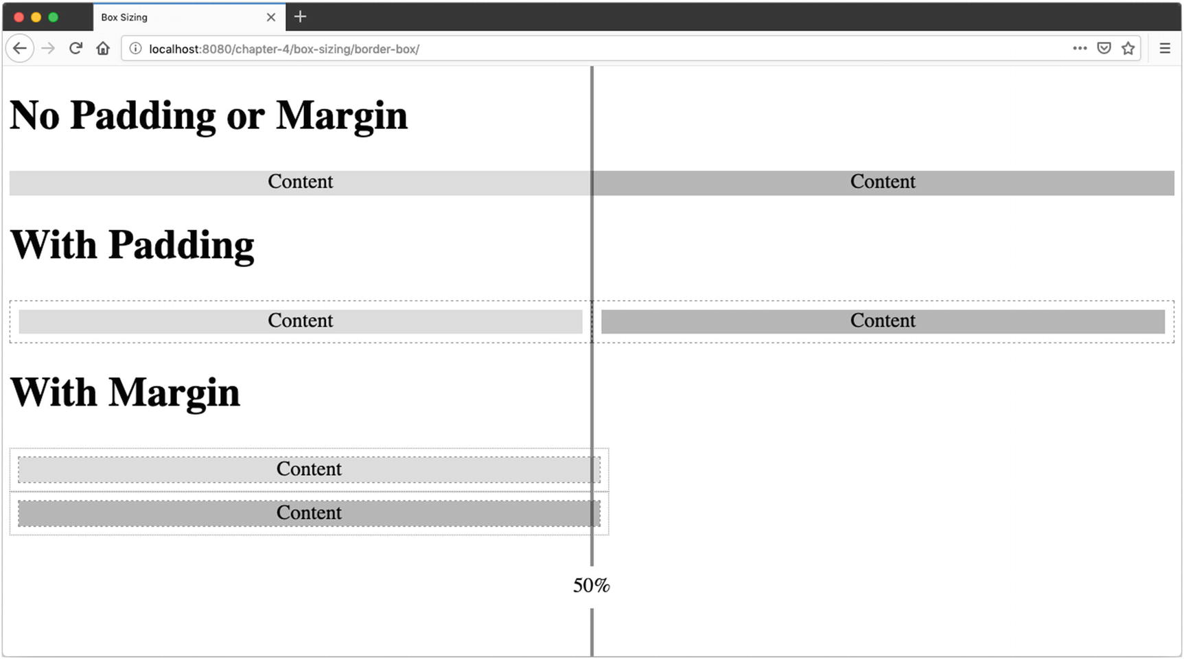
Box-sizing , or the property that defines the height and width of an element, by default has a value of content-box which means that when a width and height is defined for an element, it is only applied to the content. Adding padding or margin to the element therefore increases the percentage width of the total available viewport that the element utilizes.
Content-Box
If a two-column layout, with each div equaling 50% of the width of the viewport, is desired, the amount of padding applied to each column needs to be subtracted from the width given to the element or the total width of both elements will exceed 100%.

Content-Box – No Padding

Content-Box – With Padding

Effects of Padding and Border When Using box-sizing: content-box
In Code
HTML
CSS
Border will behave the same way as padding; therefore, any border width applied will need to be included in the sum of content and padding to calculate the full width or height of the elements included in the layout.
Margin Collapse

Margin Collapsing
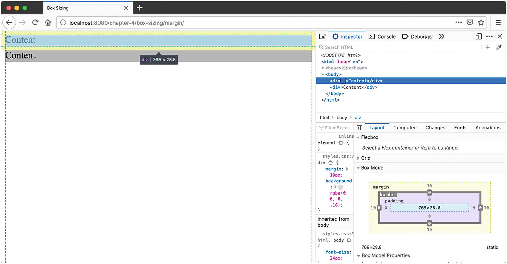
There is nothing separating the margin of the parent and the margin of its child including padding, border, inline parts, block formatting context, or clearance property clear (e.g., clear: right, used with floats).
Elements are adjacent siblings except if the latter needs to be cleared past floats (more about floats later in this chapter).
Even when one of the margins is equal to 0.1
In Code
Margin Collapse
HTML
CSS
Floated Divs – No Margin Collapse
table-row-group(<tbody>)
table-header-group (<thead>)
table-footer-group (<tfoot>)
table-row (<tr>)
table-column-group
table-column
Margin cannot be set on elements with table display types (e.g., <tr>, <td>, etc.) except table, inline-table, and table-caption.2
Pros and Cons
Although the mixins pixels and percentage-based values can lead to some interesting math, the benefit of keeping the box-sizing value as content-box is that when a width or height value is assigned to the content, it will not be subject to side effects from the padding added. The content will be exactly the height or width it was assigned by the developer. Furthermore, because it is the default value, the element’s sizing will exhibit “normal” expected behavior without having to know anything about the other properties already set on the element.
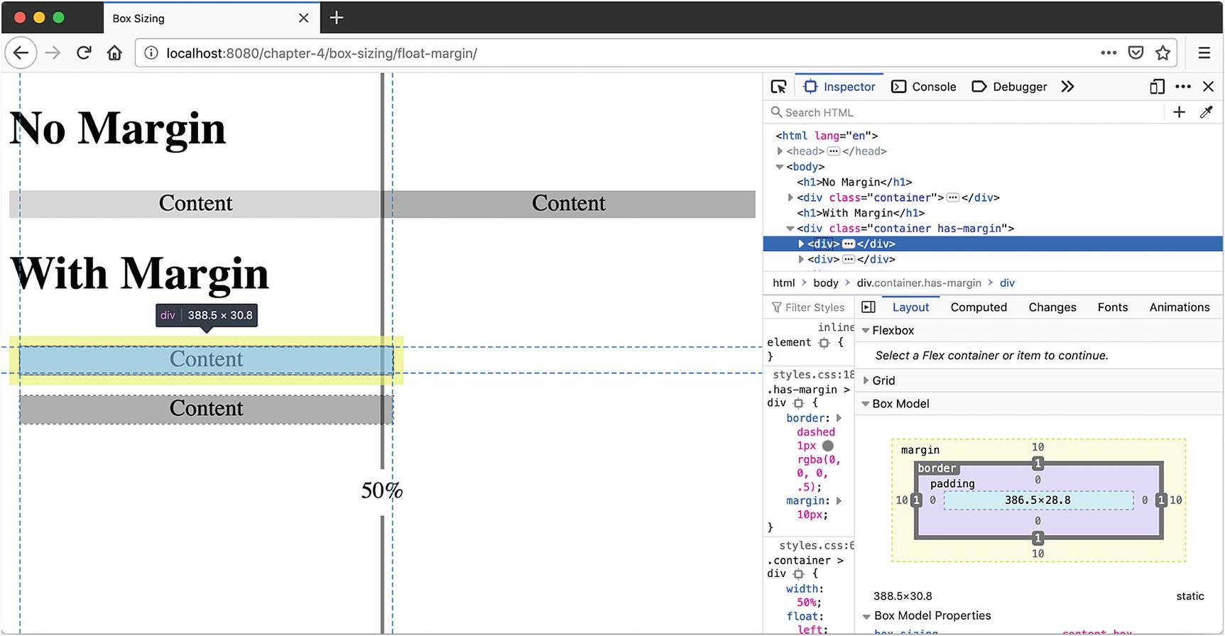
Outline and Box Shadow

Box-Shadow and Outline Do Not Occupy Space in the Layout
HTML
CSS
When both outline and box-shadow are set, they will overlap each other.
Border-Box
As described earlier, box-sizing: content-box has some disadvantages when mixins absolute units and percentage-based units. Content-box can also add extra complexity when setting content as a percentage of total width or height when the content has padding.
Border-Box with Padding
HTML
CSS
Element Using Border-Box
Box-sizing is not inherited. It will need to be applied to all elements for which it needs to be changed.
Display
Margin and padding allow for manipulating the display of the element; the display property manipulates how elements are displayed in relationship to one another by specifying the type of rendering the box uses for the element.
Display Property Values by CSS Version3
Level 1 | Level 2 (Revision 1) | Level 3 |
|---|---|---|
1996 | 2011 | 2018 |
block inline list-item none | inline-block table inline-table table-row-group table-header-group table-footer-group table-row table-column-group table-column table-cell table-caption inherit | Contents flow-root run-in inline list-item flex * inline-flex * grid * inline-grid * ruby** |
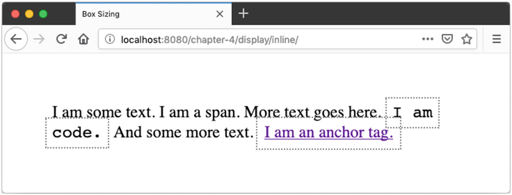
Inline
*Deprecated
**Obsolete

Inline Elements
HTML
CSS
Element Using border-box
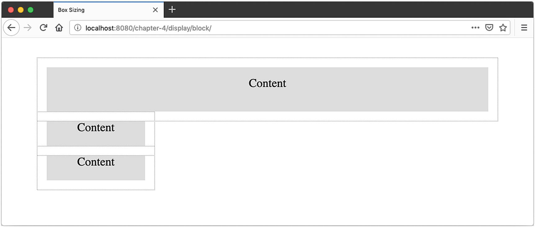
Block Elements
Also considered flow content, block elements stack atop one another unless they are affected by another property such as float.

Default Block-Level Behavior Diagram
HTML
CSS
Default Block-Level Behavior
HTML
CSS

Block and Inline
Inline-Block
Inline-Block HTML
Inline-Block CSS

Inline-Block
The default behaviors of inline, block, and inline-block elements are not enough to create the layouts often desired. Before such options as grid and flex were introduced in 2018 or float, introduced until 1996,6 we relied on tables even when the data was not tabular. For a long time, this was the only option in creating some more complex layouts, as even if the CSS specification described better methods, browsers did not necessarily support them. Today, this is no longer the case, and the use of tables for display purposes is now thoroughly frowned upon as it prevents assistive technologies from properly conveying the content being displayed to the users. Some exceptions, such as e-mail templates, still exist. Similarly to why historically they had been used for display purposes in web sites, most e-mail clients have little to no support for CSS layout properties, but the accessibility concerns remain and therefore tables for layout should be avoided whenever possible. For general web use, however, using tables for layouts is considered bad form and inaccessible. We are going to cover three commonly used patterns for laying out content: float, flexbox, and grid.
Float
Unlike flex and grid, float is not part of the display property, but a property in and of itself.

Floated Image
Example HTML
Float: CSS
Floated Navigation
Clearfix
CSS for Figure 4-21

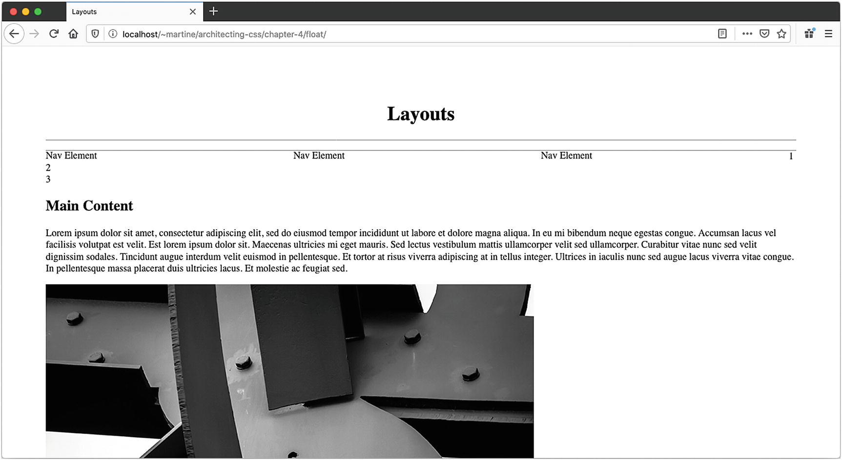
Attempt a Layout Using Floats
Getting the text around the image worked really well, as it is what float was designed to do. The rest of the layout had some issues, however. The padding and combination of a set height and width would more than likely make longer content expand out of its container in the far-left bar. Also of concern, 100% is not easily divisible by 3, so depending on how the browser decides to calculate the width of each nav element, content could be pushed around in ways it was not supposed to. Lastly the background on the columns just doesn’t line up.
For all of these reasons, this would be a bug-prone and hard-to-maintain layout. To achieve this layout, and have the UI be fluid, the use of tables, the CSS display: table property, and/or JavaScript would have been required before flexbox and grid were introduced.
Flexbox
Multiple columns where the background color is to align no matter the content within them
Centering content vertically
Today we have flexbox. Solving those two problems is where flex really shines. Flexbox also allows for dynamically determining the width of the column based on the amount of content. Using display: flex is particularly useful when creating a layout that necessitates control over the spacing of elements across a container.
Flexbox CSS
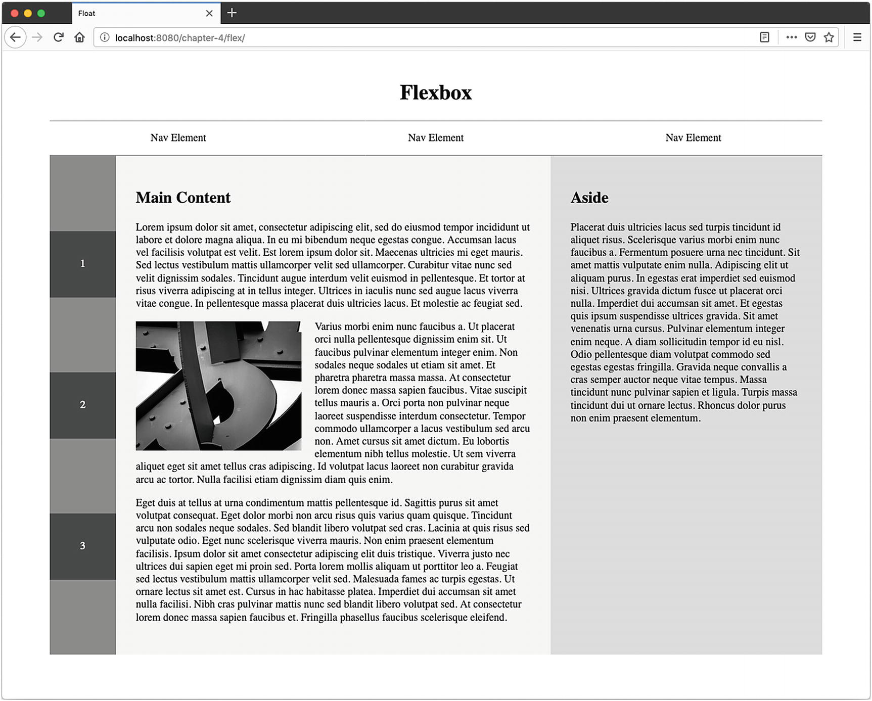
Dissecting the preceding layout, we apply flex to three areas of the layout, the three content columns, the navigation, and the far-left column itself. For both the far-left column and in the navigation, flex is used in order to distribute the content across their container vertically and horizontally, respectively.
Flex-Direction

Flexbox Main Axis
nowrap – This is the default. All items will be placed on one line following the main axis and cause overflow if necessary.
wrap – Items will wrap from top to bottom.
wrap-reverse – Items will wrap from bottom to top.

Wrap
By adding to row, column, or wrap, we can alter the sequence in which elements are displayed. If we want to move a specific element in the sequence individually, we can use order. The property takes an integer, by default 0. If an element is assigned a 1, and all others are set to the default 0, it will appear at the end. If assigned a -1, the element will appear at the beginning. The order is therefore based on the sequence provided and then weighted based on values assigned to each element using the order property.
Justify-Content
To determine the position of each element across the main axis, we use justify-content on the container. Possible values are as follows:
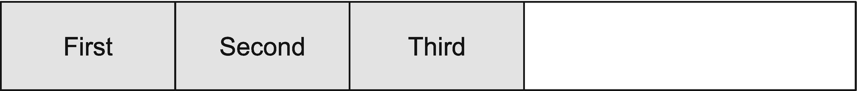
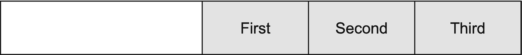


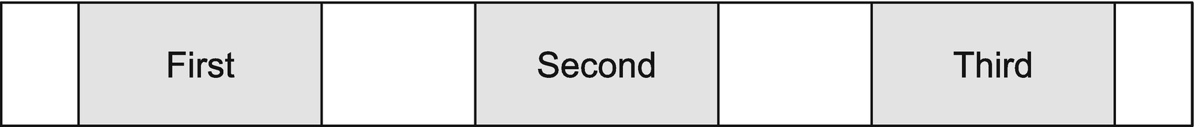

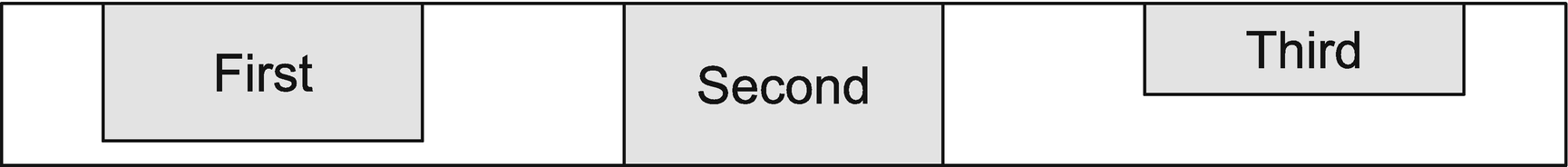
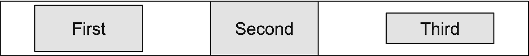
Flex-start, middle, and flex-end have some advantages over inline-block. For many use cases, the use of display: inline-block in conjunction with text-align can achieve the same result; however, inline-block has some intricacies regarding spacing. Even when margins are set to 0, a small gap will appear between elements. A layout where the sum of the elements equals 100% of the width of the container therefore becomes challenging to create. Let’s look at the code and its output (Listings 4-22 and 4-23 and Figure 4-24).
Example 1
Inline-Block HTML
Inline-Block CSS

Inline-Block Gap
Notice the gap between the inline-block elements. There is no margin on the list element. Flexed items do not suffer from this unintended behavior.
Align-Items and Align-Self
The cross-axis is perpendicular to the main axis. Looking back at our original flexbox example (Figure 4-24), we have three columns of content, the left number section, the middle content section, and the right aside. For each of them to have the same length, denoted by their respective background colors aligning at the bottom, we can use the align-content property. The values are as follows:

For the purposes of columns, this behavior allows flexed elements to grow in size, similarly to a table row, so that all the elements included will have the same height as the latest in the array.


The preceding properties are set on the container and will apply to all elements within. To manipulate a single element and make it behave differently from the others, we can use align-self. Its values are the same as those available for align-items, listed earlier.
Flex-Basis, Flex-Grow, and Flex-Shrink
Flex-basis allows for setting a base width elements should start at. Their content will determine whether they need to grow or shrink to fit the space available in the container.
To ensure that content fills 100% of the available space in the container, a flex-grow property can be applied. By default set to 0, it specifies the growth factor of the flexed item. This value is ratio based. If all siblings of the container have the same value, then they will all grow by the same amount so that the sum of the elements equals 100% of the available width (or height if flex-direction is set to column). Otherwise it will be distributed according to the ratio defined on each flexed element.
Flex-shrink works similarly to flex-grow but for shrinking content to prevent overflow. By default set to 1, it can be set to 0 and used in conjunction with flex-basis to ensure a flexed element has a fixed width (or height if flex-direction is set to column).
Because of its ability to dynamically deal with the space provided, display-flex makes generating fluid designs and aligning content easier than ever before, without resorting to the use of tables for display purposes but it is very one directional. Grid, however, brings in the second dimension.
Grid
Grid CSS
Grid-template-columns defines four columns. The first three of equal width and the last of 300px. The “fr” unit used here represents a fraction of leftover space as a ratio.7 The last column will be given a width of 300 pixels; the other three will receive equal amounts of leftover space as their width.
Grid-template-rows defines three rows, the first with height and last with height of 46 and 36 pixels, respectively. The middle row, set to auto, will adjust its height to accommodate its content.
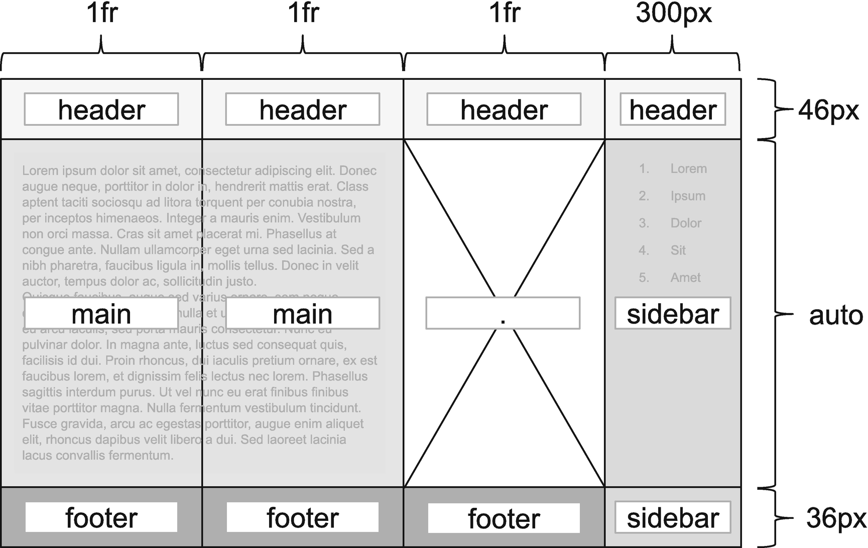
Grid Template Areas
Grid HTML
Grid CSS
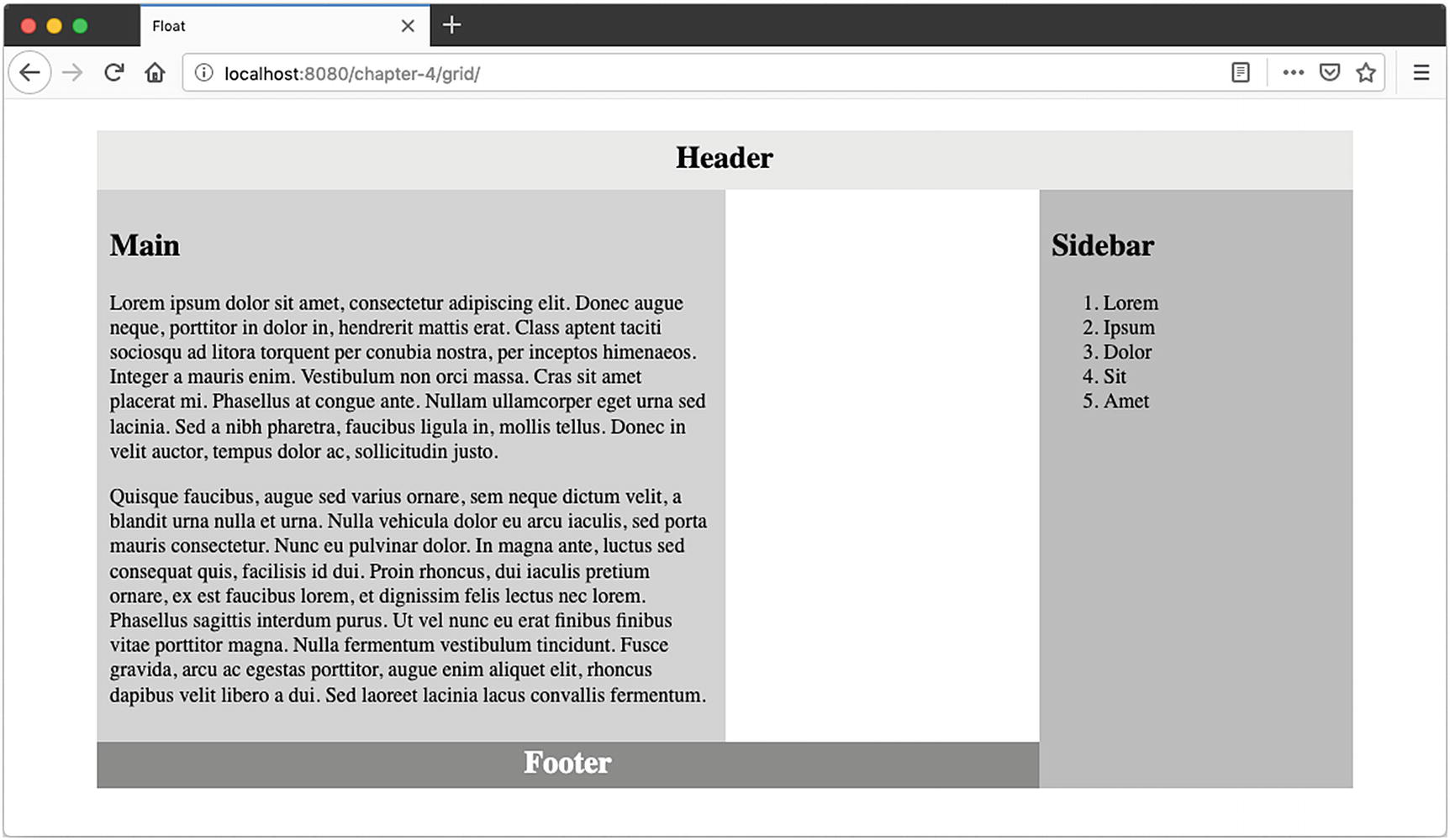
Grid Output
Each UI element is set to its named grid-area. The advantage is the naming can follow the purpose of the container being positioned, making the code easy to read and then maintain. Furthermore, when repositioning elements for responsiveness, the only property that needs to be updated is the grid-template-areas .

Grid Rows and Columns
Grid CSS
Grid-row and grid-column can be defined using a single integer (grid-row: 1) or two integers separated by a / (grid-row: 1/3). When only one integer is used, the section will start that the line specified and span one column or row such as for the main element in the example earlier. When two integers separated by a / are used, the section will start at the line specified by the first integer and end at the line specified by the second, as seen on the footer’s grid-column value.

Justify-Items Values
The same values can be used to change the alignment of a specific cell using the justify-self property on the specific section.
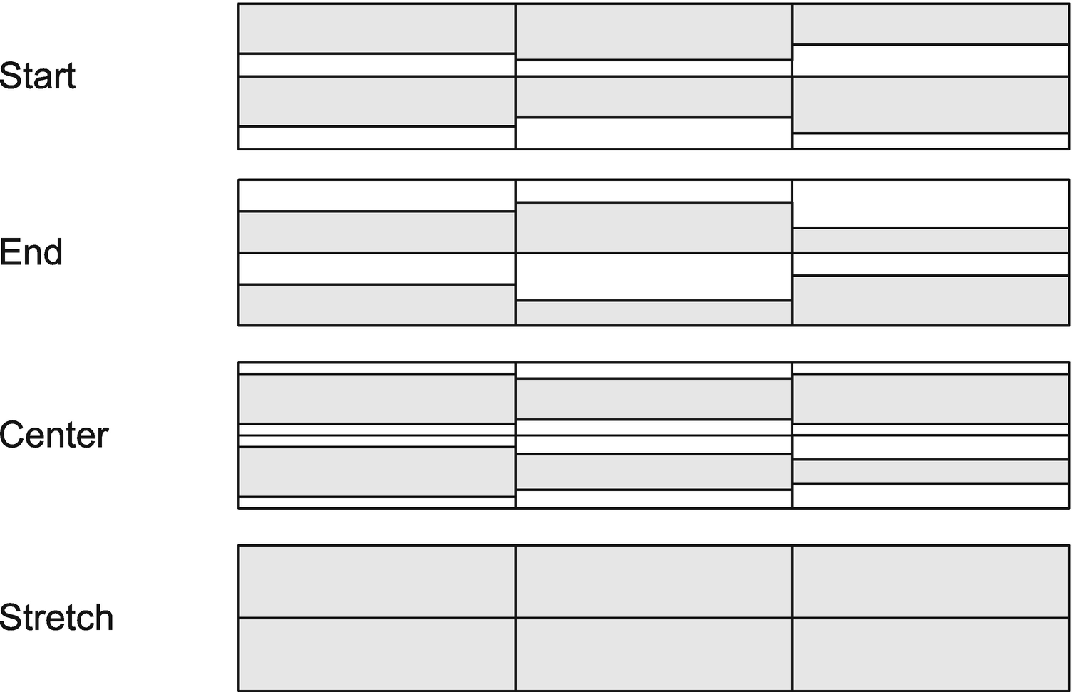
Vertical Alignment Using Align-Items
Similarly to justify-self, the same values can be used with the align-self property on an individual section to allow for a cell to behave differently than the default set on the container.
Just like flexbox, grid also has a justify-content and an align-items property. They have the same values and work in the same fashion as for flexbox. They position grid cells horizontally and vertically within the container. This can be very useful when the grid itself is smaller than the grid container.
To add space between the cells, grid-gap can be used. This will determine how much space is between each row and/or column. Individually, they can be set using grid-row-gap and grid-column-gap, respectively. For example, grid-gap: 5px 2rem would set a gap of 5 pixels between each row and a gap of 2 rems between each column.
By row with row value – Fills in rows and adds new rows as necessary
By column, using the column value – Fills in columns and adds new columns as necessary
To have the grid fill in any gaps that may exist, dense may be added to both the row and column values, grid-auto-flow: column dense.
Grid is now much more widely supported across evergreen browsers but has some compatibility issues in older browsers such as Internet Explorer 11 which currently has an incomplete implementation of the specification.
 Accessibility When Using Flexbox or Grid
Grid and flexbox give the ability to reposition and reorder content at will simply by changing just one or two properties regardless of the sequence in the HTML. This can become problematic for accessibility.
The Web Content Accessibility Guidelines states
When the sequence in which content is presented affects its meaning, a correct reading sequence can be programmatically determined. (Level A) Criterion 1.3.2 Meaningful Sequence (Level A)8
When changing the order of elements using CSS, it is important to make sure the programmatic sequence still makes sense.
Responsive Design
At the core of responsive design implementation is the media query.
“Media Queries allow authors to test and query values or features of the user agent or display device, independent of the document being rendered. They are used in the CSS @media rule to conditionally apply styles to a document, and in various other contexts and languages, such as HTML and JavaScript.”
—Media Queries Level 49
Media Query
Ranged Media Query
where the styles are applied when the viewport widths are between 500 and 700 pixels.
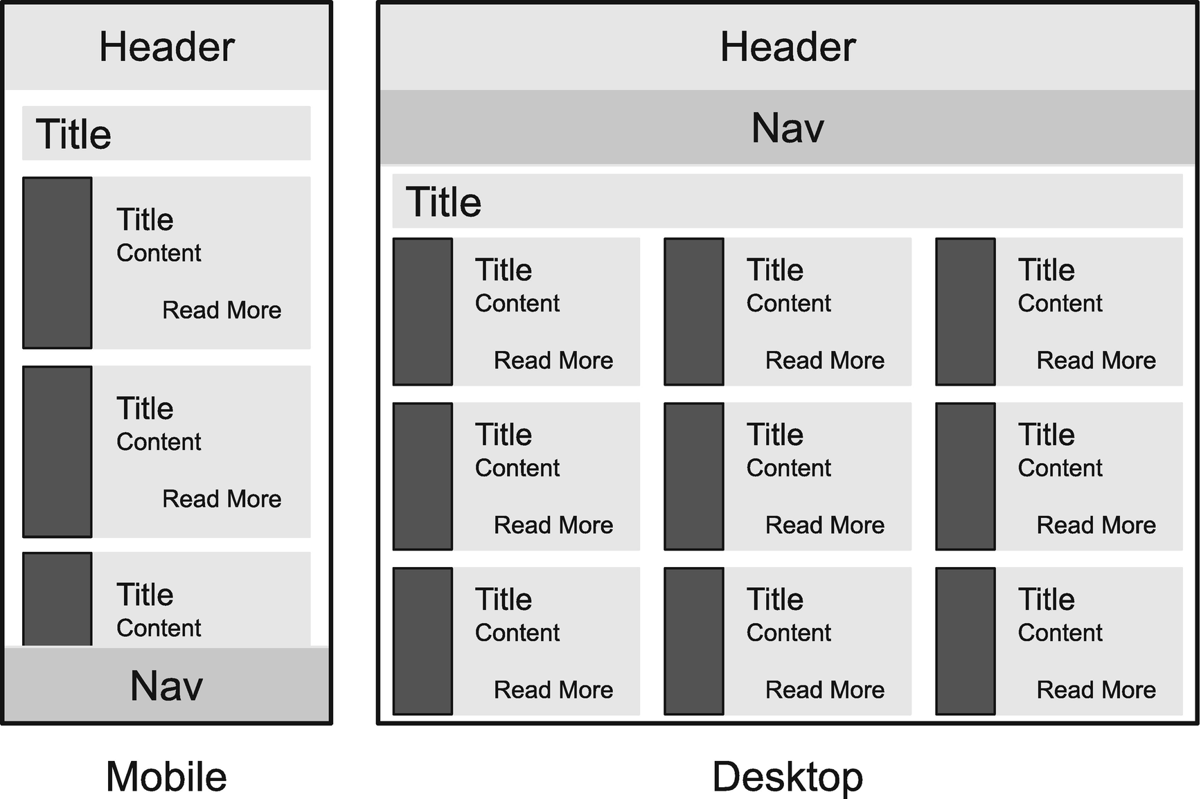
Responsive Design
Responsive Layout HTML
Base Styles
Mobile CSS
Desktop CSS
Notice that in Listing 4-33, it takes very little CSS to readjust the layout for desktop users. This is because base styles are already applied and do not have to be duplicated. We also see here the advantages of named areas for grid layout and the ease of organizing them for the correct layout.
Summary
Elements are subject to the box model, which dictates how its width, padding, margin, and border will behave. When put together, the elements form a layout. There are as many ways to approach a layout as there are layouts to be created, but each technique has its own strengths and weaknesses. We have looked at float, flexbox, and grid as well as media queries for responsive layouts.
In the next chapter, we will look at scenarios where CSS doesn’t seem to work as expected, with a special focus on differences between browsers.