While you may already be familiar with the basics of CSS, this chapter provides a quick overview of the language features at your disposal when making architectural decisions. An important part of software architecture is having a deep understanding of the tools and methods available to accomplish various tasks to achieve our system goals.
Selectors
As we saw in Chapter 1, selectors are the part of a CSS ruleset that determine exactly which elements get style declarations applied. Proficient use of selectors can go a long way toward decoupling HTML and CSS making for robust and consistently styled web sites and web applications.
Basics
The basic selectors allow elements to be selected based upon their obvious qualities as rendered in HTML: tag names, attributes, and class names. The CSS selector syntax is so expressive that there is a DOM function querySelector which accepts a CSS selector string to locate elements in the DOM tree. See Chapter 8 for more about JavaScript.
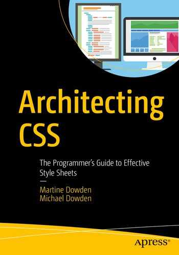
Universal Selector
Outline Selected Elements
Universal Selector
However, this convenience comes at a cost – the universal selector effectively short-circuits inheritance for the associated declarations.
Unless you have a specific use case, it’s generally best to avoid the universal selector in favor of inheritance. It’s also a good idea to use the universal selector in combination with other selectors.
One use case for the universal selector is to apply a declaration to all children of another element, even if that property wouldn’t be inherited, such as a border. For this use case, consider either custom properties or mixins as an alternative to this approach.
Type Selector
Selecting an element in CSS can be as simple as using the tag name. This is called the type selector , and all HTML tags are valid selectors.

Class Selector
Selector HTML
Class Selector CSS
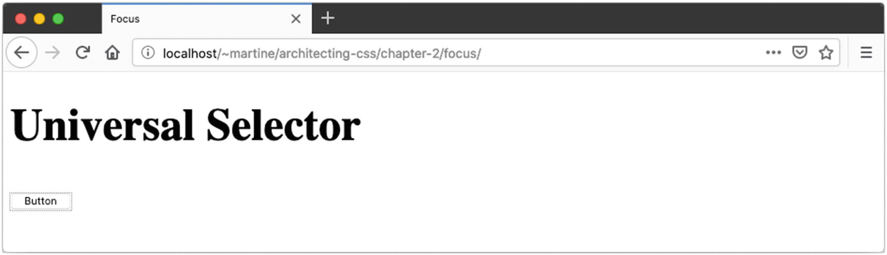
Class Selector
In this example, the <img> element does not receive a border due to the type selector. The OK button has a thicker, darker border than the Cancel button.
ID Selector
ID Selector CSS

ID Selector
This will make the button text bold on the OK button. The example shows that the ID selector may be combined with type selectors in the same way as the class selector. By combining these selectors in a way that doesn’t match the HTML, the contents of the paragraph tag will not become pink in this example.
Attribute Selector
The attribute selector matches an element based upon one of its attributes. This selector uses square brackets to contain the attribute match and may be optionally combined with a type selector. For example, a [rel] can be used to match all anchor tags with a provided relationship. To allow <area> tags to also match, use [rel] by itself.
Attribute Selector HTML
Attribute Selector CSS

Attribute Selector
Attribute Selector Equivalents
Basic Selector | Attribute Selector | |
|---|---|---|
Select by ID | #contactForm | [id=contactForm] |
Select by Class | .outline | [class~="outline"] |
To minimize duplication of declaration blocks, selectors can be grouped together into a comma-delimited list. For example, a, button { ... } would apply the declaration block to both anchor and button elements in the HTML.
Combinators
Combinators
Name | Combinator | Example | Description |
|---|---|---|---|
Descendant | " " (space) | nav a | All anchor tags inside of a nav element |
Child | ">" | nav > ul > li | First list items inside a navigation list, ignoring any items after the first level |
Sibling | "~" | p ~ p | All paragraphs (after the first) that share the same parent element |
Adjacent Sibling | "+" | h2 + p | All paragraphs that immediately follow an <h2> tag on the same hierarchy |
Combinators HTML
Combinators CSS

Combinators
By combining selectors together, we can select elements to style based upon their natural location and ordering within an HTML document. This can help us separate concerns between layout, theming, and content for more manageable rulesets.
Pseudo Elements
Pseudo elements allow you to select elements that do not exist within the HTML document, but show on the screen visually. Both ::first-letter and ::first-line select a portion of text within an element.
Pseudo Elements HTML – ::first-line and ::first-level
Pseudo Elements CSS – ::first-line and ::first-level

Pseudo Elements – ::first-line and ::first-level
Pseudo Elements HTML – ::before and ::after
Pseudo Elements CSS – ::before and ::after

Pseudo Elements – ::before and ::after
Pseudo Elements HTML – ::placeholder, ::selection, and ::backdrop
Pseudo Elements CSS – ::placeholder, ::selection, and ::backdrop

Pseudo Elements – ::placeholder and ::selection

Pseudo Elements – ::backdrop
Have you selected text on a web site and noticed that the selection highlight was in the site’s brand colors? This can be accomplished with *::selection {background-color: cornflowerblue}.
The background in full-screen browsing mode can be customized using ::backdrop.
Both are also seen in the preceding example.
The CSS specification calls for a two-colon prefix before a pseudo element, such as ::after. However, most browsers support pseudo elements with just a single colon (:after) without throwing an error. It is likely that you will see this usage in the style sheets you encounter and it is important to understand why it works. In general, we recommend the standard two-colon prefix for two reasons: (1) it adheres to the CSS specification and (2) it clearly distinguishes pseudo elements from pseudo classes.
Pseudo Classes
Pseudo classes select elements based upon information that is not available in the HTML document. This may include state or context metadata.
:hover – Match when an element is being hovered over (such as using the mouse)
:focus – Match an element selected with the keyboard (by tabbing), or with the mouse (by clicking the element)
:active – Match an element in the process of being activated (such as clicking, while the mouse button is depressed)
:target – Select an element that has an ID matching the URL’s fragment (the portion after the #)
Displaying tabular data with beautiful formatting is made easy with the positional pseudo classes. Select the first and last rows of a table with tr:first-of-type and tr:last-of-type, respectively. Use the same technique to select the first and last columns using <td>. Highlight every other row using tbody > tr:nth-child(even).
:in-range, :out-of-range – Numeric value compared to defined range
:placeholder-shown – If the placeholder text is currently visible
:invalid, :valid – Checks the validation status of form fields for error and success indicators
:checked, :indeterminate – Used to select a checkbox or radio button that is currently selected or if the selected option cannot be determined
:default – Matches only if this element is the default in a group of elements (such as the default submit button or the default radio option on a form)
:disabled, :read-only, :read-write – Matches the current status of a form field based on availability to user interaction
:optional, :required – Matches fields based upon their required status
Another important pseudo class is the :not() selector, which select elements that do not match a list of selectors. While many of the pseudo classes have their inverse state defined (e.g., :optional vs. :required), there are many other scenarios where negation can be useful. For example, you can select every direct child tag of an <article> that is not an <img> by using article > *:not(img) { ... }.
Pseudo Classes HTML
Pseudo Classes CSS

Pseudo Classes
Declarations
Selecting the elements doesn’t do any good if we don’t apply styles to those elements. The declarations section of each ruleset is where the individual style properties, and their values, are specified for the matching elements.
Properties
The properties in CSS refer to the various aspects of layout and style that can be affected. Many properties are available for some elements and not others. Sometimes the visibility of a property will depend upon the display setting of an element. For instance, the height property is ignored on elements with display: inline, but is rendered on display: inline-block.
Border Property
Each of the individual border properties is available as an optional value parameter to the border shorthand property. Some of the other shorthand properties include background, box-shadow, font, padding, margin, and outline. Each of these has a different list of properties they summarize, and they have a specific order in which the properties should be provided. Be sure to check a reference when using these until you become comfortable with the syntax of each.
Property Disambiguation
First Property | Second Property | Description |
|---|---|---|
margin: 2px; | padding: px; | Margin is outside the box model and can be collapsed when adjacent. Padding is inside the box. |
border: 2px solid black; | outline: 2px solid black; | Border adds to the box model dimension and exists between margin and padding. The outline exists outside the border and takes up no space on the box. |
visibility: hidden; | display: none; | A hidden element still exists on the page and can take up space and receive events. An element that is not displayed effectively doesn’t exist in the render tree. |
The outline property is very useful for highlighting elements on the screen where you do not want the item to reflow. This is commonly used to highlight elements in combination with the :focus pseudo class. See Chapter 4 for details of the box model, as well as on properties related to layout, including display, grid, and flex.
A comprehensive review of the available CSS properties and values is outside of the scope of this book. For an excellent reference, we recommend the MDN CSS Reference from Mozilla, which can be found at https://developer.mozilla.org/docs/Web/CSS/Reference.
Units
There are a number of CSS properties that expect a <length> data type. This length is a scalar (numeric) value with an associated unit of measure. Selecting the correct units can make the difference between a nice fluid, responsive layout and one that breaks anytime the user resizes the window or zooms. The correct units can also have a tremendous impact on the amount of work it takes to achieve certain layouts.
There are three basic categories of units that we’ll discuss. The first category includes absolute measures that are established at the time of the design. The second category is font-relative, meaning that if the user zooms the page or changes their default font size, the meaning of these values will change relative to one another. And the third category contains viewport-relative lengths, meaning they will change relative to the browser size or the specific display on the user’s device.
Absolute
px – The traditional unit of measure for computer graphics; this is only suitable for screen-based displays.
in –Inch. 1in. = 6pc = 72pt = 2.54cm. This will be a true inch on printers, but defined relative to a reference pixel for screens which is 96px regardless of the screen resolution.
pc – Pica. A traditional unit of measure in typography.
pt – Point. A traditional unit of measure in typography.
cm – Centimeter. 1cm = 10mm. See the earlier note on inches relating to printers and screens.
mm – Millimeter.
Absolute units of measure do not scale relative to user settings such as font-size. As a result, the use of these units (especially on-screen) is likely to cause significant issues for accessibility and is not recommended.
Font-Relative
ch – Represents the width of the “0” character in the element’s font (consisting of both typeface and size).
ex – Represents the height of the “x” character in the element’s font (consisting of both typeface and size).
em – The calculated font-size of the element. If this unit is used on the font-size property, it will be relative to the inherited font-size.
rem – Exactly the same as em, but always relative to the font-size of the root element (which is the <html> for HTML documents). This is the preferred default unit for many web designers as it allows for manageable fluid layouts while addressing accessibility concerns.
Viewport-Relative
vh – Equal to 1% of the height of the viewport
vw – Equal to 1% of the width of the viewport
vmin – Equal to the smaller of vh or vw
vmax – Equal to the larger of vh or vw
Percentage
Many CSS properties will accept a <percentage> or a <length-percentage> (meaning either a length or a percentage). While the rem is the best choice for many purposes, especially those relating to content and accessibility, percentage works relative to any inherited size including font-relative, view-relative, or even absolute units.
Functions
While CSS does not allow user-defined functions, there are a large number of available functions to perform a variety of tasks, some of which are described as follows:
Shape – There are a number of nonrectangular shapes supported through the functions circle(), ellipse(), inset(), and polygon(). Combine with the shape-outside property to wrap text to a specific shape, or with clip-path to crop an image or container.
Transformation – There are a large number of transformation functions, including rotateX(), scale(), and skewY(). There are also 3D transformations such as perspective(), matrix3d(), and scaleZ(). These transformations can adjust the shape, orientation, and position of elements on the screen to create a wide range of visual effects and layouts.
Gradients – There are a large number of functions to support the creation of gradients, including linear-gradient(), radial-gradient(), repeating-linear-gradient(), and repeating-radial-gradient(). The blending of colors enabled by gradients supports a large number of visual effects.
Effects – There are other visual effects beyond just gradients. The blur() function will produce a Gaussian blur on the selected element, even an image. This can be useful for the backdrop of a modal dialog. The drop-shadow() adds some dimension to a theme. And opacity() allows elements to be somewhere between fully opaque and fully transparent, to allow dimensional overlays. (Note that if you want opaque text but a semitransparent background, you may want to consider using the rgba() or hsla() color functions as described in the following text.)
Color – The most common way of specifying color in CSS is with the 3- or 6-digit hex code preceded by a hash symbol, such as #FF0000 for the color red. Colors can also be specified by hue, saturation, and lightness using the hsl() and hsla() functions, or as RGB (red, green, blue) using rgb() or rgba(). The “a” in each of these function sets refers to the alpha channel which specifies level of opacity or transparency.
Colors can also be manipulated in a consistent fashion using the filter property with alterations such as contrast(), saturate(), and hue-rotate() and effects applied such as grayscale() or sepia(). These functions are particularly useful because they can apply to an image as well as text on the page.
Resources – The url() function is used to add image resources to a design through CSS. This allows the <img> tag in HTML to be reserved for images that are relevant to the content, rather than to the layout and design.
Counting – The counting functions counter(), counters(), and symbols() are used to manage counter variables. See more about counters in the following “Variables” section.
Math – Sometimes the built-in units aren’t enough and you need to calculate size or position based upon other elements. The calc() function makes it possible to do some basic math with a mix of units. Addition, subtraction, multiplication, and division are supported along with parentheses. As an example, you could use height: calc(10vh - 1rem) to calculate the height of a header that was 10% of the viewport height, but accounted for a 1rem border.
Functions HTML
Functions CSS

Functions
The example shown in Figure 2-12 highlights a number of functions. The position of the stars in the example is dependent upon the size of the browser window since calculations are based upon the vw and vh units.
Variables
There are a few ways to use dynamic data within CSS (examples found in Listings 2-21 and 2-22 and Figure 2-13):
Custom properties – These variables are defined much like any other CSS property and can contain any value that would be legal in CSS. They can then be referenced later in a style sheet using the var() function.
Attributes – Using the attr() function , you can pull in the value from an HTML attribute. Combine this with the content property to display attribute data in unique ways.
Variables HTML
Variables CSS

Variables
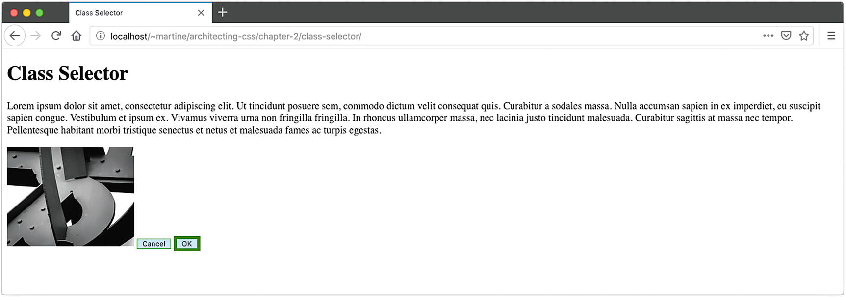
At-Rules
The CSS at-rules (so-named because of the @ or “at” symbol in the name of each) are language features that provide some control over the structure of your styles. Among other things these rules provide a mechanism for collecting or grouping other rulesets.
@import
In Chapter 1 we looked at three ways to include CSS in an HTML document, including the <link> element. The @import at-rule provides a similar function for CSS. Both of these include pull mechanisms in a CSS file, effectively inserting its contents at the position of the import statement.
This is very useful as it allows us to break up style sheets into more logical and manageable files without any impact on the HTML document. See Chapter 7 for a more in-depth discussion of @imports along with other mechanisms for pulling in external style sheets.
@supports
The @supports at-rule allows rules to be applied based upon specific support of CSS features by the user agent. This is a way to provide styling and formatting based upon what a web browser declares support for, rather than using old-school hacks in an attempt to detect if a given rule will work as expected.
At-Rules HTML
At-Rules CSS
At-Rules, text-underline-offset Supported in Firefox

At-Rules, text-underline-offset Not Supported in Opera
@media
The CSS media at-rule is used to perform queries against the system, environment, or user agent. This use is called a media query .
“Media Queries allow authors to test and query values or features of the user agent or display device, independent of the document being rendered. They are used in the CSS @media rule to conditionally apply styles to a document, and in various other contexts and languages, such as HTML and JavaScript.”
—Media Queries Level 41
Printer-Friendly Design
Additional control over printing can be obtained by providing page-specific instructions using the @page at-rule.2
Tablet-Friendly Icon
Summary
Specify printer-specific layout and designs
Insert document icons based upon the file extension using nothing but CSS
Combine multiple selectors together into more advanced expressions
Highlight alternating rows on a table
Provide alternate styles based upon browser and device capabilities
The next chapter covers the cascading part of Cascading Style Sheets and demystifies the process by which a user agent decides the values of every property of every element on the page.