Chapter 5
Handling Multiple Screen Resolutions with CSS 3
One of the hardest things to deal with when designing websites is the myriad of different user configurations you might encounter. Modern web browsers and operating systems are highly configurable, and different options can affect how your web application is viewed. In this chapter, we’ll talk specifically about screen resolution—or the number of pixels on the screen—and how one can accommodate varying resolution settings using CSS 3.
A History of Tired Eyes and Resolution Evolution
If you’ve ever used a computer late into the night, perhaps after a long day of work, you might have discovered a helpful trick: You can change the size of the objects on the screen to make reading them easier on your eyes. This generally involves changing your computer’s display resolution. The resolution is simply the number of pixels that are displayed by your screen and is given in two numbers—the first for the number of pixels wide, the second for the number of pixels tall (i.e., height). By changing resolution, most often by scaling it down from something high, such as 2560 × 1600 (incidentally, what I’m using as I type this page at 7 PM at night), to something lower (perhaps 1600 × 1200—a good 11 PM resolution) you’re taking away individual pixels, which means that items on your screen will appear larger.
In the late 1990s, as people began to surf the web in larger numbers, the standard resolution was known as VGA (for Video Graphics Array) and it was commonly set as 640 × 480. As time went by and monitors became larger, cheaper, and more efficient, most users adopted SVGA (the S being for Super—honestly!), at 800 × 600. This gave way to XGA (Extended Graphics Array—thankfully not Xtreme) at 1024 × 768, and larger. Today, my monitor is displaying WQHD (Wide Quad High Definition) at the aforementioned 2560 × 1600.
As you can imagine, web designers have struggled with screen resolutions for years, ever since 640 × 480 went out of style. They eventually diverged into two camps—those who supported designing for one resolution (a “fixed-width”), and those who designed for multiple resolutions (“flexible-width”). The fixed-width folks believe that the best web design is one in which you are absolutely sure that all users are seeing your website as close to the way you designed it as possible. This means picking a resolution, such as 1024 × 768, and designing your page to make use of that space (see Figure 5–1). If the user has a larger resolution set, your page will simply have extra space at the sides, but the tables and placement will remain where you want them, within your 1024-pixel width (see Figure 5–2). If the user has—horrifyingly—a smaller resolution, then your content will take up more of the screen than they have to give, and they’ll be forced to use the absolutely dreaded horizontal scroll bar for your page.
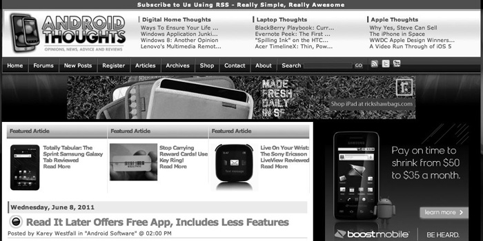
Figure 5–1. An example of a Fixed-Width Webpage at 1024 × 600 resolution
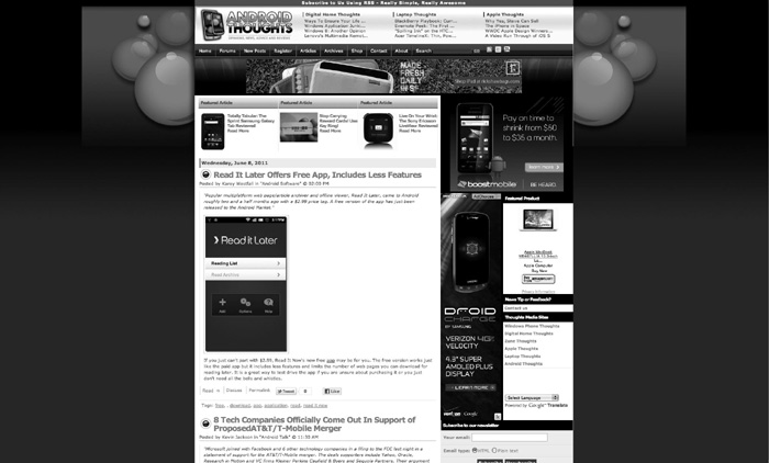
Figure 5–2. The same page at 2048 × 1536 resolution. Note the wide black bars on the sides
In comparison, a flexible-width layout will try to accommodate resolutions of all sizes (see Figures 5–3 and 5–4).
Figure 5–3. An example of a Flexible-Width Webpage at 1024 × 600 resolution
Figure 5–4. The same page at 2048 × 1536 resolution
By now, you might have started looking at your smartphone or tablet and thought, “Hmm… wonder what the resolution is on this thing?” You know what? That’s what most of the designers of mobile web pages are wondering too. Currently, with Android activations hovering around 350,000 new devices a day, designers and developers alike are realizing they need to make drastic changes in their approach to web application development in order to stay relevant with the vast array of devices we use daily to view the web. It’s a hard game to play if you favor a fixed-width approach: What resolution do I build my mobile app for? There are some easy answers (“Well, most people have iPhones, I’ll just build for that”), but they have their downfalls (“What?!? They made a BIGGER iPhone called an iPad… uh oh…”). By targeting specific devices, you also tend to annoy users of any device other than your target.
In this chapter, we’ll offer you a bit of “screen resolution.” That is to say, we’ll attempt to solve the problem by discussing how your mobile web application can actually be intelligent enough to understand the resolution, and even the orientation, of the device that your user is using and adapt automatically for it. It’s almost as if you’ll be coding up a small brain that says “Hmm, this device has a lot of width; let’s show everything we can” or “Oh, no; this is a small screen. We can’t show this information side by side!” As a designer, we can harness the small brain and make it even more intelligent, by letting it display the same content in a variety of different ways to different devices and—by extension—different users. Let’s begin with an example.
The Daily Droid
Imagine you’ve decided to start publishing a daily newspaper for Android users and you’ve come up with a great title: The Daily Droid. The only problem is that some of your users are using a Motorola Xoom, which has a resolution of 2048 × 1536; some are using a Samsung Galaxy Tab (a 1024 × 600 resolution); and still others are using the Roccwest XTreme, which for some odd reason has a resolution of 1280 × 800. If you were to target one of these devices, the other two wouldn’t look quite right using a fixed width. Thankfully, we can write one page that will look fine in all three—see Figures 5–5 through 5–7:
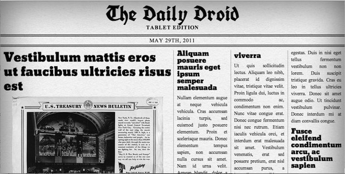
Figure 5–5. The Daily Droid at 1024 × 600 resolution
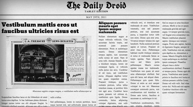
Figure 5–6. The Daily Droid at 1280 × 800 resolution
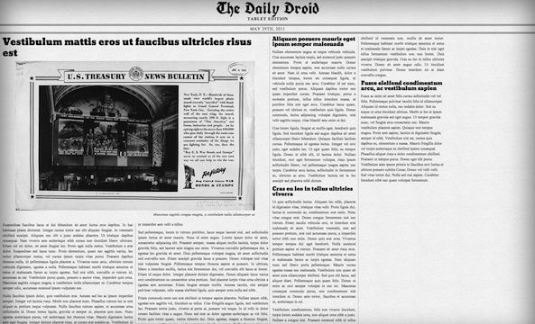
Figure 5–7. The Daily Droid at 2048 × 1536 resolution
Comparing these figures side by side can be very surprising—the content is exactly the same, but the layout has shifted quite markedly. The even more amazing part is that this is the same page—our developer was able to create it once and make it smart enough to react appropriately at these three different resolutions1.
But what about our friends without tablets? Well, with a tiny bit of work, we can also accommodate them with the Daily Droid Smartphone Edition, as shown in Figure 5–8 (portrait orientation) and Figure 5–9 (landscape).
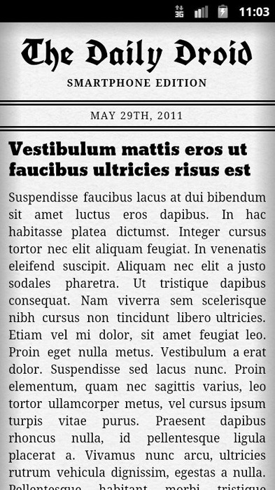
Figure 5–8. The Daily Droid at 480 × 859 resolution
__________
1 In this case, the developer (Rocco) had no idea what resolutions the guy writing the narrative (Jon) was going to pick, and yet the page still looks great.
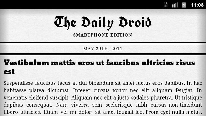
Figure 5–9. The Daily Droid at 859 × 480 resolution
Let’s take a look at the code behind the Daily Droid to discover both how the page is built, and how we determine if it should say “Smartphone” or “Tablet” edition. We’ll go over the HTML in the next section and then the CSS in the following section. Reading through the following code, you should, based on the comments, get a sense of what each section is doing.
The Daily Droid’s Base HTML Code
We’ve broken the HTML it into several parts, so you can go through it in manageable pieces. In the first part, shown in Listing 5–1, we create the initial HTML layout and specify the two different headers.
Listing 5–1. HTML Code for The Daily Droid part 1
<!DOCTYPE HTML>

<html>

<head>

<meta http-equiv="Content-Type" content="text/html; charset=utf-8">

<meta charset="utf-8">

<title>The Daily Droid</title>

<meta name="description" content="An Android Responsive Web Design Demonstration.">

<meta name="author" content="Rocco Augusto">


<!-- Here we set the viewport so the device knows that this page is not one that can

scale/zoom -->

<meta name="viewport" content="width=device-width; initial-scale=1.0; maximum-scale=1.0;

user-scalable=0;" />

<link href="style.css" rel="stylesheet" type="text/css" >


<!-- Here we pull in two fonts from the Google Font API database -->

<link href="http://fonts.googleapis.com/css?family=UnifrakturCook:bold" rel="stylesheet"

type="text/css">

<link href='http://fonts.googleapis.com/css?family=Bevan' rel='stylesheet' type='text/css'>
</head>


<!--

    HEADER

    We are adding two different sub headings (h6) to this page.

    One heading will be for the "Smartphone Edition" of the

    page and the second will be for the "Tablet Edition"

    of the page. Both pages are the same but depending on

    the screen size the pages CSS will tell the browser which

    subheading to display.

-->

<header id="mast">

    <hgroup>

        <h1>The Daily Droid</h1>

        <h6>Smartphone Edition</h6>

        <h6>Tablet Edition</h6>

    </hgroup>

    <time datetime="2011-05–29">May 29th, 2011</time>

</header><!-- /HEADER -->
As you can see from the code in Listing 5–1, both the Smartphone Edition and Tablet Edition text appear in the HTML. The CSS (discussed in “The Daily Droid CSS” later in this section) will select the correct one to display. In part 2 of the HTML, shown in Listing 5–2, we’ll lay out the content and article space, and then finish up the HTML structure.
Listing 5–2. HTML code for The Daily Droid, part 2
<section id="content">

    <!--

        SECTION: FEATURED ARTICLES

        The featured article would be the main article on the page

        that will be featured. Think of it in this sense as the

        front page story on a newspaper - which makes sense since

        this demo's completed code would be a mock vintage newspaper

        layout.


        The article contains several sections. You have the header

        section which contains the title of the article as well as

        a "figure" or image that would be displayed with the article

        and any caption text that would go along with it.

   -->

  <section id="featured">

      <article>

          <header>

          <h1>Title goes here...</h1>

               <figure>

                  <img src="ww1647-05.jpg" width="100%" alt="" />

                  <figcaption>Figure caption...</figcaption>

              </figure>

         </header>

         <div class="entry">

              <p>Article content goes here...</p>

          </div>

      </article><!-- /ARTICLE -->

  </section><!-- /SECTION: FEATURED ARTICLES -->


  <!--

      SECTION: REGULAR ARTICLES
      The regular articles on this page will be housed in this

      section of the document. The markup of this section is

      exactly the same as the featured articles section. The only

      difference will come down to how they are displayed based

      off their assigned styles.

   -->

  <section id="regular">

      <article>

          <header>

              <h2>Title...</h2>

          </header>

          <div class="entry">

              <p>Body Content...</p>

         </div>

     </article><!-- /ARTICLE-->

  </section><!-- /SECTION: REGULAR ARTICLES -->


</section><!-- /SECTION: CONTENT -->

<body>

</body>

</html>
Now let’s turn to the CSS and the visual presentation of The Daily Droid.
The Daily Droid’s Semi-magical CSS Code
Now here’s the CSS Style Sheet used to set the overall appearance of The Daily Droid. CSS, as you remember, will take the plain HTML structure explained in the preceding section and apply various styles to the tags, as we specify. We’ve broken the CSS into several parts to help explain what it does. The first part, as shown in Listing 5–3, sets how the body text and some of the headings should look.
Listing 5–3. CSS Code for The Daily Droid, part 1
/*

    CSS reset code only for the elements that will be

    used in our code. We could use a more robust CSS reset

    solution, but I am a firm believer that you should not

    riddle your stylesheet with code that you have no

    intention of using in your markup.

*/

html, body, h1, h2, h6, p, article, figure, figcaption header, hgroup, section {

    padding:0;

    margin:0;

}

/*

    General global styles to be used throughout the demo

*/

html, body {

    width:100%;

    overflow-x:hidden;

}

body {

    font-size:14px;

    font-family:"Times New Roman", Times, serif;

    line-height:20px;
    background:url(bg.png);

    -webkit-box-shadow: inset 0 -5px 300px rgba(153,99,38,1); /* This inset box-shadow

adds gives the page a nice vintage feel to it */

    box-shadow: inset 0 -5px 300px rgba(153,99,38,1);

}

h1, h2 {

    font-weight:normal;

}

h1 {

    font-size:36px;

    line-height:42px;

}

h2 {

    font-size:20px;

}

h6 {

    font-size:16px;

    text-transform:uppercase;

}

p {

    margin:10px 0;

}

/*

    Header/Mast CSS code

*/

#mast {

    padding:20px 0 00;

    text-align:center;

    letter-spacing:1px;

}

#mast h1 {

    font-family:'UnifrakturCook', Georgia, "Times New Roman", Times, serif;

    font-size:62px;

    line-height:48px;

}
Now that we’ve got some of the CSS in place, it’s time to see the code that switches between the “Tablet” and “Smartphone” edition. By default, we want to display Tablet Edition, so that code is shown in Listing 5–4:
Listing 5–4. CSS Code for The Daily Droid, part 2
#mast h6 {

    display:none; /* hiding both of the pages subheaders */

}

#mast h6:nth-child(3) {

    display:block; /* displaying the "Tablet Edition" subheader by default */

}

#mast time {

    display:block;

    margin:10px 0;

    border-top:double 6px #000;

    border-bottom:double 6px #000;

    text-transform:uppercase;

    font-size:16px;

    line-height:24px;

}

/*
  Article/Content styles.

  This section will rely heavily on two new features

  of CSS3: Flexible Box Model and Columns.


  The Flexible Box Model is probably one of my favorite

  new features of CSS3. In a nutshell, it allows one to

  take control of how their page is laid out, using a grid

  of flexible boxes and essentially eliminating the need to

  hack together layouts by improperly using floats in one’s

  code.


  CSS3 Columns are another time saving new feature of CSS3

  and allow a designer/developer to take a block of code

  and automatically convert it into a column based layout

  that is just perfect for a newspaper demonstration.

*/

#content {

    padding:0 10px;

    display:-webkit-box; /* here we are using the -webkit-box argument instead of

        plain old "box," so our code will work across newer and

        older Android browsers*'

    */

    -webkit-box-orient: horizontal; /* setting the box orientation to horizontal

        displays the content in this container from

        left to right instead displaying the content

        in the traditional way of top to bottom */

}

#featured {

    max-width:50%; /* our featured article will take up half the width of the display */

    height:100%; /* our featured article will take up all of the available height of the

display */

    box-flex:1; /* tell our child elements to be evenly sized and take up one "box"

space */

    -webkit-box-flex:1;

}

#featured .entry {

    -webkit-column-count: 2; /* this will display our featured content article text in 2

columns */

    -webkit-column-gap: 20px; /* here we add a hearty 20px gap/spacing between our

columns */

    -webkit-column-rule: 1px solid rgba(91,58,21,0.5); /* here we are adding a border to

our columns */

}

#regular {

    margin-left:5px;

    padding-left:10px;

    max-width:49%;

    box-flex:1;

    -webkit-box-flex:1;

    -webkit-column-count: 3;

    -webkit-column-gap: 20px;

    -webkit-column-rule: 1px solid rgba(91,58,21,0.5);

    border-left: 1px solid rgba(91,58,21,0.5);    /* here we are adding a border to the

#regular container to match the rest of the columns' borders */

}

#regular article {
    display:inline; /* displaying our articles inline prevents our articles from

stacking on top of each other */

}

article h1, article h2 {

    margin-bottom:10px;

    font-family:Bevan, "Times New Roman", Times, serif;

}

article .entry {

    text-align:justify; /* to give the page a more realistic feel we will justify the

column text */

}

article figure {

    width:90%;

    padding:0;

    margin:10px auto 20px auto;

}

articlefigcaption {

    font-style:italic;

    text-align:right;

}
Now we’ll set up the Smartphone code (in Listing 5–5) and adjust the layout accordingly.
Listing 5–5. CSS Code for The Daily Droid, part 3
/*

    Android Smartphone Devices

    Here we will use CSS3 media queries to determine

    the resolution of our screen and present the user with

    a completely different layout if their viewing

    does not meet certain requirements.


    Here we are targeting smartphone devices that will,

    on average, have a width of 320px (portrait) and up

    to 569px (landscape).


    This layout will display the content in a more

    commonly used smartphone style layout, presenting the

    user with a list of articles that they can scroll up

    and down to view.

*/

@media screen and (min-width: 320px) and (max-width: 569px) {

    body {

        -webkit-box-shadow: inset 0 -5px 50px rgba(153,99,38,1); /* lessen the shadow on

the page to adjust to the screen's new dimensions */

        box-shadow: inset 0 -5px 50px rgba(153,99,38,1);

    }

    h1 {

        font-size:20px;  /* lower the size of the header font to accommodate the smaller

screen resolution */

        line-height:24px;

    }

    h6 {

        font-size:12px; /* same as the h1 above it */

    }

    #mast h1 {

        font-family:'UnifrakturCook', Georgia, "Times New Roman", Times, serif;

        font-size:42px;
        line-height:42px;

    }

    #mast h6:nth-child(2) {

        display:block; /* since we are dealing with a smaller screen we will show the

"Smartphone Edition" subheader */

    }

    #mast h6:nth-child(3) {

        display:none; /* and hide the "Tablet Edition" subheader */

    }

    #mast time {

        font-size:12px;

        line-height:24px;

    }

    section#content {

        -webkit-box-orient: vertical; /* here we are telling this content to display

vertically instead of horizontally */

        padding-bottom:15px;

    }

    #featured {

        max-width:100%; /* take up the entire width of the screen instead of half of it

*/

    }

    #featured .entry {

        -webkit-column-count: 1; /* only display our text in a single column, which is

more appropriate for our screen real estate */

        -webkit-column-gap: 0; /* remove the 20px padding around columns */

        -webkit-column-rule: none; /* remove the border off our columns */

    }

    #regular {

        margin-left:0px;

        padding-left:0px;

        max-width:100%; /* like our featured article we will now take up the entire

width of the page */

        -webkit-column-count: 1; /* like our featured article we will display a single

column of text */

        -webkit-column-gap: 0;

        -webkit-column-rule: none;

        border-left: none;

    }

    #regular article {

        display:block; /* display our articles as blocks so they appear vertical */

    }

    article .entry p, article figure {

        display:none; /* hide all of our article content so the user is not stuck

scrolling into oblivion */

    }

    article .entry p:first-child {

        display:block; /* display only the first paragraph of an article for the user */

    }

    article {

        margin-bottom:10px;

        border-bottom:2px solid rgba(0,0,0,1);

    }

}
This is a lot of code for a simple newspaper; however, the beauty of it is in its versatility: One HTML page and one CSS page to rule all devices—phones, tablets, Android Media players, and whatever else someone puts Android on! Let’s take a moment to discuss how this magic happens, using media queries.
Media Queries
When you looked at the preceding code, the first thing that you probably noticed is that the very fluid vintage newspaper layout that was programmed consists of only two relatively small files of code. Five to seven years ago, in a land where web developers had to wear two different hats—web developer hat and Internet Explorer 6 hacker hat—creating a layout such as this would have been a ridiculously cumbersome task that would have most likely consisted of two, if not more, completely different layouts. Each layout would have had to be its own set of HTML and CSS files, displayed to the client by some backend server code that looked up your device’s user agent string. Mobile devices would have been served the HTML and CSS templates designed specifically for mobile devices. Desktop computers would have been served desktop equivalent templates. There was no melding or fluidity between the code versions.
Fast forward a few years into the future—where we sit at the dawn of HTML5 and CSS3—and the landscape is completely different. Currently we live in a world where Desktop Internet browsers are being developed and released faster than most users can get around to installing the most recent update. On the mobile front, it is almost equally as progressive, with new versions of the Smartphone's operating systems, and in turn new feature rich versions of their Internet browsers, being released every six to twelve months, if not sooner!
What that means for you, the mobile web developer, is that you are not stuck in the past, coding your sites for browsers that are a decade old if not older. At the most, as a developer targeting the Android user experience, you really only have to worry about developing for the last year and a half of Android releases. The ability to focus on newer devices without worrying about hindering your user’s experience by focusing too much on past technologies gives developers a certain freedom that we did not possess before. With that freedom comes innovation and with innovation comes better technology and features—such as CSS3 media queries—the technology that is responsible for letting us create the beautiful “The Daily Droid” demo that we previously built.
Media queries have, in some form or other, been a part of web development since the days of HTML4. During that dark shadowy time of font tags and nested tables, media types made their big claim to fame by controlling styles and style sheets associated with the medium in which the user would be using to view the content (see Figures 5–10 and 5–11). For instance, a developer would assign some styles to the “print” media type to remove all advertisements from printed articles on a blog so their user would not unnecessarily use up their expensive ink when trying to print the blog's content (see Listing 5–6).
Listing 5–6. Media Query Example 1: Hiding or showing a block based on media type
<style type="text/css" media="screen">

    #advertisements {

        display:block;

    }

</style>


<style type="text/css" media="print">

    #advertisements {

        display:none;

    }

</style>
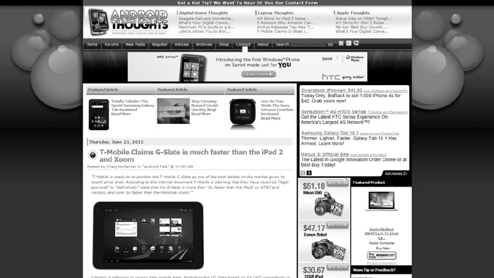
Figure 5–10. The Android Thoughts homepage viewed in a normal Desktop web browser
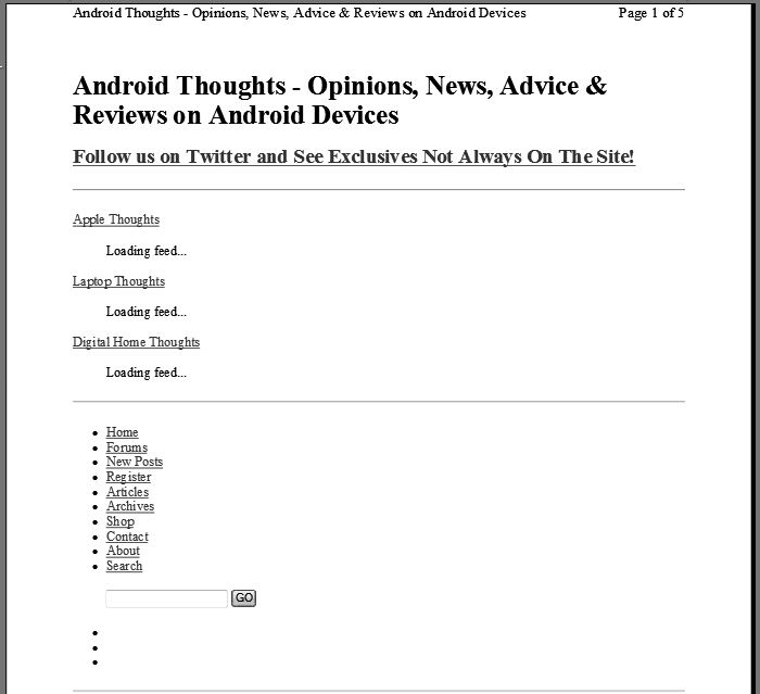
Figure 5–11. The same Android Thoughts web page viewed when printed
A developer could also assign styles or style sheets to the “projection” media type, to account for washed out colors in a site’s header when viewing a project on a projector in a meeting room (see Listing 5–7).
Listing 5–7. Media Query Example 2: Changing background color based on media type
<style type="text/css" media="screen">

    #header {

        background: #444444;

    }

</style>


<style type="text/css" media="projection">

    #header {

        background: #111111;

    }

</style>
However, with CSS3, the concept of media types has evolved into something much more beautiful and flexible, which gives Cascading Style Sheets the ability not to be just a “dumb” mechanism for adding style to documents and markup made for the web. Media queries are something that, when used, feel like they should have been a part of CSS from the very beginning. I have heard some friends of mine refer to media queries as “freedom” and have even heard one developer I know—granted, after a very long night of coding—refer to media queries simply as the new “black magic” of the digital age. In reality, they are neither. Media queries serve as a tool that, when mastered, will make your job as a developer easier and at the end of the day will give you a beautifully flexible layout that instantly transforms to your user’s viewing medium, right before your eyes!
If you have worked with JavaScript or any other scripting or programming language of the past, then media queries will probably be easy for you to learn. Basically, what one is doing is assigning logic to their style sheets that will let the browser on the client side do all of the heavy lifting when it comes to assigning the right template styles to the right viewing device. The following is a very basic example of using CCS's media queries:
<linkrel="stylesheet" media="screen and (orientation:portrait)" href="portrait.css" />
In this example, we are telling the client’s browser to load the “portrait.css” stylesheet when the browser is viewing the application, or website, from a mobile device that is in the vertical position.2 One is not limited to assigning media queries to the link tag. Media queries can also be added directly to your device’s CSS files, as we saw with the preceding example of “The Daily Droid”. In fact, one can even go as far as invoking media queries when using the @import rule to call a CSS file for the correct display as in the following example:
<style type="text//css">

    @importurl(landscape.css) screen and (orientation:landscape);

</style>
In the following example, we will have several @import rules importing in many different CSS files for different layout types (see Listing 5–8).
Listing 5–8: Media Query Example 3
<style type="text//css">

    <!-- Styles for a smartphone landscape display -->

    @import url(landscape.css) handheld and (orientation:landscape) and (max-

width:480px);


    <!-- Styles for a Honeycomb tablet landscape display -->

    @import url(landscape.css) handheld and (orientation:landscape) and (max-

width:648px);


    <!-- Styles for a portrait display -->

    @import url(landscape.css) all and (orientation:portrait);

</style>
__________
2 Devices that have sensors to detect movement typically will tell the software if the phone is switched from landscape to portrait view, allowing your web page to reformat automatically based on the styles you define.
I know exactly what you’re thinking, “What if I have to code my web application to match a Google TV Android device hooked up to a television or device with a 16×9 display?!” Well don't you fret because the flexible nature of CSS3 media queries has you covered, as it does in the following example:
<link rel="stylesheet" media="all and (device-aspect-ratio: 16/9)" href="television.css"

/>
As you can see from these preceding examples, media queries are an incredible tool in any web developer’s arsenal in a world that is quickly becoming dominated by HTML5 and CSS3 capable devices and applications. To learn more about the power of Media Queries, check them out on the W3.org website here—www.w3.org/TR/css3-mediaqueries/#media0.
Summary
In this chapter, we’ve talked a lot about the size of your web pages and how that size can change based on the screen used to view the content. Now that we’ve got the screen resolution issue out of the way, we'll zoom in a bit and address the best ways to handle different browsers!