
Chapter 5 presented a variety of text manipulation properties. This chapter continues the discussion of text manipulation with CSS's font manipulation properties. CSS includes a variety of properties that change the face, size, and style of a font. This chapter covers:
The
font-familyproperty and how it is used to change the face of a fontThe
font-styleproperty and how it is used to make a font italic or obliqueThe
font-variantproperty, a property similar to thetext-transformproperty presented in Chapter 5, and how this property is used to create a small-caps effectThe
font-weightproperty and how it is used to increase or decrease how bold or light a font appearsThe
font-sizeproperty and how it is used to increase or decrease the size of a fontThe
fontproperty and how it is used as shorthand to specify a number of other font properties
I begin the discussion of CSS's font properties with the font-family property.
The font-family property is used to specify fonts. The following table outlines the font-family property and the values that it allows.
Property | Value |
|---|---|
font-family | [[ <family-name> | <generic-family> ] [, <family-name>| <generic-family>]* ] Initial value: Varies depending on the browser or user agent. |
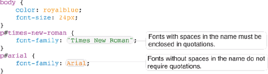
Figure 6-1a is an example of the basic use of the font-family property.
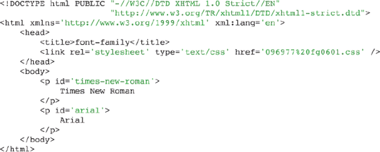
The rules in Figure 6-1a are combined with the markup in Figure 6-1b.
The CSS and markup in Figures 6-1a and 6-1b result in the output in Figure 6-1c.
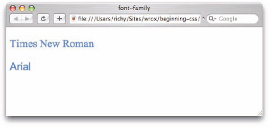
The example is pretty straightforward. Times New Roman is applied to the first paragraph with the id name times-new-roman, and Arial is applied to the second paragraph, with id name arial. There is one fundamental difference between the two: Times New Roman appears enclosed in double quotes. The name of the font itself contains white space, and so enclosing the name of the font in quotes prevents the browser from getting confused. The second example, which specifies an Arial font, does not appear enclosed in quotes because no white space appears in the name of the font.
The notation for the font-family property can accept one or more fonts for its value, which is what is meant by the repetition of the syntax in the notation and the presence of the asterisk. The asterisk indicates that the syntax may be repeated one or more times, and a comma is used to separate each font name provided. You can specify two types of fonts. The first is documented as <family-name> in the preceding table. The <family-name> notation refers to fonts installed on the user's computer, which means that the available fonts depend on the user's operating system and the fonts available to that operating system. The <generic-family> notation refers to a small subset of predefined fonts that can be expected to always be available; this is discussed shortly.
The available font families that can be specified vary depending on the operating system. Using a default installation, Windows does not provide the same fonts as Mac OS X, for instance. Furthermore, the available fonts also vary depending on the programs installed on the user's computer. For instance, Microsoft Office installs a number of extra fonts in addition to those that ship with Mac OS X or Windows. In fact, with the exception of a few fonts, Mac OS X with Microsoft Office installed provides pretty much the same fonts as installed on Windows. Without Microsoft Office installed, however, many Windows fonts are not available on the Mac platform.
It is for this reason, the possibility of font inconsistencies, that the font-family property is dynamic. It can accept more than one font as its value. The browser will use the first font provided that is installed and available on the end user's computer. The browser will fall back to the next font in the list in the event that previous fonts are not available. So subsequent fonts in the list are called fallback fonts. This capability is provided because it is difficult to foresee which fonts will be available on the user's computer.
It is best to test your web page on several different platforms using different browsers on different operating systems to ensure that your fonts are working as you intend them to. Providing fallback fonts ensures consistency of fonts. Take for example the rule in Figure 6-2a.

The CSS in Figure 6-2a is combined with the markup in Figure 6-2b.
The CSS and markup in Figures 6-2a and 6-2b produce the results shown in Figure 6-2c.

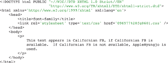
In the example in Figure 6-2, two fonts are specified as the value of the font-family property. This allows you to specify a fallback font. In this case, if Californian FB (common to Windows computers) is not installed on the user's computer, the browser attempts to display the AppleMyungjo font (common to Macintosh computers). If neither font is available, the browser uses its default font, which is the same as the font used when no font is specified and varies depending on the browser. The font-family allows a potentially unlimited list of fonts to be specified, meaning that you can specify as many fonts as you'd like to fall back on. It may also be possible that you do not have any of these fonts, since certain software packages such as Microsoft Office, and Adobe Creative Suite install various fonts along with the software; fonts available will vary from computer to computer.
The effect of the following code is that the browser goes through the list of comma-separated fonts until it finds one that it is capable of displaying:
p {
    font-family: Arial, Shruti, "Microsoft Sans Serif", Tahoma, Mangal, Helvetica;
}
CSS provides a couple of generic fonts, serif, sans-serif, monospace, fantasy, and cursive, that you can always rely on being installed.
As I mentioned in the previous section, the available fonts vary from operating system to operating system. They can vary even more with individual user's computer systems because even more fonts can be installed along with certain programs. The only way to maintain consistency displaying from platform to platform is to provide either a list of font families (so a fallback font can be called upon if the desired font is not installed) or to specify a generic font. Generic fonts are a set of basic fonts that are available regardless of the user's operating system.
The following table outlines the generic font family names defined in CSS.
Generic Font | Resembles |
|---|---|
serif | Times, Times New Roman |
sans-serif | Helvetica, Arial |
cursive | Zapf-Chancery |
fantasy | Western |
monospace | Courier, Courier New |
Generic fonts are often mapped, by the browser, to other fonts that already exist on the system. For example, on Windows, IE maps the sans-serif font to Arial and the serif font to Times New Roman. In fact some browsers provide user-configurable generic fonts. In Firefox, for example, you can set the font used for the serif, sans-serif, cursive, fantasy, and monospace generic fonts.
The generic font names display fonts similarly in different browsers and operating systems. Figure 6-3 shows generic font output in various browsers, as they appear by default.

Figure 6-3 shows how various browsers render generic fonts. From the output shown in those figures, you can see that generic font rendering is not exactly identical between browsers and platforms. Fonts that display consistently are serif, sans-serif, and monospace. Because of the wildly varying differences in rendering of the fantasy and cursive fonts, designers seldom use these two fonts.
In the notation for the font-family property documentation, <generic-family> refers to the possible specification of a generic font name. Often a generic font is included as a last fallback option, as shown in the following rule:
P  {
   font-family: Arial, Shruti, Tahoma, Mangal, Helvetica, sans-serif;
}
The addition of sans-serif to the end of the font list for the font-family property means that as a last resort, if none of the other fonts specified are installed on the user's computer, the generic sans-serif font should be used.
Use the following Try It Out to experiment with the font-family property for yourself.
Try It Out: Applying the font-family Property
Example 6-1. Follow these steps to experiment with the font-family property.
Write the following markup in your text editor:
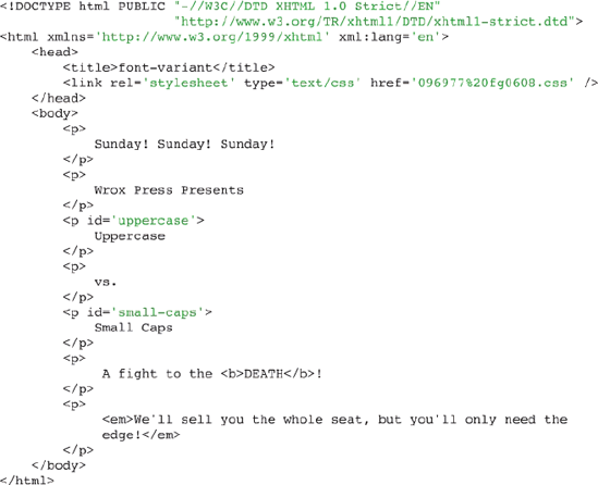
<!DOCTYPE html PUBLIC "-//W3C//DTD XHTML 1.0 Strict//EN"
                      "http://www.w3.org/TR/xhtmll/DTD/xhtmll-strict.dtd">
<html xmlns='http://www.w3.org/1999/xhtml' xml:lang='en'>
    <head>
        <title>font-family</title>
        <link rel='stylesheet' type='text/css' href='Example_6-1.css' />
    </head>
    <body>
        <p>
            The font-family property allows you to specify a
            <span class='fontl'>font face</span>.
            It has the built-in ability of allowing you to
            <span class='font2'>specify fallback fonts</span>,
            <span class='font3'>
                fonts that are used when your first choice
                (or choices) aren't installed on the end user's OS
            </span>.
            Even though, these days, because of the dominance of the
            <span class='font4'>Windows platform</span>,
            cross-platform fonting is less of an issue.
        </p>
    </body>
</html>
Save
Example_6-l.html.Write the following CSS in your text editor:
body {
    font: 14px sans-serif;
    line-height: 30px;
}
span {
    background: mistyrose;
    border: 1px solid pink;
}
span.font1 {
    font-family: "Perpetua Titling MT", serif;
}
span.font2 {
    font-family: "Baskerville Old Face", serif;
}
span.font3 {
    font-family: "Lucida Bright", monospace;
}
span.font4 {
    font-family: Herculanum, "Eras Demi ITC", sans-serif;
}
Save the CSS as
Example_6-1.css.The results of these modifications are shown in Figure 6-4.

In Example 6-1, you made use of four examples of the font-family property. Following is a review of each of the four relevant rules.
The first example of the font-family property you used was applied to the <span> element with class name font1. It is given the Perpetua Titling MT font face, which is enclosed in quotations because the font name contains spaces. As you can see in the screenshot of Safari and IE 6 in Figure 6-4, this font works on both Mac and Windows platforms.
span.font1 {
    font-family: "Perpetua Titling MT", serif;
}
In the second example, you specify the Baskerville Old Face font, which is again present on both Mac OS X and Windows.
span.font2 {
    font-family: "Baskerville Old Face", serif;
}
In the third example, you specify the Lucida Bright font, and like the previous two, this font is present on both Mac OS X and Windows. The generic font, monospace, is specified as a fallback font, just in case Lucida Bright is not installed on the end user's OS.
span.font3 {
    font-family: "Lucida Bright", monospace;
}
Finally, in the last example you encounter a font that is not shared between Mac and Windows, Herculanum, which is installed on Mac OS X. On Windows, the browser falls back to Eras Demi ITC, and if neither of those fonts are present, the browser falls back to the generic sans-serif font
span.font4 {
    font-family: Herculanum, "Eras Demi ITC", sans-serif;
}
In the next section, I discuss how to make text italic or oblique with the font-style property.
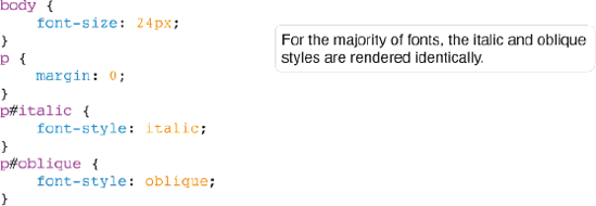
The font-style property is used to switch between styles provided by a particular font. Those styles are italic or oblique, and they are a part of the font itself. The following table outlines the possible values for the font-style property.
The italic and oblique values are, with most fonts, indistinguishable in how they render. Consider the example in Figure 6-5a.
Combine the rules in Figure 6-5a with the markup in Figure 6-5b.

Figure 6-5c shows that the oblique and italic values are identical.
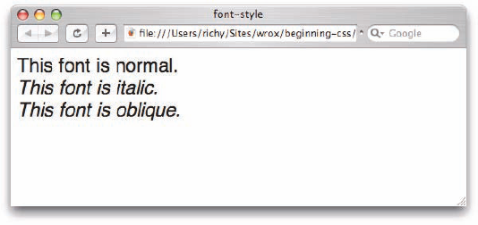
This test of the oblique and italic values shows that if the font has an italic style, that italic style is used when either the italic or oblique values are specified, there is no difference between the two values. This behavior is identical when viewed in IE, Opera, or Firefox. In my experience, because it is identical to the italic style, and the browser will automatically select the italic style if a font has no oblique style and vice versa, I have never seen the oblique style actually used in real-world sites.
However, not all fonts have an italic style or an oblique style. Consider the example in Figure 6-6, which demonstrates what happens when a font has neither an italic nor an oblique style.

Combine the style sheet in Figure 6-6a with the markup in Figure 6-6b.

Figure 6-6c shows Monotype Corsiva, a font that has neither an italic style nor an oblique style—it has only one style.
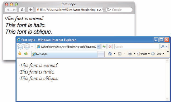
In Figure 6-6c, you can see that Safari and IE treat fonts that do not have an italic or an oblique style differently. Safari falls back on the default font, rather than rendering the font. IE just ignores the italic and oblique styles and goes ahead and renders the font.
In the following Try It Out you experiment with the font-style property.
Try It Out: Applying the font-style Property
Example 6-2. Follow these steps to try out the font-style property.
Write the following markup in your text editor:
<!DOCTYPE html PUBLIC "-//W3C//DTD XHTML 1.0 Strict//EN"
                      "http://www.w3.org/TR/xhtmll/DTD/xhtmll-strict.dtd">
<html xmlns='http://www.w3.org/1999/xhtml' xml:lang='en'>
    <head>
        <title>font-style</title>
        <link rel='stylesheet' type='text/css' href='Example_6-2.css' />
    </head>
    <body>
        <p>
            When it comes to the font-style property,
            <span class='oblique'>oblique</span> and
            <span class='italic'>italic</span> are interchangeable.
        </p>
        <p class='naught'>
            Some fonts have neither an oblique nor an italic style.
            Safari differs from IE, Firefox, and Opera on what to do
            when one of these is encountered.
        </p>
    </body>
</html>
Save the preceding markup as
Example_6-2.html.Write the following CSS in your text editor:
body {
    font: 14px sans-serif;
    line-height: 30px;
}
span {
    background: yellow;
    border: lpx solid gold;
}
span.oblique {
    font-style: oblique;
}
span.italic {
    font-style: italic;
}
p.naught {
font-family: "Monotype Corsiva"; font-style: italic; }
Save the preceding CSS as
Example_6-2. css.The example results in the output in Figure 6-7.

In Example 6-2 you experimented a bit with the font-style property. You found that browsers use the italic and oblique style interchangeably as evidenced by the following two rules.
First you applied the oblique font style to the <span> element with class name oblique.
span.oblique {
font-style: oblique;
}Then you applied the italic font-style to the <span> element with class name italic. In Figure 6-7 you can see that the rendered output of the italic and the oblique style are indistinguishable.
span.italic {
font-style: italic;
}Finally in the last example you specified a font with neither an oblique nor an italic style, Monotype Corsiva. In Figure 6-7, you can see that Safari differs from IE, Firefox, and Opera in what it does when a font with neither an italic nor an oblique style is set to either italic or oblique. Safari ignores the font altogether, while IE, Firefox, and Opera just ignore the italic or oblique style.
p.naught {
font-family: "Monotype Corsiva";
   font-style: italic;
}In the next section, I introduce the font-variant property.
The font-variant property provides an effect that is only slightly different from that of the text-transform: uppercase; declaration presented in Chapter 5. The following table outlines the font-variant property and its possible values.
Property | Value |
|---|---|
font-variant | normal | small-caps Initial value: normal |
The font-variant: small-caps; declaration causes letters to appear in uppercase but scaled slightly smaller than capitalized letters. Consider the example in Figure 6-8a.

Combine the style sheet in Figure 6-8a with the markup in Figure 6-8b.
The result is shown in Figure 6-8c.
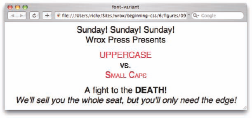
Figure 6-8c shows that when compared side by side with the text-transform: uppercase; declaration, the effect of the font-variant: small-caps; declaration is obvious. The capitalized letter maintains its case and size, but all lowercase letters are displayed as capital letters scaled slightly smaller than any real capital letters appearing in the markup's source code.
The next section continues the discussion of font manipulation properties with the font-weight property.
The font-weight property provides the functionality to specify how bold a font is. The following table outlines the font-weight property and the values that it allows.
Property | Value |
|---|---|
font-weight | normal | bold | bolder | lighter | 100 | 200 | 300 | 400 | 500 | 600 | 700 | 800 | 900 Initial value: normal |
As you can see in the preceding table, the font-weight property has several values. Despite all of these different values being available for the font-weight property, in real-world web design, a font is either bold or it isn't. That is to say, in real-world web design, the only two values that matter in the preceding table are the normal and bold values.
In the preceding table, you can see that CSS allows for up to nine different variations of bold, from 100, being very light, to 900, being very bold. The reasoning behind there being several possible values for the font-weight property is in professional typography, designers are likely to have access to fonts with nine different variations of bold. However, these high-end professional fonts aren't available by default on any operating system, and in order to make use of the 100 through 900 values, you'd need to purchase a professional font package. Purchase of a font package that contains nine different variations of bold can be quite expensive. The average price tag for a font package (one single font) with this many variations is on average about $300.
Setting aside the values of the font-weight property that you're extremely unlikely to ever have need of, there are two uses for the font-weight property: to make text bold, or to make bold text normal. This is demonstrated in Figure 6-9a.
The CSS in Figure 6-9a is combined with the markup in Figure 6-9b.
The CSS and markup in Figure 6-9a and Figure 6-9b result in the output in Figure 6-9c.
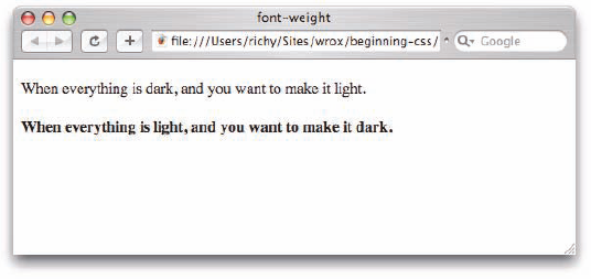
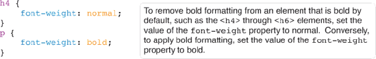
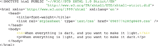
In Figure 6-9a, you see two elements in the body of the document, an <h4> element and a <p> element. The <h4> element is formatted bold by default. To take away the bold formatting, you simply include the font-weight: normal; declaration. The text within <p> elements is not bold by default. To make that text bold, you use the font-weight: bold; declaration.
Now that you have seen how to make font bold, or not, depending on the element, the next section describes how to use the font-size property.
The font-size property is, of course, used to control the size of fonts. The following table outlines the font-size property and its possible values.
Property | Value |
|---|---|
font-size | <absolute-size> | <relative-size> | <length> | <percentage> Initial value: medium |
The bad news, as I mentioned in Chapter 2 in the discussion of CSS length units, is the number of caveats and fallbacks attached to each measurement. Some are better suited for screen and some are better suited for print, and not all length units are interpreted consistently on different browsers. The same is true of the keyword values for the font-size property that I discuss in the following sections.
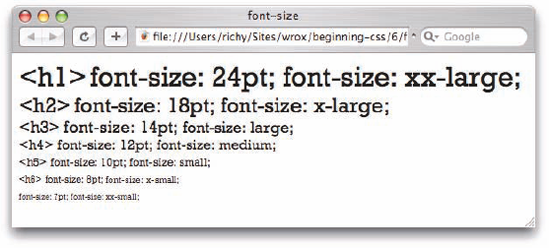
The <absolute-size> value notation of the font-size property refers to one of seven keyword values. Absolute values for the font-size property are defined using keywords that range from xx-large to xx-small. The following table outlines the absolute values and their relation to HTML heading sizes as of CSS 2.0.
Absolute Keyword | xx-small | x-small | small | medium | large | x-large | xx-large |
|---|---|---|---|---|---|---|---|
HTML Heading | n/a |
|
|
|
|
|
|
These keywords specify the font size based on a scaling factor of 1.2. Scaling factor is the ratio between two shapes. The scaling factor is determined by multiplying the font size by 1.2 to determine the next font size relative to the previous one. For instance, if a font size of 16 pixels is assumed for the medium keyword value, the large keyword would be approximately 20 pixels, rounding up from 19.2 because 16 multiplied by 1.2 equals 19.2.
These keywords exist for sizing fonts relative to the browser user's font-size preferences. The browser precalculates the value of each keyword depending on those preferences. The name absolute is somewhat misleading because each keyword is relative to the user's font-size preferences. The actual length unit size of each keyword varies depending on a number of factors, such as:
The browser's default font size
The user's font size preferences
The font family being used
Despite all of these variables, this is one place where the three browsers, IE, Firefox, Safari, and Opera, seem to be consistent.
Figure 6-10 shows each absolute font size in relation to the default HTML heading size and a size specified in points.
Although this association between font size keywords and length units works for the Rockwell font I used in Figure 6-10, the point sizes depicted are approximations and might not be the same point unit values when another font is used. If you increase or decrease the size of the text using the zoom feature of the browser, you'd notice that the point sizes change in response to the absolute keyword values if you are using IE 7, Safari, Opera, or Firefox. However, IE 6 ignores the user's adjustments to font size preferences on font sizes specified in points (or any other absolute length unit, like inches or centimeters). Therefore, the point sizes do not change with the size of the absolute keywords when adjustments to the user's font size preferences are made. You can make adjustments in the size of the font in Internet Explorer from the View
Relative font-size keywords, covered in the following section, are closely associated with the absolute font size keywords.
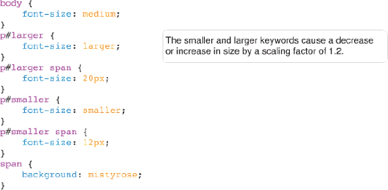
The <relative-size> notation of the font-size property refers to two values: larger and smaller. When either of these two values is used, the font size is determined by the values appearing in the table for absolute size keywords discussed in the previous section. Take, for instance, the example in Figure 6-11a.
Combine the CSS in Figure 6-11a with the markup in Figure 6-11b.

The results are shown in Figure 6-11c.
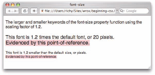
Figure 6-11 demonstrates how the next value in the absolute font-size keyword table is chosen. Because the font for the <body> element is made medium in size with the font-size: medium; declaration, when font-size: larger; is applied to the <p> element, the browser chooses the next larger value in the absolute keyword table and applies a font size that is the same as would be generated by the font-size: large; declaration. If the value is specified with a length unit—say, for instance, as pixels—the browser simply applies a 1.2 scaling factor to that size to get the larger size.
Figure 6-12 shows how a font size specified as 16 pixels gets increasingly larger when font-size: larger; is applied to descendant elements.

In contrast to the font-size: larger; declaration, Figure 6-13 shows what happens when the font-size: smaller; declaration is used instead.
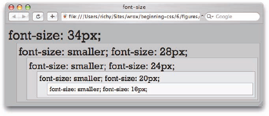
The font-size: smaller; declaration performs the same scaling factor changes that the font-size: larger; declaration does, but does them in reverse.
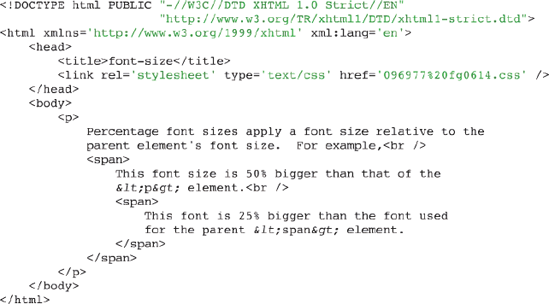
Percentage font sizes work much like the em units discussed in Chapter 2. Consider the example in Figure 6-14a.

Combine the CSS in Figure 6-14a with the markup in Figure 6-14b.
The result is shown in Figure 6-14c.
Figure 6-14c shows that percentage values are based on the element's ancestry. The font size for the <p> element is the default font size, which is medium or typically 16 pixels. The font size of the first <span> element is made 50% larger than the font size of its parent element, the <p> element. Assuming the default font size is 16 pixels, that makes the font size of the first <span> element 24 pixels. Then, the nested, child <span> element is made 25% bigger than the font size of its parent <span> element, which comes to 30 pixels.

A percentage font size measurement might also be used to decrease the size of a font. Take, for instance, the CSS in Figure 6-15a.
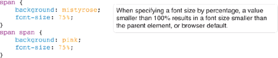
The CSS in Figure 6-15a is combined with the markup in Figure 6-15b.

The result is shown in Figure 6-15c.
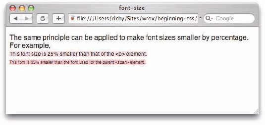
As you saw in Figure 6-14c, Figure 6-15c shows how percentage fonts can be used to make a font smaller. Again assuming the default font size is 16 pixels, the child <span> element is made 25% smaller than the font of the <p> element, which comes to 12 pixels. Then the nested <span> element is made 25% smaller than its parent <span> element, which comes to 9 pixels.
Now that you've had an overview of how the font-size property works, you can try out the font-size property firsthand.
Try It Out: Applying a Font Size
Example 6-3. Follow these steps to try out the font-size property.
In your text editor, type the following markup:
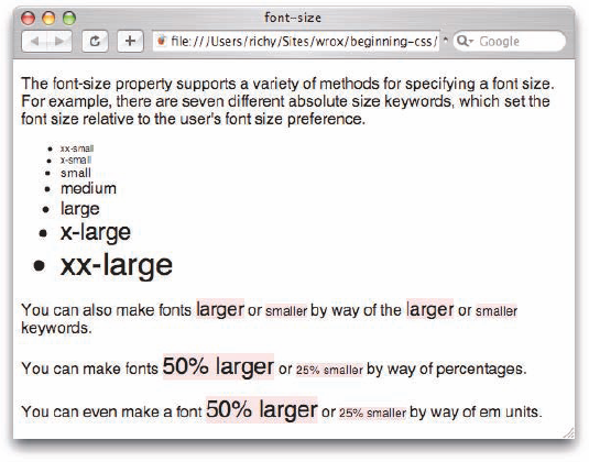
<!DOCTYPE html PUBLIC "-//W3C//DTD XHTML 1.0 Strict//EN"
                      "http://www.w3.org/TR/xhtmll/DTD/xhtmll-strict.dtd">
<html xmlns='http://www.w3.org/1999/xhtml' xml:lang='en'>
    <head>
        <title>font-size</title>
        <link rel='stylesheet' type='text/css' href='Example_6-3.css' />
    </head>
    <body>
        <p>
            The font-size property supports a variety of methods for
            specifying a font size. For example, there
            are seven different absolute size keywords, which set the
            font size relative to the user's font size preference.
        </p>
        <ul>
            <li style='font-size: xx-small;'>xx-small</li>
            <li style='font-size: x-small;'>x-small</li>
            <li style='font-size: small;'>small</li>
            <li style='font-size: medium;'>medium</li>
            <li style='font-size: large;'>large</li>
            <li style='font-size: x-large;'>x-large</li>
            <li style='font-size: xx-large;'>xx-large</li>
        </ul>
        <p>
            You can also make fonts
            <span style='font-size: larger;'>larger</span> or
            <span style='font-size: smaller;'>smaller</span> by way
            of the <span style='font-size: larger;'>larger</span> or
            <span style='font-size: smaller;'>smaller</span> keywords.
        </p>
        <p>
            You can make fonts
            <span style='font-size: 150%;'>50% larger</span>
            or <span style='font-size: 75%;'>25% smaller</span> by way
            of percentages.
        </p>
        <p>
            You can even make a font
            <span style='font-size: 1.5em;'>50% larger</span>
            or <span style='font-size: 0.75em;'>25% smaller</span> by way
            of em units.
        </p>
    </body>
</html>
Save the markup as
Example_6-3.html.In a new document in your text editor, write the following CSS:
body {
    font: 16px sans-serif;
}
span {
    background: mistyrose;
}
Save the preceding CSS as
Example_6-3. css. The results of these modifications can be seen in Figure 6-16.
How It Works
In Example 6-3, you tried a variety of different methods of setting a font size. You began by typing out all seven absolute font sizes, from xx-small to xx-large.
Next you experimented with three different ways of adjusting a font size relative to the parent element or browser default font size. You began with the larger and smaller keywords. The larger keyword makes the font size 1.2 times larger, and the smaller keyword makes the font size 1.2 times smaller.
<p>
    You can also make fonts
    <span style='font-size: larger;'>larger</span> or
    <span style='font-size: smaller;'>smaller</span> by way
    of the <span style='font-size: larger;'>larger</span> or
    <span style='font-size: smaller;'>smaller</span> keywords.
</p>
Next, you experimented with percentage font size. A percentage value larger than 100 results in a larger font size, while a percentage value under 100 results in a smaller font size.
<p>
    You can make fonts
    <span style='font-size: 150%;'>50%  larger</span>
    or <span style='font-size: 75%;'>25% smaller</span> by way
    of percentages.
</p>
The em unit is pretty much identical to the percentage font size, except you can use the em unit on any element, not just font sizes (such as defining the width of a <div>; more on this in Chapter 7). You get identical results when using em units as you did with the percentage size.
<p>
    You can even make a font
    <span style='font-size: 1.5em;'>50% larger</span>  or
    <span style='font-size: 0.75em;'>25% smaller</span> by way
    of em units.
</p>
The next section examines a special shorthand property used to specify several font properties in one.
The font property is a shorthand property that allows you to write several font-related properties in a single property. The following table outlines the font property and the values that it allows.
Property | Value |
|---|---|
font | [<'font-style'> || <'font-variant'> || <'font-weight'> ]? <'font-size'> [ /<'line-height'> ]? <'font-family'> ] caption | icon | menu | message-box | small-caption | status-bar |
The notation for the font property is somewhat more complicated than those presented in previous examples. For now, just ignore the caption, icon, menu, message-box, small-caption, and status-bar values—these are called system fonts, and I discuss them in the next section.
As for the first part of the notation, here's a breakdown of each portion:
[ <'font-style'> || <'font-variant'> || <'font-weight'> ]?
This indicates that either a font-style, font-variant, or font-weight value can be provided. The question mark indicates that this part is optional; you don't have to include a font-style, font-variant, or a font-weight. The double vertical bars in the notation indicates that each value is optional, and they also indicate that any combination of the three can appear. You can include just a font-style, just a font-variant, just a font-weight, all three, or any combination of the three.
The next part indicates that a font size must be specified:
<'font-size'>
The font size is not optional, so a font-size value must always be provided.
The next part indicates that a line-height (discussed in Chapter 7) may be specified, but because a question mark follows it, the line height is optional:
[ / <'line-height'> ]?
The forward slash in the notation indicates that if a line height is specified, a forward slash must separate the font-size and line-height properties. The question mark after the closing square bracket indicates that this portion of the syntax is optional.
The last portion indicates that a font-family must be specified:
<'font-family'>
So at the very least, a font-size value and a font-family value must be specified. Now that you understand the notation, Figure 6-17a is an example of this property including all its optional values.

The CSS in Figure 6-17a is combined with the markup in Figure 6-17b.
The result is shown in Figure 6-17c.
This rule includes all the values possible with the font property shorthand. Figure 6-17 shows that this rule makes the font italic, small-caps, bold, 1em in size with a 1.5em line-height and a sans-serif font. I haven't discussed the line-height property yet because this property is discussed in Chapter 7, but essentially the line-height property accepts a normal length value, which sets the height for each line of text.
In contrast to the example in Figure 6-17, the example in Figure 6-18a shows the font property with a minimal set of values.

The CSS in Figure 6-18a is combined with the markup in Figure 6-18b.
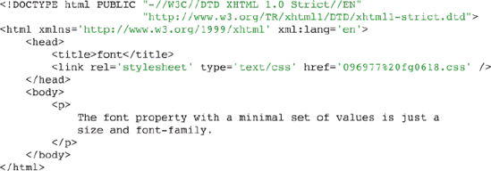
The result is shown in Figure 6-18c.

The notation indicates that at least a font size and a font family must be provided, as is reflected in the preceding example. Figure 6-18c shows output with a Monotype Corsiva font 32px in size.
Here are a few more possible variations of the font property:
font: bold 1.2em Arial, sans-serif;
This makes the font bold and 1.2em in size. Then, like the font-family property, the font property accepts a list of fonts. I've specified an Arial font, which is common. If that font isn't found on the user's computer, the generic sans-serif font is used. The following is another variation of the font property:
font: italic 1.2/2em "Times New Roman", Times, serif;
The preceding rule makes the font italic and 1.2em in size with a 2em line height. Those specifications are followed by a list of font families.
Now that you've had an overview of the font shorthand property, you can try out the font property for yourself in the following Try It Out.
Try It Out: Applying the font Property
Example 6-4. Follow these steps to try out the font property.
In your text editor, type the following markup:
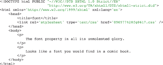
<!DOCTYPE html PUBLIC "-//W3C//DTD XHTML 1.0 Strict//EN"
                      "http://www.w3.org/TR/xhtmll/DTD/xhtmll-strict.dtd">
<html xmlns='http://www.w3.org/1999/xhtml' xml:lang='en'>
    <head>
        <title>font</title>
        <link rel='stylesheet' type='text/css' href='Example_6-4.css' />
    </head>
    <body>
        <p>
            The font shorthand property lets you combine up to six
            different properties in one single property.
        </p>
        <p class='fontl'>
            You can make text that's bold, 24 pixels in size,
            and sans-serif.
        </p>
        <p class='font2'>
            You can make text that's italic, bold, small-caps,
            24 pixel sans-serif, which looks like a comic
            book font.
        </p>
        <p class='font3'>
            Or you can just keep it simple, 16 pixels and
            monospace.
        </p>
    </body>
</html>
Save the markup as
Example_6-4.html.In a new document in your text editor, write the following CSS:
body {
    font: 16px sans-serif;
}
p.fontl {
    font: bold 24px sans-serif;
}
p.font2 {
    font: italic bold small-caps 24px sans-serif;
}
p.font3 {
    font: 16px monospace;
}
Save the preceding CSS as
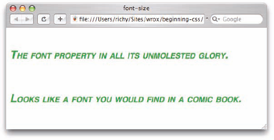
Example_6-4. css. The results of these modifications are shown in Figure 6-19.

How It Works
In Example 6-4, you saw four examples of the font shorthand property. The first example sets the font for the whole document, 16px, sans-serif. Because the font property is inherited, the font will stay 16px and sans-serif unless specified otherwise for a child element.
body {
    font: 16px sans-serif;
}
You then set the font to be bold, 24px, sans-serif for the <p> element with class name font1.
p.font1 {
    font: bold 24px sans-serif;
}
Next you made the font italic, bold, small-caps, 24px, and sans-serif for the <p> element with class name font2.
p.font2 {
    font: italic bold small-caps 24px sans-serif;
}
Finally, you set the font to 16px, monospace for the <p> element with class name font3.
p.font3 {
    font: 16px monospace;
}
In the next section I talk about system fonts, which are fonts that you can use to style a web page based on an end user's operating system fonts.
System fonts are keywords that refer to a font predefined by the user's operating system. The following table outlines each available system font.
Font Name | Font Description |
|---|---|
Caption | Refers to the font used for captioned controls. |
Icon | Refers to the font used to label icons like those found on the desktop. |
Menu | Refers to the font used in menus, drop-down menus, and menu lists. |
message-box | The font used in dialog boxes. |
small-caption | The font used for labeling small controls. |
status-bar | The font used in window status bars. |
System fonts may only be set as a whole when a system font is specified using the font shorthand property, the font-family, font-size, font-weight properties, and all other aspects of font display are set at once.
The CSS in Figure 6-20a is combined with the markup in Figure 6-20b.
Figure 6-20c shows what system fonts look like in various browsers on various operating systems.

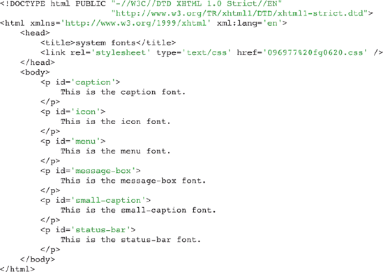
Figure 6-20c demonstrates each of the system fonts. From left to right and top to bottom the screenshots in Figure 6-20c are Safari, Windows XP IE 6, Windows Vista IE 7, Mac Opera 9, Ubuntu Linux Firefox 1.5, Windows XP Opera 9, Mac Firefox 1.5, Windows XP Firefox 1.5.

System fonts are intended to allow a web designer to set fonts based on a user's font preferences as defined for his or her operating system. While system fonts sound great in theory Figure 6-20c shows that system fonts are a bit of a hit and miss proposition. They don't work in IE 7 on Windows Vista, in Firefox on Ubuntu Linux, or in Safari on Mac OS X. Because system fonts can't be relied upon absolutely, it may be better to just define font styles for yourself.
Additionally, different aspects of system fonts can be overridden via the cascade by specifying the different font properties after a font declaration with a system font value. This is demonstrated by the following rule:
p {
    font: caption;
    font-size: 2em;
    font-style: italic;
}
In the preceding example, the font size and font style replace those specified for the system font.
This chapter demonstrated several properties CSS provides for manipulating font display. These properties allow both simple and complex control over how fonts are presented to the end user. In this chapter you learned:
How to specify the font face using the
font-familyproperty.How to make the font style oblique or italic with the
font-styleproperty.How to style the small-caps effect using the
font-variantproperty.How to control the lightness and boldness of a font using the
font-weightproperty.How to take advantage of specifying a font size that adjusts based on the user's font size preferences with the
font-sizeproperty and absolute keywords.How to increase the size of a font based on the font size of an element's parent using relative keywords, percentage font sizes, or em units with the
font-sizeproperty.How to combine the various font properties into one using the
fontshorthand property.
After learning some of CSS's simpler properties for text manipulation in Chapter 5 and going over font manipulation in this chapter, you now learn about the CSS box model in Chapter 7.
Why aren't the values of the
font-weightproperty100through900, bolder, andlighterused in real-world web design?If "Font A" is supported on Mac OS X, and "Font B" is supported on Windows XP, and "Font C" is supported on Linux, what style would you write so that one of the three would always be used in the absence of one of the others?
If you want to make text italic, what are two possible declarations for doing that?
What's the difference between the
font-variant: small-caps;andtext-transform: uppercase;declarations?How could the following rules be better written?
p {
    font-family: Arial, sans-serif;
    font-weight: bold;
    font-size: 24px;
    color: crimson;
}
p.copy {
    font-style: italic;
    font-weight: bold;
    line-height: 2em;
}
p#footer {
font-size: 12px; line-height: 2em; font-family: Helvetica, Arial, sans-serif; }What's wrong with the following rule?
p {
    font-size: 24;
}
If you include the declaration
font-size: larger;in a style sheet rule, how much larger would the text be?Would the declaration
font-size: 75%;make the font size larger or smaller?